LinkedIn Design System
LinkedIn's marketing system pairs near-black ink on white with the corporate blue at #0a66c2 reserved for primary CTAs. Tokens for React, Next.js, and AI coding tools.
Add shadcn.io to your AI agent. · Pro It installs blocks, icons and templates in your design system from a prompt, with Pro.
Set up MCP- Primary
- #0a66c2
- Typeface
- -apple-system
- Shape
- Soft
- Base radius
- 8px
- Colors
- 9
- Type tokens
- 10
- Components
- 12
- Spacing values
- 8
About
About LinkedIn DESIGN.md
Curated by Dov Azencot · Updated May 18, 2026 · Source linkedin.com (opens in a new tab)
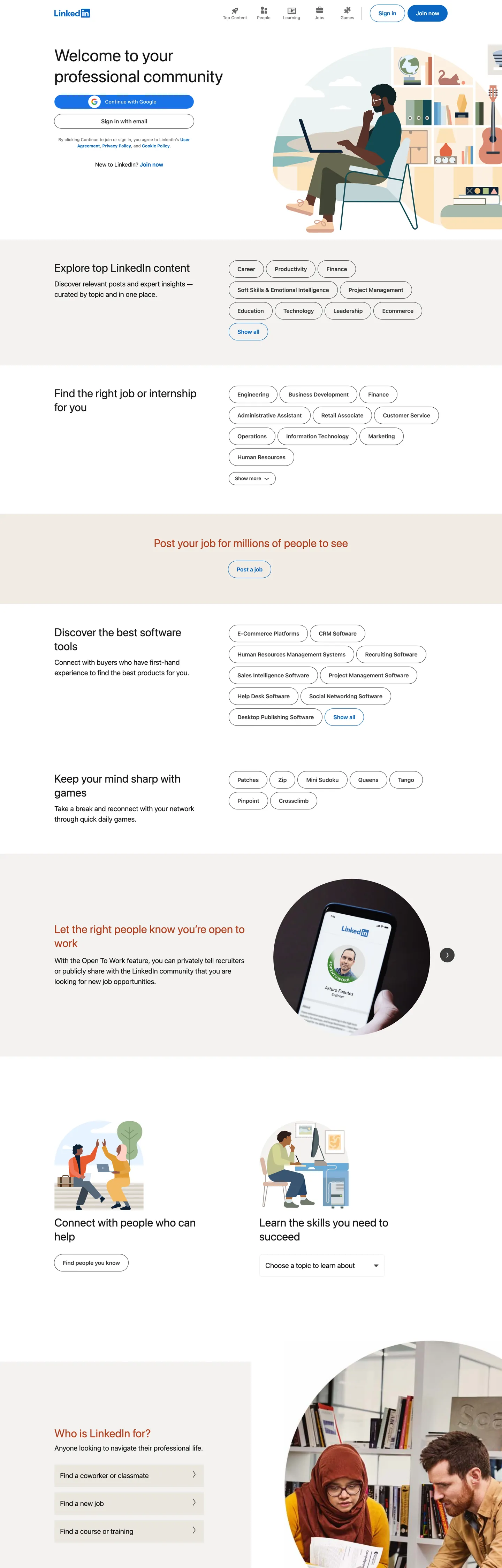
LinkedIn.com logged-out is the world's largest career-directory surface disguised as a sign-up page. The hero headline reads as a welcome to the member community — 48px, weight 400, set in a system-sans stack on stark white, with the LinkedIn wordmark in the corporate blue at the top-left and a single blue "Join now" pill anchoring the call to action. Below the hero, eight content-discovery panels stack vertically: an "Explore top LinkedIn content" row, a job-and-internship finder row, a software-discovery row, a games row, each one rendered as a horizontal row of pill-shaped chips at 24px radius. The page is content surfacing, not feature marketing. Where Twitter's logged-out page paints a vibrant gradient and where Facebook hides everything behind a login wall, LinkedIn does the inverse — it exposes the entire content graph as the marketing argument.
The chromatic palette is restrained to a degree that is unusual at this scale. There is exactly one brand voltage — the corporate blue at `{colors.primary}` (#0a66c2) — and it carries three jobs: the "Join now" primary CTA pill, the LinkedIn wordmark itself, and the inline anchor links that surface "See more" affordances. Every other interactive element on the page is either a pill chip in soft white with a near-black hairline border, or plain text. The remaining structural tones are near-black ink for body and headline copy, a soft mid-gray for secondary metadata, and a warm beige band that marks the "sign-in / new-to-LinkedIn?" zone in the middle of the page. There is also a deep rust-red color reserved for a single "Get the right people drawn to you" promotional panel — the only chromatic surprise on the page.
Typography is pure system-sans — no webfont, no custom typeface. The stack reads `-apple-system, system-ui, "Segoe UI", Roboto, "Helvetica Neue"`, which means San Francisco renders on macOS, Segoe UI on Windows, and Roboto on Android. Display hits at 48px in weight 400 for the hero h1 and 32px in weight 400 for section h2; navigation links and primary CTAs sit at weight 600. There is no separate display family. Feed this DESIGN.md to an AI coding tool and it reproduces LinkedIn's specific moves: corporate-blue voltage reserved for brand + primary CTA + inline link, system sans across every tier, 24px pill chrome everywhere, and content panels as the dominant marketing block rather than feature screenshots.
What makes it distinct
5
- Single corporate-blue voltagethe LinkedIn blue carries every primary CTA, the wordmark, and the inline 'See more' links; every other interactive element is neutral pill or text
- System-sans-onlythe typography stack is pure system fonts (San Francisco, Segoe UI, Roboto) with zero custom webfont; LinkedIn deliberately renders in whatever the OS ships
- 24px pill radius everywhereevery chip, every button, every pill container rounds to 24px; the system has essentially one rounding value
- Content-as-marketingthe hero is followed by eight chip-grid panels listing real content discovery (top software, jobs by region, articles), not feature screenshots
- Weight-400 displaythe 48px hero h1 sits at weight 400 in a system sans, paired with weight-600 navigation links as the only emphasis tier
linkedin.com
Live at linkedin.com
A snapshot of the brand in production. Scroll the frame to see the whole page.
Colors
9 colors
LinkedIn's system runs on #0a66c2 as its primary voltage, used in 3 of 12 components. Type is set in -apple-system across 10 tokens from 12px to 48px, weights 400–600. Shape language is soft — components average 21px corner radius, with no sharp interactive edges.
Brand & Accent
Sparing, CTA-only voltage · 3
Surface
Page and card backgrounds · 2
Text
Headlines, body, captions · 3
Borders & Hairlines
Dividers, outlines, rules · 1
Typography
10 type tokens
Set in -apple-system across 10 tokens, from 12px to 48px, weights 400–600. Shown in its own stack: where the font isn't installed, the fallback the file names stands in.
- display-xl48px · weight 400 · lh 60pxThe quick brown fox jumps over the lazy dog
- display-md32px · weight 400 · lh 40pxThe quick brown fox jumps over the lazy dog
- body-lg20px · weight 400 · lh 30pxThe quick brown fox jumps over the lazy dog
- body-md16px · weight 400 · lh 24pxThe quick brown fox jumps over the lazy dog
- link-md16px · weight 600 · lh 24pxThe quick brown fox jumps over the lazy dog
- label-md16px · weight 600 · lh 20pxThe quick brown fox jumps over the lazy dog
- link-sm14px · weight 600 · lh 17.5pxThe quick brown fox jumps over the lazy dog
- button-md14px · weight 600 · lh normalThe quick brown fox jumps over the lazy dog
- caption12px · weight 400 · lh 18pxThe quick brown fox jumps over the lazy dog
- caption-bold12px · weight 600 · lh 18pxThe quick brown fox jumps over the lazy dog
Layout
Radii and spacing
4 corner radii and 8 spacing values. Shape language: soft.
Radii
- none0px
- sm8px
- pill24px
- full9999px
Spacing
- xs8px
- sm12px
- md16px
- lg24px
- xl32px
- 2xl48px
- 3xl60px
- 4xl64px
Components
12 components
Each rendered from its tokens (color, type, radius, padding) on LinkedIn's own canvas.
- Button Primarybutton-primaryButton Primary
- Button Secondarybutton-secondaryButton Secondary
- Top Navtop-navTop Nav
- Nav Linknav-linkNav Link
- Hero Headinghero-headingHero Heading
- Section Headingsection-headingSection Heading
- Body Paragraphbody-paragraphBody Paragraph
- Content Chipcontent-chipContent Chip
- Inline Linkinline-linkInline Link
- Signin Bandsignin-bandSignin Band
- Promo Panelpromo-panelPromo Panel
- Type here…text-inputText Input
In use
The system, in use
LinkedIn's tokens on the kind of product it builds.
Build something people actually use.
A short paragraph of marketing copy that previews how the brand's display tier and body tier read together. Two sentences is usually enough.
FAQ
LinkedIn design system FAQ
Common questions about LinkedIn's tokens, components, and how to use this DESIGN.md in your project.
Read next
Related reading
Specs, directories, and component libraries that pair with this design system.
- Browse all design systemsThe full directory of DESIGN.md files on shadcn.io, with live mockups for each.shadcn.io
- LinkedIn — official siteLinkedIn's public marketing site — the source of truth for the live tokens captured in this file.linkedin.com (opens in a new tab)
- The DESIGN.md specificationGoogle Labs' open spec for machine-readable design system files — the format this page is built on.github.com (opens in a new tab)
Use it
Use LinkedIn in your project
One machine-readable file. Drop it into Claude, Cursor, or any AI tool that reads DESIGN.md.
Download the DESIGN.md
One machine-readable file: every color, type, radius, spacing, and component token of LinkedIn.
Feed it to your AI tool
Drop it into Claude, Cursor, or GitHub Copilot. The agent writes React components and Tailwind classes that match LinkedIn's visual language.
Reference the tokens directly
Or paste the values into your Tailwind config, CSS variables, or component library: every color, size and radius is a quoted, ready-to-copy value.
Read the full DESIGN.md: overview, rationale, do’s and don’ts
Overview
LinkedIn's logged-out page is the world's largest career-directory surface disguised as a sign-up flow. Content-as-marketing. Where Twitter's logged-out surface paints a vibrant gradient and where Facebook hides everything behind a login wall, LinkedIn does the inverse — it exposes the entire content graph as the marketing argument. Eight stacked panels of pill-chip rows (a top-content row, a jobs row, a software-discovery row, a games row, and four more) replace the feature-screenshot blocks that every other social network uses below the hero. The page is a 1B-member table of contents.
The chromatic restraint is the system's signature. There is exactly one brand voltage — the corporate blue at {colors.primary} (#0a66c2) — and it carries three jobs: the LinkedIn wordmark, the primary "Join now" CTA pill, and the inline "See more" anchor links that surface inside every content panel. The blue is structurally tied to identity, action, and navigation — never decoration. Near-black ink at {colors.ink} (#000000) dominates body and headline reading at frequency 523, against the stark-white canvas at {colors.canvas}. A soft beige band at {colors.surface-beige} (#eae6df) marks the "New to LinkedIn?" sign-in zone, and a single rust-red panel for a recruiter-targeted promotional feature is the only chromatic surprise.
Typography is pure system-sans — no webfont, no custom typeface. The stack runs -apple-system, system-ui, "Segoe UI", Roboto, which means San Francisco renders on macOS, Segoe UI Variable on Windows, Roboto on Android. Display hits at 48px in weight 400 for the hero h1; weight 600 is reserved for navigation links, primary CTAs, and inline anchor links. The system has no separate display family.
Key Characteristics:
- Pure stark white canvas (
{colors.canvas}— #ffffff), reading as "office document" rather than "consumer app." - Single corporate-blue voltage (
{colors.primary}— #0a66c2) carrying three jobs: brand wordmark, primary CTA pill, inline anchor link. - Pure system-sans stack with zero custom webfont — typography inherits whatever the OS ships.
- Single radius value: 24px pill (
{rounded.pill}). 46 of 49 rounded elements on the captured page use this value. - Content-discovery chip grids (8 panels) replace feature screenshots below the hero.
- Warm beige band (
{colors.surface-beige}— #eae6df) marks the "New to LinkedIn?" sign-in zone — the page's only canvas break. - Single rust-red accent (
{colors.accent-rust}— #b24020) reserved for one recruiter-targeted promotional panel. - Weight-400 display paired with weight-600 navigation and CTA labels as the only emphasis tier.
Colors
Brand
- Corporate Blue (
{colors.primary}— #0a66c2): frequency 27. Used as text (10), bg (3), border (10), shadow (4). The single brand voltage carrying three jobs — LinkedIn wordmark, "Join now" primary CTA pill, inline "See more" anchor links inside every content panel. Wired across hundreds of CSS variables in the LinkedIn design-token system. Structural to brand identity. - Corporate Blue Dark (
{colors.primary-dark}— #004182): declared in the token system as the press/active state for the primary blue. Not rendered in resting state but reserved for hover transitions on the CTA pill.
Accent
- Rust Red (
{colors.accent-rust}— #b24020): frequency 10. Used as text (5), border (5). The only chromatic surprise on the page — appears on a single promotional panel ("Get the right people drawn to you") targeting recruiter accounts. The deep rust reads warm and editorial against the rest of the page's blue-and-black palette.
Surface
- Canvas (
{colors.canvas}— #ffffff): frequency 11 — used as text (5), bg (2), border (4). Pure white page floor for the hero, the content-discovery panels, and the footer. The canvas of a CV or printed memo. - Sign-in Band (
{colors.surface-beige}— #eae6df): frequency 3 as bg. A warm taupe-beige carrying the "New to LinkedIn?" sign-in zone and one secondary chip-panel band. The single canvas break on the page.
Text
- Ink (
{colors.ink}— #000000): frequency 523 — the dominant text/border/shadow tone. Used as text (243), bg (1), border (241), shadow (38). Pure black for body, headline, and pill-chip borders alike. The most-used color in the captured token system by a wide margin, wired across 300+ CSS variables. - Ink Muted (
{colors.ink-muted}— #666666): frequency 44 — text (22), border (22). The mid-gray for secondary metadata, footer copy, and the hairline borders on tertiary chip groups. - Ink Inverse (
{colors.ink-inverse}— #ffffff): the white text color used on the corporate-blue CTA pill.
Hairline
- Hairline (
{colors.hairline}— #000000): pure-black ink doubles as the 1px border on every chip pill. The hairline-on-white discipline gives the chip grids their distinctive "tagged" reading.
Typography
Font Family
The system runs pure system-sans across every tier. The full fallback stack is -apple-system, system-ui, "Segoe UI", Roboto, "Helvetica Neue", "Fira Sans", Ubuntu, Oxygen, Cantarell, "Droid Sans", "Helvetica", Arial, sans-serif. On macOS this resolves to San Francisco; on Windows to Segoe UI Variable; on Android to Roboto; on Linux to whatever the distribution ships. There is no custom webfont anywhere on the captured page — LinkedIn deliberately renders in whatever the OS provides, which keeps the page feeling native to every viewer.
Hierarchy
| Token | Size | Weight | Line Height | Use |
|---|---|---|---|---|
{typography.display-xl} | 48px | 400 | 60px | Hero h1 — the member-community welcome line |
{typography.display-md} | 32px | 400 | 40px | Section h2 ("Explore top LinkedIn content," "Find the right job for you") |
{typography.body-lg} | 20px | 400 | 30px | Default running body copy, panel sub-paragraphs |
{typography.body-md} | 16px | 400 | 24px | Secondary body copy |
{typography.link-md} | 16px | 600 | 24px | Nav links, primary CTA label, inline "See more" anchors |
{typography.label-md} | 16px | 600 | 20px | Section subheadings (h3) |
{typography.link-sm} | 14px | 600 | 17.5px | Tertiary nav links, footer links |
{typography.button-md} | 14px | 600 | normal | Compact button labels |
{typography.caption} | 12px | 400 | 18px | Footer microcopy, disclaimers |
{typography.caption-bold} | 12px | 600 | 18px | Small emphasized labels |
Principles
Display tier sits at weight 400 — the 48px hero h1 and 32px section h2 are both weight 400. Weight 600 is the system's only "emphasis" treatment, reserved exclusively for navigation links, primary CTA labels, and inline anchor links. There is no weight 500 tier and no weight 700 tier — the system jumps directly from 400 to 600 and nothing else. Line heights are generous at every tier (60px on 48px display, 30px on 20px body), giving the dense chip-panel layout breathing room.
Note on Font Substitutes
Because LinkedIn uses pure system fonts, the truest reproduction is to use the same fallback stack in your own project. If you need a single webfont for cross-platform consistency, Inter at weights 400 and 600 transfers cleanly — Inter is explicitly designed to feel close to San Francisco at body sizes. Söhne is closer to Segoe UI Variable's display proportions if you have a Klim Type license.
Layout
Spacing System
- Base unit: 4px (with 8px and 12px as the dominant modules).
- Tokens:
{spacing.xs}8px ·{spacing.sm}12px ·{spacing.md}16px ·{spacing.lg}24px ·{spacing.xl}32px ·{spacing.2xl}48px ·{spacing.3xl}60px ·{spacing.4xl}64px. - Section padding (vertical): 60px between content-discovery panels.
- Chip internal padding: 12px vertical, 24px horizontal — the dominant
padding: 12px 24pxvalue appears 43 times in the captured layout. - Hero padding: the hero leaves generous left-column whitespace for the sign-in form, with the wordmark and primary CTA aligned to the same 24px grid as the chip rows below.
Grid & Container
- Max content width: ~1080px on the hero, ~960px on the content-discovery panels.
- Hero: two-column layout — left column carries the wordmark, h1, sign-in form stack, and "Join now" CTA; right column carries a custom illustration of a worker at a desk.
- Content-discovery panels: 8 stacked panels alternating between white-canvas and beige-band backgrounds. Each panel is a 2-row chip grid showing 8-12 pill chips in a flowing left-to-right wrap.
- Footer: multi-column link grid below a final beige sign-up band.
Rhythm
The page alternates between white-canvas chip panels and beige-band chip panels in a rhythmic stack: white → white → beige → white → white → white → beige → white. There is no atmospheric gradient between bands. The single rust-red promotional panel breaks the rhythm once near the page midpoint, anchored visually by the same 24px pill radius as every other panel.
Elevation
The system has almost no shadow tier. The captured page records 38 shadow occurrences, all driven by the corporate-blue focus-ring shadow on form inputs and the pill chips' soft hover states. Resting-state cards and pill chips carry zero drop shadow.
- Flat (no shadow): every chip, every content panel, every CTA — 99% of surfaces.
- Tonal lift: the beige sign-in band lifts off the white canvas by hue contrast alone, no shadow.
- Hairline outlines:
{colors.hairline}(pure black) marks every chip pill border at 1px. The hairline does all the "container" work in the system — there are no soft-gray borders. - Focus shadow: form input focus states fire a corporate-blue glow shadow as the only chromatic depth cue on the page.
Shapes
The radius scale is one value, repeated:
{rounded.none}0px — only on full-bleed page bands.{rounded.sm}8px — a single instance in the captured page, on a code-style element.{rounded.pill}24px — every chip, every CTA, every interactive container. 46 of 49 rounded elements on the page use this value.{rounded.full}9999px (50% on square elements) — avatars only.
The discipline is striking: there is no 4px tier, no 12px tier, no 16px tier. The 24px pill is enough generosity to read "tappable, tagged, businesslike" without crossing into the playful pill-everywhere aesthetic that consumer brands like WhatsApp or Spotify use. At 24px, the chip is a label; at 50px it would feel like a button.
Components
button-primary — The signature "Join now" CTA. Corporate-blue {colors.primary} fill, white text, {rounded.pill} 24px radius, 12x24 padding, 48px height. Anchors the hero left column.
button-secondary — Transparent fill with near-black text and a 1px {colors.hairline} border. {rounded.pill} 24px radius, same dimensions as the primary. Used for "Sign in with Google" and tertiary CTAs.
top-nav — White canvas background flush with the page floor, 56px height, 12x24 padding. Houses the LinkedIn wordmark in corporate blue, the right-aligned product nav links (Articles, People, Learning, Jobs, Games), and the right-most "Join now" + "Sign in" cluster.
nav-link — Transparent background, corporate-blue text in {typography.link-md} (16px / 600). The right-aligned navigation links use the brand blue rather than near-black ink — every clickable nav target sits in the brand voltage.
hero-heading — Near-black text on the white canvas, {typography.display-xl} (48px / 400). The member-community welcome line is the canonical instance.
section-heading — Near-black text, {typography.display-md} (32px / 400). Used for every content-panel title ("Explore top LinkedIn content," "Find the right job for you").
body-paragraph — Default near-black text at {typography.body-lg} (20px / 400). Panel sub-paragraphs and the hero sub-copy.
content-chip — The defining component of the page. White canvas fill, near-black text in weight 600, {rounded.pill} 24px radius, 12x24 padding, 48px height, 1px black hairline border. Every chip in every content-discovery panel uses this exact spec — "JavaScript," "Senior Software Engineer," "San Francisco Bay Area," "Adobe Photoshop," etc. The page contains hundreds of these chips arranged in flowing rows.
inline-link — Transparent background, corporate-blue text in weight 600. "See more articles," "See more jobs," "Show all" — the inline anchor link that closes every content-discovery panel. The blue is the only color the chip grids ever introduce besides black-on-white.
signin-band — {colors.surface-beige} (#eae6df) fill, near-black text, 60x24 padding. The warm taupe band carrying the "New to LinkedIn?" sign-up prompt and one secondary content-discovery panel.
promo-panel — White canvas with rust-red text and a 1px {colors.accent-rust} border. The single chromatic surprise on the page — "Get the right people drawn to you" recruiter-targeted promotional block.
text-input — White fill, near-black text, {rounded.sm} 8px radius (the one place 8px appears), 12x16 padding, 48px height, 1px black border. The sign-in email/password fields. The 8px radius here is the single exception to the 24px-everywhere rule — inputs are tiles, not pills.
Do's and Don'ts
Do reserve the corporate blue {colors.primary} for three uses only: the brand wordmark, the primary CTA pill, and inline anchor links. Multiplying the blue into chip backgrounds or panel accents would dilute its function as the page's only navigation signal.
Do use pure system-sans across every tier. LinkedIn renders in San Francisco / Segoe UI / Roboto depending on OS — adding a custom webfont would break the "feels native to every viewer" reading that the design intentionally cultivates.
Do keep every chip pill at exactly 24px radius. The system's one-radius discipline is what makes the chip grids read as a coherent taxonomy rather than a UI collage; mixing in 12px or 16px chips would visually fracture the rows.
Do use the warm beige band ({colors.surface-beige} — #eae6df) as the only canvas variation. The beige reads warm-editorial rather than gray-corporate, and one warm tone against pure white is enough to mark the sign-in zone without introducing a third canvas color.
Don't stack chips with soft-gray borders instead of pure-black hairlines. The captured page uses the page ink at 1px on every chip border — switching to a mid-gray hairline would soften the "tagged taxonomy" reading into a generic chip-cloud aesthetic.
Don't introduce a weight 500 or weight 700 typography tier. The system jumps directly from weight 400 (display, body) to weight 600 (links, CTAs). Adding a middle weight will flatten the hierarchy that the size step does.
Don't swap the rust-red promotional accent ({colors.accent-rust} — #b24020) into broader brand use. It appears once on the page as a recruiter-targeted promotional panel. Multiplying it would steal voltage from the corporate-blue primary CTA and create a two-color brand identity that the system was not designed to support.
Don't add drop shadows to the chip pills. The captured page sits chips on the canvas with no shadow — only a 1px black hairline. Adding even a subtle shadow would import a Material Design aesthetic that fights the print-document reading.
Known Gaps
- Hover and focus states: the captured marketing surface shows resting states only. Pill chip hover, focus ring, and disabled tints live in the token system but are not rendered on the marketing page.
- Logged-in product UI: this DESIGN.md captures the logged-out marketing surface only. The full LinkedIn product (feed, messaging, jobs, profile) carries a much richer token system — reaction colors, status badges, story rings, in-feed promoted-content treatments — that is not represented here.
- Paid tier accents: LinkedIn's paid subscription tier uses a distinct gold accent in the product UI that does not appear on the logged-out marketing surface.
- Mobile responsive breakpoints: the captured page is desktop-only. Mobile reflow rules for the chip grids (wrap behavior, chip size scaling) live in CSS but are not exposed in the static capture.
- Motion: the chip panels likely carry a subtle scroll-reveal animation but the spec captures end-state values only.
- Internationalization typography: LinkedIn renders in dozens of languages with script-specific font stacks (Noto Sans CJK on Chinese / Japanese / Korean surfaces, etc.) that are not represented in the en-US capture.
- Dark mode: the marketing page is light-only. A dark mode exists in the product UI but is not exposed on the logged-out surface.
Social & Community
More systems like this
More DESIGN.md files in Social & Community.
Pricing
Build it with Pro
The DESIGN.md files are free. Pro adds 6,000+ blocks, premium templates and the MCP server, so your AI editor builds in your system for you.
4.9/5 out of 5 · 150+ reviewsfrom 150+ founders and developers.
Billing
Billed once a year in USD. Cancel anytime.
- How many people can use the license.
- Client work, SaaS products and anything you charge for.
- Production-ready React sections: hero, pricing, features, dashboards and more.
- Complete multi-page sites you can ship as they are.
- React icons from every major library, installable with one command.
- Presets that restyle every block, in light and dark.
- Lets your AI editor search, preview and install blocks for you.
- Priority requests are answered first.
Individual
For personal projects & open source
$32instead of $49/mo
$389 billed yearly
- Seats: 1 seat
- Commercial use: Personal & open source only
- Pro blocks: 6,000+ blocks
- Templates: All 14 templates
- React icons: 294k+ icons
- Themes: All 59 themes
- MCP server: Basic usage
- Support: Standard
Team
Most popularFor freelancers, agencies & startups
$66instead of $99/mo
$789 billed yearly · ≈ $13/dev/mo
- Seats: Up to 5 seats
- Commercial use: Included
- Pro blocks: 6,000+ blocks
- Templates: All 14 templates
- React icons: 294k+ icons
- Themes: All 59 themes
- MCP server: High usage
- Support: Priority
Organization
For companies with larger teams
$132instead of $199/mo
$1,589 billed yearly
- Seats: Unlimited seats
- Commercial use: Included
- Pro blocks: 6,000+ blocks
- Templates: All 14 templates
- React icons: 294k+ icons
- Themes: All 59 themes
- MCP server: Unlimited usage
- Support: Priority
Billed once a year in USD. Cancel anytime.
Individual
For personal projects & open source
$32instead of $49/mo
$389 billed yearly
- How many people can use the license.Seats: 1 seat
- Client work, SaaS products and anything you charge for.Commercial use: Personal & open source only
- Production-ready React sections: hero, pricing, features, dashboards and more.Pro blocks: 6,000+ blocks
- Complete multi-page sites you can ship as they are.Templates: All 14 templates
- React icons from every major library, installable with one command.React icons: 294k+ icons
- Presets that restyle every block, in light and dark.Themes: All 59 themes
- Lets your AI editor search, preview and install blocks for you.MCP server: Basic usage
- Priority requests are answered first.Support: Standard
Team
Most popularFor freelancers, agencies & startups
$66instead of $99/mo
$789 billed yearly · ≈ $13/dev/mo
Everything in Individual, plus
- How many people can use the license.Seats: Up to 5 seats
- Client work, SaaS products and anything you charge for.Commercial use: Included
- Lets your AI editor search, preview and install blocks for you.MCP server: High usage
- Priority requests are answered first.Support: Priority
Organization
For companies with larger teams
$132instead of $199/mo
$1,589 billed yearly
Everything in Team, plus
- How many people can use the license.Seats: Unlimited seats
- Lets your AI editor search, preview and install blocks for you.MCP server: Unlimited usage
- Secure checkout via Stripe
- Code lives in your repo
- Keep what you've shipped if you cancel
- License terms
Your system, built for you
Every block, template and icon, installed by your AI agent in your design system. The DESIGN.md files stay free.