BuzzFeed Design System
BuzzFeed's homepage as a DESIGN.md file. Electric purple primary CTA on a charcoal ink grid, Proxima Nova body, Calistoga display serif for quiz titles, pill-radius 29px chips. Tokens for React, Next.js, and AI tools.
Add shadcn.io to your AI agent. · Pro It installs blocks, icons and templates in your design system from a prompt, with Pro.
Set up MCP- Primary
- #5246f5
- Typeface
- Calistoga
- Shape
- Mixed
- Base radius
- 8px
- Colors
- 13
- Type tokens
- 12
- Components
- 14
- Spacing values
- 8
About
About BuzzFeed DESIGN.md
Curated by Dov Azencot · Updated May 19, 2026 · Source buzzfeed.com (opens in a new tab)
BuzzFeed's homepage looks like a tabloid front page crossed with a social-media feed, organized around an inky charcoal grid with a saturated electric-purple primary CTA. The wordmark sits in the historical BuzzFeed red as a decorative header at the top of the page, but the brand voltage that actually carries every primary action below the masthead is electric purple — every Add Your Answer pill, every Subscribe button, every quiz-call-to-action uses #5246f5 at 29px pill radius. This is the inverse of what most readers expect: the "red BuzzFeed pill" people remember from the 2014-era brand has been retired from the action layer, and red survives only on the wordmark itself and a handful of inline accents.
The DESIGN.md file packages the system into a structured spec. Inside: 13 colors tokens organized around an inky charcoal body grid (#222222 carries 2395 occurrences — the dominant token by an enormous margin), a saturated electric purple primary, a graphite gray for secondary text, a cool gray for surface fills, and a single lemon-highlighter yellow used as a feature-band background on the "Literally LOL" quiz section; 11 typography tokens running Proxima Nova at weight 600/700 for every news-and-action tier and Calistoga (a bouncy display serif) at 18/22/28/48px for quiz-and-list section titles; an 8/29/50% radius scale with no middle tier; a 12/24/48px spacing rhythm; and 14 components definitions covering the photo card, the electric-purple pill CTA, the yellow-band quiz section, the avatar chip, and the dense top-nav.
Feed this file to Claude, Cursor, or any AI coding agent that reads structured tokens and it reproduces BuzzFeed's specific moves: charcoal ink on white canvas, electric-purple pill CTAs at 29px radius, Proxima Nova / Calistoga two-voice display, the lemon highlighter band as the only chromatic feature fill, and the dense 3-up / 4-up news-grid rhythm. The token references resolve cleanly. The one disciplined move worth borrowing only if your content mix includes quizzes: the two-voice display pairing where Proxima Nova carries news and Calistoga signals "this is a quiz." On a pure-news brand the Calistoga tier would feel unmotivated; here it carries the editorial scope-flip that BuzzFeed's mixed-feed identity depends on.
What makes it distinct
5
- Electric purple primary CTA#5246f5 at 29px pill radius carries every Add Your Answer and primary action, the inverse of the red-pill brand most readers remember
- Calistoga display serifa bouncy display serif at 48px weight 400 signals quiz-and-list editorial scope; never used on news headlines
- Inky charcoal body#222222 carries 1209 text and 1184 border occurrences, the dominant token by a 5x margin over any other
- Lemon highlighter banda saturated #f0fa81 yellow appears just 3 times as a full-bleed feature-band background, the page's only quiz-emphasis fill
- 8px / 29px / 50% radius ladderstory cards at 8px, primary pill CTAs at 29px, avatar chips at full circle; no middle tier between the card and the pill
buzzfeed.com
Live at buzzfeed.com
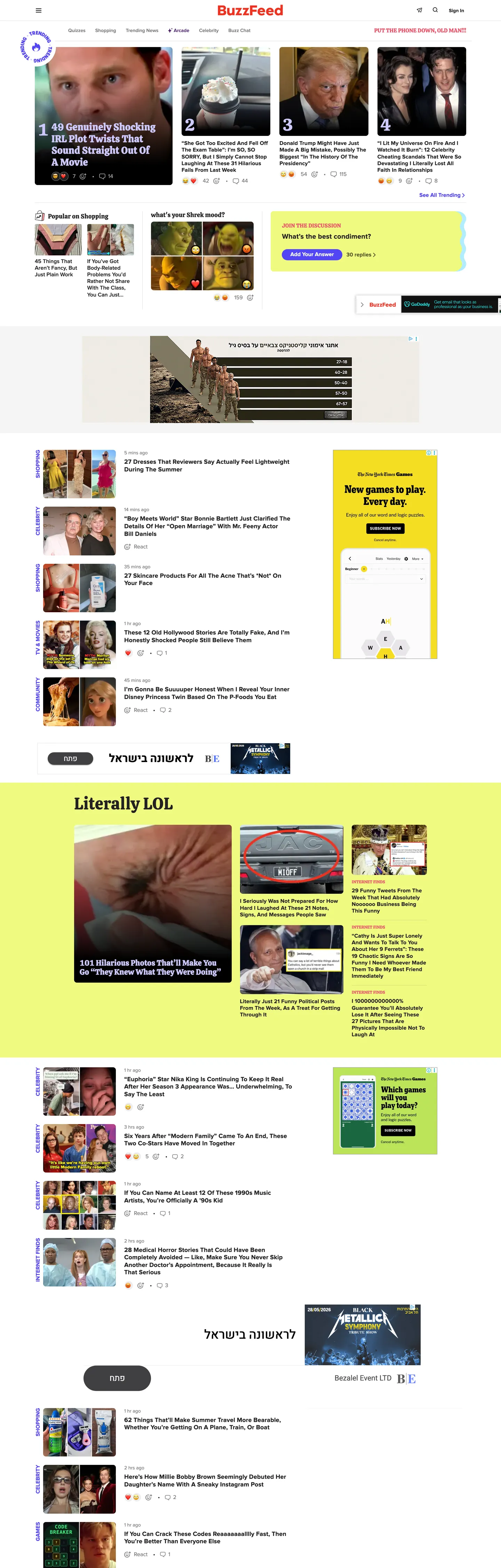
A snapshot of the brand in production. Scroll the frame to see the whole page.
Colors
13 colors
BuzzFeed's system runs on #5246f5 as its primary voltage, used in 1 of 14 components. Type is set in Calistoga across 12 tokens from 12px to 48px, weights 400–700. Shape language is mixed across 14 components, blending pills, soft rounds, and squarer corners.
Brand & Accent
Sparing, CTA-only voltage · 3
Surface
Page and card backgrounds · 2
Text
Headlines, body, captions · 4
Borders & Hairlines
Dividers, outlines, rules · 1
Other
Specialty colors · 3
Typography
12 type tokens
Set in Calistoga across 12 tokens, from 12px to 48px, weights 400–700. Shown in its own stack: where the font isn't installed, the fallback the file names stands in.
- display-xl48px · weight 400 · lh 57.6px · tracking 0.48pxThe quick brown fox jumps over the lazy dog
- display-lg32px · weight 400 · lh 38.4px · tracking 0.32pxThe quick brown fox jumps over the lazy dog
- display-md28px · weight 700 · lh 33.6px · tracking 0.28pxThe quick brown fox jumps over the lazy dog
- display-sm22px · weight 700 · lh 26.4px · tracking 0.22pxThe quick brown fox jumps over the lazy dog
- heading-md20px · weight 700 · lh 24px · tracking 0.2pxThe quick brown fox jumps over the lazy dog
- heading-sm18px · weight 700 · lh 21.6px · tracking 0.18pxThe quick brown fox jumps over the lazy dog
- heading-quiz18px · weight 400 · lh 21.6px · tracking 0.18pxThe quick brown fox jumps over the lazy dog
- body-md16px · weight 700 · lh 19.2px · tracking 0.16pxThe quick brown fox jumps over the lazy dog
- body-sm14px · weight 400 · lh 21pxThe quick brown fox jumps over the lazy dog
- nav-link14px · weight 600 · lh 16.8pxThe quick brown fox jumps over the lazy dog
- button-md16px · weight 700 · lh 16pxThe quick brown fox jumps over the lazy dog
- caption12px · weight 400 · lh 14.4pxThe quick brown fox jumps over the lazy dog
Layout
Radii and spacing
5 corner radii and 8 spacing values. Shape language: mixed.
Radii
- none0px
- sm4px
- md8px
- pill29px
- full9999px
Spacing
- xs4px
- sm8px
- md12px
- base16px
- lg20px
- xl24px
- 2xl28px
- 3xl48px
Components
14 components
Each rendered from its tokens (color, type, radius, padding) on BuzzFeed's own canvas.
- Hero Headinghero-headingHero Heading
- Section Headingsection-headingSection Heading
- Section Heading Quizsection-heading-quizSection Heading Quiz
- Body Paragraphbody-paragraphBody Paragraph
- Body Paragraph Mutedbody-paragraph-mutedBody Paragraph Muted
- Button Primarybutton-primaryButton Primary
- Button Secondarybutton-secondaryButton Secondary
- Top Navtop-navTop Nav
- Nav Linknav-linkNav Link
- Story Cardstory-cardStory Card
- Quiz Cardquiz-cardQuiz Card
- Feature Bandfeature-bandFeature Band
- Avatar Chipavatar-chipAvatar Chip
- Type here…text-inputText Input
In use
The system, in use
BuzzFeed's tokens on the kind of product it builds.
Build something people actually use.
A short paragraph of marketing copy that previews how the brand's display tier and body tier read together. Two sentences is usually enough.
FAQ
BuzzFeed design system FAQ
Common questions about BuzzFeed's tokens, components, and how to use this DESIGN.md in your project.
Read next
Related reading
Specs, directories, and component libraries that pair with this design system.
- Browse all design systemsThe full directory of DESIGN.md files on shadcn.io, with live mockups for each.shadcn.io
- BuzzFeed — official siteBuzzFeed's public marketing site — the source of truth for the live tokens captured in this file.buzzfeed.com (opens in a new tab)
- The DESIGN.md specificationGoogle Labs' open spec for machine-readable design system files — the format this page is built on.github.com (opens in a new tab)
Use it
Use BuzzFeed in your project
One machine-readable file. Drop it into Claude, Cursor, or any AI tool that reads DESIGN.md.
Download the DESIGN.md
One machine-readable file: every color, type, radius, spacing, and component token of BuzzFeed.
Feed it to your AI tool
Drop it into Claude, Cursor, or GitHub Copilot. The agent writes React components and Tailwind classes that match BuzzFeed's visual language.
Reference the tokens directly
Or paste the values into your Tailwind config, CSS variables, or component library: every color, size and radius is a quoted, ready-to-copy value.
Read the full DESIGN.md: overview, rationale, do’s and don’ts
Overview
BuzzFeed's homepage inverts the brand most readers remember. Purple as the action voltage. The historical "red BuzzFeed pill" has been retired from the CTA layer entirely — the saturated electric-purple {colors.primary} (#5246f5) now carries every Add Your Answer button, every Subscribe pill, every primary action below the masthead. The brand red survives only on the wordmark itself (declared as the HTML theme-color #ee3322) and a small desaturated coral {colors.red-accent} (#eb5369) that shows up just 16 times as an inline tag accent. Where The Atlantic reserves a hazard red for the Subscribe pill and POLITICO scopes crimson to masthead duty, BuzzFeed swaps the action voltage to purple and quietly keeps red as a decorative wordmark color — a brand move that signals the publication has aged out of the 2014-era red-pill identity.
The body grid runs on inky charcoal restraint. {colors.ink} (#222222) appears 2395 times in the captured page — 1209 as text, 1184 as border, 2 as background — making it the single dominant token by a 5x margin over any other (the next most-occurring color, {colors.ink-muted} at #757575, sits at 378 occurrences). The charcoal is warmer than pure black; combined with the cool-gray surface fill {colors.surface-1} (#f4f4f4) on quiz cards, the page reads as ink on newsprint rather than as pixel-pure dev-tool chrome.
Typography is a two-voice display split: Proxima Nova at weight 700 carries every news-and-shopping headline; Calistoga (a bouncy display serif by Yellow Design Studio) carries every quiz-and-list section title at 18-48px. The split is editorial-mode signaling. Calistoga at 48px on "Literally LOL" means quiz section; Proxima Nova at 18px on a card means news. Where a single-voice system (Cloudflare's FT Kunst Grotesk, Spline Sans) trusts one typeface across every tier, BuzzFeed's mixed-content mandate demands two — and the discipline is in the scope rule: Calistoga never appears on a hard-news headline, and Proxima Nova never appears on a quiz title.
Key Characteristics:
- Electric purple (
{colors.primary}— #5246f5) carries every primary CTA at 29px pill radius. 236 total occurrences. The historical red has been retired from the action layer. - Warm charcoal ink (
{colors.ink}— #222222) dominates: 2395 total occurrences, 5x more than the next-most-occurring color. - Two-voice display: Proxima Nova at weight 700 for news headlines, Calistoga at weight 400 for quiz-and-list titles.
- 29px pill radius on every primary CTA — a specific value between an 8px softened rectangle and a 9999px full pill.
- 8px / 50% radius ladder on cards and avatar chips; no middle tier between the 8px card and the 29px pill.
- Lemon highlighter feature band (
{colors.feature-band}— #f0fa81) appears 3 times as a full-bleed quiz-emphasis fill — the only saturated chromatic background in the system. - Cool-gray surface fill (
{colors.surface-1}— #f4f4f4) carries 189 background occurrences — the secondary surface that lifts quiz cards off the white canvas. - Avatar chips at 50% radius (68 occurrences) — the second-most-occurring radius after 8px (95 occurrences); circular avatars are a brand fingerprint inherited from the social-feed era.
Colors
Brand
- Electric Purple (
{colors.primary}— #5246f5): frequency 236. Used as text (118), border (117), background (1). The CTA voltage — every Add Your Answer pill, every Subscribe action, every primary button below the masthead. Note the inversion: the rendered usage is mostly text and border (purple inline links and chip outlines), with only one true background fill — the canonical primary-button instance. - Primary Pale (
{colors.primary-pale}— #cdc9ff): frequency 22. A faint lavender used on link-hover backgrounds and inline highlight chips. Used as text (11) and border (11) in roughly equal split. - Primary Soft (
{colors.primary-soft}— #8daaf8): frequency 1. A muted periwinkle used on a single avatar background.
Feature
- Feature Band (
{colors.feature-band}— #f0fa81): frequency 3, all as background. The saturated lemon-highlighter yellow that fills the "Literally LOL" quiz feature band — the only chromatic feature-band fill in the system. Reserved exclusively for quiz-section emphasis. - Feature Deep (
{colors.feature-deep}— #481f6b): frequency 2. A deep aubergine used as a single inline accent inside a category tag. Wired to a specific feature lockup; not part of the general accent palette.
Red
- Red Accent (
{colors.red-accent}— #eb5369): frequency 16. Used as text (8) and border (8). A desaturated coral red used on a single inline tag chip — the only surviving rendered red in the system below the wordmark, which itself declares the HTML theme-color as#ee3322but does not render that hex inside the page chrome.
Text
- Ink (
{colors.ink}— #222222): frequency 2395 — the dominant token by an enormous margin. Used as text (1209), border (1184), background (2). The warm charcoal that carries every running-text moment on the page. Never pure black; the slight warmth is consistent across body, headings, and the buttoned outline. - Ink Muted (
{colors.ink-muted}— #757575): frequency 378. Used as text (189) and border (189) in perfect symmetry. The secondary running-text tone — timestamp captions, byline credits, "Quizzes" nav-link tone. - Ink Shadow (
{colors.ink-shadow}— #ada8a8): frequency 25. Used as text (3), border (3), shadow (19). The only token that meaningfully participates in shadow ink — used inside card-hover lift shadows.
Surface
- Canvas (
{colors.canvas}— #ffffff): frequency 32. The page floor — pure white. Used as text (1, where it renders white against the purple CTA pill), border (1), background (30). - Surface-1 (
{colors.surface-1}— #f4f4f4): frequency 189, all as background. The cool-gray secondary surface used on quiz cards and the right-rail promo strip — lifts a card off the white canvas without introducing a chromatic accent.
Hairline
- Hairline (
{colors.hairline}— #000000): frequency 29. Pure black used as text (5) and border (24). The single hairline-rule tone for card outlines where the warm charcoal{colors.ink}would feel insufficiently sharp.
Link
- Link Blue (
{colors.link-blue}— #0f65ef): frequency 8. Used as text (4) and border (4). The single inline link-default tone — distinct from the electric-purple primary, reserved for legacy hyperlink semantics.
Typography
Font Families
The system runs two voices: Proxima Nova (the licensed Mark Simonson grotesk-humanist sans) for every news-and-action tier — display, heading, navigation, body, button — and Calistoga (the Yellow Design Studio bouncy display serif) for every quiz-and-list section title at 18-48px. Fallbacks walk to Helvetica, Arial, sans-serif for Proxima Nova and cursive for Calistoga.
The two-voice display split is the typographic move that defines the brand. Calistoga only ships at weight 400 — its only weight in the family — and reads as a hand-set wood-block display serif with bouncy character. Proxima Nova at weight 700 reads as straightforward news-feed grotesk-humanist. The pairing — bouncy serif for quizzes, sturdy sans for news — is how the reader knows which editorial scope they're in without reading the headline content.
Hierarchy
| Token | Size | Weight | Line Height | Use |
|---|---|---|---|---|
{typography.display-xl} | 48px | 400 | 57.6px | Quiz-section hero title ("Literally LOL") — Calistoga |
{typography.display-lg} | 32px | 400 | 38.4px | Mid-tier feature lockup — Calistoga |
{typography.display-md} | 28px | 700 | 33.6px | Quiz-section subhead — Calistoga 700 |
{typography.display-sm} | 22px | 700 | 26.4px | Inline quiz card title — Calistoga 700 |
{typography.heading-md} | 20px | 700 | 24px | News-story h3 — Proxima Nova |
{typography.heading-sm} | 18px | 700 | 21.6px | Standard news headline — Proxima Nova (the workhorse tier, 58 occurrences) |
{typography.heading-quiz} | 18px | 400 | 21.6px | Quiz card title — Calistoga at heading size |
{typography.body-md} | 16px | 700 | 19.2px | Card body / link text — Proxima Nova |
{typography.body-sm} | 14px | 400 | 21px | Default running text — Proxima Nova |
{typography.nav-link} | 14px | 600 | 16.8px | Top-nav category labels — Proxima Nova |
{typography.button-md} | 16px | 700 | 16px | CTA button labels — Proxima Nova |
{typography.caption} | 12px | 400 | 14.4px | Small Calistoga caption inside category badges |
Principles
Proxima Nova sits at weight 700 across most of its tiers — the news-feed grotesk wants to read as ink-stamped, not as restrained editorial. Calistoga at weight 400 (its only weight) contrasts hard with the Proxima Nova 700 — the bouncy serif against the sturdy sans is the entire editorial-mode signal.
A small positive letter-spacing (0.16-0.48px) runs across both Proxima Nova at 16-20px and Calistoga at every size. The positive tracking is the brand's tabloid-display fingerprint; it pushes the type slightly looser than default, giving the page a more conversational rhythm than tight-tracked editorial systems like The Atlantic.
Note on Font Substitutes
Proxima Nova is licensed. The closest open-source substitutes are Montserrat at the same weights (proportions transfer cleanly, slightly geometric in places) or Source Sans Pro at the same weights (slightly more humanist). For Calistoga, no perfect open-source match exists — Bevan is the closest bouncy display serif at the 48px display tier, Carter One transfers reasonably at 18-32px, and Lobster can substitute at smaller sizes though its script-leaning glyphs shift the feel.
Layout
Spacing System
- Base unit: 8px — the dominant gap value, appearing 72 times in the captured page. The 8/16/24/48 ladder anchors most card-and-section work, with a 12px secondary rhythm for inline gaps (66 occurrences).
- Tokens:
{spacing.xs}4px ·{spacing.sm}8px ·{spacing.md}12px ·{spacing.base}16px ·{spacing.lg}20px ·{spacing.xl}24px ·{spacing.2xl}28px ·{spacing.3xl}48px. - Section padding (vertical): ~48px between major story bands; the lemon feature band uses 48px internal vertical padding.
- Card internal padding:
{spacing.md}(12px) on news story cards;{spacing.base}(16px) on quiz cards. - Top-nav padding:
{spacing.md}(12px) vertical,{spacing.base}(16px) horizontal. - Inline metadata gap:
{spacing.sm}(8px) between byline, timestamp, and category chip.
Grid & Container
- Max content width: ~1280px on the main news grid.
- Hero band: a 4-up news-story grid at the top of the page with full-bleed photo thumbnails, an 18px Proxima Nova weight 700 headline below each, and a small Calistoga 12px category badge above each.
- Quiz strip: the "Literally LOL" feature band runs full-bleed with a lemon yellow background, a 48px Calistoga title, and a 4-up quiz-card grid.
- News grid: alternating 3-up and 4-up rows separated by
{colors.surface-1}band gutters; cards sit at 8px radius with cool-gray surface fill on quiz cards and white surface fill on news cards. - Right rail: a narrower column on the right carrying "Popular on Shopping," "Tasty," and promotional product cards in a stacked layout.
Rhythm
The page alternates between dense news rows (3-up and 4-up Proxima Nova headlines with photo thumbnails) and lemon-band quiz strips (full-bleed Calistoga feature bands). The two editorial modes interleave roughly every 3-4 rows, giving the page a "news / quiz / news / quiz" cadence rather than the single-tempo grid of POLITICO or Atlantic. The quiz bands are the only chromatic-fill moments in the system; everything else sits on white or cool-gray.
Elevation
The system has a light card-lift shadow tier distinct from the hard-or-zero shadow patterns of POLITICO and VICE.
- Card-lift shadow:
{colors.ink-shadow}(#ada8a8) at low opacity provides a soft ~25-point lift on hover-capable story cards and quiz cards. The shadow ink is a warm taupe rather than pure black — keeping with the warm-ink palette of the rest of the system. - Flat cards by default: the resting state of most story cards is no shadow; depth comes from the cool-gray surface-1 fill against the white canvas.
- Modal scrim: not exposed on the captured marketing surface; the modal layer lives in the article-detail and quiz-flow product surfaces.
Shapes
The radius scale runs three tiers with no middle:
{rounded.none}0px — full-bleed feature bands, photo thumbnails inside the news grid.{rounded.sm}4px — declared but rare; used once on a small inline chip.{rounded.md}8px — the dominant value (95 occurrences). Every news story card, every quiz card, every feature lockup. The standard surface radius.{rounded.pill}29px — used exclusively on primary CTA pills (Add Your Answer, Subscribe). The radius sits just under half the 32px pill height, rendering as a true horizontal pill with a slightly squared cap.{rounded.full}9999px (50% on square elements) — used on avatar chips (68 occurrences). Circular avatars are inherited from the social-feed era of the brand.
There is no 12px, 16px, or 20px middle tier. The shape language is binary on cards (square photo, 8px card) and binary on actions (29px pill or 50% circle). The absence of a softened-rectangle middle is deliberate — every shape on the page reads as either a card or a pill, no in-between.
Components
hero-heading — The quiz-section signature display. Calistoga at 48px weight 400, rendered in {colors.ink} (warm charcoal). Used at the top of feature bands like "Literally LOL".
section-heading — Proxima Nova at 18px weight 700 — the workhorse news headline tier rendered inside story cards.
section-heading-quiz — Calistoga at 48px weight 400 — the quiz-and-list equivalent of section-heading. The two are scope-divided: news cards always use the Proxima Nova tier, quiz feature bands always use the Calistoga tier.
body-paragraph — Proxima Nova at 14px weight 400. Default running text.
body-paragraph-muted — {colors.ink-muted} (graphite gray) at the same body-sm typography — used for timestamps, byline credits, and secondary metadata.
button-primary — The signature CTA. {colors.primary} (electric purple) fill, white text, 29px pill radius, 8x24 padding, 32px height. "Add Your Answer" is the canonical instance. No border.
button-secondary — White fill, ink text, 1px {colors.ink} border, 29px pill radius, 8x24 padding, 32px height. The inverse of the purple primary.
top-nav — White surface, 56px height, 1px bottom {colors.surface-1} rule, 12x16 padding. Holds the BuzzFeed wordmark on the left (in the historical red, but only as the wordmark — not as a chrome accent) and a row of category nav links (Quizzes, News, Shopping, Tasty, etc.) in Proxima Nova 14px / 600.
nav-link — Transparent background, {colors.ink-muted} (graphite gray) text in {typography.nav-link} (14px weight 600). 0 padding, 17px height. The nav labels are quieter than the headlines below — graphite gray rather than charcoal.
story-card — White {colors.canvas} surface, 8px radius, 12px internal padding, 1px {colors.surface-1} border. The default news story card holds a 16:9 photograph at the top, an 18px Proxima Nova weight 700 headline below, and a byline row.
quiz-card — {colors.surface-1} (cool-gray) fill, 8px radius, 16px internal padding. The quiz equivalent of the story card — the cool-gray surface lift signals "this is a quiz" without using a chromatic accent.
feature-band — {colors.feature-band} (lemon yellow) fill, 8px radius, 48x24 padding. The full-bleed quiz feature band that wraps the "Literally LOL" section. The only chromatic-fill background in the system.
avatar-chip — {colors.surface-1} fill, 9999px radius (50% on a 40x40 square), 0 padding. The circular avatar inherited from the social-feed era.
text-input — White fill, ink text, 1px {colors.ink-muted} border, 8px radius, 12x16 padding, 44px height. Standard inline search input.
Do's and Don'ts
Do use {colors.primary} (#5246f5) at 29px pill radius for every primary CTA. The electric purple is the action voltage that replaced the historical red pill — keeping it scoped to the action layer (not to inline kickers, not to category badges) preserves the single-voltage discipline.
Do scope Calistoga to quiz-and-list section titles only. The two-voice display split is the brand's editorial-mode signal — using Calistoga on a hard-news headline breaks the scope rule, and using Proxima Nova on a quiz title strips the editorial flag. The rule is binary: news = sans, quiz = serif.
Do use {colors.surface-1} (#f4f4f4) cool gray as the quiz-card surface lift. The cool-gray fill is the secondary surface that signals "this is a quiz card" without introducing a chromatic accent. News cards stay white.
Do keep the BuzzFeed wordmark in the historical red as a decorative top-of-page element. The brand red has been retired from the action layer but survives on the wordmark and as the HTML theme-color — keeping it scoped to the masthead preserves the brand-recognition signal without diluting the new purple action voltage.
Don't use the historical BuzzFeed red on a CTA fill. The red has been retired from the action layer entirely; every primary button now uses {colors.primary} (#5246f5) electric purple. Reverting a Subscribe pill to red would re-trigger the 2014-era brand identity the publication has aged out of.
Don't introduce a 12px, 16px, or 20px middle radius tier between the 8px card and the 29px pill. The shape language is binary — cards at 8px, pills at 29px, avatars at 50%. Adding a softened-rectangle middle would dilute the distinction between "this is a content surface" (8px) and "this is an action" (29px).
Don't use the lemon {colors.feature-band} (#f0fa81) for any element outside a full-bleed quiz feature band. The yellow has exactly 3 occurrences in the captured page, all as full-bleed background fills on the "Literally LOL" strip. Using it as a card surface or a button fill would dilute the feature-band signal.
Don't use Proxima Nova at weight 400 or below for headlines. The system runs Proxima Nova at 700 for every news-and-action tier; dropping the weight to 400 would push the page toward editorial-restraint convention and lose the news-feed-grotesk authority that defines the brand voice.
Known Gaps
- Hover and focus states: the resting states of
{component.button-primary},{component.nav-link}, and{component.story-card}are captured; hover backgrounds, focus rings, and disabled tints are not exposed on the marketing surface. - Form input error states:
{component.text-input}carries the resting state only; validation styling lives inside the article-detail and quiz-flow product surfaces and is not represented here. - Dark mode: the captured marketing surface is light-only. No dark-mode variants are declared in the captured CSS — the warm charcoal
{colors.ink}body grid is light-only by design. - Motion: the quiz-flow product animates on result reveal, but the spec captures end-state values only. Easing curves, stagger timing, and quiz-result confetti behavior are not represented.
- Article-detail and quiz-flow surfaces: this DESIGN.md captures the homepage only. The article-detail view runs a different type ladder (longer body measure, drop-cap-free reading view), and the interactive quiz-flow surface uses its own component vocabulary that is not represented here.
- Tasty / shopping sub-brand surfaces: Tasty (the food sub-brand) and BuzzFeed Shopping run on related but distinct surfaces with their own color and component variations — these are not captured here.
- Wordmark red rendering: the BuzzFeed wordmark renders in red on the page but the exact rendered hex of the wordmark image is not exposed in the captured CSS chrome (the HTML theme-color is declared as
#ee3322but this value does not appear inside the captured page styles).
News & Publishing
More systems like this
More DESIGN.md files in News & Publishing.
Pricing
Build it with Pro
The DESIGN.md files are free. Pro adds 6,000+ blocks, premium templates and the MCP server, so your AI editor builds in your system for you.
4.9/5 out of 5 · 150+ reviewsfrom 150+ founders and developers.
Billing
Billed once a year in USD. Cancel anytime.
- How many people can use the license.
- Client work, SaaS products and anything you charge for.
- Production-ready React sections: hero, pricing, features, dashboards and more.
- Complete multi-page sites you can ship as they are.
- React icons from every major library, installable with one command.
- Presets that restyle every block, in light and dark.
- Lets your AI editor search, preview and install blocks for you.
- Priority requests are answered first.
Individual
For personal projects & open source
$32instead of $49/mo
$389 billed yearly
- Seats: 1 seat
- Commercial use: Personal & open source only
- Pro blocks: 6,000+ blocks
- Templates: All 14 templates
- React icons: 294k+ icons
- Themes: All 59 themes
- MCP server: Basic usage
- Support: Standard
Team
Most popularFor freelancers, agencies & startups
$66instead of $99/mo
$789 billed yearly · ≈ $13/dev/mo
- Seats: Up to 5 seats
- Commercial use: Included
- Pro blocks: 6,000+ blocks
- Templates: All 14 templates
- React icons: 294k+ icons
- Themes: All 59 themes
- MCP server: High usage
- Support: Priority
Organization
For companies with larger teams
$132instead of $199/mo
$1,589 billed yearly
- Seats: Unlimited seats
- Commercial use: Included
- Pro blocks: 6,000+ blocks
- Templates: All 14 templates
- React icons: 294k+ icons
- Themes: All 59 themes
- MCP server: Unlimited usage
- Support: Priority
Billed once a year in USD. Cancel anytime.
Individual
For personal projects & open source
$32instead of $49/mo
$389 billed yearly
- How many people can use the license.Seats: 1 seat
- Client work, SaaS products and anything you charge for.Commercial use: Personal & open source only
- Production-ready React sections: hero, pricing, features, dashboards and more.Pro blocks: 6,000+ blocks
- Complete multi-page sites you can ship as they are.Templates: All 14 templates
- React icons from every major library, installable with one command.React icons: 294k+ icons
- Presets that restyle every block, in light and dark.Themes: All 59 themes
- Lets your AI editor search, preview and install blocks for you.MCP server: Basic usage
- Priority requests are answered first.Support: Standard
Team
Most popularFor freelancers, agencies & startups
$66instead of $99/mo
$789 billed yearly · ≈ $13/dev/mo
Everything in Individual, plus
- How many people can use the license.Seats: Up to 5 seats
- Client work, SaaS products and anything you charge for.Commercial use: Included
- Lets your AI editor search, preview and install blocks for you.MCP server: High usage
- Priority requests are answered first.Support: Priority
Organization
For companies with larger teams
$132instead of $199/mo
$1,589 billed yearly
Everything in Team, plus
- How many people can use the license.Seats: Unlimited seats
- Lets your AI editor search, preview and install blocks for you.MCP server: Unlimited usage
- Secure checkout via Stripe
- Code lives in your repo
- Keep what you've shipped if you cancel
- License terms
Your system, built for you
Every block, template and icon, installed by your AI agent in your design system. The DESIGN.md files stay free.