Skip to content

MIT Technology Review Design System

MIT Technology Review's design system as a DESIGN.md file. Near-black hero with pastel-neon section accent fills, NeueHaas display at weight 600, sharp-cornered editorial layout, TRMono section labels, 16 components for React and AI tools.

Add shadcn.io to your AI agent. · Pro It installs blocks, icons and templates in your design system from a prompt, with Pro.

Set up MCP
Primary
#89f0e1
Typeface
NeueHaasText
Shape
Sharp
Base radius
4px
Colors
16
Type tokens
12
Components
16
Spacing values
8

About

About MIT Technology Review DESIGN.md

Curated by Dov Azencot · Updated May 19, 2026 · Source technologyreview.com (opens in a new tab)

MIT Technology Review's homepage opens with a near-black canvas, a 62px golden-yellow headline, and a mint-aqua subscribe button at 0px radius. It is the most deliberately academic-looking home page in technology journalism. Where Wired leans into neon-saturated tech-bro energy and The Verge uses a system-level rounded-corner grammar, MIT Technology Review stays flat and compositional — sharp edges throughout, pastel-neon accents filling section card backgrounds rather than appearing on CTAs or nav chrome, and a monospace face (TRMono) reserved for the smallest section-identifier labels.

The DESIGN.md file packages the system into a machine-readable spec for React and AI tools. Inside: 16 colors tokens — a near-black structural layer for the dark hero, a white canvas for editorial content below the fold, six pastel-neon section-category accent fills (mint aqua, chartreuse, sage green, lavender, peach, sky blue), and dark counterpart fills for each section's inverted card variant. Twelve typography tokens span NeueHaas in three display sizes at weight 600, NeueHaasText in two body and label tiers at weight 400, and TRMono at 10px for the single monospace-identifier moment. The radius scale has one value: effectively zero. Sixteen components cover the sharp-cornered CTA, the colored-fill section cards, the TRMono section labels, and the newsletter input module.

Feed this file to an AI coding tool and it reproduces MIT Technology Review's specific moves: near-black hero with pastel-neon colored-fill section cards, NeueHaas 600 as the single display weight, sharp corners everywhere, golden-yellow display headline, and TRMono for the section-identifier label tier only. The discipline worth borrowing for academic or research publications: using color as a section-classifier rather than as a brand accent creates a navigational system that lets readers identify content categories at a glance — a UX choice driven by editorial function rather than brand marketing.

What makes it distinct

5

  1. Pastel-neon section palettesix distinct accent colors (mint aqua, chartreuse, sage green, lavender, peach, sky blue) fill section-category card backgrounds rather than appearing as brand chrome
  2. Yellow display headline on near-blackthe hero h2 runs in golden yellow on a dark canvas, a pairing closer to a scientific journal cover than to consumer tech publishing
  3. NeueHaas weight 600 across all displaythe system never goes to 400 or 700 for headings; a single semibold weight handles every editorial hierarchy tier
  4. TRMono at 10px for section identifiersa custom monospace face appears only in the smallest label tier, adding academic-register texture without committing to a full mono voice
  5. Zero border-radius throughoutevery card, input, button, and panel in the system runs at 0px or approximately 1px; there is no pill or rounded-corner treatment anywhere on the editorial surface

technologyreview.com

Live at technologyreview.com

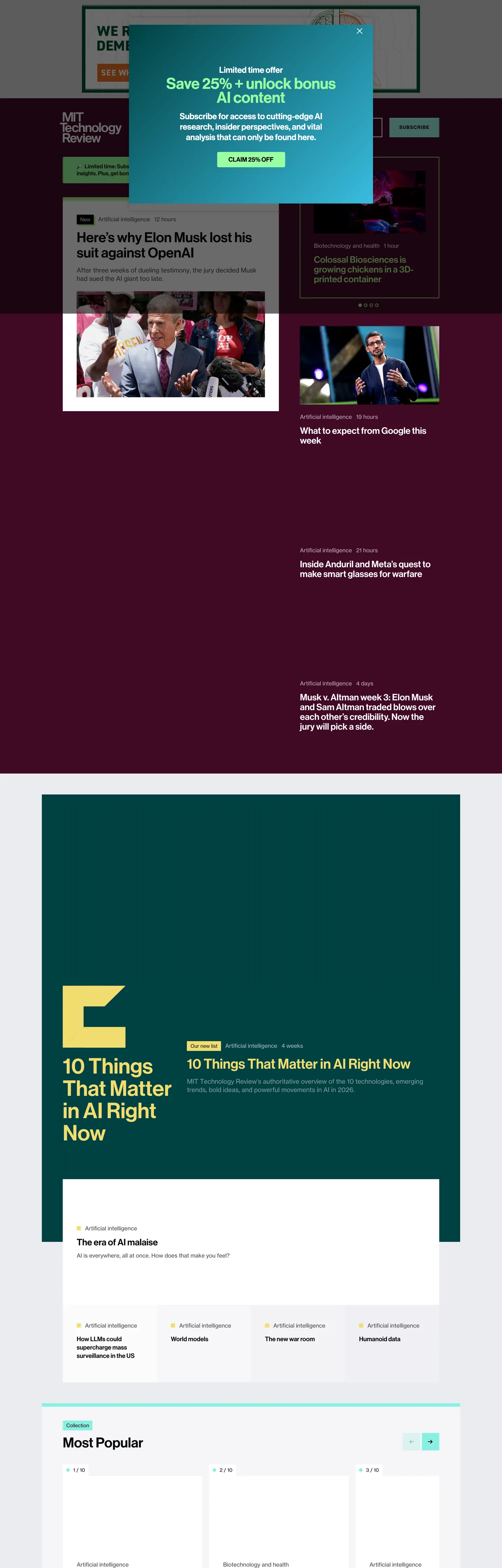
A snapshot of the brand in production. Scroll the frame to see the whole page.

MIT Technology Review's website at technologyreview.com

Colors

16 colors

MIT Technology Review's system runs on #89f0e1 as its primary voltage, used in 2 of 16 components. Type is set in NeueHaasText across 12 tokens from 10px to 62px, weights 400–700. Shape language is sharp — components average 0px corner radius, favoring crisp rectangles.

Brand & Accent

Sparing, CTA-only voltage · 1

Surface

Page and card backgrounds · 3

Text

Headlines, body, captions · 8

Borders & Hairlines

Dividers, outlines, rules · 1

Other

Specialty colors · 3

Typography

12 type tokens

Set in NeueHaasText across 12 tokens, from 10px to 62px, weights 400–700. Shown in its own stack: where the font isn't installed, the fallback the file names stands in.

  • display-xl62px · weight 600 · lh 64pxThe quick brown fox jumps over the lazy dog
  • display-lg40px · weight 600 · lh 44pxThe quick brown fox jumps over the lazy dog
  • heading-lg26px · weight 600 · lh 28pxThe quick brown fox jumps over the lazy dog
  • heading-md18px · weight 600 · lh 24pxThe quick brown fox jumps over the lazy dog
  • heading-sm18px · weight 600 · lh 20px · tracking -0.18pxThe quick brown fox jumps over the lazy dog
  • body-lg18px · weight 400 · lh 24pxThe quick brown fox jumps over the lazy dog
  • body-md16px · weight 400 · lh 22pxThe quick brown fox jumps over the lazy dog
  • body-sm14px · weight 400 · lh 24pxThe quick brown fox jumps over the lazy dog
  • label-md12px · weight 700 · lh 24px · tracking 0.96pxThe quick brown fox jumps over the lazy dog
  • button-md13px · weight 700 · lh 24px · tracking 1.04pxThe quick brown fox jumps over the lazy dog
  • nav-link16px · weight 400 · lh 22pxThe quick brown fox jumps over the lazy dog
  • mono-label10px · weight 400 · lh 24px · tracking 0.4pxThe quick brown fox jumps over the lazy dog

Layout

Radii and spacing

4 corner radii and 8 spacing values. Shape language: sharp.

Radii

  • none0px
  • xs1px
  • sm4px
  • full9999px

Spacing

  • xs4px
  • sm10px
  • base16px
  • md24px
  • lg30px
  • xl40px
  • 2xl60px
  • section48px

Components

16 components

Each rendered from its tokens (color, type, radius, padding) on MIT Technology Review's own canvas.

  • Button Primary
    button-primaryButton Primary
  • Button Secondary
    button-secondaryButton Secondary
  • Top Nav
    top-navTop Nav
  • Nav Link
    nav-linkNav Link
  • Hero Heading
    hero-headingHero Heading
  • Hero Section
    hero-sectionHero Section
  • Body Paragraph
    body-paragraphBody Paragraph
  • Section Heading
    section-headingSection Heading
  • Card
    cardCard
  • Card Colored
    card-coloredCard Colored
  • Card Dark
    card-darkCard Dark
  • Section Label
    section-labelSection Label
  • Type here…
    text-inputText Input
  • Footer
    footerFooter
  • Newsletter Module
    newsletter-moduleNewsletter Module
  • Article Card Heading
    article-card-headingArticle Card Heading

In use

The system, in use

MIT Technology Review's tokens on the kind of product it builds.

Build something people actually use.

A short paragraph of marketing copy that previews how the brand's display tier and body tier read together. Two sentences is usually enough.

Get startedLearn more
Marketing heroHeadline, sub-copy, primary CTA — the universal homepage opener.
Reporting · 14 min read

The quiet collapse of an old idea

For decades the consensus held that the system would correct itself. Then it didn't. This is the inside story of what changed, told by the people who watched it unravel.

"Nobody noticed because the failure was indistinguishable from progress."

By Sam Reporter · Updated 2 hours ago

Editorial articleMagazine-style longform with display headline.

FAQ

MIT Technology Review design system FAQ

Common questions about MIT Technology Review's tokens, components, and how to use this DESIGN.md in your project.

Read next

Specs, directories, and component libraries that pair with this design system.

Use it

Use MIT Technology Review in your project

One machine-readable file. Drop it into Claude, Cursor, or any AI tool that reads DESIGN.md.

Download DESIGN.md
  1. Download the DESIGN.md

    One machine-readable file: every color, type, radius, spacing, and component token of MIT Technology Review.

  2. Feed it to your AI tool

    Drop it into Claude, Cursor, or GitHub Copilot. The agent writes React components and Tailwind classes that match MIT Technology Review's visual language.

  3. Reference the tokens directly

    Or paste the values into your Tailwind config, CSS variables, or component library: every color, size and radius is a quoted, ready-to-copy value.

Read the full DESIGN.md: overview, rationale, do’s and don’ts

Overview

MIT Technology Review's homepage does something most technology journalism avoids: it makes the section-color system do structural work rather than decorative work. Taxonomy through color. Each editorial section — AI, Climate, BioTech, Computing, Space — receives a distinct pastel-neon fill used as the card background for every article in that section. The result is a scanning experience where a reader can identify the subject area of an article before reading a word of the headline, by the color of the card's background. Wired uses color as brand energy; The Verge uses color for hover state and accent decoration; MIT Technology Review uses color as editorial wayfinding.

The display typographic system reinforces the academic register. The hero h2 runs in golden yellow on a near-black canvas at 62px / weight 600 in NeueHaas — not the 700+ that consumer-tech titles favor, not the 300 that luxury brands deploy. The primary CTA button is mint aqua on near-black at 0px radius: a sharp-cornered, large-format action surface that reads more like a newspaper button than a SaaS pill. TRMono, a custom monospace face appearing only at 10px uppercase for section identifiers, adds one academic-register texture note without committing the system to a mono-first aesthetic. The full type stack — NeueHaas for display, NeueHaasText for body, TRMono for labels — is the closest thing in editorial publishing to the Neue Haas Grotesk / IBM Plex Mono pairing in a technical documentation system.

Key Characteristics:

  • Six pastel-neon section fills ({colors.primary} mint aqua, {colors.secondary} golden yellow, {colors.tertiary} chartreuse, {colors.section-lavender}, {colors.section-peach}, {colors.section-sky}) used as card-background section classifiers, not as brand chrome.
  • Near-black hero canvas ({colors.ink-deep}) with golden yellow display headline — high-contrast pairing that reads as laboratory print.
  • NeueHaas weight 600 across all display tiers — a single semibold weight for 62px, 40px, 26px, and 18px headings, with no 700+ or 400 alternative at any heading level.
  • TRMono at 10px uppercase for section-identifier labels — the sole monospace occurrence in the chrome.
  • 0px border radius everywhere — all cards, buttons, inputs, section panels, and containers run sharp-cornered.
  • NeueHaasText at weight 400 for body and weight 700 for label/button tiers — two weights in the text family separate editorial prose from interface actions.
  • Dark counterpart fills ({colors.section-teal-dark}, {colors.section-wine-dark}, {colors.section-navy-dark}) for inverted card variants within dark-background sections.

Colors

Brand

  • Primary ({colors.primary} — ): frequency 54. Used as bg (36), text (7), border (11). Mint aqua — the AI-section identifier and the primary CTA button fill. The most-used accent color in the captured page, appearing as the subscribe button fill and as the background of AI-content editorial cards.
  • Secondary ({colors.secondary} — ): frequency 20. Used as bg (12), text (4), border (4). Golden yellow — the hero display headline color and a section-card fill for specific editorial categories. The hero h2 text color.
  • Tertiary ({colors.tertiary} — ): frequency 11. Used as bg (11). Chartreuse — section-card background for climate and energy content.
  • Section Lavender ({colors.section-lavender} — ): frequency 11. Used as bg (11). Computing-section card background.
  • Section Peach ({colors.section-peach} — ): frequency 10. Used as bg (6), text (2), border (2). Space and transport-section card background.
  • Section Sky ({colors.section-sky} — ): frequency 10. Used as bg (6), text (2), border (2). Emerging-tech section card background.

Surface Dark (section inverts)

  • Section Teal Dark ({colors.section-teal-dark} — ): frequency 2. Used as bg (2). Deep teal — inverted card variant for AI-section dark contexts.
  • Section Wine Dark ({colors.section-wine-dark} — ): frequency 2. Used as bg (2). Deep wine — inverted card variant for BioTech-section dark contexts.
  • Section Navy Dark ({colors.section-navy-dark} — ): frequency 2. Used as bg (2). Deep navy — inverted card variant for Computing-section dark contexts.

Structural

  • Ink ({colors.ink} — ): frequency 2276. Used as text (1142), border (1134). The dominant near-black ink — runs every below-fold headline, body paragraph, nav link, and border rule.
  • Ink Deep ({colors.ink-deep} — ): frequency 842. Used as text (419), border (419), bg (3), shadow (1). A slightly deeper near-black with a faint blue tint — used for the hero canvas background, the footer, and below-fold editorial text where maximum contrast is needed.
  • Canvas ({colors.canvas} — ): frequency 655. Used as text (262), border (260), bg (129), shadow (4). The editorial body floor — pure white for the below-fold content area.
  • Surface-1 ({colors.surface-1} — ): frequency 102. Used as text (47), border (47), bg (8). A cool light grey — hairline dividers, the newsletter module background, and secondary surface fills.
  • Surface Dark ({colors.surface-dark} — ): frequency 5. Used as bg (2), text (2), border (1). A warm dark charcoal for mid-dark surface contexts.

Hairline

  • Hairline ({colors.hairline} — ): carried by the surface-1 token at border contexts. Cool light grey dividers between editorial sections and card outlines.

Elevation

  • Shadow ({colors.shadow} — ): frequency 180 as shadow ink, concentrated in the deep-shadow gradient overlays beneath photography (0px 0px 180px fill). Used at high opacity to create the fade-to-black effect behind article photography in dark-background sections.

Typography

Font Families

The system runs three families: NeueHaas (display and heading tiers, weight 600 throughout), NeueHaasText (body and label tiers, weights 400 and 700), and TRMono (section-identifier labels only, weight 400). NeueHaas and NeueHaasText are proprietary Linotype grotesks used exclusively by MIT Technology Review's brand; TRMono is a custom monospace face. The two Neue Haas variants share a visual family but have different optical corrections — NeueHaas is calibrated for display sizes, NeueHaasText for running text.

Hierarchy

TokenSizeWeightLine HeightUse
{typography.display-xl}62px60064pxHero h2 ("10 Things That Matter in AI Right Now")
{typography.display-lg}40px60044pxSection display headings
{typography.heading-lg}26px60028pxArticle card headlines, primary grid h3
{typography.heading-md}18px60024pxSecondary article card headings
{typography.heading-sm}18px60020px-0.18px
{typography.body-lg}18px40024pxLead body paragraphs
{typography.body-md}16px40022pxDefault running body text
{typography.body-sm}14px40024pxCaptions, metadata, secondary text
{typography.label-md}12px70024px0.96px
{typography.button-md}13px70024px1.04px
{typography.nav-link}16px40022pxTop navigation links
{typography.mono-label}10px40024px0.4px

Principles

NeueHaas at weight 600 is the system's single display weight — used at 62px, 40px, 26px, and 18px without variation. This uniformity prevents a weight-ladder approach where display headlines shout and sub-headings whisper. Every heading arrives at the same semibold confidence regardless of size, letting the size differential alone communicate hierarchy. The label and button tier jumps to NeueHaasText weight 700 and adds uppercase tracking (0.96–1.04px), creating a clear signal that these small elements are interface actions rather than editorial text. TRMono at 10px uppercase sits beneath even the labels — a register-marker rather than a navigation device.

Note on Font Substitutes

NeueHaas and NeueHaasText are proprietary. The closest open-source substitute for display and heading tiers is Inter at weight 600, with line-height set to 1.03× font-size to match NeueHaas's tight leading. For NeueHaasText at 16px body, IBM Plex Sans at weight 400 is the closest match — both have a slightly technical, neutral quality that suits editorial prose. For TRMono at 10px uppercase, IBM Plex Mono with 0.04em letter-spacing is the nearest freely available equivalent.

Layout

Spacing System

  • Base unit: 16px — the dominant padding token, appearing 102 times.
  • Tokens: {spacing.xs} 4px · {spacing.sm} 10px · {spacing.base} 16px · {spacing.md} 24px · {spacing.lg} 30px · {spacing.xl} 40px · {spacing.2xl} 60px · {spacing.section} 48px.
  • Section padding: {spacing.section} (48px) vertical for the hero band; 40px horizontal on major sections.
  • Card internal padding: {spacing.base} (16px) — standard across all editorial card types.
  • Newsletter module padding: {spacing.xl} (40px) — the most generous contained surface on the page.

Grid & Container

  • Hero: full-width near-black canvas at {colors.ink-deep}, with content centered at approximately 840px max-width. The golden-yellow headline in a narrow column (316px wide in the extracted component) reads as a tall thin editorial column, distinct from the full-bleed hero conventions of most consumer tech publications.
  • Editorial grid: a primarily two-column layout at the content level, with the hero article taking left-column prominence and secondary articles at right. Below the fold, the grid opens to a 3–4 column card grid with section-colored card backgrounds.
  • Newsletter module: a centered container at approximately 720px max-width with the cool grey {colors.surface-1} background — the only below-fold surface that departs from pure white.
  • Most Popular section: a full-width white surface with article titles in a uncluttered horizontal scroll at desktop.

Rhythm

The page alternates between the near-black hero band and the white editorial-content band without any gradient or photographic transition. The boundary is a hard cut. Below the fold, section-colored card grids are interspersed with white editorial sections, creating a rhythm of color-then-neutral that mirrors the section-palette taxonomy. The deep-shadow gradient ({spacing.section} 180px shadow) appears behind article photography in sections where text overlays photography — a purely structural shadow, not an elevation effect.

Elevation

The system uses the deep shadow gradient technique rather than traditional card shadows. The 180px bottom shadow in near-black ({colors.shadow}) appears as a fade-to-black gradient beneath article photography, creating contrast for white text overlaid on images. This is a photography-text legibility device, not a surface-elevation signal.

  • Flat (no shadow): all cards, nav, newsletter module, editorial content — 98% of surfaces.
  • Photography gradient: 0px 0px 180px {colors.shadow} ink — the fade-beneath-photo treatment that lets white headlines sit on photographic backgrounds without a separate overlay panel.
  • Card outlines: {colors.hairline} 1px borders on standard editorial cards — surface separation comes from hairlines rather than shadows.

Shapes

The radius scale is flat throughout:

  • {rounded.none} 0px — all standard surfaces: editorial cards, the subscribe CTA button, the email subscription input, section panels, and the hero.
  • {rounded.xs} 1px — a near-zero rounding appearing on cards in some article grid contexts; visually indistinguishable from 0px but technically present.
  • {rounded.sm} 4px — appears on the tag-chip UI in reader-interaction contexts.
  • {rounded.full} 9999px — reserved for circular avatar treatments (profile icons, author photography).

There is no pill CTA, no rounded-corner card, no 8–20px middle tier. The system is the flattest in the publishing category — flatter than The Financial Times, flatter than the WSJ, and decisively flatter than consumer-tech publications like The Verge or Wired. The sharpness signals academic formality.

Components

button-primary — The signature subscribe CTA. Mint aqua {colors.primary} fill, near-black {colors.ink-deep} text, NeueHaasText at 13px / 700 / uppercase / 1.04px tracking, 0px radius, 16×28px padding, 56px height. "Subscribe" is the canonical instance. No border; the mint fill sits against the near-black hero canvas with maximum contrast.

button-secondary — Transparent fill, near-black text, 1px ink border, 0px radius, 10×20px padding, 44px height. Secondary actions below the fold — newsletter "Sign up" style CTAs outside the hero.

top-nav — White {colors.canvas} surface, near-black text, 64px height, 40px horizontal padding. Contains the MIT Technology Review wordmark, primary section navigation links, and the subscribe CTA on the right side.

nav-link — Transparent, near-black text, NeueHaasText 16px / 400, 4×10px padding. Section navigation links — no uppercase, no tracking, no bold weight. The nav intentionally reads as quiet reference text.

hero-section — Near-black {colors.ink-deep} canvas, golden yellow headline, 48×40px padding, 0px radius. The full-width hero band that anchors the top of the page.

hero-heading — Golden yellow {colors.secondary} text, NeueHaas 62px / 600, 40px vertical padding, 0px horizontal. The hero display headline — unusually narrow in rendered width (316px) for a 62px type size.

body-paragraph — Near-black {colors.ink-deep} text, NeueHaasText 16px / 400, 22px line height. The default reading text for article body content.

section-heading — Near-black text, NeueHaas 26px / 600. Section display headings within the editorial grid.

card — White {colors.canvas} surface, near-black text, approximately 1px hairline border, 16px padding. The default editorial card for articles without a section color assignment.

card-colored — Section-pastel fill (mint aqua {colors.primary} as the canonical instance), near-black text, NeueHaas 26px / 600, approximately 1px radius, 16px padding. Used for every article in a color-coded section — the background fill identifies the section, not the text label.

card-dark — Deep teal {colors.section-teal-dark} fill (or wine/navy variants), white text, NeueHaas 26px / 600, approximately 1px radius, 16px padding. The inverted card variant for dark-background editorial sections.

section-label — Transparent, near-black text, TRMono 10px / 400 / uppercase / 0.4px tracking, 2×10px padding. The monospace section-identifier label — the single TRMono occurrence in the entire chrome.

text-input — White {colors.canvas} fill, near-black text, NeueHaasText 18px / 400, 0px radius, 8×10px padding, 44px height, 1px ink border. Email subscription field — sharp-cornered to match the CTA button's zero-radius treatment.

footer — Near-black {colors.ink-deep} fill, white text, NeueHaasText 14px / 400, 48×40px padding. Mirrors the hero canvas color, bookending the page.

newsletter-module — Cool grey {colors.surface-1} fill, near-black text, 0px radius, 40px padding. The newsletter signup container — the only below-fold surface that departs from pure white; the grey separates it from the surrounding editorial content without introducing an accent color.

article-card-heading — Transparent, near-black text, NeueHaas 26px / 600. The heading text within editorial cards.

Do's and Don'ts

Do treat the pastel-neon colors as section classifiers, not brand accents. The mint aqua, chartreuse, lavender, peach, and sky blue tokens exist to identify content sections at a glance — they belong on card backgrounds and section dividers, not on hover states, inline links, or navigation chrome outside the section grid.

Do keep every display and heading tier at NeueHaas weight 600. The uniformity of a single display weight across 62px, 40px, 26px, and 18px is the system's typographic signature — introducing a lighter 400 weight on secondary headings or a heavier 700 on the hero breaks the semibold-throughout discipline.

Do use TRMono exclusively for the 10px uppercase section-identifier label tier. The monospace appears exactly once in the chrome to add academic register to the smallest label surface. Using it at body sizes or in headings converts it from a texture note into a typographic voice, which the system explicitly avoids.

Do maintain 0px border radius on all interactive surfaces including the subscribe CTA button. The flat-cornered CTA button is the system's most counter-discoverable choice and its clearest academic-register signal — rounding it even to 4px moves it toward consumer tech publishing and away from the scientific-journal aesthetic.

Don't introduce the section colors into the navigation bar or the CTA button label. The mint aqua appears on the subscribe button as a background fill against the near-black hero — using it as a link accent inside the white-canvas editorial area would dissolve the section-classification function it serves.

Don't render golden yellow ({colors.secondary}) outside the hero display headline. The golden yellow is calibrated for maximum contrast on a near-black background; against the white canvas below the fold it reads as a muted tan rather than a vivid yellow, and its sectional meaning (it also identifies specific editorial categories) becomes ambiguous.

Don't use box shadows on cards. The system achieves card separation through hairline borders ({colors.hairline}) and section-color fill contrast. Adding shadows on editorial cards introduces a depth layer the academic register explicitly does not use.

Don't expand card padding beyond 16px. The editorial grid's information density depends on 16px as the card-internal padding standard. Expanding to 24px reduces headline density per viewport and changes the reading character of the page from dense-information-surface to selected-magazine — a fundamentally different editorial posture.

Known Gaps

  • Hover and focus states: no interactive hover states were captured from the static marketing surface; link underline conventions, button hover fills, and focus ring styles are not documented.
  • Dark mode: the page uses a dark hero section and a light editorial body, but a full system-level dark mode is not represented in the captured tokens.
  • Article page typography: the long-form article reading surface likely uses a larger body size, increased line height, and possibly a different font-weight profile optimized for sustained reading — not captured from the homepage.
  • Subscriber and paywall states: the metered paywall overlay, the registration prompt, and the subscriber-specific navigation states are not visible on the public homepage capture.
  • Mobile layout: the mobile navigation drawer, the collapsed section grid, and the touch-optimized article card sizes at small breakpoints are not represented.
  • Section-color mapping: the complete taxonomy linking specific content sections to specific pastel-neon tokens is not fully documented — only the most frequent colors were captured; additional section colors may exist for categories not heavily represented in the captured page.
  • Animation and transitions: the article card hover animations, the section-carousel scroll behavior, and the newsletter module interaction states are not captured.

News & Publishing

More systems like this

More DESIGN.md files in News & Publishing.

Pricing

Build it with Pro

The DESIGN.md files are free. Pro adds 6,000+ blocks, premium templates and the MCP server, so your AI editor builds in your system for you.

4.9/5 out of 5 · 150+ reviewsfrom 150+ founders and developers.

Billed once a year in USD. Cancel anytime.

Individual

For personal projects & open source

$32instead of $49/mo

$389 billed yearly

  • How many people can use the license.Seats: 1 seat
  • Client work, SaaS products and anything you charge for.Commercial use: Personal & open source only
  • Production-ready React sections: hero, pricing, features, dashboards and more.Pro blocks: 6,000+ blocks
  • Complete multi-page sites you can ship as they are.Templates: All 14 templates
  • React icons from every major library, installable with one command.React icons: 294k+ icons
  • Presets that restyle every block, in light and dark.Themes: All 59 themes
  • Lets your AI editor search, preview and install blocks for you.MCP server: Basic usage
  • Priority requests are answered first.Support: Standard

Team

Most popular

For freelancers, agencies & startups

$66instead of $99/mo

$789 billed yearly · ≈ $13/dev/mo

Everything in Individual, plus

  • How many people can use the license.Seats: Up to 5 seats
  • Client work, SaaS products and anything you charge for.Commercial use: Included
  • Lets your AI editor search, preview and install blocks for you.MCP server: High usage
  • Priority requests are answered first.Support: Priority

Organization

For companies with larger teams

$132instead of $199/mo

$1,589 billed yearly

Everything in Team, plus

  • How many people can use the license.Seats: Unlimited seats
  • Lets your AI editor search, preview and install blocks for you.MCP server: Unlimited usage
  • Secure checkout via Stripe
  • Code lives in your repo
  • Keep what you've shipped if you cancel
  • License terms

Your system, built for you

Every block, template and icon, installed by your AI agent in your design system. The DESIGN.md files stay free.

Get Pro