Medium Design System
Medium's homepage design as a DESIGN.md file. Cream canvas #f7f4ed, GT Super serif at 120px, Söhne UI, pill CTAs. For React, Next.js, and AI tools.
Add shadcn.io to your AI agent. · Pro It installs blocks, icons and templates in your design system from a prompt, with Pro.
Set up MCP- Primary
- #191919
- Typeface
- sohne
- Shape
- Sharp
- Base radius
- 0px
- Colors
- 18
- Type tokens
- 9
- Components
- 16
- Spacing values
- 8
About
About Medium DESIGN.md
Curated by Dov Azencot · Updated May 13, 2026 · Source medium.com (opens in a new tab)
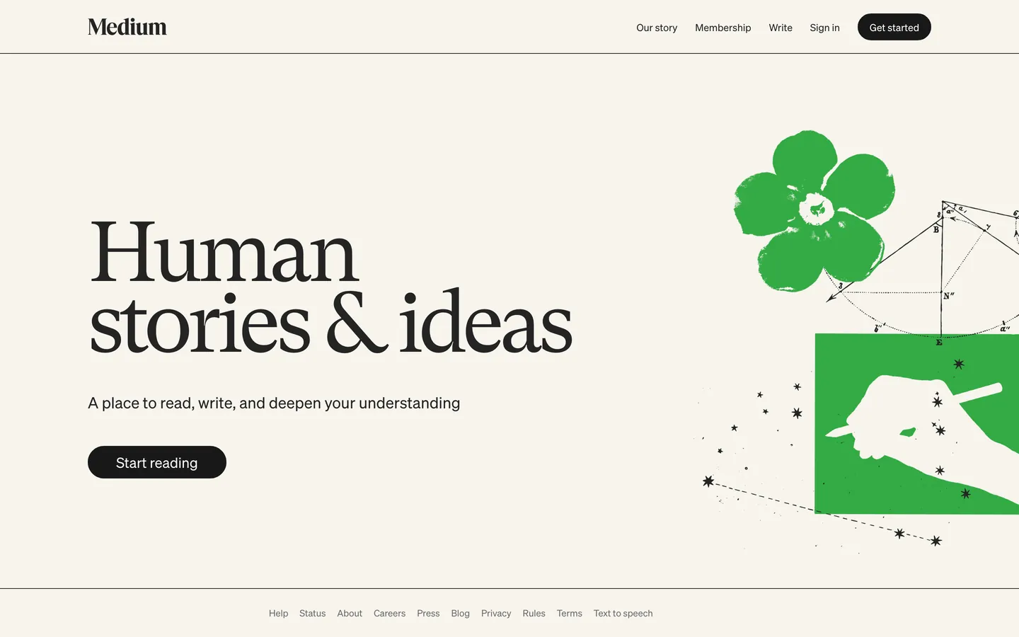
Medium's homepage is a reading room rendered as a webpage. The canvas is a warm cream ("#f7f4ed") rather than pure white — close enough to feel like cheap newsprint, far enough from beige to avoid the vintage-tea-stain trap. The hero is four words of GT Super serif set at 120px ("Human stories & ideas"), and that single typographic gesture is the entire identity. There is no gradient, no abstract product illustration, no SaaS-template feature grid below the fold — the page ends where it begins, with one headline, one dek, one pill button, and a hand-screened green illustration occupying the right half.
This DESIGN.md file packages the homepage system into a structured spec: 18 colors tokens covering the cream-and-ink monochrome plus the editorial green, 9 typography tokens spanning GT Super display (28–120px) and Söhne UI (13–22px), a 2-step radius scale where the pill ("1386px") swallows every button and the rectangle ("0px") owns everything else, an 8-step spacing scale, and 16 components specifications covering the nav, hero, CTA pill, footer link rail, and the surface treatments for both reading body and metadata layers. The format follows the Google Labs DESIGN.md specification.
Feed the file to Claude, Cursor, or any agent that reads structured tokens and it produces Medium's exact reading-first voice — cream paper, oversize literary serif, monochrome ink, a single pill CTA. Unlike most publishing brands that stack a feature grid below a 64px headline, Medium commits the entire first viewport to one sentence — that restraint is the design. Reference the tokens directly in Tailwind config, paste the hex values into CSS variables, or use the spec as an audit checklist when reviewing whether a long-form reading surface feels like a magazine page or a SaaS landing.
What makes it distinct
5
- Cream canvas#f7f4ed warm off-white reads as printed paper rather than screen, set against #242424 ink for newspaper-grade contrast
- GT Super at 120px / weight 400a literary serif treated at billboard scale with -6.6px tracking, where most publishing brands cap display at 64px
- Single near-black pill CTA#191919 fill at 1386px radius, paired with a 38px height that reads more like a chip than a button
- Two-family stackGT Super serif for the hero word, Söhne sans for every nav link, byline, and button label, with zero blended weights
- Hand-screened editorial illustrationa stamped green flower and pencil hand occupy the right column, the only color voltage in an otherwise monochrome page
medium.com
Live at medium.com
A snapshot of the brand in production. Scroll the frame to see the whole page.
Colors
18 colors
Medium's system runs on #191919 as its primary voltage, used in 1 of 16 components. Type is set in sohne across 9 tokens from 12px to 120px, weights 400–400. Shape language is sharp — components average 0px corner radius, favoring crisp rectangles.
Surface
Page and card backgrounds · 2
Text
Headlines, body, captions · 12
Borders & Hairlines
Dividers, outlines, rules · 3
Other
Specialty colors · 1
Typography
9 type tokens
Set in sohne across 9 tokens, from 12px to 120px, weights 400–400. Shown in its own stack: where the font isn't installed, the fallback the file names stands in.
- display-hero120px · weight 400 · lh 0.83 · tracking -6.6pxThe quick brown fox jumps over the lazy dog
- display-lg80px · weight 400 · lh 0.95 · tracking -3pxThe quick brown fox jumps over the lazy dog
- display-md56px · weight 400 · lh 1.05 · tracking -1.5pxThe quick brown fox jumps over the lazy dog
- dek-serif28px · weight 400 · lh 1.2 · tracking -0.5pxThe quick brown fox jumps over the lazy dog
- heading-sm22px · weight 400 · lh 1.27 · tracking 0The quick brown fox jumps over the lazy dog
- button-md20px · weight 400 · lh 1.4 · tracking 0The quick brown fox jumps over the lazy dog
- body-md14px · weight 400 · lh 1.43 · tracking 0The quick brown fox jumps over the lazy dog
- body-sm13px · weight 400 · lh 1.54 · tracking 0The quick brown fox jumps over the lazy dog
- caption12px · weight 400 · lh 1.5 · tracking 0The quick brown fox jumps over the lazy dog
Layout
Radii and spacing
3 corner radii and 8 spacing values. Shape language: sharp.
Radii
- none0px
- pill1386px
- full9999px
Spacing
- xxs4px
- xs8px
- sm12px
- md16px
- base20px
- lg24px
- xl25px
- section48px
Components
16 components
Each rendered from its tokens (color, type, radius, padding) on Medium's own canvas.
- Top Navtop-navTop Nav
- Nav Linknav-linkNav Link
- Nav Link Hovernav-link-hoverNav Link Hover
- WordmarkwordmarkWordmark
- Button Primarybutton-primaryButton Primary
- Button Primary Hoverbutton-primary-hoverButton Primary Hover
- Button Secondarybutton-secondaryButton Secondary
- Hero Headlinehero-headlineHero Headline
- Hero Dekhero-dekHero Dek
- Body Paragraphbody-paragraphBody Paragraph
- BylinebylineByline
- Page Dividerpage-dividerPage Divider
- Footer Railfooter-railFooter Rail
- Footer Linkfooter-linkFooter Link
- Link Inlinelink-inlineLink Inline
- Illustration Frameillustration-frameIllustration Frame
In use
The system, in use
Medium's tokens on the kind of product it builds.
Build something people actually use.
A short paragraph of marketing copy that previews how the brand's display tier and body tier read together. Two sentences is usually enough.
FAQ
Medium design system FAQ
Common questions about Medium's tokens, components, and how to use this DESIGN.md in your project.
Read next
Related reading
Specs, directories, and component libraries that pair with this design system.
- Browse all design systemsThe full directory of DESIGN.md files on shadcn.io, with live mockups for each.shadcn.io
- Medium — official siteThe publishing platform itself — read the homepage to see the GT Super hero and cream canvas in motion.medium.com (opens in a new tab)
- The DESIGN.md specificationGoogle Labs' open spec for machine-readable design system files — the format this page is built on.github.com (opens in a new tab)
Use it
Use Medium in your project
One machine-readable file. Drop it into Claude, Cursor, or any AI tool that reads DESIGN.md.
Download the DESIGN.md
One machine-readable file: every color, type, radius, spacing, and component token of Medium.
Feed it to your AI tool
Drop it into Claude, Cursor, or GitHub Copilot. The agent writes React components and Tailwind classes that match Medium's visual language.
Reference the tokens directly
Or paste the values into your Tailwind config, CSS variables, or component library: every color, size and radius is a quoted, ready-to-copy value.
Read the full DESIGN.md: overview, rationale, do’s and don’ts
Overview
Medium's homepage is a reading room rendered as a webpage. The canvas is Cream Newsprint ({colors.canvas} — #f7f4ed) — a warm off-white that reads as cheap printed paper rather than screen, set against Ink ({colors.ink} — #242424) for the hero headline and Ink Strong ({colors.ink-strong} — #191919) for the pill CTA. There is no chromatic brand color in the conventional sense. The only saturated voltage on the homepage is a hand-screened green editorial illustration of a stamped flower and a pencil-wielding hand, which behaves as commissioned art rather than a tokenized brand color.
Reading-room restraint: where most publishing brands stack a feature grid, testimonial wall, and feature-comparison band below a 64px hero headline, Medium commits the entire first viewport to four words of GT Super serif set at 120px in regular weight 400 with -6.6px tracking. That single gesture is the homepage. Below the fold there is a horizontal hairline, a footer link rail at 12px, and nothing else. The platform trusts its serif voice to carry the page without typographic muscle — bold display weights are absent from the homepage entirely.
The shape language is binary. Every interactive surface is either a fully rounded pill ({rounded.pill} — 1386px, which resolves to a fully rounded chip at the 38px button height) or a sharp rectangle ({rounded.none} — 0px). There is no 4px, no 8px, no 12px middle ground. The CTA reads more like a magazine subscription chip than a SaaS conversion button — it is 104px wide by 38px tall, sized for one phrase, not for a value proposition.
Key Characteristics:
- Cream Newsprint canvas (
{colors.canvas}—#f7f4ed): warm off-white that anchors every surface. Pure white (#ffffff) appears only inside the pill CTA as text fill. - Ink-only voltage: the system uses three ink shades (
#242424,#191919,#000000) for every text, border, and button surface. Chromatic saturation lives only inside the editorial illustration. - GT Super at billboard scale: hero serif at 120px in weight 400 with
-6.6pxtracking — the single loudest typographic move on the page, executed without bold weight. - Two-family stack: GT Super serif for the hero word and dek, Söhne sans for every nav link, byline, button label, and footer item. Zero blended weights between families.
- Pill-or-rectangle geometry: every button is
1386pxrounded, every text block and image frame is0pxsharp. Nothing in between. - One ruled line: a 1px horizontal divider in
#000000sits below the top nav. That is the entire elevation system — no shadows, no surface ladder, no inset rings. - Hand-screened illustration: a stamped green flower and pencil-hand fills the right column. The only saturated color on the homepage, treated as commissioned editorial art rather than a brand token.
- Static hover treatment: nav links shift from
#242424to#191919on hover — a four-point ink darkening that reads as paper-ink response, not a UI animation.
Colors
Surface
- Cream Newsprint (
{colors.canvas}—#f7f4ed) — frequency 3 (bg). The warm off-white canvas across the entire homepage. Sits at OKLCH lightness0.97with a faint warm chroma (0.01at hue87) — just enough warmth to read as printed paper rather than OLED off-white. The defining brand decision. - Pure White (
{colors.surface-card}—#ffffff) — frequency 3 (2 text, 1 bg). Appears only as the text fill inside the pill CTA and rare card surfaces. Not a canvas color in this system.
Ink
- Ink (
{colors.ink}—#242424) — frequency 24 (12 text, 12 border). The default text color for the hero headline, nav links, and body copy. Not pure black — a near-black with a faint warmth that prevents the printed-paper canvas from looking like a screen. - Ink Strong (
{colors.ink-strong}—#191919) — frequency 4 (2 bg, 2 border). The pill CTA fill. Slightly darker than the text ink, creating a one-shade depth between body type and button surface without introducing a second hue. - Ink Pure (
{colors.ink-pure}—#000000) — frequency 120 (60 text, 60 border). The wordmark and the page-divider rule. The most frequent color on the page by raw count — used for the Medium wordmark glyph, the 1px ruled line below the nav, and high-contrast accent border treatments. Reserved for elements that need to read as printed mark rather than rendered pixel. - Ink Muted (
{colors.ink-muted}—#6b6b6b) — frequency 20 (10 text, 10 border). The mid-gray that anchors the footer link rail, bylines, and timestamps. The only neutral between cream and ink.
Text
- Text Primary (
{colors.text-primary}—#242424): hero headline, nav links, dek, inline reading body. - Text Secondary (
{colors.text-secondary}—#6b6b6b): footer links, captions, byline metadata. - Text Inverse (
{colors.text-inverse}—#ffffff): the pill CTA label. The only place white type appears.
Interactive
- CTA Fill (
{colors.cta-fill}—#191919): the pill button background. - Link Default (
{colors.link-default}—#242424): inline links inherit the ink color — no underline, no chromatic accent. - Link Hover (
{colors.link-hover}—#191919): hover darkens the ink by four points. The full extent of the link hover response — no underline, no color shift to blue.
Rule
- Border Rule (
{colors.border-rule}—#000000): the 1px horizontal ruled line below the top nav. The only structural rule on the page. - Border Strong (
{colors.border-strong}—#191919): the 1px secondary-button outline.
Gradient System
Medium uses zero gradients. Every surface is a flat single-hex fill. The cream canvas does not fade into anything; the pill CTA does not glow; the wordmark does not have a glyph gradient. The hand-screened green illustration is the closest the page comes to chromatic depth, and even there the green is applied as a single flat ink layer mimicking a rubber-stamp print rather than a CSS gradient.
Typography
Font Family
Two families do the work, with no overlap. GT Super (Grilli Type, fallback Georgia / Cambria / Times) is the editorial serif — used exclusively for the hero headline, secondary display tiers, and the serif dek. Söhne (Klim Type Foundry, fallback Helvetica Neue / Helvetica / Arial) is the UI workhorse — every nav link, button label, byline, footer item, and reading body uses Söhne at regular weight 400. There is no italic in the homepage, no bold in either family, and no third family — not a monospace, not a script, not a fallback display sans.
Hierarchy
| Token | Size | Weight | Line Height | Letter Spacing | Use |
|---|---|---|---|---|---|
{typography.display-hero} | 120px | 400 | 0.83 | -6.6px | Hero headline ("Human stories & ideas") |
{typography.display-lg} | 80px | 400 | 0.95 | -3px | Secondary feature headlines (responsive scale-down tier) |
{typography.display-md} | 56px | 400 | 1.05 | -1.5px | Tablet hero size and section heads on inner pages |
{typography.dek-serif} | 28px | 400 | 1.2 | -0.5px | Serif sub-dek beneath the hero, sized to one phrase |
{typography.heading-sm} | 22px | 400 | 1.27 | 0 | Wordmark glyph and section sub-heads |
{typography.button-md} | 20px | 400 | 1.4 | 0 | Secondary button labels |
{typography.body-md} | 14px | 400 | 1.43 | 0 | Nav links, primary button label, the homepage dek |
{typography.body-sm} | 13px | 400 | 1.54 | 0 | Reading body, footer rail items, bylines |
{typography.caption} | 12px | 400 | 1.5 | 0 | Microcopy and timestamp metadata |
Principles
Weight 400 as signature: every type token on the homepage runs at weight 400. Where most publishing brands command attention with weight 700 display and weight 500 sub-heads, Medium holds every tier at regular — confidence by typographic restraint. Bold serif at this scale would read as a CNN headline; regular serif at 120px reads as a magazine title page.
Negative tracking is the display signal: GT Super at 120px takes -6.6px of tracking — roughly -0.055em. The negative spacing tightens the literary serif into a compact word-cluster rather than letting the words breathe at billboard distance. Below 56px, tracking returns to 0. The negative scale is reserved exclusively for display tiers.
Söhne never carries display: the sans family caps out at 22px on the homepage. It exists to label, not to announce. Every moment that would be display in a SaaS system — the dek, the section head, the wordmark — is either GT Super or absent.
Note on Font Substitutes
GT Super at 120px with 0.83 line-height and -6.6px tracking assumes the proprietary GT Super Display face from Grilli Type. If you substitute with Tiempos Headline, Newsreader Display, Source Serif 4 Display, or Fraunces, hold the regular weight 400 and match the negative tracking proportionally (-0.055em works as a substitute for the explicit -6.6px at 120px). Loosen line-height by approximately +0.05 (0.83 → 0.88) if the substitute has taller ascenders. Söhne substitutes (Inter, Hanken Grotesk, DM Sans, Söhne Schmal) work at the token values without adjustment.
Layout
Spacing System
- Base unit: 4px with an 8px primary step.
- Tokens:
{spacing.xxs}4px ·{spacing.xs}8px ·{spacing.sm}12px ·{spacing.md}16px ·{spacing.base}20px ·{spacing.lg}24px ·{spacing.xl}25px ·{spacing.section}48px. - Nav padding: 24px vertical, 48px horizontal. The top nav sits at
76pxtotal height. - Hero cluster padding: the headline and dek share a vertical gap of roughly 24px; the dek and pill share roughly 32px. Generous breathing room — the cluster is not crowded.
- Footer rail padding: 24px vertical, items separated by 16px inline gaps. Sits at the page floor with the same cream canvas, no separator beyond the 1px black rule under the top nav.
Grid & Container
- Max content width: ~1280–1440px with the page extending to the viewport edge — there is no centered container card.
- Column patterns: a two-column hero where text occupies the left 50% and the green illustration occupies the right 50%. The footer link rail collapses to a single centered row of 8 items.
- Outer padding: 48px on desktop, scaling to 24px on mobile.
Whitespace Philosophy
The page is the inverse of an editorial maximalist — Medium uses whitespace as the primary structural device. Roughly half the homepage by area is empty cream canvas. The hero cluster sits anchored low-left, the illustration anchors center-right, and the top-left and bottom-right corners are deliberately empty. Where most publishing brands fill every quadrant with a story tile, Medium leaves the canvas to breathe.
Border Radius Scale
{rounded.none}0px: every text block, image frame, illustration container, and surface.{rounded.pill}1386px: the primary CTA — resolves to a fully rounded chip at the 38px button height.{rounded.full}9999px: alias for pill, available for any button or chip that needs the same geometry.
Two radii is unusually few for a 16-component system, and it is deliberate. The binary pill-or-rectangle vocabulary treats every interactive surface as either a chip or a printed text block — there is no notched, slightly-softened middle.
Elevation
Medium's depth philosophy is flat ink-on-paper. There are zero box shadows, zero atmospheric blurs, and zero surface ladders on the homepage.
| Level | Treatment | Use |
|---|---|---|
| 0 | No border, no shadow | Default cream canvas text |
| 1 | 1px #000000 horizontal rule | The single page-divider line below the top nav |
| 2 | 1px #191919 outline | Secondary outlined buttons (if used) |
| 3 | #191919 saturated fill on cream canvas | The pill CTA — depth via fill weight, not shadow |
When something needs to stand out, it does not get a shadow — it gets either the near-black pill fill or sits inside the ink-only type ladder. The cream canvas stays perfectly flat throughout. No gradients, no glows, no inset rings, no atmospheric darkening anywhere.
Components
Buttons
button-primary — Ink Strong (#191919) fill, white text, Söhne 14px / 400, {rounded.pill} 1386px radius, 8px 16px padding, 38px total height. The only primary CTA on the homepage — usually "Get started". Hover state darkens the fill to pure black #000000 with no scale, no glow, no ring.
button-primary-hover — Pure black #000000 fill, same white text and pill geometry. Color-only response.
button-secondary — Transparent fill with a 1px #191919 outline, Ink text, Söhne 20px / 400, {rounded.pill} 1386px radius, 8px 20px padding. Used for "Sign in" and other ghost-pill calls.
Editorial Display
hero-headline — The signature Medium move. GT Super 120px regular weight 400 with -6.6px tracking and 0.83 line-height, Ink (#242424) on cream canvas. Sized for one phrase, anchored to the left column. Below 768px the size collapses to roughly 56–72px while keeping the regular weight pinned.
hero-dek — Söhne 22px / 400 in Ink. Sits beneath the headline at roughly 24px vertical gap. Sans-serif voice deliberately contrasts the serif headline — the dek is UI text labeling the editorial display above it, not an extension of the serif voice.
Navigation
top-nav — Cream canvas (#f7f4ed) bar at 76px height with the Medium wordmark left-aligned and four UI-sans nav links plus a single pill CTA pinned right. Padding: 24px vertical / 48px horizontal. Below the bar sits a 1px #000000 ruled line — the only ruled line on the page.
wordmark — The Medium logo set in Söhne 22px / 400 with 0 tracking, rendered in pure black #000000. Treated as a glyph, not a decorative mark.
nav-link — Söhne 14px / 400 in Ink (#242424). No underline at rest. Hover shifts the color to Ink Strong (#191919) — a four-point darkening that reads as paper-ink response rather than a UI animation. No background fill on hover.
nav-link-hover — Ink Strong text color, no underline, no background.
Editorial Bits
body-paragraph — Söhne 14px / 400 with 1.43 line-height in Ink. The reading body voice across the homepage and footer.
byline — Söhne 13px / 400 in Ink Muted (#6b6b6b). Used for author names and timestamps on article cards (off-homepage but extracted from the type ladder).
page-divider — 1px #000000 horizontal rule. Sits below the top nav. The single ruled line on the page.
link-inline — Inherits the Ink (#242424) color of body type with no underline at rest, no color accent. Inline links read as bolded printed words rather than as web links — readers click them because of context, not because of chrome.
Footer
footer-rail — Cream canvas footer band with 24px vertical padding, holding 8 footer links centered in a single row. Each link in Söhne 13px / 400 with #6b6b6b ink muted text. No background change, no rule above the rail — the cream canvas continues uninterrupted.
footer-link — Söhne 13px / 400 in Ink Muted. Hover behavior matches the nav link — color darkens to Ink Strong, no underline.
Illustration
illustration-frame — Transparent background, no border, no radius. Contains the hand-screened green flower and pencil-wielding hand SVG illustration. The illustration occupies roughly the right 40% of the hero band and bleeds to the viewport edge without a frame or shadow.
Do's and Don'ts
Do
- Hold every type tier at weight 400. GT Super at 120px works because the weight is regular — moving to 600 or 700 collapses the magazine-title-page feel into a tabloid headline.
- Use
1386px(or9999px) for the pill CTA and0pxfor everything else. The binary geometry is the system's shape signature. - Keep the 1px
#000000rule below the top nav. It is the only ruled line on the page and it does the entire elevation job. - Apply the green only as commissioned illustration. Treat any saturated color the same way — a single stamped editorial moment, never a button fill or hover state.
- Pair GT Super for display, Söhne for everything else, and stop there. A third family breaks the two-family discipline.
Don't
- Don't underline links. Both
link-inlineandnav-linkrender with zero text-decoration. The four-point ink darkening on hover (#242424→#191919) is the entire response — adding an underline reads as broken-link CSS reset. - Don't use
#6b6b6b(Ink Muted) for headlines or buttons. It is a metadata-layer ink only (frequency 20, used entirely on captions, footer links, and timestamps). Use#242424for headline-rank text instead. - Don't introduce
4px,8px, or12pxborder-radius on any surface. The system is binary — pill or sharp rectangle, nothing in between. A8pxrounded card breaks the printed-page voice entirely. - Don't add box-shadows to the pill CTA. Medium's depth comes from fill weight (
#191919sitting on#f7f4ed), not from atmospheric blur. A0 2px 6px rgba(0,0,0,0.1)would import a SaaS-button signal into a chip vocabulary. - Don't scale GT Super display to bold weights even on mobile. When the hero collapses from 120px to 56–72px on small screens, the weight stays at 400. Bold display is not in the system at any breakpoint.
- Don't fill the right column with a product screenshot. The green illustration occupies that real estate as commissioned art, not as a feature visual. Replacing it with a UI mockup turns the homepage into a SaaS landing.
Known Gaps
- Article-detail reading view: the long-form article surface past the homepage uses a different type ladder (GT Super body at 21px, wider measure, drop-cap variants) that is not captured in this homepage-only spec.
- Membership paywall surface: the subscribe flow has its own cream-on-cream card stack with reader-facing pricing chrome — not in scope.
- Dark mode tokens: the reader-controlled dark mode on logged-in surfaces is not extracted. A derived dark variant would invert canvas to a warm dark (
~#1a1a18) rather than a cool slate to preserve the printed-paper warmth. - Author profile and publication pages: these surfaces add follow-button chrome, avatar treatments, and tag pills not present on the homepage.
- Hand-screened illustration set: the green stamped flower and pencil-hand is one of a small editorial illustration family on the marketing site; the others (different motifs, same printing voice) are not tokenized here.
- Motion and transition timings: the four-point ink darkening on hover is documented, but transition duration and easing curves are not captured in the extracted CSS.
News & Publishing
More systems like this
More DESIGN.md files in News & Publishing.
Pricing
Build it with Pro
The DESIGN.md files are free. Pro adds 6,000+ blocks, premium templates and the MCP server, so your AI editor builds in your system for you.
4.9/5 out of 5 · 150+ reviewsfrom 150+ founders and developers.
Billing
Billed once a year in USD. Cancel anytime.
- How many people can use the license.
- Client work, SaaS products and anything you charge for.
- Production-ready React sections: hero, pricing, features, dashboards and more.
- Complete multi-page sites you can ship as they are.
- React icons from every major library, installable with one command.
- Presets that restyle every block, in light and dark.
- Lets your AI editor search, preview and install blocks for you.
- Priority requests are answered first.
Individual
For personal projects & open source
$32instead of $49/mo
$389 billed yearly
- Seats: 1 seat
- Commercial use: Personal & open source only
- Pro blocks: 6,000+ blocks
- Templates: All 14 templates
- React icons: 294k+ icons
- Themes: All 59 themes
- MCP server: Basic usage
- Support: Standard
Team
Most popularFor freelancers, agencies & startups
$66instead of $99/mo
$789 billed yearly · ≈ $13/dev/mo
- Seats: Up to 5 seats
- Commercial use: Included
- Pro blocks: 6,000+ blocks
- Templates: All 14 templates
- React icons: 294k+ icons
- Themes: All 59 themes
- MCP server: High usage
- Support: Priority
Organization
For companies with larger teams
$132instead of $199/mo
$1,589 billed yearly
- Seats: Unlimited seats
- Commercial use: Included
- Pro blocks: 6,000+ blocks
- Templates: All 14 templates
- React icons: 294k+ icons
- Themes: All 59 themes
- MCP server: Unlimited usage
- Support: Priority
Billed once a year in USD. Cancel anytime.
Individual
For personal projects & open source
$32instead of $49/mo
$389 billed yearly
- How many people can use the license.Seats: 1 seat
- Client work, SaaS products and anything you charge for.Commercial use: Personal & open source only
- Production-ready React sections: hero, pricing, features, dashboards and more.Pro blocks: 6,000+ blocks
- Complete multi-page sites you can ship as they are.Templates: All 14 templates
- React icons from every major library, installable with one command.React icons: 294k+ icons
- Presets that restyle every block, in light and dark.Themes: All 59 themes
- Lets your AI editor search, preview and install blocks for you.MCP server: Basic usage
- Priority requests are answered first.Support: Standard
Team
Most popularFor freelancers, agencies & startups
$66instead of $99/mo
$789 billed yearly · ≈ $13/dev/mo
Everything in Individual, plus
- How many people can use the license.Seats: Up to 5 seats
- Client work, SaaS products and anything you charge for.Commercial use: Included
- Lets your AI editor search, preview and install blocks for you.MCP server: High usage
- Priority requests are answered first.Support: Priority
Organization
For companies with larger teams
$132instead of $199/mo
$1,589 billed yearly
Everything in Team, plus
- How many people can use the license.Seats: Unlimited seats
- Lets your AI editor search, preview and install blocks for you.MCP server: Unlimited usage
- Secure checkout via Stripe
- Code lives in your repo
- Keep what you've shipped if you cancel
- License terms
Your system, built for you
Every block, template and icon, installed by your AI agent in your design system. The DESIGN.md files stay free.