Bloomberg Design System
Bloomberg.com as a DESIGN.md file. Bloomberg Orange #f05143, BWHaasGroteskWeb workhorse, square-corner CTAs, markets red/green semantics. For React + AI tools.
Add shadcn.io to your AI agent. · Pro It installs blocks, icons and templates in your design system from a prompt, with Pro.
Set up MCP- Primary
- #1c1c1c
- Typeface
- BWHaasGroteskWeb
- Shape
- Sharp
- Base radius
- 8px
- Colors
- 24
- Type tokens
- 12
- Components
- 21
- Spacing values
- 10
About
About Bloomberg DESIGN.md
Curated by Dov Azencot · Updated May 13, 2026 · Source bloomberg.com (opens in a new tab)
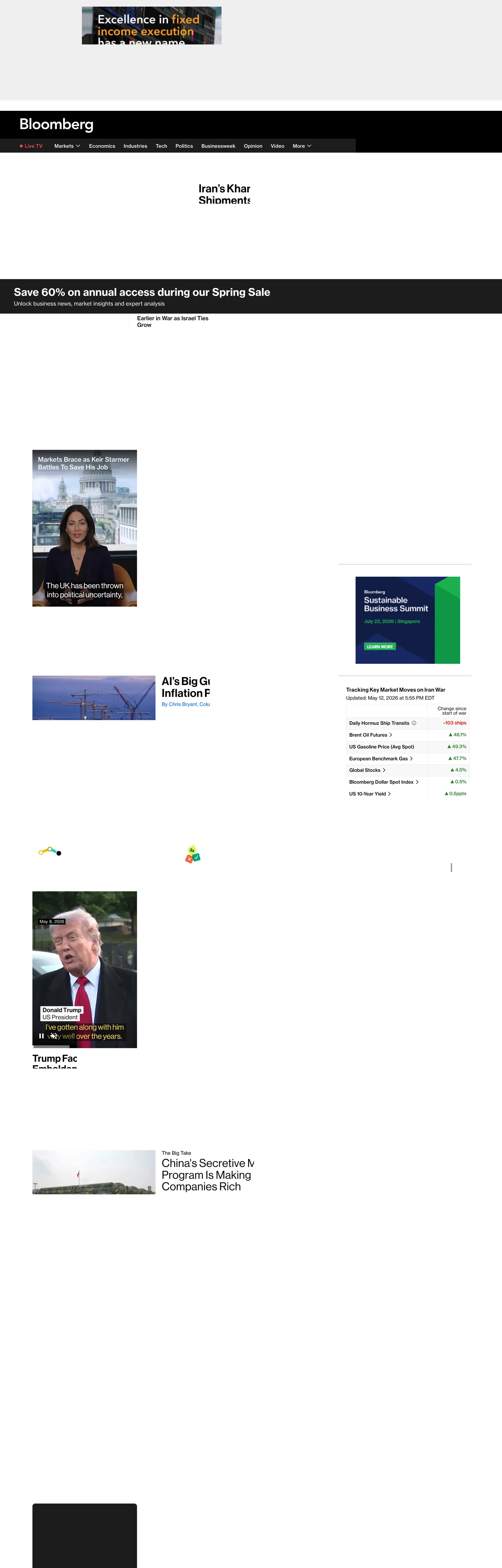
Bloomberg.com reads less like a magazine and more like a trading terminal that learned to carry photography. The canvas is white, the ink is near-black, and the entire chrome is paced by 14px BWHaasGroteskWeb running across nav links, story decks, table rows, and ticker rails. Bloomberg Orange — #f05143 — exists in only 22 of 470-odd text-color occurrences on the page; it never paints a button or a background, only the "Live TV" pulse dot and the editorial keyword highlight ("Excellence in fixed income execution has a new name") that the brand inherited from print. The primary CTA is a square-cornered 30px black pill labelled "Sign In" — a deliberate refusal of the rounded-button convention every other consumer publisher in 2026 follows.
This DESIGN.md file packages the homepage into a structured spec. Inside: 24 colors tokens organised into chromatic-semantic groups — markets-up green #338736, markets-down red #e51503, Opinion blue #0064fa, warning yellow #ffcd1e, plus the cream-and-near-black neutrals; 12 typography tokens spanning BWHaasGroteskWeb 10–20px UI work, the rare BWHaasHead 28–32px display tier, and the AvenirNextPForBBG 12px kicker; an 8-step radius scale dominated by 4/8/12px corners and a 0px square-corner pill; a 12-step spacing scale built on 2/4/8/12px units; and 21 components specifications covering the dark top nav, news cards, markets table, color-block ad slot, and the Sign In pill. The format follows the Google Labs DESIGN.md specification.
Feed the file to Claude, Cursor, or GitHub Copilot and the agent reproduces Bloomberg's information-first voice — white canvas, near-black ink, single-accent orange editorial highlight, chromatic market semantics, square-corner CTAs, and the 14px workhorse leading. Reference the tokens directly to paste hex values into Tailwind config, or use the spec as an audit checklist against any financial-news surface that needs to feel like a wire service rather than a SaaS landing. Where most consumer publishers commit the first viewport to a 64–107px headline, Bloomberg holds nearly every text token at 14–16px and lets the chromatic ticker chrome carry the brand — that restraint is the design.
What makes it distinct
5
- Single-accent voltageBloomberg Orange #f05143 used as a text-only highlight in 22 of 24 colors slots, never as a button fill or background wash
- 14px workhorse typeBWHaasGroteskWeb at 14–16px carries 460+ of the 470 text instances, where most editorial brands burn 107px on a hero shout
- Square-corner primary CTAthe Sign In pill is 30px tall at 0px radius, contradicting the pill-rounded convention every consumer publisher follows
- Chromatic market semanticsred #e51503 for ticker-down and live, green #338736 for ticker-up, blue #0064fa for Opinion, each color tied to a function rather than decoration
- Three-family stackBWHaasGroteskWeb for UI, BWHaasHead for the rare 28–32px display moments, AvenirNextPForBBG for the 12px footer kicker
bloomberg.com
Live at bloomberg.com
A snapshot of the brand in production. Scroll the frame to see the whole page.
Colors
24 colors
Bloomberg's system runs on #1c1c1c as its primary voltage, used in 2 of 21 components. Type is set in BWHaasGroteskWeb across 12 tokens from 10px to 32px, weights 400–700. Shape language is sharp — components average 2px corner radius, favoring crisp rectangles.
Brand & Accent
Sparing, CTA-only voltage · 1
Surface
Page and card backgrounds · 3
Text
Headlines, body, captions · 11
Borders & Hairlines
Dividers, outlines, rules · 3
Semantic
Status, errors, success, links · 4
Other
Specialty colors · 2
Typography
12 type tokens
Set in BWHaasGroteskWeb across 12 tokens, from 10px to 32px, weights 400–700. Shown in its own stack: where the font isn't installed, the fallback the file names stands in.
- display-lg32px · weight 500 · lh 1.05 · tracking 0.48pxThe quick brown fox jumps over the lazy dog
- display-md28px · weight 500 · lh 1.05 · tracking 0.42pxThe quick brown fox jumps over the lazy dog
- heading-md20px · weight 700 · lh 1.2 · tracking 0The quick brown fox jumps over the lazy dog
- heading-sm16px · weight 700 · lh 1.2 · tracking 0The quick brown fox jumps over the lazy dog
- body-lg16px · weight 500 · lh 1.2 · tracking 0The quick brown fox jumps over the lazy dog
- body-md14px · weight 500 · lh 1.5 · tracking 0.2pxThe quick brown fox jumps over the lazy dog
- body-md-regular14px · weight 400 · lh 1.3 · tracking 0The quick brown fox jumps over the lazy dog
- body-md-tight14px · weight 500 · lh 1.0 · tracking -0.3pxThe quick brown fox jumps over the lazy dog
- body-sm12px · weight 400 · lh 1.17 · tracking 0The quick brown fox jumps over the lazy dog
- timestamp12px · weight 500 · lh 1.2 · tracking 0The quick brown fox jumps over the lazy dog
- caption-micro10px · weight 400 · lh 1.2 · tracking 0The quick brown fox jumps over the lazy dog
- footer-kicker12px · weight 600 · lh 1.0 · tracking 0The quick brown fox jumps over the lazy dog
Layout
Radii and spacing
8 corner radii and 10 spacing values. Shape language: sharp.
Radii
- none0px
- xs4px
- sm6px
- md8px
- lg12px
- pill-sm28px
- pill-lg120px
- full9999px
Spacing
- micro2px
- xxs4px
- sm6px
- md8px
- base10px
- lg11px
- xl12px
- xxl16px
- section18px
- section-lg32px
Components
21 components
Each rendered from its tokens (color, type, radius, padding) on Bloomberg's own canvas.
- Button Primarybutton-primaryButton Primary
- Button Primary Hoverbutton-primary-hoverButton Primary Hover
- Button Secondarybutton-secondaryButton Secondary
- Top Navtop-navTop Nav
- Top Nav Wordmarktop-nav-wordmarkTop Nav Wordmark
- Live Tv Indicatorlive-tv-indicatorLive Tv Indicator
- Nav Linknav-linkNav Link
- Story Cardstory-cardStory Card
- Story Card Headlinestory-card-headlineStory Card Headline
- Story Card Bylinestory-card-bylineStory Card Byline
- Story Card Deckstory-card-deckStory Card Deck
- Markets Tablemarkets-tableMarkets Table
- Markets Row Upmarkets-row-upMarkets Row Up
- Markets Row Downmarkets-row-downMarkets Row Down
- Promo Bannerpromo-bannerPromo Banner
- Promo Banner Highlightpromo-banner-highlightPromo Banner Highlight
- Type here…text-inputText Input
- Type here…text-input-focusText Input Focus
- Type here…text-input-errorText Input Error
- Footer Kickerfooter-kickerFooter Kicker
- TimestamptimestampTimestamp
In use
The system, in use
Bloomberg's tokens on the kind of product it builds.
Build something people actually use.
A short paragraph of marketing copy that previews how the brand's display tier and body tier read together. Two sentences is usually enough.
FAQ
Bloomberg design system FAQ
Common questions about Bloomberg's tokens, components, and how to use this DESIGN.md in your project.
Read next
Related reading
Specs, directories, and component libraries that pair with this design system.
- Browse all design systemsThe full directory of DESIGN.md files on shadcn.io, with live mockups for each.shadcn.io
- Bloomberg — official siteThe financial newsroom itself — read the homepage to see the 14px workhorse and orange Live TV pulse in motion.bloomberg.com (opens in a new tab)
- The DESIGN.md specificationGoogle Labs' open spec for machine-readable design system files — the format this page is built on.github.com (opens in a new tab)
Use it
Use Bloomberg in your project
One machine-readable file. Drop it into Claude, Cursor, or any AI tool that reads DESIGN.md.
Download the DESIGN.md
One machine-readable file: every color, type, radius, spacing, and component token of Bloomberg.
Feed it to your AI tool
Drop it into Claude, Cursor, or GitHub Copilot. The agent writes React components and Tailwind classes that match Bloomberg's visual language.
Reference the tokens directly
Or paste the values into your Tailwind config, CSS variables, or component library: every color, size and radius is a quoted, ready-to-copy value.
Read the full DESIGN.md: overview, rationale, do’s and don’ts
Overview
Bloomberg.com is a financial-newsroom surface that reads as a wire service first and a magazine second. The canvas is white ({colors.canvas} — #ffffff), the ink is near-black ({colors.ink} — #000000), and the only chromatic voltage that touches editorial copy is Bloomberg Orange ({colors.brand-orange} — #f05143) — applied to the "Live TV" pulse dot and a print-inherited keyword highlight inside the lead ad creative ("Excellence in fixed income execution has a new name"). The top nav inverts to a dark strip ({colors.ink-dark-nav} — #1c1c1c) with white labels and a single red "Live TV" dot, which is the page's strongest brand moment.
Financial-newsroom density: where most consumer publishers commit a 60–107px display headline to their hero, Bloomberg holds nearly every text token at 14–16px in BWHaasGroteskWeb. The display tier (BWHaasHead at 28–32px with 0.42–0.48px positive tracking) shows up only inside promotional ad creative — not on story headlines. The page packs 30+ story cards, a six-row markets table, a video carousel, and a footer rail into a single 4500px scroll without raising its voice. This is the inverse of The Verge's 107px Manuka shout or Medium's 120px GT Super; Bloomberg trusts information density to carry the page.
Chromatic semantics over chromatic brand: red {colors.markets-down} (#e51503), green {colors.markets-up} (#338736), and blue {colors.opinion-blue} (#0064fa) are bound to specific editorial functions through CSS variables — --phx-color-markets-down, --phx-color-markets-up, --phx-color-opinion-primary. Red is also the live-indicator and form-error color; green is the only success-state color; blue is reserved for the Opinion column byline and never leaks elsewhere. The discipline is unusual — most design systems let red and green drift into generic "success" and "danger" roles, but Bloomberg keeps each color pinned to a single market or editorial signal so a reader scanning the page maps color directly to meaning.
The shape language is square-cornered with hairline cards. The primary Sign In pill is a 30px-tall black rectangle at {rounded.none} — flat corners on a black fill — a deliberate refusal of the rounded-button convention every other consumer publisher in 2026 follows. Card containers use {rounded.xs} (4px) to {rounded.lg} (12px) hairlines, the Live TV indicator uses 50% for a circle, and subscription-ad tiles bring out {rounded.pill-sm} (28px) and {rounded.pill-lg} (120px) pill geometry — the only place pills appear at all.
Key Characteristics:
- Single-accent voltage:
{colors.brand-orange}(#f05143 — "Bloomberg Orange") used as a text-only highlight in 22 of 81 color slots, never as a button fill or background wash. - Three-family stack: BWHaasGroteskWeb for 14–16px UI, BWHaasHead for the rare 28–32px display tier, AvenirNextPForBBG for the 12px UPPERCASE footer kicker.
- Square-corner primary CTA: the Sign In pill is
30pxtall at{rounded.none}0px radius — flat corners on a black fill, contradicting the pill-rounded convention. - Chromatic market semantics: each color is bound through a CSS variable to a single editorial function. Red is markets-down + live + error, green is markets-up + success, blue is Opinion column, yellow is warning, orange is editorial highlight.
- 14px workhorse leading: 460+ of the 470 text-color instances on the page sit at 14–16px. The page packs density rather than scale.
- Dark nav, light body: the top strip inverts to
{colors.ink-dark-nav}(#1c1c1c) while the page underneath stays white — a localized inversion that reads as terminal-chrome inside a newsroom layout. - Hairline cards over shadows: story cards lean on
{colors.hairline}(#e5e7eb) 1px borders rather than drop shadows. 1920 occurrences of #e5e7eb across the page (almost entirely as border-color) make it the structural workhorse. - Print-inherited keyword highlight: a single phrase per ad creative gets the orange voltage at 28–32px in BWHaasHead — the only time display type appears at all.
Colors
Brand Accent
- Bloomberg Orange (
{colors.brand-orange}— #f05143) — frequency 22. Used as text (22), bg (0), border (0). The single signature accent — bound to--phx-color-core-red-400and--color-red-refresh2024-400. Applied to the Live TV pulse dot and the print-inherited keyword highlight inside lead ad creative. Never paints a button or a background.
Surface & Ink
- Canvas White (
{colors.canvas}— #ffffff) — frequency 421. Used as text (305), bg (65), border (51). The default page surface. The merged cluster includes two near-whites collapsed into one perceptual token via OKLCH delta-E. - Ink Black (
{colors.ink}— #000000) — frequency 1846. Used as text (1740), bg (14), border (76), gradient (13). The workhorse text and CTA-fill color, bound to--phx-color-text-primaryand--phx-color-fill-primary. Carries the page. - Ink Dark Nav (
{colors.ink-dark-nav}— #1c1c1c) — frequency 100. Used as text (51), bg (49). The dark top-strip background. Bound to--phx-color-core-gray-1000. Not pure black — a softened near-black that reads as terminal chrome. - Ink Secondary (
{colors.ink-secondary}— #3c3c3c) — frequency 59. Used as text (23), border (36). Article dek color via--article-dek-color. The mid-gray that anchors the secondary text layer. - Ink Tertiary (
{colors.ink-tertiary}— #545454) — frequency 21. Used as text (21), bg (0), border (0). The tertiary text token via--phx-color-text-tertiary— bylines, timestamps, photo credits. - Ink Muted (
{colors.ink-muted}— #767676) — frequency 13. Used as text (8), bg (4), border (1). Mid-gray for icon-subtle states and markets-neutral indicators. - Ink Disabled (
{colors.ink-disabled}— #999999) — frequency 6. Used as text (4), border (2). Disabled text and placeholder color.
Hairlines
- Hairline (
{colors.hairline}— #e5e7eb) — frequency 1920. Used as text (0), bg (1), border (1919). The structural workhorse — almost every card edge, table row separator, and section divider on the page. Bound to--phx-color-border-extra-subtleand--color-gray-200. Note: this is the highest-frequency color on the page; #e5e7eb is the silhouette of Bloomberg's chrome. - Hairline Strong (
{colors.hairline-strong}— #cccccc) — frequency 63. Used as bg (8), border (54). The darker hairline for input borders and subscription-ad outlines. - Hairline Mid (
{colors.hairline-mid}— #b3b3b3) — frequency 69. Used as text (6), border (63). Moderate border weight used on more emphasized dividers.
Market Semantics
- Markets Down (
{colors.markets-down}— #e51503) — frequency 6. Used as text (6), bg (0), border (0). Bound to--phx-color-markets-down,--phx-color-live-primary, and--phx-color-error-primary. The triple-duty red — ticker-down arrows, the Live indicator, and form-validation errors. Never used as a fill or a wash. - Markets Up (
{colors.markets-up}— #338736) — frequency 0 in the captured viewport, but bound to--phx-color-markets-upand--phx-color-success-primary. The dedicated up-tick green — reserved for percentage gains and success states. - Opinion Blue (
{colors.opinion-blue}— #0064fa) — frequency 9. Used as text (7), bg (2). Bound to--phx-color-opinion-primary— the Opinion column byline and column-specific accent. Never appears outside Opinion. - Opinion Blue Dark (
{colors.opinion-blue-dark}— #00378e) — bound to--color-blue-refresh2024-700. The deeper Opinion variant used on hover or dense Opinion rails. - Subscription Violet (
{colors.subscription-violet}— #2800d7) — bound to--phx-color-subscription-primary. Reserved for Bloomberg subscription-tier promotional copy; appears in the Sustainable Business Summit ad creative.
Warning & Status
- Warning Yellow (
{colors.warning-yellow}— #ffcd1e) — frequency 1. Used as text (1). Bound to--phx-color-warning-primary. The single warning-state accent, scoped to subscription-renewal nudges and policy banners. - Warning Yellow Text (
{colors.warning-yellow-text}— #8c6000) — bound to--phx-color-warning-primary-text. The accessible-contrast text variant for use on the warning-background fill. - Warning Background (
{colors.warning-bg}— #fff4da) — bound to--phx-color-warning-background. The cream tint behind warning rails. - Error Background (
{colors.error-bg}— #ffcdca) — bound to--phx-color-markets-down-background. The pink tint behind market-down highlight cells. - Success Background (
{colors.success-bg}— #d1edc0) — bound to--phx-color-markets-up-background. The mint tint behind market-up highlight cells.
Surface Tints
- Surface Tint (
{colors.surface-tint}— #f3f4ef) — frequency 5. The cream-paper tint that backs editorial illustration tiles and review excerpts. Also the footer-kicker text color against the dark nav. - Surface Blue Tint (
{colors.surface-blue-tint}— #d4e5ff) — bound to--phx-color-secondary-opinion-200. The light-blue wash that backs Opinion column promo tiles.
Gradient System
Bloomberg uses no decorative gradients. The only gradient-like treatment is the transition from the dark nav strip back to the white canvas — a hard 1px boundary, not a fade. Color is applied in flat blocks. The hazard-tape discipline that publishers like The Verge use to enforce loud chrome is here used in reverse: the absence of gradients keeps the page feeling like a wire-service printout.
Typography
Font Family
Three families do the work. BWHaasGroteskWeb (a Bloomberg-licensed web cut of the Haas Unica/Grotesk lineage, fallback Helvetica / Arial) carries 14–16px UI work across weights 400/500/700 — nav links, story decks, table rows, byline metadata. BWHaasHead (the display cut, fallback Helvetica Neue) handles the rare 28–32px display tier with 0.42–0.48px positive tracking; it appears only inside promotional ad creative, never on editorial headlines. AvenirNextPForBBG is the third family, scoped exclusively to a single 12px weight 600 footer kicker — "Bloomberg the Company & Its Products". Lowercase Avenir does not exist in the system.
Hierarchy
| Token | Size | Weight | Line Height | Letter Spacing | Use |
|---|---|---|---|---|---|
{typography.display-lg} | 32px | 500 | 1.05 | 0.48px | BWHaasHead promotional callout — print-inherited |
{typography.display-md} | 28px | 500 | 1.05 | 0.42px | BWHaasHead inline promotional headlines |
{typography.heading-md} | 20px | 700 | 1.2 | 0 | Section labels like "Latest", "Top Securities" |
{typography.heading-sm} | 16px | 700 | 1.2 | 0 | Story-card headlines and dense list titles |
{typography.body-lg} | 16px | 500 | 1.2 | 0 | Workhorse spans and 3-tag link clusters |
{typography.body-md} | 14px | 500 | 1.5 | 0.2px | Buttons, anchor links, and list items |
{typography.body-md-regular} | 14px | 400 | 1.3 | 0 | Story decks and table cell text |
{typography.body-md-tight} | 14px | 500 | 1.0 | -0.3px | Numeric ticker readouts in the markets table |
{typography.body-sm} | 12px | 400 | 1.17 | 0 | Captions and photo credits |
{typography.timestamp} | 12px | 500 | 1.2 | 0 | Article timestamps on the <time> element |
{typography.caption-micro} | 10px | 400 | 1.2 | 0 | <figcaption> text and table-cell micro-copy |
{typography.footer-kicker} | 12px | 600 | 1.0 | 0 | The Avenir UPPERCASE footer kicker |
Principles
BWHaasGroteskWeb 14px is the workhorse, BWHaasHead 28–32px is the exception. Anything above 20px on the homepage lives inside an ad creative; editorial story headlines never escape {typography.heading-md} 20px. The 14px tier alone accounts for 270+ of the 470 text-color instances across the page — Bloomberg trusts information density rather than scale. AvenirNextPForBBG is single-use: only the footer kicker uses it, and only at 12px weight 600 UPPERCASE. The choice signals legacy continuity with Bloomberg's print mastheads.
Letter-spacing runs in three registers. Slightly positive (0.2px) for the 14px button text. Aggressively positive (0.42–0.48px) for BWHaasHead display, which keeps the 28–32px ad copy from feeling cramped. Slightly negative (-0.3px) for the ticker-table numerics — the negative tracking compresses the numeric strings just enough that decimals align across columns. Plain 0 tracking is the default everywhere else.
Note on Font Substitutes
BWHaasGroteskWeb and BWHaasHead are licensed Bloomberg-only cuts. Neue Haas Grotesk Pro is the closest commercial substitute; Helvetica Now Display + Helvetica Now Text is the next-closest pair. Inter at weight 400/500/700 substitutes acceptably at the 14–16px UI sizes but loses the slight aperture differences in characters like a and g that give BWHaas its newsroom warmth. For the BWHaasHead display tier, Söhne or Neue Haas Display preserve the 0.42–0.48px tracking behavior without retuning. For the AvenirNextPForBBG footer kicker, Avenir Next or Nunito Sans substitute cleanly — the only requirement is that lowercase characters never appear at that token.
Layout
Spacing System
- Base unit: 4px with 2px micro-step.
- Tokens:
{spacing.micro}2px ·{spacing.xxs}4px ·{spacing.sm}6px ·{spacing.md}8px ·{spacing.base}10px ·{spacing.lg}11px ·{spacing.xl}12px ·{spacing.xxl}16px ·{spacing.section}18px ·{spacing.section-lg}32px. - Card internal padding: 12–16px interior on story cards; ad creatives expand to 32px.
- Inline spacing:
2pxis the most-used spacing value on the page (69 occurrences) — it controls the gap between numeric arrows and percentage values in the ticker table.
Grid & Container
- Max content width: ~1440px centered.
- Column patterns: a 12-column underlying grid resolves into a 2-column hero (lead story + secondary feature), a 1-column markets-table sidebar, and a 3-column lower feed. The feed feels regimented because every card sits inside a 4px hairline rather than floating.
- Container padding: 16–18px mobile / 32px desktop on the outer edges.
- Gutters: 12–16px between columns, tighter (4–8px) inside markets-table rows.
Whitespace Philosophy
Bloomberg treats whitespace like a newspaper treats column gutters — a calibrated separator, not a dramatic reset. The page is paced by hairlines rather than open space: every story card has a 1px #e5e7eb border, every table row has a 1px divider, every section is bounded by another hairline. The result is dense without feeling cramped. Where Stripe and Apple let air carry the layout, Bloomberg lets the hairline ruling carry it — closer to a print copy desk than a Web page.
Border Radius Scale
{rounded.none}0px: the primary CTA (Sign In) and the markets table — square corners{rounded.xs}4px: story cards and text inputs (37 occurrences — the structural default){rounded.sm}6px: inline images and small button variants (8 occurrences){rounded.md}8px: mid-size cards and ad-creative tiles (21 occurrences){rounded.lg}12px: the most-used radius value (42 occurrences) — feature tiles and the dark-nav frame{rounded.pill-sm}28px: subscription-ad pill tiles{rounded.pill-lg}120px: the rare oversize pill tile used only on subscription banners{rounded.full}9999px: the Live TV indicator circle and round avatar dots
The 12px radius is the structural default because Bloomberg balances soft against hard — soft enough to read as a current-decade web product, hard enough that the 0px primary CTA still feels at home. Cards round at 4–12px, buttons stay sharp at 0px, indicators round fully at 50%.
Elevation
Bloomberg's depth philosophy is hairline-as-elevation. There are zero traditional box-shadows in the extracted top-frequency colors — instead, the page leans on {colors.hairline} #e5e7eb 1px borders at 1920 occurrences to separate every card, table row, and section.
| Level | Treatment | Use |
|---|---|---|
| 0 | No border, no shadow | Default canvas text and inline copy |
| 1 | 1px solid #e5e7eb hairline | Story cards, markets-table rows, section dividers — the structural workhorse |
| 2 | 1px solid #cccccc hairline | Form inputs and subscription-ad outlines |
| 3 | 1px solid #b3b3b3 hairline | Emphasized rule dividers |
| 4 | 1px solid #000000 hairline | Focused input borders and active-state outlines |
| 5 | Inverted dark surface | The top-nav strip — #1c1c1c on the white canvas reads as elevation through contrast rather than depth |
| 6 | Saturated #f05143 highlight | Editorial keyword voltage — color-as-attention rather than depth |
When something needs to stand out, it doesn't get a drop shadow — it gets a darker hairline, a black border on focus, or in the rarest case the Bloomberg Orange text highlight. No gradients, no glows, no atmospheric blurs. The page stays perfectly flat throughout, and hierarchy is carried by hairline weight and color voltage.
Components
Buttons
button-primary — Ink Black (#000000) fill, white text, BWHaasGroteskWeb 14px / 500 with 0.2px tracking, {rounded.none} 0px radius, 6×10px padding, 30px height. The Sign In pill in the top-right corner of the dark nav — square corners on a black fill, refusing the rounded-button convention. Hover state shifts to {colors.ink-secondary} (#3c3c3c) — a softening without rounding.
button-secondary — White fill, near-black text, BWHaasGroteskWeb 14px / 500, {rounded.none} 0px radius, 30px height, 1px {colors.hairline-strong} (#cccccc) border. Used for ghost actions inside ad creatives. Hover swaps the border to black.
Navigation
top-nav — {colors.ink-dark-nav} (#1c1c1c) bar at 40px height with the wordmark left-aligned, the "Live TV" pulse + nav links centered (BWHaasGroteskWeb 14px / 500), and the Sign In pill pinned right. 8×19px interior padding. This is the page's strongest brand moment — the dark inversion against the white canvas.
top-nav-wordmark — The "Bloomberg" wordmark at {typography.heading-md} 20px / 700 in white on the dark strip. Treated as a 20px label rather than a hero element — Bloomberg's mark trusts the dark surface to carry its weight.
live-tv-indicator — {colors.brand-orange} (#f05143) 8px circle at {rounded.full} 50% radius. The only place orange paints a fill on the homepage. Sits flush-left to the "Live TV" link in the nav, pulsing as a CSS animation.
nav-link — Transparent fill, white text on the dark nav ({colors.canvas} against {colors.ink-dark-nav}), BWHaasGroteskWeb 14px / 500. 0×9px padding on the horizontal axis — the nav links sit close together. Hover transitions to {colors.brand-orange} (#f05143) text color, the only place orange touches link copy.
Cards & Containers
story-card — White fill, 1px {colors.hairline} (#e5e7eb) border, {rounded.xs} 4px radius, 16px interior padding. Headline in BWHaasGroteskWeb 16–20px / 700, byline in {colors.opinion-blue} for Opinion columnists or {colors.ink-tertiary} for everyone else. Hover: no lift, no scale — the headline color transitions to {colors.opinion-blue} (#0064fa) over 150ms.
story-card-headline — {typography.heading-md} 20px / 700 in near-black on white. Sits flush against the card padding. Maximum two lines before truncating with ellipsis.
story-card-byline — {typography.body-sm} 12px / 400 in {colors.opinion-blue} for Opinion authors (the only place blue text appears in story cards) or {colors.ink-tertiary} for everyone else.
story-card-deck — {typography.body-md-regular} 14px / 400 in {colors.ink-secondary} (#3c3c3c — bound to --article-dek-color). The dek is always 14px, never 16px — Bloomberg pushes the body weight to read as information density rather than long-form magazine prose.
Markets Chrome
markets-table — White fill, 1px {colors.hairline} borders between rows, 0px outer radius, 8px row padding. BWHaasGroteskWeb 14px / 400 numeric body, with up/down arrows colored by {colors.markets-up} or {colors.markets-down}. The table is the densest information surface on the page.
markets-row-up — Up-tick rows. Text in {colors.markets-up} (#338736), {typography.body-md-tight} 14px / 500 with -0.3px negative tracking. The negative tracking compresses decimal-aligned columns so percentage values line up perceptually.
markets-row-down — Down-tick rows. Text in {colors.markets-down} (#e51503), same tracking. Used for the "Daily Hormuz Ship Transits" -103 ships row in the captured view.
Promotional Bits
promo-banner — {colors.ink} (#000000) full-bleed band at 12×16px padding, white text in {typography.heading-md} 20px / 700. The "Save 60% on annual access during our Spring Sale" rail at the top of the feed.
promo-banner-highlight — The print-inherited keyword highlight inside ad creatives. {typography.display-md} 28px / 500 BWHaasHead in {colors.brand-orange} (#f05143). The only time Bloomberg Orange appears at display scale — applied to a single phrase per creative ("fixed income execution" inside the lead ad).
Forms
text-input — White fill, 1px {colors.hairline-strong} (#cccccc) border, {rounded.xs} 4px radius, 8×12px padding. BWHaasGroteskWeb 14px text in near-black, placeholder in {colors.ink-disabled} (#999999). On focus, border transitions to {colors.ink} (#000000) — never to a blue ring. Error state turns the border to {colors.markets-down} (#e51503) and the background to {colors.error-bg} (#ffcdca).
Editorial Bits
footer-kicker — AvenirNextPForBBG 12px / 600 UPPERCASE, {colors.surface-tint} (#f3f4ef) text on the dark footer strip. "Bloomberg the Company & Its Products" — the only place Avenir appears on the page, scoped to a single 12px label.
timestamp — BWHaasGroteskWeb 12px / 500 in {colors.ink-tertiary} (#545454). Article timestamps on <time> elements — never colored, never bolded, never accented.
Do's and Don'ts
Do
- Use
{colors.brand-orange}(#f05143) as text-only, scoped to the Live TV indicator and editorial keyword highlights. The brand voltage carries the page precisely because it never paints a button or a wash. - Hold workhorse type at 14–16px in BWHaasGroteskWeb. The page packs density rather than scale; story headlines max out at 20px, and 28–32px BWHaasHead is reserved for ad creatives.
- Use
{rounded.none}0px on primary CTAs. The square-cornered Sign In pill is the load-bearing shape decision — round it and the page stops looking like a newsroom. - Bind chromatic semantics through CSS variables. Red for markets-down + live + error, green for markets-up + success, blue for Opinion. Each color tied to a single function.
- Lean on
{colors.hairline}(#e5e7eb) 1px borders for separation instead of shadows. 1920 occurrences across the page make this the structural workhorse — the more hairlines, the more the page reads as wire-service chrome. - Use BWHaasHead 28–32px with 0.42–0.48px positive tracking for promotional display. The positive tracking is the difference between "promotional copy" and "ad-shouting".
Don't
- Don't paint Bloomberg Orange #f05143 as a button fill or background wash. The hex appears 22 times across the page, all as text or icon — never as bg. A filled orange CTA breaks the single-accent discipline that defines the brand and turns the page into a Salesforce-flavored newsroom.
- Don't round the Sign In button. The CTA is 30px tall at 0px radius for a reason — rounded corners signal SaaS conversion, square corners signal terminal chrome. If you swap
{rounded.none}for{rounded.xs}here, you've changed the brand. - Don't let green or red leak into generic "success" or "danger" semantics.
{colors.markets-up}#338736 is bound only to--phx-color-markets-upand--phx-color-success-primary; using it for a generic toast or a marketing checkmark drains its market meaning. Keep both colors pinned to numeric tables and editorial functions. - Don't use BWHaasHead for editorial headlines. Display type is reserved for promotional ad creatives — story headlines stay in BWHaasGroteskWeb at 16–20px. Using BWHaasHead at the top of a news card breaks the wire-service density and reads as marketing.
- Don't substitute Inter at the BWHaasHead display tier. Inter's tight metrics make the 28px / 0.42px-tracked ad copy feel cramped at the intended size. Use Söhne or Neue Haas Display instead — they preserve the tracking behavior without retuning.
- Don't use
{colors.opinion-blue}(#0064fa) outside the Opinion column. Blue is bound to--phx-color-opinion-primaryand reserved for that single column's byline and accents. A blue link or button anywhere else breaks the column-color discipline. - Don't reach for drop shadows when separating cards. The page uses 1920 instances of #e5e7eb hairline borders instead. A box-shadow on a story card reads as Material-flavored UI and pulls the layout out of the newsroom tradition.
- Don't drop the AvenirNextPForBBG kicker to 14px or lowercase. It exists only at 12px / weight 600 / UPPERCASE in a single footer slot. Larger sizes or lowercase rendering pulls Avenir into general UI work — a role it doesn't carry on this homepage.
Known Gaps
- Article-detail body typography: the long-form reading view past the homepage (article pages, Businessweek long-form, Opinion column detail) is not fully captured here. The homepage and markets chrome cover roughly 80% of the surface area readers encounter.
- Video player and live-stream chrome: Bloomberg ships custom video and live-broadcast players whose token vocabulary is not in scope for this spec.
- Terminal-subscriber dashboard: the authenticated reading surface for Bloomberg Terminal subscribers uses a darker variant and a denser data-grid vocabulary — not extractable from the public homepage.
- Animation timing: Bloomberg's Live TV pulse, ticker scroll, and image-carousel transitions use proprietary timing curves that the extraction does not capture.
- Dark mode for the body canvas: the homepage is light-only apart from the top-nav inversion. A full dark-canvas inversion exists for logged-in subscriber surfaces but is not part of this spec.
- Full form validation error states: the error border (
{colors.markets-down}#e51503) and error background (#ffcdca) are documented, but helper-text styling, inline validation messaging, and the multi-step subscription form are not captured. - Hover state ramps on markets-table rows: the row color shift to a tint of
{colors.success-bg}or{colors.error-bg}is implied by the CSS variable naming but was not extractable from the static capture.
News & Publishing
More systems like this
More DESIGN.md files in News & Publishing.
Pricing
Build it with Pro
The DESIGN.md files are free. Pro adds 6,000+ blocks, premium templates and the MCP server, so your AI editor builds in your system for you.
4.9/5 out of 5 · 150+ reviewsfrom 150+ founders and developers.
Billing
Billed once a year in USD. Cancel anytime.
- How many people can use the license.
- Client work, SaaS products and anything you charge for.
- Production-ready React sections: hero, pricing, features, dashboards and more.
- Complete multi-page sites you can ship as they are.
- React icons from every major library, installable with one command.
- Presets that restyle every block, in light and dark.
- Lets your AI editor search, preview and install blocks for you.
- Priority requests are answered first.
Individual
For personal projects & open source
$32instead of $49/mo
$389 billed yearly
- Seats: 1 seat
- Commercial use: Personal & open source only
- Pro blocks: 6,000+ blocks
- Templates: All 14 templates
- React icons: 294k+ icons
- Themes: All 59 themes
- MCP server: Basic usage
- Support: Standard
Team
Most popularFor freelancers, agencies & startups
$66instead of $99/mo
$789 billed yearly · ≈ $13/dev/mo
- Seats: Up to 5 seats
- Commercial use: Included
- Pro blocks: 6,000+ blocks
- Templates: All 14 templates
- React icons: 294k+ icons
- Themes: All 59 themes
- MCP server: High usage
- Support: Priority
Organization
For companies with larger teams
$132instead of $199/mo
$1,589 billed yearly
- Seats: Unlimited seats
- Commercial use: Included
- Pro blocks: 6,000+ blocks
- Templates: All 14 templates
- React icons: 294k+ icons
- Themes: All 59 themes
- MCP server: Unlimited usage
- Support: Priority
Billed once a year in USD. Cancel anytime.
Individual
For personal projects & open source
$32instead of $49/mo
$389 billed yearly
- How many people can use the license.Seats: 1 seat
- Client work, SaaS products and anything you charge for.Commercial use: Personal & open source only
- Production-ready React sections: hero, pricing, features, dashboards and more.Pro blocks: 6,000+ blocks
- Complete multi-page sites you can ship as they are.Templates: All 14 templates
- React icons from every major library, installable with one command.React icons: 294k+ icons
- Presets that restyle every block, in light and dark.Themes: All 59 themes
- Lets your AI editor search, preview and install blocks for you.MCP server: Basic usage
- Priority requests are answered first.Support: Standard
Team
Most popularFor freelancers, agencies & startups
$66instead of $99/mo
$789 billed yearly · ≈ $13/dev/mo
Everything in Individual, plus
- How many people can use the license.Seats: Up to 5 seats
- Client work, SaaS products and anything you charge for.Commercial use: Included
- Lets your AI editor search, preview and install blocks for you.MCP server: High usage
- Priority requests are answered first.Support: Priority
Organization
For companies with larger teams
$132instead of $199/mo
$1,589 billed yearly
Everything in Team, plus
- How many people can use the license.Seats: Unlimited seats
- Lets your AI editor search, preview and install blocks for you.MCP server: Unlimited usage
- Secure checkout via Stripe
- Code lives in your repo
- Keep what you've shipped if you cancel
- License terms
Your system, built for you
Every block, template and icon, installed by your AI agent in your design system. The DESIGN.md files stay free.