Skip to content

Axios Design System

Axios's homepage as a DESIGN.md file — NB International Pro sans headlines, Atiza serif body, a single deep navy CTA, and the signature pill-rounded section chips. Tokens for React, Next.js, and AI coding tools.

Add shadcn.io to your AI agent. · Pro It installs blocks, icons and templates in your design system from a prompt, with Pro.

Set up MCP
Primary
#104ac2
Typeface
NB International Pro
Shape
Soft
Base radius
4px
Colors
9
Type tokens
12
Components
16
Spacing values
7

About

About Axios DESIGN.md

Curated by Dov Azencot · Updated May 19, 2026 · Source axios.com (opens in a new tab)

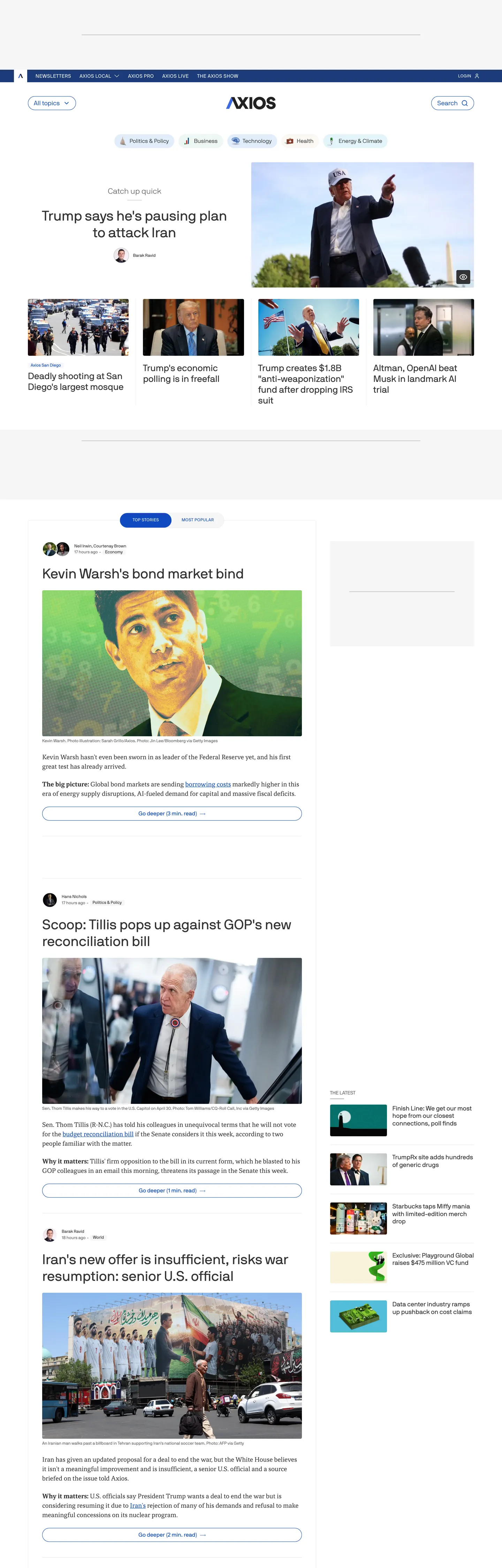
Axios's homepage runs on a typographic inversion. The headlines are sans-serif (NB International Pro at 40px / 400), the body is serif (Atiza at 18px / 400). Every newspaper Axios competes with — the Washington Post, the New York Times, Bloomberg — does the opposite: serif headlines, sans body. Axios flipped the convention in 2017 when the publication launched, and the chrome still carries that decision. The top-nav band is a slim black strip with the "AXIOS" wordmark rendered in Atiza serif caps at the center. Below it: a packed two-column news grid against a near-white #f5f5f5 canvas, lead story top-left with a square photo, supporting columns to its right, no marketing hero, no rotating cover image, no full-bleed gradient.

The DESIGN.md file packages the system into a machine-readable spec for React tooling. Inside: 9 colors tokens organized around an off-black ink #333335 that carries 974 occurrences in the captured page (508 text, 465 border) and an off-white surface #f5f5f5 that handles every background fill. A single deep navy #104ac2 — wired as `--color-accent-blue-core` and `--bg-interactive-primary` — serves as the link color, the active-state border, the "Sign in" pill fill, and the leading colored dot inside category chips. Twelve typography tokens cover NB International Pro at 12 / 14 / 16 / 18 / 26 / 40px in weights 300 / 400 (the system has no weight-700 sans anywhere), plus Atiza serif at 18px / 400 for the body-dek tier. Sixteen components describe the slim top-nav, the pill-rounded section chip with leading colored dot, the story cell with square photo, the bullet-list article preview, the newsletter signup, and the consent overlay.

Feed this file to an AI coding tool and it reproduces Axios's specific moves: sans headline / serif body inversion, single deep-navy accent reserved for the interactive layer, pill-rounded section chips that mark the publication's structural signature, the off-white canvas that distinguishes the chrome from every plain-white peer, and the Smart Brevity editorial rhythm of dek-first paragraphs and tight bullet structure. The one move worth borrowing for any news product: the willingness to commit to one accent and stop adding category-tag colors. Most editorial sites paint every section a different color; Axios trusts the chip shape and the leading dot to carry section semantics in monochrome.

What makes it distinct

5

  1. Sans headlines, serif bodyNB International Pro at weight 400 carries headlines up to 40px while Atiza serif at 18px carries story decks, the inverse of every traditional newspaper
  2. Black-and-white-and-bluethe entire chrome runs in a charcoal-and-near-white ladder with a single deep navy #104ac2 for accents, no secondary or tertiary brand colors
  3. Pill-rounded section chipsthe 100px-radius category chip with a leading colored dot is the brand's structural signature, used for every section navigation and inline tag
  4. Smart Brevity layoutbullet-list articles, dek-first decks, and tight 8px vertical rhythm reflect the publication's editorial format directly in the chrome
  5. Off-white canvasthe homepage background is #f5f5f5 rather than pure white; the slightly-gray floor softens the contrast with the black top-nav band

axios.com

Live at axios.com

A snapshot of the brand in production. Scroll the frame to see the whole page.

Axios's website at axios.com

Colors

9 colors

Axios's system runs on #104ac2 as its primary voltage, used in 3 of 16 components. Type is set in NB International Pro across 12 tokens from 12px to 40px, weights 300–600. Shape language is soft — components average 51px corner radius, with no sharp interactive edges.

Brand & Accent

Sparing, CTA-only voltage · 2

Surface

Page and card backgrounds · 2

Text

Headlines, body, captions · 3

Borders & Hairlines

Dividers, outlines, rules · 1

Other

Specialty colors · 1

Typography

12 type tokens

Set in NB International Pro across 12 tokens, from 12px to 40px, weights 300–600. Shown in its own stack: where the font isn't installed, the fallback the file names stands in.

  • display-xl40px · weight 400 · lh 48pxThe quick brown fox jumps over the lazy dog
  • display-md26px · weight 400 · lh 31.2pxThe quick brown fox jumps over the lazy dog
  • heading-md18px · weight 400 · lh 21.6pxThe quick brown fox jumps over the lazy dog
  • body-serif-lg18px · weight 400 · lh 27pxThe quick brown fox jumps over the lazy dog
  • body-serif-bold18px · weight 600 · lh 27pxThe quick brown fox jumps over the lazy dog
  • body-md16px · weight 400 · lh 24pxThe quick brown fox jumps over the lazy dog
  • body-md-light16px · weight 300 · lh 16pxThe quick brown fox jumps over the lazy dog
  • caption12px · weight 400 · lh 18pxThe quick brown fox jumps over the lazy dog
  • caption-tight12px · weight 400 · lh 12pxThe quick brown fox jumps over the lazy dog
  • section-label14px · weight 400 · lh 20px · tracking 0.7pxThe quick brown fox jumps over the lazy dog
  • nav-link16px · weight 400 · lh 16pxThe quick brown fox jumps over the lazy dog
  • button-md14px · weight 400 · lh 16.8pxThe quick brown fox jumps over the lazy dog

Layout

Radii and spacing

6 corner radii and 7 spacing values. Shape language: soft.

Radii

  • none0px
  • xs2px
  • sm4px
  • lg24px
  • pill100px
  • full9999px

Spacing

  • xs4px
  • sm8px
  • md12px
  • base16px
  • lg20px
  • xl24px
  • 2xl40px

Components

16 components

Each rendered from its tokens (color, type, radius, padding) on Axios's own canvas.

  • Top Nav
    top-navTop Nav
  • Masthead
    mastheadMasthead
  • Nav Link
    nav-linkNav Link
  • Section Chip
    section-chipSection Chip
  • Section Chip Active
    section-chip-activeSection Chip Active
  • Section Label
    section-labelSection Label
  • Button Primary
    button-primaryButton Primary
  • Button Secondary
    button-secondaryButton Secondary
  • Hero Heading
    hero-headingHero Heading
  • Story Headline
    story-headlineStory Headline
  • Body Dek
    body-dekBody Dek
  • Body Dek Emphasis
    body-dek-emphasisBody Dek Emphasis
  • Caption Meta
    caption-metaCaption Meta
  • Story Card
    story-cardStory Card
  • Type here…
    text-inputText Input
  • Link Text
    link-textLink Text

In use

The system, in use

Axios's tokens on the kind of product it builds.

Build something people actually use.

A short paragraph of marketing copy that previews how the brand's display tier and body tier read together. Two sentences is usually enough.

Get startedLearn more
Marketing heroHeadline, sub-copy, primary CTA — the universal homepage opener.
Reporting · 14 min read

The quiet collapse of an old idea

For decades the consensus held that the system would correct itself. Then it didn't. This is the inside story of what changed, told by the people who watched it unravel.

"Nobody noticed because the failure was indistinguishable from progress."

By Sam Reporter · Updated 2 hours ago

Editorial articleMagazine-style longform with display headline.

FAQ

Axios design system FAQ

Common questions about Axios's tokens, components, and how to use this DESIGN.md in your project.

Read next

Specs, directories, and component libraries that pair with this design system.

Use it

Use Axios in your project

One machine-readable file. Drop it into Claude, Cursor, or any AI tool that reads DESIGN.md.

Download DESIGN.md
  1. Download the DESIGN.md

    One machine-readable file: every color, type, radius, spacing, and component token of Axios.

  2. Feed it to your AI tool

    Drop it into Claude, Cursor, or GitHub Copilot. The agent writes React components and Tailwind classes that match Axios's visual language.

  3. Reference the tokens directly

    Or paste the values into your Tailwind config, CSS variables, or component library: every color, size and radius is a quoted, ready-to-copy value.

Read the full DESIGN.md: overview, rationale, do’s and don’ts

Overview

Axios's homepage runs on a typographic inversion that defines the brand. Sans-headline, serif-body. Every newspaper Axios competes with — the Washington Post, the New York Times, Bloomberg, the Wall Street Journal — runs the opposite: serif headlines on top, sans body underneath. Axios flipped the convention at the 2017 launch and the chrome still carries the decision. The lead headline above the fold is NB International Pro at 40px / 400; the dek beneath it is Atiza serif at 18px / 400; the section labels above story groups are NB International Pro caps at 14px / 400 with 0.7px tracking. Where the Post asserts editorial authority through Postoni serif weight 700, Axios asserts it through a humanist sans at modest weight 400. The lighter weight is the signal — confident enough not to shout.

The chromatic system is black-and-white-and-blue. The entire chrome runs on three colors: an off-black ink ladder ({colors.ink} #333335 at 974 occurrences, {colors.ink-muted} #656568 at 28), an off-white canvas ({colors.canvas} #f5f5f5) lifted with pure-white card surfaces ({colors.surface} #ffffff), and a single deep navy accent ({colors.primary} #104ac2 at 26 occurrences) reserved for the interactive layer. There is no secondary or tertiary brand color — no Axios green for "Markets," no Axios red for "Politics," no Axios mustard for "Energy." Sections are color-coded only through the small leading dot inside each pill chip; the chip shell stays monochrome. This is the inverse of how most editorial sites work — Bloomberg's section-tag rainbow, the Times's category color-keys, Vox's strip-of-colors. Axios trusts the pill shape and the off-black running text to carry section identity without secondary chromatic voices.

The shape language is pill-as-section. The pill-rounded category chip with leading colored dot, rendered at a 100px corner radius (which reads as fully-rounded at the 40px heights it appears at), is the structural signature of the brand. It marks every section navigation tab in the top strip, every inline tag above a story headline, and every "Continue reading" affordance below a story dek. The 100px radius value appears in the CSS as the canonical chip radius. The rounded-pill shape is the brand-recognition moment — replacing it with right-angled tags or 4px chips would lose the visual identity that has marked Axios pages since launch.

Key Characteristics:

  • Sans-headline, serif-body inversion — NB International Pro at 12-40px / 400 carries every headline tier, Atiza at 18px / 400 carries every body dek.
  • Single deep-navy accent {colors.primary} (#104ac2) reserved for the interactive layer — link color, active-state borders, button fills, leading colored dot inside section chips. 26 occurrences total.
  • Off-black ink ladder — {colors.ink} (#333335) at frequency 974, {colors.ink-muted} (#656568) at 28, {colors.ink-faint} (#bababe) at 2.
  • Off-white canvas — {colors.canvas} (#f5f5f5) handles 143 background fills; pure {colors.surface} (#ffffff) carries inset story-card surfaces only.
  • Pill-rounded section chip at {rounded.pill} (100px radius, rendering as fully-rounded at 40px heights) is the brand structural signature — every section nav, inline tag, and continue-reading affordance.
  • Slim black top-nav band — {colors.alpha-black} (#000000) surface, ~48px tall, with the "AXIOS" wordmark rendered in serif caps at the center.
  • Atiza serif body weight 400 with 27px line height — Smart Brevity-style dek paragraphs with generous leading.
  • Section-label uppercase treatment — {typography.section-label} at 14px / 400 with 0.7px tracking marks "THE LATEST", "POLITICS", "MARKETS" above story groups.

Colors

Brand

  • Accent Navy ({colors.primary} — #104ac2): frequency 26 — 12 text, 12 border, 2 background. Wired in CSS as --color-accent-blue-core, --bg-interactive-primary, --border-interactive-primary, --text-interactive-secondary. The single chromatic voltage in the chrome — link color, active-state borders on category chips, the "Sign in" CTA pill fill, and the leading colored dot inside section chips. Every interactive affordance routes through this hex.
  • Deep Navy ({colors.primary-deep} — #1c3b7a): frequency 2 — both as background fill. Wired as --bg-nav-primary, --color-blue-800, --bg-brand-blue-tertiary. The press / selected state of the accent navy, used on the dark navigation surface variant when it appears.

Text

  • Ink ({colors.ink} — #333335): frequency 974 — 508 text, 465 border. Wired as --text-primary, --color-neutral-700, --color-soft-black-core. The dominant structural color — headlines, body dek, primary nav labels, and 1px hairline rules. Never pure black; the slight warmth in the OKLCH hue (286° chroma 0.003) softens the contrast on the off-white canvas.
  • Ink Muted ({colors.ink-muted} — #656568): frequency 28 — 14 text, 14 border. Wired as --text-secondary, --color-neutral-500, --border-tertiary. The section-label tone and timestamp meta — slightly muted from the body ink to push secondary chrome back.
  • Ink Faint ({colors.ink-faint} — #bababe): frequency 2 — both as border. Wired as --color-neutral-300, --border-secondary. The faintest text-on-paper grade in the system — used for tertiary form-input borders and disabled-state strokes.

Surface

  • Canvas ({colors.canvas} — #f5f5f5): frequency 235 — 143 background, 56 border, 36 text. Wired as --bg-secondary, --color-white, --color-neutral-100. The off-white floor of the entire page. The merged token also absorbs a small set of pale tints (a pale red for callouts, a pale green for success, a pale blue for highlighted links) that share the near-white luminance but carry distinct hue accents in CSS.
  • Surface ({colors.surface} — #ffffff): pure white. The story-card surface fill that sits on top of the off-white canvas, lifting the cards by a single tonal step. Wired through the same --color-white variable as the canvas merge.
  • Hairline ({colors.hairline} — #e9e9ee): frequency 21 — 19 border, 2 background. Wired as --color-zinc-200, --border-interactive-secondary-selected, --bg-highlight. The near-white divider tone — 1px rules between story cells and the selected-tab background fill.

Structural

  • Alpha Black ({colors.alpha-black} — #000000): frequency 2 — 1 text, 1 border. Wired as --color-neutral-900, --color-secondary-pitch-black, --bg-interactive-tertiary. Pure black exists in the system but renders only on the slim top-nav band; body text never reaches it.

Typography

Font Families

The system runs two voices in inversion. NB International Pro is a contemporary humanist sans used at 12 / 14 / 16 / 18 / 26 / 40px in weights 300 / 400 for every headline, nav, section-label, button, and caption tier. The system has no weight-700 sans anywhere on the captured page. Atiza is a contemporary serif used at 18px / 400 (and 18px / 600 for emphasis-inline <strong>) for every body dek and bullet-list preview. There is no third typeface — no monospace for code, no script for pull-quotes, no display sans for marketing. NB International Pro speaks the headline, Atiza speaks the body.

Hierarchy

TokenSizeWeightLine HeightLetter SpacingUse
{typography.display-xl}40px40048px0Lead-story headline above the fold
{typography.display-md}26px40031.2px0Column-story headlines
{typography.heading-md}18px40021.6px0Sub-headings, secondary story titles
{typography.body-serif-lg}18px40027px0Story decks, bullet-list previews (Atiza serif)
{typography.body-serif-bold}18px60027px0Inline <strong> emphasis inside Atiza body
{typography.body-md}16px40024px0Default sans running text
{typography.body-md-light}16px30016px0Section-chip label text
{typography.caption}12px40018px0Footnote rows, secondary captions
{typography.caption-tight}12px40012px0Nav meta, dense caption rows
{typography.section-label}14px40020px0.7pxUppercase section labels ("THE LATEST", "POLITICS", "MARKETS")
{typography.nav-link}16px40016px0Top-nav link labels
{typography.button-md}14px40016.8px0Primary and secondary button labels

Principles

The sans tier sits entirely at weight 400 (with a single 300 chip variant) across every size — there is no weight-700 NB International Pro anywhere on the page. The Atiza body tier mirrors that restraint at weight 400, with a single 600 inline-emphasis variant for <strong> tags inside body copy. The lighter weights are the signal — Axios's confidence move is the inverse of fintech's weight-300 thinness (Stripe) and traditional newspapers' weight-700 boldness (the Post): a steady weight 400 across every tier that reads as humanist and direct rather than fashionable or commanding.

The section-label uppercase treatment with 0.7px tracking is the system's only typographic shout. Every other type tier sits in title case with default tracking; the uppercase-tracked sans label marks structural section breaks and is the only place the chrome takes a typographic pause to label itself.

Note on Font Substitutes

NB International Pro is proprietary. Inter at the same weights is the closest open-source substitute — comparable cap height, similar humanist warmth, slightly looser counters at 18-26px. For Atiza, Source Serif Pro or Lora transfer cleanly at 18px / 400; Source Serif has the contemporary feel that matches Atiza's slight slab. If you need a tighter alternative for the 40px display, Inter Display holds up at the larger size.

Layout

Spacing System

  • Base unit: 8px — the dominant gap value at frequency 64.
  • Tokens: {spacing.xs} 4px · {spacing.sm} 8px · {spacing.md} 12px · {spacing.base} 16px · {spacing.lg} 20px · {spacing.xl} 24px · {spacing.2xl} 40px.
  • Section vertical padding: 40px between major bands (the 0px 0px 40px pattern at frequency 14 marks below-section margin).
  • Story-card internal padding: {spacing.xl} (24px) on cards, {spacing.lg} (20px) on dense list items.
  • Top-nav padding: 12px on every side; nav links sit at 12px padding.

Grid & Container

  • Max content width: ~1280px on the main news grid, narrower (~960px) on long-form article pages.
  • Above-fold layout: two-column grid — lead story (~720px) on the left with a square photo and 40px headline above its dek, supporting stories in a stacked right column (~480px) with smaller photos and 26px headlines.
  • Section-chip strip: horizontal row of pill-rounded chips above the news grid, scrollable on narrow viewports, each chip carrying a leading colored dot and section name.
  • Below-fold sections: themed bands grouped by topic (Politics, Markets, Energy & Climate) each headed by an uppercase section label and an opening 40px lead headline.

Rhythm

The page runs on tight Smart Brevity rhythm. Vertical gaps stay tight (8-12px) inside story cells, then open up (40px) between major bands. There is no atmospheric pause between sections — every band terminates on the same off-white canvas, and depth comes from typographic hierarchy (section label + lead headline + dek) rather than from card surfaces or background-color shifts. The bullet-list article preview is the brand's distinctive editorial rhythm: a dek paragraph, then 2-4 bulleted "Why it matters" / "What they're saying" / "The big picture" subhead-and-paragraph pairs.

Elevation

The system has no shadow tier on the visible chrome. Story cards, section chips, and the consent overlay all sit flat on the off-white canvas; depth comes from the half-step tonal lift between {colors.canvas} (#f5f5f5) and {colors.surface} (#ffffff) — a card surface sits a half-shade brighter than the page floor, which reads as elevation without any shadow being drawn.

  • Flat (no shadow): top-nav, masthead, story grid, section chip strip, footer — 100% of visible homepage surfaces.
  • Tonal lift: pure-white {colors.surface} cards sit on off-white {colors.canvas} — the small luminance gap reads as elevation without drawn shadow.
  • Hairline dividers: 1px {colors.hairline} (#e9e9ee) rules separate story cells, the top-nav from the masthead, and consent-overlay rows.

Shapes

The radius scale is binary plus pill.

  • {rounded.none} 0px — every story card edge, masthead surface, top-nav, story-cell — the dominant value on the page.
  • {rounded.xs} 2px — frequency 6; small chip dots and inline-icon backgrounds.
  • {rounded.sm} 4px — frequency 20; story-card corners, secondary button corners, text-input fields.
  • {rounded.lg} 24px — frequency 3; large category chips on themed-section pages.
  • {rounded.pill} 100px — frequency 8; the section chip with leading colored dot; renders as a fully-rounded pill at the 40px heights it appears at.
  • {rounded.full} 9999px — frequency 21; circular avatar bubbles and icon-only buttons in the masthead.

The pill chip with leading colored dot is the brand structural signature. It marks every section navigation tab, every inline tag above a headline, and every "Continue reading" affordance — the single rounded-pill shape that color-codes section identity through the leading dot while keeping the chip shell monochrome.

Components

top-nav — Pure-black {colors.alpha-black} surface, ~48px tall, 12px padding. Holds nav links and the right-aligned "Sign in" pill flush-right. Slim editorial band rather than a hovering bar.

masthead — Pure-black surface with the "AXIOS" wordmark rendered in serif caps at the center, 48px tall, 12px padding. The visual anchor — Axios's only typographic-display moment in serif (the rest of the headlines run sans).

nav-link — Transparent fill, white text in {typography.nav-link} (16px / 400), 12px padding. Renders on the black top-nav surface.

section-chip — Off-white {colors.canvas} fill, ink text in {typography.body-md-light} (16px / 300), fully-rounded {rounded.pill} shape, 4px right + 16px left padding asymmetric to make room for the leading colored dot. 40px height. The brand structural signature.

section-chip-active — Pale-tint {colors.hairline} fill with a 1px {colors.primary} border and ink-replaced-with-navy text. The "currently viewing" affordance.

section-label — Ink-muted {colors.ink-muted} text in {typography.section-label} (14px / 400 uppercase with 0.7px tracking). "THE LATEST" / "POLITICS" / "MARKETS" labels above story groups.

button-primary — The single CTA. Accent-navy {colors.primary} fill, white text, fully-rounded {rounded.pill} shape, 8×12px padding, 36px height. "Sign in" is the canonical instance, fixed in the right of the top-nav.

button-secondary — White {colors.surface} fill, ink text, 1px {colors.ink-faint} border, fully-rounded pill, 8×12px padding, 36px height.

hero-heading — Ink {colors.ink} text in {typography.display-xl} (40px / 400). The lead-story headline above the fold.

story-headline — Ink text in {typography.display-md} (26px / 400). Column-story headlines in the supporting strip and themed-section leads.

body-dek — Ink text in {typography.body-serif-lg} (Atiza 18px / 400, 27px line-height). The story dek — Smart Brevity-style opening paragraph in serif.

body-dek-emphasis — <strong> inline emphasis in {typography.body-serif-bold} (Atiza 18px / 600). Used for "Why it matters" lead-in phrases inside the dek.

caption-meta — Ink-muted text in {typography.caption-tight} (12px / 400). Timestamp meta, byline rows, footnote captions.

story-card — White {colors.surface} fill, ink text, {rounded.sm} 4px radius, 24px padding, 1px {colors.hairline} border. The default story-cell surface that sits lifted off the off-white canvas.

text-input — White surface, ink text, 1px {colors.ink-muted} border, {rounded.sm} 4px radius, 8×12px padding, 40px height. The newsletter-signup input is the canonical instance.

link-text — Inline accent-navy {colors.primary} text in {typography.body-md}. Every inline link in body and dek copy.

Do's and Don'ts

Do keep the typographic inversion intact: NB International Pro sans for every headline tier, Atiza serif for every body dek. Reversing it (serif headlines on sans body) erases the brand decision that has defined Axios since 2017.

Do reserve the deep-navy accent {colors.primary} (#104ac2) for the interactive layer only — link color, active-state borders, button fills, and the leading colored dot inside section chips. Letting it leak into headlines or body text breaks the single-voltage discipline.

Do use the pill-rounded section chip with leading colored dot for section nav, inline tags, and "Continue reading" affordances. The chip shape is the brand structural signature; section semantics live in the leading dot, not in the chip-shell color.

Do sit cards on the off-white canvas with a half-step tonal lift to pure white. Adding a drop shadow breaks the editorial-flat treatment that defines the chrome.

Don't render the headline tier at weight 700. The system sits at weight 400 across every size; bumping to 700 turns the editorial sans into a generic SaaS headline and undercuts the humanist-confidence move.

Don't color-code sections by tinting the chip shell — paint the leading dot, not the pill. Multi-color chip fills (a green chip for Markets, a red chip for Politics) compete with the single accent voltage and turn the navigation into a chromatic rainbow.

Don't use {colors.canvas} (#f5f5f5) as a card fill — it is the page floor, not a surface tone. For cards, use {colors.surface} (#ffffff); the half-step luminance gap is the entire elevation strategy.

Don't introduce a 4px or 8px corner radius for section chips. The chip uses {rounded.pill} (100px) and renders as a fully-rounded pill; a soft-rounded variant breaks the chip shape that defines the brand.

Known Gaps

  • Article surfaces: this DESIGN.md captures the homepage only. The article-read page, the bullet-list "Why it matters" layout, and the live-coverage chrome each carry their own typographic scales and section-callout treatments not represented here.
  • Hover and focus states: the captured surface exposes resting states only; hover variants for the section chips, top-nav links, and "Sign in" CTA are not visible in the static capture.
  • Newsletter surfaces: Axios's newsletter family (Pro, AM, PM, Macro, China, Markets) carries its own per-newsletter chrome and accent colors that are not represented here.
  • Local-city editions: Axios Local (Boston, Charlotte, Denver, etc.) layers a city-specific accent on top of the brand chrome that is absent from the national homepage.
  • Dark mode: the captured homepage is light-only; a dark variant may exist in the email newsletter rendering but is not represented here.
  • Motion: the lead-story photograph occasionally swaps via fade and the section-chip strip can scroll horizontally on narrow viewports; the spec captures end-state values only.
  • Consent overlay: the OneTrust-style fides consent overlay carries its own typographic scale and pale-tint button variants. The CSS variables for it (--fides-overlay-*) are extensive but the rendered chrome on the homepage is a single dismissible bar.

News & Publishing

More systems like this

More DESIGN.md files in News & Publishing.

Pricing

Build it with Pro

The DESIGN.md files are free. Pro adds 6,000+ blocks, premium templates and the MCP server, so your AI editor builds in your system for you.

4.9/5 out of 5 · 150+ reviewsfrom 150+ founders and developers.

Billed once a year in USD. Cancel anytime.

Individual

For personal projects & open source

$32instead of $49/mo

$389 billed yearly

  • How many people can use the license.Seats: 1 seat
  • Client work, SaaS products and anything you charge for.Commercial use: Personal & open source only
  • Production-ready React sections: hero, pricing, features, dashboards and more.Pro blocks: 6,000+ blocks
  • Complete multi-page sites you can ship as they are.Templates: All 14 templates
  • React icons from every major library, installable with one command.React icons: 294k+ icons
  • Presets that restyle every block, in light and dark.Themes: All 59 themes
  • Lets your AI editor search, preview and install blocks for you.MCP server: Basic usage
  • Priority requests are answered first.Support: Standard

Team

Most popular

For freelancers, agencies & startups

$66instead of $99/mo

$789 billed yearly · ≈ $13/dev/mo

Everything in Individual, plus

  • How many people can use the license.Seats: Up to 5 seats
  • Client work, SaaS products and anything you charge for.Commercial use: Included
  • Lets your AI editor search, preview and install blocks for you.MCP server: High usage
  • Priority requests are answered first.Support: Priority

Organization

For companies with larger teams

$132instead of $199/mo

$1,589 billed yearly

Everything in Team, plus

  • How many people can use the license.Seats: Unlimited seats
  • Lets your AI editor search, preview and install blocks for you.MCP server: Unlimited usage
  • Secure checkout via Stripe
  • Code lives in your repo
  • Keep what you've shipped if you cancel
  • License terms

Your system, built for you

Every block, template and icon, installed by your AI agent in your design system. The DESIGN.md files stay free.

Get Pro