Ghost Design System
Ghost's marketing site as a DESIGN.md file. Electric-lime eyebrow accent, 96px InterDisplay hero, near-black primary button, 14 colors, 14 components. For React, Next.js, and AI tools.
Add shadcn.io to your AI agent. · Pro It installs blocks, icons and templates in your design system from a prompt, with Pro.
Set up MCP- Primary
- #d1ff19
- Typeface
- InterDisplay
- Shape
- Mixed
- Base radius
- 8px
- Colors
- 14
- Type tokens
- 11
- Components
- 14
- Spacing values
- 9
About
About Ghost DESIGN.md
Curated by Dov Azencot · Updated May 19, 2026 · Source ghost.org (opens in a new tab)
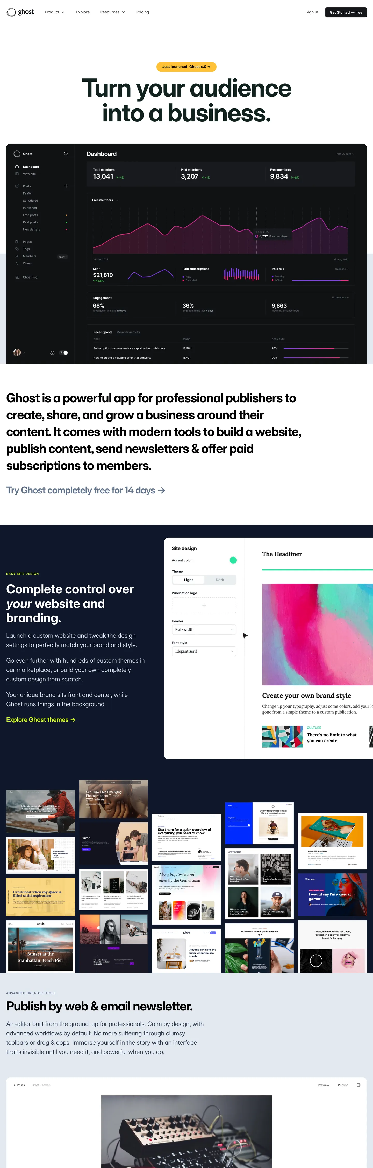
Ghost's marketing site does something almost no publishing platform attempts: it reaches for an electric chartreuse — not a calm slate or a magazine red — as the only chromatic note above the fold, then keeps that lime entirely off the CTA. The hero h1 ("Turn your audience into a business.") sits at 96px InterDisplay weight 700 with tight -2.4px tracking, rendered in a near-black teal ink that reads as charcoal against the warm white canvas. Above the headline floats a 12px uppercase tracked eyebrow in the lime, and a 24px InterDisplay lede sits below in a soft slate. The primary "Get Started — free" pill is the dark base color filled with white text, sized at a deliberate 39px tall with 6px corner-radius. Where Substack reaches for its orange CTA and Beehiiv pairs purple with neon yellow, Ghost holds the voltage in the eyebrow tier and lets the typography carry the entire hero.
The page is built as an alternating editorial band rhythm. The white hero hands off to a near-black product-dashboard band showing a chart-heavy analytics view, then returns to a white "Complete control" headline section, then drops to a dark olive band with a grid of customer site thumbnails, then closes on a white "Publish by web and email newsletters" section. Each band terminates with a flush horizontal edge — no dividers, no gradients, no atmospheric transitions — so the eye reads the page as a stack of magazine spreads rather than as a SaaS scroll. The dashboard band uses Tailwind slate borders at #e5e7eb (462 captured occurrences) to outline every analytics card; the dark olive band uses an even deeper near-black olive #1a2e05 as its surface tone.
The DESIGN.md file packages the system into a machine-readable spec for React tooling. Inside: 14 colors tokens drawn from the eight Tailwind slate greys that hold the dashboard chrome together, the warm-white canvas, the dark base near-black, the electric lime voltage, and the deep olive band surface; 11 typography tokens spanning InterDisplay from 96px display down to 12px uppercase eyebrow, plus InterVariable at 14-15px for nav and body and a Georgia serif fallback; six radii topped by 24px and a 9999px pill; and 14 components definitions covering the dark pill primary button, the lime eyebrow H2, the dashboard analytics card, the dark olive customer-site tile, and the dark surface band. Feed it to Claude or Cursor and the agent reproduces Ghost's specific moves: warm-white canvas alternating with near-black bands, electric lime held in reserve for the eyebrow tier only, near-black primary button rather than a lime CTA, and a 96px InterDisplay h1 in deep teal-ink rather than pure black.
What makes it distinct
5
- Lime eyebrow as voltageelectric chartreuse appears 8 times across the page, all on 12px uppercase tracked H2 labels above section headers, never on a CTA
- 96px InterDisplay heroweight 700 with -2.4px tracking on the headline, rendered in a near-black teal ink rather than pure black
- Near-black primary buttonthe CTA fills with the dark base tone rather than the brand lime, inverting the publishing-tools convention where Substack and Beehiiv reach for color
- Two Inter cutsInterDisplay carries headings and the 24px lede, InterVariable carries 15px nav and body, with Georgia held in reserve as the serif fallback
- Alternating light-dark editorial bandsthe page rhythm flips between warm white and the dark base across five distinct horizontal sections
ghost.org
Live at ghost.org
A snapshot of the brand in production. Scroll the frame to see the whole page.
Colors
14 colors
Ghost's system runs on #d1ff19 as its primary voltage, used in 1 of 14 components. Type is set in InterDisplay across 11 tokens from 12px to 96px, weights 400–700. Shape language is mixed across 14 components, blending pills, soft rounds, and squarer corners.
Brand & Accent
Sparing, CTA-only voltage · 2
Surface
Page and card backgrounds · 3
Text
Headlines, body, captions · 5
Borders & Hairlines
Dividers, outlines, rules · 3
Other
Specialty colors · 1
Typography
11 type tokens
Set in InterDisplay across 11 tokens, from 12px to 96px, weights 400–700. Shown in its own stack: where the font isn't installed, the fallback the file names stands in.
- display-xl96px · weight 700 · lh 96px · tracking -2.4pxThe quick brown fox jumps over the lazy dog
- display-lg48px · weight 700 · lh 55.2px · tracking -1.2pxThe quick brown fox jumps over the lazy dog
- display-md36px · weight 700 · lh 36px · tracking -0.9pxThe quick brown fox jumps over the lazy dog
- body-lg24px · weight 400 · lh 36pxThe quick brown fox jumps over the lazy dog
- body-md24px · weight 500 · lh 30pxThe quick brown fox jumps over the lazy dog
- heading-sm18px · weight 600 · lh 18pxThe quick brown fox jumps over the lazy dog
- eyebrow12px · weight 700 · lh 12px · tracking 1.2pxThe quick brown fox jumps over the lazy dog
- nav-link15px · weight 500 · lh 22.5pxThe quick brown fox jumps over the lazy dog
- body-sm15px · weight 400 · lh 22.5pxThe quick brown fox jumps over the lazy dog
- caption14px · weight 400 · lh 21pxThe quick brown fox jumps over the lazy dog
- button-md14px · weight 400 · lh 21pxThe quick brown fox jumps over the lazy dog
Layout
Radii and spacing
7 corner radii and 9 spacing values. Shape language: mixed.
Radii
- none0px
- xs4px
- sm6px
- md8px
- lg16px
- xl24px
- full9999px
Spacing
- xs4px
- sm8px
- md12px
- base16px
- lg24px
- xl32px
- 2xl36px
- 3xl48px
- 4xl72px
Components
14 components
Each rendered from its tokens (color, type, radius, padding) on Ghost's own canvas.
- Hero Headinghero-headingHero Heading
- Eyebrow H2eyebrow-h2Eyebrow H2
- Section Headingsection-headingSection Heading
- Body Paragraphbody-paragraphBody Paragraph
- Body Paragraph Mutedbody-paragraph-mutedBody Paragraph Muted
- Button Primarybutton-primaryButton Primary
- Top Navtop-navTop Nav
- Nav Linknav-linkNav Link
- Dashboard Banddashboard-bandDashboard Band
- Dashboard Carddashboard-cardDashboard Card
- Olive Bandolive-bandOlive Band
- Site Tilesite-tileSite Tile
- Type here…text-inputText Input
- Card Hairlinecard-hairlineCard Hairline
In use
The system, in use
Ghost's tokens on the kind of product it builds.
Build something people actually use.
A short paragraph of marketing copy that previews how the brand's display tier and body tier read together. Two sentences is usually enough.
FAQ
Ghost design system FAQ
Common questions about Ghost's tokens, components, and how to use this DESIGN.md in your project.
Read next
Related reading
Specs, directories, and component libraries that pair with this design system.
- Browse all design systemsThe full directory of DESIGN.md files on shadcn.io, with live mockups for each.shadcn.io
- Ghost — official siteGhost's public marketing site — the source of truth for the live tokens captured in this file.ghost.org (opens in a new tab)
- The DESIGN.md specificationGoogle Labs' open spec for machine-readable design system files — the format this page is built on.github.com (opens in a new tab)
Use it
Use Ghost in your project
One machine-readable file. Drop it into Claude, Cursor, or any AI tool that reads DESIGN.md.
Download the DESIGN.md
One machine-readable file: every color, type, radius, spacing, and component token of Ghost.
Feed it to your AI tool
Drop it into Claude, Cursor, or GitHub Copilot. The agent writes React components and Tailwind classes that match Ghost's visual language.
Reference the tokens directly
Or paste the values into your Tailwind config, CSS variables, or component library: every color, size and radius is a quoted, ready-to-copy value.
Read the full DESIGN.md: overview, rationale, do’s and don’ts
Overview
Ghost's marketing site argues that an open-source publishing platform can stake a typographic claim without reaching for a chromatic CTA. Lime as eyebrow. The single brand voltage — an electric chartreuse — appears 8 times across the captured page, all of them confined to the 12px uppercase tracked H2 labels that sit above each section heading. The primary "Get Started — free" button fills with the dark base near-black {colors.ink-base} (#15171a), not with the lime; the CTA inverts the convention that Substack uses for its orange call-to-action and that Beehiiv uses for its purple-and-yellow stack. Where the typical newsletter-platform hero shouts in a saturated brand fill, Ghost holds the chrome monochrome and lets the chartreuse signal "section change" rather than "click here."
The page is built as an alternating band rhythm rather than as a single continuous scroll. The warm-white hero hands off to a near-black dashboard band carrying a product analytics screenshot (lavender data line, slate hairlines, the same dark base tone as the primary button). The next band returns to white with a 48px InterDisplay section heading. The fourth band drops to a deep olive surface {colors.surface-olive} (#1a2e05) holding a 3-column grid of customer-site thumbnails; the olive mutes the varied source colors of each thumbnail into a uniform editorial grid. The final band returns to white with the email-newsletter section. Five bands, three light, two dark, each flush-edged with no atmospheric transitions. The structure is closer to a magazine spread than to a SaaS landing page.
Typography is two cuts of Inter. InterDisplay carries every display surface — the 96px hero h1 at weight 700 with tight -2.4px tracking, the 48px section heading, the 36px sub-display, and the 12px uppercase tracked eyebrow. InterVariable carries every running surface — the 15px nav links and the 14px footnote text. Georgia is declared as the serif fallback in CSS (--serif: Georgia, serif) but never renders in the captured marketing chrome; it sits in reserve for the editor theme.
Key Characteristics:
- Single chromatic voltage (
{colors.primary}—--color-lime) confined entirely to the eyebrow tier — 8 total page occurrences, never on a CTA fill. - Near-black primary button (
{colors.ink-base}— #15171a, wired as--color-base) at 6px radius, 39px height, white text — the inverse of the lime-fill CTA convention. - Hero h1 renders in
{colors.ink}(#112220) — a deep teal-ink, never pure black — at 96px InterDisplay weight 700. - Five-band editorial rhythm: warm white hero, near-black dashboard, white headline, deep olive customer grid, white newsletter band. Flush edges, no atmospheric gradients.
- Tailwind slate hairline (
{colors.hairline}— #e5e7eb) is the dominant border tone — 462 of the captured border occurrences sit on this single value. - Eight Tailwind slate greys carry the dashboard chrome (slate-100 through slate-700); the deep olive
{colors.surface-olive}is the only saturated dark surface in the system. - InterDisplay handles all headings; InterVariable handles all body and nav; Georgia and the system mono stack are reserved fallbacks that never render on the captured surface.
- The 96px hero size is unique to the headline — no second display step matches it. The next display tier drops to 48px.
Colors
Brand
- Lime (
{colors.primary}— #d1ff19): frequency 8. Used as text (7), background (1). Wired in CSS as--color-lime. The single chromatic brand moment — confined to the 12px uppercase tracked eyebrow labels above each section heading. Never appears on a CTA fill or as a hover state. - Lime Soft (
{colors.primary-soft}— #bef264): frequency 3. A Tailwind lime-300 step lighter than the brand lime. Used sparingly inside customer-site thumbnails in the olive band; not part of the page chrome.
Surface
- Canvas (
{colors.canvas}— #ffffff): frequency 109 — 99 as text on dark surfaces, 8 as background, 2 inside gradients. The warm-white page floor used on the hero, the white headline band, and the newsletter band. - Ink Base (
{colors.ink-base}— #15171a): frequency 7 as background. Wired as--color-base. The dark surface for the dashboard band and the primary button fill — a true near-black with a faint warm undertone. - Surface Deep (
{colors.surface-deep}— #0f172a): frequency 2 as background. A Tailwind slate-900 used inside the dashboard analytics card chrome. - Surface Olive (
{colors.surface-olive}— #1a2e05): frequency 3 as background. Wired as a brand-layer hex in the extraction. The deep olive band surface holding the customer-site thumbnail grid — chromatic enough to read as a deliberate color, dark enough to mute the varied source colors of each thumbnail.
Text
- Ink (
{colors.ink}— #112220): frequency 4 as text. The hero h1 color — a deep teal-ink, never pure black. Reads as charcoal on the warm-white canvas while carrying a faint chromatic warmth that ties to the olive band lower on the page. - Ink Soft (
{colors.ink-soft}— #334155): frequency 9 — 8 as text, 1 as background. Wired as--color-darkgreyin legacy CSS, but the rendered value is Tailwind slate-700. Used for body paragraph running text under the hero. - Ink Mute (
{colors.ink-mute}— #64748b): frequency 9 as text. A Tailwind slate-500 used for secondary captions and the body text inside dashboard analytics cards. - Ink Stone (
{colors.ink-stone}— #94a3b8): frequency 93 as text. The dominant secondary-text tone — Tailwind slate-400 — carrying nav-link inactive states and the dashboard chrome metadata labels. - Shadow (
{colors.shadow}— #000000): frequency 306 — 236 as text on the dark dashboard band, 70 as shadow ink. The dominant text tone on dark surfaces; the dashboard chrome uses pure black for its primary text rather than the warm ink-base.
Hairline
- Hairline (
{colors.hairline}— #e5e7eb): frequency 464 — 462 of those are borders. The dominant border tone across the entire system. Card outlines, input field outlines, dashboard cell dividers — wired as--color-whitegreyin the legacy CSS, rendered as Tailwind slate-200. - Hairline Soft (
{colors.hairline-soft}— #cbd5e1): frequency 8 as text. Tailwind slate-300; used inside dashboard cards for metadata labels rather than as a border. - Hairline Dark (
{colors.hairline-dark}— #1f2937): frequency 3 as border. Tailwind slate-800; the divider tone for cards sitting on the dark dashboard band.
Typography
Font Families
The system runs two Inter cuts. InterDisplay (--font-heading: "InterDisplay", sans-serif) handles every display surface — the hero h1, all H2 / H3 section headings, the 24px lede, and the 12px uppercase eyebrow. InterVariable (--font-sans-serif: "InterVariable", sans-serif) handles every running text surface — the 15px nav links, the 15px body, the 14px footnote text. Both faces are free and open-source under the SIL Open Font License.
Georgia is declared as a serif fallback (--serif: Georgia, serif) but never appears in the captured marketing chrome — it sits in reserve for the Ghost editor theme. The mono stack (--font-monospace: Menlo, ui-monospace, SFMono-Regular, Monaco, Consolas, Liberation Mono, Courier New, monospace) is similarly reserved.
Hierarchy
| Token | Size | Weight | Line Height | Letter Spacing | Use |
|---|---|---|---|---|---|
{typography.display-xl} | 96px | 700 | 96px | -2.4px | Hero h1 ("Turn your audience into a business.") |
{typography.display-lg} | 48px | 700 | 55.2px | -1.2px | Section h2 ("Complete control over your website and branding") |
{typography.display-md} | 36px | 700 | 36px | -0.9px | Sub-display H3 |
{typography.body-lg} | 24px | 400 | 36px | 0 | Hero lede paragraph |
{typography.body-md} | 24px | 500 | 30px | 0 | Featured body, link callouts |
{typography.heading-sm} | 18px | 600 | 18px | 0 | H3 feature-card titles |
{typography.eyebrow} | 12px | 700 | 12px | 1.2px | Uppercase tracked H2 labels in lime |
{typography.nav-link} | 15px | 500 | 22.5px | 0 | Top-nav link labels |
{typography.body-sm} | 15px | 400 | 22.5px | 0 | Default body running text |
{typography.caption} | 14px | 400 | 21px | 0 | Footnote text and dashboard captions |
{typography.button-md} | 14px | 400 | 21px | 0 | Primary CTA label |
Principles
Display weight is heavy and consistent. The hero h1 sits at 96px / 700 with tight -2.4px tracking — the loudest typographic moment in the system, sized to dominate the viewport at desktop. The next display step drops dramatically to 48px / 700; there is no intermediate 64-80px tier. This binary scale (96px hero, 48px section) keeps the hero as the page's single typographic event and treats every other heading as a secondary anchor.
The eyebrow tier carries every section-change signal. At 12px InterDisplay weight 700 with 1.2px tracking and text-transform: uppercase, it does the work that a heavier H2 would normally do — naming the section ("Easy site design," etc.) without competing visually with the 48px display heading that follows.
Note on Font Substitutes
Both InterDisplay and InterVariable are free under the SIL Open Font License — paste them into a self-hosted React project with no licensing concern. If a fallback is needed, the platform system-ui stack (San Francisco on macOS, Segoe UI on Windows, Roboto on Android) is the closest match for the 15px running text; Geist is the closest open-source alternative for the 96px display tier with comparable cap height.
Layout
Spacing System
- Base unit: 8px (
{spacing.sm}) — the dominant gap value across the captured page. - Tokens:
{spacing.xs}4px ·{spacing.sm}8px ·{spacing.md}12px ·{spacing.base}16px ·{spacing.lg}24px ·{spacing.xl}32px ·{spacing.2xl}36px ·{spacing.3xl}48px ·{spacing.4xl}72px. - Section padding (vertical): ~72px between major editorial bands. The dashboard and olive bands carry the most generous internal padding (
{spacing.4xl}72px top and bottom). - Card internal padding:
{spacing.base}(16px) on dashboard analytics cards,{spacing.lg}(24px) on hairline-bordered feature cards. - Hero padding: 0 horizontal on the headline itself; the centered container holds the 809px-wide h1 at native size.
Grid & Container
- Max content width: ~1080px on the hero h1, ~1280px on the dashboard band, ~1200px on the olive customer-site grid.
- Hero: centered content stack — eyebrow chip, 96px headline, 24px lede, near-black primary pill — on a warm-white floor.
- Dashboard band: full-bleed near-black canvas holding a single dashboard screenshot at ~1200px wide with hairline-dark cell dividers and a lavender analytics line.
- Customer-site grid: 3-column grid on the olive band showing example customer publications (Lever News, 404 Media, The Browser, Platformer, Tangle).
- Newsletter band: centered split — a publishing-card mockup on the left, a section heading and 18px caption stack on the right.
Rhythm
The page reads as five distinct horizontal spreads stacked vertically. The light bands carry the editorial typography; the dark bands carry the product imagery. Each band terminates on a flush edge — there is no gradient, no fade, no atmospheric transition. The five-band structure is closer to a print magazine layout than to a typical SaaS scroll, and the flush edges are deliberate: each spread should read as a separate page rather than as a continuous flow.
Elevation
The system has essentially no shadow tier on the marketing surface. The captured page carries 70 shadow occurrences, all on #000000 ink at low opacity, and almost all of them confined to subtle elevations on the dashboard cards inside the dark band. The light bands carry zero shadow — depth comes from hairline borders alone.
- Flat (no shadow): hero, white headline band, olive customer-site grid, newsletter band — every editorial surface.
- Dashboard elevation: the analytics cards on the dark band carry a faint 1px hairline-dark
{colors.hairline-dark}border, with a low-opacity shadow halo beneath. The lavender data line is the only chromatic element inside the band. - Hairline outlines:
{colors.hairline}(462 occurrences) does the entire elevation job on the light bands. Cards are outlined, not lifted.
Shapes
The radius scale runs from sharp to fully-rounded, with a strong default at 24px:
{rounded.none}0px — section bands and the dashboard chrome edges.{rounded.xs}4px (1 occurrence) — the dashboard analytics line chart container.{rounded.sm}6px (3 occurrences) — the primary button and small inline chips.{rounded.md}8px (16 occurrences) — dashboard cards, input fields, secondary surfaces.{rounded.lg}16px (5 occurrences) — larger feature cards.{rounded.xl}24px (34 occurrences) — the dominant rounded surface, used on customer-site tiles and large content cards.{rounded.full}9999px (2 occurrences) — circular avatar badges and a single pill chip.
The 24px tier carries 34 of the 61 total rounded surfaces, making it the system's default. The 6px primary button is deliberately tighter than the dominant tier — a small, deliberate shape choice that signals "click" against the otherwise soft chrome.
Components
hero-heading — The 96px InterDisplay h1 in {colors.ink} (#112220, a deep teal-ink) on the warm-white canvas. Weight 700, tracking -2.4px, line-height 96px. The loudest typographic moment in the system; the next display step drops to 48px.
eyebrow-h2 — The 12px uppercase tracked H2 label in {colors.primary} lime above each section heading. Wired as an H2 in the markup despite its small size — semantically the section name, visually a chromatic chip.
section-heading — The 48px InterDisplay display heading in {colors.ink} on white bands. Weight 700, tracking -1.2px. Used for "Complete control over your website and branding" and "Publish by web and email newsletters."
body-paragraph — The 24px InterDisplay lede in {colors.ink-soft} (slate-700). Used for the hero sub-paragraph and the lead lines beneath each section heading.
body-paragraph-muted — The 15px InterVariable secondary body text in {colors.ink-mute} (slate-500).
button-primary — The signature CTA. Near-black {colors.ink-base} (#15171a) fill, white text, {rounded.sm} 6px radius, 8x16 padding, 39px height. "Get Started — free" is the canonical instance, anchored in the hero and repeated in the top-nav right-cluster. The fill choice — near-black rather than lime — is the system's defining inversion.
top-nav — White canvas surface, ~72px height (matched to a 4xl spacing token). Holds the Ghost wordmark flush-left, the product-nav links ("Why Ghost," "Explore," "Tour," "Pricing") center, and the "Sign in" link plus near-black "Get Started" pill flush-right.
nav-link — Pure black {colors.shadow} text in {typography.nav-link} (15px InterVariable weight 500). Inactive — no hover-state pill captured.
dashboard-band — Full-bleed dark {colors.ink-base} band with 72x24 padding, no border-radius. Holds the product-analytics screenshot at ~1200px wide. The dashboard chrome itself uses pure black {colors.shadow} for primary text and slate-400 {colors.ink-stone} for metadata.
dashboard-card — Dark {colors.ink-base} fill matching the band surface, {rounded.md} 8px radius, 16px internal padding, 1px {colors.hairline-dark} border. Holds individual analytics tiles inside the dashboard band.
olive-band — Full-bleed {colors.surface-olive} (#1a2e05) band with 72x24 padding. Holds the 3-column customer-site thumbnail grid. The olive is the only saturated chromatic surface in the system.
site-tile — White {colors.canvas} fill, {rounded.lg} 16px radius, 0 padding (each customer-site thumbnail fills the tile edge-to-edge). Used in the olive customer-site grid.
text-input — White surface, ink text, 1px hairline border, {rounded.md} 8px radius, 8x16 padding, 39px height — matched to the primary button.
card-hairline — White fill, 1px {colors.hairline} border, {rounded.xl} 24px radius, 24px internal padding. The default feature card; the 24px radius is the system's dominant rounded tier.
Do's and Don'ts
Do keep the lime ({colors.primary}) scoped to the eyebrow tier. The 12px uppercase tracked H2 labels are the entire chromatic budget of the page — multiplying the lime onto a CTA fill or a hover state collapses the system's defining restraint.
Do use {colors.ink} (#112220) for the hero headline rather than pure black. The deep teal-ink carries a faint warmth that ties to the olive band lower on the page; pure black at 96px display weight reads as industrial against the warm canvas.
Do alternate light and dark bands with flush edges. The five-band rhythm is the page's structural device — adding a gradient or atmospheric transition between bands flattens the magazine-spread feel into a generic continuous scroll.
Do outline {component.card-hairline} cards with {colors.hairline} (#e5e7eb) rather than lifting them with shadow. 462 of the captured border occurrences sit on this single hairline tone; introducing shadow elevation on a hairline-card breaks the system's flat depth language.
Don't fill {component.button-primary} with the lime brand color. The inversion — near-black CTA on warm-white canvas with a lime eyebrow above — is the system's signature. Filling the CTA with the lime would push the page into the Substack / Beehiiv register that Ghost specifically refuses.
Don't scale the hero headline down below 96px on desktop. The 96px / 700 / -2.4px tracking is a deliberate choice — dropping to 72px softens the typographic force that the system relies on to carry the otherwise-monochrome hero.
Don't use the {colors.surface-olive} (#1a2e05) outside the customer-site band. The olive is scoped to a single band as a mute background for varied source-color thumbnails; placing it elsewhere reads as a second brand chromatic moment and competes with the lime.
Don't introduce a serif body face. Georgia is declared as a fallback (--serif: Georgia, serif) for the editor theme, but the marketing system runs 100% InterDisplay and InterVariable. Serif body would push the page into the Substack / Medium editorial register that Ghost's marketing site specifically avoids.
Known Gaps
- Hover and focus states: the captured marketing surface does not expose CTA hover-fills, focus rings, or active-press states. The
{component.button-primary}carries only the resting state. - Form input error states:
{component.text-input}is captured at resting state only; error / validation styling lives inside the Ghost dashboard and editor. - Dark mode: the public marketing surface alternates between light and dark bands rather than offering a separate dark-mode variant. The dashboard band already runs on the near-black
{colors.ink-base}floor. - Motion: the hero, dashboard, and olive band are static in the captured render; any scroll-triggered transitions (parallax, fade-in) live in client-side scripts not captured in the token spec.
- Product surfaces: this DESIGN.md captures the marketing site at
ghost.orgonly. The Ghost editor and admin dashboard atghost.ioand<your-site>.ghost.io/ghost/carry richer token systems — editor toolbar, member analytics, publishing flows — that are not represented here. - Customer-site colors: several brand-layer hexes captured in the extraction (a warm yellow, a soft pink, a sky blue, a deep navy, a saturated red) appear only inside customer-site thumbnails on the olive band, not in the Ghost page chrome itself, and are not declared as design tokens.
- Mobile breakpoint: the captured render is desktop-only at ~1280px viewport; mobile typography scales and navigation chrome are not represented.
News & Publishing
More systems like this
More DESIGN.md files in News & Publishing.
Pricing
Build it with Pro
The DESIGN.md files are free. Pro adds 6,000+ blocks, premium templates and the MCP server, so your AI editor builds in your system for you.
4.9/5 out of 5 · 150+ reviewsfrom 150+ founders and developers.
Billing
Billed once a year in USD. Cancel anytime.
- How many people can use the license.
- Client work, SaaS products and anything you charge for.
- Production-ready React sections: hero, pricing, features, dashboards and more.
- Complete multi-page sites you can ship as they are.
- React icons from every major library, installable with one command.
- Presets that restyle every block, in light and dark.
- Lets your AI editor search, preview and install blocks for you.
- Priority requests are answered first.
Individual
For personal projects & open source
$32instead of $49/mo
$389 billed yearly
- Seats: 1 seat
- Commercial use: Personal & open source only
- Pro blocks: 6,000+ blocks
- Templates: All 14 templates
- React icons: 294k+ icons
- Themes: All 59 themes
- MCP server: Basic usage
- Support: Standard
Team
Most popularFor freelancers, agencies & startups
$66instead of $99/mo
$789 billed yearly · ≈ $13/dev/mo
- Seats: Up to 5 seats
- Commercial use: Included
- Pro blocks: 6,000+ blocks
- Templates: All 14 templates
- React icons: 294k+ icons
- Themes: All 59 themes
- MCP server: High usage
- Support: Priority
Organization
For companies with larger teams
$132instead of $199/mo
$1,589 billed yearly
- Seats: Unlimited seats
- Commercial use: Included
- Pro blocks: 6,000+ blocks
- Templates: All 14 templates
- React icons: 294k+ icons
- Themes: All 59 themes
- MCP server: Unlimited usage
- Support: Priority
Billed once a year in USD. Cancel anytime.
Individual
For personal projects & open source
$32instead of $49/mo
$389 billed yearly
- How many people can use the license.Seats: 1 seat
- Client work, SaaS products and anything you charge for.Commercial use: Personal & open source only
- Production-ready React sections: hero, pricing, features, dashboards and more.Pro blocks: 6,000+ blocks
- Complete multi-page sites you can ship as they are.Templates: All 14 templates
- React icons from every major library, installable with one command.React icons: 294k+ icons
- Presets that restyle every block, in light and dark.Themes: All 59 themes
- Lets your AI editor search, preview and install blocks for you.MCP server: Basic usage
- Priority requests are answered first.Support: Standard
Team
Most popularFor freelancers, agencies & startups
$66instead of $99/mo
$789 billed yearly · ≈ $13/dev/mo
Everything in Individual, plus
- How many people can use the license.Seats: Up to 5 seats
- Client work, SaaS products and anything you charge for.Commercial use: Included
- Lets your AI editor search, preview and install blocks for you.MCP server: High usage
- Priority requests are answered first.Support: Priority
Organization
For companies with larger teams
$132instead of $199/mo
$1,589 billed yearly
Everything in Team, plus
- How many people can use the license.Seats: Unlimited seats
- Lets your AI editor search, preview and install blocks for you.MCP server: Unlimited usage
- Secure checkout via Stripe
- Code lives in your repo
- Keep what you've shipped if you cancel
- License terms
Your system, built for you
Every block, template and icon, installed by your AI agent in your design system. The DESIGN.md files stay free.