Skip to content

Defector Design System

Defector's design system as a DESIGN.md file. Near-monochrome ink palette with midnight navy navigation band, Karla at weight 700 for all editorial display, ghost-pill CTAs at 40px radius, 15 components for React and AI tools.

Add shadcn.io to your AI agent. · Pro It installs blocks, icons and templates in your design system from a prompt, with Pro.

Set up MCP
Primary
#120852
Typeface
Karla
Shape
Mixed
Base radius
0px
Colors
8
Type tokens
10
Components
15
Spacing values
7

About

About Defector DESIGN.md

Curated by Dov Azencot · Updated May 19, 2026 · Source defector.com (opens in a new tab)

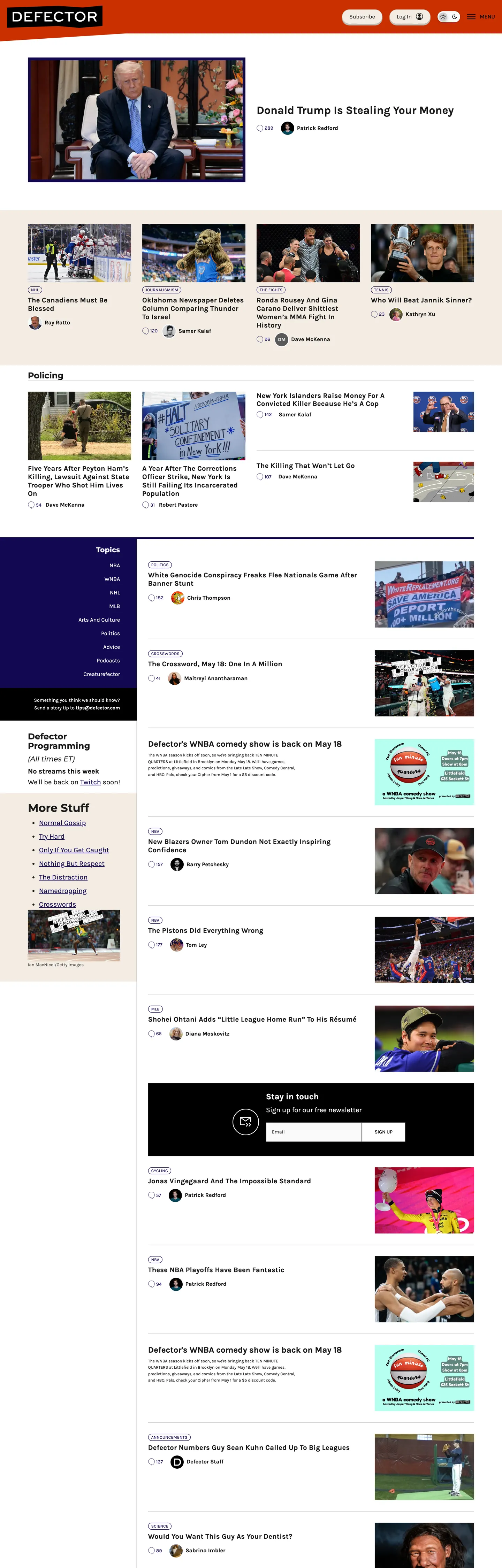
Defector's homepage packs more content into one viewport than almost any peer publication. A 32px bold article headline sits above a compressed grid of photo-plus-title cards, a sidebar column runs parallel with a timestamped feed of stories, and a dark-navy navigation bar anchors the top with sport-category links in white Karla at weight 500. This is a publication built by and for people who want sports writing in high volume. Where The Atlantic layers editorial restraint into every typographic choice and The New Yorker deploys custom display type, Defector uses a Google Font at bold weight and makes no apologies for it.

The DESIGN.md file packages the system into a machine-readable spec for React and AI tools. Inside: 8 colors tokens drawn from a near-monochromatic palette — near-black ink, midnight navy for the navigation band, white canvas, light cream for secondary surface states, and a handful of greys — with no accent color appearing in any chrome element. Ten typography tokens run Karla across all display and body tiers, with Montserrat appearing in section-heading contexts; weight 700 is the display standard, weight 500 the body standard, and weight 400 reserved for form inputs. The radius scale has one step for pill CTAs at 40px and zero for all other surfaces. 15 components cover the dense article-card grid, the dark-navy nav band, the ghost-pill login button, and the square email subscription input.

Feed this file to an AI coding tool and it reproduces Defector's specific moves: navy-only chromatic moment in the nav, Karla bold across editorial display, ghost-pill CTA beside a sharp-cornered input, and the compressed multi-column layout built for reading volume rather than premium pause. The one discipline worth borrowing for editorial products: Defector proves that a single navy navigation bar — not a full brand color applied to CTAs and links — is enough chromatic identity for a site that runs on content authority rather than brand marketing.

What makes it distinct

5

  1. Midnight navy navigation bandthe only chromatic moment in the chrome is the deep navy header bar; every other surface is near-black or white, making the nav the sole brand-color statement
  2. Karla 700 as the editorial workhorseheadlines, section labels, and the primary button all run Karla at bold weight; there is no display-only tier using a separate high-contrast face
  3. Ghost pill at 40px beside a square input at 0pxthe CTA button curves to a full capsule while the email subscription field stays flat-cornered; the radius contrast is stark and intentional
  4. Information-dense grid20px column gutters, compressed article-card layouts, and a sidebar-plus-feed structure that packs more headlines per viewport than any peer publication
  5. Worker-owned publication identityno investor-aligned color restraint or enterprise-safe neutrality; the system is built for readers who want a lot of sports writing, fast

defector.com

Live at defector.com

A snapshot of the brand in production. Scroll the frame to see the whole page.

Defector's website at defector.com

Colors

8 colors

Defector's system runs on #120852 as its primary voltage, used in 2 of 15 components. Type is set in Karla across 10 tokens from 12px to 32px, weights 500–700. Shape language is mixed across 15 components, blending pills, soft rounds, and squarer corners.

Brand & Accent

Sparing, CTA-only voltage · 1

Surface

Page and card backgrounds · 3

Text

Headlines, body, captions · 3

Borders & Hairlines

Dividers, outlines, rules · 1

Typography

10 type tokens

Set in Karla across 10 tokens, from 12px to 32px, weights 500–700. Shown in its own stack: where the font isn't installed, the fallback the file names stands in.

  • display-lg32px · weight 700 · lh 36.8pxThe quick brown fox jumps over the lazy dog
  • display-md24px · weight 700 · lh 28.8pxThe quick brown fox jumps over the lazy dog
  • heading-lg24px · weight 700 · lh 27.6pxThe quick brown fox jumps over the lazy dog
  • heading-md20px · weight 700 · lh 24px · tracking 0.32pxThe quick brown fox jumps over the lazy dog
  • body-lg20px · weight 500 · lh 31pxThe quick brown fox jumps over the lazy dog
  • body-md16px · weight 500 · lh 24.8pxThe quick brown fox jumps over the lazy dog
  • body-sm14px · weight 500 · lh 21.7pxThe quick brown fox jumps over the lazy dog
  • label-sm12px · weight 500 · lh 12px · tracking 0.32pxThe quick brown fox jumps over the lazy dog
  • button-md16px · weight 500 · lh 24.8pxThe quick brown fox jumps over the lazy dog
  • nav-link16px · weight 500 · lh 24.8pxThe quick brown fox jumps over the lazy dog

Layout

Radii and spacing

4 corner radii and 7 spacing values. Shape language: mixed.

Radii

  • none0px
  • pill20px
  • full40px
  • circle50%

Spacing

  • xs8px
  • sm12px
  • base16px
  • md20px
  • lg32px
  • xl40px
  • 2xl80px

Components

15 components

Each rendered from its tokens (color, type, radius, padding) on Defector's own canvas.

  • Button Primary
    button-primaryButton Primary
  • Button Secondary
    button-secondaryButton Secondary
  • Top Nav
    top-navTop Nav
  • Nav Link
    nav-linkNav Link
  • Hero Heading
    hero-headingHero Heading
  • Body Paragraph
    body-paragraphBody Paragraph
  • Card
    cardCard
  • Section Heading
    section-headingSection Heading
  • Article Label
    article-labelArticle Label
  • Type here…
    text-inputText Input
  • Feed Item
    feed-itemFeed Item
  • Subscribe Band
    subscribe-bandSubscribe Band
  • Footer
    footerFooter
  • Sidebar Nav
    sidebar-navSidebar Nav
  • Category Tag
    category-tagCategory Tag

In use

The system, in use

Defector's tokens on the kind of product it builds.

Build something people actually use.

A short paragraph of marketing copy that previews how the brand's display tier and body tier read together. Two sentences is usually enough.

Get startedLearn more
Marketing heroHeadline, sub-copy, primary CTA — the universal homepage opener.
Reporting · 14 min read

The quiet collapse of an old idea

For decades the consensus held that the system would correct itself. Then it didn't. This is the inside story of what changed, told by the people who watched it unravel.

"Nobody noticed because the failure was indistinguishable from progress."

By Sam Reporter · Updated 2 hours ago

Editorial articleMagazine-style longform with display headline.

FAQ

Defector design system FAQ

Common questions about Defector's tokens, components, and how to use this DESIGN.md in your project.

Read next

Specs, directories, and component libraries that pair with this design system.

Use it

Use Defector in your project

One machine-readable file. Drop it into Claude, Cursor, or any AI tool that reads DESIGN.md.

Download DESIGN.md
  1. Download the DESIGN.md

    One machine-readable file: every color, type, radius, spacing, and component token of Defector.

  2. Feed it to your AI tool

    Drop it into Claude, Cursor, or GitHub Copilot. The agent writes React components and Tailwind classes that match Defector's visual language.

  3. Reference the tokens directly

    Or paste the values into your Tailwind config, CSS variables, or component library: every color, size and radius is a quoted, ready-to-copy value.

Read the full DESIGN.md: overview, rationale, do’s and don’ts

Overview

Defector is an employee-owned sports and culture publication founded by former Deadspin staff. Density over drama. Where The Atlantic composes each section with editorial breathing room and The New Yorker deploys custom display type to signal literary authority, Defector packs the viewport with headlines, timestamps, and article photos — and runs it all in Karla, a free humanist sans from Google Fonts, at bold weight. This is not an aesthetic compromise; it is a deliberate signal that the publication's value is in the writing, not the brand chrome.

The single chromatic move in the entire system is the midnight navy navigation band — a deep, slightly purple-tinted dark blue that runs across the full-width header bar. Below it, the entire page runs in near-black, white, and neutral grey. There is no red despite the publication's bold red wordmark logo; the logo color does not transfer into the surrounding chrome. The navy nav functions as a second ink tone — closer to the newspaper convention of black-and-ink than to a brand accent system. BuzzFeed and Vice both apply brand colors to link states, hover fills, and category tags throughout their editorial grids; Defector applies its only chromatic element once, at the top, and lets the headlines carry the rest.

Key Characteristics:

  • Midnight navy ({colors.primary}) fills only the top navigation band and the footer — every other chrome element runs in near-black or white, making the nav color the site's sole chromatic statement.
  • Karla 700 for all editorial display and Montserrat 700 for section category labels — both free Google Fonts, no licensing barrier.
  • Ghost-pill button at 40px radius for the login CTA, flat-cornered square input at 0px for email subscription — the radius contrast divides interactive-action surfaces from data-entry surfaces.
  • 20px base column gutter — tighter than any comparable news publication, enabling more content per viewport width.
  • Uppercase category tags at 12px / weight 500 / 0.32px tracking — small-caps labels above article cards identifying section (NBA, Policing, Culture).
  • Near-monochromatic palette: 8 tokens, all grey-to-black plus the single navy, zero warm or cool accent colors in the chrome.
  • Dense sidebar-plus-feed layout: parallel columns running sport-category feed and main editorial grid simultaneously.

Colors

Text

  • Ink ({colors.ink} — #191919): frequency 808. Used as text (416), border (392). The dominant ink tone — a near-black charcoal that covers every article headline, body paragraph, border rule, and interactive link in the below-nav content area.
  • Ink Secondary ({colors.ink-secondary} — #333333): frequency 12. Used as text (6), border (6). A slightly lighter charcoal for secondary content contexts — bylines, sub-labels, reduced-emphasis text.
  • Ink Muted ({colors.ink-muted} — #4d4d4d): frequency 6. Used as text (2), border (4). Tertiary labels and the email input border in its resting state.

Brand

  • Primary ({colors.primary} — #120852): frequency 280. Used as text (139), border (140), bg (1). The midnight navy — the site's only chromatic token. Fills the navigation band and footer, used for link-border underlines throughout the editorial grid.

Surface

  • Canvas ({colors.canvas} — #ffffff): frequency 99. Used as text (39), border (54), bg (6). The page floor for all editorial content below the nav band. Pure white.
  • Surface-1 ({colors.surface-1} — #f3ece2): frequency 6. Used as bg (4), text (1), border (1). A warm parchment cream — used for the login button fill and secondary surface states in the cookie consent overlay.
  • Surface Dark ({colors.surface-dark} — #000000): frequency 14. Used as text (5), bg (3), border (5), shadow (1). Pure black, used for the subscription call-to-action band and the darkest surface contexts.

Hairline

  • Hairline ({colors.hairline} — #c2bdb5): frequency 4. Used as border (2), shadow (2). A warm grey — the login button border tone and subtle shadow ink in the cookie consent layer.

Typography

Font Families

The system runs two voices from Google Fonts: Karla (primary) for editorial display, body, buttons, and navigation; Montserrat (secondary) for section-category headers and section-specific emphasis moments. Both are freely available. Fallbacks for both declare sans-serif.

The Karla / Montserrat pairing is not a high-contrast serif/sans split — it is a subtle texture change within the sans genre. Karla's open humanist forms feel approachable at body sizes; Montserrat's more geometric construction gives section headings a slightly more structured authority. The difference is small enough that most readers won't notice it consciously, but it provides typographic variety across a page dense with text.

Hierarchy

TokenSizeWeightLine HeightUse
{typography.display-lg}32px70036.8pxFeature article hero headline
{typography.display-md}24px70028.8pxH2 section display headings
{typography.heading-lg}24px70027.6pxSection category banner (Montserrat)
{typography.heading-md}20px70024pxArticle card headlines in the feed grid
{typography.body-lg}20px50031pxLead body and section sub-decks
{typography.body-md}16px50024.8pxDefault running body paragraph
{typography.body-sm}14px50021.7pxSecondary body, captions, sidebar metadata
{typography.label-sm}12px50012pxUppercase category labels above article cards
{typography.button-md}16px50024.8pxLogin / subscribe button labels
{typography.nav-link}16px50024.8pxTop navigation category links

Principles

Weight 700 runs across all display sizes — 32px, 24px, 20px — with no lighter alternative. This uniformity is the system's characteristic editorial voice: every headline, regardless of hierarchy level, arrives at the same bold-weight confidence. The Atlantic and The New Yorker use weight 600 or lighter on secondary heading tiers; Defector doesn't differentiate. Weight 500 handles body copy and navigation — a medium weight that reads clearly in dense grid layouts without appearing gray. There is no weight 400 presence beyond form inputs.

Note on Font Substitutes

Both Karla and Montserrat are free Google Fonts — no substitution is needed. Load via @import url('https://fonts.googleapis.com/css2?family=Karla:wght@500;700&family=Montserrat:wght@700;900&display=swap'). If you prefer a self-hosted humanist sans alternative, Nunito at weights 500 and 700 approximates Karla's open letterform style; Outfit is a closer optical match for Montserrat's section-heading usage.

Layout

Spacing System

  • Base unit: 12px — the dominant padding token, appearing 47 times; 8px appears 38 times as a close second.
  • Tokens: {spacing.xs} 8px · {spacing.sm} 12px · {spacing.base} 16px · {spacing.md} 20px · {spacing.lg} 32px · {spacing.xl} 40px · {spacing.2xl} 80px.
  • Card internal padding: {spacing.sm} (12px) — the compressed default that produces the high-density grid.
  • Section vertical spacing: {spacing.lg} (32px) between major content sections.
  • Subscribe band padding: {spacing.md} (20px) horizontal, {spacing.lg} (32px) vertical.

Grid & Container

  • Navigation: full-width midnight navy band, no max-width constraint, category links at 20px horizontal margins.
  • Main content: two-column layout — primary editorial feed on the left, sidebar with additional links and categories on the right. Column gap approximately 20px.
  • Article card grid: compressed 3-column grid for secondary article cards — photo at top, headline below, category tag and timestamp at bottom. 12px internal card padding.
  • Sidebar feed: single-column list of story titles, timestamps, and category labels — 8px vertical spacing between items.

Rhythm

The page has almost no empty space between sections. The nav band terminates directly into the hero article area; the hero terminates into the article grid without a dividing whitespace band; the sidebar runs the full height of the content in parallel. Section category banners (NBA, Policing, Culture) use the Montserrat heading at 24px with a 1px ink border above and below — dividers rather than whitespace create the sectioning rhythm. This is a reading-volume layout, not a pause-and-consider layout.

Elevation

The system has a minimal shadow tier. Fourteen occurrences of pure black appear as shadow ink at low opacity, primarily in the cookie consent overlay and the subscribe band boundary. Content cards use no shadow; separation between editorial areas comes from 1px ink-colored border rules rather than elevation.

  • Flat (no shadow): all article cards, navigation, and editorial content — 98% of surfaces.
  • Overlay shadow: the cookie consent drawer uses a faint shadow to lift it above the page content; the subscribe band has one shadow occurrence marking its boundary.

Shapes

The radius scale is functional-binary:

  • {rounded.none} 0px — all article cards, section panels, text inputs, category tags, and content borders. The default for every non-interactive container is sharp-cornered.
  • {rounded.pill} 20px — secondary button variant, moderate pill CTA shapes.
  • {rounded.full} 40px — the primary login ghost-pill button. Applied to the 43px-height login CTA in the top-right corner of the nav.
  • {rounded.circle} 50% — author avatars and icon buttons in circular format.

The jump from 0px on content to 40px on the primary CTA is the system's most distinctive shape decision. There is no 4 / 8 / 12px middle tier for cards or panels — either a surface is sharp-cornered content or it is a fully-rounded interactive pill.

Components

button-primary — The ghost-pill login button. Warm parchment {colors.surface-1} fill, near-black text in {typography.button-md} (16px / 500), {rounded.full} 40px radius, 8×20px padding, 43px height, 1px {colors.hairline} border. Sits in the top-right of the navigation band — the only light-fill element against the dark navy nav.

button-secondary — Transparent background, white text, 1px white border, {rounded.pill} 20px radius. Used for secondary actions within dark-background contexts such as the subscribe band.

top-nav — Midnight navy {colors.primary} fill, white text, 48px height, 20px horizontal padding. Sports-category navigation links (NBA, NFL, MLB, NHL, Soccer, More) plus Defector wordmark left, login button right.

nav-link — Transparent, white text in {typography.nav-link} (16px / 500). Navigation category labels with no padding beyond their container — inline horizontal arrangement.

hero-heading — Near-black text, {typography.display-lg} (32px / 700). The feature article headline — the largest editorial typography moment on the page, without background color.

body-paragraph — White text on dark contexts (subscribe band, footer), {typography.body-sm} (14px / 500). Captions and secondary body copy.

card — White {colors.canvas} surface, near-black text, 0px radius, 12px padding, 1px ink border on bottom edge. Holds article photo, headline in {typography.heading-md}, category tag, and timestamp.

section-heading — Near-black text, {typography.heading-lg} Montserrat (24px / 700). Section category banners with 1px ink rules above and below.

article-label — Transparent background, near-black text, {typography.label-sm} (12px / 500 / uppercase / 0.32px tracking), 3×8px padding. Category identifier above article cards — appears in uppercase: "NBA", "POLICING", "CULTURE".

text-input — White {colors.canvas} fill, near-black text in 14px body, 0px radius, 16px padding, 56px height, 1px {colors.ink-muted} border. The email subscription input — deliberately sharp-cornered against the pill button.

feed-item — White surface, near-black text in {typography.heading-md} (20px / 700), 0px radius, 12px vertical padding, 1px ink border beneath. Sidebar and secondary-feed story titles.

subscribe-band — Pure-black {colors.surface-dark} surface, white body text, 32×20px padding. The full-width subscription call-to-action module below the main editorial content.

footer — Midnight navy {colors.primary} fill, white text, 32×20px padding. Repeats the nav band color, bookending the page's chromatic identity.

sidebar-nav — Transparent, near-black text, {typography.body-sm}, 8px vertical padding. Navigation links and article titles in the right sidebar feed.

category-tag — Transparent, near-black text, {typography.label-sm} uppercase, 3×8px padding, 1px ink border, 0px radius. In-content article category identifiers — the sharp-cornered border tag is the secondary UI identity marker.

Do's and Don'ts

Do treat the midnight navy as a framing color, not an accent. The navy belongs on the navigation band and footer — the structural brackets of the page — and not on inline links, hover states, or body-content highlights. Using it inside the editorial content area would transform it from an architectural framing device into a brand accent, which the system explicitly avoids.

Do use Karla at weight 700 for all article headlines, regardless of size. The uniform bold weight across 32px, 24px, and 20px headline tiers is the system's editorial voice. Lightening secondary headlines to weight 500 introduces a differentiation the system doesn't use and makes the page feel less confident.

Do keep the 0px-to-40px radius contrast between content and action surfaces. The sharp card edge and the fully-rounded pill CTA divide information from interaction at a glance. Rounding content cards even slightly — to 4px — erodes the distinction.

Do maintain 12px internal card padding. The compressed spacing is load-bearing for the density the layout achieves; expanding to 16–20px reduces the articles-per-viewport count and changes the editorial character of the page.

Don't introduce any accent color. No hover fills in navy, no link underlines in a warm tan, no category tags in a sports-specific color (red for NBA, green for soccer). The near-monochromatic discipline is the system's most deliberate editorial choice — it keeps the focus on the text rather than on the chrome.

Don't use weight 400 in headlines or navigation. The system's minimum weight for non-input surfaces is 500. Using 400 in a headline or label context makes the typography feel underweight relative to the compressed, dense layout that surrounds it.

Don't use box shadows on article cards. Separation comes from 1px ink border rules, not elevation. Adding shadows makes cards feel like UI components lifted from a dashboard system rather than sections of a printed publication.

Don't pad the category-tag borders with significant horizontal space. The {typography.label-sm} tag at 3×8px padding is calibrated to sit tightly above article cards — expanding to 6×12px makes the tags feel more prominent than the headlines they introduce.

Known Gaps

  • Hover and focus states: no hover states were captured from the static surface; link hover colors, nav link underline or fill treatments, and button focus rings are not documented.
  • Subscriber-only article states: articles behind the paywall likely carry a distinct card treatment (blurred preview, overlay CTA) that is not exposed on the public marketing surface.
  • Dark mode: the site appears to be light-mode only on the main editorial surface; a reader-mode or dark-mode variant is not captured.
  • Mobile navigation: the mobile hamburger menu, drawer behavior, and collapsed sport-category layout at mobile widths are not represented in the captured desktop tokens.
  • Article page typography: the article reading page likely carries a distinct body-text treatment (larger line height, possibly a different weight or a serif sub-tier for long-form reading) not exposed on the homepage.
  • Video and podcast components: Defector produces audio and video content; the embedded player components are not captured from the homepage surface.
  • Authentication states: the logged-in header state (subscriber avatar, account menu, subscriber-specific navigation items) is not captured.

News & Publishing

More systems like this

More DESIGN.md files in News & Publishing.

Pricing

Build it with Pro

The DESIGN.md files are free. Pro adds 6,000+ blocks, premium templates and the MCP server, so your AI editor builds in your system for you.

4.9/5 out of 5 · 150+ reviewsfrom 150+ founders and developers.

Billed once a year in USD. Cancel anytime.

Individual

For personal projects & open source

$32instead of $49/mo

$389 billed yearly

  • How many people can use the license.Seats: 1 seat
  • Client work, SaaS products and anything you charge for.Commercial use: Personal & open source only
  • Production-ready React sections: hero, pricing, features, dashboards and more.Pro blocks: 6,000+ blocks
  • Complete multi-page sites you can ship as they are.Templates: All 14 templates
  • React icons from every major library, installable with one command.React icons: 294k+ icons
  • Presets that restyle every block, in light and dark.Themes: All 59 themes
  • Lets your AI editor search, preview and install blocks for you.MCP server: Basic usage
  • Priority requests are answered first.Support: Standard

Team

Most popular

For freelancers, agencies & startups

$66instead of $99/mo

$789 billed yearly · ≈ $13/dev/mo

Everything in Individual, plus

  • How many people can use the license.Seats: Up to 5 seats
  • Client work, SaaS products and anything you charge for.Commercial use: Included
  • Lets your AI editor search, preview and install blocks for you.MCP server: High usage
  • Priority requests are answered first.Support: Priority

Organization

For companies with larger teams

$132instead of $199/mo

$1,589 billed yearly

Everything in Team, plus

  • How many people can use the license.Seats: Unlimited seats
  • Lets your AI editor search, preview and install blocks for you.MCP server: Unlimited usage
  • Secure checkout via Stripe
  • Code lives in your repo
  • Keep what you've shipped if you cancel
  • License terms

Your system, built for you

Every block, template and icon, installed by your AI agent in your design system. The DESIGN.md files stay free.

Get Pro