Discord Design System
Discord's design system as a DESIGN.md file. Blurple #5865f2, ABC Ginto Discord Nord uppercase display, 24 colors, 24 components. For React, Next.js, and AI tools.
Add shadcn.io to your AI agent. · Pro It installs blocks, icons and templates in your design system from a prompt, with Pro.
Set up MCP- Primary
- #5865f2
- Typeface
- ABC Ginto Discord
- Shape
- Soft
- Base radius
- 16px
- Colors
- 24
- Type tokens
- 12
- Components
- 24
- Spacing values
- 8
About
About Discord DESIGN.md
Curated by Dov Azencot · Updated May 13, 2026 · Source discord.com (opens in a new tab)
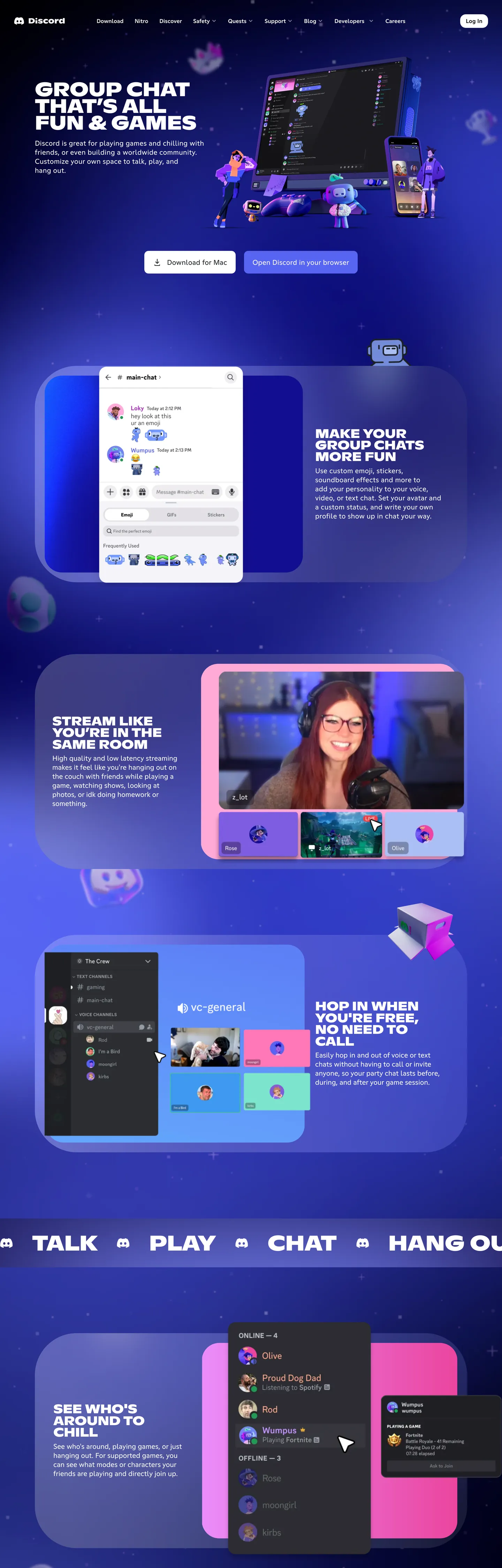
Discord's marketing page is dressed like a friend's bedroom poster. The outer frame stays pure black ("#000000"), but the page itself drops into a midnight indigo gradient — "#1a2081" warming into "#24173f" — with a starfield and 3D-illustrated planets, hands holding phones, and bedroom-game-night scenes layered over it. Against that canvas, ABC Ginto Discord Nord shouts the hero in full uppercase at 56-61px weight 700-800 with tight -0.56px tracking, while a single Blurple ("#5865f2") pill CTA does the only color work the chrome ever performs. The brand voltage is famously the singular Blurple — three on-page renders is all it takes, because every other section steals attention with full-bleed candy-colored feature cards (pink, spring green, yellow, fuchsia) and full-width 3D scenes. The chrome is quiet; the illustration is loud.
This file packages the public marketing system as a single Google Labs DESIGN.md spec. Inside: 24 colors tokens covering the brand Blurple plus the six-card feature palette, two canvas surfaces, and supporting structural greys; 12 typography styles all set in ABC Ginto Discord / ABC Ginto Discord Nord with one substitution-ready Inter stack and one weight-800 display register; a 5-step radius scale where every CTA pill renders at 12px and feature cards at 50-120px; 8 spacing steps tuned to the 4-8-16 base rhythm; and 24 components recipes covering primary and ghost CTAs, the dark top nav, feature cards in all six accent fills, the rotating word banner, the 3D-scene hero panel, and the support search field.
Feed this file to Claude, Cursor, or GitHub Copilot and the AI will produce React components that look like Discord, not like a generic dark dashboard — uppercase Nord display, single-Blurple CTA discipline, rainbow accent cards swapping per section, and the outer-black / inner-indigo two-tier canvas. Or reference the tokens directly when building social, community, or chat-app marketing surfaces: every hex is quoted, every component recipe ready to paste into Tailwind config or CSS custom properties. The system is worth studying because it proves a social brand can carry a marketing site on illustration energy plus one accent — restraint at the chrome level, maximalism at the imagery level.
What makes it distinct
5
- Single-voltage Blurple'#5865f2' carries every primary CTA, never decorates surfaces, and never shares the stage with a second accent on chrome
- Shouting display tierABC Ginto Discord Nord renders headlines at 56-61px, weight 700-800, full uppercase, -0.56px to -0.61px tracking
- Two-tier dark canvasouter black '#000000' frames the page, an inner midnight '#1a2081' over '#24173f' band hosts the hero illustration
- Six-color feature card rainbowpink '#ffcdee', spring green '#57f287', yellow '#fee75c', fuchsia '#eb459e', cerulean '#00b0f4', orange '#fda220' rotate between sections
- 12px-radius pill CTA at 65px tall with 24px horizontal paddingevery button shares one geometry; no square edges anywhere on chrome
discord.com
Live at discord.com
A snapshot of the brand in production. Scroll the frame to see the whole page.
Colors
24 colors
Discord's system runs on #5865f2 as its primary voltage, used in 1 of 24 components. Type is set in ABC Ginto Discord across 12 tokens from 16px to 61px, weights 400–800. Shape language is soft — components average 55px corner radius, with no sharp interactive edges.
Text
Headlines, body, captions · 6
Semantic
Status, errors, success, links · 1
Other
Specialty colors · 17
Typography
12 type tokens
Set in ABC Ginto Discord across 12 tokens, from 16px to 61px, weights 400–800. Shown in its own stack: where the font isn't installed, the fallback the file names stands in.
- display-xl61px · weight 700 · lh 25px · tracking -0.61pxThe quick brown fox jumps over the lazy dog
- display-lg56px · weight 700 · lh 48px · tracking -0.56pxThe quick brown fox jumps over the lazy dog
- display-md48px · weight 700 · lh 57.6px · tracking -0.48pxThe quick brown fox jumps over the lazy dog
- display-sm36px · weight 800 · lh 33.48px · tracking -0.36pxThe quick brown fox jumps over the lazy dog
- body-lg20px · weight 400 · lh 26px · tracking 0.32pxThe quick brown fox jumps over the lazy dog
- body-lg-tracked20px · weight 400 · lh 26px · tracking 0.25pxThe quick brown fox jumps over the lazy dog
- body-md16px · weight 400 · lh 24px · tracking normalThe quick brown fox jumps over the lazy dog
- body-md-strong16px · weight 500 · lh 19.2px · tracking normalThe quick brown fox jumps over the lazy dog
- label-md16px · weight 500 · lh 22px · tracking normalThe quick brown fox jumps over the lazy dog
- link-md16px · weight 500 · lh 19.2px · tracking 0.25pxThe quick brown fox jumps over the lazy dog
- nav-md16px · weight 400 · lh 20px · tracking normalThe quick brown fox jumps over the lazy dog
- button-lg20px · weight 400 · lh 26px · tracking 0.25pxThe quick brown fox jumps over the lazy dog
Layout
Radii and spacing
5 corner radii and 8 spacing values. Shape language: soft.
Radii
- pill12px
- md16px
- lg50px
- xl60px
- xxl120px
Spacing
- xxs4px
- xs8px
- sm10px
- md16px
- lg34.6px
- xl42px
- xxl48px
- section56px
Components
24 components
Each rendered from its tokens (color, type, radius, padding) on Discord's own canvas.
- Button Primarybutton-primaryButton Primary
- Button Primary Hoverbutton-primary-hoverButton Primary Hover
- Button Primary Pressedbutton-primary-pressedButton Primary Pressed
- Button Ghostbutton-ghostButton Ghost
- Button Ghost Hoverbutton-ghost-hoverButton Ghost Hover
- Nav Linknav-linkNav Link
- Top Navtop-navTop Nav
- Hero Canvashero-canvasHero Canvas
- Hero Headinghero-headingHero Heading
- Hero Subheadhero-subheadHero Subhead
- Feature Card Pinkfeature-card-pinkFeature Card Pink
- Feature Card Spring Greenfeature-card-spring-greenFeature Card Spring Green
- Feature Card Fuchsiafeature-card-fuchsiaFeature Card Fuchsia
- Feature Card Navyfeature-card-navyFeature Card Navy
- Feature Card Yellowfeature-card-yellowFeature Card Yellow
- Feature Card Orangefeature-card-orangeFeature Card Orange
- Rotating Word Bannerrotating-word-bannerRotating Word Banner
- Inline Linkinline-linkInline Link
- Status Pill Onlinestatus-pill-onlineStatus Pill Online
- Status Pill Errorstatus-pill-errorStatus Pill Error
- Type here…text-inputText Input
- Type here…text-input-focusText Input Focus
- Footer Stripfooter-stripFooter Strip
- Badge Newbadge-newBadge New
In use
The system, in use
Discord's tokens on the kind of product it builds.
Build something people actually use.
A short paragraph of marketing copy that previews how the brand's display tier and body tier read together. Two sentences is usually enough.
FAQ
Discord design system FAQ
Common questions about Discord's tokens, components, and how to use this DESIGN.md in your project.
Read next
Related reading
Specs, directories, and component libraries that pair with this design system.
- Browse all design systemsThe full directory of DESIGN.md files on shadcn.io, with live mockups for each.shadcn.io
- Discord — official siteGroup chat for friends, game nights, study halls, and worldwide communities.discord.com (opens in a new tab)
- The DESIGN.md specificationGoogle Labs' open spec for machine-readable design system files — the format this page is built on.github.com (opens in a new tab)
Use it
Use Discord in your project
One machine-readable file. Drop it into Claude, Cursor, or any AI tool that reads DESIGN.md.
Download the DESIGN.md
One machine-readable file: every color, type, radius, spacing, and component token of Discord.
Feed it to your AI tool
Drop it into Claude, Cursor, or GitHub Copilot. The agent writes React components and Tailwind classes that match Discord's visual language.
Reference the tokens directly
Or paste the values into your Tailwind config, CSS variables, or component library: every color, size and radius is a quoted, ready-to-copy value.
Read the full DESIGN.md: overview, rationale, do’s and don’ts
Overview
Discord's marketing page reads as a bedroom poster scrolled into a browser. The outer frame holds pure black {colors.ink} ("#000000"), but the body of the page drops into a midnight band — a {colors.navy-deep} ("#1a2081") gradient warming through {colors.navy-blue} ("#24173f") — with a starfield illustration, 3D-rendered hands, glowing phones, and game-night planets layered across it. Against that loud canvas, the chrome whispers: ABC Ginto Discord Nord shouts "GROUP CHAT THAT'S ALL FUN & GAMES" in 56px weight 700 uppercase at {typography.display-lg}, and one Blurple {colors.blurple} ("#5865f2") pill carries the "Open Discord in your browser" CTA. Three on-page renders is all the Blurple gets — the rest of the section colors come from full-bleed feature cards in pink, spring green, fuchsia, and navy.
Loud-canvas, quiet-chrome: where most consumer-app marketing pages pair a calm hero photograph with high-saturation chrome, Discord inverts the contract — the illustration carries the saturation budget (a starfield, a fuchsia/green floating video call, a pink chat panel), and the chrome holds back to one Blurple pill plus a white ghost-pill. The CTAs are pills with a 12px radius — not full 9999px pills, not sharp 0px corners — and every chrome button is 65px tall with 19.5px vertical and 24px horizontal padding. Unlike the convention of pairing a brand voltage with an analogous secondary accent (Stripe pairs indigo with violet, Slack pairs aubergine with gold), Discord never lets a second color touch a CTA; the candy palette (pink "#ffcdee", green "#57f287", yellow "#fee75c", fuchsia "#eb459e", orange "#fda220", cerulean "#00b0f4") is card-only territory.
The typography is the second voice signature. All-caps shout register: Nord display tier renders at 36-61px weight 700-800, full uppercase, with tight tracking from -0.36px to -0.61px. Body and UI labels switch to the lower-case ABC Ginto Discord at 16-20px, weights 400-500 — a deliberate two-register binary where every heading shouts and every paragraph speaks. Sizes step in tight increments (61 → 56 → 48 → 36 for display, 20 → 16 for body) and the only line-heights are 24px for body, 19.2-22px for labels, and 25-57.6px for display. Hero, h1, and h2 all share the Nord uppercase voice; h3 and below drop to ABC Ginto Discord at body weight.
Key Characteristics:
- Outer-black
{colors.ink}("#000000") frames an inner midnight{colors.navy-deep}("#1a2081") canvas — the two-tier dark scheme is the page's structural rhythm - Single Blurple
{colors.blurple}("#5865f2") voltage carries every primary CTA — three renders on the marketing page, never as background fill - ABC Ginto Discord Nord shouts the display tier at 56-61px weight 700-800 uppercase with -0.56px to -0.61px tracking
- Six-card accent rotation — pink, spring green, fuchsia, navy, yellow, orange — each band picks one card color and never reuses it on chrome
- Every chrome button is a 12px-radius pill at 65px tall with 19.5px × 24px padding — no other button geometry exists
- Feature cards render at 120px corner radius — the largest radius on the page, signaling "playful artifact" rather than "UI element"
- The rotating word banner ("TALK · PLAY · CHAT · HANG OUT") sits on a pure black
{colors.ink}strip between bands as the only divider element
Colors
The palette splits along function lines: a structural achromatic stack (black, off-white, dim greys, two charcoals), a Blurple-led brand stack (Blurple, Blurple-hover, Blurple-dark, refresh-blue), and a six-color "feature card" stack (pink, spring green, yellow, fuchsia, orange, cerulean) that lives exclusively inside illustration cards.
- Ink (
#000000) — frequency 405. Used as text (202), border (202), background (1). The outer frame color and the rotating-word-banner background; carries the highest border count on the page because every dark hairline resolves through it. - Canvas white (
#ffffff) — frequency 231. Used as text (111), border (111), background (4), gradient (5). The on-dark text color across the indigo band; also the ghost-button fill on "Download for Mac". Exported through three CSS variables:--off-white,--always-white,--white. - Dark charcoal (
#333333) — frequency 6. Used as text (3), border (3). Reserved for fine-print footer text and inactive-state borders inside--dark-charcoaland--dark-not-blacktoken roles. - Blurple (
#5865f2) — frequency 3. Used as text (1), background (1), border (1). The singular brand voltage; powers the "Open Discord in your browser" pill and the active in-product invite banner. Lives in--blurpleand--brandCSS variables. Three renders on the marketing page is its entire budget. - Not-quite-black (
#23272a) — frequency 2. Used as text (1), border (1). The in-app dark canvas (when the public app surface peeks into the marketing screenshots). Discord's own naming —--not-quite-black— is the system's running joke about almost-but-not-pure-black surfaces. - Navy-deep (
#1a2081) — frequency 1. Used as background (1). The inner indigo canvas color, lifted as a one-off background. Carries the hero starfield band edge-to-edge. - Refresh blue (
#161cbb) — declared as--refresh-blue. A reserved theme color (set as the documentthemeColormeta tag); not rendered as a chrome fill on the captured page but available as the future-tense brand-refresh variant. - Cerulean (
#00b0f4) — declared as--text-link,--focus-border,--vivid-cerulean. The link color and focus-ring color; reserved for inline hyperlink runs and form-control focus states. Never used as a CTA fill. - Pink (
#ffcdee) — declared as--pink. The pastel pink feature-card fill for the "Make Your Group Chats More Fun" band; pairs with ink text and a smaller pink-deep (#dc4195) accent badge inside the chat-screenshot panel. - Pink-deep (
#dc4195) — declared as--pinc-2. A saturated pink reserved for the inner badge / username dot inside the pink feature card. - Spring green (
#57f287) — declared as--spring-green,--green. The green feature-card fill for the "Hop In" band and the in-app online-status dot. - Status green (
#43b581) — declared as--mint-green,--status-green. The deeper green specifically for the online presence indicator inside the in-product peek. - Navy blue (
#24173f) — declared as--navy-blue. The deepest navy of the indigo canvas — the warm tone the#1a2081gradient resolves into. - Orange (
#fda220) — declared as--orange. The orange feature-card fill, reserved for one band per page (not shown on the home capture but declared in the chrome). - Purple-soft (
#808aff) — declared as--purple. A lifted pastel purple reserved for illustration-internal accents (sparkles, glow halos in the 3D scenes). - Yellow (
#fee75c) — declared as--yellow. The yellow feature-card fill; used as the "TALK · PLAY · CHAT · HANG OUT" banner alt-fill on some seasonal variants. - Fuchsia (
#eb459e) — declared as--fuchsia. The fuchsia feature-card fill for the "Hop In" video-call band, paired with spring-green to make the brand's most recognizable two-color combo. - Ekko red (
#de2761) — declared as--ekko-red. A reserved red specifically for the "Ekko" feature illustration; not a system error color. - Red-error (
#ed4245) — declared as--red. The error/destructive state color, used for in-app banners and error toast pills. - Greyple (
#99aab5) — declared as--greyple. The system's mid-grey for inactive labels and the "muted" presence indicator. The Discord-coined name — Grey + Purple — is now part of brand vernacular. - Dim grey (
#50555f) — declared as--dim-grey. The deeper structural grey for fine borders inside the in-product peek. - Blurple-hover (
#8891f2) — declared as--button-hover. The lifted Blurple variant for primary-pill hover states. - Blurple-dark (
#3442d9) — declared as--dark-blurple. The deep Blurple for pressed state and for Blurple-on-Blurple surfaces (rare). - Dark button hover (
#3b3b3b) — declared as--dark-button-hover. The ghost-button hover variant on the dark canvas — when a white ghost pill darkens slightly on hover.
Typography
Every text role on the page sits inside two faces: ABC Ginto Discord (custom Ginto by Dinamo) for body, labels, links, and buttons; ABC Ginto Discord Nord (the condensed-and-stacked Nord cut) for the all-uppercase display tier. The binary is load-bearing — Nord shouts, Discord speaks. There is no middle register; an h3 is either Nord (when the band acts like a section title) or Discord at body weight (when it's a card subhead).
The display tier runs four sizes: 61px (display-xl, the largest banner heading), 56px (display-lg, the h1 hero), 48px (display-md, the rotating-word banner), 36px (display-sm, the per-section h2). All four use weight 700 except display-sm which jumps to weight 800. Tracking is tight and negative throughout — -0.61px at the largest tier, -0.36px at the smallest. Line-height runs short relative to size: 48px on 56px display gives a chunky one-line-per-line feel with no air between stacked lines.
Body and UI run six sizes inside ABC Ginto Discord: 20px (body-lg, the hero subhead and primary-button label), 20px tracked (body-lg-tracked, with +0.25-0.32px tracking for the button-label variant), 16px (body-md, the universal paragraph register), 16px weight 500 (body-md-strong, the label voice), 16px weight 500 with +0.25px tracking (link-md), and 16px weight 400 (nav-md, the top-nav link). Line-heights range 19.2-26px — never bigger than 26px, which keeps body copy compact on the dark canvas.
Layout
The page is a column-first vertical scroll, each band stretched edge-to-edge at the viewport width with the inner content held to roughly 1100px max. Bands stack at a 56px rhythm but don't share a hairline divider — the band's surface color, illustration, and corner radius are the divider. The outer ink-black frame is the only true page background; every other surface is a 120px-radius card sitting on top of it.
The hero band is a single full-bleed indigo card occupying about 65% of the first viewport, with the headline pinned to the upper-left and a 3D illustration filling the right two-thirds. Subsequent bands all use the same 120px-radius card shape, swapping the fill color (pink, spring green, navy, fuchsia) and the illustration content (chat screenshot, streamer setup, video-call avatars). Padding inside each card is generous — 120px top/bottom on hero, 56-60px on feature cards — and the typography sits left-aligned with a single CTA pinned beneath the headline.
Vertical spacing tokens lean on 4/8/16-multiples: 4px and 8px for tight UI gaps, 10px and 16px for component-internal padding, 34.6-42-48-56px for band-internal whitespace and section rhythm. The page never uses a 24px or 32px spacing step — the rhythm skips from 16px directly to 34.6px and 42px, producing visibly larger blocks of negative space between elements than a typical SaaS marketing page.
Elevation & Depth
Discord's marketing surfaces don't use drop shadows. The shadow count in the extracted CSS for chrome elements is zero — depth comes entirely from color layering and the 120px corner radius, which makes every band card visually float on the outer-ink background even without a cast shadow. The starfield illustration adds the only atmospheric depth, with smaller star-dots receding to suggest distance behind the hero card.
Inside the in-product peek (the chat screenshot embedded in the pink feature card), a faint inset shadow defines the conversation panel against the chat-list rail, but that's an in-app token, not a marketing-chrome decision. The chrome itself is flat: opaque single-fill cards on an opaque single-fill canvas, with the corner radius and color contrast doing all the depth work.
The one exception is the rotating-word banner ({components.rotating-word-banner}), which sits as a pure-black strip between feature cards — a flat, full-width, 120px-radius band that visually drops behind the cards above and below it because the surrounding cards are lighter. Even there, no shadow; the effect is achieved through the color step alone.
Shapes
The radius scale is short and intentional: 12px for every pill (CTA, top-nav, text-input), 16px for one-off cards, 50px and 60px for the in-product chat panel and rounded photo frames, and 120px for every feature card on the marketing page. The page has no sharp corners — the 0px and 4px radius tier doesn't appear anywhere on chrome.
The two load-bearing radii are 12px and 120px. Pill-at-12, card-at-120 is the entire system: every interactive element gets the small 12px pill (which reads as tactile but not bouncy), and every full-bleed marketing card gets the loud 120px corner (which reads as poster artifact, not UI element). The 50-60px tier appears only inside the in-app screenshots embedded as illustration content. This is unlike the convention of dropping a single radius across an entire page; Discord runs two radii an order of magnitude apart and lets the gap signal "chrome vs canvas".
Components
- button-primary — Blurple pill (
{colors.blurple}"#5865f2"), white text, ABC Ginto Discord at 20px weight 400 with +0.25px tracking, 65px tall, 19.5px × 24px padding, 12px radius. The single primary CTA shape; "Open Discord in your browser" and "Download for Mac" both use this recipe. - button-primary-hover — Blurple-hover (
{colors.blurple-hover}"#8891f2") fill, same geometry. Lifts the saturation rather than darkening. - button-primary-pressed — Blurple-dark (
{colors.blurple-dark}"#3442d9") fill, same geometry. Pressed/active state for keyboard-focused CTAs. - button-ghost — White fill, ink text, same 65px × 12px-radius pill geometry. Used on the dark indigo band when the primary slot is already a Blurple pill and a secondary action is needed.
- button-ghost-hover — Greyple (
{colors.greyple}"#99aab5") fill, ink text. The hover variant for the white ghost pill. - nav-link — Transparent ink-on-canvas label at 16px weight 400, 20-24px line-height. The top-nav items ("Download", "Nitro", "Discover", "Safety", "Support", "Blog", "Careers"); no underline, no chrome.
- top-nav — Indigo
{colors.navy-deep}("#1a2081") strip, 56px tall, 10px × 16px padding per nav item, 12px corner radius on the rounded outer container. The navy strip is technically a giant pill itself. - hero-canvas — Indigo
{colors.navy-deep}("#1a2081") full-bleed band, 120px corner radius, 120px × 60px padding. The hero illustration sits on this surface; Nord display-lg headline plus body-lg subhead plus button-primary stack inside the left third. - hero-heading — White Nord uppercase display at 56px weight 700 with -0.56px tracking, 48px line-height. The "GROUP CHAT THAT'S ALL FUN & GAMES" register.
- hero-subhead — White ABC Ginto Discord at 20px weight 400 with +0.32px tracking, 26px line-height. The intro paragraph below the hero headline.
- feature-card-pink — Pink
{colors.pink}("#ffcdee") fill, ink text, Nord display-sm at 36px weight 800 uppercase, 120px corner radius, 120px × 60px padding. The "Make Your Group Chats More Fun" band. - feature-card-spring-green — Spring-green
{colors.spring-green}("#57f287") fill, ink text, same Nord display-sm. Reserved for one band per page (the streaming or community feature). - feature-card-fuchsia — Fuchsia
{colors.fuchsia}("#eb459e") fill, white text, Nord display-sm. The "Hop In When You're Free" video-call band. - feature-card-navy — Navy
{colors.navy-blue}("#24173f") fill, white text. The "See Who's Around to Chill" deep-navy variant. - feature-card-yellow — Yellow
{colors.yellow}("#fee75c") fill, ink text. Reserved for seasonal or promo bands. - feature-card-orange — Orange
{colors.orange}("#fda220") fill, ink text. The orange variant — typically the rare band, used at most once per page. - rotating-word-banner — Ink-black
{colors.ink}strip, white Nord display-md at 48px weight 700, 120px corner radius, 42px × 48px padding. The "TALK · PLAY · CHAT · HANG OUT" interstitial that rotates words between bands. - inline-link — Cerulean
{colors.link-cerulean}("#00b0f4") text, ABC Ginto Discord 16px weight 500 with +0.25px tracking. Reserved for inline hyperlinks in body copy and form helper text. - status-pill-online — Status-green
{colors.status-green}("#43b581") fill, white text at 16px weight 500, 12px corner radius, 4px × 10px padding. The online-presence dot variant inside the in-product peek. - status-pill-error — Red-error
{colors.red-error}("#ed4245") fill, white text, same geometry. The error/destructive label variant. - text-input — White
{colors.on-canvas}fill, ink text, ABC Ginto Discord body-md, 12px corner radius, 10px × 16px padding, 48px tall. The support-search input and any in-product invite field. - text-input-focus — Same surface; focus is signaled by a cerulean
{colors.link-cerulean}("#00b0f4") 2px ring (declared in--focus-border). - footer-strip — Ink-black
{colors.ink}full-width band, white text at body-md, 12px corner radius, 48px × 40px padding. Hosts the link rail (Product, Company, Resources, Policies) plus the social-icon row. - badge-new — Fuchsia
{colors.fuchsia}("#eb459e") fill, white text at label-md, 12px pill, 4px × 10px padding. The "NEW" / "BETA" marker on feature labels.
Do's and Don'ts
Do keep Blurple #5865f2 to chrome CTAs only — three on-page renders is the brand's running budget. The "Open Discord" pill, the "Download" pill, and one in-product invite banner is the entire scope. Adding a fourth Blurple surface breaks the singular-voltage discipline.
Do swap feature-card fills per band — pink for one section, spring-green for the next, fuchsia for the one after. The system reads as playful because no two consecutive bands share a card color. Pinning all cards to one pink (or one navy) flattens the page rhythm.
Do render every display headline in Nord uppercase. The all-caps voice is load-bearing; lowercase display copy collapses the chrome-shout / body-speak binary the system relies on.
Don't use Blurple #5865f2 as a background fill on a hero band or feature card — it's pill-only. The hero band is #1a2081 indigo, never Blurple. If you need a brand-saturated band, use the indigo gradient #1a2081 → #24173f, not the Blurple itself.
Don't pair Blurple with cerulean #00b0f4 on the same chrome element. Cerulean is link-and-focus-only; making it a button fill (a natural temptation when you need a "secondary" button) breaks the link-color affordance for users who scan for blue text.
Don't drop the 120px feature-card radius to 16px or 24px because "it looks more like a UI element." The poster-artifact corner is the whole point — large radius signals "look at this thing", small radius signals "click me." The split must stay disciplined; collapsing the two radii erases the chrome-vs-poster boundary.
Don't sub the Nord display tier for a generic bold geometric face like Inter Black at weight 900 without tightening the tracking to -0.36px to -0.61px and forcing uppercase. Without the tracking and case discipline, the Nord voice collapses into a generic gym-poster aesthetic.
Don't use #23272a ("not-quite-black") as the marketing-page canvas. It's the in-app dark surface, not a marketing chrome color. The marketing page is ink-black #000000 outer frame plus the #1a2081 indigo band — mixing in #23272a produces a muddy third dark that flattens the layering.
Known Gaps
- In-product chat shell (channels rail, message list, voice-channel UI) is out of scope — the captured surface is the public marketing page only. The component recipes here cover marketing chrome, not the chat application.
- Mobile breakpoint behavior is not captured. The responsive collapse pattern (hamburger nav, single-column band reflow, hero illustration scale-down) is known but not extracted from this snapshot.
- Light mode for the Discord application is real but not present on the marketing page; the marketing chrome is dark-only.
- Motion — the rotating-word banner cycles through "TALK", "PLAY", "CHAT", "HANG OUT" on a roughly 2-second cadence; the exact timing function and the in-product avatar-bounce / call-join animations are not in the captured tokens.
- Hover and focus state pixel-precise treatments for nav links and inline links (subtle underline grow, cerulean focus ring thickness) are only partially extracted.
- Form validation — error-state borders, helper-text styles, and inline form-validation messaging beyond the
red-errorcolor token are not captured.
Communication & Messaging
More systems like this
More DESIGN.md files in Communication & Messaging.
Pricing
Build it with Pro
The DESIGN.md files are free. Pro adds 6,000+ blocks, premium templates and the MCP server, so your AI editor builds in your system for you.
4.9/5 out of 5 · 150+ reviewsfrom 150+ founders and developers.
Billing
Billed once a year in USD. Cancel anytime.
- How many people can use the license.
- Client work, SaaS products and anything you charge for.
- Production-ready React sections: hero, pricing, features, dashboards and more.
- Complete multi-page sites you can ship as they are.
- React icons from every major library, installable with one command.
- Presets that restyle every block, in light and dark.
- Lets your AI editor search, preview and install blocks for you.
- Priority requests are answered first.
Individual
For personal projects & open source
$32instead of $49/mo
$389 billed yearly
- Seats: 1 seat
- Commercial use: Personal & open source only
- Pro blocks: 6,000+ blocks
- Templates: All 14 templates
- React icons: 294k+ icons
- Themes: All 59 themes
- MCP server: Basic usage
- Support: Standard
Team
Most popularFor freelancers, agencies & startups
$66instead of $99/mo
$789 billed yearly · ≈ $13/dev/mo
- Seats: Up to 5 seats
- Commercial use: Included
- Pro blocks: 6,000+ blocks
- Templates: All 14 templates
- React icons: 294k+ icons
- Themes: All 59 themes
- MCP server: High usage
- Support: Priority
Organization
For companies with larger teams
$132instead of $199/mo
$1,589 billed yearly
- Seats: Unlimited seats
- Commercial use: Included
- Pro blocks: 6,000+ blocks
- Templates: All 14 templates
- React icons: 294k+ icons
- Themes: All 59 themes
- MCP server: Unlimited usage
- Support: Priority
Billed once a year in USD. Cancel anytime.
Individual
For personal projects & open source
$32instead of $49/mo
$389 billed yearly
- How many people can use the license.Seats: 1 seat
- Client work, SaaS products and anything you charge for.Commercial use: Personal & open source only
- Production-ready React sections: hero, pricing, features, dashboards and more.Pro blocks: 6,000+ blocks
- Complete multi-page sites you can ship as they are.Templates: All 14 templates
- React icons from every major library, installable with one command.React icons: 294k+ icons
- Presets that restyle every block, in light and dark.Themes: All 59 themes
- Lets your AI editor search, preview and install blocks for you.MCP server: Basic usage
- Priority requests are answered first.Support: Standard
Team
Most popularFor freelancers, agencies & startups
$66instead of $99/mo
$789 billed yearly · ≈ $13/dev/mo
Everything in Individual, plus
- How many people can use the license.Seats: Up to 5 seats
- Client work, SaaS products and anything you charge for.Commercial use: Included
- Lets your AI editor search, preview and install blocks for you.MCP server: High usage
- Priority requests are answered first.Support: Priority
Organization
For companies with larger teams
$132instead of $199/mo
$1,589 billed yearly
Everything in Team, plus
- How many people can use the license.Seats: Unlimited seats
- Lets your AI editor search, preview and install blocks for you.MCP server: Unlimited usage
- Secure checkout via Stripe
- Code lives in your repo
- Keep what you've shipped if you cancel
- License terms
Your system, built for you
Every block, template and icon, installed by your AI agent in your design system. The DESIGN.md files stay free.