Signal Design System
Signal's marketing site pairs a pale lavender-blue theme-color and a brighter signal-blue with Inter at weight 800 for every display tier. Privacy-first chat tokens for React, Next.js, and AI coding tools.
Add shadcn.io to your AI agent. · Pro It installs blocks, icons and templates in your design system from a prompt, with Pro.
Set up MCP- Primary
- #000000
- Typeface
- Inter
- Shape
- Mixed
- Base radius
- 8px
- Colors
- 12
- Type tokens
- 8
- Components
- 17
- Spacing values
- 8
About
About Signal DESIGN.md
Curated by Dov Azencot · Updated May 19, 2026 · Source signal.org (opens in a new tab)
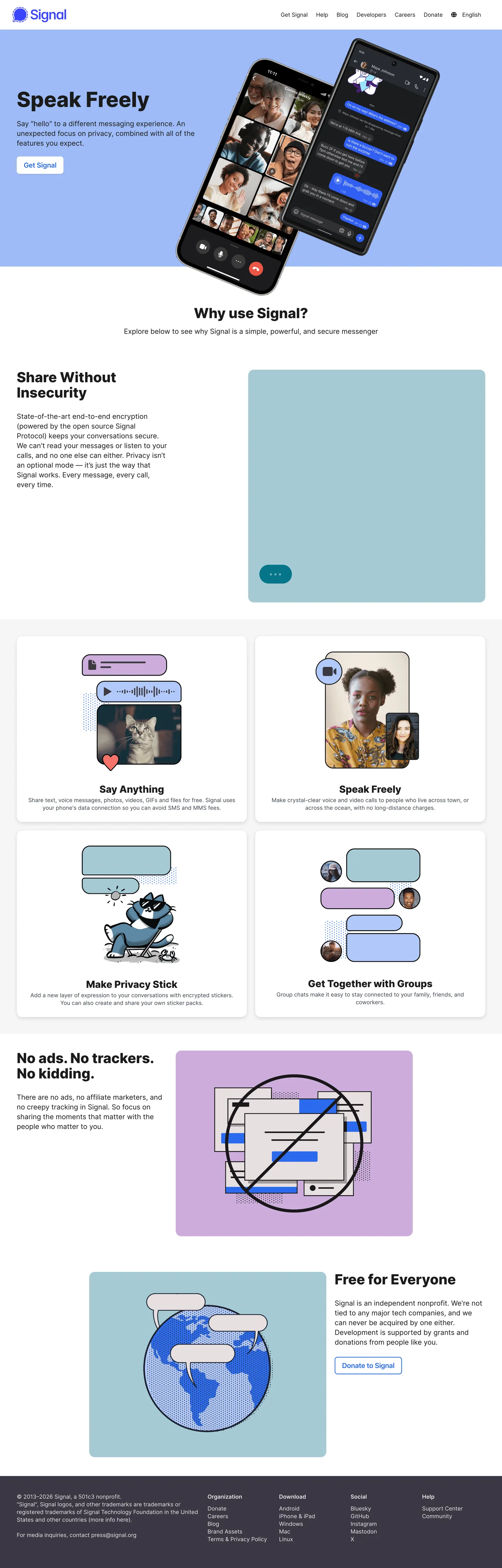
Signal's marketing site is built around four chat-bubble illustrations and one trust message. The above-fold hero pairs a "Speak Freely" headline at Inter 60px / weight 800 with a phone mockup showing a cobalt-blue Signal conversation thread — a contact list, a chat with read receipts, a voice-message wave. Below the fold, a 4-card "Why use Signal?" grid (Say Anything / Speak Freely / Make Privacy Stick / Get Together with Groups) presents each privacy theme on its own pastel ground — mint green, sky blue, lavender, sky blue — with the chat-bubble illustration as the visual anchor inside each card. The lower bands ("No ads. No trackers. No kidding." on lavender, "Free for Everyone" on lavender-blue) close the page on a single repeated chromatic ground that doubles as the brand's declared meta theme color.
The DESIGN.md file packages the system into a machine-readable spec for React tooling. Inside: 12 colors tokens — a pure white canvas, a near-black ink (#1b1b1b appearing 138 times as text and border), two structural neutrals (#e9e9e9 hairline at 106 occurrences, #404654 slate at 24 occurrences for the dark footer band), a cobalt link tone (#2942ff and #2c6bed, 8 combined occurrences for "Get Signal" CTAs and link text), and three pastel card grounds (lavender #e3e8fe from the declared meta theme, sky #9dbbf8, mint-teal #a5cad5). 8 typography tokens running Inter at weights 400 / 600 / 800 — no semibold ladder, no editorial-thin tier, no monospace voice. A binary 8/16px radius scale and 17 components covering the cobalt CTA, the pastel-ground feature card, the hairline-bordered grid card, the phone-mockup hero frame, and the footer-band split.
Feed this file to an AI coding tool and it reproduces Signal's specific moves: Inter at weight 800 across every display tier instead of weight 500-600, pastel card grounds rather than a single brand voltage, cobalt-blue scarcity (8 occurrences total) reserved for the primary CTA and link text, lavender-blue theme color (#e3e8fe) repeating across multiple bands, and a hairline-only depth tier with no shadow. The one move worth borrowing for any non-profit or trust-driven product: the willingness to commit to weight 800. Signal's brand voice is unequivocal — "say anything", "speak freely", "no ads, no trackers, no kidding" — and the typographic weight matches the message. Most editorial-leaning brands would soften the display to weight 500; Signal stays at 800 because the message is not subtle.
What makes it distinct
5
- Bold-weight displayInter 60px / weight 800 on the 'Speak Freely' hero, 40px / 800 on 'Why use Signal?', 28px / 800 on card titles; the brand sits at fintech-grade weight rather than the editorial-thin treatment its non-profit peers favor
- Pastel card groundsfour 'Why use Signal?' tiles each render on their own ground (mint, sky, lavender, sky-blue), turning the comparison grid into a chromatic survey of privacy themes
- Lavender theme-color#e3e8fe declared as the page meta theme color and used as the 'No ads. No trackers.' card ground; the warmest pastel in the system
- Signal blue scarcity#2c6bed and #2942ff together appear 8 total times on the captured page, reserved for the 'Get Signal' CTA and inline link text
- Hairline-only depth#e9e9e9 carries 106 occurrences as the 1px border on every card, with no shadow tier; depth comes from pastel grounds, not from elevation
signal.org
Live at signal.org
A snapshot of the brand in production. Scroll the frame to see the whole page.
Colors
12 colors
Signal's system anchors on #000000 (ink-black) as its primary color. Type is set in Inter across 8 tokens from 16px to 60px, weights 400–800. Shape language is mixed across 17 components, blending pills, soft rounds, and squarer corners.
Surface
Page and card backgrounds · 1
Text
Headlines, body, captions · 5
Borders & Hairlines
Dividers, outlines, rules · 1
Other
Specialty colors · 5
Typography
8 type tokens
Set in Inter across 8 tokens, from 16px to 60px, weights 400–800. Shown in its own stack: where the font isn't installed, the fallback the file names stands in.
- display-xl60px · weight 800 · lh 64pxThe quick brown fox jumps over the lazy dog
- display-lg40px · weight 800 · lh 44pxThe quick brown fox jumps over the lazy dog
- display-md28px · weight 800 · lh 32pxThe quick brown fox jumps over the lazy dog
- heading-md20px · weight 600 · lh 28pxThe quick brown fox jumps over the lazy dog
- body-lg20px · weight 400 · lh 28pxThe quick brown fox jumps over the lazy dog
- body-md16px · weight 400 · lh 24pxThe quick brown fox jumps over the lazy dog
- body-sm16px · weight 400 · lh 22pxThe quick brown fox jumps over the lazy dog
- button-md16px · weight 600 · lh 22pxThe quick brown fox jumps over the lazy dog
Layout
Radii and spacing
3 corner radii and 8 spacing values. Shape language: mixed.
Radii
- none0px
- sm8px
- lg16px
Spacing
- xs4px
- sm8px
- base12px
- lg16px
- xl30px
- 2xl32px
- 3xl48px
- 4xl64px
Components
17 components
Each rendered from its tokens (color, type, radius, padding) on Signal's own canvas.
- Hero Sectionhero-sectionHero Section
- Hero Headinghero-headingHero Heading
- Hero Subhero-subHero Sub
- Section Headingsection-headingSection Heading
- Card Titlecard-titleCard Title
- Body Paragraphbody-paragraphBody Paragraph
- Body Paragraph Secondarybody-paragraph-secondaryBody Paragraph Secondary
- Button Primarybutton-primaryButton Primary
- Button Secondarybutton-secondaryButton Secondary
- Top Navtop-navTop Nav
- Nav Linknav-linkNav Link
- Feature Card Lavenderfeature-card-lavenderFeature Card Lavender
- Feature Card Skyfeature-card-skyFeature Card Sky
- Feature Card Tealfeature-card-tealFeature Card Teal
- Hairline Cardhairline-cardHairline Card
- Band Lavenderband-lavenderBand Lavender
- FooterfooterFooter
In use
The system, in use
Signal's tokens on the kind of product it builds.
Build something people actually use.
A short paragraph of marketing copy that previews how the brand's display tier and body tier read together. Two sentences is usually enough.
FAQ
Signal design system FAQ
Common questions about Signal's tokens, components, and how to use this DESIGN.md in your project.
Read next
Related reading
Specs, directories, and component libraries that pair with this design system.
- Browse all design systemsThe full directory of DESIGN.md files on shadcn.io, with live mockups for each.shadcn.io
- Signal — official siteSignal's public marketing site — the source of truth for the live tokens captured in this file.signal.org (opens in a new tab)
- The DESIGN.md specificationGoogle Labs' open spec for machine-readable design system files — the format this page is built on.github.com (opens in a new tab)
Use it
Use Signal in your project
One machine-readable file. Drop it into Claude, Cursor, or any AI tool that reads DESIGN.md.
Download the DESIGN.md
One machine-readable file: every color, type, radius, spacing, and component token of Signal.
Feed it to your AI tool
Drop it into Claude, Cursor, or GitHub Copilot. The agent writes React components and Tailwind classes that match Signal's visual language.
Reference the tokens directly
Or paste the values into your Tailwind config, CSS variables, or component library: every color, size and radius is a quoted, ready-to-copy value.
Read the full DESIGN.md: overview, rationale, do’s and don’ts
Overview
Signal's marketing site reads the privacy-product brief the opposite way most of its non-profit peers do. Bold weight as trust: where Mozilla holds Firefox typography at editorial weight 500 and the EFF runs serif body at the same weight to signal earnestness, Signal commits to Inter weight 800 across every display tier — 60px hero, 40px section head, 28px card title. The bold-weight commitment is the chrome's main rhetorical move; the message ("speak freely", "no ads, no trackers, no kidding") is unequivocal and the typographic weight matches. Where Stripe at weight 300 and Patreon at weight 250 use light display weight as confidence, Signal does the inverse — heavy display weight is the brand's confidence signal.
Pastel grounds as survey: the "Why use Signal?" feature grid presents four privacy themes on four different pastel grounds — lavender {colors.card-lavender} (#e3e8fe, the declared page meta-theme color), sky-blue {colors.card-sky} (#9dbbf8), mint-teal {colors.card-teal} (#a5cad5), and a second sky-blue card. The "No ads. No trackers. No kidding." band repeats {colors.card-lavender}, and the "Free for Everyone" footer-adjacent band echoes it. Each card carries a stylized chat-bubble illustration tinted to its ground. Where most brands hold a single voltage in reserve for the CTA, Signal distributes its chromatic identity across four soft grounds and lets the comparison grid read as a chromatic survey of privacy ideas. The cobalt-blue {colors.signal-blue} and {colors.signal-cobalt} together appear only 8 times on the captured page — reserved for the "Get Signal" CTA and inline link words.
Hairline-only depth: the structural binary is pure white canvas ({colors.canvas} — #ffffff) and near-black ink ({colors.ink} — #1b1b1b, frequency 138 as text and border), with a single 1px hairline tone ({colors.hairline} — #e9e9e9, frequency 106) on every card outline. The system carries no shadow tier; depth comes from pastel-ground value contrast and from the 1px hairline border that traces every grid card. The footer band shifts to a dark slate ({colors.ink-slate} — #404654) for the closing footnote-credits surface; this is the only non-pastel band on the page.
Key Characteristics:
- Pure-white canvas (
{colors.canvas}— #ffffff), with hairline borders ({colors.hairline}— #e9e9e9, frequency 106) doing the entire elevation job. - Inter at weight 800 across every display tier (60px / 40px / 28px). Body at weight 400; the only semibold sits at 16px / 600 on small card-title and button labels.
- Lavender meta theme-color (
{colors.card-lavender}— #e3e8fe) declared on the page meta tag and used as both feature-card ground and band fill. - Three pastel card grounds (
{colors.card-lavender},{colors.card-sky},{colors.card-teal}) populating the 4-card "Why use Signal?" grid — chromatic variety instead of single-voltage discipline. - Cobalt-blue scarcity:
{colors.signal-blue}(#2c6bed) and{colors.signal-cobalt}(#2942ff) together appear 8 times on the captured page, reserved for the "Get Signal" CTA and inline link text. - Binary radius scale: 8px on CTAs / inline tags, 16px on cards and panel bands. No 4px, no 12px, no pill.
- Ink at #1b1b1b (frequency 138) rather than pure black — the dominant text color across every tier, carrying both text duty (69x) and border duty (69x) at the same weight.
- Dark slate footer (
{colors.ink-slate}— #404654, frequency 24) as the only non-pastel band on the page — the credits / sister-organization surface ("Signal Foundation", "Signal Messenger LLC").
Colors
Brand
- Signal Blue (
{colors.signal-blue}— #2c6bed): frequency 4 — used as text 2 times, border 2 times. The lighter cobalt — fills the "Get Signal" CTA and the inline-link underline tone. - Signal Cobalt (
{colors.signal-cobalt}— #2942ff): frequency 4. Wired into 3 CSS variables. The darker cobalt — used as the inline-link text color and the navigation link tone. - Card Lavender (
{colors.card-lavender}— #e3e8fe): declared as the page metatheme-color. Frequency 1 as background in the captured render, but used as the architectural band fill for "No ads. No trackers. No kidding." and "Free for Everyone." The system's declared brand chromatic — softer than the cobalts; pastel-led identity. - Card Sky (
{colors.card-sky}— #9dbbf8): frequency 1 — used as background. The "Make Privacy Stick" card ground. A mid-saturation sky blue. - Card Teal (
{colors.card-teal}— #a5cad5): frequency 1 — used as background. The "Speak Freely" card ground. A muted mint-teal pastel.
Surface
- Canvas (
{colors.canvas}— #ffffff): frequency 9 as background, plus the implicit page floor. Wired into 50 CSS variables across the Bulma framework Signal uses. The dominant page surface beneath every band and card.
Text
- Ink (
{colors.ink}— #1b1b1b): frequency 138 — used as text 69 times and border 69 times. The dominant text color across hero, headings, body, card titles, and as the 1px border on the "Get Signal" CTA. Not pure black; a 10% lightness ink that reads softer at the bold-800 weights. - Ink Black (
{colors.ink-black}— #000000): frequency 10. Used very rarely — reserved for the small set of true-black emphasis tokens; pure black would be too cold against the lavender / teal pastels. - Ink Slate (
{colors.ink-slate}— #404654): frequency 24 — text 12, border 12. The dark slate that fills the footer-credits band — the only non-pastel band on the page. - Ink Shadow (
{colors.ink-shadow}— #3c3744): frequency 1. A near-black with a violet undertone used as a subtle decorative tile inside the privacy illustration. - Ink Charcoal (
{colors.ink-charcoal}— #333333): wired into 14 CSS variables. The mid-charcoal used for secondary text labels in the footer band.
Hairline
- Hairline (
{colors.hairline}— #e9e9e9): frequency 106 — text 53 times, border 53 times. The dominant border tone across every grid card outline, the phone-mockup frame, and the footer dividers. The single hairline tone — no second border variant.
Typography
Font Family
The system runs Inter as the sole typeface across every tier. The CSS declaration is the bare Inter, sans-serif chain — Signal does not declare a longer fallback stack because Inter is itself an open-source variable font and the brand expects it to load. A single system-ui exception appears once in the captured surface at 20px / 600 for a small-print legal label; the rest of the page is Inter.
The choice is itself a brand statement. Where Stripe ships Sohne-var, Patreon ships Oracle, and Cloudflare ships FT Kunst Grotesk + Apercu Mono Pro, Signal — a non-profit with no font-licensing budget — runs the same open-source Inter that the rest of the open-source web already runs. The marketing surface demonstrates that Inter at weight 800 can carry hero display work without any licensed display tier.
Hierarchy
| Token | Size | Weight | Line Height | Use |
|---|---|---|---|---|
{typography.display-xl} | 60px | 800 | 64px | Hero h1 ("Speak Freely") |
{typography.display-lg} | 40px | 800 | 44px | Section h2 ("Why use Signal?", "No ads. No trackers. No kidding.", "Free for Everyone") |
{typography.display-md} | 28px | 800 | 32px | Feature-card titles ("Say Anything", "Speak Freely", "Make Privacy Stick", "Get Together with Groups") |
{typography.heading-md} | 20px | 600 | 28px | Inline sub-headings, footer column titles |
{typography.body-lg} | 20px | 400 | 28px | Lead paragraphs ("State-of-the-art end-to-end encryption…") |
{typography.body-md} | 16px | 400 | 24px | Default running text, nav labels |
{typography.body-sm} | 16px | 400 | 22px | Caption text, secondary copy |
{typography.button-md} | 16px | 600 | 22px | Button labels — the weight-600 middle, sized to match body |
Principles
The weight ladder runs 400 / 600 / 800 — no 500, no 700, no 900. The system commits to three weights and uses them strictly: 400 for everything informational, 600 for actionable (button labels, h6-level micro-headings), 800 for every display tier. Weight 800 reads bolder than the more common weight 700 default of most marketing systems; the choice is deliberate — at 60px the difference between Inter's 700 and 800 cuts is visible, and Signal opts for the heavier of the two.
The display ladder skips intermediate sizes. 60px → 40px → 28px is the entire display range. There is no 48px or 32px middle, no 24px tertiary; the system jumps in 12-20px steps to keep the hierarchy unambiguous.
Note on Font Substitutes
Inter is itself the open-source default; no substitute is needed. If the local target ships its own variable sans (Geist, Manrope, IBM Plex Sans), substitute at the same weight values — 800 is the move to preserve, not the specific cut. The Signal site demonstrates Inter at unmodified default proportions; tracking is normal across every tier and no font-feature-settings overrides are declared.
Layout
Spacing System
- Base unit: 12px is the dominant captured gap value (frequency 30), with 4px and 8px appearing 4-7 times each.
- Tokens:
{spacing.xs}4px ·{spacing.sm}8px ·{spacing.base}12px ·{spacing.lg}16px ·{spacing.xl}30px ·{spacing.2xl}32px ·{spacing.3xl}48px ·{spacing.4xl}64px. - Section padding (vertical): ~64px on the hero and the lavender bands; ~48px on the feature-grid section.
- Card internal padding: feature cards carry
{spacing.2xl}(32px) of inner padding; the "Share Without Insecurity" lead-paragraph card carries 48px. - Top-nav padding:
{spacing.base}(12px) vertical,{spacing.xl}(30px) horizontal.
Grid & Container
- Max content width: the section h2 ("Why use Signal?") spans 1344px in the captured render; lead paragraphs constrain to ~432px width.
- Hero: 2-column grid pairing the headline + CTA stack on the left with a phone-mockup carousel on the right. The phone frame is itself a 16px-radius rounded rectangle with a chamfer-emulating outer frame.
- Feature grid: 2-column, 2-row grid of 4 pastel cards. Each card holds a 28px / 800 title, a body paragraph, and a stylized chat-bubble illustration.
- Lavender bands: edge-to-edge fills with the section h2 centered horizontally and a short body paragraph beneath.
Rhythm
The page reads as a sequence of three rhythmic blocks: (1) hero with phone-mockup, (2) 4-card feature grid on white canvas, (3) full-bleed lavender / sky / mint bands that close the page on the "no ads, no trackers" message and the "Free for Everyone" call. The grid is the densest section; the bands are the most generous. There is no asymmetric "split panel" anywhere — every section is either centered or 2-up symmetric.
Elevation
The system has essentially no shadow tier. The captured page reports zero shadow occurrences across the structural color set; depth comes from the 1px {colors.hairline} (#e9e9e9) border on every card and from the pastel-ground contrast against the white canvas. Where the system needs a sense of physical layering, it uses the phone-mockup illustration in the hero — the phone screen is a 16px-radius rounded rectangle with a 1px hairline border, sitting flat on the canvas without any drop shadow.
- Flat (no shadow): every band and every card on the page.
- Hairline borders:
{colors.hairline}(#e9e9e9) carries 53 of the captured border occurrences — every feature-card outline, every footer divider, every "Get Signal" button outline. - Pastel-ground contrast: the four feature-grid cards sit on
{colors.card-lavender},{colors.card-sky}, and{colors.card-teal}over the white canvas — the ground-against-canvas value contrast does the elevation work that shadows would do elsewhere.
Shapes
The radius scale is binary at 8 / 16px.
{rounded.none}0px — full-bleed bands, edge-to-edge lavender / sky sections.{rounded.sm}8px (frequency 2) — the "Get Signal" CTA and small inline tags.{rounded.lg}16px (frequency 7) — every feature card, the phone-mockup frame, the "Share Without Insecurity" lead-paragraph card.
There is no 4px or 12px middle, no pill. The 8px CTA reads as the tightest interactive surface; the 16px card reads as a soft container. The contrast is the system's micro-affordance signal — buttons are smaller-rounded than the cards they sit inside.
Components
hero-section — White {colors.canvas} canvas, 48px internal padding, no radius. Holds the hero heading + CTA stack on the left and the phone-mockup carousel on the right.
hero-heading — Ink {colors.ink} text at {typography.display-xl} (60px / 800). The single loudest typographic moment in the system; the bold weight is the brand's voice signal.
hero-sub — Default ink body text at {typography.body-md} directly under the hero heading; introduces the end-to-end encryption claim.
section-heading — Ink text at {typography.display-lg} (40px / 800). Used for "Why use Signal?", "No ads. No trackers. No kidding.", and "Free for Everyone."
card-title — Ink text at {typography.display-md} (28px / 800) inside each feature card. The four canonical instances are "Say Anything", "Speak Freely", "Make Privacy Stick", and "Get Together with Groups."
body-paragraph — Default ink running-text at {typography.body-lg} (20px / 400) — the lead-paragraph style used inside the "Share Without Insecurity" card and beneath section headings.
body-paragraph-secondary — Body-md (16px / 400) for tighter card-body copy.
button-primary — Signal-blue {colors.signal-blue} fill, white text, {rounded.sm} 8px radius, 8×12px padding, 40px height, weight 600. The "Get Signal" CTA — the single chromatic CTA on the page. "Continue" is the secondary instance.
button-secondary — White {colors.canvas} fill, signal-cobalt {colors.signal-cobalt} text, 1px cobalt outline, same 8px radius and dimensions. Used inside lavender bands where a chromatic-on-pastel CTA reads against the ground.
top-nav — White surface, 52px height, 12×30px padding. Signal wordmark flush left, product nav links flush right (Why Signal / Blog / Donate / Download).
nav-link — Transparent background, signal-cobalt text at {typography.body-md} (16px / 400), 8×12px padding. The cobalt-blue link tone is the brand's signature treatment for inline navigation.
feature-card-lavender — Lavender {colors.card-lavender} (#e3e8fe) fill, ink text, 16px {rounded.lg} radius, 32px internal padding, 1px hairline border. The "No ads. No trackers." card composition.
feature-card-sky — Sky-blue {colors.card-sky} (#9dbbf8) fill, ink text, same 16px radius and 32px padding. The "Make Privacy Stick" card.
feature-card-teal — Mint-teal {colors.card-teal} (#a5cad5) fill. The "Speak Freely" card; the cool-teal ground pairs with the warm-lavender card to keep the 4-card grid chromatically varied.
hairline-card — White fill with a 1px hairline outline. Used inside the lavender bands where the card needs to sit on a pastel ground without competing with another pastel.
band-lavender — Full-bleed {colors.card-lavender} fill, ink text, no radius, 64×48px padding. The "No ads. No trackers." and "Free for Everyone" architectural bands.
footer — Dark slate {colors.ink-slate} (#404654) fill, white text at {typography.body-sm}, 48×32px padding. The only dark band on the page; holds the Signal Foundation / Signal Messenger LLC credits and the cross-product links (GitHub, Sustainer, Donate).
Do's and Don'ts
Do commit to Inter weight 800 across every display tier. The bold-weight commitment is the chrome's main rhetorical move; the message ("speak freely", "no kidding") is unequivocal and the typographic weight matches. Dropping to weight 600 turns the page into a generic non-profit marketing surface and erases the trust-through-weight signal.
Do use multiple pastel grounds ({colors.card-lavender}, {colors.card-sky}, {colors.card-teal}) rather than holding one voltage in reserve. The chromatic strategy is one-color-per-theme; the 4-card feature grid reads as a survey of privacy ideas, not as a single brand statement.
Do keep the cobalt-blues ({colors.signal-blue}, {colors.signal-cobalt}) scarce — 8 total occurrences on the captured page, reserved for the "Get Signal" CTA and inline links. The brand-identity in the app is the cobalt chat-bubble fill; on the marketing surface the cobalt sits at text level, not at architecture level.
Do use {colors.ink} (#1b1b1b) for every text and border surface — not pure black. The 10% lightness ink reads softer against the pastel card grounds; pure {colors.ink-black} (#000000) would feel too cold against the lavender / teal cards.
Don't bind the cobalt-blue to card or band fills. Filling a feature card with {colors.signal-blue} (#2c6bed) would reverse the chromatic strategy — the pastels carry architecture, the cobalts carry affordance. Mixing the two tiers erases Signal's pastel-led identity.
Don't introduce a shadow tier. The system depends on hairline {colors.hairline} (#e9e9e9) borders and pastel-ground contrast for depth; adding a drop shadow to feature cards would re-skeuomorphize the surface and pull the design back toward consumer-app conventions Signal deliberately avoids.
Don't add a 12px or 24px middle radius. The system is binary at 8px (CTAs) and 16px (cards). A middle radius would blur the line between affordance and container and weaken the micro-tap-affordance signal.
Don't swap Inter for a licensed display family. Signal's choice to run open-source Inter at weight 800 is itself a brand position — a non-profit demonstrating that no custom font is needed when the message and the weight are right. Substituting a licensed display would compromise the typographic claim.
Known Gaps
- Hover and focus states: the captured marketing surfaces show resting states only; the full state matrix (focus rings, active press, disabled tints, link-underline hover) is not exposed in the static render.
- Form input error states: no text input is rendered on the captured surface — Signal's marketing site carries no signup, search, or comment field. The
text-inputcomponent is omitted from the spec because the system does not declare one. - App surfaces: this DESIGN.md captures signal.org (the marketing site and download portal) only. The Signal Messenger desktop, iOS, and Android apps carry a richer token system — chat-bubble fills, message-state indicators, voice-call surfaces, sticker-pack chrome — that is not represented here.
- Motion: the hero phone-mockup carousel cycles through three conversation views on a timer, and the chat-bubble illustrations animate on scroll-into-view; the spec captures end-state values only. Easing curves, timing, and stagger live in the live runtime.
- Dark mode: the captured marketing surface is light-only. The Signal app itself ships a dark variant, but the marketing chrome runs the lavender-on-white treatment exclusively.
- Localization surfaces: Signal renders in 60+ languages; the captured page is the English variant. Display-size proportions tighten in CJK locales to accommodate character heights, but those tokens are not represented here.
- Donation flow: the "Free for Everyone" closing band carries a "Sustainer / Donate" CTA that leads to a separate donation-flow surface (signalfoundation.org); that surface carries its own forms and is not captured.
Communication & Messaging
More systems like this
More DESIGN.md files in Communication & Messaging.
Pricing
Build it with Pro
The DESIGN.md files are free. Pro adds 6,000+ blocks, premium templates and the MCP server, so your AI editor builds in your system for you.
4.9/5 out of 5 · 150+ reviewsfrom 150+ founders and developers.
Billing
Billed once a year in USD. Cancel anytime.
- How many people can use the license.
- Client work, SaaS products and anything you charge for.
- Production-ready React sections: hero, pricing, features, dashboards and more.
- Complete multi-page sites you can ship as they are.
- React icons from every major library, installable with one command.
- Presets that restyle every block, in light and dark.
- Lets your AI editor search, preview and install blocks for you.
- Priority requests are answered first.
Individual
For personal projects & open source
$32instead of $49/mo
$389 billed yearly
- Seats: 1 seat
- Commercial use: Personal & open source only
- Pro blocks: 6,000+ blocks
- Templates: All 14 templates
- React icons: 294k+ icons
- Themes: All 59 themes
- MCP server: Basic usage
- Support: Standard
Team
Most popularFor freelancers, agencies & startups
$66instead of $99/mo
$789 billed yearly · ≈ $13/dev/mo
- Seats: Up to 5 seats
- Commercial use: Included
- Pro blocks: 6,000+ blocks
- Templates: All 14 templates
- React icons: 294k+ icons
- Themes: All 59 themes
- MCP server: High usage
- Support: Priority
Organization
For companies with larger teams
$132instead of $199/mo
$1,589 billed yearly
- Seats: Unlimited seats
- Commercial use: Included
- Pro blocks: 6,000+ blocks
- Templates: All 14 templates
- React icons: 294k+ icons
- Themes: All 59 themes
- MCP server: Unlimited usage
- Support: Priority
Billed once a year in USD. Cancel anytime.
Individual
For personal projects & open source
$32instead of $49/mo
$389 billed yearly
- How many people can use the license.Seats: 1 seat
- Client work, SaaS products and anything you charge for.Commercial use: Personal & open source only
- Production-ready React sections: hero, pricing, features, dashboards and more.Pro blocks: 6,000+ blocks
- Complete multi-page sites you can ship as they are.Templates: All 14 templates
- React icons from every major library, installable with one command.React icons: 294k+ icons
- Presets that restyle every block, in light and dark.Themes: All 59 themes
- Lets your AI editor search, preview and install blocks for you.MCP server: Basic usage
- Priority requests are answered first.Support: Standard
Team
Most popularFor freelancers, agencies & startups
$66instead of $99/mo
$789 billed yearly · ≈ $13/dev/mo
Everything in Individual, plus
- How many people can use the license.Seats: Up to 5 seats
- Client work, SaaS products and anything you charge for.Commercial use: Included
- Lets your AI editor search, preview and install blocks for you.MCP server: High usage
- Priority requests are answered first.Support: Priority
Organization
For companies with larger teams
$132instead of $199/mo
$1,589 billed yearly
Everything in Team, plus
- How many people can use the license.Seats: Unlimited seats
- Lets your AI editor search, preview and install blocks for you.MCP server: Unlimited usage
- Secure checkout via Stripe
- Code lives in your repo
- Keep what you've shipped if you cancel
- License terms
Your system, built for you
Every block, template and icon, installed by your AI agent in your design system. The DESIGN.md files stay free.