Loom Design System
Loom's design system as a DESIGN.md file. Loom Blue #1868db, Charlie Display, pill geometry, 18 components. For React, Next.js, and AI tools.
Add shadcn.io to your AI agent. · Pro It installs blocks, icons and templates in your design system from a prompt, with Pro.
Set up MCP- Primary
- #1868db
- Typeface
- Charlie Text
- Shape
- Mixed
- Base radius
- 12px
- Colors
- 19
- Type tokens
- 11
- Components
- 18
- Spacing values
- 8
About
About Loom DESIGN.md
Curated by Dov Azencot · Updated May 13, 2026 · Source loom.com (opens in a new tab)
Loom's marketing page is a white canvas with a single saturated voltage — Loom Blue (#1868db) — carrying every primary CTA, link underline, and focus ring across the surface. The body charcoal (#292a2e) does the workhorse text duty at 551 occurrences across paragraphs and nav links. Headlines are Charlie Display at weight 700 with no negative tracking, an unusual choice in a SaaS category where most competitors pull -1px to -2px on display copy. Body type is Charlie Text at weight 400. The page floor is pure white (#ffffff); structural depth comes from very pale blue tints (#e9f2fe) rather than gray ladders. The record-red token (#ff613d) exists in the variables but appears only as the in-product recording affordance — it is deliberately kept out of marketing chrome.
The DESIGN.md file packages 19 colors tokens, 11 typography styles, 5 corner radii, 8 spacing values, and 18 components. The 450 CSS custom properties on the live :root resolve to a much smaller perceptual palette — Loom Blue plus a graded blue ladder (#1558bc hover, #123263 active, #cfe1fd light), record red, plus an extended in-product report swatch set covering green, violet, and yellow that lives inside product mockups rather than marketing surfaces. The format is the Google Labs DESIGN.md spec — a machine-readable file with token references like `{colors.loom-blue}` and `{typography.display-xl}` that designers and AI agents can both parse.
Feed the file to Claude, Cursor, or GitHub Copilot and the agent will reproduce Loom's pill-first geometry: 9999px CTAs, white card surfaces, blue accent reserved strictly for action. Reference the tokens directly in Tailwind config or CSS variables, or paste the components block into a design audit. The discipline worth studying is the refusal of two SaaS shortcuts at once — display-weight negative tracking and a rainbow accent palette — in favor of one geometric move (pills) and one voltage (Loom Blue) repeated across every viewport.
What makes it distinct
5
- Pill geometry as signature62 of the captured radius values are 9999px against just 4 rectangle-card values
- Single brand voltageLoom Blue (#1868db) reserved for CTAs, links, focus rings, never decorative fills
- Record red (#ff613d) scoped to in-product recording dots onlykept out of marketing chrome by design
- Charlie Display weight 700 carries the entire heading scale at 63px hero with zero negative tracking
- White canvas with very pale blue tints (#e9f2fe) as the only structural surface variation
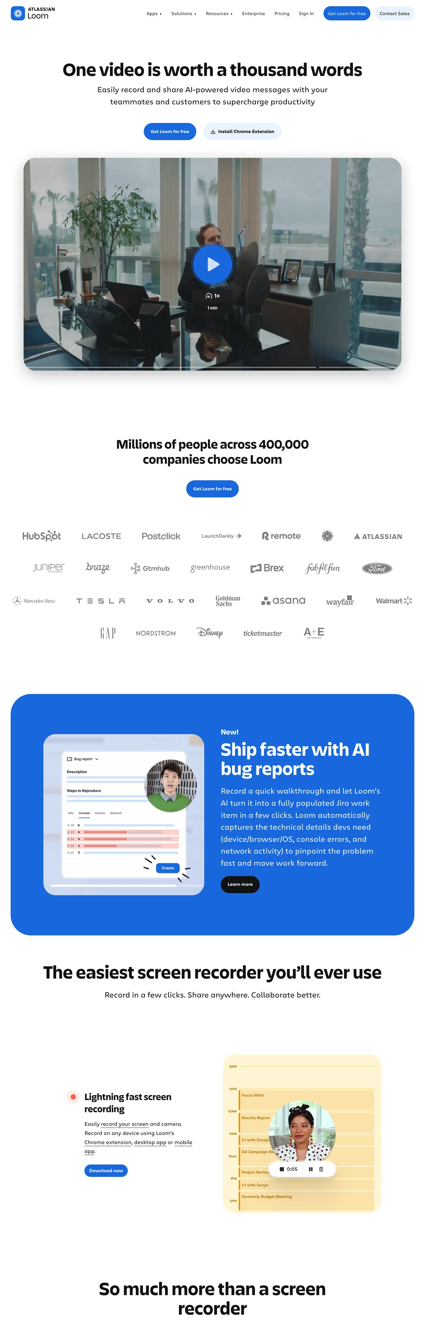
loom.com
Live at loom.com
A snapshot of the brand in production. Scroll the frame to see the whole page.
Colors
19 colors
Loom's system runs on #1868db as its primary voltage, used in 4 of 18 components. Type is set in Charlie Text across 11 tokens from 12px to 63px, weights 400–700. Shape language is mixed across 18 components, blending pills, soft rounds, and squarer corners.
Surface
Page and card backgrounds · 3
Text
Headlines, body, captions · 5
Borders & Hairlines
Dividers, outlines, rules · 1
Other
Specialty colors · 10
Typography
11 type tokens
Set in Charlie Text across 11 tokens, from 12px to 63px, weights 400–700. Shown in its own stack: where the font isn't installed, the fallback the file names stands in.
- display-xl63px · weight 700 · lh 1.03The quick brown fox jumps over the lazy dog
- display-lg44px · weight 700 · lh 1.14The quick brown fox jumps over the lazy dog
- display-md32px · weight 700 · lh 1.27The quick brown fox jumps over the lazy dog
- heading-md25px · weight 700 · lh 1.33The quick brown fox jumps over the lazy dog
- body-xl26px · weight 400 · lh 1.52The quick brown fox jumps over the lazy dog
- body-lg18px · weight 400 · lh 1.65The quick brown fox jumps over the lazy dog
- body-md16px · weight 400 · lh 1.5The quick brown fox jumps over the lazy dog
- body-sm15px · weight 400 · lh 1.71The quick brown fox jumps over the lazy dog
- caption12px · weight 400 · lh 1.45The quick brown fox jumps over the lazy dog
- eyebrow12px · weight 700 · lh 1.45The quick brown fox jumps over the lazy dog
- button-md16px · weight 400 · lh 1.5The quick brown fox jumps over the lazy dog
Layout
Radii and spacing
5 corner radii and 8 spacing values. Shape language: mixed.
Radii
- none0px
- sm6px
- md12px
- lg16px
- pill9999px
Spacing
- xxs4px
- xs8px
- sm12px
- md16px
- lg24px
- xl40px
- xxl72px
- section111px
Components
18 components
Each rendered from its tokens (color, type, radius, padding) on Loom's own canvas.
- Button Primarybutton-primaryButton Primary
- Button Primary Hoverbutton-primary-hoverButton Primary Hover
- Button Primary Activebutton-primary-activeButton Primary Active
- Button Secondarybutton-secondaryButton Secondary
- Button Darkbutton-darkButton Dark
- LinklinkLink
- Highlight Chiphighlight-chipHighlight Chip
- Feature Cardfeature-cardFeature Card
- Feature Bandfeature-bandFeature Band
- Video Framevideo-frameVideo Frame
- Type here…text-inputText Input
- Type here…text-input-focusedText Input Focused
- Top Navtop-navTop Nav
- Nav Linknav-linkNav Link
- Recording Dotrecording-dotRecording Dot
- Logo Rowlogo-rowLogo Row
- Cta Sectioncta-sectionCta Section
- FooterfooterFooter
In use
The system, in use
Loom's tokens on the kind of product it builds.
Build something people actually use.
A short paragraph of marketing copy that previews how the brand's display tier and body tier read together. Two sentences is usually enough.
FAQ
Loom design system FAQ
Common questions about Loom's tokens, components, and how to use this DESIGN.md in your project.
Read next
Related reading
Specs, directories, and component libraries that pair with this design system.
- Browse all design systemsThe full directory of DESIGN.md files on shadcn.io, with live mockups for each.shadcn.io
- Loom — official siteLoom's marketing site — async video messaging for work, with the design surface this file extracts.loom.com (opens in a new tab)
- The DESIGN.md specificationGoogle Labs' open spec for machine-readable design system files — the format this page is built on.github.com (opens in a new tab)
Use it
Use Loom in your project
One machine-readable file. Drop it into Claude, Cursor, or any AI tool that reads DESIGN.md.
Download the DESIGN.md
One machine-readable file: every color, type, radius, spacing, and component token of Loom.
Feed it to your AI tool
Drop it into Claude, Cursor, or GitHub Copilot. The agent writes React components and Tailwind classes that match Loom's visual language.
Reference the tokens directly
Or paste the values into your Tailwind config, CSS variables, or component library: every color, size and radius is a quoted, ready-to-copy value.
Read the full DESIGN.md: overview, rationale, do’s and don’ts
Overview
Loom's marketing canvas is a white ground ({colors.canvas} #ffffff) with a single saturated voltage — Loom Blue ({colors.loom-blue} #1868db) — carrying every primary CTA, inline link, focus ring, and highlight chip. The body charcoal ({colors.ink-body} #292a2e) is the workhorse text color across paragraphs and nav. Headlines step up to a darker near-black ({colors.ink} #101214) and run Charlie Display at weight 700.
Pill geometry as signature: where most SaaS systems lean on 8–12px rounded rectangles for every interactive element, Loom commits to pills ({rounded.pill} 9999px) for every button, chip, and tag — 62 captured pill values against just 4 corner-12px card values. The 12px radius is reserved for content surfaces (video frames, feature cards), so the two geometries never compete: pills are interactive, rectangles are content.
Display type is Charlie Display at weight 700 with zero negative letter-spacing — a deliberate counter-move to the SaaS category default. Stripe, Linear, and Vercel all pull tracking aggressively negative on display copy; Loom keeps it at 0 and lets the type breathe. Body type is Charlie Text at weight 400, with weight 700 for emphasis. There is no separate mono family.
The record red ({colors.record-red} #ff613d) is the system's most disciplined token. It surfaces only on the in-product recording dot — never on a CTA, never as a section background, never as decorative emphasis. This is intentional: red on a video product means a camera is rolling, and Loom protects that semantic.
Key Characteristics:
- Pill-first geometry —
{rounded.pill}carries every interactive control;{rounded.md}is content-card-only. - Single voltage — Loom Blue
{colors.loom-blue}(#1868db) is the only chromatic accent; record red is scoped to in-product use. - Zero negative tracking on display copy — Charlie Display 63px hero runs at letter-spacing 0, contrary to the category default.
- White canvas with blue tint depth —
{colors.surface-blue-tint}#e9f2fe replaces the gray ladder most SaaS pages use. - Hairline borders over shadows — only the top nav carries a real shadow; cards depend on
{colors.hairline}#e4e2e7. - Two-tier ink stack —
{colors.ink}#101214 for headlines,{colors.ink-body}#292a2e for body, separated by ~7% lightness.
Colors
- Loom Blue (
#1868db) — frequency 81. Used as text (36), border (36), background (9). The brand voltage; mapped to--lns-color-primary,--lns-color-highlight, and--lns-color-info. Reserved for primary pill CTAs, inline links, focus chips. - Ink (
#101214) — frequency 518. Used as text (257), border (257), background (4). Near-black ink for h1 / h2 headlines; mapped to--thd-color-blackand--lns-color-disabledBackground. - Ink Body (
#292a2e) — frequency 551. Used as text (275), border (275), background (1). The workhorse body color across paragraphs and nav links; mapped to--lns-color-body. - Canvas (
#ffffff) — frequency 109. Used as background (16), text (45), border (45). The page floor and card surface — Loom does not use a tinted canvas. - Surface Blue Tint (
#e9f2fe) — frequency 37. Used as background (27), text (4), border (4). The depth cue — a pale blue band that lifts feature sections off the white canvas. - Loom Blue Hover (
#1558bc) — frequency 2. The CTA hover step; mapped to--lns-color-primaryHover. - Loom Blue Active (
#123263) — frequency 2. The CTA pressed step; mapped to--lns-color-primaryActiveand--lns-color-blurpleStrong. - Loom Blue Light (
#cfe1fd) — frequency 0 on captured page; declared as--thd-color-blue-20/--lns-color-blueLightfor light-tinted blue surfaces. - Ink Muted (
#6c6f77) — frequency 0 declared; mapped to--lns-color-bodyDimmedand--thd-color-grey-70for dimmed body copy. - Ink Subtle (
#8c8f97) — frequency 0 declared; the form-field border token (--lns-color-formFieldBorder). - Ink Disabled (
#b7b9be) — frequency 0 declared; mapped to--lns-color-disabledContentfor greyed-out controls. - Hairline (
#e4e2e7) — frequency 0 declared; mapped to--thd-color-grey-30and--lns-themeDark-color-borderfor card / divider hairlines. - Record Red (
#ff613d) — frequency 5. Used as text (2), background (1), border (2). The in-product recording state — mapped to--lns-color-recordand never used on marketing chrome. - Report Green (
#82b536) — frequency 3. Background-only. Lives inside in-product analytics swatches; mapped to--thd-color-green-50. - Report Violet (
#bf63f3) — frequency 2. Text and border use; mapped to--thd-color-violet-50. Appears in product-mockup data tags. - Report Violet Deep (
#48245d) — frequency 1. Background use; the upgrade-CTA hover background (--lns-color-upgradeHoverdark variant). - Report Yellow (
#ffc716) — frequency 0 declared; the warning state token (--lns-color-warning). - Focus Ring (
#4d8ced) — frequency 0 declared; mapped to--lns-color-focusRingfor keyboard-focus outlines. - Surface Elevated (
#1e1f21) — frequency 0 declared; the dark-mode card background (--lns-themeDark-color-backgroundSecondary).
Typography
Loom runs two proprietary families: Charlie Display for headlines and Charlie Text for body copy and UI. Charlie Display appears only on h1, h2, h3 and large display blockquotes; everything else is Charlie Text. The display tier sits at weight 700 across all sizes — Loom does not vary display weight, only size and line-height.
Light weight as absence: where most SaaS systems offer a weight-300 or weight-500 display option, Loom does not. Every headline is weight 700. The variation across the hierarchy is achieved through size (63px → 44px → 32px → 25px) and line-height (1.03 → 1.14 → 1.27 → 1.33), never through weight modulation.
The hero h1 is 63.27px Charlie Display at weight 700, line-height 65.1px (so 1.029), letter-spacing 0. No tracking adjustment is applied at any tier — display through caption all sit at letter-spacing 0. This is the most distinctive typographic decision in the system and runs contrary to the category default of negative tracking on display copy.
Body type splits into four tiers: body-xl (26.65px / 1.52, for marketing paragraph copy), body-lg (18.62px / 1.65), body-md (16px / 1.5, the workhorse UI body), and body-sm (15.62px / 1.71). The eyebrow style is Charlie Text 12.62px at weight 700, uppercase — the only uppercase text-transform in the system, scoped to section labels (h4) and small uppercase eyebrows.
Layout
Loom's marketing surface uses a centered single-column layout with generous vertical rhythm — the captured page spans 4500px tall against a 1440px viewport, so the page is roughly 3.1 viewports of scroll. Section spacing leans on {spacing.section} 111px between major bands and {spacing.xxl} 72px between blocks within a section.
Horizontal padding on hero and feature copy sits at {spacing.xl} 40px on the outer container with 0px 36px on the nav. Cards inside a section bound at 24px ({spacing.lg}) internal padding for feature cards and 40px ({spacing.xl}) for the prominent blue feature band that hosts product screenshots.
The grid is content-led rather than 12-column rigid — long-form sections sit centered at roughly 720px max-width, while product-mockup bands extend to a wider 1100px frame to let the screenshot read.
Elevation & Depth
The page is compositionally flat outside of the top nav. The only declared shadow is --thd-shadow-nav, a 3-layer black stack at 4 / 6 / 10 percent opacity (0 0.125rem 0.375rem rgba(0,0,0,.04), 0 0.3125rem 1.125rem rgba(0,0,0,.06), 0 1.5rem 5.1875rem rgba(0,0,0,.1)). Cards inside sections do not carry shadows.
Depth instead comes from two moves: hairline borders ({colors.hairline} #e4e2e7) that draw a thin perimeter around content cards, and blue-tint surface lifts ({colors.surface-blue-tint} #e9f2fe) where an entire section band switches from white to pale blue to signal a new content block. The blue feature band is the most prominent example — a full-width 16px-radius card filled with Loom Blue ({colors.loom-blue} #1868db) that hosts a feature pitch and product screenshot.
Shapes
The radius scale is extreme by SaaS standards: 62 occurrences of 9999px against just 4 occurrences of 12px. Pills dominate, rectangles are scarce. The split is semantic — interactive controls (buttons, chips, tags, the search input) are pills; content surfaces (video frames, feature cards, the blue feature band at 16px) are rounded rectangles; section containers are square.
The five-step scale: {rounded.none} 0px for section containers, {rounded.sm} 6px for form inputs, {rounded.md} 12px for feature cards and video frames, {rounded.lg} 16px for the prominent blue feature band, {rounded.pill} 9999px for every interactive control.
Components
- button-primary — Loom Blue pill, 48px tall, 8/16px padding, Charlie Text 16px weight 400.
- button-primary-hover — steps to
{colors.loom-blue-hover}#1558bc; everything else holds. - button-primary-active — steps to
{colors.loom-blue-active}#123263 deep navy. - button-secondary — white pill with
{colors.hairline}1px border, ink-body label. - button-dark — near-black pill (
{colors.ink}#101214) for inverted contexts. - link — Loom Blue text on Charlie Text 16px, used for inline anchors.
- highlight-chip — surface-blue-tint pill with Loom Blue label, 4/12px padding, the section-eyebrow pattern.
- feature-card — white surface, 12px radius, hairline border, 24px padding.
- feature-band — Loom Blue background, 16px radius, 40px padding — the prominent blue product band.
- video-frame — white surface with hairline border at 12px radius, the embedded Loom recording frame.
- text-input — white field, 6px radius, ink-subtle 1px border, 8/12px padding.
- text-input-focused — swaps border to a 2px focus-ring (#4d8ced).
- top-nav — 72px tall, white, 0/36px padding, carries the only real shadow in the system.
- nav-link — ink-body text, 48px hit-target.
- recording-dot — record-red 8px circle; the in-product recording affordance.
- logo-row — white band with muted-ink labels, 40px vertical padding — the "trusted by" customer-logo strip.
- cta-section — surface-blue-tint band, 16px radius, 72/40px padding, display-md headline.
- footer — white surface, muted-ink labels, 72/36px padding.
Do's and Don'ts
Do use {rounded.pill} for every interactive control — buttons, chips, tags. Pill geometry is the system's load-bearing identity move; switching a CTA to a 12px rounded rectangle breaks the silhouette.
Do keep {colors.loom-blue} (#1868db) for CTAs and links. Pair it with white canvas and ink-body text; do not introduce a second chromatic accent on the same viewport.
Do set display letter-spacing to 0. Charlie Display at 63px is designed to sit at neutral tracking — pulling it to -1px or -2px collapses the breathing room the system relies on.
Don't use {colors.record-red} (#ff613d) for marketing CTAs, error states, or decorative emphasis. It is scoped to the in-product recording affordance and --lns-color-record only — surfacing it elsewhere breaks the camera-is-rolling semantic.
Don't use {colors.surface-blue-tint} (#e9f2fe) for body text or borders — it is a background-only token (27 of 37 occurrences are bg). For tinted-blue text on a light surface, use {colors.loom-blue} itself.
Don't shadow cards inside sections. The only declared shadow is the nav shadow; adding box-shadows to feature cards or the blue feature band flattens the contrast between nav (floating) and content (flat) that the system relies on.
Don't use Charlie Display for body copy. The family is scoped to h1, h2, h3, and large blockquotes — at 16px or 18px it sits oddly tight. Use Charlie Text for everything at 18px and below.
Don't introduce a 8px or 10px corner radius. The declared scale is 0 / 6 / 12 / 16 / 9999; intermediate values dilute the rectangle-vs-pill split that gives the system its geometric clarity.
Known Gaps
- The report palette (green, violet, yellow, deep violet) lives inside in-product analytics swatches rendered in marketing mockups; they are documented for completeness but are not brand surface colors.
- The focus-ring token (#4d8ced) is declared in
--lns-color-focusRingbut did not surface as a captured count on the marketing page — it is enforced via the focus state stylesheet rather than rendered statically. - Dark mode is documented through
--lns-themeDark-*variables (a near-black{colors.surface-elevated}#1e1f21 floor) but is not toggled on the public marketing surface. - Form-field error and validation styling is not visible on the inspected pages.
- Motion — Loom is a video product; the marketing surface includes auto-playing in-frame video and hover transitions on cards that are out of scope for a static token file.
- Charlie Display and Charlie Text are proprietary; Inter, Geist Sans, or Söhne are acceptable open substitutes.
Communication & Messaging
More systems like this
More DESIGN.md files in Communication & Messaging.
Pricing
Build it with Pro
The DESIGN.md files are free. Pro adds 6,000+ blocks, premium templates and the MCP server, so your AI editor builds in your system for you.
4.9/5 out of 5 · 150+ reviewsfrom 150+ founders and developers.
Billing
Billed once a year in USD. Cancel anytime.
- How many people can use the license.
- Client work, SaaS products and anything you charge for.
- Production-ready React sections: hero, pricing, features, dashboards and more.
- Complete multi-page sites you can ship as they are.
- React icons from every major library, installable with one command.
- Presets that restyle every block, in light and dark.
- Lets your AI editor search, preview and install blocks for you.
- Priority requests are answered first.
Individual
For personal projects & open source
$32instead of $49/mo
$389 billed yearly
- Seats: 1 seat
- Commercial use: Personal & open source only
- Pro blocks: 6,000+ blocks
- Templates: All 14 templates
- React icons: 294k+ icons
- Themes: All 59 themes
- MCP server: Basic usage
- Support: Standard
Team
Most popularFor freelancers, agencies & startups
$66instead of $99/mo
$789 billed yearly · ≈ $13/dev/mo
- Seats: Up to 5 seats
- Commercial use: Included
- Pro blocks: 6,000+ blocks
- Templates: All 14 templates
- React icons: 294k+ icons
- Themes: All 59 themes
- MCP server: High usage
- Support: Priority
Organization
For companies with larger teams
$132instead of $199/mo
$1,589 billed yearly
- Seats: Unlimited seats
- Commercial use: Included
- Pro blocks: 6,000+ blocks
- Templates: All 14 templates
- React icons: 294k+ icons
- Themes: All 59 themes
- MCP server: Unlimited usage
- Support: Priority
Billed once a year in USD. Cancel anytime.
Individual
For personal projects & open source
$32instead of $49/mo
$389 billed yearly
- How many people can use the license.Seats: 1 seat
- Client work, SaaS products and anything you charge for.Commercial use: Personal & open source only
- Production-ready React sections: hero, pricing, features, dashboards and more.Pro blocks: 6,000+ blocks
- Complete multi-page sites you can ship as they are.Templates: All 14 templates
- React icons from every major library, installable with one command.React icons: 294k+ icons
- Presets that restyle every block, in light and dark.Themes: All 59 themes
- Lets your AI editor search, preview and install blocks for you.MCP server: Basic usage
- Priority requests are answered first.Support: Standard
Team
Most popularFor freelancers, agencies & startups
$66instead of $99/mo
$789 billed yearly · ≈ $13/dev/mo
Everything in Individual, plus
- How many people can use the license.Seats: Up to 5 seats
- Client work, SaaS products and anything you charge for.Commercial use: Included
- Lets your AI editor search, preview and install blocks for you.MCP server: High usage
- Priority requests are answered first.Support: Priority
Organization
For companies with larger teams
$132instead of $199/mo
$1,589 billed yearly
Everything in Team, plus
- How many people can use the license.Seats: Unlimited seats
- Lets your AI editor search, preview and install blocks for you.MCP server: Unlimited usage
- Secure checkout via Stripe
- Code lives in your repo
- Keep what you've shipped if you cancel
- License terms
Your system, built for you
Every block, template and icon, installed by your AI agent in your design system. The DESIGN.md files stay free.