Resend Design System
Resend's design system as a DESIGN.md file. Black #000000 canvas, Domaine Display serif, 28 colors, 19 components. For React, Next.js, and AI tools.
Add shadcn.io to your AI agent. · Pro It installs blocks, icons and templates in your design system from a prompt, with Pro.
Set up MCP- Primary
- #fcfdff
- Typeface
- Inter
- Shape
- Mixed
- Base radius
- 8px
- Colors
- 28
- Type tokens
- 14
- Components
- 19
- Spacing values
- 10
About
About Resend DESIGN.md
Curated by Dov Azencot · Updated May 12, 2026 · Source resend.com (opens in a new tab)
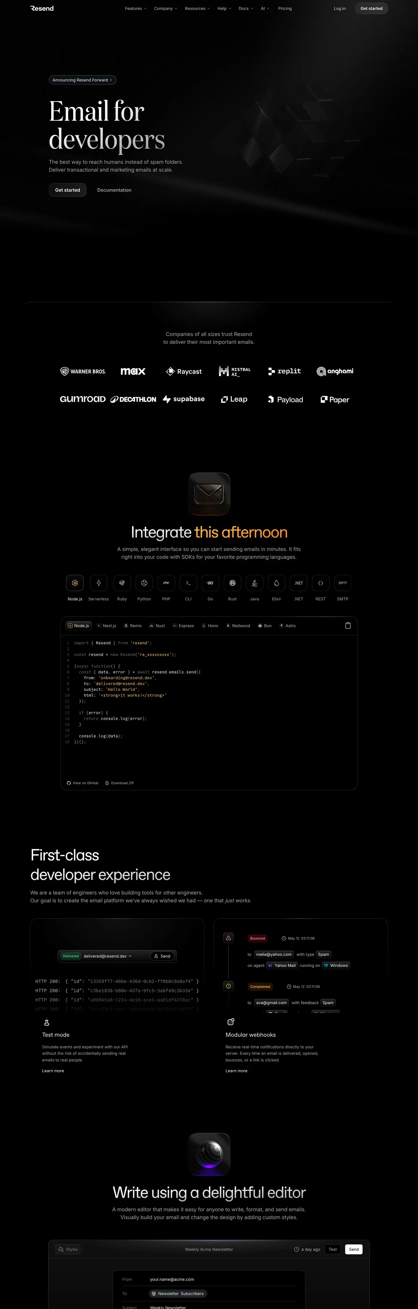
Resend looks like a developer tool styled by a literary magazine. The whole brand sits on true black #000000, and the loudest element on every page is not a button or a logo but a 96px Domaine Display serif headline with the ss01, ss04, and ss11 stylistic alternates engaged. That single typographic decision sets the tone: confident, considered, slightly print-editorial, and priced on quality rather than novelty. The supporting cast is technical — ABC Favorit for marketing prose, Inter for UI labels, and Geist Mono for the code wells that anchor most marketing sections.
This page packages Resend's full visual system into a single DESIGN.md file written against the Google Labs spec. Inside: 28 colors tokens (one true #000000 canvas, three near-black surface steps from #06060a to #101012, six atmospheric accent glows from #ff801f orange to #11ff99 green, plus a four-step ink ramp from #fcfdff to #464a4d), 14 typography tokens spanning a 96px hero down to 12px captions, a 7-step radius scale from 0px to 9999px, a 10-step spacing scale topping out at 128px band padding, and 19 components — buttons, cards, code wells, email mockups, pills, status dots, and the global nav and footer.
Feed this file to Claude, Cursor, or GitHub Copilot and the model will generate React components that hold Resend's discipline: the white-on-black CTA, the 12px feature-card radius, the translucent hairlines that replace shadows entirely, the four-family type stack with strict lane assignments. Reference the tokens directly in Tailwind config or paste them into CSS variables. The reason to study Resend is the restraint — a developer brand that refuses every easy decoration and trusts type, code, and atmospheric color to do the entire job.
What makes it distinct
5
- Pure black canvasevery public page sits on #000000, never near-black #0a0a0a, with off-white #fcfdff ink carrying the read
- Editorial serif at scaleDomaine Display at 96px / 400 with ss01/ss04/ss11 features makes a developer tool read like a print magazine
- White is the brandthe primary CTA is a small #fcfdff pill with #000000 text, the brightest pixel on every viewport
- Six atmospheric accent glowsorange, yellow, blue, green, red, slate — used only as low-opacity radial washes, never as solid surfaces
- No drop shadows anywheredepth is built from 6% and 14% translucent-white hairlines plus radial atmospheric gradients
resend.com
Live at resend.com
A snapshot of the brand in production. Scroll the frame to see the whole page.
Colors
28 colors
Resend's system runs on #fcfdff as its primary voltage, used in 1 of 19 components. Type is set in Inter across 14 tokens from 12px to 96px, weights 400–600. Shape language is mixed across 19 components, blending pills, soft rounds, and squarer corners.
Brand & Accent
Sparing, CTA-only voltage · 11
Surface
Page and card backgrounds · 5
Text
Headlines, body, captions · 5
Borders & Hairlines
Dividers, outlines, rules · 3
Other
Specialty colors · 4
Typography
14 type tokens
Set in Inter across 14 tokens, from 12px to 96px, weights 400–600. Shown in its own stack: where the font isn't installed, the fallback the file names stands in.
- display-xxl96px · weight 400 · lh 1 · tracking -0.96pxThe quick brown fox jumps over the lazy dog
- display-xl76.8px · weight 400 · lh 1 · tracking -0.768pxThe quick brown fox jumps over the lazy dog
- display-lg56px · weight 400 · lh 1.2 · tracking -2.8pxThe quick brown fox jumps over the lazy dog
- heading-md24px · weight 500 · lh 1.5 · tracking -0.4pxThe quick brown fox jumps over the lazy dog
- heading-sm20px · weight 500 · lh 1.3 · tracking -0.3pxThe quick brown fox jumps over the lazy dog
- subtitle20px · weight 400 · lh 1.3The quick brown fox jumps over the lazy dog
- body-lg18px · weight 400 · lh 1.5The quick brown fox jumps over the lazy dog
- body-md16px · weight 400 · lh 1.5 · tracking -0.8pxThe quick brown fox jumps over the lazy dog
- body-sm14px · weight 400 · lh 1.43The quick brown fox jumps over the lazy dog
- button-md14px · weight 500 · lh 1.43The quick brown fox jumps over the lazy dog
- button-sm14px · weight 500 · lh 1.43 · tracking 0.35pxThe quick brown fox jumps over the lazy dog
- caption12px · weight 400 · lh 1.5The quick brown fox jumps over the lazy dog
- caption-emph14px · weight 600 · lh 1The quick brown fox jumps over the lazy dog
- code-md13px · weight 400 · lh 1.6The quick brown fox jumps over the lazy dog
Layout
Radii and spacing
7 corner radii and 10 spacing values. Shape language: mixed.
Radii
- none0px
- xs4px
- sm6px
- md8px
- lg12px
- xl16px
- full9999px
Spacing
- xxs2px
- xs4px
- sm8px
- md12px
- lg16px
- xl24px
- xxl32px
- xxxl48px
- section96px
- band128px
Components
19 components
Each rendered from its tokens (color, type, radius, padding) on Resend's own canvas.
- Button Primarybutton-primaryButton Primary
- Button Primary Pressedbutton-primary-pressedButton Primary Pressed
- Button Ghostbutton-ghostButton Ghost
- Button Outlinebutton-outlineButton Outline
- Type here…text-inputText Input
- Hero Stripehero-stripeHero Stripe
- Feature Cardfeature-cardFeature Card
- Feature Card Borderedfeature-card-borderedFeature Card Bordered
- Pricing Tierpricing-tierPricing Tier
- Pricing Tier Featuredpricing-tier-featuredPricing Tier Featured
- Code Windowcode-windowCode Window
- Code Tabcode-tabCode Tab
- Email Mockupemail-mockupEmail Mockup
- Badge Pillbadge-pillBadge Pill
- Status Dotstatus-dotStatus Dot
- Nav Barnav-barNav Bar
- Sub Nav Pillsub-nav-pillSub Nav Pill
- Contributor Avatarcontributor-avatarContributor Avatar
- FooterfooterFooter
In use
The system, in use
Resend's tokens on the kind of product it builds.
Build something people actually use.
A short paragraph of marketing copy that previews how the brand's display tier and body tier read together. Two sentences is usually enough.
FAQ
Resend design system FAQ
Common questions about Resend's tokens, components, and how to use this DESIGN.md in your project.
Read next
Related reading
Specs, directories, and component libraries that pair with this design system.
Use it
Use Resend in your project
One machine-readable file. Drop it into Claude, Cursor, or any AI tool that reads DESIGN.md.
Download the DESIGN.md
One machine-readable file: every color, type, radius, spacing, and component token of Resend.
Feed it to your AI tool
Drop it into Claude, Cursor, or GitHub Copilot. The agent writes React components and Tailwind classes that match Resend's visual language.
Reference the tokens directly
Or paste the values into your Tailwind config, CSS variables, or component library: every color, size and radius is a quoted, ready-to-copy value.
Read the full DESIGN.md: overview, rationale, do’s and don’ts
Overview
Resend reads like a developer tool with the typography of an editorial. Every page opens on true black #000000, and the loudest element on the canvas is not a button or a brand stamp — it is a 96px Domaine Display serif headline with the ss01 / ss04 / ss11 stylistic alternates engaged. That single typographic decision sets the brand tone: confident, considered, slightly literary, and priced on quality rather than novelty. The supporting cast is technical. Body copy switches to ABC Favorit for marketing prose and Inter for UI labels, while code blocks render in Geist Mono inside surface-deep (#06060a) shells with hairline traffic-light dots.
Surface depth is built almost entirely from translucent white. A 6% rgba(255,255,255,0.06) hairline carries soft separation, a 14% rgba(255,255,255,0.14) strong border frames cards and code wells, and a 4% divider tone separates footer columns. There are no full-band gradients — only soft atmospheric glows in the six accent colors (orange #ff801f, yellow #ffc53d, blue #3b9eff, green #11ff99, red #ff2047, plus a deep slate) anchored at the top of select sections at 18–34% opacity. Page rhythm cycles in a single dark register: hero stripe, atmospheric section, code window section, email mockup section, pricing or feature grid, black footer.
Key Characteristics:
- Pure black canvas (
#000000) on every public page; off-white ink (#fcfdff) carries the full read. - A serif-led four-family type system: Domaine Display at 76.8–96px for hero headlines, ABC Favorit for marketing body, Inter for UI, Geist Mono for code at 13px.
- Six accent glow colors used only as low-opacity atmospheric washes, never as buttons or solid surfaces.
- Strict container vocabulary: 12px
rounded.lgfor feature cards, code wells, and email mockups; 8pxrounded.mdfor buttons;rounded.fullfor pills and avatars. - Translucent white borders replace shadows entirely — the system has no traditional drop-shadow elevation language.
- The primary CTA is a small white
#fcfdffrectangle with#000000text — counterintuitive contrast that becomes the page's brightest pixel and works as a single visual anchor.
Known Gaps
- Pressed and active visual states are documented only for
button-primary-pressed; other components rely on the default browser focus ring for interactive feedback. - Logged-in dashboard surfaces (API keys, sending logs, audience management) are out of scope; only the public marketing canvas is documented.
- Email-template editor surfaces — a key product feature — are not extracted, since they live behind authentication.
- The atmospheric glow rendering uses CSS radial gradients; exact stops and angles vary per section and are not standardized as tokens, so they render per section-specific design judgment.
Developer Tools & IDEs
More systems like this
More DESIGN.md files in Developer Tools & IDEs.
Pricing
Build it with Pro
The DESIGN.md files are free. Pro adds 6,000+ blocks, premium templates and the MCP server, so your AI editor builds in your system for you.
4.9/5 out of 5 · 150+ reviewsfrom 150+ founders and developers.
Billing
Billed once a year in USD. Cancel anytime.
- How many people can use the license.
- Client work, SaaS products and anything you charge for.
- Production-ready React sections: hero, pricing, features, dashboards and more.
- Complete multi-page sites you can ship as they are.
- React icons from every major library, installable with one command.
- Presets that restyle every block, in light and dark.
- Lets your AI editor search, preview and install blocks for you.
- Priority requests are answered first.
Individual
For personal projects & open source
$32instead of $49/mo
$389 billed yearly
- Seats: 1 seat
- Commercial use: Personal & open source only
- Pro blocks: 6,000+ blocks
- Templates: All 14 templates
- React icons: 294k+ icons
- Themes: All 59 themes
- MCP server: Basic usage
- Support: Standard
Team
Most popularFor freelancers, agencies & startups
$66instead of $99/mo
$789 billed yearly · ≈ $13/dev/mo
- Seats: Up to 5 seats
- Commercial use: Included
- Pro blocks: 6,000+ blocks
- Templates: All 14 templates
- React icons: 294k+ icons
- Themes: All 59 themes
- MCP server: High usage
- Support: Priority
Organization
For companies with larger teams
$132instead of $199/mo
$1,589 billed yearly
- Seats: Unlimited seats
- Commercial use: Included
- Pro blocks: 6,000+ blocks
- Templates: All 14 templates
- React icons: 294k+ icons
- Themes: All 59 themes
- MCP server: Unlimited usage
- Support: Priority
Billed once a year in USD. Cancel anytime.
Individual
For personal projects & open source
$32instead of $49/mo
$389 billed yearly
- How many people can use the license.Seats: 1 seat
- Client work, SaaS products and anything you charge for.Commercial use: Personal & open source only
- Production-ready React sections: hero, pricing, features, dashboards and more.Pro blocks: 6,000+ blocks
- Complete multi-page sites you can ship as they are.Templates: All 14 templates
- React icons from every major library, installable with one command.React icons: 294k+ icons
- Presets that restyle every block, in light and dark.Themes: All 59 themes
- Lets your AI editor search, preview and install blocks for you.MCP server: Basic usage
- Priority requests are answered first.Support: Standard
Team
Most popularFor freelancers, agencies & startups
$66instead of $99/mo
$789 billed yearly · ≈ $13/dev/mo
Everything in Individual, plus
- How many people can use the license.Seats: Up to 5 seats
- Client work, SaaS products and anything you charge for.Commercial use: Included
- Lets your AI editor search, preview and install blocks for you.MCP server: High usage
- Priority requests are answered first.Support: Priority
Organization
For companies with larger teams
$132instead of $199/mo
$1,589 billed yearly
Everything in Team, plus
- How many people can use the license.Seats: Unlimited seats
- Lets your AI editor search, preview and install blocks for you.MCP server: Unlimited usage
- Secure checkout via Stripe
- Code lives in your repo
- Keep what you've shipped if you cancel
- License terms
Your system, built for you
Every block, template and icon, installed by your AI agent in your design system. The DESIGN.md files stay free.