Biome Design System
Biome's design system as a DESIGN.md file — cobalt #0065da brand voltage, system-ui at 64px display, One Dark code panels, light-document surface. For React, Next.js, and AI tools.
Add shadcn.io to your AI agent. · Pro It installs blocks, icons and templates in your design system from a prompt, with Pro.
Set up MCP- Primary
- #0065da
- Typeface
- -apple-system
- Shape
- Soft
- Base radius
- 8px
- Colors
- 17
- Type tokens
- 12
- Components
- 15
- Spacing values
- 9
About
About Biome DESIGN.md
Curated by Dov Azencot · Updated May 19, 2026 · Source biomejs.dev (opens in a new tab)
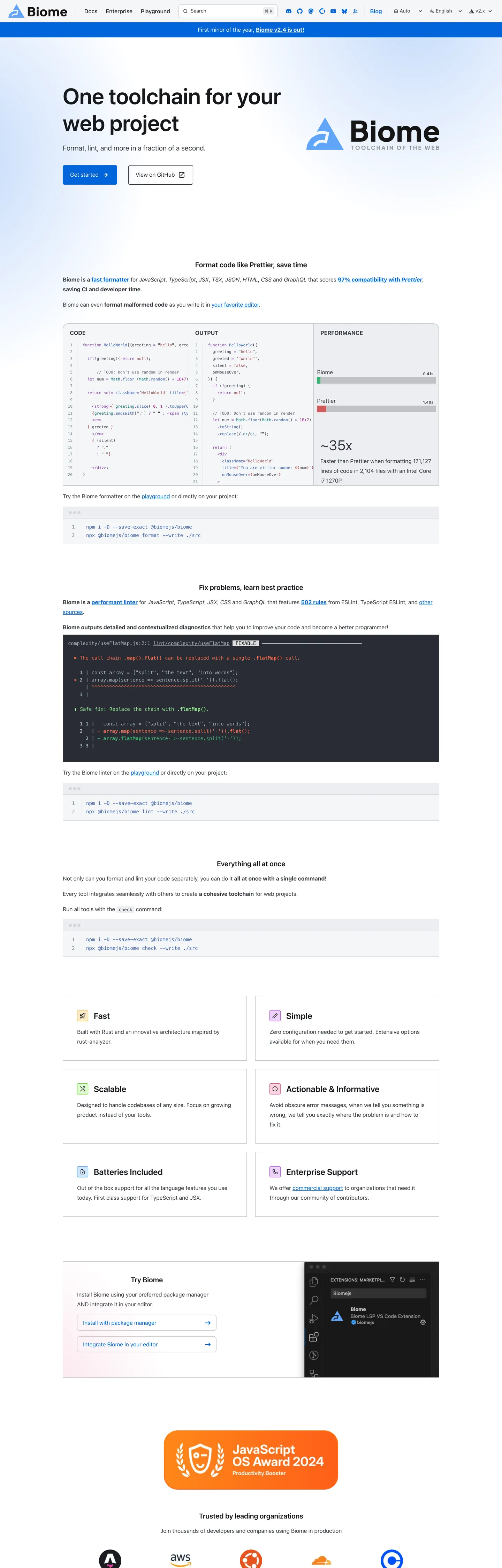
Biome's marketing page is a documentation site doing marketing work — the same Starlight/Astro framework that powers the reference docs also carries the landing page, so the hero shares its structural chrome (top-nav height, sidebar width, hairline border palette) with the API reference a click away. The above-fold experience is a light white surface with a 64px system-ui headline "One toolchain for your web project" at weight 600 in near-black (#17181c), a cobalt-blue "Get started" CTA pill at the left, and the Biome wordmark + geometric logo on the right. Below the fold the page shifts into a wide dark-background code-comparison panel that demonstrates the formatter working on real JavaScript — this is where the One Dark Pro color palette enters: tomato red (#ff6347) for deleted tokens, medium green (#3cb371) for added tokens, steel blue (#3b61b0) for keywords, purple (#8844ae) for function names. Not brand colors — borrowed syntax colors.
The DESIGN.md file packages this into machine-readable tokens. Inside: 17 colors tokens including the cobalt brand voltage (#0065da) and a One Dark subset (tomato, green, blue, purple, muted red) plus the Starlight gray scale; 12 typography tokens using system-ui for all prose and the system mono stack for code; 8 radius values with an 800px pill as the dominant CTA shape (32 occurrences) and 12px as the card default; 9 spacing values; and 15 components covering the pill CTA button, the dark code-diff panel, the feature comparison grid, the syntax-highlight inline code chip, and the light document card.
Feed this file to Claude or Cursor and it reproduces Biome's specific moves: white light-document canvas with a single cobalt accent, pill-shaped primary CTAs, One Dark syntax colors for code demonstration panels, and a Starlight-inherited hairline and gray system for all structural chrome. The most transferable pattern for any developer toolchain landing page: place a live code formatter diff directly below the fold, using real before/after code rather than illustrative screenshots. Biome's diff panel is the strongest product argument on the page.
What makes it distinct
5
- Cobalt-as-the-only-color#0065da appears 75 times as the single chromatic accent on an otherwise monochrome white-and-near-black doc surface
- One Dark code panelsthe full formatter diff section uses One Dark Pro's palette: tomato red, medium green, steel blue, purple — borrowed entirely from VS Code's most popular dark theme
- 64px system-ui at weight 600the hero headline uses no custom typeface and outweighs every other typography-brand decision in this directory at the same size
- Pill-dominant radius32 occurrences of 800px radius (effectively full-pill) for the hero CTA buttons, against a 12px default for cards
- Starlight documentation aestheticthe page is a Starlight/Astro docs site repurposed as a marketing surface; the sidebar nav chrome, badge system, and color variables all belong to the Starlight design system
biomejs.dev
Live at biomejs.dev
A snapshot of the brand in production. Scroll the frame to see the whole page.
Colors
17 colors
Biome's system runs on #0065da as its primary voltage, used in 2 of 15 components. Type is set in -apple-system across 12 tokens from 11.2px to 64px, weights 400–600. Shape language is soft — components average 303px corner radius, with no sharp interactive edges.
Brand & Accent
Sparing, CTA-only voltage · 4
Surface
Page and card backgrounds · 3
Text
Headlines, body, captions · 5
Borders & Hairlines
Dividers, outlines, rules · 1
Other
Specialty colors · 4
Typography
12 type tokens
Set in -apple-system across 12 tokens, from 11.2px to 64px, weights 400–600. Shown in its own stack: where the font isn't installed, the fallback the file names stands in.
- display-xl64px · weight 600 · lh 76.8pxThe quick brown fox jumps over the lazy dog
- display-lg40px · weight 400 · lh 70pxThe quick brown fox jumps over the lazy dog
- heading-lg24px · weight 600 · lh 28.8pxThe quick brown fox jumps over the lazy dog
- heading-md20px · weight 600 · lh 24pxThe quick brown fox jumps over the lazy dog
- body-lg20px · weight 400 · lh 35pxThe quick brown fox jumps over the lazy dog
- body-md16px · weight 400 · lh 28pxThe quick brown fox jumps over the lazy dog
- body-sm14px · weight 500 · lh 19.6pxThe quick brown fox jumps over the lazy dog
- button-md16px · weight 400 · lh 19pxThe quick brown fox jumps over the lazy dog
- nav-link16px · weight 400 · lh 19.2pxThe quick brown fox jumps over the lazy dog
- label-sm11.2px · weight 600 · lh 19.6pxThe quick brown fox jumps over the lazy dog
- mono-sm11.2px · weight 400 · lh 19.6pxThe quick brown fox jumps over the lazy dog
- mono-md14px · weight 400 · lh 24.5pxThe quick brown fox jumps over the lazy dog
Layout
Radii and spacing
8 corner radii and 9 spacing values. Shape language: soft.
Radii
- none0px
- xs1px
- sm4px
- md8px
- lg12px
- xl16px
- pill800px
- full50%
Spacing
- xxs4px
- xs8px
- sm12px
- md16px
- base19.2px
- lg24px
- xl40px
- 2xl48px
- 3xl64px
Components
15 components
Each rendered from its tokens (color, type, radius, padding) on Biome's own canvas.
- Button Primarybutton-primaryButton Primary
- Button Secondarybutton-secondaryButton Secondary
- Top Navtop-navTop Nav
- Nav Linknav-linkNav Link
- Hero Headinghero-headingHero Heading
- Section Headingsection-headingSection Heading
- Body Paragraphbody-paragraphBody Paragraph
- CardcardCard
- Code Panelcode-panelCode Panel
- Code Inlinecode-inlineCode Inline
- Badge Defaultbadge-defaultBadge Default
- Feature Cellfeature-cellFeature Cell
- Syntax Addedsyntax-addedSyntax Added
- Syntax Removedsyntax-removedSyntax Removed
- FooterfooterFooter
In use
The system, in use
Biome's tokens on the kind of product it builds.
Build something people actually use.
A short paragraph of marketing copy that previews how the brand's display tier and body tier read together. Two sentences is usually enough.
import { build } from "./build"

export async function main() {
  const result = await build()
  console.log("done", result)
}
FAQ
Biome design system FAQ
Common questions about Biome's tokens, components, and how to use this DESIGN.md in your project.
Read next
Related reading
Specs, directories, and component libraries that pair with this design system.
- Browse all design systemsThe full directory of DESIGN.md files on shadcn.io, with live mockups for each.shadcn.io
- Biome — official siteBiome's public marketing site — the source of truth for the live tokens captured in this file.biomejs.dev (opens in a new tab)
- The DESIGN.md specificationGoogle Labs' open spec for machine-readable design system files — the format this page is built on.github.com (opens in a new tab)
Use it
Use Biome in your project
One machine-readable file. Drop it into Claude, Cursor, or any AI tool that reads DESIGN.md.
Download the DESIGN.md
One machine-readable file: every color, type, radius, spacing, and component token of Biome.
Feed it to your AI tool
Drop it into Claude, Cursor, or GitHub Copilot. The agent writes React components and Tailwind classes that match Biome's visual language.
Reference the tokens directly
Or paste the values into your Tailwind config, CSS variables, or component library: every color, size and radius is a quoted, ready-to-copy value.
Read the full DESIGN.md: overview, rationale, do’s and don’ts
Overview
Biome's marketing page is a Starlight documentation site carrying marketing weight — the same structural chrome (nav height, sidebar width, badge system, hairline palette) that appears on every Starlight-powered docs page also appears here, meaning the design decisions start not with Biome's brand team but with the Starlight default theme. Documentation posture as brand signal. Where most developer toolchain brands build a custom marketing page that links to docs, Biome puts the docs site itself in the marketing role — communicating that the tool is documentation-native rather than marketing-first.
The above-fold experience is white, light, and low-ceremony: system-ui at 64px / weight 600 in near-black (#17181c), a cobalt pill CTA (#0065da — the single chromatic brand moment), and the Biome wordmark with its geometric diamond logo. Below the fold, the page shifts into a full-width dark-background code panel demonstrating the formatter working on a real JavaScript file. The diff uses One Dark Pro's palette (tomato red for deletions, medium green for additions, steel blue for keywords, purple for function names) — borrowed entirely from the VS Code theme that Expressive Code renders by default. The syntax colors are not Biome's brand colors; they are VS Code's.
The shape language is pill CTA + 12px card — a binary contrast similar to Cloudflare's pill-plus-small-step pattern. The hero "Get started" and "Read the announcement" buttons use 800px border-radius (effectively full-pill at any height). All card surfaces use 12px rounding. There is nothing in between.
Key Characteristics:
- Cobalt #0065da as the single brand voltage — 75 occurrences (36 text, 36 border, 3 bg), wired to --sl-color-accent and four other Starlight variable slots.
- System-ui at 64px / weight 600 for the hero headline — no custom display typeface, heavier than Drizzle's system-ui but still lighter than Cloudflare's FT Kunst Grotesk.
- One Dark Pro syntax palette in the code diff panel — tomato red, medium green, steel blue, purple — borrowed from Expressive Code's default theme, not from Biome's brand.
- 800px pill radius (32 occurrences) for all primary and secondary CTAs; 12px for all cards; 1px for inline code chips.
- Light-document canvas (#ffffff / #f5f6f8 nav) — a documentation aesthetic rather than a SaaS marketing surface.
- Starlight badge system — "default" badges (cobalt border, dark-navy fill #093066) for integration annotations.
- Monospace at two tiers: system mono 11.2px for inline code spans, 14px for code block body text.
Colors
Brand
- Primary (
#0065da): frequency 75. Used as text (36), border (36), bg (3). Wired as --sl-color-accent, --sl-color-text-accent, --sl-color-bg-accent, --sl-badge-default-border, --ec-frm-edActTabIndTopCol. The only chromatic brand moment — pill CTA fill, active sidebar link, badge borders, inline link text. - Primary Light (
#25aff4): frequency 4. Used as background — a lighter cobalt-sky, wired as a brand variant. Appears on a single accent block above the fold. - Primary Pale (
#c2d9fa): frequency 2. Used in gradients. Wired as --sl-color-accent-low — the pale end-stop for cobalt gradient fills. - Primary Dark (
#093066): wired as --sl-badge-default-bg and --sl-color-accent-high. The dark navy fill for "default" badges on dark surfaces; the badge border is still cobalt primary.
Structural
- Ink (
#17181c): frequency 54. Used as text (27) and border (27). The near-black used for the hero heading and for the dark code-panel background. Wired as --sl-color-white (inverted — Starlight uses "white" to mean the background of text on dark canvases). - Ink Soft (
#353841): frequency 487. Used as text (252) and border (235). The primary body text and structural border tone. Wired as --sl-color-text, --sl-color-gray-2, multiple Expressive Code vars. - Ink Muted (
#788b94): frequency 240. Used as text (120) and border (120). Secondary text for captions, sidebar meta, inactive nav links. Wired as --ec-gtrFg and --sl-color-gray-4. - Ink Faint (
#abb2bf): frequency 143. Used as text (72) and border (71). The faintest structural text — One Dark Pro's default identifier color inside code blocks. - Canvas (
#ffffff): frequency 24. Used as background (16), text (5), border (3). The page floor and card surface. Wired as --sl-color-bg, --sl-color-bg-sidebar, --sl-color-text-invert. - Surface-1 (
#eceef2): frequency 9. Used as background (7) and gradient (2). The light hairline surface — inline code chip background, tab bar, search modal border. Wired as --sl-color-hairline, --sl-color-gray-6, --sl-color-bg-inline-code. - Surface Nav (
#f5f6f8): wired as --sl-color-bg-nav, --ec-codeBg, --ec-frm-edBg, --sl-color-gray-7. The nav bar and code editor background — one step warmer than canvas. - Hairline (
#c0c2c7): frequency 15. Used as background (3) and border (12). The structural divider color. Wired as --sl-color-gray-5.
Syntax (One Dark Pro)
- Syntax Red (
#ff6347): frequency 260. Used as text (130) and border (130). Tomato red — deleted tokens in the formatter diff. Not a brand color. - Syntax Green (
#3cb371): frequency 129. Used as text (64), bg (1), border (64). Medium sea green — added/success tokens in the formatter diff. Not a brand color. - Syntax Blue (
#3b61b0): frequency 120. Used as text (60) and border (60). Steel blue — keywords and operators. Not a brand color. - Syntax Purple (
#8844ae): frequency 116. Used as text (58) and border (58). Medium purple — function names and imports. Not a brand color. - Syntax Muted Red (
#984e4d): frequency 24. Used as text (12) and border (12). A desaturated red used for deleted-line background annotations in the diff gutter.
Typography
Font Families
The system runs two voices: system-ui (resolving to system-native sans-serif) for all prose, headings, and navigation; and system monospace (ui-monospace → Menlo → Monaco → Consolas) for inline code spans and code block text. The CSS also references source-code-pro as --code-font but this appears to be a fallback declaration rather than an actively loaded font.
Unlike Cloudflare's FT Kunst Grotesk or Prisma's Mona Sans VF, Biome commits fully to the platform-native type experience. On macOS the hero reads in San Francisco; on Windows in Segoe UI. The cobalt CTA pill is the only element that looks the same across platforms.
Hierarchy
| Token | Size | Weight | Line Height | Use |
|---|---|---|---|---|
{typography.display-xl} | 64px | 600 | 76.8px | Hero h1 — "One toolchain for your web project" |
{typography.display-lg} | 40px | 400 | 70px | Secondary display — counter/stat elements |
{typography.heading-lg} | 24px | 600 | 28.8px | Feature category headers |
{typography.heading-md} | 20px | 600 | 24px | Section h2 — "Format code like Prettier, save time" etc. |
{typography.body-lg} | 20px | 400 | 35px | Hero sub-copy beneath the headline |
{typography.body-md} | 16px | 400 | 28px | Primary running paragraph text |
{typography.body-sm} | 14px | 500 | 19.6px | Secondary labels and sidebar navigation |
{typography.button-md} | 16px | 400 | 19px | CTA button label |
{typography.nav-link} | 16px | 400 | 19.2px | Top-nav link labels |
{typography.label-sm} | 11.2px | 600 | 19.6px | Badge labels and tight UI annotations |
{typography.mono-sm} | 11.2px | 400 | 19.6px | Inline code spans (101 occurrences — most frequent typography sample) |
{typography.mono-md} | 14px | 400 | 24.5px | Code block body text |
Principles
The dominant typography token by occurrence is {typography.mono-sm} at 11.2px (101 samples) — the system's most-seen text size is an inline code chip, not a paragraph. This is the documentation-first type hierarchy made explicit: the most frequent text in the system is a code reference, not a human sentence.
Note on Font Substitutes
System-ui substitution follows the same pattern as Drizzle: Inter at the same weights for cross-platform consistency. For the 64px / weight 600 display tier, Inter at 600 weight is the closest match — it produces comparable cap height and counter proportions.
Layout
Spacing System
- Base unit: 16px and 24px most frequent single values.
- Tokens:
{spacing.xxs}4px ·{spacing.xs}8px ·{spacing.sm}12px ·{spacing.md}16px ·{spacing.base}19.2px ·{spacing.lg}24px ·{spacing.xl}40px ·{spacing.2xl}48px ·{spacing.3xl}64px. - Nav padding:
{spacing.md}16px left, 14.5px right (the asymmetric sidebar tree indent contributes to the non-standard right padding). - Code panel padding:
{spacing.lg}24px on all sides. - Feature cell padding:
{spacing.lg}24px.
Grid & Container
- Hero: centered two-column layout — headline + CTA stack left at ~55%, Biome wordmark + logo right at ~45%.
- Feature section: full-width dark code panel spanning the entire viewport, followed by a four-cell feature grid (Fast / Straightforward / Scalable / Batteries Included / Enterprise-ready / Community Support) in a two-column layout.
- Code comparison: the formatter diff panel is a full-width dark-background block with two code editor panels side-by-side — "Before" and "After" — using Expressive Code's tab UI.
- Content width: the --sl-content-width variable is set to 67.5rem (1080px), consistent with a documentation site's reading column.
Rhythm
The page alternates between a white light-document band (hero, feature grid) and a dark editor-panel band (the code diff). The dark panel is the page's single high-contrast moment and is the primary product argument — a live diff is more convincing than a feature list. Below the dark panel, the page returns to white for the "Try Biome" card and the award badges (JavaScript Open Source Award 2024).
Elevation
The system uses two tiers: flat white document surfaces and a single dark code-panel canvas. Shadow tokens are minimal: {colors.ink} (pure black, 6 occurrences) as shadow ink for the Expressive Code scrollbar thumb and the Starlight modal scrim. The primary card surfaces use {colors.surface-1} (#eceef2) hairlines for borders, with no drop shadow. The dark code panel floats against the white page through background-color contrast alone — no shadow underliner.
- Flat white: hero, feature grid, awards section, footer.
- Dark panel: the formatter diff section — the only section with a non-white background on the marketing surface.
- Hairline borders: cards, inline code chips, nav bottom rule, tab bar.
Shapes
The radius scale is pill + 12px card — a binary system:
{rounded.none}0px — tab bar edges, Expressive Code frame borders (--ec-brdRad: 0px).{rounded.xs}1px — the nav border width and very small annotation chips.{rounded.sm}4px — the --unit-border-radius value; secondary form surfaces.{rounded.md}8px — the pagefind search modal border.{rounded.lg}12px — feature cards, the try-Biome card, badge chips.{rounded.xl}16px — the largest card surface (awards section).{rounded.pill}800px — primary and secondary CTA buttons (32 occurrences). Full-pill rendering at any button height.{rounded.full}50% — avatar circles and icon containers.
The pill-vs-12px binary means every element is either a fully-rounded pill (CTAs) or a gently-rounded card (content surfaces). There is no mid-radius surface.
Components
button-primary — Cobalt {colors.primary} fill, white text, system-ui 16px / 400, {rounded.pill} 800px radius, 15×20px padding, 56px height. "Get started" is the canonical instance.
button-secondary — Transparent fill, ink-soft text, 1px {colors.hairline} border, pill radius, same padding and height. "Read the announcement" is the canonical instance.
top-nav — {colors.surface-nav} (#f5f6f8) background, ink-soft text, 64px height, bottom hairline border. Biome wordmark left, nav links (Introduction, Formatter, Linter, Docs, Blog, Playground) center, GitHub + social right.
nav-link — Transparent background, ink-soft at {typography.nav-link} (16px / 400), 8×16px padding.
hero-heading — Near-black {colors.ink} (#17181c), system-ui 64px / weight 600. "One toolchain for your web project."
section-heading — Ink-soft text, system-ui 20px / 600. "Format code like Prettier, save time," "Lint code like ESLint," etc.
body-paragraph — Ink-soft {colors.ink-soft} text, system-ui 16px / 400 / 28px line-height.
card — White canvas, 1px {colors.surface-1} border, 12px radius, 24px padding. The standard feature card.
code-panel — Near-black {colors.ink} background, white text, system mono 14px, 8px radius, 24px padding. The formatter diff panel.
code-inline — {colors.surface-1} fill, ink-soft text, system mono 11.2px, 4px radius, 2×4px padding. Inline code references in body prose.
badge-default — Dark navy {colors.primary-dark} fill, white text, cobalt border, pill radius, 4×12px padding. The Starlight "default" badge style — used for integration version annotations.
feature-cell — White canvas, 1px {colors.surface-1} border, no radius (cells form a grid with shared borders), 24px padding. Fast / Straightforward / Scalable / Batteries Included / Enterprise-ready / Community.
syntax-added — Transparent background, {colors.syntax-green} (#3cb371) text, system mono 14px. Added token in the diff panel.
syntax-removed — Transparent background, {colors.syntax-red} (#ff6347) text, system mono 14px. Deleted token in the diff panel.
footer — White canvas, ink-muted text, 14px / 500, 40px vertical padding. Flat wordmark row (sponsor logos: Shorebird, Depot, Coderabbit, Sentry, Astro, NL Design System) + award badge.
Do's and Don'ts
Do use {colors.primary} (#0065da) for exactly one CTA tier above the fold. The system is built around a single cobalt accent against a monochrome white surface — the pill button's cobalt reads as the entire brand statement. Adding cobalt to link text, hover states, or secondary UI elements dilutes the one moment the color is doing brand work.
Do restrict the One Dark Pro syntax colors ({colors.syntax-red}, {colors.syntax-green}, {colors.syntax-blue}, {colors.syntax-purple}) to code block panels only. They are Expressive Code defaults, not brand tokens — placing tomato red on a non-code UI element (error badge, decorative icon) creates a false semantic signal.
Do use {rounded.pill} (800px) for all primary CTAs. The pill treatment is the system's single warmest surface — the only element that breaks from the flat document aesthetic. Switching to a standard 8px or 12px rounded button flattens the CTA into the surrounding card grid.
Do let the code diff panel be the primary product argument. The dark Expressive Code block showing a real formatter diff is more persuasive than any feature bullet. The panel's One Dark coloring is specifically chosen to look like VS Code — the tool your user is already using.
Don't use {colors.surface-nav} (#f5f6f8) for card backgrounds. This is the Starlight nav-bar tone — wired as --sl-color-bg-nav and --ec-codeBg. Using it for card fills would collapse the visual distinction between navigation chrome and content surfaces.
Don't place {colors.primary-dark} (#093066) on marketing text or icons outside of badge fills. The dark navy is wired exclusively as --sl-badge-default-bg — it exists to create contrast against the cobalt badge border, not as an independent brand tone.
Don't increase the hero headline weight above 600. System-ui at 64px / 600 already renders at the top of the weight scale for the system-ui san-serif — San Francisco's heavy weight at this size reads considerably bolder than a typical 600 on a loaded web font. Increasing to 700 or 800 produces a disproportionate visual mass that crushes the cobalt CTA button.
Don't apply the {rounded.pill} radius to cards or surface elements. The binary between pill CTAs and 12px cards is the system's only shape language. Breaking the binary by adding pill surfaces makes the CTAs indistinguishable from content containers.
Known Gaps
- Starlight vs. Biome-specific tokens: many color and spacing variables belong to the Starlight framework and are not specific to Biome's brand decisions. Overriding them requires understanding Starlight's variable architecture, not just the token values in this file.
- Dark mode: the Starlight theme ships dark mode support, but the captured screenshot is the light-mode version. The --sl-color-gray-* scale inverts in dark mode; the cobalt primary likely becomes lighter.
- Navigation hover states: nav links are captured in resting state. Starlight's hover treatment adds a subtle background fill — not represented here.
- The formatter diff interaction: the code panel is interactive — users can type in the left panel and see Biome format in real-time. The editing and cursor states are not captured.
- Award badge section: the JavaScript Open Source Award 2024 badge at the bottom of the page uses a custom illustrated component (shield + trophy icon + sponsors row) whose internal token structure is not captured.
- Expressive Code frame styling: the code panel uses Expressive Code's tab-bar UI (file-name tabs, copy button, terminal dots) with custom styling. The --ec-frm-* variable family has 20+ members; only the most-used are included here.
Developer Tools & IDEs
More systems like this
More DESIGN.md files in Developer Tools & IDEs.
Pricing
Build it with Pro
The DESIGN.md files are free. Pro adds 6,000+ blocks, premium templates and the MCP server, so your AI editor builds in your system for you.
4.9/5 out of 5 · 150+ reviewsfrom 150+ founders and developers.
Billing
Billed once a year in USD. Cancel anytime.
- How many people can use the license.
- Client work, SaaS products and anything you charge for.
- Production-ready React sections: hero, pricing, features, dashboards and more.
- Complete multi-page sites you can ship as they are.
- React icons from every major library, installable with one command.
- Presets that restyle every block, in light and dark.
- Lets your AI editor search, preview and install blocks for you.
- Priority requests are answered first.
Individual
For personal projects & open source
$32instead of $49/mo
$389 billed yearly
- Seats: 1 seat
- Commercial use: Personal & open source only
- Pro blocks: 6,000+ blocks
- Templates: All 14 templates
- React icons: 294k+ icons
- Themes: All 59 themes
- MCP server: Basic usage
- Support: Standard
Team
Most popularFor freelancers, agencies & startups
$66instead of $99/mo
$789 billed yearly · ≈ $13/dev/mo
- Seats: Up to 5 seats
- Commercial use: Included
- Pro blocks: 6,000+ blocks
- Templates: All 14 templates
- React icons: 294k+ icons
- Themes: All 59 themes
- MCP server: High usage
- Support: Priority
Organization
For companies with larger teams
$132instead of $199/mo
$1,589 billed yearly
- Seats: Unlimited seats
- Commercial use: Included
- Pro blocks: 6,000+ blocks
- Templates: All 14 templates
- React icons: 294k+ icons
- Themes: All 59 themes
- MCP server: Unlimited usage
- Support: Priority
Billed once a year in USD. Cancel anytime.
Individual
For personal projects & open source
$32instead of $49/mo
$389 billed yearly
- How many people can use the license.Seats: 1 seat
- Client work, SaaS products and anything you charge for.Commercial use: Personal & open source only
- Production-ready React sections: hero, pricing, features, dashboards and more.Pro blocks: 6,000+ blocks
- Complete multi-page sites you can ship as they are.Templates: All 14 templates
- React icons from every major library, installable with one command.React icons: 294k+ icons
- Presets that restyle every block, in light and dark.Themes: All 59 themes
- Lets your AI editor search, preview and install blocks for you.MCP server: Basic usage
- Priority requests are answered first.Support: Standard
Team
Most popularFor freelancers, agencies & startups
$66instead of $99/mo
$789 billed yearly · ≈ $13/dev/mo
Everything in Individual, plus
- How many people can use the license.Seats: Up to 5 seats
- Client work, SaaS products and anything you charge for.Commercial use: Included
- Lets your AI editor search, preview and install blocks for you.MCP server: High usage
- Priority requests are answered first.Support: Priority
Organization
For companies with larger teams
$132instead of $199/mo
$1,589 billed yearly
Everything in Team, plus
- How many people can use the license.Seats: Unlimited seats
- Lets your AI editor search, preview and install blocks for you.MCP server: Unlimited usage
- Secure checkout via Stripe
- Code lives in your repo
- Keep what you've shipped if you cancel
- License terms
Your system, built for you
Every block, template and icon, installed by your AI agent in your design system. The DESIGN.md files stay free.