CircleCI Design System
CircleCI's marketing system uses neon green (#00db75) CTAs on a near-white light-gray canvas, Space Grotesk for stadium-scale display, and Inter for all body copy. Tokens for React, Next.js, and AI tools.
Add shadcn.io to your AI agent. · Pro It installs blocks, icons and templates in your design system from a prompt, with Pro.
Set up MCP- Primary
- #00db75
- Typeface
- Inter
- Shape
- Mixed
- Base radius
- 16px
- Colors
- 13
- Type tokens
- 13
- Components
- 15
- Spacing values
- 10
About
About CircleCI DESIGN.md
Curated by Dov Azencot · Updated May 19, 2026 · Source circleci.com (opens in a new tab)
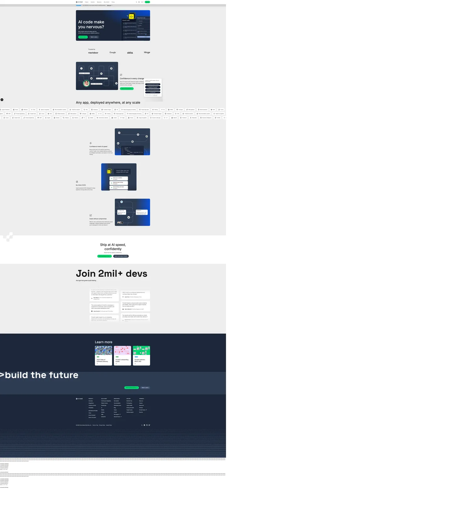
CircleCI's marketing site opens on a near-white gray canvas and makes one chromatic bet: neon green. The hero product mockup (a dark-navy card showing a pipeline dashboard) sits on the neutral #ededed background, flanked by a small green CTA pill and a ghost secondary button. There are no gradients, no floating shapes, no full-bleed brand-color sections above the fold. The system is restrained to the point of severity — until the page reaches "Join 2mil+ devs," a Space Grotesk headline at 170px / weight 700 that fills the full viewport width at desktop. This stadium-type treatment is the single theatrical moment in an otherwise methodical layout.
The DESIGN.md file packages the system into machine-readable tokens for React and AI tools. Inside: 13 colors tokens anchored by a near-black body-dark (#343434) and a near-white canvas (#ededed), with one brand-layer neon green (#00db75) wired as `--color-slime-500`; 13 typography tokens spanning the 170px Space Grotesk display tier, Inter across body and navigation, and a 14px / weight 700 / 1.75px tracked uppercase label tier for section overlines; 4 radius tokens (16px default, 8px for inner chips, pill for CTAs); and 10 spacing values on an 8px base. Components cover the neon-green primary button, the dark-navy pipeline card, the feature-section illustration tiles, the trust-logo wall, and the dark footer.
Feed this spec to an AI coding tool and it reproduces CircleCI's moves: near-white canvas instead of pure white, neon green held exclusively for the primary action, Inter for all prose and navigation, Space Grotesk reserved for the one social-proof moment, 16px rounding as the default card shape. The move worth borrowing selectively: the stadium-type social-proof number only works when you have a genuinely large number worth displaying — 2 million developers earns the 170px treatment, but a smaller number would look aspirational rather than factual.
What makes it distinct
5
- Neon green CTA voltage#00db75 appears as the single brand accent, exclusively on primary CTA buttons; the canvas stays neutral light-gray throughout
- Stadium-scale Space Groteskthe social-proof headline 'Join 2mil+ devs' renders at 170px / weight 700, the largest display size in the CI/CD category
- Light-gray canvas, not whitethe body canvas is #ededed (near-white gray), not pure white, giving the page a cooler and flatter feel than a typical SaaS landing page
- Dark navy footer inversionthe page closes on a midnight-navy (#1c273a) band that provides the only dark-surface contrast, with the neon green repeating as the CTA color
- Inter as the backbone278 elements run Inter at 16px / weight 400, making it the most frequent typographic expression in the system by a wide margin
circleci.com
Live at circleci.com
A snapshot of the brand in production. Scroll the frame to see the whole page.
Colors
13 colors
CircleCI's system runs on #00db75 as its primary voltage, used in 1 of 15 components. Type is set in Inter across 13 tokens from 13px to 170.16px, weights 400–700. Shape language is mixed across 15 components, blending pills, soft rounds, and squarer corners.
Brand & Accent
Sparing, CTA-only voltage · 3
Surface
Page and card backgrounds · 4
Text
Headlines, body, captions · 3
Borders & Hairlines
Dividers, outlines, rules · 1
Other
Specialty colors · 2
Typography
13 type tokens
Set in Inter across 13 tokens, from 13px to 170.16px, weights 400–700. Shown in its own stack: where the font isn't installed, the fallback the file names stands in.
- display-xl170.16px · weight 700 · lh 190.179pxThe quick brown fox jumps over the lazy dog
- display-md57px · weight 400 · lh 74.1pxThe quick brown fox jumps over the lazy dog
- heading-lg24px · weight 400 · lh 31.2pxThe quick brown fox jumps over the lazy dog
- heading-md20px · weight 500 · lh 30pxThe quick brown fox jumps over the lazy dog
- body-lg18px · weight 400 · lh 28.8pxThe quick brown fox jumps over the lazy dog
- body-md16px · weight 400 · lh 24pxThe quick brown fox jumps over the lazy dog
- body-sm15px · weight 400 · lh 22.5pxThe quick brown fox jumps over the lazy dog
- label-md16px · weight 600 · lh 25.6pxThe quick brown fox jumps over the lazy dog
- label-sm14px · weight 700 · lh 22.4px · tracking 1.75pxThe quick brown fox jumps over the lazy dog
- caption14px · weight 400 · lh 22.4pxThe quick brown fox jumps over the lazy dog
- button-md16px · weight 600 · lh 25.6pxThe quick brown fox jumps over the lazy dog
- nav-link16px · weight 400 · lh 24pxThe quick brown fox jumps over the lazy dog
- mono-sm13px · weight 400 · lh 19.5pxThe quick brown fox jumps over the lazy dog
Layout
Radii and spacing
5 corner radii and 10 spacing values. Shape language: mixed.
Radii
- none0px
- sm8px
- md16px
- lg40px
- full9999px
Spacing
- xs4px
- sm6px
- base8px
- md12px
- lg20px
- xl24px
- 2xl32px
- 3xl48px
- 4xl64px
- 5xl96px
Components
15 components
Each rendered from its tokens (color, type, radius, padding) on CircleCI's own canvas.
- Button Primarybutton-primaryButton Primary
- Button Secondarybutton-secondaryButton Secondary
- Top Navtop-navTop Nav
- Nav Linknav-linkNav Link
- Hero Headinghero-headingHero Heading
- Section Headingsection-headingSection Heading
- Body Paragraphbody-paragraphBody Paragraph
- Label Overlinelabel-overlineLabel Overline
- CardcardCard
- Pipeline Cardpipeline-cardPipeline Card
- Type here…text-inputText Input
- Trust Chiptrust-chipTrust Chip
- FooterfooterFooter
- Dark Cta Sectiondark-cta-sectionDark Cta Section
- Feature Tilefeature-tileFeature Tile
In use
The system, in use
CircleCI's tokens on the kind of product it builds.
Build something people actually use.
A short paragraph of marketing copy that previews how the brand's display tier and body tier read together. Two sentences is usually enough.
FAQ
CircleCI design system FAQ
Common questions about CircleCI's tokens, components, and how to use this DESIGN.md in your project.
Read next
Related reading
Specs, directories, and component libraries that pair with this design system.
- Browse all design systemsThe full directory of DESIGN.md files on shadcn.io, with live mockups for each.shadcn.io
- CircleCI — official siteCircleCI's public marketing site — the source of truth for the live tokens captured in this file.circleci.com (opens in a new tab)
- The DESIGN.md specificationGoogle Labs' open spec for machine-readable design system files — the format this page is built on.github.com (opens in a new tab)
Use it
Use CircleCI in your project
One machine-readable file. Drop it into Claude, Cursor, or any AI tool that reads DESIGN.md.
Download the DESIGN.md
One machine-readable file: every color, type, radius, spacing, and component token of CircleCI.
Feed it to your AI tool
Drop it into Claude, Cursor, or GitHub Copilot. The agent writes React components and Tailwind classes that match CircleCI's visual language.
Reference the tokens directly
Or paste the values into your Tailwind config, CSS variables, or component library: every color, size and radius is a quoted, ready-to-copy value.
Read the full DESIGN.md: overview, rationale, do’s and don’ts
Overview
CircleCI's marketing site runs a restrained, near-corporate layout that saves its single theatrical moment for a social-proof number. Neon Green as Earned Accent. Where many CI/CD brands paint the hero in their brand color, CircleCI holds its neon green ({colors.primary} — #00db75) exclusively for primary CTA buttons. The above-fold hero is entirely in near-black and near-white: a dark product-mockup card on a light-gray canvas, with "AI code make you nervous?" as the headline and two small CTA pills beneath it. The green appears only on the "Get started for free" button. Below the fold, the page builds to "Join 2mil+ devs" in Space Grotesk at 170px — the single theatrical moment — before closing in a midnight-navy dark-footer band.
The design is closer to Okta or Postman than to the developer-tool brands (Linear, Vercel, Warp) that use dark canvases and atmospheric gradients. Where GitHub uses its Primer system with green as a trust signal, CircleCI uses Inter as the structural backbone and reserves Space Grotesk for a single quantified claim. The palette is almost entirely achromatic: near-white gray floor, near-black ink, white card surfaces, dark-navy footer, and one neon-green accent.
Key Characteristics:
- Near-white gray canvas (
{colors.canvas}— #ededed) as the page floor — not pure white; the slight gray softens the card surface lift. - Single neon-green voltage (
{colors.primary}— #00db75) on primary CTA buttons only — 7 total occurrences in the captured page. - Inter as the typographic backbone — 278 elements at 16px / weight 400, the dominant text expression by count.
- Space Grotesk at 170px / weight 700 for the social-proof display headline — the only Space Grotesk usage on the page.
- Midnight-navy footer (
{colors.surface-dark}— #1c273a) as the second surface type, used for the footer and the pipeline-dashboard product card. - 16px default rounding on all cards and feature tiles — generous by dev-tools standards.
- 1.75px tracked uppercase Inter at 14px / weight 700 for section overline labels — a label convention that doesn't appear in the main typeface hierarchy.
- Trust-logo wall (Nextdoor, Google, Okta, Hinge) in monochrome below the hero.
Colors
Brand
- Neon Green (
{colors.primary}— #00db75): frequency 7 (text 1, bg 5, border 1). Wired as--color-slime-500. Primary CTA button fill — the sole chromatic brand element on the page. Appears on "Get started for free" in the hero, mid-page, and footer CTA. - Green Light (
{colors.primary-light}— #85d69c): frequency 2 (border only). Declared as--color-green-200. Border variant for the neon-green states; not rendered as a fill. - Green Dark (
{colors.primary-dark}— #005700): frequency 13 (text 9, border 4). Declared as--color-green-700. Used for accessible dark-green text on light surfaces — appears on confirmation copy and pipeline-success status labels.
Structural Text
- Body Dark (
{colors.ink}— #343434): frequency 2640 (text 1331, border 1309). The dominant color in the system — wired as--color-body-dark. Every paragraph, heading, and card border at a near-black that is slightly warmer than pure black. - Near Black (
{colors.ink-dark}— #161616): frequency 61 (text 30, border 31). Wired as--color-morph-terminaland--color-cool-grey-900. The darkest text tier — used on the top-nav background and the "Join 2mil+ devs" social-proof headline. - Gray Muted (
{colors.ink-muted}— #6a6a6a): frequency 24 (text 12, border 12). Wired as--color-neutral-400. Secondary text — section overline labels in small uppercase, footnotes, trust-chip text.
Surface
- Canvas (
{colors.canvas}— #ededed): the page floor. Wired as--color-morph-fog,--color-gray-100,--color-cool-grey-30. Near-white gray — the key surface decision that sets CircleCI apart from white-canvas dev-tools. - White Surface (
{colors.surface-1}— #ffffff): frequency 523 total (bg 282, text 122, border 119). Card fills, nav background, trust-chip fills. Wired as--color-white,--color-body-light,--color-gray-50. - Midnight Navy (
{colors.surface-dark}— #1c273a): frequency 4 (bg 3, gradient 1). Wired as--color-morph-midnight,--color-9pm-600. The footer background and the pipeline-dashboard product card fill. - Slate Navy (
{colors.surface-dark-2}— #2e3c52): frequency 3 (bg 3). Wired as--color-9pm-500. A slightly lighter navy — used inside the product-mockup card for inner UI chrome.
Hairline and Shadow
- Hairline (
{colors.hairline}— #d4d4d4): frequency 54 (bg 38, border 16). Wired as--color-gray-300,--color-neutral-80. The card border tone and internal divider — a neutral light gray. - Shadow (
{colors.shadow}— #000000): frequency 11 (shadow 9, text 1, border 1). Standard black-with-opacity shadow ink.
Accent
- Sky Blue (
{colors.sky-blue}— #75cdff): frequency 2 (bg). Wired as--color-blue-200. Appears on two UI elements inside the pipeline-mockup card — a status-indicator chip. Not part of the general brand palette.
Typography
Font Families
The system runs three families: Inter for all prose, navigation, and component labels; Space Grotesk for the single 170px social-proof display headline; and Roboto Mono for code annotations. Inter is registered as --font-sans; Space Grotesk as --font-mega; Roboto Mono as --font-mono. A Silkscreen pixel font is declared as --font-pixel but does not appear in the captured surface.
The split is disciplined: Inter carries the system, Space Grotesk is held for one moment, mono appears only in technical copy.
Hierarchy
| Token | Size | Weight | Line Height | Use |
|---|---|---|---|---|
{typography.display-xl} | 170.16px | 700 | 190.179px | "Join 2mil+ devs" social-proof headline (Space Grotesk) |
{typography.display-md} | 57px | 400 | 74.1px | Section h2 display blocks ("Ship at AI speed, confidently") |
{typography.heading-lg} | 24px | 400 | 31.2px | Card-level h2 and h3 headings |
{typography.heading-md} | 20px | 500 | 30px | Sub-section labels and feature titles |
{typography.body-lg} | 18px | 400 | 28.8px | Hero lead paragraph and testimonial body |
{typography.body-md} | 16px | 400 | 24px | Default running body text — most frequent size |
{typography.body-sm} | 15px | 400 | 22.5px | Card secondary copy and trust-chip labels |
{typography.label-md} | 16px | 600 | 25.6px | Nav items and emphasized inline labels |
{typography.label-sm} | 14px | 700 | 22.4px | Section overlines in uppercase with 1.75px tracking |
{typography.caption} | 14px | 400 | 22.4px | Post dates, pipeline metadata |
{typography.button-md} | 16px | 600 | 25.6px | CTA button labels |
{typography.nav-link} | 16px | 400 | 24px | Top-nav link labels |
{typography.mono-sm} | 13px | 400 | 19.5px | Inline code in pipeline-card annotations |
Principles
The 57px display-md ({typography.display-md}) is the main editorial headline tier — it's weight 400, not the heavier 700 used on the Space Grotesk stadium headline. Light-weight display at 57px signals confidence through scale rather than weight, in the same register as Cloudflare's editorial approach. The uppercase label-sm tier (1.75px tracking, weight 700, 14px) is the contrast voice — it sits above feature sections as an overline and uses none of the display size, creating a visible rhythm between "here's the category" (uppercase) and "here's the headline" (57px weight 400).
Note on Font Substitutes
Inter is freely available via Google Fonts and ships with many OS distributions. Space Grotesk is also free via Google Fonts. For Roboto Mono, JetBrains Mono or IBM Plex Mono transfer cleanly at the same sizes.
Layout
Spacing System
- Base unit: 8px (308 occurrences at 8px, the most frequent single value).
- Tokens:
{spacing.xs}4px ·{spacing.sm}6px ·{spacing.base}8px ·{spacing.md}12px ·{spacing.lg}20px ·{spacing.xl}24px ·{spacing.2xl}32px ·{spacing.3xl}48px ·{spacing.4xl}64px ·{spacing.5xl}96px. - Card internal padding:
{spacing.xl}24px vertical ×{spacing.2xl}32px horizontal (213 instances at 8×16px and 41 instances at 24×32px). - Section vertical padding: ~96px on major bands (hero, dark CTA, footer).
- Dark-footer padding: 64px vertical, 24px horizontal.
Grid and Container
- Max content width: approximately 1280px at desktop.
- Hero layout: centered content stack — product mockup card, headline, sub-copy, dual CTA buttons, and a trust-logo row.
- Feature section: alternating left-right split — text column (heading + body + green CTA) beside a dark product-mockup card in midnight navy.
- Pipeline-tech grid: full-width scrolling tag cloud of supported languages, frameworks, and platforms (JavaScript, React, Python, Docker, Kubernetes, etc.).
- Social proof: single full-width section with the 170px Space Grotesk headline.
- Blog/resource grid: 3-column card grid with feature image, tag overline, heading, and date.
Rhythm
The page alternates between light and dark surfaces to create section contrast: hero (light-gray), feature rows (light-gray with dark mockup cards), tag cloud (light-gray), social-proof (light-gray), blog cards (light-gray), dark CTA (near-black), dark footer (midnight navy). Two dark bands close the page after an entirely light-gray body — the structural inversion happens at the end rather than the beginning.
Elevation
The system uses light-gray-to-white card lift rather than shadow layers. The near-white gray canvas ({colors.canvas} — #ededed) is the floor; white card surfaces ({colors.surface-1} — #ffffff) sit on it with a 1px {colors.hairline} (#d4d4d4) border. The hairline-on-gray contrast provides enough elevation without any shadow. Shadow ink ({colors.shadow} — #000000) appears 9 times on the captured surface, all as soft drop-shadow-md values (0 3px 3px rgba(0,0,0,0.12)) on specific product-mockup card frames.
Shapes
The radius scale is generous and standardized:
{rounded.none}0px — the dark CTA band and footer section are square-edged.{rounded.sm}8px — inner UI chrome elements and form inputs; 78 occurrences.{rounded.md}16px — the dominant card radius; 265 occurrences — the most common radius in the system by far.{rounded.lg}40px — the singular large pill for a promotional CTA or badge element; 1 occurrence.{rounded.full}9999px — fully-rounded pill CTAs and trust-chip labels; ~49 occurrences.
The 16px default makes every card feel approachable relative to the tight 4–8px radius that Linear or Vercel use. The generous rounding is the warmest UI move in an otherwise cool achromatic system.
Components
button-primary — Neon green {colors.primary} fill, near-black {colors.ink-dark} text for contrast, {rounded.full} pill, 8×16px padding, 40px height. "Get started for free" is the canonical instance. The only use of green in the system.
button-secondary — Transparent fill, white text, 1px white border, {rounded.full} pill. "Watch demo" or "Start building for free" in ghost form — appears on dark surfaces.
top-nav — Near-black {colors.ink-dark} background, white text, 52px height, 12×24px padding. CircleCI logo flush left, product nav links (Product / Solutions / Enterprise / Resources / Pricing / Blog) centered, right-aligned "Log In" + neon-green CTA.
nav-link — Transparent background, white text in {typography.nav-link}. No padding rendered in the captured surface.
hero-heading — The social-proof 170px Space Grotesk in {typography.display-xl}, near-black {colors.ink-dark}, on the light-gray canvas. The only Space Grotesk render.
section-heading — Inter at {typography.display-md} (57px / weight 400), body-dark ink. Used for "Ship at AI speed, confidently" and "Learn more" section titles.
body-paragraph — Default body-dark text at {typography.body-lg} (18px / 400). The hero sub-paragraph and feature-section body copy.
label-overline — Muted {colors.ink-muted} text in {typography.label-sm} (14px / 700 / uppercase / 1.75px tracked). Section overline labels above feature headings — the typographic category marker.
card — White {colors.surface-1} fill, 1px {colors.hairline} border, {rounded.md} 16px radius, 24×32px padding. The blog post card, feature description card, and testimonial card.
pipeline-card — Midnight-navy {colors.surface-dark} fill, white text, {rounded.md} 16px radius, 24px padding. The above-fold product-mockup card showing the CI/CD pipeline dashboard.
text-input — White surface, 1px hairline border, {rounded.sm} 8px radius, 8×16px padding, 40px height.
trust-chip — White surface, body-dark text, {rounded.full} pill, 6×12px padding. The trusted-by customer logo chips in the trust wall.
footer — Midnight-navy {colors.surface-dark} background, white text, 64×24px padding. Multi-column footer links with the CircleCI logo, social icons, and legal links.
dark-cta-section — Near-black {colors.ink-dark} fill, white heading in {typography.display-md}, 96×24px padding. The penultimate ">build the future" closing CTA band.
feature-tile — Midnight-navy {colors.surface-dark} fill, {rounded.md} 16px radius, 0 padding. The product feature illustration tile — the dark mock screenshots and pipeline diagrams that appear beside feature copy.
Do's and Don'ts
Do hold neon green exclusively for the primary CTA button fill. The system has 7 occurrences of {colors.primary} (#00db75), all on action elements. Adding green to icons, section backgrounds, or decorative stripes would dilute the signal that green = "the thing to click."
Do use the light-gray canvas ({colors.canvas} — #ededed) rather than pure white as the page floor. Card surfaces in white ({colors.surface-1}) lift off the gray floor with only a 1px hairline border — no shadow needed. Switching the floor to pure white would collapse the contrast and require adding shadows to every card.
Do use the 14px / weight 700 / uppercase / 1.75px tracked Inter label ({typography.label-sm}) as section overlines, before large headings. The contrast between the uppercase micro-label and the 57px display heading is the page's typographic rhythm device.
Do put the Space Grotesk display headline ({typography.display-xl}) only on a genuinely large social-proof number. The 170px treatment earns its space because "2mil+" is a verifiable, meaningful claim. A placeholder like "Join our community" at 170px would read as hollow.
Don't add a gradient or atmospheric background to the hero. The hero canvas is flat {colors.canvas} (#ededed). Adding a gradient — even a subtle one — would pull the page toward the decorative-SaaS aesthetic that CircleCI's restraint deliberately avoids.
Don't use {colors.primary-dark} (#005700, --color-green-700) as a brand accent on light surfaces. This dark green appears as accessible text on light backgrounds for confirmation copy; using it as a fill or border accent on non-success surfaces would create semantic confusion with pipeline success states.
Don't introduce a second display typeface. The system has two declared display families (Inter for everything, Space Grotesk for one moment). Adding a third — or using Space Grotesk on secondary headings — would undermine the "one theatrical moment" discipline.
Don't round card corners below 16px ({rounded.md}). The 16px radius is the generous-soft signature of the system. Tightening to 8px or 4px would pull the cards into the colder dev-tools register (Vercel, Linear) rather than CircleCI's warmer, more accessible positioning.
Known Gaps
- Primary button hover and active states: the captured surface shows the resting neon-green fill only; hover (likely a darker slime-550/600 tone) and active press states are not captured.
- Form validation states:
{component.text-input}carries the resting state only; error, success, and focus-ring colors from the CSS variables (red-500, green-400, slime-500 focus ring) are declared but not rendered. - Pipeline dashboard tokens: the product mockup card inside the hero shows a CI/CD pipeline interface with its own status-indicator color set (green LED lime for passing, red for failing, bronze for waiting). These are declared in the CSS (
--color-green-led-lime,--color-bronze-300,--color-morph-bricked) but captured as illustration rather than as live component tokens. - Motion: the tag-cloud strip on the page animates as an infinite horizontal scroll; the feature-section illustrations may animate on scroll. Easing and duration values are declared in CSS but not captured in component form.
- Dark mode: the site has no declared dark-mode surface in the captured pages; the CircleCI dashboard app carries its own dark-panel theme not represented here.
- Pixel font (Silkscreen): declared as
--font-pixelbut no rendered instance is visible on the captured marketing page.
Backend, Database & DevOps
More systems like this
More DESIGN.md files in Backend, Database & DevOps.
Pricing
Build it with Pro
The DESIGN.md files are free. Pro adds 6,000+ blocks, premium templates and the MCP server, so your AI editor builds in your system for you.
4.9/5 out of 5 · 150+ reviewsfrom 150+ founders and developers.
Billing
Billed once a year in USD. Cancel anytime.
- How many people can use the license.
- Client work, SaaS products and anything you charge for.
- Production-ready React sections: hero, pricing, features, dashboards and more.
- Complete multi-page sites you can ship as they are.
- React icons from every major library, installable with one command.
- Presets that restyle every block, in light and dark.
- Lets your AI editor search, preview and install blocks for you.
- Priority requests are answered first.
Individual
For personal projects & open source
$32instead of $49/mo
$389 billed yearly
- Seats: 1 seat
- Commercial use: Personal & open source only
- Pro blocks: 6,000+ blocks
- Templates: All 14 templates
- React icons: 294k+ icons
- Themes: All 59 themes
- MCP server: Basic usage
- Support: Standard
Team
Most popularFor freelancers, agencies & startups
$66instead of $99/mo
$789 billed yearly · ≈ $13/dev/mo
- Seats: Up to 5 seats
- Commercial use: Included
- Pro blocks: 6,000+ blocks
- Templates: All 14 templates
- React icons: 294k+ icons
- Themes: All 59 themes
- MCP server: High usage
- Support: Priority
Organization
For companies with larger teams
$132instead of $199/mo
$1,589 billed yearly
- Seats: Unlimited seats
- Commercial use: Included
- Pro blocks: 6,000+ blocks
- Templates: All 14 templates
- React icons: 294k+ icons
- Themes: All 59 themes
- MCP server: Unlimited usage
- Support: Priority
Billed once a year in USD. Cancel anytime.
Individual
For personal projects & open source
$32instead of $49/mo
$389 billed yearly
- How many people can use the license.Seats: 1 seat
- Client work, SaaS products and anything you charge for.Commercial use: Personal & open source only
- Production-ready React sections: hero, pricing, features, dashboards and more.Pro blocks: 6,000+ blocks
- Complete multi-page sites you can ship as they are.Templates: All 14 templates
- React icons from every major library, installable with one command.React icons: 294k+ icons
- Presets that restyle every block, in light and dark.Themes: All 59 themes
- Lets your AI editor search, preview and install blocks for you.MCP server: Basic usage
- Priority requests are answered first.Support: Standard
Team
Most popularFor freelancers, agencies & startups
$66instead of $99/mo
$789 billed yearly · ≈ $13/dev/mo
Everything in Individual, plus
- How many people can use the license.Seats: Up to 5 seats
- Client work, SaaS products and anything you charge for.Commercial use: Included
- Lets your AI editor search, preview and install blocks for you.MCP server: High usage
- Priority requests are answered first.Support: Priority
Organization
For companies with larger teams
$132instead of $199/mo
$1,589 billed yearly
Everything in Team, plus
- How many people can use the license.Seats: Unlimited seats
- Lets your AI editor search, preview and install blocks for you.MCP server: Unlimited usage
- Secure checkout via Stripe
- Code lives in your repo
- Keep what you've shipped if you cancel
- License terms
Your system, built for you
Every block, template and icon, installed by your AI agent in your design system. The DESIGN.md files stay free.