Cloudflare Design System
Cloudflare's marketing-site design system as a DESIGN.md file. Kumo Brand #ff5e1f as full-bleed hero canvas, FT Kunst Grotesk display, Apercu Mono Pro metadata, 19 colors, 18 components. For React, Next.js, and AI tools.
Add shadcn.io to your AI agent. · Pro It installs blocks, icons and templates in your design system from a prompt, with Pro.
Set up MCP- Primary
- #ff5e1f
- Typeface
- FT Kunst Grotesk
- Shape
- Sharp
- Base radius
- 6px
- Colors
- 19
- Type tokens
- 10
- Components
- 18
- Spacing values
- 8
About
About Cloudflare DESIGN.md
Curated by Dov Azencot · Updated May 16, 2026 · Source cloudflare.com (opens in a new tab)
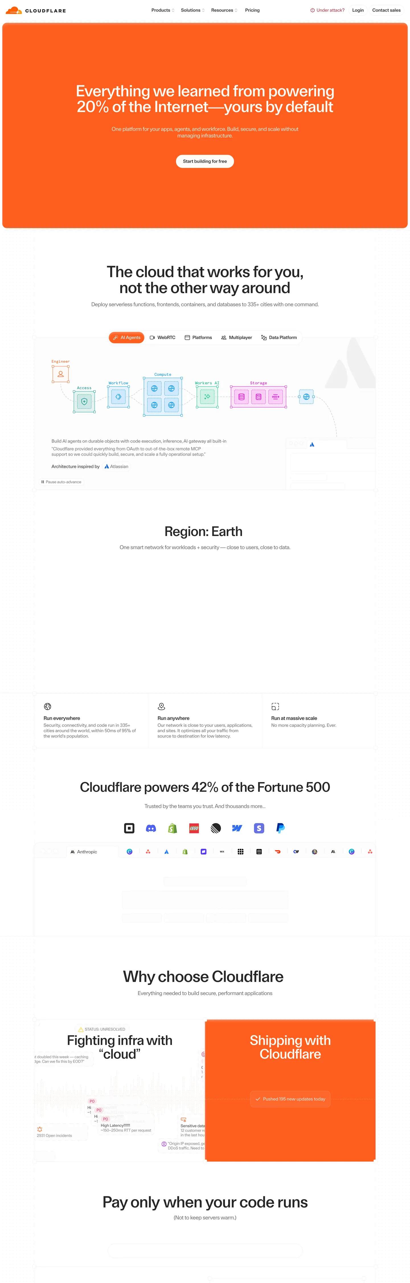
Cloudflare's marketing site does something almost no other dev-infrastructure brand does: it gives the single brand voltage the entire above-fold canvas. The hero on cloudflare.com is a flat block of Kumo Brand orange #ff5e1f, with a 56px FT Kunst Grotesk display headline rendered in cream #fffbf5 (never pure white), and a fully-rounded cream CTA pill centered below. Where Vercel keeps its hero on matte black and Linear leans on a violet-graphite surface ladder, Cloudflare paints the page with the brand color and trusts a single editorial sentence to do the work. The display weight is 500, not 700 — the same restraint Airbnb uses on Rausch, only here the voltage owns the floor instead of accenting it.
The DESIGN.md file packages the system into a machine-readable spec for React and AI tools. Inside: 19 colors tokens drawn from the 421 CSS custom properties Cloudflare exposes on `:root`, organized into a brand-voltage tier, a product-domain tier (Compute blue, Storage pink, AI green, SASE teal — each wired into its own var family like `--color-compute-100`), a structural tier of cream / ink / hairline tones, and a small semantic set. Ten typography tokens span FT Kunst Grotesk in three display sizes plus body and label tiers, and Apercu Mono Pro in two mono tiers — the latter appearing 138+ times in extracted samples across small-caps labels, footnotes, and code blocks. 18 components cover the hero, the cream-pill CTA, hairline-bordered cards, the orange-fill split panel, the monospace caption strip, the category-tab pill set, and the top-nav.
Feed this file to Claude or Cursor and it will reproduce Cloudflare's specific moves: full-bleed brand canvas instead of held-in-reserve accent, cream-not-white off-canvas, editorial display weight 500, monospace metadata, and the product-domain color split that lets a Compute card sit beside a Storage card without either compromising on the single brand orange. The token references resolve cleanly — `{colors.kumo-brand}` for the voltage, `{colors.cream}` for any "white" surface, `{typography.display-xl}` for the hero — so the AI never has to invent a value. Treat it as a reference rather than a clone target: the one disciplined move worth stealing is the voltage-as-canvas inversion, which only works when you have a brand color this saturated and one sentence this confident.
What makes it distinct
5
- Voltage as canvasKumo Brand #ff5e1f fills the entire above-fold hero rather than appearing as a scarce CTA accent, inverting the dev-infra convention
- Editorial display in sans56px FT Kunst Grotesk at weight 500 with -1.4px tracking reads like a magazine dek, not a SaaS hero
- Monospace as supporting voiceApercu Mono Pro appears 138+ times for small-caps labels, code, and metadata strips
- Five product-domain colorsCompute #0a95ff, Storage #ee0ddb, AI #00bd7d, SASE #0d9488, plus the brand orange, each scoped to its own CSS custom-property family
- Cream over pure whitethe off-white canvas and CTA fill is #fffbf5, not #ffffff; a quiet warmth move that runs the entire system
cloudflare.com
Live at cloudflare.com
A snapshot of the brand in production. Scroll the frame to see the whole page.
Colors
19 colors
Cloudflare's system runs on #ff5e1f as its primary voltage, used in 3 of 18 components. Type is set in FT Kunst Grotesk across 10 tokens from 12px to 56px, weights 400–500. Shape language is sharp — components average 4px corner radius, favoring crisp rectangles.
Surface
Page and card backgrounds · 1
Text
Headlines, body, captions · 5
Borders & Hairlines
Dividers, outlines, rules · 1
Other
Specialty colors · 12
Typography
10 type tokens
Set in FT Kunst Grotesk across 10 tokens, from 12px to 56px, weights 400–500. Shown in its own stack: where the font isn't installed, the fallback the file names stands in.
- display-xl56px · weight 500 · lh 56px · tracking -1.4pxThe quick brown fox jumps over the lazy dog
- display-lg48px · weight 500 · lh 48px · tracking -1.2pxThe quick brown fox jumps over the lazy dog
- heading-md19.2px · weight 400 · lh 23.04px · tracking -0.48pxThe quick brown fox jumps over the lazy dog
- heading-sm18px · weight 500 · lh 21.6px · tracking -0.45pxThe quick brown fox jumps over the lazy dog
- body-md16px · weight 400 · lh 19.2px · tracking -0.04pxThe quick brown fox jumps over the lazy dog
- body-sm14px · weight 400 · lh 16.1px · tracking -0.14pxThe quick brown fox jumps over the lazy dog
- button-md16px · weight 500 · lh 24px · tracking -0.16pxThe quick brown fox jumps over the lazy dog
- nav-link16px · weight 500 · lh 24pxThe quick brown fox jumps over the lazy dog
- mono-md16px · weight 400 · lh 24pxThe quick brown fox jumps over the lazy dog
- mono-sm12px · weight 400 · lh 18pxThe quick brown fox jumps over the lazy dog
Layout
Radii and spacing
6 corner radii and 8 spacing values. Shape language: sharp.
Radii
- none0px
- xs3px
- sm4px
- md6px
- lg8px
- full9999px
Spacing
- xs4px
- sm6px
- base8px
- md12px
- lg16px
- xl24px
- 2xl32px
- 3xl40px
Components
18 components
Each rendered from its tokens (color, type, radius, padding) on Cloudflare's own canvas.
- Hero Sectionhero-sectionHero Section
- Hero Headinghero-headingHero Heading
- Section Headingsection-headingSection Heading
- Body Paragraphbody-paragraphBody Paragraph
- Body Paragraph Mutedbody-paragraph-mutedBody Paragraph Muted
- Mono Captionmono-captionMono Caption
- Button Primarybutton-primaryButton Primary
- Button Primary Hoverbutton-primary-hoverButton Primary Hover
- Button Secondarybutton-secondaryButton Secondary
- Top Navtop-navTop Nav
- Nav Linknav-linkNav Link
- Under Attack Linkunder-attack-linkUnder Attack Link
- Card Hairlinecard-hairlineCard Hairline
- Card Orangecard-orangeCard Orange
- Category Tabcategory-tabCategory Tab
- Category Tab Activecategory-tab-activeCategory Tab Active
- Feature Cellfeature-cellFeature Cell
- Type here…text-inputText Input
In use
The system, in use
Cloudflare's tokens on the kind of product it builds.
Build something people actually use.
A short paragraph of marketing copy that previews how the brand's display tier and body tier read together. Two sentences is usually enough.
FAQ
Cloudflare design system FAQ
Common questions about Cloudflare's tokens, components, and how to use this DESIGN.md in your project.
Read next
Related reading
Specs, directories, and component libraries that pair with this design system.
- Browse all design systemsThe full directory of DESIGN.md files on shadcn.io, with live mockups for each.shadcn.io
- Cloudflare — official siteCloudflare's public marketing site — the source of truth for the live tokens captured in this file.cloudflare.com (opens in a new tab)
- The DESIGN.md specificationGoogle Labs' open spec for machine-readable design system files — the format this page is built on.github.com (opens in a new tab)
Use it
Use Cloudflare in your project
One machine-readable file. Drop it into Claude, Cursor, or any AI tool that reads DESIGN.md.
Download the DESIGN.md
One machine-readable file: every color, type, radius, spacing, and component token of Cloudflare.
Feed it to your AI tool
Drop it into Claude, Cursor, or GitHub Copilot. The agent writes React components and Tailwind classes that match Cloudflare's visual language.
Reference the tokens directly
Or paste the values into your Tailwind config, CSS variables, or component library: every color, size and radius is a quoted, ready-to-copy value.
Read the full DESIGN.md: overview, rationale, do’s and don’ts
Overview
Cloudflare's marketing site inverts the dev-infrastructure convention. Voltage as canvas: where Vercel sits on matte black, Linear on a violet-graphite surface ladder, and Stripe on an indigo gradient mesh, Cloudflare gives Kumo Brand orange ({colors.kumo-brand} — #ff5e1f) the full above-fold hero canvas. The brand color is not held in reserve for a CTA accent — it is the surface. A 56px FT Kunst Grotesk display headline in cream {colors.cream} (#fffbf5) sits centered on it, with a fully-rounded cream pill CTA beneath. Below the fold, the page returns to a white canvas ({colors.canvas} — #ffffff) and the brand color recedes to product-tab fills and emphasis blocks; the orange surface is the single act of typographic force in the system.
Editorial display, monospace metadata: the display tier is FT Kunst Grotesk at weight 500 — not the 700+ weight that fintech and enterprise systems lean on. At 56px with -1.4px letter-spacing it reads like a magazine dek, not a SaaS hero. The supporting voice is Apercu Mono Pro: 12px small-caps labels above feature cells, 16px mono inside code blocks, and footnote strips beneath diagrams. The pairing — editorial display + monospace metadata — does not appear elsewhere in the 198-entry directory. Where Bun and Deno commit fully to mono and Stripe commits fully to a single sans, Cloudflare runs both voices and lets them divide labor: the sans speaks, the mono annotates.
The shape language is small-step + pill. Most surfaces use 3–8px rounding ({rounded.xs} through {rounded.lg}); the hero CTA and the category-tab set use a fully-rounded pill ({rounded.full} — rendered in CSS as the maximum representable radius). There is no 12 / 16 / 20px middle tier — the system is binary: small rounding everywhere except the two pill surfaces, which read as the warmest, most-tappable elements on the page.
Key Characteristics:
- Single brand voltage (
{colors.kumo-brand}— #ff5e1f) fills the entire hero canvas, then recedes to category-tab and emphasis-block fills below the fold — 79 total occurrences, 52 as text, 12 as border, 10 as background. - Cream-not-white off-surfaces —
{colors.cream}(#fffbf5) carries every "white" element that sits over the brand orange (hero text, CTA pill, split-panel headlines), while pure{colors.canvas}(#ffffff) handles the below-fold body. - Five product-domain accents (
{colors.compute}blue,{colors.storage}pink,{colors.ai}green,{colors.sase}teal, plus the multiplayer orange) wired into per-product CSS custom-property families (--color-compute-100/200,--color-storage-100/200, etc.). - Two typeface voices: FT Kunst Grotesk for everything spoken, Apercu Mono Pro for everything annotated — 138+ extracted mono samples.
- Display weight 500 (not 700) at 48–56px with -1.4px tracking — the editorial-magazine treatment.
- Hairline-only cards:
{colors.hairline}(#f0f0f0) carries 1485 of the 1486 border occurrences in the captured page; there is essentially no other border tone. - Binary radius scale — small-step (3 / 4 / 6 / 8px) plus a full pill (
{rounded.full}). No 12 / 16 / 20px middle. - 8px base spacing unit. Major tokens at
{spacing.lg}(16px),{spacing.xl}(24px), and{spacing.2xl}(32px); section padding sits at 96px on the hero.
Colors
Brand
- Kumo Brand (
{colors.kumo-brand}— #ff5e1f): frequency 79. Used as text (52), border (12), background (10), gradient (3). The single brand voltage — fills the hero canvas, the active category-tab pill, the split-panel emphasis block, and any inline icon that needs to read as Cloudflare-coded. Wired in CSS as--color-kumo-brand,--color-accent-100,--color-multiplayer-orange, and--text-color-kumo-brand. - Kumo Brand Hover (
{colors.kumo-brand-hover}— #ff7038): frequency 12. The hover / press variant — one step lighter, used on primary-button hover and active category-tab hover. Wired as--color-kumo-brand-hoverand--color-accent-200. - Kumo Brand Soft (
{colors.kumo-brand-soft}— #ff9650): frequency 6, all inside gradients. Used as the soft end-stop on orange-to-cream gradients in feature illustrations. - Kumo Brand Dark (
{colors.kumo-brand-dark}— #d63c01): declared as--color-dark-accentbut absent from the captured render. Reserved for dark-mode contexts the public marketing site does not currently expose. - Emergency Red (
{colors.emergency-red}— #ed1641): frequency 10. Used as the "Under attack?" inline link and as a status-flag accent — distinct from the brand orange, slightly more chromatic.
Surface
- Cream (
{colors.cream}— #fffbf5): frequency 270 (as--color-background-content,--color-light-foreground,--color-yellow-50,--color-kumo-neutral-50). The off-white that runs the system — CTA pill fill, hero display-text color, split-panel headline color. Not pure white; the warmth is deliberate and consistent. - Canvas (
{colors.canvas}— #ffffff): pure white — the body floor below the fold, the top-nav surface, and inside hairline-bordered cards. Used where the cream's warmth would compete with the page content.
Text
- Ink (
{colors.ink}— #262626): frequency 1135 — the dominant text color. Display headlines below the hero, body paragraphs, primary nav labels. Wired as--color-foreground-100,--color-foreground-200,--color-neutral-800. Never pure black. - Ink Soft (
{colors.ink-soft}— #414040): frequency 7. A secondary running-text tone used inside long-form body copy where ink would feel too heavy. - Muted (
{colors.muted}— #727272): frequency 49. Secondary and tertiary text — caption rows, "View all" links, footer category sub-labels. Wired as--color-text-secondary,--color-text-tertiary,--color-muted-foreground. - Nav Muted (
{colors.nav-muted}— #6a6967): frequency 4. The top-nav inactive label tone — slightly warmer than the muted body text, presumably to carry the cream undertone of the surface. - Under Attack (
{colors.under-attack}— #b52932): the rendered color of the persistent "Under attack?" emergency link in the top-nav band. A deep, slightly desaturated red — distinct from the saturated{colors.emergency-red}used elsewhere.
Hairline
- Hairline (
{colors.hairline}— #f0f0f0): frequency 1486 — the dominant border tone, used as 1485 of the 1486 captured border occurrences. Card outlines, feature-cell dividers, top-nav bottom rule, input field outlines. There is essentially no second hairline tone; the system is mono-hairline.
Product Domain
- Compute (
{colors.compute}— #0a95ff): frequency 30 — 8 as background, 18 as border, 4 as text. Wired as--color-compute-100/200. The color of Compute nodes in the platform diagram. - Storage (
{colors.storage}— #ee0ddb): frequency 14 — 4 as background, 8 as border, 2 as text. Wired as--color-storage-100/200. The color of Storage nodes. - AI (
{colors.ai}— #00bd7d): frequency 10. Wired as--color-ai-200(and--color-emerald-500). The color of AI / agent nodes. - SASE (
{colors.sase}— #0d9488): frequency 10 — 2 background, 6 border, 2 text. Wired as--color-sase-100/200. The color of Zero-Trust / network nodes.
Semantic
- Selection Background (
{colors.selection-bg}— #c82800): frequency 9 — used as the browser text-selection background only. Wired as--color-selection-text. - Shadow (
{colors.shadow}— #000000): frequency 24, all as shadow ink. The system uses black-with-opacity for elevation rather than a tinted shadow.
Typography
Font Families
The system runs two voices: FT Kunst Grotesk for every spoken surface (display, heading, body, button, nav) and Apercu Mono Pro for every annotated surface (small-caps labels, code blocks, footnote strips, metadata captions). Fallbacks walk to sans-serif and monospace respectively — there is no Inter or system-ui safety stack declared on the captured surfaces.
The pairing is the distinguishing typographic move. Editorial display in a contemporary grotesk plus monospace metadata is closer to a print-magazine or a documentation site (Stripe Docs, MDN) than to a typical SaaS marketing page.
Hierarchy
| Token | Size | Weight | Line Height | Letter Spacing | Use |
|---|---|---|---|---|---|
{typography.display-xl} | 56px | 500 | 56px | -1.4px | Hero h1 ("Everything we learned…"), section h2 below the fold |
{typography.display-lg} | 48px | 500 | 48px | -1.2px | Smaller section displays, split-panel headlines |
{typography.heading-md} | 19.2px | 400 | 23.04px | -0.48px | Sub-heading / lead-paragraph blocks |
{typography.heading-sm} | 18px | 500 | 21.6px | -0.45px | h3 / h6 feature-cell titles |
{typography.body-md} | 16px | 400 | 19.2px | -0.04px | Default running text, paragraph body |
{typography.body-sm} | 14px | 400 | 16.1px | -0.14px | Caption rows, footnote text |
{typography.button-md} | 16px | 500 | 24px | -0.16px | Primary and secondary button labels |
{typography.nav-link} | 16px | 500 | 24px | 0 | Top-nav link labels |
{typography.mono-md} | 16px | 400 | 24px | 0 | Code blocks, multi-line monospace samples |
{typography.mono-sm} | 12px | 400 | 18px | 0 | Small-caps labels, footnote strips, metadata captions |
Principles
Display weight stays at 500. The hero h1 at 56px / 500 with tight -1.4px tracking is the editorial-magazine treatment — confidence through tracking, not weight. Stripe at weight 300 makes the inverse move; Cloudflare meets it at 500, which holds the line on warmth without tipping into bold authority. The 56px hero size repeats on the section h2 below the fold, anchoring the page on a single display step rather than a tiered ladder.
The monospace voice does the labor a label / caption tier would normally do. There are no uppercase-tracked sans labels in the system; small-caps duty falls entirely to Apercu Mono Pro at 12px. The result reads quietly technical without ever shouting "DEVELOPERS" the way an all-caps sans heading would.
Note on Font Substitutes
FT Kunst Grotesk is a licensed display family. The closest open-source substitute is Inter at 95% line-height (adjust display tracking to -0.04em on hero sizes to match Kunst Grotesk's tighter cap height); General Sans is closer in feel but not free. For Apercu Mono Pro, JetBrains Mono or IBM Plex Mono transfer cleanly at the same sizes.
Layout
Spacing System
- Base unit: 8px — the dominant gap value, appearing 122 times in the captured page.
- Tokens:
{spacing.xs}4px ·{spacing.sm}6px ·{spacing.base}8px ·{spacing.md}12px ·{spacing.lg}16px ·{spacing.xl}24px ·{spacing.2xl}32px ·{spacing.3xl}40px. - Section padding (vertical): ~96px on the hero band; below the fold the rhythm tightens to ~64px between major sections.
- Card internal padding:
{spacing.xl}(24px) for{component.card-hairline}and{spacing.3xl}(40px) for{component.card-orange}— the orange split panel sits noticeably more generous than the hairline card. - Top-nav padding:
{spacing.md}(12px) vertical,{spacing.2xl}(32px) horizontal.
Grid & Container
- Max content width: ~1080px on display headlines and feature cells, ~1280px on the platform diagram and logo wall.
- Hero block: full-bleed orange canvas, content centered at ~720px max-width.
- Below-fold sections: centered displays at ~1080px, with 3-up feature rows splitting into three equal columns separated by 1px
{colors.hairline}rules. - Split panel: 2-column 50/50 grid pairing a white hairline-bordered card on the left with the orange-fill
{component.card-orange}on the right.
Rhythm
The page alternates between dense and generous bands rather than holding a single tempo. The hero is generous (96px top/bottom, single sentence). Section 2 (platform diagram) is dense (illustrated, multi-element). Section 3 (3-up features) returns to generous (single text column per cell, no surface fill). Section 4 (logo wall) is densely-packed. The split panel is generous again. This rhythm is the page's structural device — bands either breathe or pack, never sit in between.
Elevation
The system has essentially no shadow tier. The captured page has 24 occurrences of #000000 used as shadow ink — almost all of them confined to soft elevations on the cream CTA pill and to subtle 1px-shadow halos on dropdowns. Hairline borders ({colors.hairline} — 1486 occurrences) carry the work that shadows would carry on a typical dashboard product; depth comes from surface-color contrast (cream over orange, white over cream) rather than from layered elevation.
- Flat (no shadow): hero, body bands, feature cells, logo wall, footer — 99% of surfaces.
- CTA elevation: the cream pill in the hero sits with a faint
rgba(0,0,0,0.04)2-pixel shadow — readable as the only meaningfully-elevated element on the page. - Modal scrim: not exposed on the captured surfaces.
Shapes
The radius scale is binary: small-step rounding everywhere except for two pill surfaces.
- Small-step:
{rounded.xs}3px (60 occurrences — inputs, small chips),{rounded.sm}4px (59 — cards, dropdowns, popovers),{rounded.md}6px (35 — icon buttons, secondary surfaces),{rounded.lg}8px (23 — larger cards, the orange split panel). - Pill:
{rounded.full}— the hero CTA{component.button-primary}, the category-tab set{component.category-tab}/{component.category-tab-active}. Both render in CSS as the maximum representable border-radius value (effectively a fully-rounded pill). - No middle tier: the scale skips 12 / 16 / 20px entirely. Either a surface uses one of the four small-step radii or it goes to a full pill — there is no rounded-but-not-pill option.
The pill treatment is the warmest surface in the system. The cream pill on the orange hero is the single most-tappable element on the page; the category-tab pills are the second.
Components
hero-section — Full-bleed orange {colors.kumo-brand} canvas, 96×24px padding, no border-radius. Holds the hero h1 in cream at {typography.display-xl}, a single-sentence lead paragraph beneath, and the cream CTA pill centered.
hero-heading — Cream {colors.cream} text on the orange canvas, FT Kunst Grotesk 56px / 500, -1.4px tracking. The display tier — confidence by tracking and color contrast, not by weight.
section-heading — Same {typography.display-xl} token but rendered in ink {colors.ink} on the white canvas — the section h2s below the fold ("The cloud that works for you, not the other way around", "Region: Earth", "Why choose Cloudflare").
body-paragraph — Default ink running-text at {typography.body-md} — the workhorse paragraph style.
body-paragraph-muted — Muted {colors.muted} variant for secondary copy.
mono-caption — Apercu Mono Pro at {typography.mono-sm} (12px / 400), used for small-caps labels above feature cells, footnote strips beneath diagrams, and metadata captions.
button-primary — The signature CTA. Cream {colors.cream} fill on the orange hero, charcoal {colors.ink} text, fully-rounded {rounded.full} pill, 12×24px padding, 46px height, weight 500. No border. "Start building for free" is the canonical instance.
button-primary-hover — Flips to the kumo-brand-hover orange {colors.kumo-brand-hover} with cream text. The single hover state worth noting in the system.
button-secondary — White {colors.canvas} fill, ink text, 1px hairline border, {rounded.md} 6px radius, 10×14px padding, 40px height. Used below the fold for "Learn more" / "View docs" style secondary actions.
top-nav — White {colors.canvas} surface, 64px height, 1px bottom hairline {colors.hairline}. Cloudflare wordmark flush left, product links (Products / Solutions / Resources / Pricing) center, "Under attack?" link + "Login" + "Contact sales" flush right.
nav-link — Nav-muted {colors.nav-muted} text in {typography.nav-link}, with 6×12px padding and a {rounded.md} 6px hover-state pill that fills on hover. The hover surface is subtle — a near-white fill, not the brand orange.
under-attack-link — The persistent "Under attack?" inline link in the top-nav band. Rendered in {colors.under-attack} (#b52932) — distinct from the saturated {colors.emergency-red} used elsewhere. The link is a permanent emergency-routing affordance that runs across every marketing page.
card-hairline — White {colors.canvas} surface, 1px {colors.hairline} border, {rounded.lg} 8px radius, 24px internal padding. The default content card — holds feature explanations, code snippets, and customer quotes. Zero shadow; the hairline does the elevation work.
card-orange — Orange {colors.kumo-brand} fill, cream text, {rounded.lg} 8px radius, 40px padding. The emphasis split-panel block ("Shipping with Cloudflare" pairs with a {component.card-hairline} on the left at 50/50). The single in-body application of the brand canvas treatment.
category-tab — White {colors.canvas} fill, ink text, 1px hairline border, {rounded.full} pill, 8×16px padding, 36px height. The inactive tab in the product-category strip ("AI agents / WebRTC / Platforms / Multiplayer / Data Platform").
category-tab-active — Orange {colors.kumo-brand} fill, cream text, full pill. The active tab — same dimensions as the inactive but with the brand voltage carrying the fill.
feature-cell — White surface, 32×24px padding, divided from siblings by 1px {colors.hairline} vertical rules. Holds a small monospace icon-pictogram top, a {typography.heading-sm} title, and a 1–2 line body paragraph. Used in the 3-up "Run everywhere / Run anywhere / Run at massive scale" strip.
text-input — White surface, ink text, 1px hairline border, {rounded.xs} 3px radius, 10×12px padding, 40px height. Form field outline thickens to 2px on focus; no glow, no ring.
Do's and Don'ts
Do treat the brand orange as a canvas color, not just an accent. The single move that defines this system is the full-bleed {colors.kumo-brand} hero. Holding the orange in reserve for a CTA fill misses the point — the hero canvas is the brand statement, and the cream pill on top inverts the figure-ground.
Do use {colors.cream} (#fffbf5) — never pure #ffffff — for any "white" surface that sits over or beside the brand orange. The warmth difference is intentional and consistent across the entire system; mixing the two destroys the cohesion.
Do let Apercu Mono Pro carry every small-caps label, footnote, and metadata strip. The system has no uppercase-tracked sans label tier; if you reach for one, you've broken the typographic split.
Do use the product-domain colors ({colors.compute}, {colors.storage}, {colors.ai}, {colors.sase}) only inside product-platform diagrams and product-category chips. Outside those contexts they read as random secondary accents and weaken the single-voltage discipline.
Don't render display headlines at weight 700 or above. The system sits at weight 500 with tight -1.4px tracking; bumping to 700 turns the editorial dek into a SaaS hero and loses the magazine treatment.
Don't use {colors.hairline} (#f0f0f0) for background fills or text — it is a border-only token (1485 of 1486 occurrences are borders). For a light surface, use {colors.canvas} or {colors.cream}.
Don't introduce a 12 / 16 / 20px middle radius tier. The system is binary — small-step (3–8px) or full pill. Adding a middle value softens the contrast between body chrome and the two warm pill surfaces.
Don't add a tinted shadow layer. The system has 24 captured shadow occurrences and they all use rgba(0,0,0,*) neutral ink. Tinting shadows orange would feel decorative rather than structural.
Don't mix the brand orange with the {colors.emergency-red} or the {colors.under-attack} red in the same composition. Each red has a single semantic role (brand voltage vs. emergency routing); placing them adjacent reads as a system fault.
Known Gaps
- Dark mode: the captured marketing surfaces are light-only. A dark variant exists in product surfaces (the Dashboard) but is not represented here;
{colors.kumo-brand-dark}(#d63c01) is declared as--color-dark-accentbut absent from the rendered page. - Hover and focus states: documented for
{component.button-primary-hover}only; the full state matrix (focus rings, active press, disabled tints) was not visible on the captured surfaces. - Form input error states:
{component.text-input}carries the resting state; error / validation styling is not exposed in the captured marketing surfaces. - Motion: the platform diagram animates on scroll-into-view but the spec captures end-state values only. Easing curves, duration, and stagger timing live in the Dashboard / Workers product surfaces.
- Product surfaces: this DESIGN.md captures the marketing site only. The Cloudflare Dashboard (
dash.cloudflare.com), Workers IDE, and product-specific marketing sub-sites (workers.dev,developers.cloudflare.com) carry their own surface tokens and component sets that are not represented here. - Five product-domain accents beyond the four declared: the CSS also exposes
--color-pink-*,--color-sky-*,--color-slate-*families; these appear to be utility palettes rather than product-domain identifiers and are not included as primary tokens.
Web Infrastructure & Hosting
More systems like this
More DESIGN.md files in Web Infrastructure & Hosting.
Pricing
Build it with Pro
The DESIGN.md files are free. Pro adds 6,000+ blocks, premium templates and the MCP server, so your AI editor builds in your system for you.
4.9/5 out of 5 · 150+ reviewsfrom 150+ founders and developers.
Billing
Billed once a year in USD. Cancel anytime.
- How many people can use the license.
- Client work, SaaS products and anything you charge for.
- Production-ready React sections: hero, pricing, features, dashboards and more.
- Complete multi-page sites you can ship as they are.
- React icons from every major library, installable with one command.
- Presets that restyle every block, in light and dark.
- Lets your AI editor search, preview and install blocks for you.
- Priority requests are answered first.
Individual
For personal projects & open source
$32instead of $49/mo
$389 billed yearly
- Seats: 1 seat
- Commercial use: Personal & open source only
- Pro blocks: 6,000+ blocks
- Templates: All 14 templates
- React icons: 294k+ icons
- Themes: All 59 themes
- MCP server: Basic usage
- Support: Standard
Team
Most popularFor freelancers, agencies & startups
$66instead of $99/mo
$789 billed yearly · ≈ $13/dev/mo
- Seats: Up to 5 seats
- Commercial use: Included
- Pro blocks: 6,000+ blocks
- Templates: All 14 templates
- React icons: 294k+ icons
- Themes: All 59 themes
- MCP server: High usage
- Support: Priority
Organization
For companies with larger teams
$132instead of $199/mo
$1,589 billed yearly
- Seats: Unlimited seats
- Commercial use: Included
- Pro blocks: 6,000+ blocks
- Templates: All 14 templates
- React icons: 294k+ icons
- Themes: All 59 themes
- MCP server: Unlimited usage
- Support: Priority
Billed once a year in USD. Cancel anytime.
Individual
For personal projects & open source
$32instead of $49/mo
$389 billed yearly
- How many people can use the license.Seats: 1 seat
- Client work, SaaS products and anything you charge for.Commercial use: Personal & open source only
- Production-ready React sections: hero, pricing, features, dashboards and more.Pro blocks: 6,000+ blocks
- Complete multi-page sites you can ship as they are.Templates: All 14 templates
- React icons from every major library, installable with one command.React icons: 294k+ icons
- Presets that restyle every block, in light and dark.Themes: All 59 themes
- Lets your AI editor search, preview and install blocks for you.MCP server: Basic usage
- Priority requests are answered first.Support: Standard
Team
Most popularFor freelancers, agencies & startups
$66instead of $99/mo
$789 billed yearly · ≈ $13/dev/mo
Everything in Individual, plus
- How many people can use the license.Seats: Up to 5 seats
- Client work, SaaS products and anything you charge for.Commercial use: Included
- Lets your AI editor search, preview and install blocks for you.MCP server: High usage
- Priority requests are answered first.Support: Priority
Organization
For companies with larger teams
$132instead of $199/mo
$1,589 billed yearly
Everything in Team, plus
- How many people can use the license.Seats: Unlimited seats
- Lets your AI editor search, preview and install blocks for you.MCP server: Unlimited usage
- Secure checkout via Stripe
- Code lives in your repo
- Keep what you've shipped if you cancel
- License terms
Your system, built for you
Every block, template and icon, installed by your AI agent in your design system. The DESIGN.md files stay free.