AWS Design System
AWS marketing site as a DESIGN.md file. Amazon Ember Display at 40px/500 hero, cerulean-blue link voltage on a white canvas, generous 16px rounding, 17 colors tokens, 19 components. For React, Next.js, and AI tools.
Add shadcn.io to your AI agent. · Pro It installs blocks, icons and templates in your design system from a prompt, with Pro.
Set up MCP- Primary
- #0972d3
- Typeface
- Amazon Ember Display
- Shape
- Soft
- Base radius
- 16px
- Colors
- 17
- Type tokens
- 12
- Components
- 19
- Spacing values
- 8
About
About AWS DESIGN.md
Curated by Dov Azencot · Updated May 18, 2026 · Source aws.amazon.com (opens in a new tab)
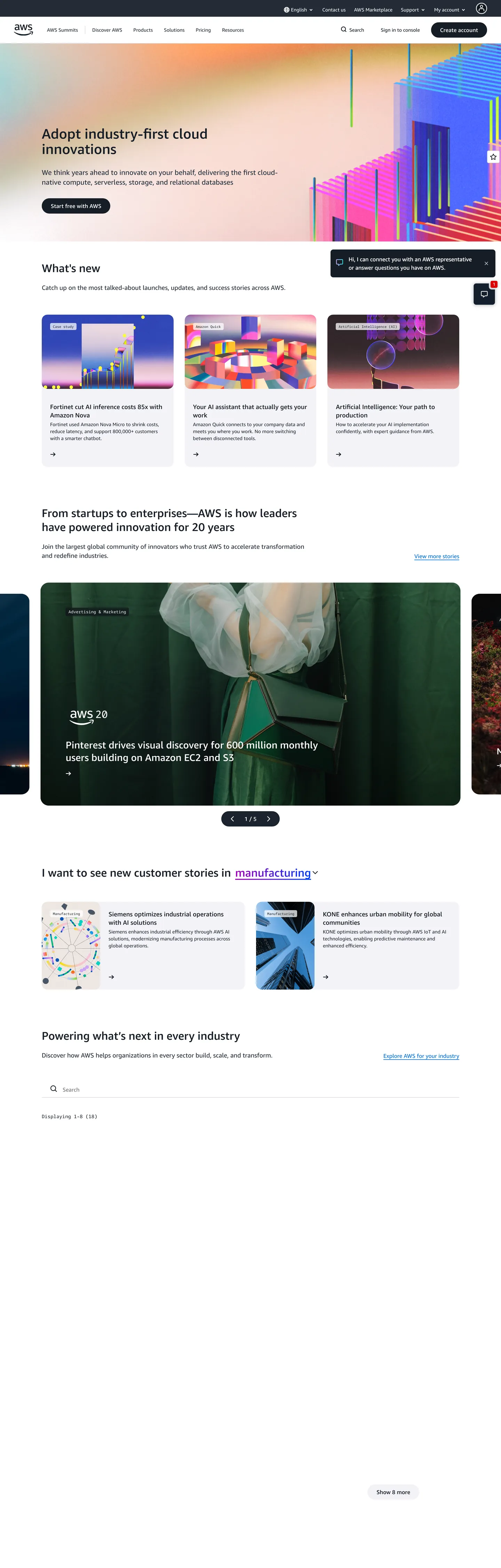
The AWS homepage looks nothing like its console. Where the Console UI is dense charcoal with tight 4px rounding and table-centric layouts, the marketing site is a white editorial surface: a 40px Amazon Ember Display headline in near-black, a 20px sub-paragraph in body gray, and a grid of "What's new" thumbnail cards below the fold. The hero's right side carries a four-panel gradient thumbnail strip where each tile cycles through a different spectral gradient stop — fuchsia to indigo, blue to teal — making the color variety feel curatorial rather than chaotic. No brand orange appears above the fold. The Amazon smile mark in the nav is the only warm chromatic note.
The system runs two Amazon typefaces: Amazon Ember Display for every spoken surface (headline, subhead, body, button, nav link), and Amazon Ember Mono for service-tag chips, pricing metadata, and code annotations. Display tops out at 40px in weight 500 — a deliberate restraint for a brand with 200+ services; the page can't afford a single voice dominating the attention budget. The supporting color story is simpler than the console suggests: one cerulean-blue voltage (#0972d3, wired as --rg-color-link-default) for links, interactive states, and gradient accents; four near-black prose tones that divide heading, body, secondary, and faded roles; and pure white below with a barely-there #f3f3f7 surface tone for card backgrounds.
Feed this file to Claude or Cursor and it reproduces the marketing-site AWS, not the Console — white canvas, generous 16px rounding, two Amazon Ember voices, cerulean-blue as the single interactive voltage. The system is notably warmer and more editorial than the dev-infra convention set by Cloudflare (orange hero canvas) or Vercel (matte black floor). It reads like a retail brand that also happens to run half the internet.
What makes it distinct
5
- Two Amazon Ember voicesAmazon Ember Display for headlines and body, Amazon Ember Mono for service tags and pricing metadata
- Cerulean-blue link voltagethe single chromatic accent wired as --rg-color-link-default across text, borders, and gradient stops
- Generous-rounded card system16px default, 40px pill CTAs, 8px hairline cards; the scale is notably softer than AWS's own Console UI
- Near-black multi-tier textfour near-black tones (#161d26, #232b37, #333333, #72747e) carry the entire prose hierarchy on a white canvas
- Spectral gradient hero bandthe above-fold thumbnail strip cycles fuchsia→indigo→blue→teal color-stop gradients as editorial variety, not brand chrome
aws.amazon.com
Live at aws.amazon.com
A snapshot of the brand in production. Scroll the frame to see the whole page.
Colors
17 colors
AWS's system runs on #0972d3 as its primary voltage, used in 3 of 19 components. Type is set in Amazon Ember Display across 12 tokens from 10px to 40px, weights 400–500. Shape language is soft — components average 16px corner radius, with no sharp interactive edges.
Brand & Accent
Sparing, CTA-only voltage · 2
Surface
Page and card backgrounds · 3
Text
Headlines, body, captions · 5
Borders & Hairlines
Dividers, outlines, rules · 1
Semantic
Status, errors, success, links · 3
Other
Specialty colors · 3
Typography
12 type tokens
Set in Amazon Ember Display across 12 tokens, from 10px to 40px, weights 400–500. Shown in its own stack: where the font isn't installed, the fallback the file names stands in.
- display-xl40px · weight 500 · lh 44pxThe quick brown fox jumps over the lazy dog
- display-lg32px · weight 500 · lh 40pxThe quick brown fox jumps over the lazy dog
- display-md28px · weight 500 · lh 36pxThe quick brown fox jumps over the lazy dog
- heading-lg20px · weight 500 · lh 28pxThe quick brown fox jumps over the lazy dog
- heading-md18px · weight 500 · lh 24pxThe quick brown fox jumps over the lazy dog
- body-lg18px · weight 400 · lh 26pxThe quick brown fox jumps over the lazy dog
- body-md16px · weight 400 · lh 24pxThe quick brown fox jumps over the lazy dog
- body-sm14px · weight 400 · lh 20pxThe quick brown fox jumps over the lazy dog
- label-md16px · weight 500 · lh 24pxThe quick brown fox jumps over the lazy dog
- nav-link14px · weight 400 · lh 20pxThe quick brown fox jumps over the lazy dog
- mono-md14px · weight 400 · lh 20pxThe quick brown fox jumps over the lazy dog
- mono-sm10px · weight 400 · lh 12pxThe quick brown fox jumps over the lazy dog
Layout
Radii and spacing
7 corner radii and 8 spacing values. Shape language: soft.
Radii
- none0px
- xs4px
- sm8px
- md16px
- lg24px
- pill40px
- full9999px
Spacing
- xs4px
- sm8px
- md16px
- lg24px
- xl32px
- 2xl40px
- 3xl56px
- 4xl120px
Components
19 components
Each rendered from its tokens (color, type, radius, padding) on AWS's own canvas.
- Button Primarybutton-primaryButton Primary
- Button Primary Invertedbutton-primary-invertedButton Primary Inverted
- Button Secondarybutton-secondaryButton Secondary
- Top Navtop-navTop Nav
- Nav Linknav-linkNav Link
- Hero Headinghero-headingHero Heading
- Section Headingsection-headingSection Heading
- Body Paragraphbody-paragraphBody Paragraph
- Body Paragraph Mutedbody-paragraph-mutedBody Paragraph Muted
- CardcardCard
- Card Hairlinecard-hairlineCard Hairline
- Thumbnail Cardthumbnail-cardThumbnail Card
- Service Tagservice-tagService Tag
- Type here…text-inputText Input
- Nav Searchnav-searchNav Search
- FooterfooterFooter
- Link Textlink-textLink Text
- Mono Chipmono-chipMono Chip
- Section Dividersection-dividerSection Divider
In use
The system, in use
AWS's tokens on the kind of product it builds.
Build something people actually use.
A short paragraph of marketing copy that previews how the brand's display tier and body tier read together. Two sentences is usually enough.
FAQ
AWS design system FAQ
Common questions about AWS's tokens, components, and how to use this DESIGN.md in your project.
Read next
Related reading
Specs, directories, and component libraries that pair with this design system.
- Browse all design systemsThe full directory of DESIGN.md files on shadcn.io, with live mockups for each.shadcn.io
- AWS — official siteAmazon Web Services' public marketing site — the source of truth for the live tokens captured in this file.aws.amazon.com (opens in a new tab)
- The DESIGN.md specificationGoogle Labs' open spec for machine-readable design system files — the format this page is built on.github.com (opens in a new tab)
Use it
Use AWS in your project
One machine-readable file. Drop it into Claude, Cursor, or any AI tool that reads DESIGN.md.
Download the DESIGN.md
One machine-readable file: every color, type, radius, spacing, and component token of AWS.
Feed it to your AI tool
Drop it into Claude, Cursor, or GitHub Copilot. The agent writes React components and Tailwind classes that match AWS's visual language.
Reference the tokens directly
Or paste the values into your Tailwind config, CSS variables, or component library: every color, size and radius is a quoted, ready-to-copy value.
Read the full DESIGN.md: overview, rationale, do’s and don’ts
Overview
AWS's marketing homepage operates on a different register than its console. Editorial Restraint for 200 Services. Where the AWS Management Console runs dense charcoal surfaces with 4px rounding, the marketing site is a white editorial canvas: a 40px Amazon Ember Display headline, a measured body paragraph, and a scrolling grid of news cards and service thumbnails. Where Cloudflare puts its brand color on the full hero canvas and Vercel uses matte black as the floor, AWS uses white — the most neutral possible stance for a platform that must sell compute, AI, storage, networking, and databases without privileging any one domain.
The chromatic system is minimal for a company with 200+ services: one cerulean-blue voltage ({colors.primary} — #0972d3) for links and interactive states, four near-black prose tones for the text hierarchy, and an above-fold thumbnail strip that cycles spectral gradient stops (mint-to-cerulean, fuchsia-to-indigo) as editorial variety rather than brand color. The orange Amazon smile mark is present in the wordmark but absent from any interactive or structural role; the marketing color story is cold.
The radius scale is notably generous for enterprise infrastructure: 16px default on cards, 40px pill CTAs, 8px on nav chips. This softness is a deliberate distance from the Console's tighter chrome. Amazon Ember Mono — appearing in service-tag chips and pricing metadata — is the system's quiet technical signal.
Key Characteristics:
- White canvas (
{colors.canvas}— #ffffff) with a barely-there #f3f3f7 surface tone for card backgrounds. No dark hero, no brand-color floor. - Single cerulean-blue voltage (
{colors.primary}— #0972d3) wired as link, focus, selected, status-info across 354 captured occurrences. - Four near-black prose tones: ink-heading (#161d26), ink-body (#232b37), ink-secondary (#333333), ink-muted (#72747e) — zero pure black in prose.
- Amazon Ember Display across all display and body tiers; Amazon Ember Mono for service metadata and code annotations.
- 40px hero h1 at weight 500 — restrained for the scale of the brand; not the 700-weight hero that fintech brands lean on.
- Generous-soft radius: 16px default (71 occurrences), 40px pill CTA (26 occurrences), 8px nav chips (30 occurrences).
- Pitch-black top nav (#0f141a) with white link text — the single dark surface on an otherwise all-white page.
- Five named spectral gradients (blue, teal, purple, fuchsia, orange) used on hero thumbnails and editorial illustration, not on interactive chrome.
Colors
Brand / Interactive
- Primary Blue (
{colors.primary}— #0972d3): frequency 354. Used as text (173), border (173), gradient stop (8). Wired as--rg-color-link-default,--rg-color-link-focus,--rg-color-link-selected,--rg-color-status-info. The single interactive voltage across the entire marketing surface — carries every link, every CTA underline, every focus ring. - Primary Dark (
{colors.primary-dark}— #003b8f): frequency 0 (declared, not rendered on captured surface). Hover state for the primary voltage, wired as--rg-color-link-hover.
Text
- Ink (
{colors.ink}— #161d26): frequency 228. Used as text (109) and border (109). The dominant heading color — title, eyebrow, and high-contrast text wired as--rg-color-text-title,--rg-color-text-primary,--rg-color-text-heading. - Ink Body (
{colors.ink-body}— #232b37): frequency 137. Used as text (68) and border (68). Default running text:--rg-color-text-body,--rg-color-text-secondary. - Ink Secondary (
{colors.ink-secondary}— #333333): frequency 874. Used as text (438) and border (432). The structural label and subhead tone. Wired as--rg-color-base-gray-700. - Ink Muted (
{colors.ink-muted}— #72747e): frequency 12. Used in faded text states and medium-contrast borders. Wired as--rg-color-text-faded,--rg-color-border-mediumcontrast. - Ink Faded (
{colors.ink-faded}— #a4a4ad): frequency 72. Used as text (36) and border (36). The footer and caption gray. Wired as--rg-color-base-gray-450.
Surface
- Canvas (
{colors.canvas}— #ffffff): frequency 189. The page floor, card interiors, and body content. Pure white. - Surface-1 (
{colors.surface-1}— #f3f3f7): frequency 32, all as background. Card background, code-window fill, thumbnail tile background. Wired as--rg-color-background-object,--rg-color-code-window. - Surface-2 (
{colors.surface-2}— #dedee3): frequency 1, background. A slightly-darker gray for elevated chips and dividers. - Nav Background (
{colors.nav-bg}— #0f141a): frequency 6. The pitch-black top-nav and footer surface. Wired as--rg-color-background-page-inverted.
Hairlines
- Hairline (
{colors.hairline}— #ccccd1): frequency 1. Low-contrast border for card outlines and dividers. Wired as--rg-color-border-lowcontrast.
Semantic
- Error (
{colors.error}— #db0000): frequency 1, background. Status error, wired as--rg-color-base-red-600/--rg-color-status-error.
Typography
Font Families
Two Amazon-proprietary voices: Amazon Ember Display for every spoken surface — headlines, headings, body paragraphs, buttons, nav links — and Amazon Ember Mono for every annotated surface — service-tag chips, pricing metadata, and code-style annotations. Fallback stacks walk "Amazon Ember", "Helvetica Neue", Helvetica, Arial, sans-serif and Consolas, "Andale Mono WT", "Andale Mono", monospace.
This is the same two-voice split as Cloudflare (sans + mono), but where Cloudflare's Apercu Mono Pro carries 138+ samples, Amazon Ember Mono is used more sparingly — confined to service-category chips and pricing tables.
Hierarchy
| Token | Size | Weight | Line Height | Use |
|---|---|---|---|---|
{typography.display-xl} | 40px | 500 | 44px | Hero h1 ("Adopt industry-first cloud innovations") |
{typography.display-lg} | 32px | 500 | 40px | Section h2 ("What's new") |
{typography.display-md} | 28px | 500 | 36px | Sub-section h2 |
{typography.heading-lg} | 20px | 500 | 28px | h2 feature-cell headings |
{typography.heading-md} | 18px | 500 | 24px | h4 card titles |
{typography.body-lg} | 18px | 400 | 26px | Hero sub-paragraph, lead copy |
{typography.body-md} | 16px | 400 | 24px | Default running text |
{typography.body-sm} | 14px | 400 | 20px | Captions, nav links, button labels |
{typography.label-md} | 16px | 500 | 24px | Emphasized inline labels |
{typography.mono-md} | 14px | 400 | 20px | Service tags, pricing metadata |
{typography.mono-sm} | 10px | 400 | 12px | Small service-category chips |
Principles
Display weight tops out at 500. The hero h1 at 40px / 500 is the loudest typographic moment — measured for a brand that must carry 200+ services without privileging any one. Bold (700) appears only on emphasized inline <strong> text, not in structural headings. The weight discipline mirrors Cloudflare's: confidence through scale and proportion, not through weight.
Note on Font Substitutes
Both Amazon Ember families are proprietary. For Amazon Ember Display, Inter at the same weights transfers cleanly; the proportions are close at 16–18px body sizes and at the 28–40px display tier. For Amazon Ember Mono, IBM Plex Mono or JetBrains Mono at the same 10–14px sizing are functional substitutes.
Layout
Spacing System
- Base unit: 4px (appearing 32 times as the smallest gap value).
- Tokens:
{spacing.xs}4px ·{spacing.sm}8px ·{spacing.md}16px ·{spacing.lg}24px ·{spacing.xl}32px ·{spacing.2xl}40px ·{spacing.3xl}56px ·{spacing.4xl}120px. - Section padding: ~120px top/bottom on major hero bands (
--rg-margin-1/--rg-padding-1). - Card internal padding:
{spacing.lg}(24px) on the default card grid. - CTA padding: 10×26px on the pill primary button.
Grid & Container
- Max content width: ~1280px on the hero; the "What's new" card grid and "From startups to enterprises" section sit in a ~1080px centered container.
- Hero: left-aligned 40px headline + 20px sub-paragraph + pill CTA; right half carries a 2×2 spectral-gradient thumbnail panel.
- "What's new" grid: 3-column grid of editorial thumbnail cards with
{colors.surface-1}background and{rounded.md}16px rounding. - Feature sections: alternating 2-column split (text left, image/thumbnail right) and full-width editorial bands.
Rhythm
The page alternates between editorial dek (headline + sub-paragraph, white canvas, generous spacing) and dense card grid (3- or 4-up thumbnail rows with {colors.surface-1} cards). Section transitions are hard cuts — no gradient crossfades, no color-band transitions. The pitch-black nav and footer anchor top and bottom without bleeding into the white body.
Elevation
The marketing surface uses a light shadow system rather than a hairline-only approach:
- Card lift:
--rg-shadow-gray-elevation-1:1px 1px 20px rgba(0,0,0,0.1)— used on hover states for thumbnail cards. - Menu lift:
--rg-shadow-gray-elevation-2:1px 1px 24px rgba(0,0,0,0.25)— used on mega-menu dropdowns. - Hairline borders:
{colors.hairline}(#ccccd1) and{colors.surface-2}on card outlines. The system uses both shadow and hairline — not shadow-only (Cloudflare) and not tonal-lift-only (Spline).
Shapes
The radius scale is generous-soft, centered on 16px with a 40px pill for CTAs:
{rounded.none}0px — text inputs and inline dividers only.{rounded.xs}4px — service-tag chips, small nav surfaces.{rounded.sm}8px — nav link hover tiles, smaller cards.{rounded.md}16px — the dominant card radius (71 occurrences); editorial thumbnail cards, feature panels, content tiles.{rounded.lg}24px — larger feature cards (8 occurrences).{rounded.pill}40px — primary and secondary CTA buttons (26 occurrences); the warmest tap target on the page.{rounded.full}9999px — avatar chips and circular logo marks.
There is no tight 2–3px tier. Even the smallest service-tag chip starts at 4px. The scale is substantially softer than AWS's console and softer than Cloudflare's marketing binary (3–8px or full pill).
Components
button-primary — Cerulean-blue {colors.primary} fill, white text, {rounded.pill} 40px radius, 10×26px padding, 44px height. The "Get started" / "Create account" canonical form.
button-primary-inverted — Used in the pitch-black nav band: {colors.nav-bg} fill with cerulean-blue {colors.primary} text. Inverts the CTA figure-ground for dark-surface contexts.
button-secondary — White canvas fill, ink text, {rounded.pill} 40px radius, 1px hairline border. Used alongside the primary for "Learn more" secondary actions.
top-nav — Pitch-black {colors.nav-bg} surface, white text in {typography.nav-link}, 56px height, 32px horizontal padding. Houses the Amazon logo (orange smile mark on dark), dense mega-menu triggers, a search input, and "Sign in to Console" / "Create account" cluster.
nav-link — Transparent fill, white text, {rounded.sm} 8px radius on hover. 14px / 400. The pitch-black surface makes hover states invisible until activated — typical for dark nav bars.
hero-heading — Near-black {colors.ink} text, {typography.display-xl} (40px / 500). Left-aligned against the white canvas — no colored background, no gradient, no hero block.
section-heading — Near-black text, {typography.display-lg} (32px / 500). Used for "What's new," "From startups to enterprises," and similar section-entry headings.
body-paragraph — {colors.ink-body} text at {typography.body-lg} (18px / 400) for the hero sub-paragraph; {typography.body-md} (16px / 400) for section body.
card — {colors.surface-1} (#f3f3f7) fill, ink text, {rounded.md} 16px radius, 24px padding, 1px {colors.surface-2} border. The default content card for the "What's new" editorial grid.
card-hairline — White canvas fill, ink text, {rounded.md} 16px radius, 1px {colors.hairline} border. Used where cards sit on the surface-1 background rather than on white.
thumbnail-card — {colors.surface-1} fill, {rounded.md} 16px radius, 0 padding. The image fills edge-to-edge. Used in the "What's new" 3-up grid and the hero thumbnail panel.
service-tag — {colors.surface-1} fill, ink-body text, {typography.mono-sm} (10px Amazon Ember Mono), {rounded.xs} 4px radius, 4×8px padding. The small service-category chip that identifies AWS compute, storage, AI taxonomy.
text-input — White canvas fill, ink-body text, {rounded.none} 0px radius, 0×16px padding, 44px height. Search bar in the nav uses a variant on {colors.nav-bg} fill.
footer — Pitch-black {colors.nav-bg} fill, faded {colors.ink-faded} text at {typography.body-sm}, 40×32px padding.
link-text — {colors.primary} (#0972d3) text color, underline on hover. The canonical inline link treatment across body paragraphs, card CTAs, and nav anchors.
mono-chip — Amazon Ember Mono at {typography.mono-md}, {colors.surface-1} fill, {rounded.xs} 4px. Used for pricing metadata and service-tab labels.
section-divider — 1px {colors.surface-2} border. Hairline rule separating editorial sections.
Do's and Don'ts
Do keep the hero h1 at weight 500. The 40px / 500 display is deliberate restraint for a platform that sells 200+ services simultaneously — no single headline can dominate. Bumping to 700 turns one section's headline into a brand statement and breaks the editorial neutrality.
Do treat {colors.primary} (#0972d3) as a link and interactive-state voltage only. It does not appear as a button background in the captured hero (the CTA inverts the figure-ground on the dark nav instead). Using it as a fill color below the fold competes with its role as the link signal.
Do use {colors.surface-1} (#f3f3f7) — not white — for card backgrounds that sit on the white page canvas. The barely-visible tonal distinction reads as structural lift without shadows.
Do use the 40px pill radius ({rounded.pill}) only for primary and secondary CTAs. Applying it to cards or section containers breaks the binary logic: soft rounding on cards (16px), pill rounding only on tap targets.
Don't use the spectral gradient families ({colors.gradient-blue-start}, {colors.gradient-purple-start}, etc.) as CTA fills or heading backgrounds. They are thumbnail-illustration fills — mixing them into interactive chrome makes the gradient system feel decorative rather than editorial.
Don't use pure black for prose text. The system runs four near-black tones (ink heading through ink faded) that carry the full prose hierarchy; dropping to pure black at any tier breaks the graduated warmth of the text scale.
Don't introduce a 2–3px radius tier. The scale starts at 4px ({rounded.xs}) — adding tighter corners imports the Console's denser aesthetic into the marketing surface.
Don't remove the pitch-black nav/footer contrast. The {colors.nav-bg} (#0f141a) top and bottom bands are the only dark surfaces on an otherwise all-white page; they anchor the layout's vertical hierarchy. A white or gray nav removes the only structural contrast signal.
Known Gaps
- Brand orange (Amazon smile): the orange Amazon smile mark is visually iconic but does not appear as a rendered color in the extracted marketing surface. The token
--rg-color-base-orange-*family exists in CSS but carries no marketing-surface usage — orange is a logo asset, not a system color. - Dark mode: the captured marketing surface is light-only. The Console has a dark variant, but no dark-mode design tokens are wired into the marketing page's
:root. - Hover and focus states: documented for
{component.button-primary}and{component.nav-link}only; the full state matrix (disabled, error, loading) lives in the Cloudscape design system (AWS's internal React component library) not exposed on the marketing surface. - Mega-menu surfaces: the nav mega-menu (which reveals service categories in a two-column panel) carries its own card and link surface tokens not captured in this spec.
- Product surfaces: this DESIGN.md captures the marketing homepage only. The AWS Console, the service-specific marketing pages (S3, EC2, Bedrock, SageMaker), and the AWS documentation site each carry their own visual systems — Cloudscape for the Console, a different editorial system for documentation.
- Mobile-first breakpoints: the marketing homepage reflows aggressively below 1024px (hero switches to single-column, card grid collapses to 1-up) but breakpoint-specific token overrides are not captured here.
- Animation: the hero thumbnail strip appears to auto-advance through gradient combinations on a timer; easing curves and transition duration are not represented in the extracted static tokens.
Web Infrastructure & Hosting
More systems like this
More DESIGN.md files in Web Infrastructure & Hosting.
Pricing
Build it with Pro
The DESIGN.md files are free. Pro adds 6,000+ blocks, premium templates and the MCP server, so your AI editor builds in your system for you.
4.9/5 out of 5 · 150+ reviewsfrom 150+ founders and developers.
Billing
Billed once a year in USD. Cancel anytime.
- How many people can use the license.
- Client work, SaaS products and anything you charge for.
- Production-ready React sections: hero, pricing, features, dashboards and more.
- Complete multi-page sites you can ship as they are.
- React icons from every major library, installable with one command.
- Presets that restyle every block, in light and dark.
- Lets your AI editor search, preview and install blocks for you.
- Priority requests are answered first.
Individual
For personal projects & open source
$32instead of $49/mo
$389 billed yearly
- Seats: 1 seat
- Commercial use: Personal & open source only
- Pro blocks: 6,000+ blocks
- Templates: All 14 templates
- React icons: 294k+ icons
- Themes: All 59 themes
- MCP server: Basic usage
- Support: Standard
Team
Most popularFor freelancers, agencies & startups
$66instead of $99/mo
$789 billed yearly · ≈ $13/dev/mo
- Seats: Up to 5 seats
- Commercial use: Included
- Pro blocks: 6,000+ blocks
- Templates: All 14 templates
- React icons: 294k+ icons
- Themes: All 59 themes
- MCP server: High usage
- Support: Priority
Organization
For companies with larger teams
$132instead of $199/mo
$1,589 billed yearly
- Seats: Unlimited seats
- Commercial use: Included
- Pro blocks: 6,000+ blocks
- Templates: All 14 templates
- React icons: 294k+ icons
- Themes: All 59 themes
- MCP server: Unlimited usage
- Support: Priority
Billed once a year in USD. Cancel anytime.
Individual
For personal projects & open source
$32instead of $49/mo
$389 billed yearly
- How many people can use the license.Seats: 1 seat
- Client work, SaaS products and anything you charge for.Commercial use: Personal & open source only
- Production-ready React sections: hero, pricing, features, dashboards and more.Pro blocks: 6,000+ blocks
- Complete multi-page sites you can ship as they are.Templates: All 14 templates
- React icons from every major library, installable with one command.React icons: 294k+ icons
- Presets that restyle every block, in light and dark.Themes: All 59 themes
- Lets your AI editor search, preview and install blocks for you.MCP server: Basic usage
- Priority requests are answered first.Support: Standard
Team
Most popularFor freelancers, agencies & startups
$66instead of $99/mo
$789 billed yearly · ≈ $13/dev/mo
Everything in Individual, plus
- How many people can use the license.Seats: Up to 5 seats
- Client work, SaaS products and anything you charge for.Commercial use: Included
- Lets your AI editor search, preview and install blocks for you.MCP server: High usage
- Priority requests are answered first.Support: Priority
Organization
For companies with larger teams
$132instead of $199/mo
$1,589 billed yearly
Everything in Team, plus
- How many people can use the license.Seats: Unlimited seats
- Lets your AI editor search, preview and install blocks for you.MCP server: Unlimited usage
- Secure checkout via Stripe
- Code lives in your repo
- Keep what you've shipped if you cancel
- License terms
Your system, built for you
Every block, template and icon, installed by your AI agent in your design system. The DESIGN.md files stay free.