DigitalOcean Design System
DigitalOcean's AI-Native Cloud marketing system as a DESIGN.md file. Deep teal-black hero, forest-teal CTA, Plus Jakarta Sans + Inter + JetBrains Mono, 15 colors, 14 components. For React, Next.js, and AI tools.
Add shadcn.io to your AI agent. · Pro It installs blocks, icons and templates in your design system from a prompt, with Pro.
Set up MCP- Primary
- #000f0f
- Typeface
- Inter
- Shape
- Soft
- Base radius
- 8px
- Colors
- 15
- Type tokens
- 11
- Components
- 14
- Spacing values
- 9
About
About DigitalOcean DESIGN.md
Curated by Dov Azencot · Updated May 19, 2026 · Source digitalocean.com (opens in a new tab)
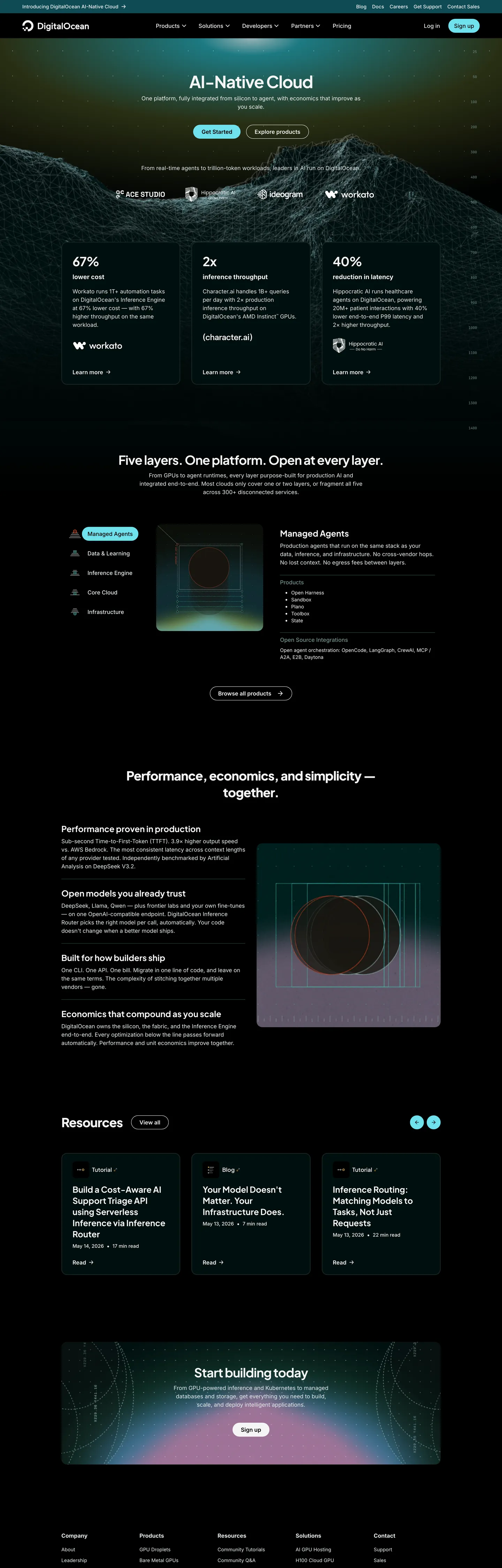
DigitalOcean's marketing site just pivoted. For a decade the brand ran a single cobalt blue (#0069ff) on a white canvas — the most recognizable indie-cloud identity in dev infrastructure. The captured surface above the fold has fully replaced that treatment with a deep teal-black hero (#000f0f) carrying a 48px Plus Jakarta Sans bold display headline ("AI-Native Cloud") in near-white, a forest-teal pill CTA (#1f403e), and an illustrated mountain-peak backdrop in grayscale. The cobalt blue is still declared as the brand's HTML theme-color, but it doesn't appear on the captured surface — the AI-Native Cloud product line has its own palette, and the marketing home page has adopted it whole-cloth. Where AWS holds a single orange across every product surface and Linode keeps its green pinned to one CTA, DigitalOcean has just shipped a complete chromatic reset in service of a product positioning.
The DESIGN.md file packages the system into a machine-readable spec for React tooling. Inside: 15 colors tokens drawn from a deep-teal canvas tier (the new product-line palette), a near-white running-text tier sitting on top, a small set of foam-green and sky-blue brand-layer accents reserved for product-domain marks, and the structural grays that carry hairline and muted-text duty; 11 typography tokens running three families in distinct semantic roles — Plus Jakarta Sans for display (48px / 700 on the hero, 36px / 800 on section h2), Inter for body and nav (14-18px / 400-600), and JetBrains Mono for small-caps metadata strips (10px / 400); 5 radius tokens with a notable 40px fully-rounded primary-button treatment; 9 spacing values on an 8px base; and 14 components definitions covering the teal pill, the dark hero card, the foam-green chip, the white feature card on the body band, and the mono caption strip.
Feed this file to an AI coding tool and it reproduces DigitalOcean's new specific moves: deep teal-black canvas instead of cobalt-on-white, forest-teal CTA pill instead of the classic indigo button, Plus Jakarta Sans at weight 700-800 for display (heavier than peers like Cloudflare and Vercel), Inter for body and nav, JetBrains Mono for 10px tracked metadata, and the illustrated grayscale mountain backdrop that returns the brand to its indie-dev illustrated heritage. The borrowable move is the three-typeface stack — display / body / mono split into deliberately distinct families — which gives every typographic surface a clear semantic role without requiring multiple weights inside one family to do the same work.
What makes it distinct
5
- Three-typeface stackPlus Jakarta Sans for display, Inter for body, JetBrains Mono for 10px small-caps metadata
- Deep teal-black hero#000f0f canvas with foam-green and sky-blue brand-layer accents, a pivot from the historical #0069ff cobalt
- Forest-teal CTA pill#1f403e fill at fully-rounded 40px radius, the most distinctive button shape in dev infrastructure
- Plus Jakarta Sans at weight 700-80048px hero h1 with -1.5px tracking, the heaviest display weight in this directory
- Mountain-graphic hero backdropillustrated grayscale peaks behind the headline, a return to the indie-dev illustrated heritage
digitalocean.com
Live at digitalocean.com
A snapshot of the brand in production. Scroll the frame to see the whole page.
Colors
15 colors
DigitalOcean's system runs on #000f0f as its primary voltage, used in 3 of 14 components. Type is set in Inter across 11 tokens from 10px to 48px, weights 400–800. Shape language is soft — components average 31px corner radius, with no sharp interactive edges.
Brand & Accent
Sparing, CTA-only voltage · 3
Surface
Page and card backgrounds · 3
Text
Headlines, body, captions · 7
Borders & Hairlines
Dividers, outlines, rules · 2
Typography
11 type tokens
Set in Inter across 11 tokens, from 10px to 48px, weights 400–800. Shown in its own stack: where the font isn't installed, the fallback the file names stands in.
- display-xl48px · weight 700 · lh 56px · tracking -1.5pxThe quick brown fox jumps over the lazy dog
- display-md36px · weight 700 · lh 48px · tracking -1pxThe quick brown fox jumps over the lazy dog
- display-md-heavy36px · weight 800 · lh 48px · tracking -1pxThe quick brown fox jumps over the lazy dog
- heading-md24px · weight 700 · lh 32pxThe quick brown fox jumps over the lazy dog
- heading-sm18px · weight 700 · lh 26pxThe quick brown fox jumps over the lazy dog
- body-md16px · weight 400 · lh 24pxThe quick brown fox jumps over the lazy dog
- body-sm14px · weight 400 · lh 20pxThe quick brown fox jumps over the lazy dog
- label-md16px · weight 600 · lh 24pxThe quick brown fox jumps over the lazy dog
- button-md14px · weight 600 · lh 20pxThe quick brown fox jumps over the lazy dog
- nav-link14px · weight 500 · lh 21pxThe quick brown fox jumps over the lazy dog
- mono-sm10px · weight 400 · lh 14pxThe quick brown fox jumps over the lazy dog
Layout
Radii and spacing
8 corner radii and 9 spacing values. Shape language: soft.
Radii
- none0px
- xs2px
- sm4px
- md8px
- lg12px
- xl16px
- pill40px
- full9999px
Spacing
- xs2px
- sm4px
- base8px
- md12px
- lg16px
- xl24px
- 2xl32px
- 3xl48px
- 4xl96px
Components
14 components
Each rendered from its tokens (color, type, radius, padding) on DigitalOcean's own canvas.
- Button Primarybutton-primaryButton Primary
- Button Primary Hoverbutton-primary-hoverButton Primary Hover
- Button Secondarybutton-secondaryButton Secondary
- Top Navtop-navTop Nav
- Nav Linknav-linkNav Link
- Hero Headinghero-headingHero Heading
- Section Headingsection-headingSection Heading
- Body Paragraphbody-paragraphBody Paragraph
- Body Paragraph Mutedbody-paragraph-mutedBody Paragraph Muted
- Mono Statmono-statMono Stat
- Card Darkcard-darkCard Dark
- Card Resourcecard-resourceCard Resource
- Chip Foamchip-foamChip Foam
- FooterfooterFooter
In use
The system, in use
DigitalOcean's tokens on the kind of product it builds.
Build something people actually use.
A short paragraph of marketing copy that previews how the brand's display tier and body tier read together. Two sentences is usually enough.
FAQ
DigitalOcean design system FAQ
Common questions about DigitalOcean's tokens, components, and how to use this DESIGN.md in your project.
Read next
Related reading
Specs, directories, and component libraries that pair with this design system.
- Browse all design systemsThe full directory of DESIGN.md files on shadcn.io, with live mockups for each.shadcn.io
- DigitalOcean — official siteDigitalOcean's public marketing site — the source of truth for the live tokens captured in this file.digitalocean.com (opens in a new tab)
- The DESIGN.md specificationGoogle Labs' open spec for machine-readable design system files — the format this page is built on.github.com (opens in a new tab)
Use it
Use DigitalOcean in your project
One machine-readable file. Drop it into Claude, Cursor, or any AI tool that reads DESIGN.md.
Download the DESIGN.md
One machine-readable file: every color, type, radius, spacing, and component token of DigitalOcean.
Feed it to your AI tool
Drop it into Claude, Cursor, or GitHub Copilot. The agent writes React components and Tailwind classes that match DigitalOcean's visual language.
Reference the tokens directly
Or paste the values into your Tailwind config, CSS variables, or component library: every color, size and radius is a quoted, ready-to-copy value.
Read the full DESIGN.md: overview, rationale, do’s and don’ts
Overview
DigitalOcean's marketing site just pivoted. Chromatic reset for a product line. For a decade the brand ran a single cobalt blue (#0069ff) on a white canvas — the most recognizable indie-cloud identity in dev infrastructure. The captured marketing home has fully replaced that treatment with a deep teal-black hero ({colors.ink-canvas} — #000f0f) carrying a 48px Plus Jakarta Sans 700 display headline in near-white ({colors.ink-near-white} — #f4f5f5), a forest-teal pill CTA at {colors.surface-card-2} (#1f403e), and an illustrated mountain-peak backdrop in grayscale. The cobalt blue is still declared as the HTML theme-color, but it doesn't appear on the captured surface above the fold — the AI-Native Cloud product line has its own palette, and the marketing home page has adopted it whole. Where AWS holds a single orange across every product surface and Linode keeps its green pinned to one CTA, DigitalOcean has just shipped a complete chromatic reset in service of a product positioning.
The system runs a three-typeface stack in distinct semantic roles. Plus Jakarta Sans carries display — 48px / 700 on the hero, 36px / 700-800 on section h2 (the 800 weight is the heaviest display weight in the directory), 24px / 700 on h3. Inter carries body, nav, and label tiers at 14-18px in weights 400-600. JetBrains Mono carries 10px small-caps metadata strips on infra-stat rows. This pairing — heavy editorial display + neutral body + utilitarian mono — is rare in dev infrastructure (Cloudflare runs Apercu Mono Pro for metadata, Vercel runs Geist for everything, Stripe runs a custom display sans plus IBM Plex Mono); DigitalOcean ships a stack closer to a technical documentation site than to a typical SaaS marketing surface.
The shape language is small-step plus a distinctive 40px primary-button pill. The forest-teal CTA at 40px border-radius — which renders as fully rounded at the button's 32px height — is the most identifiable shape element on the page. Cards round at 12-16px, internal chips at 8px, small UI surfaces at 2-4px. The scale skips the 24-32px middle tier that Stripe and Linear use; DigitalOcean keeps cards at 12-16px and reserves the warm rounding for the button itself.
Key Characteristics:
- Deep teal-black hero canvas (
{colors.ink-canvas}— #000f0f) instead of the historical cobalt-on-white — the AI-Native Cloud product line carries its own palette. - Forest-teal CTA pill (
{colors.surface-card-2}— #1f403e) at{rounded.pill}40px radius — the canonical button treatment, distinct from the indigo or cobalt buttons of peer brands. - Three-typeface stack — Plus Jakarta Sans display, Inter body / nav, JetBrains Mono metadata — each pinned to one semantic role.
- Plus Jakarta Sans at weight 700-800 on display — the heaviest display weight in the directory; the 36px h2 at weight 800 is the loudest typographic moment.
- Foam-green and sky-blue brand-layer accents (
{colors.brand-foam}#6fe0ed,{colors.brand-cerulean}#5198fb) reserved for product-domain chips; the chromatic palette is otherwise structural. - Mountain-graphic hero backdrop — illustrated grayscale peaks behind the headline, a return to the brand's indie-dev illustrated heritage.
- Near-white running text (
{colors.ink-near-white}— #f4f5f5) on every dark surface; pure white reserved for hover states and small elevation moments. - 8px base spacing, with 24-32px as the dominant card padding rhythm and ~96px on the hero band.
Colors
Surface
- Ink Canvas (
{colors.ink-canvas}— #000f0f): frequency 17 — used as background only. The hero floor and the page-wide canvas above the fold. Wired in CSS as--deep-00and--deep-100. Slightly teal-tinted rather than pure black — the warmth is the AI-Native Cloud palette signature. - Canvas Surface (
{colors.canvas-surface}— #000000): frequency 29 — used as background (13), text (8), border (8). Pure black, reserved for the navigation strip and the deepest inset surfaces. - Surface Card (
{colors.surface-card}— #13302e): frequency 4 — used as background only. The dark forest-teal card fill used on the resource cards and dark feature surfaces. Wired as--foam-800and--deep-300. - Surface Card 2 (
{colors.surface-card-2}— #1f403e): frequency 2 — the forest-teal CTA button fill. Wired as--deep-400. The button's signature color.
Brand
- Brand Foam (
{colors.brand-foam}— #6fe0ed): frequency 5 — used as background only. The bright cyan-green accent for chips and product-domain marks. Wired as--foam-200. The brightest chromatic moment on the page. - Brand Cerulean (
{colors.brand-cerulean}— #5198fb): frequency 2 — used as background only. A muted sky-blue accent for secondary chips and inline highlights. Wired as--cerulean-300. - Brand Foam Deep (
{colors.brand-foam-deep}— #104b55): frequency 1 — used as background only. A deeper foam-tone reserved for chip hover states. Wired as--foam-700.
Text
- Ink Near White (
{colors.ink-near-white}— #f4f5f5): frequency 714 — used as text (351), border (355), shadow (7). The dominant text color across the dark canvas. Wired as--primary-gray-900and--deep-1000. Near-white, not pure white — the slight warmth keeps the contrast from feeling industrial. - Ink Light (
{colors.ink-light}— #e5eceb): frequency 262 — used as text (131) and border (131). Secondary running-text on the dark canvas where near-white would feel too heavy. Wired as--primary-gray-800and--deep-950. - Ink Dim (
{colors.ink-dim}— #6f908c): frequency 38 — used as text (19) and border (19). The muted-gray tertiary text tone. Wired as--deep-700and--scale-400. - Ink Soft (
{colors.ink-soft}— #4d5b7c): frequency 22 — used as text (11) and border (11). A slightly cooler tertiary tone for cross-band UI labels. Wired as--primary-gray-400. - Ink Pure (
{colors.ink-pure}— #ffffff): frequency 910 — used as text (457) and border (453). The dominant white reference, used inside chip text and on small icon strokes. Distinct from{colors.ink-near-white}which carries the running text. - Text Light (
{colors.text-light}— #f4f5f5): same hex value as{colors.ink-near-white}but exposed as a separate semantic token in the captured CSS via--text-light; aliased here to keep the component token map readable.
Hairline
- Hairline (
{colors.hairline}— #e5eceb): frequency 262 as border — the dominant border tone on dark-canvas cards. Same hex as{colors.ink-light}but used in border role. - Hairline Dim (
{colors.hairline-dim}— #6f908c): frequency 38 — used on muted card outlines and secondary button borders. Same hex as{colors.ink-dim}.
Typography
Font Families
The system runs three typeface families in distinct semantic roles. Plus Jakarta Sans (a contemporary geometric sans, open-source on Google Fonts) carries every display tier — hero h1, section h2, h3 sub-section titles. Inter (the dev-tools default) carries body, nav, label, and button — 14-18px in weights 400-600. JetBrains Mono carries 10px small-caps metadata strips on infra-stat rows and inside code-adjacent annotations. The fallback for Inter walks "Inter Fallback", sans-serif; for JetBrains Mono "JetBrains Mono Fallback", monospace. The fallbacks are JetBrains's variable-width metric-matched alternates that prevent CLS during font load.
Hierarchy
| Token | Size | Weight | Line Height | Letter Spacing | Use |
|---|---|---|---|---|---|
{typography.display-xl} | 48px | 700 | 56px | -1.5px | Hero h1 ("AI-Native Cloud") |
{typography.display-md} | 36px | 700 | 48px | -1px | Section h2 ("Five layers. One platform. Open at every layer.") |
{typography.display-md-heavy} | 36px | 800 | 48px | -1px | The heaviest h2 variant — used on the most prominent section heads |
{typography.heading-md} | 24px | 700 | 32px | 0 | h3 / sub-section titles ("Open models you already trust", "Managed Agents") |
{typography.heading-sm} | 18px | 700 | 26px | 0 | h4 / card titles |
{typography.body-md} | 16px | 400 | 24px | 0 | Default running text on hero and section sub-paragraphs |
{typography.body-sm} | 14px | 400 | 20px | 0 | Caption rows, footnote text |
{typography.label-md} | 16px | 600 | 24px | 0 | Button labels and emphasized inline copy |
{typography.button-md} | 14px | 600 | 20px | 0 | Primary and secondary button labels |
{typography.nav-link} | 14px | 500 | 21px | 0 | Top-nav link labels |
{typography.mono-sm} | 10px | 400 | 14px | 0 | Infra-stat metadata strips ("EAST AT BC", "G2 NORTH AMERICA", "AI INFRASTRUCTURE") |
Principles
Display weight sits at 700-800 across every Plus Jakarta Sans tier — heavier than the editorial 500 weight that Cloudflare and Spline use. The 48px hero h1 at weight 700 with -1.5px tracking is loud by design; the 36px h2 at weight 800 (the heaviest weight in the directory) is the section anchor that announces each new platform layer. Plus Jakarta Sans's geometric proportions carry the weight cleanly without feeling industrial.
Body tier is Inter at 400-600, which keeps the running text neutral and dev-readable rather than competing with the display family. The mono tier is JetBrains Mono at 10px — a tiny size used for the small-caps metadata strips that anchor infra-stat rows. The mono never appears in headings or body; it stays locked to one semantic role.
Note on Font Substitutes
All three families are open-source. Plus Jakarta Sans is on Google Fonts. Inter is via the official site or Google Fonts. JetBrains Mono is via JetBrains. No substitute needed. If you must substitute Plus Jakarta Sans, DM Sans at weight 700 is the closest open alternative; for Inter, Geist at the same weights transfers cleanly; for JetBrains Mono, IBM Plex Mono or the system stack are both acceptable.
Layout
Spacing System
- Base unit: 8px — the dominant gap value, appearing 155 times in the captured page.
- Tokens:
{spacing.xs}2px ·{spacing.sm}4px ·{spacing.base}8px ·{spacing.md}12px ·{spacing.lg}16px ·{spacing.xl}24px ·{spacing.2xl}32px ·{spacing.3xl}48px ·{spacing.4xl}96px. - Section padding (vertical): ~96px on the hero band; below the fold the rhythm tightens to ~48px between major sections.
- Card internal padding:
{spacing.xl}(24px) horizontal with{spacing.2xl}(32px) vertical is the dominant card pattern; smaller resource cards sit at 24px on all four sides. - Top-nav padding:
{spacing.md}(12px) vertical,{spacing.xl}(24px) horizontal.
Grid & Container
- Max content width: ~1080px on the hero and editorial bands, ~1280px on the five-layer platform diagram and the footer logo strip.
- Hero band: full-bleed deep-teal canvas with the illustrated mountain backdrop, content centered at ~864px max-width; the headline / sub-paragraph / CTA pair stacks vertically with a 3-column stat row beneath ("47% lower latency", "2x throughput", "40% cost reduction").
- Five-layer platform diagram: 2-column 50/50 grid pairing a layer-list on the left with a 3D-rendered cube graphic on the right.
- Resource cards: 3-column grid below the fold pairing thumbnail + title + sub-caption per card.
- Footer: centered full-bleed dark canvas with a 5-column link grid.
Rhythm
The page alternates between product-claim bands (the hero with the stat row, the five-layer diagram, the customer-outcome strip) and resource bands (the resource card grid, the build-today close, the footer). Every section anchors on a Plus Jakarta Sans 700-800 h2 followed by an Inter body sub-paragraph, then a content payload (diagram, card grid, or stat row). The rhythm is consistent — the page never breaks the display-then-body-then-payload sequence — which makes the page read as a single product prospectus rather than a feature list.
Elevation
The system has essentially no shadow tier on the captured surfaces. The deep-teal canvas is too dark for traditional drop shadows to read — instead, hierarchy comes from tonal-lift between {colors.surface-card} (#13302e) cards lifted off the {colors.ink-canvas} (#000f0f) floor by ~15 points of lightness. The forest-teal CTA pill sits flat with no halo. Captured shadow occurrences total 7 (all on the white near-textures inside the body sections) — essentially none on the dark canvas.
- Flat (no shadow): hero, five-layer diagram, resource cards, customer-outcome strip, footer — 99% of surfaces.
- Tonal lift:
{colors.surface-card}and{colors.surface-card-2}cards lift off the{colors.ink-canvas}floor by 15-25 points of lightness. The two card surfaces are themselves close in tone (one is the resting state, the other is the CTA fill), which keeps the card-and-button language unified. - Hairline outlines:
{colors.hairline}carries the elevation work on dark cards that need a visible edge against the canvas.
Shapes
The radius scale is small-step plus a distinctive 40px primary-button pill:
{rounded.none}0px — only on the hero illustrated backdrop edge.{rounded.xs}2px — small chips and inline status pills.{rounded.sm}4px — small UI surfaces (dropdown items, internal sub-cards).{rounded.md}8px — input field corners, secondary chips.{rounded.lg}12px — default card rounding ({component.card-dark},{component.card-resource}).{rounded.xl}16px — larger feature surfaces.{rounded.pill}40px — the canonical primary button ({component.button-primary}). At the button's 32px height, the 40px radius renders as fully rounded — a deliberately distinctive treatment.{rounded.full}9999px — chip pills and circular icon buttons.
The 40px pill on the primary button is the most identifiable shape on the page. Cards round at 12-16px (small-step), the button rounds at 40px (warm pill). The middle tier — 20-32px — is skipped entirely.
Components
button-primary — The signature CTA. Forest-teal {colors.surface-card-2} (#1f403e) fill, near-white text, fully-rounded {rounded.pill} 40px radius, 6x16px padding, 32px height, weight 600 Inter. "Get migration assistance" and "Start building today" are the canonical instances.
button-primary-hover — Background flips to {colors.surface-card} (#13302e) — slightly darker — on press. Near-white text remains.
button-secondary — Transparent fill, near-white text, 1px {colors.hairline-dim} border, fully-rounded {rounded.pill} 40px radius, 6x16px padding, 32px height. Used for "Read whitepaper" and "Talk to sales" tertiary actions.
top-nav — Deep teal-black {colors.ink-canvas} surface, near-white text, 12x24px padding, 56px height. Houses the DigitalOcean wordmark flush left, the product nav (Products / Solutions / Resources / Pricing / Docs) center, and the Sign In / Get Started cluster flush right.
nav-link — Transparent background, near-white text at {typography.nav-link} (14px / 500), 8x12px padding.
hero-heading — Near-white {colors.ink-near-white} text on the deep-teal canvas, Plus Jakarta Sans 48px / 700 with -1.5px letter-spacing. The h1 anchors the hero — "AI-Native Cloud" is the canonical render.
section-heading — Near-white text at {typography.display-md} (36px / 700). Section h2 below the fold — "Five layers. One platform. Open at every layer.", "Performance, economics, and simplicity — together."
body-paragraph — Default running-text at {typography.body-md} (16px / 400 Inter) rendered in {colors.ink-light} (#e5eceb) on the dark canvas.
body-paragraph-muted — {colors.ink-dim} (#6f908c) text at {typography.body-sm} for secondary copy.
mono-stat — Near-white JetBrains Mono at {typography.mono-sm} (10px / 400). Used for the small-caps metadata strips above infra stats ("EAST AT BC", "G2 NORTH AMERICA", "AI INFRASTRUCTURE").
card-dark — Dark forest-teal {colors.surface-card} (#13302e) fill, near-white text, {rounded.lg} 12px radius, 24x32px padding. The default dark-canvas content card — holds five-layer feature explanations and managed-agent details.
card-resource — Slightly-lighter forest-teal {colors.surface-card-2} (#1f403e) fill, near-white text, {rounded.lg} 12px radius, 24px padding. The resource-card treatment in the "Resources" grid pairing thumbnail + title + sub-caption.
chip-foam — Bright cyan-green {colors.brand-foam} (#6fe0ed) fill, dark canvas text, fully-rounded {rounded.pill} 40px radius, 4x8px padding, 24px height. The smallest brand-accent surface on the page; carries product-domain marks ("Foam", "Cerulean", "Algae").
footer — Deep teal-black {colors.ink-canvas} floor, muted-gray text at {typography.body-sm}, 48x24px padding. Continues the dark hero canvas without a surface break.
Do's and Don'ts
Do use the deep teal-black {colors.ink-canvas} (#000f0f) — NOT pure black — for the AI-Native Cloud canvas surfaces. The slight teal tint is the product-line signature; flattening to pure {colors.canvas-surface} (#000000) would lose the warmth that distinguishes this surface from a generic dev-tools dark mode.
Do carry the three-typeface stack in distinct semantic roles. Plus Jakarta Sans for display, Inter for body and nav, JetBrains Mono for 10px metadata. Collapsing to a single sans (Inter for everything) would erase the editorial / utilitarian split that makes the typography read as deliberate.
Do keep the forest-teal {colors.surface-card-2} (#1f403e) primary button at the distinctive 40px {rounded.pill} radius. The fully-rounded button is the most identifiable shape on the page; tightening to a 12-16px corner-radius would lose the warm CTA contrast.
Do reserve the cobalt blue (#0069ff) for the master brand across other surfaces. The captured marketing home has pivoted to the AI-Native Cloud palette, but the cobalt is still the company's HTML theme-color and appears on the pricing page, the docs, and the legacy /products section. Don't ship a single-page chromatic reset that breaks the brand at the system level.
Don't introduce shadows on the dark canvas. The system has 7 captured shadow occurrences and they all live on the white near-textures inside body sections. Adding a tinted shadow on the dark cards would read as decorative rather than structural.
Don't render display headlines in Inter. Plus Jakarta Sans at weight 700-800 is the typographic anchor — bumping the display family to Inter (even at the same weights) flattens the editorial register the page depends on.
Don't flatten the foam-green and sky-blue brand-layer accents into a single accent voltage. {colors.brand-foam} (#6fe0ed) and {colors.brand-cerulean} (#5198fb) carry distinct product-domain marks (the data layer vs. the compute layer) and collapsing them would erase the structural color split.
Don't use the mono {typography.mono-sm} outside small-caps metadata strips. The 10px JetBrains Mono is locked to one semantic role — using it for body, headings, or button labels would break the only meaningful typographic split in the system.
Known Gaps
- The cobalt brand color: the captured surface above the fold does not render the historical brand voltage #0069ff that still appears as the HTML theme-color. The cobalt lives on the legacy pricing, docs, and product sub-pages — the AI-Native Cloud marketing home has pivoted to the deep-teal palette but the master brand color is not captured here.
- Hover and focus states: documented for
{component.button-primary-hover}only; the full state matrix (focus rings, disabled tints, error tokens) is declared in the deep CSS palette but not rendered on the captured surface. - Form input states: no surface-rendered text input on the captured marketing surface above the fold. Newsletter and signup forms live deeper in the footer column and are not visible in the static capture.
- Motion: the five-layer platform diagram carries an animated 3D-rendered cube and the mountain backdrop carries subtle parallax on scroll; the spec captures end-state values only. Easing curves and motion timing live in the runtime.
- Product surfaces: this DESIGN.md captures the AI-Native Cloud marketing home only. The DigitalOcean Cloud control panel (
cloud.digitalocean.com), the Spaces / Droplets / App Platform product surfaces, and the legacy marketing pages all carry their own token sets that are not represented here. - Five product-domain accents beyond the captured three: the CSS exposes a much larger product-domain palette —
--category-mustard-*,--category-guppie-green-*,--category-pink-elephant-*,--category-lavender-*— that does not render on the captured AI-Native Cloud home. Those colors carry the broader DigitalOcean Products grid on other surfaces. - Light mode: the captured surface is dark-only. A light variant exists on the legacy marketing pages and across the control-panel product but is not represented here.
Web Infrastructure & Hosting
More systems like this
More DESIGN.md files in Web Infrastructure & Hosting.
Pricing
Build it with Pro
The DESIGN.md files are free. Pro adds 6,000+ blocks, premium templates and the MCP server, so your AI editor builds in your system for you.
4.9/5 out of 5 · 150+ reviewsfrom 150+ founders and developers.
Billing
Billed once a year in USD. Cancel anytime.
- How many people can use the license.
- Client work, SaaS products and anything you charge for.
- Production-ready React sections: hero, pricing, features, dashboards and more.
- Complete multi-page sites you can ship as they are.
- React icons from every major library, installable with one command.
- Presets that restyle every block, in light and dark.
- Lets your AI editor search, preview and install blocks for you.
- Priority requests are answered first.
Individual
For personal projects & open source
$32instead of $49/mo
$389 billed yearly
- Seats: 1 seat
- Commercial use: Personal & open source only
- Pro blocks: 6,000+ blocks
- Templates: All 14 templates
- React icons: 294k+ icons
- Themes: All 59 themes
- MCP server: Basic usage
- Support: Standard
Team
Most popularFor freelancers, agencies & startups
$66instead of $99/mo
$789 billed yearly · ≈ $13/dev/mo
- Seats: Up to 5 seats
- Commercial use: Included
- Pro blocks: 6,000+ blocks
- Templates: All 14 templates
- React icons: 294k+ icons
- Themes: All 59 themes
- MCP server: High usage
- Support: Priority
Organization
For companies with larger teams
$132instead of $199/mo
$1,589 billed yearly
- Seats: Unlimited seats
- Commercial use: Included
- Pro blocks: 6,000+ blocks
- Templates: All 14 templates
- React icons: 294k+ icons
- Themes: All 59 themes
- MCP server: Unlimited usage
- Support: Priority
Billed once a year in USD. Cancel anytime.
Individual
For personal projects & open source
$32instead of $49/mo
$389 billed yearly
- How many people can use the license.Seats: 1 seat
- Client work, SaaS products and anything you charge for.Commercial use: Personal & open source only
- Production-ready React sections: hero, pricing, features, dashboards and more.Pro blocks: 6,000+ blocks
- Complete multi-page sites you can ship as they are.Templates: All 14 templates
- React icons from every major library, installable with one command.React icons: 294k+ icons
- Presets that restyle every block, in light and dark.Themes: All 59 themes
- Lets your AI editor search, preview and install blocks for you.MCP server: Basic usage
- Priority requests are answered first.Support: Standard
Team
Most popularFor freelancers, agencies & startups
$66instead of $99/mo
$789 billed yearly · ≈ $13/dev/mo
Everything in Individual, plus
- How many people can use the license.Seats: Up to 5 seats
- Client work, SaaS products and anything you charge for.Commercial use: Included
- Lets your AI editor search, preview and install blocks for you.MCP server: High usage
- Priority requests are answered first.Support: Priority
Organization
For companies with larger teams
$132instead of $199/mo
$1,589 billed yearly
Everything in Team, plus
- How many people can use the license.Seats: Unlimited seats
- Lets your AI editor search, preview and install blocks for you.MCP server: Unlimited usage
- Secure checkout via Stripe
- Code lives in your repo
- Keep what you've shipped if you cancel
- License terms
Your system, built for you
Every block, template and icon, installed by your AI agent in your design system. The DESIGN.md files stay free.