Bitbucket Design System
Bitbucket's marketing-site design system built on Atlassian Design System: Charlie Display at 48px / weight 700, Charlie Text body, cobalt blue CTA, deep navy ink on white. Tokens for React, Next.js, and AI tools.
Add shadcn.io to your AI agent. · Pro It installs blocks, icons and templates in your design system from a prompt, with Pro.
Set up MCP- Primary
- #0052cc
- Typeface
- Charlie Display
- Shape
- Soft
- Base radius
- 3px
- Colors
- 10
- Type tokens
- 10
- Components
- 14
- Spacing values
- 5
About
About Bitbucket DESIGN.md
Curated by Dov Azencot · Updated May 19, 2026 · Source bitbucket.org (opens in a new tab)
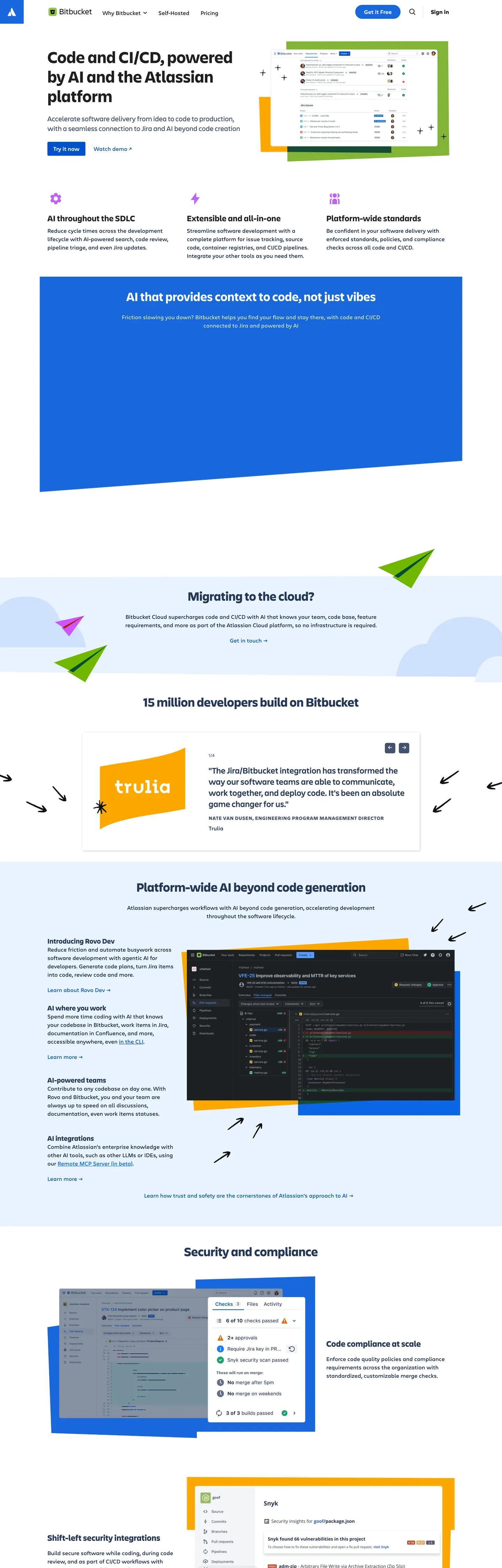
Bitbucket's marketing site announces itself with a contradiction: the heaviest headline weight in a product family known for measured, enterprise-calm typography. The hero heading — "Code and CI/CD, powered by AI and the Atlassian platform" — runs Charlie Display at 48px / weight 700, a striking departure from Jira's 600-weight and Confluence's 400-weight display treatments. Below that headline everything returns to Atlassian's characteristically controlled palette: deep navy ink (#091e42) on white, a mid-cobalt primary button in a 40px pill, 3px card rounding, and Charlie Text for body copy. Where GitHub signals developer identity through darkness and GitHub Sans, and where GitLab reaches for orange-to-purple gradients, Bitbucket presents the most enterprise-legible surface in the Git-hosting category.
The system runs on Atlassian Design System (ADS) CSS custom properties — every token resolves through the `--ds-*` variable family that powers Jira, Confluence, and Trello. The primary button maps to `--ds-background-brand-bold` (captured as #1868db, a cobalt shifted slightly blue from the themeColor #0052cc). Navigation uses `--ds-text` resolved through the Charlie Text family. The extraction surfaces 12 meaningful structural colors from a page that exposed the full ADS token tree. Radius uses only two values with any real frequency: 40px pill on the CTA button and 3px on cards and inputs — there is no mid-range 8-16px tier.
Feed this file to an AI coding tool and it will reproduce Bitbucket's specific moves: deep-navy ink instead of near-black, weight-700 Charlie Display at hero scale, mid-cobalt pill CTA, ADS-standard card rounding at 3px, and Charlie Text body at 16px / 400. The Atlassian-specific pattern worth understanding is the separation between the hero ink color (#1f1f21 — a near-black close to absolute black) and the body ink (#091e42 — deep navy). The hero headline renders on a light canvas in near-black text, while body paragraphs use the navy blue ink — two distinct ink tones that most tools would collapse into one.
What makes it distinct
5
- Atlassian Design System foundationevery structural token maps to an ADS CSS custom property (--ds-*), making this the most component-system-backed brand in the developer-tools category
- Charlie Display at weight 700Bitbucket runs the heaviest display weight in the Atlassian product family; 48px / 700 for the hero h1 vs the 400-600 weights used across Jira and Confluence marketing
- Deep navy as dominant ink#091e42 (402 appearances) functions as the primary text color rather than the near-black standard; this is Atlassian's signature dark-blue ink inherited from the founding brand palette
- 40px pill CTAthe primary button uses a 40px border radius (full pill at 40px height), contrasting with Heroku's 4px or Render's 0px CTA — the roundest button in the dev-tools comparison set
- 3px universal radiusbeyond the pill CTA, every component (cards, inputs, chips) uses 3px — the second-flattest rounding in the cloud-hosting category
bitbucket.org
Live at bitbucket.org
A snapshot of the brand in production. Scroll the frame to see the whole page.
Colors
10 colors
Bitbucket's system runs on #0052cc as its primary voltage, used in 2 of 14 components. Type is set in Charlie Display across 10 tokens from 12px to 48px, weights 400–700. Shape language is soft — components average 18px corner radius, with no sharp interactive edges.
Brand & Accent
Sparing, CTA-only voltage · 2
Surface
Page and card backgrounds · 2
Text
Headlines, body, captions · 4
Borders & Hairlines
Dividers, outlines, rules · 1
Other
Specialty colors · 1
Typography
10 type tokens
Set in Charlie Display across 10 tokens, from 12px to 48px, weights 400–700. Shown in its own stack: where the font isn't installed, the fallback the file names stands in.
- display-xl48px · weight 700 · lh 56px · tracking normalThe quick brown fox jumps over the lazy dog
- display-lg36px · weight 700 · lh 48px · tracking normalThe quick brown fox jumps over the lazy dog
- heading-md24px · weight 600 · lh 32px · tracking 0.3pxThe quick brown fox jumps over the lazy dog
- heading-sm20px · weight 600 · lh 24px · tracking 0.3pxThe quick brown fox jumps over the lazy dog
- body-lg20px · weight 400 · lh 28px · tracking 0.3pxThe quick brown fox jumps over the lazy dog
- body-md16px · weight 400 · lh 24px · tracking normalThe quick brown fox jumps over the lazy dog
- body-sm14px · weight 400 · lh 15.75px · tracking normalThe quick brown fox jumps over the lazy dog
- label-md12px · weight 400 · lh 24px · tracking 1pxThe quick brown fox jumps over the lazy dog
- button-md16px · weight 500 · lh 20px · tracking normalThe quick brown fox jumps over the lazy dog
- nav-link16px · weight 400 · lh 16px · tracking normalThe quick brown fox jumps over the lazy dog
Layout
Radii and spacing
4 corner radii and 5 spacing values. Shape language: soft.
Radii
- none0px
- sm3px
- lg5px
- pill40px
Spacing
- xs8px
- sm16px
- md24px
- base32px
- lg96px
Components
14 components
Each rendered from its tokens (color, type, radius, padding) on Bitbucket's own canvas.
- Button Primarybutton-primaryButton Primary
- Button Secondarybutton-secondaryButton Secondary
- Top Navtop-navTop Nav
- Nav Linknav-linkNav Link
- Hero Headinghero-headingHero Heading
- Section Headingsection-headingSection Heading
- Card Headingcard-headingCard Heading
- Body Paragraphbody-paragraphBody Paragraph
- Body Paragraph Leadbody-paragraph-leadBody Paragraph Lead
- Label Taglabel-tagLabel Tag
- CardcardCard
- Surface Cardsurface-cardSurface Card
- Type here…text-inputText Input
- FooterfooterFooter
In use
The system, in use
Bitbucket's tokens on the kind of product it builds.
Build something people actually use.
A short paragraph of marketing copy that previews how the brand's display tier and body tier read together. Two sentences is usually enough.
FAQ
Bitbucket design system FAQ
Common questions about Bitbucket's tokens, components, and how to use this DESIGN.md in your project.
Read next
Related reading
Specs, directories, and component libraries that pair with this design system.
- Browse all design systemsThe full directory of DESIGN.md files on shadcn.io, with live mockups for each.shadcn.io
- Bitbucket — official siteBitbucket's public marketing site — the source of truth for the live tokens captured in this file.bitbucket.org (opens in a new tab)
- The DESIGN.md specificationGoogle Labs' open spec for machine-readable design system files — the format this page is built on.github.com (opens in a new tab)
Use it
Use Bitbucket in your project
One machine-readable file. Drop it into Claude, Cursor, or any AI tool that reads DESIGN.md.
Download the DESIGN.md
One machine-readable file: every color, type, radius, spacing, and component token of Bitbucket.
Feed it to your AI tool
Drop it into Claude, Cursor, or GitHub Copilot. The agent writes React components and Tailwind classes that match Bitbucket's visual language.
Reference the tokens directly
Or paste the values into your Tailwind config, CSS variables, or component library: every color, size and radius is a quoted, ready-to-copy value.
Read the full DESIGN.md: overview, rationale, do’s and don’ts
Overview
Bitbucket's marketing site operates within the Atlassian Design System, which both constrains and clarifies its choices. Enterprise Cobalt, Atlassian Ground. The deep navy ink (#091e42) that dominates body copy is not a conventional near-black — it is the founding Atlassian blue, the color the company chose in 2002 and has kept through every brand evolution. Against GitHub's charcoal dark mode and GitLab's purple-to-orange gradient marketing, Bitbucket presents a white canvas with navy text and a single cobalt pill CTA. The only dramatic typographic move is the hero h1 at 48px / weight 700 in Charlie Display — heavier than any other Atlassian product's marketing headline by at least one weight step.
The system builds on ADS CSS custom properties (--ds-*) for every structural token, which means developers familiar with Jira or Confluence component libraries can map every Bitbucket token to an already-known ADS variable. The radius system is binary with a deliberate purpose split: 40px pill on the primary CTA, 3px on every other surface. There is no mid-range rounding at 8-16px.
Key Characteristics:
- Deep navy #091e42 (404 appearances) as the dominant body ink — a distinctly blue-shifted alternative to near-black that carries Atlassian's founding brand color into every paragraph.
- Hero h1 at 48px / weight 700 in Charlie Display — the heaviest display weight in the Atlassian marketing family.
- Primary button at 40px full-pill radius filled with cobalt blue #1868db — the roundest CTA in the dev-tools comparison set (vs. Render's 0px and Heroku's 4px).
- Universal 3px rounding on all non-button components — near-flat without committing to the sharp-edge aesthetic.
- Two Charlie family typefaces: Charlie Display for headings (weight 600-700) and Charlie Text for body (weight 400-600).
- ADS token backbone:
--ds-surface,--ds-text,--ds-background-brand-bold,--ds-borderpower every structural component. - White canvas throughout — no dark hero section, no gradient bands, no tinted surface panels.
Colors
Brand
- Cobalt Blue (
{colors.primary}— #0052cc): frequency 38. Used as text (18), bg (1), border (19). Atlassian's anchor blue — the themeColor and the structural interactive reference. Wired directly at this hex. - Cobalt Interactive (
{colors.primary-interactive}— #1868db): frequency 2. Used as bg (2). The active-state / brand-bold fill for buttons and selected states, wired as --ds-background-brand-bold and --ds-icon-brand.
Ink & Surface
- Ink (
{colors.ink}— #091e42): frequency 404. Used as text (202), border (202). The dominant body and heading text color — Atlassian's founding deep navy. Unmistakably blue when isolated; reads as near-black in long-form text blocks. - Ink Medium (
{colors.ink-medium}— #42526e): frequency 130. Used as text (65), bg (2), border (63). Secondary text color for input placeholders, sub-labels, and muted body copy. - Ink Dark (
{colors.ink-dark}— #253858): frequency 44. Used as text (22), border (22). Tertiary ink for dense-content contexts like footer links and supplementary nav. - Ink Near-Black (
{colors.ink-near-black}— #1f1f21): frequency 16. Used as text (8), border (8). The hero heading color — closest to absolute black in the system, wired as --ds-text-accent-gray-bolder and --ds-shadow tokens. - Canvas (
{colors.canvas}— #ffffff): frequency 47. Used as text (17), bg (14), border (16). Page floor and input background; wired as --ds-surface, --ds-surface-overlay, --ds-background-input. - Surface 1 (
{colors.surface-1}— #f4f5f7): frequency 4. Used as bg (4). Light gray-blue surface for hover states and alternating content panels; wired as --ds-surface-hovered and --ds-background-selected.
Hairlines & Structure
- Hairline (
{colors.hairline}— #101214): frequency 46. Used as text (23), border (23). Near-black used for structural borders (card edges, nav dividers); wired as --ds-border, --ds-background-neutral-hovered. - Black (
{colors.black}— #000000): frequency 9. Used as text (2), border (2), shadow (5). True black reserved for shadows and absolute-contrast overlays; wired as --ds-interaction-hovered and --ds-blanket.
Typography
Font Families
The system runs Charlie Display for every heading level (h1 through h4) and Charlie Text for every body paragraph, label, button, nav link, and input. Both are Atlassian custom fonts. Charlie Display has a characteristic 0.3px letter-spacing at heading sizes that adds barely perceptible openness; Charlie Text is a neutral humanist sans at the body scale.
Hierarchy
| Token | Size | Weight | Line Height | Letter Spacing | Use |
|---|---|---|---|---|---|
{typography.display-xl} | 48px | 700 | 56px | normal | Hero h1 |
{typography.display-lg} | 36px | 700 | 48px | normal | Section h2 (on dark backgrounds) |
{typography.heading-md} | 24px | 600 | 32px | 0.3px | Card heading h3 |
{typography.heading-sm} | 20px | 600 | 24px | 0.3px | Card sub-heading h4 |
{typography.body-lg} | 20px | 400 | 28px | 0.3px | Lead paragraph (Charlie Display) |
{typography.body-md} | 16px | 400 | 24px | normal | Default body text (Charlie Text) |
{typography.body-sm} | 14px | 400 | 15.75px | normal | Small body / nav links |
{typography.label-md} | 12px | 400 | 24px | 1px | Category label (uppercase) |
{typography.button-md} | 16px | 500 | 20px | normal | Button label |
{typography.nav-link} | 16px | 400 | 16px | normal | Navigation link |
Principles
The hero h1 at 48px / 700 stands out as the page's single heavy-weight typographic statement — the rest of the hierarchy descends quickly to 600 (headings) and 400 (body). Charlie Text at 16px / 500 for the button label is a deliberate choice; most ADS surfaces use 400-weight text for buttons but the CTA merits a half-step emphasis. The Charlie Display lead paragraph at 20px / 400 creates a bridge between heading and body scale without requiring a separate heading family entry.
Note on Font Substitutes
Both Charlie Display and Charlie Text are Atlassian proprietary fonts. Plus Jakarta Sans at the same weights and with 0.3px tracking at heading sizes is the closest open-source substitute for Charlie Display. Inter at weight 400-500 approximates Charlie Text for body and label copy. The most important property to preserve is the 700-weight for the hero h1 — the Atlassian family convention runs 600 at sub-section headings, making the 700 hero headline the distinctive signal.
Layout
Spacing System
- Base unit: 8px.
- Tokens:
{spacing.xs}8px ·{spacing.sm}16px ·{spacing.md}24px ·{spacing.base}32px ·{spacing.lg}96px. - Section rhythm: 96px vertical padding at major section breaks (extracted as "96px 0px" at 4 counts).
- Card internal padding: 16px for standard content cards.
- Button padding: 10px × 24px — the most compact button in the comparison set at 40px total height.
Grid & Container
- Hero: full-width white canvas with the heading, sub-paragraph, and pill CTA.
- Feature sections: alternating light and dark bands — some sections run on a dark navy or cobalt background (captured in the h2 extraction showing white text on a dark surface).
- Card grid: 3-4 column feature cards at desktop with 16-24px internal padding.
- Container width: ~768px for the hero heading block; wider for full-page grids.
Rhythm
The white canvas holds through most of the page; alternating sections shift to dark navy or cobalt fills for contrast, particularly when featuring AI or CI/CD marketing content (the h2 "AI that provides context to code" renders white on a dark section). The spacing rhythm is 8px-base with 96px section gaps — tighter than Render (which uses 90px) but consistent with ADS grid standards.
Elevation
Bitbucket uses a minimal shadow system consistent with ADS. The ADS shadow tokens (--ds-shadow-overflow-spread, --ds-shadow-overflow-perimeter) appear in the CSS variable extraction but resolve to near-black (#1f1f21) — these are overflow-shadow values for modals and dropdowns rather than card shadows. On the main marketing surface, elevation reads through:
- Surface color:
{colors.surface-1}(#f4f5f7) cards sitting on the white canvas create a subtle tonal lift. - Hairline border: 1px
{colors.hairline}(#101214 at low opacity in ADS contexts) marks card and input edges. - True shadow: Pure black at 5 shadow-count uses indicates dropdowns and overlay components have actual shadows, though these are not captured in the primary marketing surface.
Shapes
The radius scale is binary with purpose:
{rounded.none}0px — structural separators and full-bleed sections.{rounded.sm}3px — universal component radius: cards, inputs, chips, form elements. The most-used radius in the system (11 counts).{rounded.lg}5px — occasional variant for secondary elements.{rounded.pill}40px — primary and secondary CTA buttons only. Renders as a full semicircle on 40px-height elements.
The intent is clear: the pill CTA draws attention because it is the only round element on a page of near-flat 3px surfaces. The shape hierarchy communicates information architecture — round means "action," flat means "content."
Components
button-primary — Cobalt interactive fill ({colors.primary-interactive}), white text, {typography.button-md} (16px / 500), 40px pill radius, 10×24 padding, 40px height. "Get it Free" is the canonical hero CTA.
button-secondary — Transparent fill, cobalt-primary text and border, same typography and sizing, pill radius. Used alongside the primary in dual-CTA moments.
top-nav — White canvas background, 68px height, 16px horizontal padding. Contains the Bitbucket wordmark, Atlassian product nav, and right-aligned "Get it Free" CTA cluster.
nav-link — Transparent background, cobalt-primary text, {typography.nav-link} (16px / 400), inline padding. Nav links render in brand cobalt rather than ink, making navigation visually distinct from body text.
hero-heading — Near-black text ({colors.ink-near-black}), {typography.display-xl} (48px / 700). The hero headline "Code and CI/CD, powered by AI and the Atlassian platform" at maximum weight.
section-heading — White text on dark backgrounds, {typography.display-lg} (36px / 700). Used on sections with navy or cobalt fill.
card-heading — Deep-navy text ({colors.ink}), {typography.heading-md} (24px / 600 / 0.3px tracking). Feature card headings across the white-canvas body.
body-paragraph — Default ink text at {typography.body-md} (16px / 400). Body copy runs in deep navy rather than near-black — the most distinctive reading-comfort choice in the system.
body-paragraph-lead — Deep-navy ink, {typography.body-lg} (20px / 400 / Charlie Display). Used for section lead paragraphs that need more visual weight than body-md.
label-tag — No background, ink text, {typography.label-md} (12px / 400 / uppercase / 1px tracking). Small category chips above headings.
card — White canvas, deep-navy ink, {typography.body-md}, 3px radius, 16px padding, near-black hairline border. The standard content card across the body.
surface-card — Light surface fill ({colors.surface-1}), deep-navy ink, 3px radius, 16px padding. Used on hover and in alternating panel variants.
text-input — White canvas fill, medium-ink text ({colors.ink-medium}) for placeholder, 3px radius, 0×12px padding, 40px height. The email input in the newsletter/sign-up section. Border at #c1c7d0 (a light blue-gray from ADS).
footer — White canvas, deep-navy ink, {typography.body-md}, 96px vertical padding. Bitbucket's footer stays on the white canvas, unlike Heroku which returns to the dark canvas.
Do's and Don'ts
Do use deep navy (#091e42) as the primary body text color. The navy ink is Atlassian's most distinctive typographic move and the element that most differentiates Bitbucket from competitors. Switching to a standard near-black loses the brand signal and makes the page indistinguishable from GitHub-derived layouts.
Do keep the hero h1 at weight 700 in Charlie Display. The 700-weight at 48px is the heaviest moment in the Atlassian marketing family; it is how Bitbucket signals competitive urgency within a product family that otherwise uses measured 600 or lower display weights.
Do use the 40px pill radius exclusively on interactive CTA buttons. The pill is the shape signal for action in this system; applying it to cards or input fields would dilute the button hierarchy.
Do map token references to ADS CSS custom properties when building in an Atlassian environment. The --ds-* variable names captured in this extraction resolve to the same hex values in any project running @atlaskit packages — you can reference them directly instead of hardcoding hex values.
Don't use the cobalt-interactive color (#1868db) for decorative elements or text links. It is reserved for button fills and ADS brand-bold states; using it for inline links or icons competes with the CTA hierarchy.
Don't introduce a mid-range radius (8-12px) between 3px and 40px. The binary radius system is the shape language. A 12px card would look neither enterprise-flat nor action-pill — it would read as an unresolved third tier.
Don't render the hero h1 in deep navy (#091e42) instead of near-black (#1f1f21). The extraction shows the hero heading uses the near-black tone (wired as --ds-text-accent-gray-bolder) while body paragraphs use the deep navy. The two-ink system is intentional: maximum contrast at display scale, brand-blue warmth at reading scale.
Don't substitute Charlie Display with a weight-400 open-source font for the hero heading. The 700-weight at 48px is the system's loudest moment; a lighter-weight substitute (even at 700) with different proportions will misrepresent the visual authority of the hero section.
Known Gaps
- Hover and focus states: the extraction captures CTA buttons and inputs at rest only; ADS focus rings (a 2px cobalt outline at
--ds-border-focused) are not reflected in the component definitions. - Dark section palette: some page sections run on dark navy or cobalt fills — the full token set for those dark bands (heading color, body color, card surface) is partially captured but not fully documented.
- Mobile breakpoints: the 48px hero heading was captured at desktop width; ADS responsive typography scales would reduce this at tablet and mobile.
- Authentication flow: Bitbucket's sign-in and sign-up pages live in an Atlassian account system with a different layout; those tokens are not represented here.
- Pipeline and repository views: the core product — the branch browser, pull request UI, pipeline logs — uses a much richer ADS token set that is not exposed in the marketing surface.
- Animation: micro-interactions (button hover pulse, page scroll transitions) are not captured in this static extraction.
- Icon system: Atlassian uses a custom icon library (@atlaskit/icon) throughout the product but icons are not part of the marketing page token extraction.
Developer Tools & IDEs
More systems like this
More DESIGN.md files in Developer Tools & IDEs.
Pricing
Build it with Pro
The DESIGN.md files are free. Pro adds 6,000+ blocks, premium templates and the MCP server, so your AI editor builds in your system for you.
4.9/5 out of 5 · 150+ reviewsfrom 150+ founders and developers.
Billing
Billed once a year in USD. Cancel anytime.
- How many people can use the license.
- Client work, SaaS products and anything you charge for.
- Production-ready React sections: hero, pricing, features, dashboards and more.
- Complete multi-page sites you can ship as they are.
- React icons from every major library, installable with one command.
- Presets that restyle every block, in light and dark.
- Lets your AI editor search, preview and install blocks for you.
- Priority requests are answered first.
Individual
For personal projects & open source
$32instead of $49/mo
$389 billed yearly
- Seats: 1 seat
- Commercial use: Personal & open source only
- Pro blocks: 6,000+ blocks
- Templates: All 14 templates
- React icons: 294k+ icons
- Themes: All 59 themes
- MCP server: Basic usage
- Support: Standard
Team
Most popularFor freelancers, agencies & startups
$66instead of $99/mo
$789 billed yearly · ≈ $13/dev/mo
- Seats: Up to 5 seats
- Commercial use: Included
- Pro blocks: 6,000+ blocks
- Templates: All 14 templates
- React icons: 294k+ icons
- Themes: All 59 themes
- MCP server: High usage
- Support: Priority
Organization
For companies with larger teams
$132instead of $199/mo
$1,589 billed yearly
- Seats: Unlimited seats
- Commercial use: Included
- Pro blocks: 6,000+ blocks
- Templates: All 14 templates
- React icons: 294k+ icons
- Themes: All 59 themes
- MCP server: Unlimited usage
- Support: Priority
Billed once a year in USD. Cancel anytime.
Individual
For personal projects & open source
$32instead of $49/mo
$389 billed yearly
- How many people can use the license.Seats: 1 seat
- Client work, SaaS products and anything you charge for.Commercial use: Personal & open source only
- Production-ready React sections: hero, pricing, features, dashboards and more.Pro blocks: 6,000+ blocks
- Complete multi-page sites you can ship as they are.Templates: All 14 templates
- React icons from every major library, installable with one command.React icons: 294k+ icons
- Presets that restyle every block, in light and dark.Themes: All 59 themes
- Lets your AI editor search, preview and install blocks for you.MCP server: Basic usage
- Priority requests are answered first.Support: Standard
Team
Most popularFor freelancers, agencies & startups
$66instead of $99/mo
$789 billed yearly · ≈ $13/dev/mo
Everything in Individual, plus
- How many people can use the license.Seats: Up to 5 seats
- Client work, SaaS products and anything you charge for.Commercial use: Included
- Lets your AI editor search, preview and install blocks for you.MCP server: High usage
- Priority requests are answered first.Support: Priority
Organization
For companies with larger teams
$132instead of $199/mo
$1,589 billed yearly
Everything in Team, plus
- How many people can use the license.Seats: Unlimited seats
- Lets your AI editor search, preview and install blocks for you.MCP server: Unlimited usage
- Secure checkout via Stripe
- Code lives in your repo
- Keep what you've shipped if you cancel
- License terms
Your system, built for you
Every block, template and icon, installed by your AI agent in your design system. The DESIGN.md files stay free.