ClickHouse Design System
ClickHouse's design system as a DESIGN.md file. Electric yellow #faff69, Inter + JetBrains Mono, 24 colors, 27 components. For React, Next.js, and AI tools.
Add shadcn.io to your AI agent. · Pro It installs blocks, icons and templates in your design system from a prompt, with Pro.
Set up MCP- Primary
- #faff69
- Typeface
- Inter
- Shape
- Mixed
- Base radius
- 8px
- Colors
- 24
- Type tokens
- 15
- Components
- 27
- Spacing values
- 8
About
About ClickHouse DESIGN.md
Curated by Dov Azencot · Updated May 12, 2026 · Source clickhouse.com (opens in a new tab)
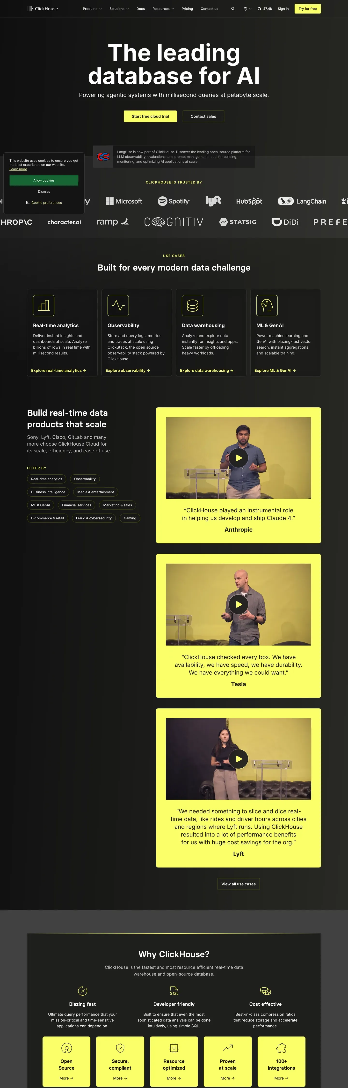
ClickHouse's design system runs on one electric idea: yellow plus black. Near-pure black canvas (#0a0a0a) underneath, electric yellow (#faff69) on top — used scarcely on individual buttons and stat numbers, then poured generously into full-bleed CTA bands. No second brand color. No gradient softening. The voltage IS the identity.
This page packages the full spec into a single DESIGN.md file. Inside: 24 colors, 16 type styles built on Inter and JetBrains Mono, 6 corner radii, 8 spacing tokens, and 27 components — buttons, stat callouts, code-window cards, pricing tiers (with a yellow-fill featured variant), and the signature yellow CTA band that closes every page.
Feed the file to Claude, Cursor, or GitHub Copilot and the React components come back in ClickHouse's voice — Inter 700 headlines at -2.5px tracking, SQL code blocks rendered in JetBrains Mono on dark surface cards, yellow reserved for the moments that matter. Or read it as a reference for how a developer-tooling brand earns recognition with one color instead of ten.
What makes it distinct
5
- Single brand voltageelectric yellow #faff69 carries every primary CTA, stat number, and full-bleed CTA band, never as secondary
- Near-pure black canvas#0a0a0a is the page floor; the system has no light-mode marketing surface anywhere
- Inter at weight 700 with -2.5px trackingdisplay headlines run 72px tight; no serif counter-voice in the entire scale
- JetBrains Mono code windows on #1a1a1aSQL syntax embedded directly in marketing pages, not painted illustrations
- Yellow stat-callouts at 56px / 700'779+', '47k+', '2.8k+' are the system's signature credibility moments
clickhouse.com
Live at clickhouse.com
A snapshot of the brand in production. Scroll the frame to see the whole page.
Colors
24 colors
ClickHouse's system runs on #faff69 as its primary voltage, used in 7 of 27 components. Type is set in Inter across 15 tokens from 12px to 72px, weights 400–700. Shape language is mixed across 27 components, blending pills, soft rounds, and squarer corners.
Brand & Accent
Sparing, CTA-only voltage · 6
Surface
Page and card backgrounds · 5
Text
Headlines, body, captions · 8
Borders & Hairlines
Dividers, outlines, rules · 2
Semantic
Status, errors, success, links · 3
Typography
15 type tokens
Set in Inter across 15 tokens, from 12px to 72px, weights 400–700. Shown in its own stack: where the font isn't installed, the fallback the file names stands in.
- display-xl72px · weight 700 · lh 1.05 · tracking -2.5pxThe quick brown fox jumps over the lazy dog
- display-lg56px · weight 700 · lh 1.1 · tracking -2pxThe quick brown fox jumps over the lazy dog
- display-md40px · weight 700 · lh 1.15 · tracking -1.5pxThe quick brown fox jumps over the lazy dog
- display-sm32px · weight 700 · lh 1.2 · tracking -1pxThe quick brown fox jumps over the lazy dog
- title-lg24px · weight 700 · lh 1.3 · tracking -0.3pxThe quick brown fox jumps over the lazy dog
- title-md18px · weight 600 · lh 1.4The quick brown fox jumps over the lazy dog
- title-sm16px · weight 600 · lh 1.4The quick brown fox jumps over the lazy dog
- stat-display56px · weight 700 · lh 1 · tracking -1.5pxThe quick brown fox jumps over the lazy dog
- body-md16px · weight 400 · lh 1.55The quick brown fox jumps over the lazy dog
- body-sm14px · weight 400 · lh 1.55The quick brown fox jumps over the lazy dog
- caption13px · weight 500 · lh 1.4The quick brown fox jumps over the lazy dog
- caption-uppercase12px · weight 600 · lh 1.4 · tracking 1.5pxThe quick brown fox jumps over the lazy dog
- code14px · weight 400 · lh 1.55The quick brown fox jumps over the lazy dog
- button14px · weight 600 · lh 1The quick brown fox jumps over the lazy dog
- nav-link14px · weight 500 · lh 1.4The quick brown fox jumps over the lazy dog
Layout
Radii and spacing
6 corner radii and 8 spacing values. Shape language: mixed.
Radii
- xs4px
- sm6px
- md8px
- lg12px
- pill9999px
- full9999px
Spacing
- xxs4px
- xs8px
- sm12px
- md16px
- lg24px
- xl32px
- xxl48px
- section96px
Components
27 components
Each rendered from its tokens (color, type, radius, padding) on ClickHouse's own canvas.
- Button Primarybutton-primaryButton Primary
- Button Primary Activebutton-primary-activeButton Primary Active
- Button Primary Disabledbutton-primary-disabledButton Primary Disabled
- Button Secondarybutton-secondaryButton Secondary
- Button Text Linkbutton-text-linkButton Text Link
- button-icon-circularButton Icon Circular
- Text Linktext-linkText Link
- Top Navtop-navTop Nav
- Hero Bandhero-bandHero Band
- Hero Stat Cardhero-stat-cardHero Stat Card
- Feature Card Yellowfeature-card-yellowFeature Card Yellow
- Feature Card Darkfeature-card-darkFeature Card Dark
- Code Window Cardcode-window-cardCode Window Card
- Product Mockup Cardproduct-mockup-cardProduct Mockup Card
- Pricing Tier Cardpricing-tier-cardPricing Tier Card
- Pricing Tier Card Featuredpricing-tier-card-featuredPricing Tier Card Featured
- Stat Calloutstat-calloutStat Callout
- Cta Band Yellowcta-band-yellowCta Band Yellow
- Type here…text-inputText Input
- Type here…text-input-focusedText Input Focused
- Category Tabcategory-tabCategory Tab
- Category Tab Activecategory-tab-activeCategory Tab Active
- Badge Pillbadge-pillBadge Pill
- Badge Yellowbadge-yellowBadge Yellow
- Events Cardevents-cardEvents Card
- Customer Logo Stripcustomer-logo-stripCustomer Logo Strip
- FooterfooterFooter
In use
The system, in use
ClickHouse's tokens on the kind of product it builds.
Build something people actually use.
A short paragraph of marketing copy that previews how the brand's display tier and body tier read together. Two sentences is usually enough.
FAQ
ClickHouse design system FAQ
Common questions about ClickHouse's tokens, components, and how to use this DESIGN.md in your project.
Read next
Related reading
Specs, directories, and component libraries that pair with this design system.
Use it
Use ClickHouse in your project
One machine-readable file. Drop it into Claude, Cursor, or any AI tool that reads DESIGN.md.
Download the DESIGN.md
One machine-readable file: every color, type, radius, spacing, and component token of ClickHouse.
Feed it to your AI tool
Drop it into Claude, Cursor, or GitHub Copilot. The agent writes React components and Tailwind classes that match ClickHouse's visual language.
Reference the tokens directly
Or paste the values into your Tailwind config, CSS variables, or component library: every color, size and radius is a quoted, ready-to-copy value.
Read the full DESIGN.md: overview, rationale, do’s and don’ts
Overview
ClickHouse's marketing surface is the highest-contrast interface in the database / data-platform category. The base atmosphere is near-pure black canvas ({colors.canvas} — #0a0a0a) with electric yellow ({colors.primary} — #faff69) as the singular brand voltage. The yellow handles every primary CTA, every stat-callout number, every "GET STARTED" badge — used scarcely on individual elements but generously on full-bleed yellow CTA cards. White typography in confident weight-700 sans-serif anchors the editorial body.
The yellow + black pairing is what makes ClickHouse instantly recognizable. Where Snowflake uses cool blue gradients and Databricks uses red + slate, ClickHouse leans hard into one electric yellow that does all the brand work. Code blocks, terminal output, and product UI fragments embed directly in dark {colors.surface-card} (#1a1a1a) cards across every page.
Type voice runs Inter at confident weights — 700 for display headlines (with negative letter-spacing -1 to -2.5px), 600 for sub-titles and buttons, 400 for body. The system has no display-serif counter-voice; everything is one geometric humanist sans, scaled and weighted for hierarchy.
Key Characteristics:
- Near-pure black canvas (
{colors.canvas}— #0a0a0a) with white type. The system has no light-mode marketing surface. - Electric yellow primary (
{colors.primary}— #faff69). Used on primary CTAs, large stat-callout numbers ("2.8k+", "74k+"), and full-bleed yellow CTA bands. - Inter at weight 700 for display, weight 600 for sub-titles + buttons, weight 400 for body. No serif counterpoint.
- Dark surface cards (
{colors.surface-card}— #1a1a1a) for feature cards, code windows, and product mockups. Cards barely lighter than canvas — color-block contrast is subtle. - Code blocks render in JetBrains Mono inside
{colors.surface-card}. SQL syntax-highlighted in muted blues / yellows / grays. - Stat numbers in yellow + sans-700 + huge size carry the credibility moment ("779+", "2.8k+", "47k+" community / contributor / star counts).
- Border radius is hierarchical:
{rounded.md}(8px) for buttons,{rounded.lg}(12px) for content cards. No pill except in tag badges. - Section rhythm
{spacing.section}(96px) between major editorial bands.
Colors
Brand & Accent
- Primary (Electric Yellow) (
{colors.primary}— #faff69): The signature brand color. All primary CTA backgrounds, large stat-callout numbers, full-bleed yellow CTA cards. The yellow is the brand. - Primary Active (
{colors.primary-active}— #e6eb52): Press / hover-darker variant. - Primary Disabled (
{colors.primary-disabled}— #3a3a1f): Desaturated dark-yellow on dark canvas.
Surface
- Canvas (
{colors.canvas}— #0a0a0a): The default page floor. Near-pure black. - Surface Soft (
{colors.surface-soft}— #121212): Section dividers, very-soft band tints. - Surface Card (
{colors.surface-card}— #1a1a1a): Feature cards, code windows, product mockups, pricing tier cards. - Surface Elevated (
{colors.surface-elevated}— #242424): Nested cards inside larger dark cards. - Surface Yellow Band (
{colors.surface-yellow-band}— #faff69): The yellow CTA card / band fill — same hex as primary. - Hairline (
{colors.hairline}— #2a2a2a): 1px borders on cards. - Hairline Strong (
{colors.hairline-strong}— #3a3a3a): Heavier divider on input underlines and emphasis.
Text
- Ink / On Dark (
{colors.on-dark}— #ffffff): All headline and primary text. - Body (
{colors.body}— #cccccc): Default running-text color. - Body Strong (
{colors.body-strong}— #e6e6e6): Emphasized paragraphs. - Muted (
{colors.muted}— #888888): Footer links, captions, breadcrumbs. - Muted Soft (
{colors.muted-soft}— #5a5a5a): Tertiary text — fine print. - On Primary / On Yellow (
{colors.on-primary}/{colors.on-yellow}— #0a0a0a): Black text on yellow CTAs and yellow CTA bands. The high-contrast yellow + black combo is the brand action signal.
Semantic / Accent
- Accent Emerald (
{colors.accent-emerald}— #22c55e): Success states, "active" status indicators in product UI. - Accent Rose (
{colors.accent-rose}— #ef4444): Error states, "down" indicators. - Accent Blue (
{colors.accent-blue}— #3b82f6): Info states, code-syntax highlighting.
Typography
Font Family
The system runs Inter for everything — display, body, navigation, buttons, captions. JetBrains Mono handles code blocks. The fallback stack walks -apple-system, BlinkMacSystemFont, "Segoe UI", Roboto, sans-serif.
The single-family approach is deliberate: Inter at weight 700 + 600 + 400 covers the entire hierarchy without needing a serif or display counter-voice. The geometric humanist character of Inter at confident bold weight gives ClickHouse a precise, engineered feel that matches the database's performance-first positioning.
Hierarchy
| Token | Size | Weight | Line Height | Letter Spacing | Use |
|---|---|---|---|---|---|
{typography.display-xl} | 72px | 700 | 1.05 | -2.5px | Homepage h1 ("The leading database for AI") |
{typography.display-lg} | 56px | 700 | 1.1 | -2px | Section heads |
{typography.display-md} | 40px | 700 | 1.15 | -1.5px | Sub-section heads, CTA-band heads |
{typography.display-sm} | 32px | 700 | 1.2 | -1px | Card titles, pricing tier prices |
{typography.title-lg} | 24px | 700 | 1.3 | -0.3px | Pricing plan names, larger feature titles |
{typography.title-md} | 18px | 600 | 1.4 | 0 | Card titles, intro paragraphs |
{typography.title-sm} | 16px | 600 | 1.4 | 0 | Small card titles, list labels |
{typography.stat-display} | 56px | 700 | 1.0 | -1.5px | Stat callouts ("779+", "47k+") — ALWAYS yellow |
{typography.body-md} | 16px | 400 | 1.55 | 0 | Default running-text |
{typography.body-sm} | 14px | 400 | 1.55 | 0 | Footer body, fine-print |
{typography.caption} | 13px | 500 | 1.4 | 0 | Badge labels, captions |
{typography.caption-uppercase} | 12px | 600 | 1.4 | 1.5px | Section labels, "NEW" badges |
{typography.code} | 14px | 400 | 1.55 | 0 | Code blocks — JetBrains Mono |
{typography.button} | 14px | 600 | 1.0 | 0 | Standard button labels |
{typography.nav-link} | 14px | 500 | 1.4 | 0 | Top-nav menu items |
Principles
Display weights stay at 700 across all sizes. Negative letter-spacing (-1 to -2.5px) is essential — Inter at weight 700 without negative tracking reads as too wide / Apple-marketing. The tightened tracking gives ClickHouse the precise, engineered feel.
Body and labels stay at weights 400 / 500 / 600. The hierarchy is built on size + weight, not on family contrast.
Note on Font Substitutes
Inter is open-source and the documented choice. Söhne is a close commercial alternative if licensed. Geist is another modern alternative.
Layout
Spacing System
- Base unit: 4px.
- Tokens:
{spacing.xxs}4px ·{spacing.xs}8px ·{spacing.sm}12px ·{spacing.md}16px ·{spacing.lg}24px ·{spacing.xl}32px ·{spacing.xxl}48px ·{spacing.section}96px. - Section padding:
{spacing.section}(96px) between major bands. - Card internal padding:
{spacing.xl}(32px) for feature cards, pricing tiers;{spacing.lg}(24px) for code-window cards and event cards.
Grid & Container
- Max content width: ~1280px centered.
- Editorial body: Single 12-column grid; hero often uses 7/5 split (h1 left, code mockup right).
- Feature card grids: 3-up at desktop, 2-up at tablet, 1-up at mobile.
- Pricing grid: 3-4 up at desktop, 1-up at mobile.
Whitespace Philosophy
ClickHouse uses dense, slightly-compressed whitespace appropriate for a developer-tooling brand — generous enough to read editorially, tight enough to feel "engineering-grade" rather than "marketing-soft." Section rhythm at 96px is standard; card internal padding stays at 32px for feature cards.
Elevation & Depth
| Level | Treatment | Use |
|---|---|---|
| Flat | No shadow, no border | Body sections, top nav, hero |
| Soft hairline | 1px {colors.hairline} border | Code-window cards, content cards |
| Surface card | {colors.surface-card} background — no shadow | Feature cards, pricing tiers, event cards |
| Yellow band | {colors.primary} background — no shadow | Full-bleed yellow CTA cards / bands |
The system uses no drop shadows. Depth comes from the contrast between black canvas and {colors.surface-card} (a barely-lighter-than-canvas tone) — the contrast is subtle, more like an "engineering-grade dim panel" than an "elevated card."
Decorative Depth
- Code-window cards carry their own internal product chrome — line numbers, syntax highlighting, status bars at the bottom — adding visual density without external shadows.
- The yellow-on-black contrast does most of the elevation work for CTAs.
Shapes
Border Radius Scale
| Token | Value | Use |
|---|---|---|
{rounded.xs} | 4px | Reserved for badge accents |
{rounded.sm} | 6px | Small inline buttons |
{rounded.md} | 8px | Standard CTA buttons, text inputs |
{rounded.lg} | 12px | Content cards, code-window cards, pricing tiers |
{rounded.pill} | 9999px | Badge pills |
{rounded.full} | 9999px / 50% | Avatars, icon buttons |
Components
Top Navigation
top-nav — Black nav bar pinned to top. 64px tall, {colors.canvas} background. Carries the ClickHouse logo + wordmark at left, primary horizontal menu (Product, Use Cases, Pricing, Resources, Customers) center-left, right-side cluster with "Sign in" + "Get Started" {component.button-primary} (yellow). Menu items in {typography.nav-link} (Inter 14px / 500).
Buttons
button-primary — The signature yellow CTA. Background {colors.primary} (#faff69), text {colors.on-primary} (black), type {typography.button} (Inter 14px / 600), padding 12px × 20px, height 40px, rounded {rounded.md} (8px). The yellow + black combination is iconic.
button-secondary — Dark surface card button. Background {colors.surface-card}, text {colors.on-dark}, same shape as primary.
button-text-link — Inline text button, no background. Used for "Sign in" and inline link CTAs.
text-link — Inline body links in {colors.primary} (yellow on dark). Underlined.
button-icon-circular — 36 × 36 circular icon button on dark.
Cards & Containers
hero-band — Black-canvas hero with 7-5 grid: h1 + sub-headline + button row on the left, code-window or product mockup on the right. Vertical padding {spacing.section} (96px).
hero-stat-card — Yellow stat-display numbers ("779+", "47k+") inline on the canvas. No card surface — just yellow text in {typography.stat-display} (56px / 700).
feature-card-yellow — Full-bleed yellow card ("Built for every modern data challenge"). Background {colors.primary}, text {colors.on-yellow} (black), rounded {rounded.lg} (12px), padding {spacing.xl} (32px). The yellow card IS the visual emphasis.
feature-card-dark — Standard dark feature card. Background {colors.surface-card}, text {colors.on-dark}, rounded {rounded.lg}, padding {spacing.xl} (32px).
code-window-card — Dark card showing a SQL code block. Background {colors.surface-card}, code in JetBrains Mono with syntax highlighting, rounded {rounded.lg}, padding {spacing.lg} (24px). Often the hero's right-side artifact on developer-focused pages.
product-mockup-card — Card showing actual ClickHouse product UI (query editor, dashboard, monitoring panel). Same shape as {component.feature-card-dark} but with embedded product chrome inside.
pricing-tier-card — Standard tier card. Background {colors.surface-card}, rounded {rounded.lg}, padding {spacing.xl} (32px).
pricing-tier-card-featured — The featured tier flips to {colors.primary} (yellow). The yellow surface IS the featured signal.
stat-callout — Inline yellow stat numbers ("779+", "2.8k+", "47k+"). Transparent background, text {colors.primary}, type {typography.stat-display}. Used as a flat layout block, not a card with surface.
events-card — Used on /company/events. Dark card with event title, date in {typography.caption-uppercase}, location, and a "Register" CTA. Rounded {rounded.lg}, padding {spacing.lg}.
customer-logo-strip — Horizontal monochrome customer-logo strip. Background {colors.canvas}, logos in {colors.muted}, vertical padding {spacing.xl} (32px).
Inputs & Forms
text-input — Dark text input. Background {colors.surface-card}, text {colors.on-dark}, rounded {rounded.md} (8px), padding 10px × 14px, height 40px.
text-input-focused — Border thickens to {colors.primary} (yellow) for emphasis.
Tags / Badges
badge-pill — Small dark pill label. Background {colors.surface-card}, text {colors.on-dark}, type {typography.caption}, rounded {rounded.pill}.
badge-yellow — Yellow pill for "NEW", "GET STARTED" emphasis. Background {colors.primary}, text {colors.on-primary}, type {typography.caption-uppercase}, rounded {rounded.pill}.
Tab / Filter
category-tab + category-tab-active — Dark tab navigation. Inactive: transparent + muted text. Active: surface-card background + on-dark text. Padding 8px × 14px, rounded {rounded.md}.
CTA / Footer
cta-band-yellow — A pre-footer "Deploy your way" CTA band. Full yellow fill, black type, rounded {rounded.lg}, padding 64px. Carries an h2 in {typography.display-md} and a CTA — usually a black-button on the yellow surface.
footer — Black footer that closes every page. Background {colors.canvas}, text {colors.muted}. 4-column link list at desktop covering Product / Use Cases / Resources / Company. Vertical padding 64px. The ClickHouse wordmark sits at the top in {colors.on-dark}.
Do's and Don'ts
Do
- Anchor every page on the black canvas. The yellow + black pairing is the brand voltage.
- Reserve
{colors.primary}(yellow) for primary CTAs, stat-callout numbers, and full-bleed yellow CTA bands. The yellow's scarcity at the element level + abundance at the band level is what makes it powerful. - Use Inter at weight 700 for every display headline, with -1 to -2.5px letter-spacing.
- Show actual SQL code blocks inside
{component.code-window-card}— ClickHouse is a database; show the query, don't paint marketing illustrations of queries. - Use
{component.stat-callout}numbers to establish credibility (community size, contributors, performance benchmarks). The yellow stat numbers are signature. - Anchor every band with
{spacing.section}(96px) vertical rhythm.
Don't
- Don't introduce a second brand color. ClickHouse is monochromatic + yellow.
- Don't bold display weight beyond 700 or use weight 500 for headlines. The hierarchy depends on size, not on weight gradation.
- Don't use yellow for body text or large surface fills outside of intentional yellow cards.
- Don't use rounded buttons / pills outside of small badges. The standard button radius is 8px (md).
- Don't repeat the same surface mode in two consecutive bands. Black canvas → dark feature card → yellow CTA card → black canvas → code-window card.
- Don't replace SQL code mockups with abstract illustrations. The code IS the marketing voltage.
- Don't add hover state styling beyond what the system already encodes.
Responsive Behavior
Breakpoints
| Name | Width | Key Changes |
|---|---|---|
| Mobile | < 768px | Hamburger nav; hero h1 72→36px; code-window-card stacks below; feature grids 1-up; pricing 1-up |
| Tablet | 768–1024px | Top nav tightens; feature cards 2-up; pricing 2-up |
| Desktop | 1024–1440px | Full top-nav; 3-up feature cards; 3-4 up pricing tiers |
| Wide | > 1440px | Same as desktop with more breathing room; max content 1280px |
Touch Targets
{component.button-primary}at minimum 40 × 40px.{component.button-icon-circular}at exactly 36 × 36 — slightly under WCAG 44, visually centered.{component.text-input}height is 40px.
Collapsing Strategy
- Top nav collapses to hamburger at < 768px.
- Hero 7-5 grid → single-column on mobile.
- Feature card grids reduce columns rather than scaling.
- Code-window cards retain font-size; horizontal scroll inside the card on mobile.
- Pricing tier cards collapse 4 → 2 → 1; featured tier yellow stays distinct.
Image Behavior
- Code blocks inside dark mockups stay at fixed font-size; horizontal scroll on mobile rather than wrapping.
- Customer logos in monochrome strip retain native widths; row wraps on mobile.
Iteration Guide
- Focus on ONE component at a time. Reference its YAML key (
{component.code-window-card},{component.pricing-tier-card-featured}). - Variants of an existing component (
-active,-disabled,-focused) live as separate entries. - Use
{token.refs}everywhere — never inline hex. - Never document hover. Default and Active/Pressed states only.
- Display headlines stay Inter 700 with negative letter-spacing. Body stays Inter 400.
- The yellow + black pairing is the brand contract. Don't soften with secondary accents.
- When in doubt about emphasis: bigger Inter 700 before adding color.
Known Gaps
- The exact yellow hex (#faff69) was sampled from the screenshot; ClickHouse may publish an official brand color slightly differently.
- Inter weight axis values beyond 400 / 500 / 600 / 700 are not formalized — only the static weights observed are documented.
- Animation and transition timings (code typewriter effects, stat counter animations) are not in scope.
- Form validation states beyond
{component.text-input-focused}are not extracted. - The actual ClickHouse Cloud product surface (query console, monitoring dashboards, table browser) shares some tokens with the marketing site but adds many product-specific components that are out of scope.
- The customer logo strip's exact opacity / treatment varies — the muted gray is approximate.
Backend, Database & DevOps
More systems like this
More DESIGN.md files in Backend, Database & DevOps.
Pricing
Build it with Pro
The DESIGN.md files are free. Pro adds 6,000+ blocks, premium templates and the MCP server, so your AI editor builds in your system for you.
4.9/5 out of 5 · 150+ reviewsfrom 150+ founders and developers.
Billing
Billed once a year in USD. Cancel anytime.
- How many people can use the license.
- Client work, SaaS products and anything you charge for.
- Production-ready React sections: hero, pricing, features, dashboards and more.
- Complete multi-page sites you can ship as they are.
- React icons from every major library, installable with one command.
- Presets that restyle every block, in light and dark.
- Lets your AI editor search, preview and install blocks for you.
- Priority requests are answered first.
Individual
For personal projects & open source
$32instead of $49/mo
$389 billed yearly
- Seats: 1 seat
- Commercial use: Personal & open source only
- Pro blocks: 6,000+ blocks
- Templates: All 14 templates
- React icons: 294k+ icons
- Themes: All 59 themes
- MCP server: Basic usage
- Support: Standard
Team
Most popularFor freelancers, agencies & startups
$66instead of $99/mo
$789 billed yearly · ≈ $13/dev/mo
- Seats: Up to 5 seats
- Commercial use: Included
- Pro blocks: 6,000+ blocks
- Templates: All 14 templates
- React icons: 294k+ icons
- Themes: All 59 themes
- MCP server: High usage
- Support: Priority
Organization
For companies with larger teams
$132instead of $199/mo
$1,589 billed yearly
- Seats: Unlimited seats
- Commercial use: Included
- Pro blocks: 6,000+ blocks
- Templates: All 14 templates
- React icons: 294k+ icons
- Themes: All 59 themes
- MCP server: Unlimited usage
- Support: Priority
Billed once a year in USD. Cancel anytime.
Individual
For personal projects & open source
$32instead of $49/mo
$389 billed yearly
- How many people can use the license.Seats: 1 seat
- Client work, SaaS products and anything you charge for.Commercial use: Personal & open source only
- Production-ready React sections: hero, pricing, features, dashboards and more.Pro blocks: 6,000+ blocks
- Complete multi-page sites you can ship as they are.Templates: All 14 templates
- React icons from every major library, installable with one command.React icons: 294k+ icons
- Presets that restyle every block, in light and dark.Themes: All 59 themes
- Lets your AI editor search, preview and install blocks for you.MCP server: Basic usage
- Priority requests are answered first.Support: Standard
Team
Most popularFor freelancers, agencies & startups
$66instead of $99/mo
$789 billed yearly · ≈ $13/dev/mo
Everything in Individual, plus
- How many people can use the license.Seats: Up to 5 seats
- Client work, SaaS products and anything you charge for.Commercial use: Included
- Lets your AI editor search, preview and install blocks for you.MCP server: High usage
- Priority requests are answered first.Support: Priority
Organization
For companies with larger teams
$132instead of $199/mo
$1,589 billed yearly
Everything in Team, plus
- How many people can use the license.Seats: Unlimited seats
- Lets your AI editor search, preview and install blocks for you.MCP server: Unlimited usage
- Secure checkout via Stripe
- Code lives in your repo
- Keep what you've shipped if you cancel
- License terms
Your system, built for you
Every block, template and icon, installed by your AI agent in your design system. The DESIGN.md files stay free.