Deno Inspired Design System
Deno's design language as a DESIGN.md file. Mint #70ffaf, Inter 400/700, fully pilled CTAs, 19 components. For React, Next.js, and AI tools.
Add shadcn.io to your AI agent. · Pro It installs blocks, icons and templates in your design system from a prompt, with Pro.
Set up MCP- Primary
- #70ffaf
- Typeface
- Inter
- Shape
- Sharp
- Base radius
- 6px
- Colors
- 25
- Type tokens
- 12
- Components
- 19
- Spacing values
- 9
About
About Deno Inspired DESIGN.md
Curated by Dov Azencot · Updated May 13, 2026 · Source deno.com (opens in a new tab)
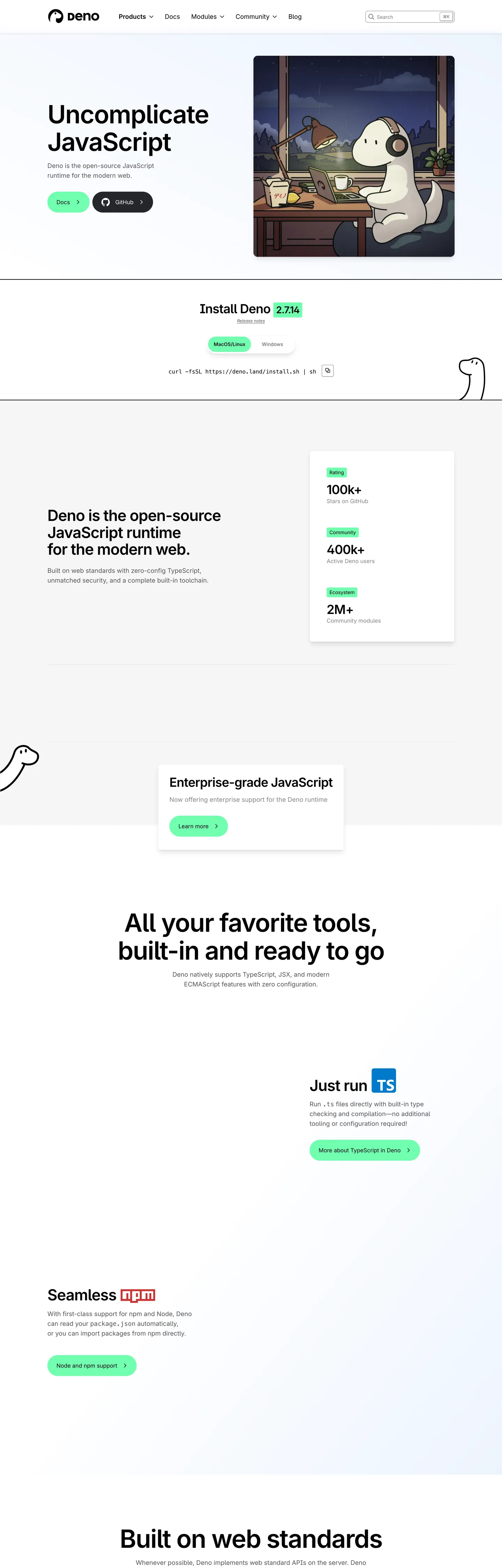
Deno's design language is a JavaScript runtime translated into a near-monochrome marketing surface that refuses to look like an infrastructure brand. The canvas is pure #ffffff with a faint #e5eaea hairline ladder; text sits at near-black #1f2328 (the brand's resolved --color-fg-default token) for headlines and a calibrated #56575a for body paragraphs. The only chromatic event across the entire fold is a single mint green at #70ffaf — the resolved --color-runtime variable — which fills the primary CTA pill, the Install Deno 2.7.14 version chip, and the Learn more button inside the Enterprise-grade JavaScript callout. Everything else is greyscale, hairline, and the recurring dino mascot.
This page packages the system into a single DESIGN.md file in the Google Labs open spec. Inside: 25 colors tokens (the mint voltage, four code-syntax brand accents pulled from --code-1 through --code-7, a five-step ink ladder, a four-step canvas ladder, and the structural hairlines), 11 typography styles running Inter at weights 400 and 700 plus a Recursive secondary face and a Moranga serif moment, 6 corner radii capped by the 9999px marketing pill, an 8-step spacing scale anchored on the brand's --spacing token at 4px, and 19 components recipes spanning the green pill, the dark GitHub pill, the bordered install card, and the H1 at 72px Inter Bold with -1.8px tracking.
Feed the file to Claude, Cursor, or GitHub Copilot and the agent reproduces Deno's specific posture — fully pilled green CTAs that keep black ink rather than flipping to white, two radius scales that never blur (4px cards, 9999px pills), and a marketing page that trusts the dino mascot more than any gradient or photograph. Reference the tokens inside Tailwind config or use them as a brand audit checklist. The system is worth studying because of what it refuses: no atmospheric gradient, no full-bleed product photography, no second accent inside the marketing fold. The runtime mascot is the entire warmth budget.
What makes it distinct
5
- Single mint voltage#70ffaf carries every primary CTA and the Install version chip, the only chromatic event on a near-monochrome page
- Two radius scales running side by side9999px fully pilled marketing CTAs against a tight 4px card and badge radius (88 occurrences each)
- Inter at weight 700 with -1.8px tracking at 72px heropulled into engineered density rather than softened into rounded display
- Mascot as the entire warmth systemthe dino illustration replaces gradients, photography, and atmospheric decoration
- Black ink on mint, not whitethe primary button keeps #000000 text on the green fill, reading as a lit surface rather than a colored chip
deno.com
Live at deno.com
A snapshot of the brand in production. Scroll the frame to see the whole page.
Colors
25 colors
Deno Inspired's system runs on #70ffaf as its primary voltage, used in 4 of 19 components. Type is set in Inter across 12 tokens from 12px to 72px, weights 400–700. Shape language is sharp — components average 4px corner radius, favoring crisp rectangles.
Brand & Accent
Sparing, CTA-only voltage · 9
Surface
Page and card backgrounds · 4
Text
Headlines, body, captions · 6
Borders & Hairlines
Dividers, outlines, rules · 4
Other
Specialty colors · 2
Typography
12 type tokens
Set in Inter across 12 tokens, from 12px to 72px, weights 400–700. Shown in its own stack: where the font isn't installed, the fallback the file names stands in.
- display-xl72px · weight 700 · lh 79.2px · tracking -1.8pxThe quick brown fox jumps over the lazy dog
- display-lg44px · weight 700 · lh 48.4px · tracking -1.1pxThe quick brown fox jumps over the lazy dog
- display-md36px · weight 700 · lh 39.6px · tracking -0.9pxThe quick brown fox jumps over the lazy dog
- heading-md28px · weight 700 · lh 30.8px · tracking -0.7pxThe quick brown fox jumps over the lazy dog
- heading-sm20px · weight 700 · lh 22px · tracking -0.5pxThe quick brown fox jumps over the lazy dog
- body-lg18px · weight 400 · lh 28px · tracking 0pxThe quick brown fox jumps over the lazy dog
- body-md16px · weight 400 · lh 24px · tracking 0pxThe quick brown fox jumps over the lazy dog
- body-sm14px · weight 400 · lh 20px · tracking 0pxThe quick brown fox jumps over the lazy dog
- button-md14px · weight 700 · lh 20px · tracking 0pxThe quick brown fox jumps over the lazy dog
- caption12px · weight 400 · lh 16px · tracking 0pxThe quick brown fox jumps over the lazy dog
- code13.6px · weight 400 · lh 19.72px · tracking 0pxThe quick brown fox jumps over the lazy dog
- editorial-serif44px · weight 400 · lh 48.4px · tracking -1.1pxThe quick brown fox jumps over the lazy dog
Layout
Radii and spacing
6 corner radii and 9 spacing values. Shape language: sharp.
Radii
- none0px
- sm4px
- md6px
- lg8px
- xl12px
- pill9999px
Spacing
- xxs2px
- xs4px
- sm8px
- md12px
- base16px
- lg24px
- xl32px
- 2xl64px
- 3xl128px
Components
19 components
Each rendered from its tokens (color, type, radius, padding) on Deno's own canvas.
- Nav Barnav-barNav Bar
- Nav Linknav-linkNav Link
- Nav Searchnav-searchNav Search
- Button Primarybutton-primaryButton Primary
- Button Primary Darkbutton-primary-darkButton Primary Dark
- Button Secondary Pillbutton-secondary-pillButton Secondary Pill
- Install Calloutinstall-calloutInstall Callout
- Install Version Chipinstall-version-chipInstall Version Chip
- Install Tab Activeinstall-tab-activeInstall Tab Active
- Install Tab Inactiveinstall-tab-inactiveInstall Tab Inactive
- Code Inlinecode-inlineCode Inline
- Card Statcard-statCard Stat
- Stat Eyebrow Chipstat-eyebrow-chipStat Eyebrow Chip
- Enterprise Calloutenterprise-calloutEnterprise Callout
- Hero Bandhero-bandHero Band
- Section Band Lightsection-band-lightSection Band Light
- Body Paragraphbody-paragraphBody Paragraph
- Divider Ruledivider-ruleDivider Rule
- Footer Bandfooter-bandFooter Band
In use
The system, in use
Deno's tokens on the kind of product it builds.
Build something people actually use.
A short paragraph of marketing copy that previews how the brand's display tier and body tier read together. Two sentences is usually enough.
FAQ
Deno Inspired design system FAQ
Common questions about Deno's tokens, components, and how to use this DESIGN.md in your project.
Read next
Related reading
Specs, directories, and component libraries that pair with this design system.
- Browse all design systemsThe full directory of DESIGN.md files on shadcn.io, with live mockups for each.shadcn.io
- Deno — official siteThe open-source JavaScript runtime for the modern web — TypeScript, JSX, and web standards built in.deno.com (opens in a new tab)
- The DESIGN.md specificationGoogle Labs' open spec for machine-readable design system files.github.com (opens in a new tab)
Use it
Use Deno Inspired in your project
One machine-readable file. Drop it into Claude, Cursor, or any AI tool that reads DESIGN.md.
Download the DESIGN.md
One machine-readable file: every color, type, radius, spacing, and component token of Deno Inspired.
Feed it to your AI tool
Drop it into Claude, Cursor, or GitHub Copilot. The agent writes React components and Tailwind classes that match Deno Inspired's visual language.
Reference the tokens directly
Or paste the values into your Tailwind config, CSS variables, or component library: every color, size and radius is a quoted, ready-to-copy value.
Read the full DESIGN.md: overview, rationale, do’s and don’ts
Overview
Deno's design language is a JavaScript runtime brand written for engineers who already know what npm install feels like — and it refuses to look like one. The page commits to one of the strictest near-monochrome systems on the web: pure {colors.canvas} (#ffffff) body background, near-black {colors.ink} (#1f2328) for headlines, a calibrated {colors.body} (#56575a) for body paragraphs, and a 4-step hairline ladder (#e5eaea, #cbd1e1, #a8b2c8, #191b1f) that gives every divider, border, and surface its own deliberate step. The only chromatic event across the entire marketing fold is a single mint green {colors.primary} (#70ffaf — the resolved --color-runtime CSS variable), which fills the primary CTA pills, the Install Deno 2.7.14 version chip, and the Learn more button inside the Enterprise callout. The runtime mascot — a dinosaur peeking from the edge of every band — does the warmth work that the rest of the page refuses.
Mint as voltage: Where most developer-platform brands soften the page with an atmospheric gradient (Stripe's mesh, Linear's purple, Vercel's cyan-magenta-amber), Deno spends its entire chromatic budget on one mint hex used in just 3 of 19 components. The mint is #70ffaf — frequency 48 in the extraction (25 as background, 19 as text, 4 in gradients) — and the brand never softens it to a secondary accent or a hover state. The pressed / inverse variant is #172723 (--color-runtime-dark) for the rare moment the green appears on a dark surface. Unlike the convention of pairing a coloured CTA with white text, Deno keeps #000000 ink on the mint fill — the button reads as a lit surface rather than a colored chip.
Two-radius posture: The brand runs two corner-radius scales side by side and never blurs them. Marketing CTAs — the Docs and GitHub primary pills, the Node and npm support pill, the Learn more button — sit at {rounded.pill} (9999px, 11 occurrences). Cards, badges, the Install Deno callout, and the install version chip sit at {rounded.sm} (4px, 88 occurrences) with {rounded.md} (6px, 48 occurrences) used for nested inputs. Marketing surfaces stay pilled, structural surfaces stay tight; the two scales never mix inside a single component.
Key Characteristics:
- A single mint primary
{colors.primary}(#70ffaf) carries every conversion target and the Install version chip — paired with{colors.on-primary}(#000000) ink, never white. - A second dark pill
{colors.ink}(#1f2328) handles the GitHub-style secondary CTA — the only non-mint primary the page allows. - Type is Inter at weights 400 (body) and 700 (display) with aggressive negative tracking at hero scale (
-1.8pxat 72px) — pulled into editorial density rather than softened. - A Recursive face is declared in
--font-deploy-sans/--font-deploy-monofor Deploy-product surfaces; a Moranga serif appears in--font-deploy-seriffor editorial pullquote moments. - Near-flat elevation —
1pxhairline borders + at most one soft drop-shadow at ~5% black opacity. Polarity-flipped dark bands handle section depth. - The dino mascot replaces every gradient, photograph, and atmospheric effect the rest of the page refuses — a
@keyframes blinkanimation is even declared for the dino's eyes.
Colors
Brand & Accent
- Runtime Mint (
{colors.primary}—#70ffaf) — frequency 48. Used as background (25), text (19), gradient (4). The single brand voltage, resolved from--color-runtime. Fills the Docs primary pill, the Install Deno version chip, the Node and npm support pill, the Learn more button inside the Enterprise callout. Reserved for primary CTAs only. - Runtime Dark (
{colors.primary-dark}—#172723) — the inverse / pressed variant resolved from--color-runtime-dark. Reserved for the rare moment the mint appears on a dark surface (footer-embedded CTAs, dark-mode product chrome). - Deploy Cyan (
{colors.accent-deploy}—#01c2ff) — frequency 4 as background. The brand's Deploy-product accent, resolved from--color-deploy/--code-1. Appears inside code-syntax accents and the Deploy product band, never on the marketing fold. - Fresh Yellow (
{colors.accent-fresh}—#ffdb1e) — frequency 5 (4 bg, 1 text). The Fresh-framework accent resolved from--color-fresh/--code-5. Reserved for sub-brand badges. - Code Emerald (
{colors.accent-code-emerald}—#01ff67) — frequency 2 as background. The--code-6accent for syntax highlighting only. - Code Magenta (
{colors.accent-code-magenta}—#db01ff) — frequency 4 as background. The--code-7accent for syntax highlighting only.
Surface
- Canvas (
{colors.canvas}—#ffffff) — frequency 103. The page body and the universal card surface. Used as background (32), text-on-dark (49), gradient (14). Resolved from--color-white/--color-canvas-default. - Canvas Soft (
{colors.canvas-soft}—#f1f3f9) — frequency 15. The faint blue-tinted alternating band surface. Used mostly inside gradients (13) with rare background fills. Resolved from--color-deploy-neutral-100. - Canvas Night (
{colors.canvas-night}—#121417) — frequency 14. The polarity-flipped dark surface — footer bands, code-block backgrounds. Resolved from--color-offblack. - Canvas Night Deep (
{colors.canvas-night-deep}—#0a0e1c) — frequency 73 as text, the brand's--black/--color-deploy-neutral-900. Used as the deepest ink and as the dark band for code blocks and Deploy-product surfaces.
Text
- Ink (
{colors.ink}—#1f2328) — frequency 165. Used as text (129), border (13), gradient (18). The default text colour resolved from--color-fg-default. Every heading and primary paragraph on light surfaces. - Ink Strong (
{colors.ink-strong}—#000000) — frequency 346. Used as text (294), shadow (52). The hero H1 colour and the on-primary text colour for the mint CTA — not a softened near-black, but pure#000000. - Body (
{colors.body}—#56575a) — frequency 34 as text. The paragraph body colour resolved from--color-gray-4/--color-gray-600. Reserved for body paragraphs under headlines. - Mute (
{colors.mute}—#868789) — frequency 74. Used as text (72), border (2). The low-priority label colour resolved from--color-gray-3. Visible in nav search placeholder, footer link rows, fine print. - Mute 2 (
{colors.mute-2}—#9ea0a5) — frequency 14. The second-lowest text grade resolved from--color-gray-2/--color-gray-400. Reserved for breadcrumb separators and disabled states.
Hairlines & Structural
- Hairline (
{colors.hairline}—#e5eaea) — frequency 98. Used as border (95), gradient (3). The 1px divider colour resolved from--color-neutral-200/--color-deploy-neutral-200. The Install callout, every card chrome, every table-row separator sits on this hex. - Hairline Strong (
{colors.hairline-strong}—#cbd1e1) — frequency 8. Used as border (4), gradient (3), shadow (1). The slightly stronger divider resolved from--color-border-default. - Hairline Deep (
{colors.hairline-deep}—#a8b2c8) — frequency 2. The strongest neutral hairline resolved from--color-deploy-neutral-400/--color-neutral-muted.
Semantic
- Link Blue (
{colors.accent-link}—#0969da) — resolved from--color-accent-emphasis/--color-accent-fg. The inline link colour for in-body anchors; rare on the marketing fold but the canonical link tone in long-form docs.
Typography
Font Family
Three faces are declared but only one carries the marketing fold:
- Inter — the entire narrative tier. Display, body, button, nav, label all set in Inter with the system-ui fallback chain declared in
--font-sans. Weights 400 (body) and 700 (display) are the working set; the face never appears at 500 or 600 in the captured surfaces. - Recursive — declared in
--font-deploy-sansand--font-deploy-monofor Deploy-product surfaces. Appears inside the Deploy band as a secondary face, never on the runtime marketing fold. - Moranga — declared in
--font-deploy-seriffor editorial pullquote moments. Renders at 44px / weight 400 /-1.1pxtracking — the only time the brand allows a serif voice. - Menlo / Monaco / Consolas — the monospace stack declared in
--font-mono. Reserved for code blocks and the install command (curl -fsSL https://deno.land/install.sh | sh).
Hierarchy
| Token | Size | Weight | Line Height | Letter Spacing | Use |
|---|---|---|---|---|---|
{typography.display-xl} | 72px | 700 | 79.2px | -1.8px | Hero H1 ("Uncomplicate JavaScript"). |
{typography.display-lg} | 44px | 700 | 48.4px | -1.1px | Section H2 ("Deno is the open-source JavaScript runtime"). |
{typography.display-md} | 36px | 700 | 39.6px | -0.9px | Subsection H2 ("Install Deno 2.7.14", "All your favorite tools"). |
{typography.heading-md} | 28px | 700 | 30.8px | -0.7px | H3 / card-cluster headlines. |
{typography.heading-sm} | 20px | 700 | 22px | -0.5px | H4 — Enterprise callout, Just run TS heading. |
{typography.body-lg} | 18px | 400 | 28px | 0px | Nav links, secondary body. |
{typography.body-md} | 16px | 400 | 24px | 0px | Default body paragraph, CTA pill labels. |
{typography.body-sm} | 14px | 400 | 20px | 0px | Stat card body, secondary labels. |
{typography.button-md} | 14px | 700 | 20px | 0px | Button labels and bold stat eyebrows. |
{typography.caption} | 12px | 400 | 16px | 0px | Footer fine print, version metadata. |
{typography.code} | 13.6px | 400 | 19.72px | 0px | Inline code, install command, terminal snippets. |
{typography.editorial-serif} | 44px | 400 | 48.4px | -1.1px | Moranga pullquote — the brand's only serif moment. |
Principles
- Negative tracking at hero scale is part of the voice. The H1 sits at
-1.8pxand section H2s step down to-1.1px/-0.9px. Reverting to default tracking breaks the brand. - Weight 700 is the display strategy. Inter at weight 700 — not 500 or 600 — carries every heading. The brand reads as engineered rather than friendly.
- Body stays at 16px / 400. No body-md-strong variant on the marketing fold; bold inline text is rare and always at weight 700.
- Monospace for the technical layer only. The install command and inline code snippets only. Paragraphs never set in mono.
Layout
Spacing System
- Base unit:
4px— the brand's--spacingtoken is exactly0.25remand almost every captured value is a multiple of 4. - Tokens:
{spacing.xxs}2px ·{spacing.xs}4px ·{spacing.sm}8px ·{spacing.md}12px ·{spacing.base}16px ·{spacing.lg}24px ·{spacing.xl}32px ·{spacing.2xl}64px ·{spacing.3xl}128px. - Section padding: marketing bands use
144px 0px(extracted 10 times) for the vertical rhythm between hero, Install, Enterprise, and feature bands. - Card interior padding: the Install callout sits at
32px; stat cards at16px 24px; chips at4px 8px(the dominant inline padding, 85 occurrences in the extraction). - Nav padding: the top bar uses
0px 56pxhorizontal — wider gutters than the marketing card padding.
Grid & Container
- Container width: Tailwind's
--container-7xl(80rem / 1280px) is the marketing-page maximum. Hero copy sits inside a--container-4xl(56rem) column. - Column patterns:
- Hero split — H1 + body + CTA row left, dino illustration right (the lo-fi rain window).
- Install Deno callout — single-column, centered, with the version chip flush to the right of the H2.
- Stat card column — three vertical
card-statcells stacked, each with an eyebrow chip on top. - Enterprise callout — single bordered card centered, dino mascot poking from the left margin.
Whitespace Philosophy
The dino mascot does the warmth work that the rest of the page refuses, and whitespace separates the bands. Section padding of 144px 0px lets each band breathe — hero, Install, Enterprise, and feature bands all use the same vertical rhythm. Inside a card, the headline / body stack is tight (8px to 12px gap), then a wider gap before the CTA cluster. The page reads as engineered — large gaps between bands, tight interior, never the other way around.
Responsive Strategy
Breakpoints
| Name | Width | Key Changes |
|---|---|---|
| sm | 40rem | Hero stacks vertically; dino illustration moves below the H1; nav collapses. |
| md | 48rem | Two-up grids appear; nav still horizontal. |
| lg | 64rem | Full hero split (H1 left, dino right); 3-up feature grids. |
| xl | 80rem | Container caps at --container-7xl; bands stretch edge-to-edge in color. |
| 2xl | 96rem | Content stays centered at the same --container-7xl. |
Touch Targets
The button-primary pill renders at 60px tall in marketing contexts — well above the WCAG AAA 44px floor. Nav link click areas inflate through 8px padding to meet the touch-target floor on mobile.
Collapsing Strategy
- Nav: full link row (Products / Docs / Modules / Community / Blog) + Search box at desktop. Collapses to logo + hamburger at mobile.
- Hero: H1 + body + CTA row on the left, dino illustration on the right at lg+; stacks vertically at sm.
- Install callout: keeps the single-column shape across all breakpoints; the MacOS/Linux vs Windows tab row scrolls horizontally on mobile.
- Stat card column: stays 1-up across all breakpoints (it's a vertical stack by design).
Elevation & Depth
| Level | Treatment | Use |
|---|---|---|
| Level 0 — Flat | No shadow, no border. | Full-bleed hero, section bands. |
| Level 1 — Hairline | 1px solid #e5eaea border, no shadow. | Default card chrome — the Install callout, stat cards, the Enterprise callout. |
| Level 2 — Subtle Drop | 1px solid #e5eaea border + 0 1px 2px rgba(0,0,0,0.05). | Slightly elevated callouts, the dino-adjacent Enterprise card. |
| Level 3 — Polarity Flip | Surface flips from #ffffff to #121417. | Code blocks, footer band, dark-mode embedded surfaces. |
The brand uses hairline-first elevation — every elevated card carries a 1px solid #e5eaea border (95 border occurrences in the extraction) and at most a single soft drop-shadow at ~5% black opacity. Cards never carry stacked shadow stacks; the hairline alone reads as the boundary.
Decorative Depth
- Mascot as atmosphere: the dino illustration is the page's only "atmospheric" effect — applied as a flat 2-D illustration rather than a 3-D gradient. A
@keyframes blinkanimation is even declared for the dino's eyes. - Polarity-flipped dark band as section-depth: switching the surface from
{colors.canvas}(#ffffff) to{colors.canvas-night}(#121417) is the brand's chief depth cue between bands. - Hairline ring as card boundary: every card carries a
1px solid #e5eaearing; no heavy drop-shadow ever appears in the captured marketing fold.
Shapes
Border Radius Scale
| Token | Value | Use |
|---|---|---|
{rounded.none} | 0px | Full-bleed hero / footer bands; inline code spans. |
{rounded.sm} | 4px | The brand's --radius-sm token (88 occurrences) — cards, install callout, version chip, stat eyebrow chip. |
{rounded.md} | 6px | The brand's --radius-md token (48 occurrences) — search input, nested chips, badge backgrounds. |
{rounded.lg} | 8px | The brand's --radius-lg token (29 occurrences) — feature card chrome. |
{rounded.xl} | 12px | The brand's --radius-xl token — larger card chrome (occurs once in the extraction). |
{rounded.pill} | 9999px | The marketing CTA pill (11 occurrences) — button-primary, button-primary-dark, button-secondary-pill, install-tab-active. |
Illustration Geometry
- Dino mascot: rendered as an inline SVG; full-bleed against its container with no clip-path or frame. Treated as the page's signature illustration.
- Hero lo-fi window: the rainy-night dinosaur-at-desk illustration sits inside a square frame, ~
{rounded.sm}4px corners, with a soft inner glow from the desk lamp. - Code block thumbnails: dark
{colors.canvas-night}(#121417) rectangle with mono text rendered inside; treated as an image at the layout level.
Components
Buttons
button-primary — the canonical mint pill, marketing scale.
- Background
{colors.primary}(#70ffaf), text{colors.on-primary}(#000000), label set in{typography.body-md}, padding2px, shape{rounded.pill}(9999px). Renders at60pxtall when paired with the marketing flex layout. The Docs pill in the hero is the canonical instance.
button-primary-dark — the dark secondary pill paired with the mint primary inside marketing bands.
- Background
{colors.ink}(#1f2328— the ink hex covers the GitHub button surface as well), text{colors.on-dark}(#ffffff), same typography + padding asbutton-primary, shape{rounded.pill}. The GitHub pill in the hero is the canonical instance.
button-secondary-pill — the white-bordered pill used for tertiary marketing CTAs.
- Background
{colors.canvas}(#ffffff), text{colors.ink-strong}(#000000),1px solid {colors.hairline}(#e5eaea) border, same typography / height / shape asbutton-primary.
install-tab-active — the active state of the MacOS/Linux vs Windows toggle in the Install callout.
- Background
{colors.primary}(#70ffaf), text{colors.on-primary}(#000000), label{typography.body-sm}, padding4px 8px, shape{rounded.pill}.
install-tab-inactive — the inactive state of the install-tab toggle.
- Background
{colors.canvas}(#ffffff), text{colors.mute}(#868789), same typography / padding / shape as the active variant.
Cards & Containers
install-callout — the canonical Install Deno 2.7.14 surface.
- Background
{colors.canvas}(#ffffff), text{colors.ink-strong}(#000000),1px solid {colors.hairline}(#e5eaea) border, padding32px, shape{rounded.sm}(4px). Hosts the H2, version chip, tab toggle, and install command monospace block.
install-version-chip — the mint version pill embedded inside the Install H2.
- Background
{colors.primary}(#70ffaf), text{colors.on-primary}(#000000), label{typography.button-md}(Inter Bold 14px), padding4px 8px, shape{rounded.sm}.
card-stat — the stacked statistic cells (100k+ Stars, 400k+ Active users, 2M+ Community modules).
- Background
{colors.canvas}(#ffffff), text{colors.ink-strong}(#000000),1px solid {colors.hairline}(#e5eaea) border, padding16px 24px, shape{rounded.sm}. The big number sits in a custom display style; the eyebrow chip sits above.
stat-eyebrow-chip — the small mint chip above each stat ("Rating", "Community", "Ecosystem").
- Background
{colors.primary}(#70ffaf), text{colors.on-primary}(#000000), label{typography.button-md}, padding4px 8px, shape{rounded.sm}.
enterprise-callout — the Enterprise-grade JavaScript card with the dino poking from the left.
- Background
{colors.canvas}(#ffffff), text{colors.ink-strong}(#000000),1px solid {colors.hairline}border, padding32px 32px 0px, shape{rounded.sm}. Hosts an H4, a body line, and the Learn more mint pill.
Navigation
nav-bar — the sticky top nav.
- Background
{colors.canvas}(#ffffff), text{colors.ink-strong}(#000000), height64px, padding0px 56px. Layout: logo left, link row center (Products / Docs / Modules / Community / Blog), Search box right with acmd-Kshortcut hint.
nav-link — the centered link row inside nav-bar.
- Text
{colors.ink-strong}(#000000), set in{typography.body-lg}(18px / 400), padding8px. Visible only as inline text — no ghost-pill background on hover.
nav-search — the right-aligned Search box with the cmd-K hint.
- Background
{colors.canvas}(#ffffff), placeholder text{colors.mute}(#868789),1px solid {colors.hairline}border, body{typography.body-sm}, padding8px 12px, height36px, shape{rounded.md}(6px).
Signature Sections
hero-band — the white hero with the dino at desk illustration.
- Background
{colors.canvas}(#ffffff), text{colors.ink-strong}(#000000), padding144px 0px. Inside: the H1 "Uncomplicate JavaScript" at{typography.display-xl}(72px / 700 / -1.8px tracking), a body lead in{typography.body-md}, then a CTA row withbutton-primary(Docs) +button-primary-dark(GitHub). The dino lo-fi window sits to the right.
section-band-light — the alternating soft-canvas band.
- Background
{colors.canvas-soft}(#f1f3f9), text{colors.ink-strong}(#000000), padding144px 0px. Hosts the Install Deno callout and the stat-card column side by side.
code-inline — the inline command snippet (curl -fsSL https://deno.land/install.sh | sh).
- Background
{colors.canvas}(#ffffff), text{colors.ink}(#1f2328), set in{typography.code}(13.6px / 400 / Menlo). No background fill — just the monospace face against the white surface.
body-paragraph — the canonical body lead under a headline.
- Text
{colors.body}(#56575a), set in{typography.body-md}(16px / 400 / 24px line-height), padding0px 0px 0px 24px(the captured indent inside the Enterprise callout). The body color drops one step from{colors.ink}to give the headline visual priority.
divider-rule — the horizontal 1px rule that separates major bands.
- Background
{colors.hairline}(#e5eaea), height1px. Used edge-to-edge below the hero and above the stat-card column.
footer-band — the bottom polarity-flipped dark band.
- Background
{colors.canvas-night}(#121417), text{colors.on-dark}(#ffffff), padding64px. Hosts the link grid (Products, Resources, Community, Company), social icons, and the legal fine print.
Do's and Don'ts
Do
- Keep the mint
#70ffaffor primary CTAs only. The hex is reserved for the Docs pill, the install version chip, the stat eyebrow chip, and the Learn more button — at most 3 of 19 components on a given screen. - Keep
#000000ink on mint surfaces. The button reads as a lit surface because the text stays pure black; flipping to white kills the brand. - Hold the two radius scales separate. CTAs sit at
9999px(pill); cards, badges, and chips sit at4px. Never round a card to9999pxor shrink a CTA to4px. - Use
1px solid #e5eaeaas the canonical card border. No drop-shadow, no inset ring — the hairline alone is the boundary. - Set every heading in Inter Bold (weight 700) with negative letter-spacing.
-1.8pxat 72px,-0.9pxat 36px,-0.5pxat 20px — the brand reads as engineered because of the tracking.
Don't
- Don't use
#70ffafas a hover state, focus ring, or chart accent. The mint is reserved for the primary CTA fill — using it as a hover background on a nav link breaks the rule that the mint is the only chromatic event on the page. - Don't pair the mint with white text. The on-primary colour is
#000000, not#ffffff. White-on-mint exists nowhere in the captured marketing fold. - Don't reach for
#01c2ff(Deploy cyan) on the runtime marketing page. The cyan is reserved for the Deploy-product band and code syntax (resolved from--code-1/--color-deploy) — using it on the runtime fold mixes the two sub-brand voltages. - Don't set body paragraphs at
{colors.ink}#1f2328. The body colour is{colors.body}#56575a— one step lighter — to give the headline visual priority. Using ink for body flattens the hierarchy. - Don't replace the dino mascot with a generic illustration or stock photograph. The dino is the brand's entire warmth budget; swapping in a 3-D render or an abstract gradient breaks the page's character.
- Don't add stacked drop-shadows to cards. The brand uses
1px solid #e5eaeahairlines and at most one soft drop at~5%black opacity — never a0 4px 24px rgba(0,0,0,0.12)material-style stack. - Don't set display headings at weight 500 or 600. Inter sits at
700for every display tier on the marketing fold; weight 500 reads as a different brand.
Known Gaps
- Hover-state colours: The marketing surface uses subtle hover transitions on nav links and the install-tab toggle, but precise per-component hover hex values were not captured. Treat
#56575abody shifting toward#1f2328ink as the working assumption. - Focus rings: Form inputs (the nav Search box) darken their border on focus, but the exact focus-ring colour and width (whether
{colors.accent-link}#0969daor an ink-tinted ring) is not documented in the extracted variables. - Deploy-product chrome: This DESIGN.md covers the runtime marketing fold (
deno.com). The Deploy sub-brand uses a parallel--color-deploy-*palette (#01c2ffvoltage, the Recursive face,#0a0e1cdark canvas) with its own spacing and component conventions — not captured here. - Mascot library: The dino appears in at least three poses across the captured surfaces (at-desk lo-fi window, peeking from the margin, animated blink). The full pose library and the
@keyframes blinktiming values are not documented. - Dark-mode in-product chrome: The runtime docs and dashboard surfaces use a dark canvas with the same mint voltage, but the dark-mode token mapping is not captured.
- Syntax-highlighting palette: The
--color-prettylights-syntax-*variables (entity purple, keyword red, string deep-navy, constant medium-blue, comment grey) drive in-product code blocks but appear only inside docs, not on the marketing fold; the full GitHub-derived palette is not declared here.
Developer Tools & IDEs
More systems like this
More DESIGN.md files in Developer Tools & IDEs.
Pricing
Build it with Pro
The DESIGN.md files are free. Pro adds 6,000+ blocks, premium templates and the MCP server, so your AI editor builds in your system for you.
4.9/5 out of 5 · 150+ reviewsfrom 150+ founders and developers.
Billing
Billed once a year in USD. Cancel anytime.
- How many people can use the license.
- Client work, SaaS products and anything you charge for.
- Production-ready React sections: hero, pricing, features, dashboards and more.
- Complete multi-page sites you can ship as they are.
- React icons from every major library, installable with one command.
- Presets that restyle every block, in light and dark.
- Lets your AI editor search, preview and install blocks for you.
- Priority requests are answered first.
Individual
For personal projects & open source
$32instead of $49/mo
$389 billed yearly
- Seats: 1 seat
- Commercial use: Personal & open source only
- Pro blocks: 6,000+ blocks
- Templates: All 14 templates
- React icons: 294k+ icons
- Themes: All 59 themes
- MCP server: Basic usage
- Support: Standard
Team
Most popularFor freelancers, agencies & startups
$66instead of $99/mo
$789 billed yearly · ≈ $13/dev/mo
- Seats: Up to 5 seats
- Commercial use: Included
- Pro blocks: 6,000+ blocks
- Templates: All 14 templates
- React icons: 294k+ icons
- Themes: All 59 themes
- MCP server: High usage
- Support: Priority
Organization
For companies with larger teams
$132instead of $199/mo
$1,589 billed yearly
- Seats: Unlimited seats
- Commercial use: Included
- Pro blocks: 6,000+ blocks
- Templates: All 14 templates
- React icons: 294k+ icons
- Themes: All 59 themes
- MCP server: Unlimited usage
- Support: Priority
Billed once a year in USD. Cancel anytime.
Individual
For personal projects & open source
$32instead of $49/mo
$389 billed yearly
- How many people can use the license.Seats: 1 seat
- Client work, SaaS products and anything you charge for.Commercial use: Personal & open source only
- Production-ready React sections: hero, pricing, features, dashboards and more.Pro blocks: 6,000+ blocks
- Complete multi-page sites you can ship as they are.Templates: All 14 templates
- React icons from every major library, installable with one command.React icons: 294k+ icons
- Presets that restyle every block, in light and dark.Themes: All 59 themes
- Lets your AI editor search, preview and install blocks for you.MCP server: Basic usage
- Priority requests are answered first.Support: Standard
Team
Most popularFor freelancers, agencies & startups
$66instead of $99/mo
$789 billed yearly · ≈ $13/dev/mo
Everything in Individual, plus
- How many people can use the license.Seats: Up to 5 seats
- Client work, SaaS products and anything you charge for.Commercial use: Included
- Lets your AI editor search, preview and install blocks for you.MCP server: High usage
- Priority requests are answered first.Support: Priority
Organization
For companies with larger teams
$132instead of $199/mo
$1,589 billed yearly
Everything in Team, plus
- How many people can use the license.Seats: Unlimited seats
- Lets your AI editor search, preview and install blocks for you.MCP server: Unlimited usage
- Secure checkout via Stripe
- Code lives in your repo
- Keep what you've shipped if you cancel
- License terms
Your system, built for you
Every block, template and icon, installed by your AI agent in your design system. The DESIGN.md files stay free.