Astro Design System
Astro's marketing design system: purple-blue gradient voltage on a deep near-black canvas, Obviously display at weight 700, system-ui body at weight 300, pill CTAs, 17 colors tokens, 20 components. For React, Next.js, and AI tools.
Add shadcn.io to your AI agent. · Pro It installs blocks, icons and templates in your design system from a prompt, with Pro.
Set up MCP- Primary
- #b845ed
- Typeface
- ui-sans-serif
- Shape
- Mixed
- Base radius
- 12px
- Colors
- 17
- Type tokens
- 13
- Components
- 20
- Spacing values
- 7
About
About Astro DESIGN.md
Curated by Dov Azencot · Updated May 19, 2026 · Source astro.build (opens in a new tab)
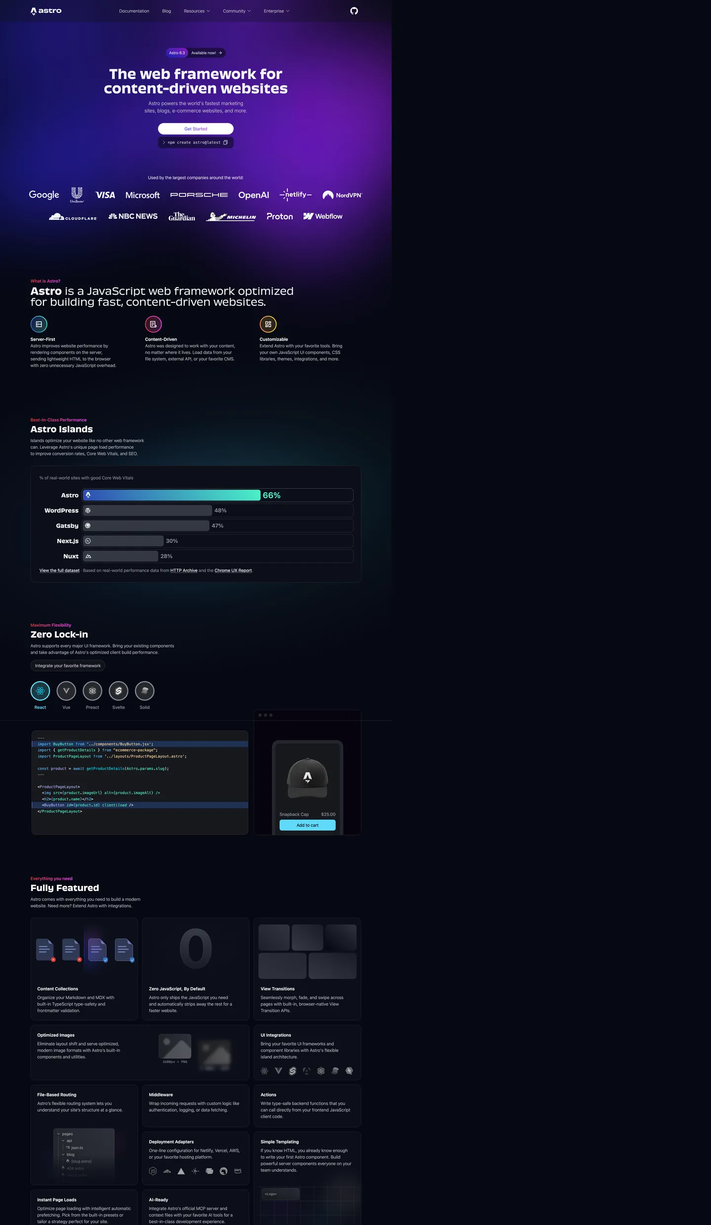
Astro's marketing page makes the framework comparison benchmark a design feature. Below the hero, a full-width bar chart shows Astro at 66% Core Web Vitals score versus WordPress at 48%, Gatsby at 47%, Next.js at 30%, and Nuxt at 28% — the chart is not tucked into a "performance" section but given its own named section called "Astro Islands," with a teal aqua bar color that matches the terminal selection-text token. The gradient behind the hero headline spans violet through fuchsia through royal blue in a radial mesh — not a single directional gradient, but an atmospheric wash that makes the canvas read as deep space. The hero h1 runs Obviously at 48px / weight 700, the body runs system-ui at weight 300 — a 400-point weight gap between the loudest and quietest typographic moments on the page.
The DESIGN.md file packages the system as machine-readable tokens for React and AI tools. Inside: 17 colors tokens anchored on the near-black canvas, a gradient vocabulary (violet, fuchsia, royal blue, aqua accent), and a structural gray tier; 13 typography tokens spanning Obviously at 36–48px display and system-ui at 14–16px body; 6 radius values dominated by the 9999px pill for CTAs and navigation chips, with 8–16px for cards; and 20 components definitions covering the photographic-gradient hero, the ghost-pill primary CTA, the embedded terminal panel, the performance chart bar, and the framework feature grid.
Feed this file to Claude or Cursor and it reproduces Astro's specific moves: deep near-black canvas with radial gradient atmosphere, ghost-pill CTAs rather than filled-color buttons, Obviously-equivalent display at heavy weight 700, body text at unusually light weight 300, and the teal terminal accent reserved for interactive feedback states. The most distinctive move worth borrowing is the weight-300 body — it requires a high-quality neutral sans and sufficient line-height to remain legible, but it gives the page a deliberate contrast against the weight-700 headline that most framework sites never attempt.
What makes it distinct
5
- Gradient as primary voltageAstro's brand identity is a purple-to-royal-blue gradient mesh (#b845ed through #3245ff), not a single hex; neither color stands alone as the brand accent
- Weight 300 bodybody text runs system-ui at weight 300 (light), the lightest body weight among major framework marketing sites; it signals confidence by restraint rather than legibility by weight
- Ghost CTA on dark canvasthe primary hero button is white pill outline with white text, not a gradient fill; the gradient stays in the atmosphere behind the headline, never in the UI chrome
- Obviously for displaya proprietary geometric sans runs all h1 / h2 display at weight 700, then drops to weight 300 for one section-level subheading — the weight extremes define the entire typographic scale
- Aqua terminal accent#4bf3c8 appears as the selection-text color in the embedded terminal panel, a bright teal that reads as interactive feedback, not as brand voltage
astro.build
Live at astro.build
A snapshot of the brand in production. Scroll the frame to see the whole page.
Colors
17 colors
Astro's system anchors on #b845ed (primary) as its primary color. Type is set in ui-sans-serif across 13 tokens from 12px to 48px, weights 200–700. Shape language is mixed across 20 components, blending pills, soft rounds, and squarer corners.
Brand & Accent
Sparing, CTA-only voltage · 5
Surface
Page and card backgrounds · 4
Text
Headlines, body, captions · 3
Borders & Hairlines
Dividers, outlines, rules · 2
Other
Specialty colors · 3
Typography
13 type tokens
Set in ui-sans-serif across 13 tokens, from 12px to 48px, weights 200–700. Shown in its own stack: where the font isn't installed, the fallback the file names stands in.
- display-xl48px · weight 700 · lh 52.8pxThe quick brown fox jumps over the lazy dog
- display-md36px · weight 700 · lh 40pxThe quick brown fox jumps over the lazy dog
- display-sm30px · weight 700 · lh 36pxThe quick brown fox jumps over the lazy dog
- display-sub36px · weight 300 · lh 40pxThe quick brown fox jumps over the lazy dog
- heading-md20px · weight 700 · lh 28pxThe quick brown fox jumps over the lazy dog
- body-lg18px · weight 200 · lh 27pxThe quick brown fox jumps over the lazy dog
- body-md16px · weight 300 · lh 24pxThe quick brown fox jumps over the lazy dog
- body-sm14px · weight 400 · lh 25.375pxThe quick brown fox jumps over the lazy dog
- label-md16px · weight 600 · lh 24pxThe quick brown fox jumps over the lazy dog
- label-sm14px · weight 300 · lh 20pxThe quick brown fox jumps over the lazy dog
- nav-link16px · weight 400 · lh 24pxThe quick brown fox jumps over the lazy dog
- mono-md13.6px · weight 400 · lh 22.44pxThe quick brown fox jumps over the lazy dog
- code-badge12px · weight 400 · lh 16px · tracking 0.3pxThe quick brown fox jumps over the lazy dog
Layout
Radii and spacing
6 corner radii and 7 spacing values. Shape language: mixed.
Radii
- none0px
- sm8px
- md12px
- lg16px
- xl20px
- full9999px
Spacing
- xs4px
- sm8px
- md12px
- base16px
- lg24px
- xl32px
- 2xl48px
Components
20 components
Each rendered from its tokens (color, type, radius, padding) on Astro's own canvas.
- Button Primarybutton-primaryButton Primary
- Button Primary Hoverbutton-primary-hoverButton Primary Hover
- Button Secondarybutton-secondaryButton Secondary
- Top Navtop-navTop Nav
- Nav Linknav-linkNav Link
- Version Badgeversion-badgeVersion Badge
- Hero Headinghero-headingHero Heading
- Section Headingsection-headingSection Heading
- Section Subheadingsection-subheadingSection Subheading
- Body Paragraphbody-paragraphBody Paragraph
- Body Paragraph Dimbody-paragraph-dimBody Paragraph Dim
- Framework Badgeframework-badgeFramework Badge
- Card Darkcard-darkCard Dark
- Card Featurecard-featureCard Feature
- Terminal Panelterminal-panelTerminal Panel
- Chart Barchart-barChart Bar
- Type here…text-inputText Input
- Newsletter Inputnewsletter-inputNewsletter Input
- Code Blockcode-blockCode Block
- FooterfooterFooter
In use
The system, in use
Astro's tokens on the kind of product it builds.
Build something people actually use.
A short paragraph of marketing copy that previews how the brand's display tier and body tier read together. Two sentences is usually enough.
import { build } from "./build"

export async function main() {
  const result = await build()
  console.log("done", result)
}
FAQ
Astro design system FAQ
Common questions about Astro's tokens, components, and how to use this DESIGN.md in your project.
Read next
Related reading
Specs, directories, and component libraries that pair with this design system.
- Browse all design systemsThe full directory of DESIGN.md files on shadcn.io, with live mockups for each.shadcn.io
- Astro — official siteAstro's public marketing site — the source of truth for the live tokens captured in this file.astro.build (opens in a new tab)
- The DESIGN.md specificationGoogle Labs' open spec for machine-readable design system files — the format this page is built on.github.com (opens in a new tab)
Use it
Use Astro in your project
One machine-readable file. Drop it into Claude, Cursor, or any AI tool that reads DESIGN.md.
Download the DESIGN.md
One machine-readable file: every color, type, radius, spacing, and component token of Astro.
Feed it to your AI tool
Drop it into Claude, Cursor, or GitHub Copilot. The agent writes React components and Tailwind classes that match Astro's visual language.
Reference the tokens directly
Or paste the values into your Tailwind config, CSS variables, or component library: every color, size and radius is a quoted, ready-to-copy value.
Read the full DESIGN.md: overview, rationale, do’s and don’ts
Overview
Astro's marketing site is the only major web-framework brand that makes a performance benchmark chart a hero-tier design element. Gradient-as-atmosphere. Where Next.js uses photography and Remix uses a bare white-on-dark canvas, Astro fills the hero with a radial gradient mesh — purple through fuchsia through royal blue — that reads as deep space rather than a brand-color fill. The gradient is not a background gradient behind content; it is the visual identity, and it spans the entire above-fold zone without resolving to a single named accent. The CTA button is a ghost pill outline in white, refusing to compete chromatically with the atmosphere behind it.
Typography makes the second structural decision. Weight extremes as signature: the hero h1 runs Obviously at 48px / weight 700 — a blocky, high-confidence geometric display. Body text runs system-ui at weight 300. The gap between headline and body is 400 weight units; no other framework marketing site captures this range. Section subheadings also drop to Obviously weight 300 for one registered rhetorical move ("Astro is a JavaScript web framework optimized for building fast, content-driven websites"), where the weight drop reads as a shift from declaration to explanation.
The embedded terminal and code panels use a near-black surface ({colors.surface-code} — #18181b) with aqua teal ({colors.aqua} — #4bf3c8) as the selection-text and interactive feedback color — a usage consistent with VS Code's aqua selection but mapped to the brand context. The aqua never appears in navigation, CTAs, or body text; it is scoped entirely to code-surface interactivity.
Key Characteristics:
- Gradient brand identity: purple (#b845ed) through fuchsia (#f041ff) through royal blue (#3245ff) — no single hex IS the brand.
- Near-black blue-tinted canvas (
{colors.canvas}— #0c0f19) carries a slight violet cast in oklch that makes the gradient atmospheric rather than pasted-on. - Ghost-pill primary CTA — white outline, white text, no fill — defers to the gradient behind it rather than competing.
- Obviously at weight 700 for all display headings; system-ui at weight 300 for body — a 400-unit weight gap.
- 9999px pill radius dominates (58 occurrences) for CTAs, version badge, framework integration chips, newsletter input.
- Aqua teal (
{colors.aqua}) appears only on the performance benchmark chart bar and as terminal selection-text — scoped to code interactivity. - MDIO monospace family used for the "Astro 6.1" version badge label — a subtle typographic signal of technical precision.
- Performance-benchmark chart (Astro 66% vs WordPress 48%, Gatsby 47%, Next.js 30%, Nuxt 28%) is a named design section, not a footnote.
Colors
Brand Gradient
- Primary Violet (
{colors.primary}— #b845ed): frequency 12, all gradient. The warm anchor of the brand gradient mesh — violet at the high-energy end. - Primary Fuchsia (
{colors.primary-fuchsia}— #f041ff): frequency 10, all gradient. The mid-point of the brand gradient — fuchsia that reads as pink-violet. - Primary Royal (
{colors.primary-royal}— #3245ff): frequency 13, all gradient. The cool anchor of the brand gradient — a near-indigo royal blue. The page meta themeColor (a middle-purple) sits perceptually between the violet and fuchsia anchors but does not appear as a standalone rendered color. - Primary Royal Mid (
{colors.primary-royal-mid}— #2f4cb3): frequency 5, all gradient. A mid-saturation royal used as a gradient stop on the below-fold feature sections.
Interactive Accent
- Aqua (
{colors.aqua}— #4bf3c8): frequency 39. Used as text (18), border (17), gradient (4). Wired as--ec-uiSelFg(terminal selection-foreground). The interactive feedback color — scoped entirely to code panels, the performance chart bar fill, and terminal selection states. Never appears in marketing chrome. - Sky (
{colors.sky}— #54b9ff): frequency 32. Used as text (16), border (16). A lighter periwinkle-blue that appears in code syntax highlighting and feature-card border accents on the dark surface.
Surface
- Canvas (
{colors.canvas}— #0c0f19): frequency 35 as background. The deep near-black canvas with a subtle violet cast (oklch hue ~271). The page floor that makes the purple-blue gradient read as atmospheric depth. - Surface-1 (
{colors.surface-1}— #2c2c2c): frequency 23 as background. The dark card and panel surface — used for framework-integration badge backgrounds and feature card interiors. - Surface-2 (
{colors.surface-2}— #343841): frequency 6 as background. Secondary elevated surface for the performance chart panel and sidebar navigation elements. - Surface Code (
{colors.surface-code}— #18181b): frequency 8. The code editor and terminal panel background — wired as--ec-codeBgand--ec-frm-edBg. Darker than surface-1 to keep code panels visually distinct.
Text
- Ink (
{colors.ink}— #f2f6fa): frequency 444 — the dominant text color on the dark canvas. Slightly blue-tinted near-white (clustered from #f2f6fa and pure white) that softens the stark contrast against the near-black canvas. - Ink Muted (
{colors.ink-muted}— #bfc1c9): frequency 84. Body paragraph text — a cool light gray, 84 text occurrences on body and supporting-paragraph elements. - Ink Dim (
{colors.ink-dim}— #858b98): frequency 73. Caption text and secondary labels — used under feature headings and for metadata labels. 15 text + 50 border occurrences.
Hairlines
- Hairline (
{colors.hairline}— #545864): frequency 8, predominantly borders. Dark panel borders — used on code editor tabs, terminal frame outlines, and card boundaries. - Hairline Light (
{colors.hairline-light}— #e5e7eb): frequency 628 — the dominant border tone. Used for hairline card outlines in the feature grid below the fold (clustered from #e5e7eb and a near-white code-editor chrome value).
Syntax & Illustrations
- Amber (
{colors.amber}— #ffd493): frequency 6. Warm amber used in code-syntax highlighting and as an illustration accent on framework-integration icons. - Accent Periwinkle (
{colors.accent-periwinkle}— #acafff): frequency 6. A lavender-periwinkle used in code annotations and the occasional feature-card accent.
Typography
Font Families
The system runs three distinct families. Obviously (the proprietary display family from OH no Type Co) handles every heading level with weight 700 for display and one weight-300 rhetorical variant. System-ui (resolved as ui-sans-serif) handles all body, nav, button, and label text at weights 200–600 — a deliberately broad weight range. MDIO (a specialized monospace from Mass-Driver) appears only in the "Astro 6.1" version badge as a 12px label — a micro-typographic signal of technical care.
The two-variable-weight pairings (Obviously 700/300 and system-ui 200/600) produce the page's extreme weight range.
Hierarchy
| Token | Size | Weight | Line Height | Use |
|---|---|---|---|---|
{typography.display-xl} | 48px | 700 | 52.8px | Hero h1 ("The web framework for content-driven websites") |
{typography.display-md} | 36px | 700 | 40px | Section h2 headings |
{typography.display-sm} | 30px | 700 | 36px | Feature section headings |
{typography.display-sub} | 36px | 300 | 40px | Subheading variant ("Astro is a JavaScript web framework…") |
{typography.heading-md} | 20px | 700 | 28px | Callout bold text and feature card titles |
{typography.body-lg} | 18px | 200 | 27px | Hero sub-paragraph |
{typography.body-md} | 16px | 300 | 24px | Default body paragraphs |
{typography.label-md} | 16px | 600 | 24px | CTA button labels, nav active states |
{typography.nav-link} | 16px | 400 | 24px | Top-nav link labels |
{typography.mono-md} | 13.6px | 400 | 22.44px | Code editor and terminal text |
{typography.code-badge} | 12px | 400 | 16px | Version badge label (MDIO family) |
Principles
The body weight of 300 (system-ui) is the system's most distinctive typographic move. At 16px / 24px line-height on a near-black canvas with muted-gray text, weight 300 remains legible because the line-height is generous and the letter-spacing is default — not because the contrast is high. The hero sub-paragraph drops to weight 200, which is at the edge of readability for body text; it works here because the sub-paragraph is short (two lines) and sits on a gradient-rich background that already carries visual weight. Matching this move requires a neutral-geometry system sans (Inter or Inter Display) that remains readable at weight 200–300.
Note on Font Substitutes
Obviously is proprietary (OH no Type Co). Neue Montreal at weight 700 or Cabinet Grotesk at weight 800 are the closest open-source alternatives for the bold display tier. For the weight-300 variant, these same families at 300 work. For system-ui body, the browser's own system sans is acceptable; Inter at matching weights is the controlled substitute.
Layout
Spacing System
- Base unit: 8px (63 occurrences — the dominant gap value).
- Tokens:
{spacing.xs}4px ·{spacing.sm}8px ·{spacing.md}12px ·{spacing.base}16px ·{spacing.lg}24px ·{spacing.xl}32px ·{spacing.2xl}48px. - Section padding (vertical): variable by section — the hero has no explicit top padding (content begins immediately under the nav), while below-fold sections use ~64px vertical spacing.
- Card internal padding: 16px on dark feature cards;
{spacing.base}(16px) standard. - Newsletter section padding:
{spacing.2xl}(48px) vertical.
Grid & Container
- Max content width: ~1024px on the hero headline; ~1280px on the feature grid.
- Hero: centered single column, gradient as full-bleed background behind transparent surfaces.
- Performance chart: full-width bar chart below the hero, with the Astro bar in aqua teal against gray comparison bars.
- Framework integration section: single row of circular icon chips (React, Vue, Preact, Svelte, SolidJS) with a code-panel split to the right.
- Feature grid ("Fully Featured"): 3-column masonry-style grid with dark bordered cards, each showing a feature illustration (icons, code snippets, interface screenshots).
Rhythm
The page moves through four distinct bands: gradient-atmosphere hero → white-canvas interstitial (the "What is Astro?" section on a lighter near-white) → dark-panel code-and-benchmark sections → dark feature grid. The white interstitial is the most unusual: a band of lighter surface that creates a breath between the dramatic gradient hero and the technical content below.
Elevation
The system uses surface-color contrast rather than shadows for depth. Dark-surface tiers ({colors.surface-code} → {colors.surface-1} → {colors.canvas}) create a 3-step elevation ladder. Shadows appear in only 8 occurrences (all as rgba-black ink on the {colors.surface-code} terminal panel). The hairline border ({colors.hairline-light} — #e5e7eb at 628 occurrences) carries the elevation signal on the below-fold feature cards, where a 1px border lifts the card off the lighter page band.
Shapes
The radius scale is pill-dominant: 9999px (58 occurrences) for interactive chrome, with a 8–16px tier for content cards.
{rounded.none}0px — hero headline zone, section dividers.{rounded.sm}8px — code panels, terminal frames, small input fields. 27 occurrences.{rounded.md}12px — feature cards in the grid below the fold. 20 occurrences.{rounded.lg}16px — larger card surfaces, embedded product UI screenshots. 21 occurrences.{rounded.xl}20px — one large card variant.{rounded.full}9999px — version badge, CTA buttons, framework integration chips, newsletter input, nav chips. 58 occurrences — the dominant radius.
The pill dominance is striking: the system uses 9999px more than all other radii combined. Pills read as the "interactive" shape — everything a user might tap or read-as-a-tag gets the pill treatment.
Components
button-primary — The ghost-pill CTA. Near-black {colors.canvas} fill, white text, 9999px pill radius, 8×16px padding, 42px height, 1px {colors.ink-dim} border. "Get Started" and "Skip to content" are the canonical instances. Notably, the primary CTA is not a chromatic fill — it is a ghost outline.
button-primary-hover — Lifts to {colors.surface-2} (#343841) on hover — a slightly lighter dark surface.
version-badge — Dark {colors.surface-1} pill, white text, 1px {colors.hairline} border, 4×12px padding. "Astro 6.1" and "Available now →" rendered as two adjacent pill badges in the hero.
hero-heading — Obviously 48px / weight 700, white text, transparent background. "The web framework for content-driven websites" — the loudest typographic moment.
section-heading — Obviously 36px / weight 700 for major section h2s. Falls to {typography.display-sub} (36px / weight 300) for the descriptive "What is Astro?" subheading.
body-paragraph — System-ui 16px / weight 300, muted-gray {colors.ink-muted} text. The lightest-weight body style in any major framework brand.
framework-badge — {colors.surface-2} pill, white text, 8×16px padding. Used for React, Vue, Preact, Svelte, SolidJS integration chips in the Zero Lock-In section.
card-dark — {colors.surface-1} fill, white text, 12px radius, 16px padding. The default feature card in the "Fully Featured" grid.
card-feature — Canvas-colored with {colors.hairline-light} border, 16px radius. The lighter feature card variant used in the "built-on" section.
terminal-panel — {colors.surface-code} fill, white text, mono typography, 8px radius, 1px {colors.hairline} border. The embedded code editor and terminal-output panel.
chart-bar — Aqua {colors.aqua} fill, 8px radius. The Astro bar in the Core Web Vitals performance comparison chart — the only place where {colors.aqua} appears as a fill.
newsletter-input — Canvas fill, white text, pill radius (9999px), 8×24px padding, 44px height, 1px {colors.hairline} border.
code-block — {colors.surface-code} fill, 8px radius, 16px padding, monospace text.
footer — Canvas fill, dim-gray text, 48×32px padding. Continues the near-black surface without surface contrast.
Do's and Don'ts
Do treat the gradient as the brand identity, not any individual hex. Violet, fuchsia, and royal blue only work together as a mesh; using any one color alone as a "brand accent" produces a result that reads as generic purple SaaS, not as Astro.
Do keep body text at weight 200–300. The weight-300 body is the page's most unusual move and its most transferable; it requires a generous line-height (24px at 16px font size, which is 1.5) to maintain legibility.
Do treat the aqua teal ({colors.aqua} — #4bf3c8) as a code-interactivity-only color. Its role is scoped entirely to the terminal selection-text token and the performance chart bar; deploying it in navigation, CTAs, or card accents would break the color discipline.
Do use 9999px pill radius for all interactive chrome (buttons, badges, chips, inputs). The system's pill-dominant radius scale makes every interactive element visually distinct from content cards; switching to 8px radius on CTAs would make them read as cards.
Don't add a chromatic fill to the primary CTA button. The ghost-pill treatment is the deliberate move — the gradient behind the headline is the visual energy, and the CTA defers to it. A purple or blue fill button would compete with the gradient and reduce the atmospheric reading.
Don't use {colors.aqua} (#4bf3c8) or {colors.sky} (#54b9ff) as section backgrounds or card fills. Both appear exclusively as text, border, or gradient tones in the captured page (0 background occurrences for sky, 0 for aqua outside the chart bar). Filling a card or section with either color would create a jarring chromatic block on a page built around atmospheric gradient.
Don't apply {typography.display-sub} (36px / weight 300) to more than one heading per section. The weight-300 display variant appears exactly once in the captured page as a contrast move against the surrounding weight-700 headings; using it broadly would collapse the weight range that defines the typographic identity.
Don't use the MDIO mono family ({typography.code-badge}) outside the version badge context. It appears exactly twice in the captured page — both in the "Astro 6.1" badge label. It signals a specific typographic precision; deploying it in body or label contexts would read as misplaced terminal aesthetic.
Known Gaps
- Gradient geometry: the token system captures the gradient color anchors but not the radial mesh geometry. The actual CSS gradient is a radial gradient with multiple stops and blur layers; the colors alone are not sufficient to reproduce the atmospheric depth without the radial definition.
- Hover states beyond button: full hover, focus, and active state matrix is not captured for nav links, framework chips, or the newsletter input.
- Light-mode variant: the "What is Astro?" section below the hero uses a lighter near-white surface band (#f2f6fa), but no full light-mode token set is declared on the captured page.
- Responsive breakpoints: all captured surfaces are desktop-only. Mobile navigation, single-column card layout, and responsive chart sizing are not documented.
- Motion: the hero gradient animates on mouse-move and the performance chart bars animate on scroll-into-view; easing curves and animation timing are not captured.
- Product application surfaces: this DESIGN.md captures the marketing site only. The Astro documentation site (docs.astro.build) and the Astro DB product carry separate token sets.
- Social proof section: the customer logo wall (Google, Microsoft, Porsche, Visa, etc.) uses white logos at uniform treatment, but the logo-wall component token is not fully specified here — it would follow the same pattern as Cloudflare's monochrome logo wall.
Developer Tools & IDEs
More systems like this
More DESIGN.md files in Developer Tools & IDEs.
Pricing
Build it with Pro
The DESIGN.md files are free. Pro adds 6,000+ blocks, premium templates and the MCP server, so your AI editor builds in your system for you.
4.9/5 out of 5 · 150+ reviewsfrom 150+ founders and developers.
Billing
Billed once a year in USD. Cancel anytime.
- How many people can use the license.
- Client work, SaaS products and anything you charge for.
- Production-ready React sections: hero, pricing, features, dashboards and more.
- Complete multi-page sites you can ship as they are.
- React icons from every major library, installable with one command.
- Presets that restyle every block, in light and dark.
- Lets your AI editor search, preview and install blocks for you.
- Priority requests are answered first.
Individual
For personal projects & open source
$32instead of $49/mo
$389 billed yearly
- Seats: 1 seat
- Commercial use: Personal & open source only
- Pro blocks: 6,000+ blocks
- Templates: All 14 templates
- React icons: 294k+ icons
- Themes: All 59 themes
- MCP server: Basic usage
- Support: Standard
Team
Most popularFor freelancers, agencies & startups
$66instead of $99/mo
$789 billed yearly · ≈ $13/dev/mo
- Seats: Up to 5 seats
- Commercial use: Included
- Pro blocks: 6,000+ blocks
- Templates: All 14 templates
- React icons: 294k+ icons
- Themes: All 59 themes
- MCP server: High usage
- Support: Priority
Organization
For companies with larger teams
$132instead of $199/mo
$1,589 billed yearly
- Seats: Unlimited seats
- Commercial use: Included
- Pro blocks: 6,000+ blocks
- Templates: All 14 templates
- React icons: 294k+ icons
- Themes: All 59 themes
- MCP server: Unlimited usage
- Support: Priority
Billed once a year in USD. Cancel anytime.
Individual
For personal projects & open source
$32instead of $49/mo
$389 billed yearly
- How many people can use the license.Seats: 1 seat
- Client work, SaaS products and anything you charge for.Commercial use: Personal & open source only
- Production-ready React sections: hero, pricing, features, dashboards and more.Pro blocks: 6,000+ blocks
- Complete multi-page sites you can ship as they are.Templates: All 14 templates
- React icons from every major library, installable with one command.React icons: 294k+ icons
- Presets that restyle every block, in light and dark.Themes: All 59 themes
- Lets your AI editor search, preview and install blocks for you.MCP server: Basic usage
- Priority requests are answered first.Support: Standard
Team
Most popularFor freelancers, agencies & startups
$66instead of $99/mo
$789 billed yearly · ≈ $13/dev/mo
Everything in Individual, plus
- How many people can use the license.Seats: Up to 5 seats
- Client work, SaaS products and anything you charge for.Commercial use: Included
- Lets your AI editor search, preview and install blocks for you.MCP server: High usage
- Priority requests are answered first.Support: Priority
Organization
For companies with larger teams
$132instead of $199/mo
$1,589 billed yearly
Everything in Team, plus
- How many people can use the license.Seats: Unlimited seats
- Lets your AI editor search, preview and install blocks for you.MCP server: Unlimited usage
- Secure checkout via Stripe
- Code lives in your repo
- Keep what you've shipped if you cancel
- License terms
Your system, built for you
Every block, template and icon, installed by your AI agent in your design system. The DESIGN.md files stay free.