Dagger Design System
Dagger's CI/CD marketing-site design system as a DESIGN.md file. Warm parchment canvas, deep indigo ink, teal + yellow + orange illustration accents, General Sans display + Inter body, 9 colors, 16 components. For React, Next.js, and AI tools.
Add shadcn.io to your AI agent. · Pro It installs blocks, icons and templates in your design system from a prompt, with Pro.
Set up MCP- Primary
- #191922
- Typeface
- General Sans
- Shape
- Mixed
- Base radius
- 12px
- Colors
- 9
- Type tokens
- 12
- Components
- 16
- Spacing values
- 8
About
About Dagger DESIGN.md
Curated by Dov Azencot · Updated May 18, 2026 · Source dagger.io (opens in a new tab)
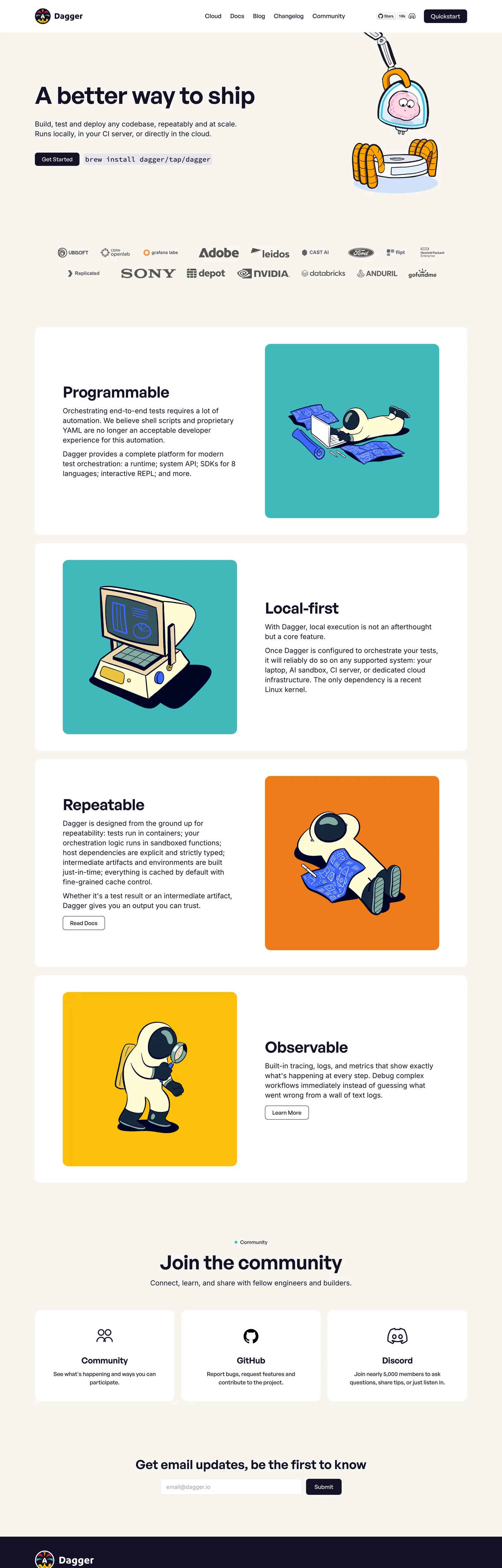
Dagger's marketing site opens on a parchment-colored canvas (#f8f4ef) with a 68px General Sans headline — "A better way to ship" — set in deep indigo-navy (#131226) at weight 600, -0.68px tracking. Below the hero paragraph a pair of pill CTAs sit in the same indigo at 8px radius. The page's decorative work is done entirely by large flat-color illustrations: a retro computer character on a teal tile, a robot on a yellow tile, an astronaut figure on an orange tile. These illustrations are drawn in a consistent bold-line, flat-fill style that reads closer to a 1960s technical manual than to a modern SaaS illustration library. Where most CI/CD brands (CircleCI, GitHub Actions, Jenkins) use pipeline diagram screenshots or terminal output as their visual language, Dagger uses illustrated characters as stand-ins for the system's four architectural properties: Programmable, Local-first, Repeatable, Observable.
The type system runs two families on a clear division: General Sans for every heading, label, and navigation element; Inter for every paragraph and body text surface. The split assigns the "personality" to the display family (General Sans's geometric, contemporary proportions) and the "readability" to Inter (the body workhorse). The uppercase tracked label tier — General Sans 600 at 14px, 0.56px letter-spacing, text-transform uppercase — is the system's metadata voice. Section labels like "PROGRAMMABLE" and "LOCAL-FIRST" use this tier to frame each illustration block.
The spacing is generous by dev-tools standards: 80px section padding, 100px horizontal container padding declared as --container-pad: 100px. The wide horizontal margins give the parchment canvas a magazine-like breathing room that separates Dagger from the tight, dense layouts of infrastructure tools like Terraform, Ansible, or Puppet. Built by the creators of Docker, Dagger uses visual restraint to signal that pipeline-as-code is worth designing around, not just configuring in YAML.
What makes it distinct
5
- Parchment canvasthe body background is a warm off-white (#f8f4ef) wired as --color-bg, not pure white; the warmth ties the page to the retro illustration character
- Bold illustration identityflat-color retro robot and character drawings in teal, yellow, and orange carry all decorative work on a system with no hero gradient or photography
- Tight negative tracking at displayGeneral Sans 600 at 68px has -0.68px letter-spacing; the negative tracking tightens large headings without an additional weight bump
- Deep indigo not true blackthe canvas ink is #131226, a near-black with a blue-purple cast, wired as --color-dark; pure black (#000000) appears only twice in the entire capture
- Uppercase spaced label tierGeneral Sans 600 at 14px with 0.56px letter-spacing and text-transform uppercase creates the section label style; the only uppercase treatment in the system
dagger.io
Live at dagger.io
A snapshot of the brand in production. Scroll the frame to see the whole page.
Colors
9 colors
Dagger's system anchors on #191922 (ink-alt) as its primary color. Type is set in General Sans across 12 tokens from 14px to 68px, weights 400–600. Shape language is mixed across 16 components, blending pills, soft rounds, and squarer corners.
Brand & Accent
Sparing, CTA-only voltage · 4
Surface
Page and card backgrounds · 2
Text
Headlines, body, captions · 2
Borders & Hairlines
Dividers, outlines, rules · 1
Typography
12 type tokens
Set in General Sans across 12 tokens, from 14px to 68px, weights 400–600. Shown in its own stack: where the font isn't installed, the fallback the file names stands in.
- display-xl68px · weight 600 · lh 75px · tracking -0.68pxThe quick brown fox jumps over the lazy dog
- display-lg56px · weight 600 · lh 62px · tracking -0.56pxThe quick brown fox jumps over the lazy dog
- display-md44px · weight 600 · lh 48px · tracking -0.44pxThe quick brown fox jumps over the lazy dog
- heading-lg36px · weight 600 · lh 43pxThe quick brown fox jumps over the lazy dog
- heading-md24px · weight 600 · lh 29px · tracking -0.24pxThe quick brown fox jumps over the lazy dog
- label-upper14px · weight 600 · lh 20px · tracking 0.56pxThe quick brown fox jumps over the lazy dog
- label-sm14px · weight 500 · lh 20px · tracking 0.14pxThe quick brown fox jumps over the lazy dog
- nav-link17px · weight 500 · lh 25pxThe quick brown fox jumps over the lazy dog
- body-lg20px · weight 400 · lh 28pxThe quick brown fox jumps over the lazy dog
- body-md16px · weight 400 · lh 24pxThe quick brown fox jumps over the lazy dog
- body-sm14px · weight 400 · lh 20pxThe quick brown fox jumps over the lazy dog
- mono-md20px · weight 500 · lh 28pxThe quick brown fox jumps over the lazy dog
Layout
Radii and spacing
6 corner radii and 8 spacing values. Shape language: mixed.
Radii
- none0px
- xs4px
- sm8px
- md12px
- lg16px
- pill999px
Spacing
- xs4px
- sm8px
- md12px
- lg16px
- xl24px
- 2xl32px
- 3xl40px
- section80px
Components
16 components
Each rendered from its tokens (color, type, radius, padding) on Dagger's own canvas.
- Button Primarybutton-primaryButton Primary
- Button Secondarybutton-secondaryButton Secondary
- Top Navtop-navTop Nav
- Nav Linknav-linkNav Link
- Hero Headinghero-headingHero Heading
- Section Headingsection-headingSection Heading
- Section Labelsection-labelSection Label
- Body Paragraphbody-paragraphBody Paragraph
- CardcardCard
- Illustration Tile Tealillustration-tile-tealIllustration Tile Teal
- Illustration Tile Yellowillustration-tile-yellowIllustration Tile Yellow
- Illustration Tile Orangeillustration-tile-orangeIllustration Tile Orange
- Type here…text-inputText Input
- Code Blockcode-blockCode Block
- Community Sectioncommunity-sectionCommunity Section
- FooterfooterFooter
In use
The system, in use
Dagger's tokens on the kind of product it builds.
Build something people actually use.
A short paragraph of marketing copy that previews how the brand's display tier and body tier read together. Two sentences is usually enough.
FAQ
Dagger design system FAQ
Common questions about Dagger's tokens, components, and how to use this DESIGN.md in your project.
Read next
Related reading
Specs, directories, and component libraries that pair with this design system.
- Browse all design systemsThe full directory of DESIGN.md files on shadcn.io, with live mockups for each.shadcn.io
- Dagger — official siteDagger's public marketing site — the source of truth for the live tokens captured in this file.dagger.io (opens in a new tab)
- The DESIGN.md specificationGoogle Labs' open spec for machine-readable design system files — the format this page is built on.github.com (opens in a new tab)
Use it
Use Dagger in your project
One machine-readable file. Drop it into Claude, Cursor, or any AI tool that reads DESIGN.md.
Download the DESIGN.md
One machine-readable file: every color, type, radius, spacing, and component token of Dagger.
Feed it to your AI tool
Drop it into Claude, Cursor, or GitHub Copilot. The agent writes React components and Tailwind classes that match Dagger's visual language.
Reference the tokens directly
Or paste the values into your Tailwind config, CSS variables, or component library: every color, size and radius is a quoted, ready-to-copy value.
Read the full DESIGN.md: overview, rationale, do’s and don’ts
Overview
Dagger's marketing site is the most illustration-driven system in the CI/CD directory. Characters over Chrome. Where CircleCI uses pipeline diagrams, GitHub Actions uses code screenshots, and Jenkins uses configuration YAML samples, Dagger assigns each of its four architectural properties (Programmable, Local-first, Repeatable, Observable) a large flat-color illustration tile with a retro character — a monitor with a face, a robot, an astronaut, a control panel. The illustrations are the primary differentiator on the page; the color palette, typography, and spacing serve them rather than the other way around.
The warm parchment canvas ({colors.canvas} — #f8f4ef) is the ground for this illustration world. Against a cold white or dark canvas the retro character drawings would read as vintage pastiche; against warm parchment they read as a considered choice — the visual language of technical zines and software manuals from an era before SaaS dashboards. General Sans at weight 600 with tight negative tracking drives every heading (68px hero, 44px section heads, 24px card titles); Inter at weight 400 carries every paragraph. The split is cleaner than most two-family systems: if a word appears in a heading or label, it's General Sans; if it's in a paragraph, it's Inter. No exceptions visible in the captured page.
Key Characteristics:
- Parchment canvas (#f8f4ef) as the body floor — not pure white; warmth indexed to the retro illustration character.
- Deep indigo-navy ink (#131226) — not pure black; a blue-purple cast wired as --color-dark.
- Three illustration-tile accent colors: teal (#40b9bc), yellow (#fcc009), orange (#ef7b1a) — used only as illustration backgrounds, never on interactive chrome.
- General Sans 600 with negative tracking across all heading tiers; Inter 400 for all body copy.
- Uppercase tracked label tier (General Sans 600 / 14px / +0.56px / uppercase) for architectural section labels.
- 16px dominant card radius, 8px on buttons and inputs, 999px pill for community tags.
- Generous 80px section padding, 100px horizontal container margins — the widest horizontal breathing room in the dev-tools category.
- Source Code Pro for inline code displays.
Colors
Surface
- Canvas (
{colors.canvas}— #f8f4ef): frequency 1 (bg). The parchment body floor. Wired as--color-bg. Not pure white — the warmth reads alongside the retro illustration tiles. - Surface-1 (
{colors.surface-1}— #ffffff): frequency 23. Card backgrounds, input fields, code block fills, and the footer-contrasted card surfaces. Wired as--color-card. - Ink (
{colors.ink}— #131226): frequency 242. Used as text (121), border (117), background (4). Deep indigo-navy, the dominant text and primary-button fill. Wired as--color-dark. - Ink Alt (
{colors.ink-alt}— #191922): frequency 6. Slightly lighter indigo for secondary dark surfaces. Wired as--color-dark-alt.
Hairlines
- Hairline (
{colors.hairline}— #ede8fa): frequency 118. Used as text (58), border (59), bg (1). A pale lavender-white that serves as both the card border tone and a secondary text color for muted labels. Wired as--color-border. The lavender tint is subtle but distinguishes this hairline from neutral gray — it carries the blue-purple cast of the ink color into the border system.
Brand Accents (illustration-only)
- Accent Teal (
{colors.accent-teal}— #40b9bc): frequency 3 (bg only). Illustration tile background for Programmable and Observable sections. Wired as--color-teal. - Accent Yellow (
{colors.accent-yellow}— #fcc009): frequency 1 (bg only). Illustration tile background for Local-first section. Wired as--color-yellow. - Accent Orange (
{colors.accent-orange}— #ef7b1a): frequency 1 (bg only). Illustration tile background for Repeatable section. Wired as--color-orange. - Accent Blue (
{colors.accent-blue}— #3d66ff): declared as--color-blue. Zero renders in the captured page — declared for the product surface or future use.
Typography
Font Families
The system runs two families on a strict semantic split. General Sans (wired as --font-heading: "General Sans", sans-serif) handles display, heading, label, and nav tiers. Inter (wired as --font-body: "Inter", sans-serif) handles body paragraphs and input field text. Source Code Pro (wired as --font-mono: "Source Code Pro", "IBM Plex Mono", monospace) appears in the embedded code example in the hero.
The split discipline is notable: there are no crossover uses in the captured render. Every heading token is General Sans; every paragraph token is Inter. The code voice is Source Code Pro at weight 500 and 20px.
Hierarchy
| Token | Size | Weight | Line Height | Letter Spacing | Use |
|---|---|---|---|---|---|
{typography.display-xl} | 68px | 600 | 75px | -0.68px | Hero h1 ("A better way to ship") |
{typography.display-lg} | 56px | 600 | 62px | -0.56px | Large section h2 |
{typography.display-md} | 44px | 600 | 48px | -0.44px | Standard section h2 ("Programmable") |
{typography.heading-lg} | 36px | 600 | 43px | 0 | Sub-section h2 |
{typography.heading-md} | 24px | 600 | 29px | -0.24px | Card h4, community section heading |
{typography.label-upper} | 14px | 600 | 20px | +0.56px | Section labels (uppercase, "PROGRAMMABLE") |
{typography.label-sm} | 14px | 500 | 20px | +0.14px | Inline tags and meta-labels |
{typography.nav-link} | 17px | 500 | 25px | 0 | Nav link labels, button labels |
{typography.body-lg} | 20px | 400 | 28px | 0 | Hero sub-paragraph, section leads |
{typography.body-md} | 16px | 400 | 24px | 0 | Default running text |
{typography.body-sm} | 14px | 400 | 20px | 0 | Caption rows, footer text |
{typography.mono-md} | 20px | 500 | 28px | 0 | Code display widget in hero |
Principles
The negative tracking convention is systematic: at every display and large heading size, the letter-spacing tracks tighter in proportion to the font size. 68px heading tracks at -0.68px (approximately -0.01em), 56px at -0.56px, 44px at -0.44px, 24px at -0.24px. This is a mechanically consistent negative tracking applied as a rule rather than by optical judgment — and it reads as tighter, more confident than many heading systems that only track at the largest display size.
The uppercase label tier (+0.56px) is the system's opposite move: where headings track tight, section labels track open. The label/heading contrast — loose-spaced uppercase at 14px vs. tight-spaced uppercase at 44–68px — is the typographic signature that lets a reader scan from a section label to its heading and feel the weight shift.
Note on Font Substitutes
General Sans is available free from Fontshare. The closest freely-licensed substitute is Plus Jakarta Sans (similar geometric proportions) or Outfit (similar cap-height and optical weight at 600). For Inter, any instance of Inter is already freely available from Google Fonts or rsms.me. Source Code Pro is available from Adobe Fonts and Google Fonts.
Layout
Spacing System
- Base unit: 4px.
- Tokens:
{spacing.xs}4px ·{spacing.sm}8px ·{spacing.md}12px ·{spacing.lg}16px ·{spacing.xl}24px ·{spacing.2xl}32px ·{spacing.3xl}40px ·{spacing.section}80px. - Section vertical padding: 80px — the most common major vertical rhythm value.
- Container horizontal padding: 100px (
--container-pad: 100px) — unusually wide margins that give the parchment canvas significant breathing room. - Illustration tile padding: 48px vertical, 80px horizontal.
Grid & Container
- Max content width: 1440px (
--container-max: 1440px). - Hero: centered headline + sub-copy + dual CTA cluster + trusted-by logo strip. Wide single-column centered layout.
- Feature sections: 2-column alternating split — text column left / illustration tile right, then text right / tile left, alternating down the page.
- Community section: 3-column card grid (GitHub card, Discord card, Slack card) at the bottom.
- Footer: full-width dark indigo (#131226) band with the Dagger wordmark and links.
Rhythm
The page's vertical rhythm is defined by the 80px section padding and the alternating left/right feature layout. Each feature pairing (text + illustration tile) is a self-contained composition rather than a list item in a grid. The wide 100px horizontal margins on a 1440px max-width container create a usable content column of ~1240px, wide enough to carry the large illustration tiles without feeling compressed.
Elevation
The system uses minimal shadow:
- Flat (no shadow): hero, feature sections, community band, footer.
- Hairline cards:
{colors.hairline}(#ede8fa) 1px border on white{colors.surface-1}cards provides the only card separation signal. - Input elevation: the newsletter input (
{component.text-input}) uses a 1px{colors.hairline}border with no shadow.
No box-shadow values were captured from the rendered page; elevation is entirely border-based.
Shapes
The radius scale is stepped-soft:
{rounded.none}0px — editorial bands and the footer.{rounded.xs}4px — smallest UI chips and tag corners.{rounded.sm}8px — primary button, secondary button, newsletter input, code block. The interactive-element default.{rounded.md}12px — mid-size cards.{rounded.lg}16px — dominant card radius. Feature tiles, illustration containers. 11 occurrences in the captured render, the most of any radius value.{rounded.pill}999px — community section tags and any fully-rounded pill element.
The system skips the 20–24px tier that some consumer-brand systems use. The jump from 16px card to 999px pill is binary at the large end — either a generously-rounded card or a full pill, nothing in between.
Components
button-primary — Deep indigo {colors.ink} fill, white text, {rounded.sm} 8px, 8×20px padding, 40px height. "Quickstart" is the canonical hero instance; wired with General Sans {typography.nav-link} (17px / 500).
button-secondary — Transparent fill, indigo {colors.ink} text, 1px {colors.hairline} lavender border, same 8px radius and sizing. Used for the "Playground" secondary CTA beside the hero primary.
top-nav — Transparent background against the parchment canvas, 64px height, 0×100px padding. Dagger wordmark left, nav links (Docs / Blog / Pricing / Changelog) center, GitHub icon + "Try Dagger Cloud" CTA right.
nav-link — Transparent background, deep indigo {colors.ink} text, General Sans {typography.nav-link} (17px / 500), 25px height, no padding.
hero-heading — Indigo {colors.ink} text, {typography.display-xl} (68px / 600 / -0.68px tracking), no padding. The largest typographic element in the system.
section-heading — Indigo {colors.ink} text, {typography.display-md} (44px / 600 / -0.44px). Section h2 for each architectural property.
section-label — Indigo {colors.ink} text, {typography.label-upper} (14px / 600 / +0.56px / uppercase). The section metadata label above each heading ("PROGRAMMABLE", "LOCAL-FIRST").
body-paragraph — Indigo {colors.ink} text, Inter {typography.body-lg} (20px / 400). Hero sub-copy and section lead paragraphs.
card — White {colors.surface-1} fill, 1px {colors.hairline} border, {rounded.lg} 16px, 24px padding. Community section cards (GitHub, Discord, Slack).
illustration-tile-teal — Teal {colors.accent-teal} fill, white text, {rounded.lg} 16px radius, 48×80px padding. The Programmable and Observable illustration containers.
illustration-tile-yellow — Yellow {colors.accent-yellow} fill, indigo text, same 16px radius and 48×80px padding. The Local-first illustration container.
illustration-tile-orange — Orange {colors.accent-orange} fill, indigo text, same radius and padding. The Repeatable illustration container.
text-input — White {colors.surface-1} fill, indigo text, Inter {typography.body-md}, {rounded.sm} 8px, 12×16px padding, 46px height, 1px {colors.hairline} border. Newsletter email field.
code-block — White {colors.surface-1} fill, indigo text, Source Code Pro {typography.mono-md}, {rounded.sm} 8px, 16px padding, 1px {colors.hairline} border. Hero code-display widget.
community-section — Parchment {colors.canvas} surface, indigo text, 80px vertical / 100px horizontal padding. The community-join band above the footer.
footer — Deep indigo {colors.ink} fill, white text, Inter {typography.body-sm}, 24×100px padding. Full-width dark footer with wordmark and navigation links.
Do's and Don'ts
Do use the three illustration-tile accent colors ({colors.accent-teal}, {colors.accent-yellow}, {colors.accent-orange}) exclusively as illustration-block backgrounds. In the captured system these colors appear zero times on buttons, links, nav, or text — they are illustration-plane colors, not interactive-chrome colors.
Do apply General Sans {typography.label-upper} (14px / 600 / uppercase / +0.56px) as the section label tier above every heading. The tracked uppercase label is the system's metadata voice; removing it or replacing it with a body-weight label loses the heading/label contrast that gives the layout its scan structure.
Do maintain the negative-tracking convention across all General Sans heading sizes: -0.01em at each size point. The mechanical -0.68px at 68px, -0.44px at 44px pattern is systematic; applying tracking only at the largest heading size is a common shortcut that breaks the internal consistency.
Do preserve the parchment canvas ({colors.canvas} — #f8f4ef) as the body floor rather than substituting pure white. The warmth is integral to the illustration-character identity; cold white makes the retro drawings read as clip art rather than intentional character.
Don't use the accent colors ({colors.accent-teal}, {colors.accent-yellow}, {colors.accent-orange}) on buttons, links, or nav elements. The primary button is deep indigo on parchment; colored buttons would confuse the illustration-as-accent system.
Don't use General Sans for body paragraphs or Inter for headings. The two-family split is strict and consistent across the captured page; mixing the roles destroys the "personality vs. readability" division.
Don't reduce the 100px horizontal container padding to match a tighter dev-tools convention. The generous horizontal margins are the system's primary differentiator from dense infrastructure tool sites; compressing to 32px or 48px sides would lose the magazine breathing room.
Don't add drop shadows to cards or buttons. The system is elevation-flat; the {colors.hairline} lavender-white border is the only card separation signal. Shadows would break the editorial flatness and conflict with the illustration-forward aesthetic.
Known Gaps
- Illustration assets: the retro character illustrations (robot, computer face, astronaut, control panel) are the system's primary visual identity and are not captured as tokens. They are SVG or PNG assets loaded as img or background-image values; this DESIGN.md cannot reproduce them from hex values alone.
- Hover and focus states: the captured render is static; the full interactive state matrix (button hover, link focus, input focus ring) is not observable. The declared accent-blue (--color-blue) is the likely focus-ring color based on its CSS variable role, but no focus states are visible in the static capture.
- Dark mode: no dark mode is declared or observed on the marketing site. The footer uses the deep indigo as a localized dark surface but there is no global dark-mode token set.
- Motion: the marketing site likely uses entrance animations on the illustration tiles (scroll-triggered reveal), but the easing curves and timing are not captured.
- Dagger Cloud product surface: the dagger.io marketing site captures the product-landing surface only. The Dagger Cloud console (pipeline visualization, agent traces) would carry a richer token set with chart colors, status indicators, and pipeline-edge colors.
- Mobile breakpoints: the 100px horizontal container padding likely collapses at mobile widths, but the breakpoint-specific layout is not captured in the static render.
Backend, Database & DevOps
More systems like this
More DESIGN.md files in Backend, Database & DevOps.
Pricing
Build it with Pro
The DESIGN.md files are free. Pro adds 6,000+ blocks, premium templates and the MCP server, so your AI editor builds in your system for you.
4.9/5 out of 5 · 150+ reviewsfrom 150+ founders and developers.
Billing
Billed once a year in USD. Cancel anytime.
- How many people can use the license.
- Client work, SaaS products and anything you charge for.
- Production-ready React sections: hero, pricing, features, dashboards and more.
- Complete multi-page sites you can ship as they are.
- React icons from every major library, installable with one command.
- Presets that restyle every block, in light and dark.
- Lets your AI editor search, preview and install blocks for you.
- Priority requests are answered first.
Individual
For personal projects & open source
$32instead of $49/mo
$389 billed yearly
- Seats: 1 seat
- Commercial use: Personal & open source only
- Pro blocks: 6,000+ blocks
- Templates: All 14 templates
- React icons: 294k+ icons
- Themes: All 59 themes
- MCP server: Basic usage
- Support: Standard
Team
Most popularFor freelancers, agencies & startups
$66instead of $99/mo
$789 billed yearly · ≈ $13/dev/mo
- Seats: Up to 5 seats
- Commercial use: Included
- Pro blocks: 6,000+ blocks
- Templates: All 14 templates
- React icons: 294k+ icons
- Themes: All 59 themes
- MCP server: High usage
- Support: Priority
Organization
For companies with larger teams
$132instead of $199/mo
$1,589 billed yearly
- Seats: Unlimited seats
- Commercial use: Included
- Pro blocks: 6,000+ blocks
- Templates: All 14 templates
- React icons: 294k+ icons
- Themes: All 59 themes
- MCP server: Unlimited usage
- Support: Priority
Billed once a year in USD. Cancel anytime.
Individual
For personal projects & open source
$32instead of $49/mo
$389 billed yearly
- How many people can use the license.Seats: 1 seat
- Client work, SaaS products and anything you charge for.Commercial use: Personal & open source only
- Production-ready React sections: hero, pricing, features, dashboards and more.Pro blocks: 6,000+ blocks
- Complete multi-page sites you can ship as they are.Templates: All 14 templates
- React icons from every major library, installable with one command.React icons: 294k+ icons
- Presets that restyle every block, in light and dark.Themes: All 59 themes
- Lets your AI editor search, preview and install blocks for you.MCP server: Basic usage
- Priority requests are answered first.Support: Standard
Team
Most popularFor freelancers, agencies & startups
$66instead of $99/mo
$789 billed yearly · ≈ $13/dev/mo
Everything in Individual, plus
- How many people can use the license.Seats: Up to 5 seats
- Client work, SaaS products and anything you charge for.Commercial use: Included
- Lets your AI editor search, preview and install blocks for you.MCP server: High usage
- Priority requests are answered first.Support: Priority
Organization
For companies with larger teams
$132instead of $199/mo
$1,589 billed yearly
Everything in Team, plus
- How many people can use the license.Seats: Unlimited seats
- Lets your AI editor search, preview and install blocks for you.MCP server: Unlimited usage
- Secure checkout via Stripe
- Code lives in your repo
- Keep what you've shipped if you cancel
- License terms
Your system, built for you
Every block, template and icon, installed by your AI agent in your design system. The DESIGN.md files stay free.