Heroku Design System
Heroku's marketing-site design system: Avant Garde at 40px for section headings, Salesforce Sans body, Salesforce brand-blue CTA on a dark-violet hero. Tokens for React, Next.js, and AI coding tools.
Add shadcn.io to your AI agent. · Pro It installs blocks, icons and templates in your design system from a prompt, with Pro.
Set up MCP- Primary
- #5a1ba9
- Typeface
- Salesforce Sans
- Shape
- Sharp
- Base radius
- 4px
- Colors
- 12
- Type tokens
- 11
- Components
- 14
- Spacing values
- 7
About
About Heroku DESIGN.md
Curated by Dov Azencot · Updated May 19, 2026 · Source heroku.com (opens in a new tab)
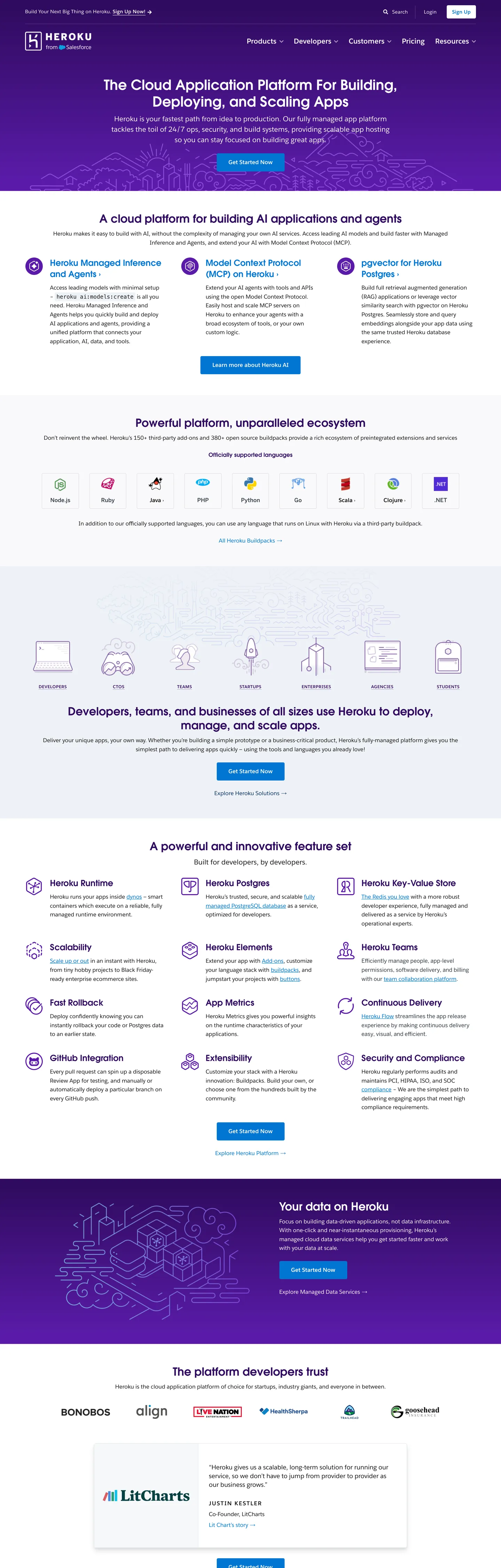
Heroku's marketing site is a study in brand inheritance tension. Above the fold, a dark violet-to-near-black canvas carries the ghost of Heroku's original pre-2010 purple identity — deep gradients layering #240643, #300b60, and #032d60 — while the primary CTA button is Salesforce brand blue #0176d3. The hero heading runs Avant Garde at 40px / weight 600, a geometric sans with high circular counters that reads nothing like Salesforce's own Salesforce Sans body copy below it. The system sits at the intersection of two brand identities: the PaaS builder culture Heroku invented, and the enterprise-SaaS structure Salesforce imposed.
The DESIGN.md file captures 12 colors tokens from a palette dominated by structural dark-purple tones and the Salesforce blue. The brand-layer color is the original Heroku violet (#5a1ba9) with a total frequency of 18 — present but not dominant, used for buttons and gradient accents rather than as the canvas floor. Near-black ink #181818 appears 870 times as the dominant text and border color; Salesforce blue #0176d3 drives all interactive elements. Typography splits between Avant Garde (headings from h2 to h3 at 24-40px / weight 600) and Salesforce Sans (body, nav, labels, buttons — the workhorse of the page). The radius scale compresses everything into a single 4px step, with rare 5px and occasional percentage radii for avatar circles.
Feed this file to an AI tool and it will reproduce Heroku's specific moves: the dark-violet hero on a white-below-fold layout, the Avant Garde geometric display at 600-weight, the Salesforce-blue CTA that overrides the purple heritage, and the 4px universal rounding that tightens every UI surface. The most revealing detail in the extraction is what's absent: Heroku's original purple (#5a1ba9) appears only 18 times, while its parent's blue (#0176d3) appears 151 times — the numbers tell the story of a brand mid-transition.
What makes it distinct
5
- Dual Salesforce heritage typefacesAvant Garde for headings and Salesforce Sans for body, both part of the Salesforce brand family that now owns Heroku
- Dark violet hero canvasthe above-fold section runs on a deep near-black violet gradient, a nod to Heroku's pre-Salesforce purple identity
- Salesforce blue CTAthe primary button uses Salesforce brand blue (#0176d3), not Heroku's historical purple, signaling the brand alignment with its parent
- 4px universal radiusalmost every component on the page uses a single 4px corner radius, the most conservative rounding tier in the cloud-hosting category
- Uppercase tracking labelsSalesforce Sans at 12px with 0.6-1.5px letter-spacing and uppercase transforms power every category chip, creating a rigid editorial grid
heroku.com
Live at heroku.com
A snapshot of the brand in production. Scroll the frame to see the whole page.
Colors
12 colors
Heroku's system anchors on #5a1ba9 (primary) as its primary color. Type is set in Salesforce Sans across 11 tokens from 12px to 40px, weights 400–700. Shape language is sharp — components average 4px corner radius, favoring crisp rectangles.
Brand & Accent
Sparing, CTA-only voltage · 1
Surface
Page and card backgrounds · 2
Text
Headlines, body, captions · 4
Borders & Hairlines
Dividers, outlines, rules · 1
Other
Specialty colors · 4
Typography
11 type tokens
Set in Salesforce Sans across 11 tokens, from 12px to 40px, weights 400–700. Shown in its own stack: where the font isn't installed, the fallback the file names stands in.
- display-xl40px · weight 600 · lh 48px · tracking normalThe quick brown fox jumps over the lazy dog
- display-lg32px · weight 600 · lh 40px · tracking normalThe quick brown fox jumps over the lazy dog
- heading-md24px · weight 600 · lh 32px · tracking normalThe quick brown fox jumps over the lazy dog
- heading-sm24px · weight 700 · lh 32px · tracking normalThe quick brown fox jumps over the lazy dog
- body-lg20px · weight 400 · lh 30px · tracking normalThe quick brown fox jumps over the lazy dog
- body-md16px · weight 400 · lh 25.6px · tracking normalThe quick brown fox jumps over the lazy dog
- body-sm14px · weight 400 · lh 14px · tracking 0.25pxThe quick brown fox jumps over the lazy dog
- label-md12px · weight 700 · lh 18px · tracking 0.6pxThe quick brown fox jumps over the lazy dog
- label-sm12px · weight 700 · lh 19.2px · tracking 1.5pxThe quick brown fox jumps over the lazy dog
- nav-link20px · weight 700 · lh 28px · tracking normalThe quick brown fox jumps over the lazy dog
- button-md16px · weight 700 · lh 24px · tracking -0.032pxThe quick brown fox jumps over the lazy dog
Layout
Radii and spacing
5 corner radii and 7 spacing values. Shape language: sharp.
Radii
- none0px
- sm3px
- md4px
- lg5px
- full50%
Spacing
- xs2px
- sm10px
- md15px
- base30px
- lg24px
- xl60px
- 2xl75px
Components
14 components
Each rendered from its tokens (color, type, radius, padding) on Heroku's own canvas.
- Button Primarybutton-primaryButton Primary
- Button Secondarybutton-secondaryButton Secondary
- Top Navtop-navTop Nav
- Nav Linknav-linkNav Link
- Hero Headinghero-headingHero Heading
- Section Headingsection-headingSection Heading
- Card Headingcard-headingCard Heading
- Body Paragraphbody-paragraphBody Paragraph
- Label Taglabel-tagLabel Tag
- Hero Labelhero-labelHero Label
- CardcardCard
- Surface Cardsurface-cardSurface Card
- Type here…text-inputText Input
- FooterfooterFooter
In use
The system, in use
Heroku's tokens on the kind of product it builds.
Build something people actually use.
A short paragraph of marketing copy that previews how the brand's display tier and body tier read together. Two sentences is usually enough.
- · 1 project
- · Community support
- · 10k req/mo
- · 10 projects
- · Priority support
- · 1M req/mo
- · Custom domains
- · Unlimited
- · SLA
- · Audit log
- · SSO
FAQ
Heroku design system FAQ
Common questions about Heroku's tokens, components, and how to use this DESIGN.md in your project.
Read next
Related reading
Specs, directories, and component libraries that pair with this design system.
- Browse all design systemsThe full directory of DESIGN.md files on shadcn.io, with live mockups for each.shadcn.io
- Heroku — official siteHeroku's public marketing site — the source of truth for the live tokens captured in this file.heroku.com (opens in a new tab)
- The DESIGN.md specificationGoogle Labs' open spec for machine-readable design system files — the format this page is built on.github.com (opens in a new tab)
Use it
Use Heroku in your project
One machine-readable file. Drop it into Claude, Cursor, or any AI tool that reads DESIGN.md.
Download the DESIGN.md
One machine-readable file: every color, type, radius, spacing, and component token of Heroku.
Feed it to your AI tool
Drop it into Claude, Cursor, or GitHub Copilot. The agent writes React components and Tailwind classes that match Heroku's visual language.
Reference the tokens directly
Or paste the values into your Tailwind config, CSS variables, or component library: every color, size and radius is a quoted, ready-to-copy value.
Read the full DESIGN.md: overview, rationale, do’s and don’ts
Overview
Heroku's marketing site carries the visible weight of two brand identities occupying the same page. Inherited Violet, Imposed Blue. The hero canvas runs on deep violet gradients that belong to Heroku's pre-Salesforce identity, while every interactive element — primary CTA, links, form controls — renders in Salesforce brand blue #0176d3. The display typeface is Avant Garde, a geometric sans-serif with conspicuously circular counters that reads more like a 1970s magazine font than either Heroku's developer culture or Salesforce's enterprise CRM aesthetic. The combination is historically layered in a way that competing cloud platforms like Render or Railway, which were designed from scratch, are not.
The system's typography is a dual-voice structure: Avant Garde carries section headings at weight 600 with its signature circular geometry; Salesforce Sans carries everything else at moderate weights with tight letter-spacing on labels. A 4px universal radius locks every component into the same conservative rounding tier — buttons, cards, inputs, and chips all share the 4px step, with no larger or smaller option in the main component set.
Key Characteristics:
- Dark violet hero gradient built from deep structural tones (#240643, #300b60, #032d60) — a heritage reference to Heroku's pre-Salesforce purple identity.
- Salesforce brand blue (#0176d3, 151 appearances) drives all interactive elements; Heroku's own violet (#5a1ba9) appears only 18 times in the captured page.
- Avant Garde at 32-40px / weight 600 carries section headings — a geometric sans with circular counters that is entirely distinct from Salesforce's standard brand typefaces.
- Salesforce Sans at 16px / weight 400 handles all body copy; at 20px / weight 700 handles nav links; at 12px / weight 700 with 0.6-1.5px letter-spacing handles uppercase category labels.
- Universal 4px corner radius on every component except avatar images (50%) — the tightest consistent rounding in the cloud-PaaS category.
- Page layout splits: dark violet above-fold hero, white body below the fold — a proven conversion pattern that Heroku popularized in the 2012-2014 era.
- BentonSans appears for some body paragraphs (count: 9-5), a trace element from earlier design iterations.
Colors
Brand
- Heroku Violet (
{colors.primary}— #5a1ba9): frequency 18. Used as text (5), bg (6), border (5), gradient (2). Heroku's heritage brand color, wired as the meta theme-color. Appears sparingly — gradient accents and occasional secondary interactive elements — not the primary CTA driver. - Salesforce Blue (
{colors.secondary}— #0176d3): frequency 151. Used as text (72), bg (8), border (71). The dominant interactive color; powers the primary button, all text links, nav hover states, and form controls. Wired at this hex directly (no CSS variable name captured).
Hero Canvas
- Hero Deep (
{colors.hero-deep}— #240643): frequency 106. Used as text (53), border (53). The deepest violet in the gradient stack; appears as the dominant foreground and border color on the dark hero canvas. - Hero Violet (
{colors.hero-violet}— #300b60): frequency 86. Used as text (42), border (42), gradient (2). Mid-layer of the dark hero gradient; also used as section heading color below the fold. - Hero Navy (
{colors.hero-navy}— #032d60): frequency 58. Used as text (29), border (29). The navy-blue depth in the hero gradient, providing the blue-shifted shadow of the violet palette.
Ink & Surface
- Ink (
{colors.ink}— #181818): frequency 870. Used as text (436), border (434). The dominant text and border color across the white-canvas body sections — a near-black with zero chromatic offset. - Ink Medium (
{colors.ink-medium}— #333d47): frequency 232. Used as text (116), border (116). Secondary text and sub-label color with a subtle slate-blue shift. - Ink Light (
{colors.ink-light}— #211746): frequency 18. Used as text (9), border (9). Dark indigo, used for deep-contrast text within dark sections. - Canvas (
{colors.canvas}— #ffffff): frequency 75. Used as text (35), bg (13), border (27). Page background below the fold; also the hero CTA button text. - Surface 1 (
{colors.surface-1}— #eef1f6): frequency 3. Used as bg (2), border (1). Light blue-gray surface for alternating content cards.
Hairlines
- Hairline (
{colors.hairline}— #dddddd): frequency 9. Used as border (9). The divider color for card edges and input field outlines.
Typography
Font Families
The system runs Avant Garde for every heading level (h2 and h3, at 24-40px / weight 600-700) and Salesforce Sans for every body, button, label, and nav element. BentonSans appears as a tertiary family on some body paragraphs and divs, likely a legacy remnant from an earlier design iteration.
Hierarchy
| Token | Size | Weight | Line Height | Use |
|---|---|---|---|---|
{typography.display-xl} | 40px | 600 | 48px | Hero h1 / top section heading |
{typography.display-lg} | 32px | 600 | 40px | Section h2 |
{typography.heading-md} | 24px | 600 | 32px | Card heading h3 |
{typography.heading-sm} | 24px | 700 | 32px | Bold card heading variant |
{typography.body-lg} | 20px | 400 | 30px | Lead paragraph / hero body |
{typography.body-md} | 16px | 400 | 25.6px | Default body text |
{typography.body-sm} | 14px | 400 | 14px | Small UI copy / footnotes |
{typography.label-md} | 12px | 700 | 18px | Category label (0.6px tracking) |
{typography.label-sm} | 12px | 700 | 19.2px | Uppercase label (1.5px tracking) |
{typography.nav-link} | 20px | 700 | 28px | Top navigation links |
{typography.button-md} | 16px | 700 | 24px | Button label (-0.032px tracking) |
Principles
Avant Garde's weight ceiling is 700 in card headings only; the primary display tier sits at 600. The most distinctive typographic pattern is the 12px uppercase label with 0.6-1.5px letter-spacing — a strict category-chip format that runs throughout the page as "PLATFORM", "RUNTIME", "AI", "SECURITY". Salesforce Sans at 20px / 700 for navigation links is unusually large; most PaaS sites use 14-16px nav links.
Note on Font Substitutes
Both Avant Garde and Salesforce Sans are proprietary. Futura or ITC Avant Garde Gothic approximate Avant Garde's circular geometric counters at display size. Inter or Nunito at the same weights approximates Salesforce Sans for body and label copy. The uppercase-tracking-label pattern (12px / 700 / 0.6px or 1.5px spacing / all-caps) is system-defining and should be preserved in any adaptation.
Layout
Spacing System
- Base unit: 10-15px (with 30px as the dominant section module).
- Tokens:
{spacing.xs}2px ·{spacing.sm}10px ·{spacing.md}15px ·{spacing.base}30px ·{spacing.lg}24px ·{spacing.xl}60px ·{spacing.2xl}75px. - Button padding: 12px vertical × 32px horizontal — compact height (52px) with generous horizontal breathing room.
- Section padding: 75px × 50px for large section containers; 30px × 60px for standard bands.
- Nav padding: 35px × 15px per link, producing the 98px navigation height.
Grid & Container
- Hero: full-width dark violet canvas carrying the headline, sub-paragraph, and primary CTA button.
- Body sections: white canvas with alternating feature blocks, typically a text-left / visual-right layout.
- Card grid: 2-3 column grids at desktop for feature and product cards, 30px internal padding.
- Container: ~1200px max content width for hero and body sections.
Rhythm
The page alternates between dark violet (hero) and white (body) — a structural contrast that has been Heroku's layout signature since approximately 2012. Section gaps use 75px vertical padding at major breaks, 30px at internal card spacing. The overall rhythm feels denser than Render or Cloudflare, with more content packed per scroll unit.
Elevation
The system has a minimal shadow tier — near-zero. On the dark hero, no shadows are needed. On the white body canvas, card edges use 1px {colors.hairline} borders at #dddddd. A single shadow reference to true black (frequency 2) appears in the extraction, suggesting an occasional very-light drop shadow on specific elements.
- Flat (no shadow): hero sections, footer, and most body cards.
- Hairline border:
{colors.hairline}(#dddddd) 1px border on content cards and inputs. - Surface lift:
{colors.surface-1}(#eef1f6) cards sit on the white canvas for a subtle light-teal-gray lift.
Shapes
The radius scale is nearly monolithic at 4px:
{rounded.none}0px — appears only on certain hero text elements.{rounded.sm}3px — one instance, minor variant.{rounded.md}4px — the universal radius: buttons, cards, inputs, chips, form elements.{rounded.lg}5px — one instance, minor variant.{rounded.full}50% — avatar images and circular icon containers only.
The 4px monoculture means there is no pill variant and no generous-soft tier anywhere in the interactive system. The rounded-ness is minimal enough that the interface reads as sharp-edged without committing to Render's zero-radius extremism.
Components
button-primary — Salesforce blue fill ({colors.secondary}), white text, {typography.button-md} (16px / 700 / -0.032px), 4px radius, 12×32 padding, 52px height. "Get Started Now" is the canonical instance.
button-secondary — Transparent fill, Salesforce blue text, blue border, same typography and sizing. Used for secondary CTAs alongside the primary.
top-nav — Dark deep-violet fill ({colors.hero-deep}), white text, 98px height, 0×30px padding. The navigation bar extends as part of the dark hero canvas.
nav-link — Transparent background, white text in {typography.nav-link} (20px / 700), 35×15px padding. Unusually large and heavy for a marketing nav — closer to a mobile CTA than a standard nav link.
hero-heading — White text on the dark hero, {typography.display-xl} (40px / 600). The captured headline is "The Cloud Application Platform For Building, Deploying, and Scaling Apps."
section-heading — Deep violet text ({colors.hero-violet}), {typography.display-lg} (32px / 600). Used for major section h2 elements on the white body canvas.
card-heading — Ink text ({colors.ink}), {typography.heading-md} (24px / 600). Feature card and sub-section headings.
body-paragraph — Default ink text ({colors.ink}) at {typography.body-md} (16px / 400 / 25.6px line height).
label-tag — No background, medium-ink text, {typography.label-md} (12px / 700 uppercase / 0.6px tracking), 4px radius. Category chips above headings.
hero-label — White text, {typography.label-sm} (12px / 700 uppercase / 1.5px tracking). Category labels on the dark hero canvas, maximum letter-spacing.
card — White canvas, ink text, {typography.body-md}, 4px radius, 30px padding, hairline border. The default content card across the white body sections.
surface-card — Light blue-gray surface ({colors.surface-1}), ink text, {typography.body-md}, 4px radius, 15×20px padding. Alternating card variant on sections that need a tonal lift.
text-input — White fill, ink text, {typography.body-sm}, 4px radius, hairline border, 52px height. Resting state only; no error or focus captures in the extraction.
footer — Deep-violet fill ({colors.hero-deep}), white text, {typography.body-md}, 60px × 0px padding. The footer returns to the hero's dark violet, framing the page with matching dark bands at top and bottom.
Do's and Don'ts
Do use Salesforce blue (#0176d3) as the primary interactive color. Despite Heroku's violet heritage, the current marketing site unambiguously routes all interactive affordances — primary CTA, text links, form controls — through the Salesforce blue. Using violet (#5a1ba9) for primary CTAs would misrepresent the current live system.
Do keep the hero canvas and footer both in dark violet. The dark-top / white-body / dark-bottom structural frame is Heroku's most distinctive layout pattern. Switching the footer to white breaks the framing and loses the page's structural identity.
Do use Avant Garde at weight 600 for section headings. The circular geometric counters at 32-40px are the most distinctive typographic move in the system; dropping to weight 400 or switching to Salesforce Sans for headings flattens the hierarchy.
Do apply 4px radius to every interactive component. The near-flat rounding is consistent across the entire component set. Introducing a pill variant or a generous 12-16px radius for any button would break the enterprise-adjacent visual grammar the 4px monoculture establishes.
Don't use the deep violet tones (#240643, #300b60, #032d60) as text colors on a white canvas. These dark purples function only as canvas fill on the dark hero sections; used as text on white they would appear nearly black but with an uncanny purple tint that reads as miscalibrated rather than branded.
Don't introduce a 12px / weight 700 uppercase label with tracking below 0.6px. The label-md and label-sm tiers define themselves through their extreme uppercase tracking (0.6-1.5px); reducing the tracking collapses them into generic small-caps and loses the editorial rigidity that distinguishes Heroku's category chips.
Don't use Heroku's violet (#5a1ba9) as a primary CTA fill. The extraction confirms this color has only 18 total uses versus 151 for the Salesforce blue — the hierarchy is clear. Using violet as the primary button would be historically accurate to pre-2018 Heroku but would conflict with the current live system.
Don't increase nav-link font size above 20px / 700. The nav links are already substantially larger than industry convention; going beyond 20px would make the top navigation dominate the page over the hero content in ways the current layout handles by confining links to the dark canvas.
Known Gaps
- Hover states: no hover transitions captured for buttons or nav links; the Salesforce blue likely lightens on hover based on adjacent brand tokens.
- Mobile layout: the hero typography scale at 40px was captured at desktop width; mobile breakpoints almost certainly reduce the display size significantly.
- Light mode nav: whether the navigation carries a white-canvas variant for scroll-past-hero is not captured in the static extraction.
- Form states:
{component.text-input}captures resting state only; focus ring color (likely Salesforce blue at some opacity), error state, and disabled state are not extracted. - AI product sections: Heroku has added AI-specific marketing sections referencing "Heroku AI Agents" — the typography and color treatments within those sections may introduce additional tokens not captured here.
- Animation: hero scroll transitions and section entrance animations are not captured in this static spec.
- Pricing table: the pricing page components — which would expose the full button hierarchy across plan tiers — were not captured in this extraction.
Web Infrastructure & Hosting
More systems like this
More DESIGN.md files in Web Infrastructure & Hosting.
Pricing
Build it with Pro
The DESIGN.md files are free. Pro adds 6,000+ blocks, premium templates and the MCP server, so your AI editor builds in your system for you.
4.9/5 out of 5 · 150+ reviewsfrom 150+ founders and developers.
Billing
Billed once a year in USD. Cancel anytime.
- How many people can use the license.
- Client work, SaaS products and anything you charge for.
- Production-ready React sections: hero, pricing, features, dashboards and more.
- Complete multi-page sites you can ship as they are.
- React icons from every major library, installable with one command.
- Presets that restyle every block, in light and dark.
- Lets your AI editor search, preview and install blocks for you.
- Priority requests are answered first.
Individual
For personal projects & open source
$32instead of $49/mo
$389 billed yearly
- Seats: 1 seat
- Commercial use: Personal & open source only
- Pro blocks: 6,000+ blocks
- Templates: All 14 templates
- React icons: 294k+ icons
- Themes: All 59 themes
- MCP server: Basic usage
- Support: Standard
Team
Most popularFor freelancers, agencies & startups
$66instead of $99/mo
$789 billed yearly · ≈ $13/dev/mo
- Seats: Up to 5 seats
- Commercial use: Included
- Pro blocks: 6,000+ blocks
- Templates: All 14 templates
- React icons: 294k+ icons
- Themes: All 59 themes
- MCP server: High usage
- Support: Priority
Organization
For companies with larger teams
$132instead of $199/mo
$1,589 billed yearly
- Seats: Unlimited seats
- Commercial use: Included
- Pro blocks: 6,000+ blocks
- Templates: All 14 templates
- React icons: 294k+ icons
- Themes: All 59 themes
- MCP server: Unlimited usage
- Support: Priority
Billed once a year in USD. Cancel anytime.
Individual
For personal projects & open source
$32instead of $49/mo
$389 billed yearly
- How many people can use the license.Seats: 1 seat
- Client work, SaaS products and anything you charge for.Commercial use: Personal & open source only
- Production-ready React sections: hero, pricing, features, dashboards and more.Pro blocks: 6,000+ blocks
- Complete multi-page sites you can ship as they are.Templates: All 14 templates
- React icons from every major library, installable with one command.React icons: 294k+ icons
- Presets that restyle every block, in light and dark.Themes: All 59 themes
- Lets your AI editor search, preview and install blocks for you.MCP server: Basic usage
- Priority requests are answered first.Support: Standard
Team
Most popularFor freelancers, agencies & startups
$66instead of $99/mo
$789 billed yearly · ≈ $13/dev/mo
Everything in Individual, plus
- How many people can use the license.Seats: Up to 5 seats
- Client work, SaaS products and anything you charge for.Commercial use: Included
- Lets your AI editor search, preview and install blocks for you.MCP server: High usage
- Priority requests are answered first.Support: Priority
Organization
For companies with larger teams
$132instead of $199/mo
$1,589 billed yearly
Everything in Team, plus
- How many people can use the license.Seats: Unlimited seats
- Lets your AI editor search, preview and install blocks for you.MCP server: Unlimited usage
- Secure checkout via Stripe
- Code lives in your repo
- Keep what you've shipped if you cancel
- License terms
Your system, built for you
Every block, template and icon, installed by your AI agent in your design system. The DESIGN.md files stay free.