Kubernetes Design System
Kubernetes marketing site as a DESIGN.md file. Bootstrap 5 base, royal blue #326ce5 as the single brand voltage, Open Sans across all tiers, 8px default rounding, 12 colors tokens, 14 components. For React, Next.js, and AI tools.
Add shadcn.io to your AI agent. · Pro It installs blocks, icons and templates in your design system from a prompt, with Pro.
Set up MCP- Primary
- #326ce5
- Typeface
- Open Sans
- Shape
- Mixed
- Base radius
- 8px
- Colors
- 12
- Type tokens
- 9
- Components
- 14
- Spacing values
- 6
About
About Kubernetes DESIGN.md
Curated by Dov Azencot · Updated May 18, 2026 · Source kubernetes.io (opens in a new tab)
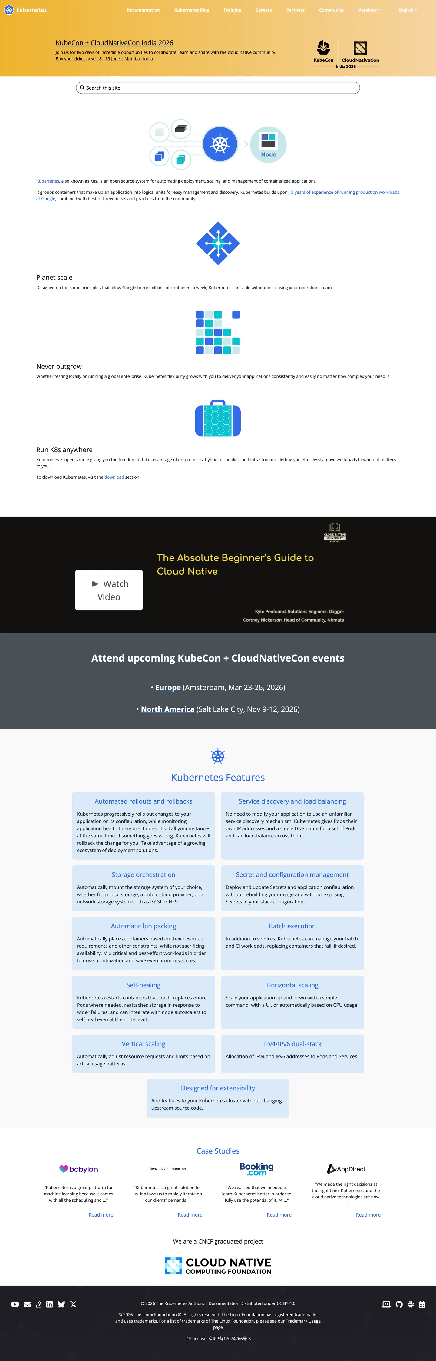
Kubernetes.io is an open-source documentation site that also functions as the project's primary marketing surface. It does not use a proprietary typeface, a bespoke design system, or a brand-hero illustration. It uses Bootstrap 5 with a theme override that maps the Bootstrap primary color to Kubernetes royal blue (#326ce5), and Open Sans as the system body font. The page's strongest visual statement is the KubeCon event announcement banner — a near-black panel carrying white text and two event-date chips — and beneath that, a series of content sections: a "Planet scale" feature list, a "Kubernetes Features" grid of 8 tiles, a CNCF case-study section, and the Cloud Native Computing Foundation affiliation footer. The helm-wheel logo mark is the most distinctive brand asset, but its azure-to-royal blue gradient appears nowhere in the CSS surface tokens — only once, as a gradient stop in the extraction.
For a project that underpins a significant fraction of global enterprise infrastructure, the design is deliberately restrained. This is not a marketing failure — it reflects the open-source governance model: the community owns the project, not a marketing team, and the visual system must signal trustworthiness and longevity rather than commercial ambition. Compared to Docker (which uses the same container ecosystem positioning but runs a bespoke Repro + electric-blue commercial design system), Kubernetes reads as the reference implementation — technically authoritative, visually neutral. The analogy in software is stable API over flashy UI.
Feed this file to an AI coding tool and it reproduces Kubernetes's specific moves: white canvas, Bootstrap 5 token structure, royal blue as the single link/interactive voltage, Open Sans at weight 400 body and 700 heading, conservative 8px default rounding, and a dark event-announcement banner as the one deliberate chromatic departure. The system is among the easiest in the directory to clone: few tokens, one family, one voltage, Bootstrap base.
What makes it distinct
5
- Bootstrap 5 foundationthe entire CSS variable set is --bs-* prefixed, making token sourcing and overriding predictable for any Bootstrap-familiar developer
- Single royal-blue brand voltage#326ce5 wired as --bs-primary and --bs-link-color across 44 rendered occurrences
- Open Sans across all tiersone family, weight 400 body and weight 700 heading, no display/body split
- Dark event bannerthe KubeCon announcement panel is near-black (#13110f) with white text, making it the page's only true dark surface
- CNCF ecosystem credibilitya logo grid of CNCF member projects and a 'Case Studies' section substitute for brand illustration
kubernetes.io
Live at kubernetes.io
A snapshot of the brand in production. Scroll the frame to see the whole page.
Colors
12 colors
Kubernetes's system runs on #326ce5 as its primary voltage, used in 4 of 14 components. Type is set in Open Sans across 9 tokens from 14px to 32px, weights 400–700. Shape language is mixed across 14 components, blending pills, soft rounds, and squarer corners.
Brand & Accent
Sparing, CTA-only voltage · 2
Surface
Page and card backgrounds · 2
Text
Headlines, body, captions · 3
Borders & Hairlines
Dividers, outlines, rules · 2
Other
Specialty colors · 3
Typography
9 type tokens
Set in Open Sans across 9 tokens, from 14px to 32px, weights 400–700. Shown in its own stack: where the font isn't installed, the fallback the file names stands in.
- display-lg32px · weight 700 · lh 38.4pxThe quick brown fox jumps over the lazy dog
- display-md24px · weight 700 · lh 36pxThe quick brown fox jumps over the lazy dog
- heading-lg21.6px · weight 500 · lh 25.92pxThe quick brown fox jumps over the lazy dog
- heading-md20.8px · weight 500 · lh 28pxThe quick brown fox jumps over the lazy dog
- body-lg19.2px · weight 400 · lh 28.8pxThe quick brown fox jumps over the lazy dog
- body-md16px · weight 400 · lh 24pxThe quick brown fox jumps over the lazy dog
- body-sm14px · weight 400 · lh 21pxThe quick brown fox jumps over the lazy dog
- label-md14px · weight 700 · lh 21pxThe quick brown fox jumps over the lazy dog
- nav-link20.8px · weight 500 · lh 28pxThe quick brown fox jumps over the lazy dog
Layout
Radii and spacing
5 corner radii and 6 spacing values. Shape language: mixed.
Radii
- none0px
- xs4px
- sm6px
- md8px
- pill50rem
Spacing
- xs8px
- sm16px
- md20px
- lg60px
- xl72px
- 2xl128px
Components
14 components
Each rendered from its tokens (color, type, radius, padding) on Kubernetes's own canvas.
- Button Primarybutton-primaryButton Primary
- Button Secondarybutton-secondaryButton Secondary
- Top Navtop-navTop Nav
- Nav Linknav-linkNav Link
- Hero Bannerhero-bannerHero Banner
- Hero Headinghero-headingHero Heading
- Body Paragraphbody-paragraphBody Paragraph
- Body Paragraph Mutedbody-paragraph-mutedBody Paragraph Muted
- CardcardCard
- Feature Tilefeature-tileFeature Tile
- Link Textlink-textLink Text
- Event Chipevent-chipEvent Chip
- Logo Grid Itemlogo-grid-itemLogo Grid Item
- FooterfooterFooter
In use
The system, in use
Kubernetes's tokens on the kind of product it builds.
Build something people actually use.
A short paragraph of marketing copy that previews how the brand's display tier and body tier read together. Two sentences is usually enough.
FAQ
Kubernetes design system FAQ
Common questions about Kubernetes's tokens, components, and how to use this DESIGN.md in your project.
Read next
Related reading
Specs, directories, and component libraries that pair with this design system.
- Browse all design systemsThe full directory of DESIGN.md files on shadcn.io, with live mockups for each.shadcn.io
- Kubernetes — official siteThe Kubernetes project's public site — the source of truth for the live tokens captured in this file.kubernetes.io (opens in a new tab)
- The DESIGN.md specificationGoogle Labs' open spec for machine-readable design system files — the format this page is built on.github.com (opens in a new tab)
Use it
Use Kubernetes in your project
One machine-readable file. Drop it into Claude, Cursor, or any AI tool that reads DESIGN.md.
Download the DESIGN.md
One machine-readable file: every color, type, radius, spacing, and component token of Kubernetes.
Feed it to your AI tool
Drop it into Claude, Cursor, or GitHub Copilot. The agent writes React components and Tailwind classes that match Kubernetes's visual language.
Reference the tokens directly
Or paste the values into your Tailwind config, CSS variables, or component library: every color, size and radius is a quoted, ready-to-copy value.
Read the full DESIGN.md: overview, rationale, do’s and don’ts
Overview
Kubernetes.io operates on a design system most commercial brands would never accept: Bootstrap 5 with a color-theme override. Open-Source Honesty. The page announces itself without commercial artifice — no bespoke typeface, no hero gradient, no brand illustration. What it has is a single royal-blue voltage (#326ce5) wired to Bootstrap's --bs-primary and --bs-link-color, Open Sans across all text tiers, a near-black KubeCon event banner as the above-fold centrepiece, and an 8px default card radius. The system is technically readable as "Bootstrap project with a theme" — which is exactly what it is.
The contrast with Docker is instructive. Docker targets the same container-ecosystem audience but uses a commercial design system (Repro + bespoke blue + 4px rounding) to signal product maturity. Kubernetes uses Bootstrap + Open Sans to signal community stewardship. For a CNCF graduated project, the open-source aesthetic is a form of brand alignment: the design communicates that the project belongs to its community, not to a vendor. Where Vercel and Cloudflare use distinctive design systems to assert commercial brand authority, Kubernetes uses Bootstrap defaults to assert technical credibility.
The page's most distinctive visual move is the KubeCon event-announcement banner: a near-black (#13110f) full-width panel with white 32px / 700 Open Sans text, two event-date chips in the Bootstrap secondary gray, and a gradient background overlay. It is the only dark surface on the page — the rest of the system is white canvas + hairline borders + blue links.
Key Characteristics:
- White canvas (
{colors.canvas}— #ffffff) with{colors.surface-1}(#e9e9e9) for hairline borders and section dividers. - Single royal-blue voltage (
{colors.primary}— #326ce5) wired as --bs-primary and --bs-link-color across 44 rendered occurrences. - Near-black event banner (
{colors.nav-dark}— #13110f) as the only dark surface — the page's maximum chromatic contrast moment. - Open Sans across all tiers, weight 400 for body and 700 for headings — no display/body family split.
- Bootstrap 5 token structure: --bs-* prefixed custom properties, standard Bootstrap radius values.
- 8px default radius (12 occurrences), 6px on smaller chips (1 occurrence), 20px on select surfaces (1 occurrence).
- No shadow system visible in the captured surface — hairline borders carry all elevation work.
- CNCF ecosystem positioned through case-study section (Spotify, Pinterest) and footer affiliation, not through illustration.
Colors
Brand
- Primary (
{colors.primary}— #326ce5): frequency 44. Used as text (22) and border (22). Wired as--bs-primary,--bs-link-color. Every rendered link, nav logo text, and interactive border resolves to this royal blue. The site's themeColor metadata declares #326de6 — one step brighter, possibly the logo's lighter blue. - Primary Hover (
{colors.primary-hover}— #234ca0): declared as--bs-link-hover-color. The darker navy hover state for links. Zero rendered occurrences in the resting capture.
Text
- Ink (
{colors.ink}— #212529): frequency 192. Used as text (96) and border (96). The dominant body text and border tone. Wired as--bs-body-color,--bs-gray-900. Near-black but with a cool gray tint, not pure black. - Ink Secondary (
{colors.ink-secondary}— #495057): frequency 4. Secondary text and the event-date chip background. Wired as--bs-secondary,--bs-gray-700. - Ink Muted (
{colors.ink-muted}— #6c757d): frequency 2. Muted text — captions, footnote references. Wired as--bs-gray,--bs-gray-600.
Surface
- Canvas (
{colors.canvas}— #ffffff): frequency 109. The page floor, card fills, and content surfaces. Pure white. Wired as--bs-body-bg,--bs-white. - Surface-1 (
{colors.surface-1}— #e9e9e9): frequency 59. Used as text (24), background (11), and border (24). The dominant hairline tone — card outlines, section dividers, grid separators. Wired as--bs-border-color,--bs-gray-200,--bs-gray-300. - Nav Dark (
{colors.nav-dark}— #13110f): frequency 1, background only. The KubeCon event-announcement banner — the page's single near-black surface.
Brand Accent (logo gradient only)
- Logo Amber (
{colors.logo-amber}— #eeb32d): frequency 1, in a gradient. Appears only as a gradient stop — the helm-wheel logo's amber-gold band in the CSS gradient decoration. Does not appear in any structural surface.
Hairlines
- Hairline (
{colors.hairline}— #e9e9e9): the dominant card border tone, shared with surface-1. - Hairline Dark (
{colors.hairline-dark}— #ced4da): declared as--bs-gray-400. Used for denser-contrast borders.
Shadow
- Shadow (
{colors.shadow}— #000000): frequency 1, shadow only. Wired as--bs-black,--bs-border-color-translucent(rgba). The system uses a single translucent-black shadow token.
Typography
Font Family
A single voice: Open Sans across every tier. The font stack is declared in both --bs-font-sans-serif and --bs-body-font-family CSS variables identically, walking through -apple-system, BlinkMacSystemFont, Segoe UI, Roboto, Helvetica Neue, Arial, sans-serif, Apple Color Emoji, Segoe UI Emoji, Segoe UI Symbol. There is no display family split (contrast with Docker's Repro + Inter or Cloudflare's FT Kunst Grotesk + Apercu Mono Pro). Open Sans does all the work, differentiated only by weight: 400 for body, 500 for headings and nav links, 700 for display headings and bold labels.
Open Sans is an open-source Google Font — no substitution required for any standard development environment.
Hierarchy
| Token | Size | Weight | Line Height | Use |
|---|---|---|---|---|
{typography.display-lg} | 32px | 700 | 38.4px | Hero banner h2 ("Attend upcoming KubeCon + CloudNativeCon events"), section h2 |
{typography.display-md} | 24px | 700 | 36px | Sub-section display headings, feature section h2 |
{typography.heading-lg} | 21.6px | 500 | 25.92px | h4 feature-cell headings |
{typography.heading-md} | 20.8px | 500 | 28px | Nav link and secondary headings |
{typography.body-lg} | 19.2px | 400 | 28.8px | Lead paragraphs |
{typography.body-md} | 16px | 400 | 24px | Default running text |
{typography.body-sm} | 14px | 400 | 21px | The dominant body size — most captured elements at 14px |
{typography.label-md} | 14px | 700 | 21px | Bold inline labels and event-chip text |
{typography.nav-link} | 20.8px | 500 | 28px | Nav link labels (the largest nav link in the directory) |
Principles
Body text runs primarily at 14px — smaller than most commercial SaaS marketing sites (16px is more typical), consistent with a documentation-first project where content density is expected. The 32px / 700 display heading uses weight 700 — the heaviest weight in the system and the system's only bold display moment. Unlike Cloudflare (500 display, track-tight) or Spline (500 display, moderate), Kubernetes uses weight 700 at the section level and 400 at the body level, with 500 used only for headings and nav labels.
Note on Font Substitutes
Open Sans is freely available at fonts.google.com and requires no substitution. If a self-hosted alternative is needed for performance reasons, Source Sans Pro (Adobe's open-source humanist sans) is optically close at the same sizes and weights.
Layout
Spacing System
- Base unit: 8px and 16px (both appearing 27 times — tied for most-frequent spacing value).
- Tokens:
{spacing.xs}8px ·{spacing.sm}16px ·{spacing.md}20px ·{spacing.lg}60px ·{spacing.xl}72px ·{spacing.2xl}128px. - Hero banner padding: 32×16px on the event-announcement panel.
- Section padding: 60px vertical for major section breaks.
- Header top padding: 128px top on the hero content area, from the extracted
128px 0px 32pxcompound value.
Grid & Container
- Max content width: ~1296px on the KubeCon banner (from extracted element width); ~1200px on body sections.
- Hero: the KubeCon event banner spans full width, near-black background, centered headline + event-location chips + CTA.
- Kubernetes Features grid: 3-column (desktop) or 2-column grid of feature tiles covering service discovery, load balancing, storage orchestration, self-healing, secret management, horizontal scaling.
- Case Studies section: 3–4-up logo/company grid referencing Spotify, Pinterest, BlaBlaCar, and similar enterprise end-users.
- Footer: CNCF branding section plus nav link columns, near-black background.
Rhythm
The page alternates between prose sections (the "What is Kubernetes?" introductory text blocks) and grid sections (the 8-tile feature grid, the case-study logo grid). Unlike commercial marketing pages that use full-bleed color bands to separate sections, Kubernetes uses hairline dividers and whitespace alone — every band sits on the white canvas. The KubeCon banner is the single color-band exception.
Elevation
The captured marketing surface has no shadow tier. Elevation comes entirely from hairline borders:
- Card borders: 1px
{colors.hairline}(#e9e9e9) outlines on feature tiles and content cards. - Grid separation: the feature tile grid uses
{colors.surface-1}fills and{colors.hairline}borders, not shadows. - No box-shadow: the extracted rendered elements carry no visible shadow values beyond the declared
--bs-border-color-translucent: rgba(0, 0, 0, 0.175)Bootstrap token, which is not rendered in the captured surface.
This is consistent with a documentation-first project that inherits Bootstrap's conservative elevation model.
Shapes
The radius scale is conservative-Bootstrap:
{rounded.none}0px — the hero banner and full-bleed sections.{rounded.xs}4px — Bootstrap--bs-border-radius-sm: 0.25rem— small chips and minimal surfaces.{rounded.sm}6px — Bootstrap--bs-border-radius: 0.375rem— the default Bootstrap element radius, used on inputs and cards in the Bootstrap default.{rounded.md}8px — Bootstrap--bs-border-radius-lg: 0.5rem— the dominant card radius (12 occurrences on the captured surface). Feature tiles, content cards.{rounded.pill}50rem — Bootstrap--bs-border-radius-pill— the event-location chips in the KubeCon banner. Full pill at the maximum representable radius.
The scale is standard Bootstrap 5 defaults — no custom radius tokens beyond the Bootstrap system. The 8px dominant card radius is in line with Docker (also 8px) and slightly tighter than AWS (16px default).
Components
button-primary — Royal-blue {colors.primary} fill, white text, {rounded.md} 8px radius, 6×12px padding, 38px height. Standard Bootstrap btn-primary styling overridden to the Kubernetes royal blue.
button-secondary — White canvas fill, royal-blue text, 1px royal-blue border, {rounded.md} 8px radius. Standard Bootstrap btn-outline-primary.
top-nav — White canvas surface, Open Sans 20.8px / 500, 48px height, 5px vertical padding. Houses the Kubernetes helm-wheel logo (SVG with cls-1: white fill and cls-2: #326ce5 fill classes), plus nav links (Documentation, Blog, Training, Partners, Community, Case Studies, Versions).
nav-link — Transparent fill, royal-blue {colors.primary} text at {typography.nav-link} (20.8px / 500), 5×0px padding. The nav links render in the primary blue by default — not muted gray as in most marketing systems.
hero-banner — Near-black {colors.nav-dark} (#13110f) full-width fill, 32×16px padding. The KubeCon + CloudNativeCon event announcement: white 32px / 700 headline, two event-location chips (Europe and North America dates), CTA button.
hero-heading — White text on the near-black banner, {typography.display-lg} (32px / 700). The heaviest typographic moment on the page.
body-paragraph — Ink {colors.ink} text at {typography.body-sm} (14px / 400). The dominant reading size throughout the project description sections.
card — White canvas fill, 1px {colors.hairline} border, {rounded.md} 8px radius, 16px padding. Default content card.
feature-tile — White canvas fill with {colors.surface-1} (#e9e9e9) border, {rounded.md} 8px radius, 16px padding. Used in the 8-tile Kubernetes Features grid (Service Discovery, Load Balancing, Storage Orchestration, Self-Healing, Secret Management, Horizontal Scaling, Automatic Rollouts, IPv4/IPv6 Dual-Stack).
link-text — {colors.primary} (#326ce5) text with underline. The system's inline link treatment — consistent with Bootstrap's default link rendering.
event-chip — {colors.ink-secondary} (#495057) fill, white text, {typography.label-md} (14px / 700), Bootstrap pill rounding ({rounded.pill}), 0×12px padding. Used for the event-date location chips in the KubeCon banner ("Europe · May 19–23, 2026", "North America · Oct 7–9, 2026").
logo-grid-item — White canvas fill, {rounded.sm} 6px, 16px padding. Used in the CNCF case-study logo grid. Logos render in full brand color (Spotify green, Pinterest red), not monochrome.
footer — Near-black {colors.nav-dark} fill, white text at {typography.body-sm}, 60×20px padding. The CNCF branding section and nav links.
Do's and Don'ts
Do use {colors.primary} (#326ce5) for every link, interactive border, and CTA background. The system routes all interactive signals through a single voltage — never split it into a "link blue" and a separate "button blue."
Do use weight 700 only for the 24px+ display tier ({typography.display-lg}, {typography.display-md}, {typography.label-md}). Below 24px, 700 reads as shouting; the system uses 500 for headings and 400 for body at smaller sizes.
Do let Open Sans carry the full typographic range without adding a secondary display face. The single-family discipline is part of the system's community-project identity — adding a bespoke display font imports a commercial aesthetic that contradicts the CNCF governance signal.
Do render the CNCF case-study logos in their native brand colors. Unlike Cloudflare's monochrome-white logo wall or Spline's uniform-white customer logos, Kubernetes presents partner marks in full color — signaling that the ecosystem is a collection of independent brands, not a vendor portfolio.
Don't extend the radius scale beyond 8px ({rounded.md}) for cards or 50rem for pill chips. The Bootstrap 5 defaults top out at 8px for large elements; adding a 16px or 24px radius tier imports a softness that reads as non-Bootstrap and breaks the system's honest-foundation aesthetic.
Don't add decorative illustration or gradient hero backgrounds. The KubeCon banner is the system's single chromatic departure; adding a second colored band turns an honest documentation site into a commercial marketing page. The credibility mechanism is sparse, not saturated.
Don't use the logo amber ({colors.logo-amber} — #eeb32d) anywhere outside the helm-wheel logo SVG gradient. It appears once, in a CSS gradient stop, and carries no structural or interactive role. Extending it to button accents or chip backgrounds would invent a secondary brand color the system does not have.
Don't introduce a shadow tier. The page carries no rendered shadows; the hairline-only elevation model is consistent with Bootstrap's default card behavior and with the documentation-site aesthetic. Box shadows on marketing cards would feel anachronistic relative to the resting system.
Known Gaps
- Hero above the fold: the extraction captured the KubeCon event banner as the primary hero surface; the section immediately below it (the "Production-Grade Container Orchestration" tagline and the "Learn Kubernetes" / "Download Kubernetes" CTA cluster) is the true product hero but was not fully captured in the component extraction.
- Primary button rendering: the
components.primaryButtonfield is null in the extraction — no primary CTA button was captured in a rendered state. The button spec above is derived from Bootstrap btn-primary defaults overridden with the --bs-primary color. - Dark mode: the site is light-only. No dark-mode token overrides are declared in the Bootstrap CSS variables.
- Documentation surfaces: this DESIGN.md captures the kubernetes.io marketing homepage only. The Kubernetes documentation (k8s.io/docs) uses a separate Hugo/Docsy theme with its own heading hierarchy, sidebar navigation, and code-block styling — all distinct from the marketing surface tokens here.
- CNCF ecosystem subpages: the /community, /blog, /training, and /case-studies pages each extend the base Bootstrap theme with their own layout patterns (article grids, author cards, certification tables) not represented in this spec.
- Motion: the feature-tile scroll animations (fade + translate) are not captured in static tokens.
- Responsive breakpoints: the feature grid collapses from 3-column to 2-column to 1-column at tablet and mobile widths; Bootstrap breakpoint tokens (sm: 576px, md: 768px, lg: 992px, xl: 1200px) are inherited but not theme-overridden.
Backend, Database & DevOps
More systems like this
More DESIGN.md files in Backend, Database & DevOps.
Pricing
Build it with Pro
The DESIGN.md files are free. Pro adds 6,000+ blocks, premium templates and the MCP server, so your AI editor builds in your system for you.
4.9/5 out of 5 · 150+ reviewsfrom 150+ founders and developers.
Billing
Billed once a year in USD. Cancel anytime.
- How many people can use the license.
- Client work, SaaS products and anything you charge for.
- Production-ready React sections: hero, pricing, features, dashboards and more.
- Complete multi-page sites you can ship as they are.
- React icons from every major library, installable with one command.
- Presets that restyle every block, in light and dark.
- Lets your AI editor search, preview and install blocks for you.
- Priority requests are answered first.
Individual
For personal projects & open source
$32instead of $49/mo
$389 billed yearly
- Seats: 1 seat
- Commercial use: Personal & open source only
- Pro blocks: 6,000+ blocks
- Templates: All 14 templates
- React icons: 294k+ icons
- Themes: All 59 themes
- MCP server: Basic usage
- Support: Standard
Team
Most popularFor freelancers, agencies & startups
$66instead of $99/mo
$789 billed yearly · ≈ $13/dev/mo
- Seats: Up to 5 seats
- Commercial use: Included
- Pro blocks: 6,000+ blocks
- Templates: All 14 templates
- React icons: 294k+ icons
- Themes: All 59 themes
- MCP server: High usage
- Support: Priority
Organization
For companies with larger teams
$132instead of $199/mo
$1,589 billed yearly
- Seats: Unlimited seats
- Commercial use: Included
- Pro blocks: 6,000+ blocks
- Templates: All 14 templates
- React icons: 294k+ icons
- Themes: All 59 themes
- MCP server: Unlimited usage
- Support: Priority
Billed once a year in USD. Cancel anytime.
Individual
For personal projects & open source
$32instead of $49/mo
$389 billed yearly
- How many people can use the license.Seats: 1 seat
- Client work, SaaS products and anything you charge for.Commercial use: Personal & open source only
- Production-ready React sections: hero, pricing, features, dashboards and more.Pro blocks: 6,000+ blocks
- Complete multi-page sites you can ship as they are.Templates: All 14 templates
- React icons from every major library, installable with one command.React icons: 294k+ icons
- Presets that restyle every block, in light and dark.Themes: All 59 themes
- Lets your AI editor search, preview and install blocks for you.MCP server: Basic usage
- Priority requests are answered first.Support: Standard
Team
Most popularFor freelancers, agencies & startups
$66instead of $99/mo
$789 billed yearly · ≈ $13/dev/mo
Everything in Individual, plus
- How many people can use the license.Seats: Up to 5 seats
- Client work, SaaS products and anything you charge for.Commercial use: Included
- Lets your AI editor search, preview and install blocks for you.MCP server: High usage
- Priority requests are answered first.Support: Priority
Organization
For companies with larger teams
$132instead of $199/mo
$1,589 billed yearly
Everything in Team, plus
- How many people can use the license.Seats: Unlimited seats
- Lets your AI editor search, preview and install blocks for you.MCP server: Unlimited usage
- Secure checkout via Stripe
- Code lives in your repo
- Keep what you've shipped if you cancel
- License terms
Your system, built for you
Every block, template and icon, installed by your AI agent in your design system. The DESIGN.md files stay free.