Fly.io Design System
Fly.io's design language as a DESIGN.md file. Violet ink #281950, Mackinac serif, Fricolage Grotesque body, rainbow gradient stops. For React + AI tools.
Add shadcn.io to your AI agent. · Pro It installs blocks, icons and templates in your design system from a prompt, with Pro.
Set up MCP- Primary
- #281950
- Typeface
- Fricolage Grotesque
- Shape
- Mixed
- Base radius
- 10px
- Colors
- 24
- Type tokens
- 12
- Components
- 18
- Spacing values
- 10
About
About Fly.io DESIGN.md
Curated by Dov Azencot · Updated May 13, 2026 · Source fly.io (opens in a new tab)
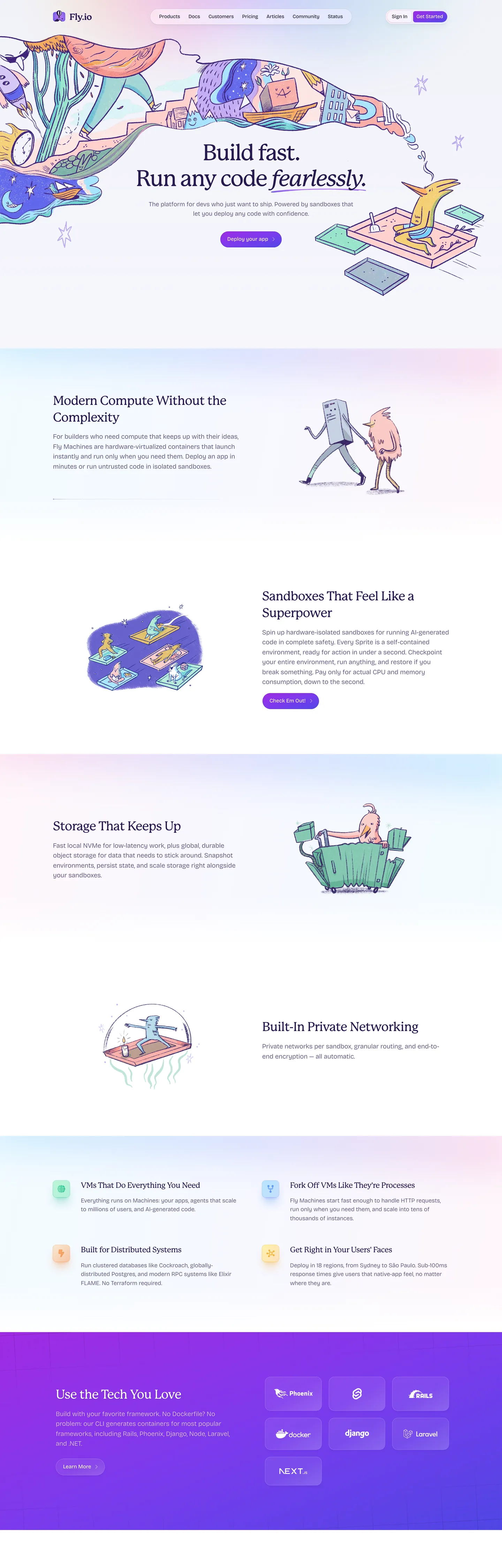
Fly.io's marketing page is what happens when a developer-infrastructure brand decides the right reference is not Linear and not Vercel but a children's storybook. The canvas is a near-white "#f1f2f9", every headline is set in Mackinac — a soft humanist serif loaded at exactly weight 500 with a punishing "-2.88px" tracking at the 64px hero size — and the section dividers are not hairlines but illustrated dragons, fish, and tools rendered in the same dusty-pastel palette as the brand's gradient. The text color is "#281950", a deep ink-violet that reads almost as navy until you put it next to actual navy and watch it tilt purple. The whole page reads as a hand-drawn periodical that happens to sell sandboxes and private networking.
This DESIGN.md packages the system into a single machine-readable file following the Google Labs spec. Inside: 24 colors tokens (the deep "#281950" violet-ink primary, the four-stop rainbow gradient set of cyan "#7dd3fc" / indigo "#a5b4fc" / pink "#f9a8d4" / violet "#a02be4", a single saturated CTA violet "#7c3aed", the structural lavender hairline "#e7e6f4" with 267 occurrences across the page, plus dark-band accents for the closing footer), 12 typography tokens across Mackinac serif and Fricolage Grotesque sans, 7 radii from 0px to a 9999px pill, 10 spacing values built around a 32px base, and 18 components covering the violet CTA, the ghost-button pair, the illustrated section card, the dark "Use the Tech You Love" band, and the global nav.
Feed the file to Claude, Cursor, or Copilot when you want a React surface that reads as Fly.io — soft canvas, illustrated rather than iconographic, serif headlines at weight 500, a single violet conversion target. The agent picks up the constraints: never escalate Mackinac past 500, never flat-fill the rainbow stops, never replace "#e7e6f4" with a darker hairline. Reference the tokens directly in Tailwind config or use the spec as an audit checklist against the page. Where most developer-infra brands signal seriousness with grayscale and weight 600 sans, Fly.io signals it by setting the entire page in serif and trusting illustration to do the rest.
What makes it distinct
5
- Storybook-on-infrastructurehand-illustrated dragons and fish frame every section heading on a developer compute platform
- Mackinac at weight 500 only64px hero with '-2.88px' tracking carries display, never escalating to 600 or italic for emphasis
- Single violet CTA'#7c3aed' is the only saturated filled surface, paired with a hairline-bordered ghost button on every section
- Lavender hairline as the structural voice'#e7e6f4' draws 267 of every divider, border, and card edge across the page
- Four-stop rainbow as glow not fillcyan, indigo, pink, violet appear only as radial gradients under illustrations, never as filled backgrounds
fly.io
Live at fly.io
A snapshot of the brand in production. Scroll the frame to see the whole page.
Colors
24 colors
Fly.io's system anchors on #281950 (primary) as its primary color. Type is set in Fricolage Grotesque across 12 tokens from 12px to 64px, weights 325–575. Shape language is mixed across 18 components, blending pills, soft rounds, and squarer corners.
Brand & Accent
Sparing, CTA-only voltage · 2
Surface
Page and card backgrounds · 3
Text
Headlines, body, captions · 6
Borders & Hairlines
Dividers, outlines, rules · 1
Other
Specialty colors · 12
Typography
12 type tokens
Set in Fricolage Grotesque across 12 tokens, from 12px to 64px, weights 325–575. Shown in its own stack: where the font isn't installed, the fallback the file names stands in.
- display-xl64px · weight 500 · lh 73.6px · tracking -2.88pxThe quick brown fox jumps over the lazy dog
- display-lg36px · weight 500 · lh 47.7px · tracking -0.9pxThe quick brown fox jumps over the lazy dog
- display-md22px · weight 500 · lh 29.15px · tracking -0.55pxThe quick brown fox jumps over the lazy dog
- body-lg19px · weight 325 · lh 28.5pxThe quick brown fox jumps over the lazy dog
- body-lg-strong19px · weight 450 · lh 28.5pxThe quick brown fox jumps over the lazy dog
- body-md18px · weight 325 · lh 27pxThe quick brown fox jumps over the lazy dog
- body-sm15.5px · weight 450 · lh 23.25pxThe quick brown fox jumps over the lazy dog
- nav-link14.5px · weight 450 · lh 21.75pxThe quick brown fox jumps over the lazy dog
- button-md14.5px · weight 500 · lh 21.75pxThe quick brown fox jumps over the lazy dog
- eyebrow12px · weight 575 · lh 18px · tracking 0.6pxThe quick brown fox jumps over the lazy dog
- label-uppercase12px · weight 500 · lh 18px · tracking 0.3pxThe quick brown fox jumps over the lazy dog
- caption12px · weight 325 · lh 18pxThe quick brown fox jumps over the lazy dog
Layout
Radii and spacing
7 corner radii and 10 spacing values. Shape language: mixed.
Radii
- none0px
- xs4px
- sm8px
- md10px
- lg16px
- xl20px
- full9999px
Spacing
- xxs4px
- xs8px
- sm10px
- md12px
- base16px
- lg20px
- xl24px
- 2xl32px
- 3xl64px
- band128px
Components
18 components
Each rendered from its tokens (color, type, radius, padding) on Fly.io's own canvas.
- Nav Barnav-barNav Bar
- Nav Linknav-linkNav Link
- Nav Cta Loginnav-cta-loginNav Cta Login
- Button Primarybutton-primaryButton Primary
- Button Primary Hoverbutton-primary-hoverButton Primary Hover
- Button Secondarybutton-secondaryButton Secondary
- Button Ghostbutton-ghostButton Ghost
- Hero Bandhero-bandHero Band
- Feature Bandfeature-bandFeature Band
- Dark Banddark-bandDark Band
- Illustrated Cardillustrated-cardIllustrated Card
- Feature Cellfeature-cellFeature Cell
- Eyebrow Tageyebrow-tagEyebrow Tag
- FooterfooterFooter
- Link Inlinelink-inlineLink Inline
- Badge Glowbadge-glowBadge Glow
- DividerdividerDivider
- Focus Ringfocus-ringFocus Ring
In use
The system, in use
Fly.io's tokens on the kind of product it builds.
Build something people actually use.
A short paragraph of marketing copy that previews how the brand's display tier and body tier read together. Two sentences is usually enough.
FAQ
Fly.io design system FAQ
Common questions about Fly.io's tokens, components, and how to use this DESIGN.md in your project.
Read next
Related reading
Specs, directories, and component libraries that pair with this design system.
- Browse all design systemsThe full directory of DESIGN.md files on shadcn.io, with live mockups for each.shadcn.io
- Fly.io — official siteRun user code, sandboxes, and any container close to users on the Fly.io platform.fly.io (opens in a new tab)
- The DESIGN.md specificationGoogle Labs' open spec for machine-readable design system files.github.com (opens in a new tab)
Use it
Use Fly.io in your project
One machine-readable file. Drop it into Claude, Cursor, or any AI tool that reads DESIGN.md.
Download the DESIGN.md
One machine-readable file: every color, type, radius, spacing, and component token of Fly.io.
Feed it to your AI tool
Drop it into Claude, Cursor, or GitHub Copilot. The agent writes React components and Tailwind classes that match Fly.io's visual language.
Reference the tokens directly
Or paste the values into your Tailwind config, CSS variables, or component library: every color, size and radius is a quoted, ready-to-copy value.
Read the full DESIGN.md: overview, rationale, do’s and don’ts
Overview
Fly.io's marketing surface is a developer-infrastructure brand styled as a pastel storybook — the page sells sandboxes, private networking, and persistent storage, but it does it with hand-drawn illustrations of dragons, fish, and laptops sitting on a near-white {colors.canvas} (#f1f2f9) canvas with Mackinac serif headlines in deep violet ink {colors.ink} (#281950). The whole composition is a deliberate inversion of the category default. Where Vercel commits to grayscale ink and Geist Sans at weight 600, where Linear commits to dark canvas and surface-ladder elevation, Fly.io commits to a soft pastel canvas, an editorial serif headline, and a single saturated {colors.cta} (#7c3aed) violet button as the only filled color on the page. The rest of the chrome is hairlines and illustrations.
Illustrated authority: most developer-infra brands signal seriousness by removing decoration — Fly.io signals it by adding hand-drawn dragons. The illustrations are not iconography; they are full painterly scenes rendered in the same dusty-pastel palette as the brand's gradient stops, and they occupy roughly half of every feature band. The typography carries the discipline (Mackinac at exactly weight 500, never 600, never italic, never oblique) and the illustrations carry the voice. The result is a page that reads as confident enough not to need a code-editor mockup or a hero animation — the serif headline plus a fish doing a backflip is the entire pitch.
Weight 500 as the ceiling: the brand's Mackinac display never escalates past weight 500. The 64px hero, the 36px H2, and the 22px card title are all loaded at the same axis position; what changes between them is size and tracking (-2.88px at hero, -0.9px at H2, -0.55px at card title — all aggressively negative). Where most serif-heavy brands reach for weight 600 or 700 at hero scale to gain shoutiness, Fly.io holds the line. The page reads as quieter for it, even at 64px.
Key Characteristics:
- A single saturated violet CTA —
{colors.cta}(#7c3aed) — fills the "Get Started" button at 32px height with an 8px radius. Every secondary action is a ghost button with{colors.hairline}(#e7e6f4) border on{colors.canvas-card}(#ffffff). - A four-stop rainbow gradient — cyan
{colors.gradient-cyan}(#7dd3fc), indigo{colors.gradient-indigo}(#a5b4fc), pink{colors.gradient-pink}(#f9a8d4), violet{colors.gradient-violet}(#a02be4) — appears only as low-opacity radial glow beneath the illustrations, never as a flat surface fill. - The lavender hairline
{colors.hairline}(#e7e6f4) is the structural backbone — 267 border occurrences in the extraction, the single highest-frequency color on the page, drawing every card edge, divider, input border, and footer column rule. - Mackinac serif at weight 500 only carries every headline tier; Fricolage Grotesque sans at non-standard weights 325 / 450 / 575 carries body, button, and uppercase eyebrow labels.
- The footer band flips polarity to
{colors.canvas-dark}(#191034) — the brand's only dark surface on the marketing page, used to close the long scroll with a "Use the Tech You Love" logo strip. - Spacing is built around a 32px base; section bands stretch to a 128px top/bottom rhythm; card interiors sit at 24px padding with 20px corner radius on the large
illustrated-card.
Colors
The palette splits into three layers: a violet-ink structural backbone, a single saturated CTA violet, and a four-stop rainbow used only as atmospheric glow. The structural layer carries the page; the rainbow is decoration that floats underneath illustration.
Brand & Accent
- Violet Ink (
#281950) — frequency 188. Used as text (188), bg (0), border (0). The deep violet-ink that handles every heading, body paragraph, nav-link, and label across the marketing surface — reads almost as navy until you put it beside actual navy and watch it tilt purple. - CTA Violet (
#7c3aed) — frequency 7. Used as text (0), bg (6), border (0), gradient (1). The single saturated filled surface on the page — fills only the "Get Started" primary button at 32px height. Never used as text, never used as a card background, never softened to a tint. - CTA Deep (
#6d28d9) — frequency 1. Used as text (1), bg (0), border (0). The pressed / hover variant of the CTA violet, slightly darkened. - Ink Deep (
#191034) — frequency 2. Used as text (0), bg (1), gradient (1). The closing dark-band canvas under the "Use the Tech You Love" footer strip — the brand's only marketing-surface dark fill.
Surface
- Canvas (
#f1f2f9) — frequency 2. Used as text (0), bg (1), gradient (1). The near-white page body — a barely-tinted blue-violet white that keeps the page from reading as sterile while staying out of the way of the illustrations. - Canvas Card (
#ffffff) — frequency 99. Used as text (42), bg (14), border (11), gradient (26). Pure white for elevated cards, the nav bar, and the illustrated feature panels. The 42 text-color occurrences are inside the dark closing band. - Hairline (
#e7e6f4) — frequency 268. Used as text (0), bg (0), border (267), shadow (1). The structural workhorse — the single highest-frequency color on the page, drawing every card edge, divider, input border, and column rule with a faint lavender tint that keeps the page reading as one system.
Text
- Violet Ink (
#281950) — every heading, body paragraph, and nav-link label. - Body Mute (
#a39ac1) — frequency 36. Used as text (36). The secondary body color — sub-headings, footer column body, illustrated-card captions. Reads as a softened violet rather than a neutral gray. - Mute Slate (
#676b89) — frequency 2. Used as text (2). Lowest-priority text — fine print and metadata captions.
Rainbow Gradient
The brand's signature decoration is a four-stop pastel rainbow used only as low-opacity radial glow under illustrations:
- Gradient Cyan (
#7dd3fc) — frequency 9. Used as gradient (9). The cool stop, anchoring sandbox and networking illustrations. - Gradient Indigo (
#a5b4fc) — frequency 8. Used as gradient (8). The next stop, transitioning cyan into pink. - Gradient Pink (
#f9a8d4) — frequency 8. Used as gradient (8). The warm stop, sitting beneath the storage and "private networking" scenes. - Gradient Violet (
#a02be4) — frequency 7. Used as gradient (7). The deep stop, closing the rainbow into the same hue family as{colors.cta}(#7c3aed). - Glow Mint (
#86efac), Glow Lemon (#fef08a), Glow Peach (#fed7aa) — frequency 1–2 each. Supporting glow stops layered into individual illustrations.
Treat the rainbow as one atmospheric object — never crop to a single hue, never flat-fill onto a button or band, never repeat as a swatch palette.
Typography
Font Family
Two faces carry the entire page:
- Mackinac — a proprietary humanist serif (Mackinac Pro by P22). Loaded at exactly weight 500 across every display tier. The hero renders at 64px / 73.6px line /
-2.88pxtracking; the H2 at 36px /-0.9px; the card title at 22px /-0.55px. Mackinac never appears at 400, 600, or italic on the marketing surface. - Fricolage Grotesque — an open-source humanist sans (Fraunces-adjacent, by Velvetyne). Loaded at non-standard variable weights 325, 450, 500, and 575 — the system uses precise variable-font axis positions rather than the rounded 300/400/500 stops most brands stick to. Body paragraphs sit at weight 325 (lighter than book weight); nav-links at 450; uppercase eyebrows at 575.
Hierarchy
| Token | Size | Weight | Line Height | Letter Spacing | Use |
|---|---|---|---|---|---|
{typography.display-xl} | 64px | 500 | 73.6px | -2.88px | Hero headline ("Build fast. Run any code fearlessly."). |
{typography.display-lg} | 36px | 500 | 47.7px | -0.9px | Section H2 ("Sandboxes That Feel Like a Superpower", "Storage That Keeps Up"). |
{typography.display-md} | 22px | 500 | 29.15px | -0.55px | Card titles, feature-cell headings. |
{typography.body-lg} | 19px | 325 | 28.5px | normal | Lead paragraphs under section H2s. |
{typography.body-lg-strong} | 19px | 450 | 28.5px | normal | Emphasised body inside illustrated cards. |
{typography.body-md} | 18px | 325 | 27px | normal | Hero subhead body paragraph. |
{typography.body-sm} | 15.5px | 450 | 23.25px | normal | Feature-cell body, mid-density supporting text. |
{typography.nav-link} | 14.5px | 450 | 21.75px | normal | Top-nav link row, footer link rows, button labels. |
{typography.button-md} | 14.5px | 500 | 21.75px | normal | Get Started button, secondary button labels. |
{typography.eyebrow} | 12px | 575 | 18px | 0.6px | Uppercase section eyebrow tags. |
{typography.label-uppercase} | 12px | 500 | 18px | 0.3px | Inline uppercase labels inside feature cells. |
{typography.caption} | 12px | 325 | 18px | normal | Fine print, illustration captions, footer secondary lines. |
Principles
- Aggressive negative tracking is the serif's voice. Mackinac's
-2.88pxat 64px is roughly -4.5% of the size — extreme even for serif display. Reverting to neutral tracking collapses the brand voice. - Weight 500 is the display ceiling. Mackinac never escalates to 600 or 700. The page reads quieter than its competitors because of this.
- Non-standard variable weights are deliberate. Fricolage body at 325 (not 300, not 400) and uppercase eyebrows at 575 (not 500, not 600) are precise variable-font axis positions — the brand cares about the half-step.
- Serif for the read, sans for the controls. Mackinac never appears on a button label or a nav-link; Fricolage never appears on a section headline.
Font Substitutes
Mackinac is proprietary. Close open-source substitutes: GT Super Display, Tiempos Headline, or PP Editorial New at weight 500 with font-feature-settings: "ss01". Fricolage Grotesque is itself open-source — pull it from Google Fonts or Velvetyne directly rather than substituting.
Layout
Spacing System
- Base unit: 4px, with a strong 32px base (the brand's
{spacing.2xl}) that dominates section padding. - Tokens:
{spacing.xxs}4px ·{spacing.xs}8px ·{spacing.sm}10px ·{spacing.md}12px ·{spacing.base}16px ·{spacing.lg}20px ·{spacing.xl}24px ·{spacing.2xl}32px ·{spacing.3xl}64px ·{spacing.band}128px. - Section padding: marketing bands stretch to
{spacing.band}(128px) top/bottom — generous vertical breathing room that lets each illustrated scene occupy its own page-height window. - Card interior padding: large
illustrated-cardsits at{spacing.xl}(24px); feature-cells at{spacing.xl} {spacing.base}(24px / 16px). - Inline gap: nav rows, button rows, and feature clusters use
{spacing.md}(12px) to{spacing.xl}(24px) between siblings.
Grid & Container
- Max width: roughly 1100–1200px content column. The hero pulls in further (~660px headline width per the extracted
widthPx: 660). - Column patterns:
- Hero: center-stacked, illustration framing both edges horizontally rather than top/bottom.
- Feature band: 2-up split (illustration left or right, body right or left), alternating direction per section to create rhythm.
- Feature-cell cluster: 2x2 or 3-up grid of small bordered cells underneath the "Built in Private Networking" section.
- Dark closing band: centered logo strip in a single horizontal row.
Whitespace Philosophy
Generous vertical space between bands ({spacing.band} 128px) lets each illustration occupy its own page-height window. Inside a section, the headline-to-body gap is tight (~12px), then a wider gap before the body-to-CTA cluster. Whitespace, not dividers, separates the bands — the lavender hairline {colors.hairline} (#e7e6f4) is reserved for inside-card structure and 1px horizontal rules.
Responsive Strategy
| Name | Width | Key Changes |
|---|---|---|
| Mobile | < 600px | Hero stacks, illustrations sit above headline; 2-up feature bands collapse to 1-up with illustration above text. |
| Tablet | 600–1023px | 2-up feature bands hold; feature-cell grid drops from 3-up to 2-up. |
| Desktop | ≥ 1024px | Full 2-up alternating bands; feature-cell grid at 3-up; nav row stays horizontal with all links visible. |
Touch targets: the 32px-tall button-primary falls below the 44px WCAG floor — on the live page, nav-bar buttons inflate touch area via padding rather than visual height.
Elevation & Depth
Fly.io's elevation system is built on hairlines and illustrations, not shadows. Drop-shadows appear sparingly — the extraction captured 16 shadow occurrences against 267 hairline borders. The hierarchy:
| Level | Treatment | Use |
|---|---|---|
| Level 0 — Flat | No border, no shadow. | Hero band, full-width section backgrounds. |
| Level 1 — Hairline | 1px unbroken {colors.hairline} (#e7e6f4). | Default card chrome — feature-cells, illustrated-cards, nav bar, footer dividers. |
| Level 2 — Soft Shadow | Subtle drop using {colors.shadow-ink} (#202237) at low opacity. | Lifted cards inside dense clusters — rare on the marketing surface. |
| Level 3 — Violet Glow | Atmospheric {colors.shadow-violet} (#5b21b6) text-shadow at 25% opacity (the --tw-text-shadow-color extracted from :root). | Reserved for the dark band's display text glow. |
| Level 4 — Rainbow Glow | Radial gradients in {colors.gradient-cyan} / {colors.gradient-indigo} / {colors.gradient-pink} / {colors.gradient-violet} at low opacity. | The atmospheric chrome under every illustrated scene — replaces shadow entirely as the brand's "depth" cue. |
Decorative Depth
- Illustration-as-atmosphere: the hand-drawn scenes carry the depth that shadow would carry in a Linear-style system. Each illustration sits on its own low-opacity radial glow in the rainbow palette.
- Hairline as edge: the page reads as composed of stacked rectangles, all separated by 1px
{colors.hairline}(#e7e6f4) lines rather than shadow drops. - Polarity flip as section punctuation: the closing
{colors.canvas-dark}(#191034) band is the only depth-change cue — the rest of the page stays on{colors.canvas}(#f1f2f9).
Shapes
Border Radius Scale
| Token | Value | Use |
|---|---|---|
{rounded.none} | 0px | Full-bleed bands, footer surface. |
{rounded.xs} | 4px | Tightest inline pill — eyebrow tag corners on some surfaces. |
{rounded.sm} | 8px | Primary button, secondary button, nav CTA — the dominant button radius. |
{rounded.md} | 10px | Feature-cell card chrome, smaller card variants. |
{rounded.lg} | 16px | Large card chrome, illustrated-card containers. |
{rounded.xl} | 20px | Largest card chrome — when a card hosts a hero illustration cap. |
{rounded.full} | 9999px | Eyebrow tags, badge-glow pills, status dots. |
Illustration Geometry
- Illustrated scenes: square or 4:5 painterly compositions, never cropped to a tight frame, rendered inline as inline SVG or raster at consistent ~480px width.
- Hero composition: the illustration straddles both edges of the hero, with the central column reserved for the headline + CTA stack.
- Feature-cell icons: small inline pictograms (lock, mesh, gear) rendered in the rainbow palette at ~24px, sitting above the cell title.
Components
Buttons
button-primary — the canonical violet pill, the only saturated filled surface on the page.
- Background
{colors.cta}(#7c3aed), text{colors.primary-on}(#ffffff), label set in{typography.button-md}(14.5px / 500), padding0px 12px 0px 10px, shape{rounded.sm}8px, height 32px. Reserved for the hero "Get Started" target.
button-primary-hover — the pressed state.
- Background
{colors.cta-deep}(#6d28d9), text and shape inherit frombutton-primary.
button-secondary — the ghost button paired with primary inside feature bands.
- Background
{colors.canvas-card}(#ffffff), text{colors.ink}(#281950), 1px{colors.hairline}(#e7e6f4) border, same typography / shape / height asbutton-primary.
button-ghost — the borderless variant inside footer or low-emphasis surfaces.
- Background
{colors.canvas}(#f1f2f9), text{colors.ink}(#281950), no border, same typography / shape / height.
nav-cta-login — the small "Log In" pill in the nav row.
- Background
{colors.canvas-card}(#ffffff), text{colors.ink}(#281950), 1px{colors.hairline}(#e7e6f4) border, set in{typography.button-md}, shape{rounded.sm}8px, height 32px.
Cards & Containers
illustrated-card — the canonical feature panel with embedded illustration.
- Background
{colors.canvas-card}(#ffffff), text{colors.ink}(#281950), 1px{colors.hairline}(#e7e6f4) border, body in{typography.body-md}, padding{spacing.xl}24px, shape{rounded.lg}16px. Hosts a rainbow-glow illustration on one half and copy on the other.
feature-cell — the small feature-grid card under the "Built in Private Networking" cluster.
- Background
{colors.canvas-card}(#ffffff), text{colors.ink}(#281950), 1px{colors.hairline}(#e7e6f4) border, body in{typography.body-sm}, padding{spacing.xl} {spacing.base}(24px / 16px), shape{rounded.md}10px.
Navigation
nav-bar — the sticky top nav.
- Background
{colors.canvas}(#f1f2f9), text{colors.ink}(#281950), 1px bottom border{colors.hairline}(#e7e6f4), padding{spacing.md} {spacing.xl}. Layout: logo left, link row center, "Log In / Get Started" cluster right.
nav-link — the link row inside nav-bar.
- Text
{colors.ink}(#281950), set in{typography.nav-link}(14.5px / 450), padding0 {spacing.md}, height 36px.
footer — the bottom multi-column nav above the dark band.
- Background
{colors.canvas}(#f1f2f9), text{colors.body}(#a39ac1), top border{colors.hairline}(#e7e6f4), padding{spacing.3xl} {spacing.2xl}. Column headings in{typography.eyebrow}(uppercase, weight 575); link rows in{typography.nav-link}.
Signature Components
hero-band — the opening band with the storybook illustration backdrop.
- Background
{colors.canvas}(#f1f2f9), text{colors.ink}(#281950), padding{spacing.band} {spacing.2xl}(128px / 32px). Inside: a centered 64px Mackinac headline ("Build fast. Run any code fearlessly."), a 19px Fricolage subhead, the violetbutton-primary, and a hand-drawn illustration that frames the left and right edges.
feature-band — the alternating-direction section band.
- Background
{colors.canvas}(#f1f2f9), text{colors.ink}(#281950), padding{spacing.band} {spacing.2xl}. Section headline in{typography.display-lg}(36px Mackinac); supporting body in{typography.body-lg}(19px Fricolage / weight 325). Alternates illustration-left / illustration-right between sections.
dark-band — the closing "Use the Tech You Love" footer band.
- Background
{colors.canvas-dark}(#191034), text{colors.primary-on}(#ffffff), padding{spacing.band} {spacing.2xl}. Hosts a logo strip of supported runtimes and a deep-violet text-shadow glow on the heading.
eyebrow-tag — the small uppercase metadata pill above section headlines.
- Background
{colors.canvas}(#f1f2f9), text{colors.ink}(#281950), label in{typography.eyebrow}(12px / 575 /+0.6pxtracking, uppercase), shape{rounded.full}, padding{spacing.xxs} {spacing.md}.
badge-glow — the inline metadata pill ("New", "Live", "Coming Soon").
- Background
{colors.canvas-card}(#ffffff), text{colors.ink}(#281950), 1px{colors.hairline}border, body in{typography.caption}, padding{spacing.xxs} {spacing.md}, shape{rounded.full}.
link-inline — body-copy inline links.
- Text
{colors.cta}(#7c3aed), body in{typography.body-md}, underlined.
divider — the horizontal hairline rule between sections inside cards.
- Background
{colors.hairline}(#e7e6f4), height 1px.
focus-ring — the accessibility focus indicator.
- Border
{colors.ring}(#3b82f6) at 50% opacity (the brand's--tw-ring-colorextracted from:root),{rounded.sm}corners.
Do's and Don'ts
Do
- Set every headline in Mackinac at weight 500 —
display-xl,display-lg,display-mdall share the same weight axis. The size and tracking are what change. - Use
{colors.hairline}(#e7e6f4) for every 1px border. Substituting a neutral gray collapses the brand's lavender-tinted system into a generic shadcn theme. - Render the rainbow gradient stops as low-opacity radial glow only —
{colors.gradient-cyan}/{colors.gradient-indigo}/{colors.gradient-pink}/{colors.gradient-violet}belong underneath illustrations, never on a CTA. - Pair the violet
button-primary({colors.cta}#7c3aed) with a hairline-borderedbutton-secondary(white surface, hairline border) — never with a second saturated color. - Hold Fricolage body text at weight 325. The half-step lightness is a deliberate axis choice that lets the serif headlines hold their authority.
Don't
- Don't escalate Mackinac past weight 500. Loading Mackinac at 600 or italic breaks the brand's voice — the page is designed around the assumption that every serif character is the same weight.
- Don't fill
button-secondarywith{colors.cta}(#7c3aed). The CTA violet is reserved for a single primary action per viewport. The secondary action is always a hairline-bordered white ghost button. - Don't replace
{colors.hairline}(#e7e6f4) with a neutral gray hairline (a token like Tailwind'sneutral-200reads as foreign). The lavender tilt is what binds the hairline into the broader violet system; a neutral gray collapses the brand voice into a generic shadcn theme. - Don't crop the rainbow gradient to a single hue. The four-stop cyan-indigo-pink-violet is one object — repeating only
{colors.gradient-pink}(#f9a8d4) as a swatch loses the brand's atmospheric voice. - Don't render Mackinac at 14px or 12px. The serif is reserved for
display-xl/display-lg/display-md; anything below 22px belongs to Fricolage Grotesque. - Don't run Mackinac headlines at neutral tracking. The
-2.88pxat 64px and-0.9pxat 36px are part of the voice; default tracking flattens the serif's confidence.
Known Gaps
- Hover and focus states: the extraction captured
--tw-ring-color({colors.ring}#3b82f6at 50% opacity) as the focus ring, but per-component hover-state shifts (button background tint, nav-link active state) are not documented as tokens. - Dark mode and authenticated dashboard: this DESIGN.md covers only the public marketing surface. The Fly.io app dashboard (deployment logs, regions map, Machines list) sits behind authentication and uses a different denser surface vocabulary not captured here.
- Illustration system: the hand-drawn illustrations are integral to the brand voice but they are bitmap / SVG assets rather than tokenized geometry. A consumer reproducing the system would need to commission illustrations in the same dusty-pastel palette rather than referencing tokens.
- Motion: subtle parallax and scroll-linked fades exist on the live page but timing curves and durations are not extracted.
- Full rainbow stop family: the extraction captured the four primary stops plus three secondary glow tones (mint, lemon, peach). The brand likely has additional named stops inside its design-tokens repo that are not surfaced on the marketing page.
Web Infrastructure & Hosting
More systems like this
More DESIGN.md files in Web Infrastructure & Hosting.
Pricing
Build it with Pro
The DESIGN.md files are free. Pro adds 6,000+ blocks, premium templates and the MCP server, so your AI editor builds in your system for you.
4.9/5 out of 5 · 150+ reviewsfrom 150+ founders and developers.
Billing
Billed once a year in USD. Cancel anytime.
- How many people can use the license.
- Client work, SaaS products and anything you charge for.
- Production-ready React sections: hero, pricing, features, dashboards and more.
- Complete multi-page sites you can ship as they are.
- React icons from every major library, installable with one command.
- Presets that restyle every block, in light and dark.
- Lets your AI editor search, preview and install blocks for you.
- Priority requests are answered first.
Individual
For personal projects & open source
$32instead of $49/mo
$389 billed yearly
- Seats: 1 seat
- Commercial use: Personal & open source only
- Pro blocks: 6,000+ blocks
- Templates: All 14 templates
- React icons: 294k+ icons
- Themes: All 59 themes
- MCP server: Basic usage
- Support: Standard
Team
Most popularFor freelancers, agencies & startups
$66instead of $99/mo
$789 billed yearly · ≈ $13/dev/mo
- Seats: Up to 5 seats
- Commercial use: Included
- Pro blocks: 6,000+ blocks
- Templates: All 14 templates
- React icons: 294k+ icons
- Themes: All 59 themes
- MCP server: High usage
- Support: Priority
Organization
For companies with larger teams
$132instead of $199/mo
$1,589 billed yearly
- Seats: Unlimited seats
- Commercial use: Included
- Pro blocks: 6,000+ blocks
- Templates: All 14 templates
- React icons: 294k+ icons
- Themes: All 59 themes
- MCP server: Unlimited usage
- Support: Priority
Billed once a year in USD. Cancel anytime.
Individual
For personal projects & open source
$32instead of $49/mo
$389 billed yearly
- How many people can use the license.Seats: 1 seat
- Client work, SaaS products and anything you charge for.Commercial use: Personal & open source only
- Production-ready React sections: hero, pricing, features, dashboards and more.Pro blocks: 6,000+ blocks
- Complete multi-page sites you can ship as they are.Templates: All 14 templates
- React icons from every major library, installable with one command.React icons: 294k+ icons
- Presets that restyle every block, in light and dark.Themes: All 59 themes
- Lets your AI editor search, preview and install blocks for you.MCP server: Basic usage
- Priority requests are answered first.Support: Standard
Team
Most popularFor freelancers, agencies & startups
$66instead of $99/mo
$789 billed yearly · ≈ $13/dev/mo
Everything in Individual, plus
- How many people can use the license.Seats: Up to 5 seats
- Client work, SaaS products and anything you charge for.Commercial use: Included
- Lets your AI editor search, preview and install blocks for you.MCP server: High usage
- Priority requests are answered first.Support: Priority
Organization
For companies with larger teams
$132instead of $199/mo
$1,589 billed yearly
Everything in Team, plus
- How many people can use the license.Seats: Unlimited seats
- Lets your AI editor search, preview and install blocks for you.MCP server: Unlimited usage
- Secure checkout via Stripe
- Code lives in your repo
- Keep what you've shipped if you cancel
- License terms
Your system, built for you
Every block, template and icon, installed by your AI agent in your design system. The DESIGN.md files stay free.