Fastly Design System
Fastly's marketing system as a DESIGN.md file. Ink-on-warm-white hero, lime-yellow status accents, deep eggplant emphasis blocks, ES Rebond Grotesque display, Inter Variable body. 15 components for React and AI tools.
Add shadcn.io to your AI agent. · Pro It installs blocks, icons and templates in your design system from a prompt, with Pro.
Set up MCP- Primary
- #ff282d
- Typeface
- ES Rebond Grotesque
- Shape
- Mixed
- Base radius
- 8px
- Colors
- 18
- Type tokens
- 14
- Components
- 15
- Spacing values
- 8
About
About Fastly DESIGN.md
Curated by Dov Azencot · Updated May 19, 2026 · Source fastly.com (opens in a new tab)
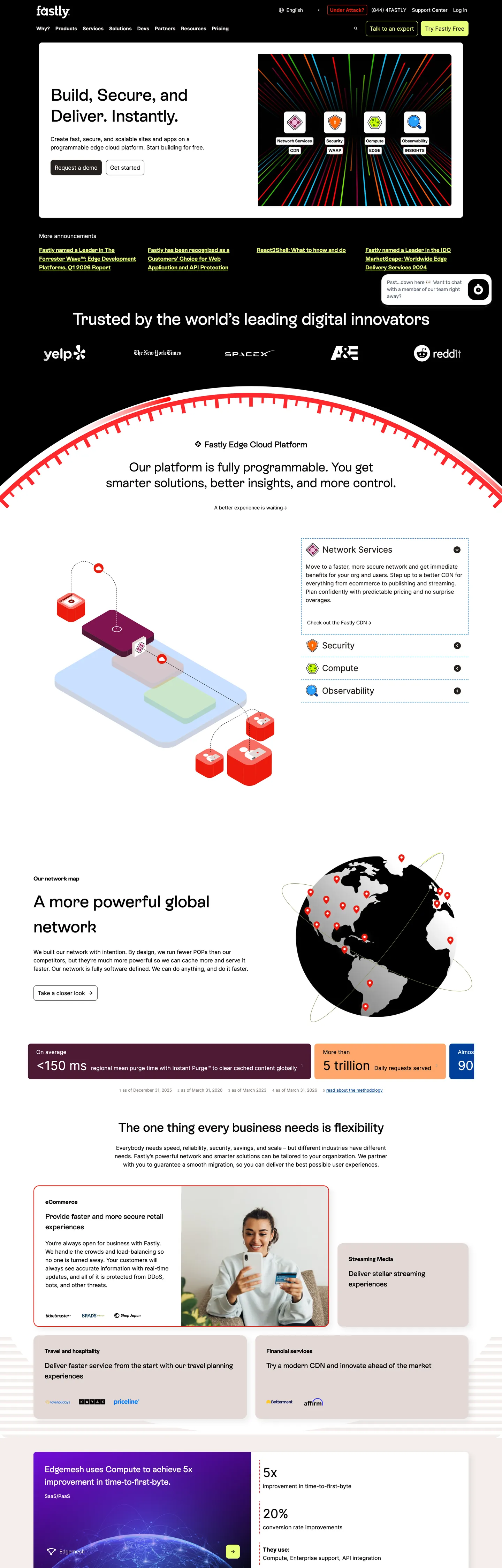
Fastly's marketing site does something the CDN category does not expect. The brand is famous for a saturated red voltage — the same red that runs on the wordmark, the dashboard, the developer docs — and the page should, by every dev-infra convention, paint that red somewhere above the fold. It does not. The hero canvas is a warm near-white floor with a 48px ES Rebond Grotesque headline ("Build, Secure, and Deliver. Instantly.") in pure ink-black, a single dark-fill pill CTA labeled "Talk to an Expert", and a giant red protractor-shaped illustration that runs as a decorative arc across the band above. The red is there — it just renders as ornament rather than as voltage. Where Cloudflare gives Kumo Brand orange the full hero canvas and Vercel commits to matte black, Fastly holds the brand red back and lets a lime-yellow chip carry the actual chromatic accent.
The DESIGN.md file packages the system into a machine-readable spec. Inside: 18 colors tokens drawn from a 300-plus CSS root that exposes three legacy palettes side-by-side (`--legacy-*`, `--color-v3-*`, `--color-*`). The brand voltage is the red hex #ff282d (wired as `--red`, `--color-red-60`, `--legacy-red`, `--color-industry-publishing`) but it appears 0 times painted in the captured render — the CSS variable is declared as the brand identifier without being used as a surface fill. The chromatic work falls instead to a saturated lime-yellow #e7ff7a (25 occurrences) and a brighter neon-lime #d0ff00 (6 background fills), both used for security-product status accents. A deep purple-eggplant #4d1935 carries the single in-body emphasis-block fill — the security-product spotlight band on the lower half of the page.
Sixteen typography tokens span two typefaces: ES Rebond Grotesque (the display sans, weight 300-700, used at 16-48px) and Inter Variable (the body sans, weight 400-700, used at 12-36px). Fifteen components cover the ink-pill primary CTA, the hairline-cream feature cards, the lime-yellow status chip, the eggplant emphasis block, and the two distinct sub-grid layouts ("Customer logo wall" and "Product feature grid"). Feed this file to Claude or Cursor and it will reproduce Fastly's specific moves: the held-back red voltage, the lime-yellow as actual accent, the warm-cream hairlines, the 48px display in ES Rebond Grotesque weight 500, and the 8px dominant radius that commits to one round step rather than a tiered ladder. One thing worth borrowing only if your brand has a strong saturated color it does not want to use as chrome: the willingness to declare the voltage in the CSS while letting a quieter accent carry the actual page.
What makes it distinct
5
- Held-back red voltagethe iconic red brand color sits in the CSS but is 0 times painted; lime-yellow carries the actual chromatic accent
- Instrument-panel displayES Rebond Grotesque at 48px / weight 500 reads like a Swiss editorial dek rather than a SaaS hero
- Warm-cream hairlinesevery card border is #c4b9b3, every soft surface is #f4eeec; the system runs warm-grey rather than cool-grey throughout
- Deep eggplant emphasispurple-eggplant #4d1935 is the single saturated emphasis-block fill, used for the security-product spotlight
- 8px dominant radius27 of 36 captured radii are 8px; the system commits to a single round step rather than a tiered ladder
fastly.com
Live at fastly.com
A snapshot of the brand in production. Scroll the frame to see the whole page.
Colors
18 colors
Fastly's system anchors on #ff282d (brand-red) as its primary color. Type is set in ES Rebond Grotesque across 14 tokens from 12px to 48px, weights 400–700. Shape language is mixed across 15 components, blending pills, soft rounds, and squarer corners.
Brand & Accent
Sparing, CTA-only voltage · 4
Surface
Page and card backgrounds · 2
Text
Headlines, body, captions · 5
Borders & Hairlines
Dividers, outlines, rules · 1
Other
Specialty colors · 6
Typography
14 type tokens
Set in ES Rebond Grotesque across 14 tokens, from 12px to 48px, weights 400–700. Shown in its own stack: where the font isn't installed, the fallback the file names stands in.
- display-xl48px · weight 500 · lh 60pxThe quick brown fox jumps over the lazy dog
- display-lg48px · weight 500 · lh 72pxThe quick brown fox jumps over the lazy dog
- display-md40px · weight 500 · lh 50pxThe quick brown fox jumps over the lazy dog
- heading-lg36px · weight 500 · lh 45pxThe quick brown fox jumps over the lazy dog
- heading-md24px · weight 500 · lh 36pxThe quick brown fox jumps over the lazy dog
- heading-sm20px · weight 500 · lh 30pxThe quick brown fox jumps over the lazy dog
- card-title16px · weight 700 · lh 28pxThe quick brown fox jumps over the lazy dog
- body-md16px · weight 400 · lh 24pxThe quick brown fox jumps over the lazy dog
- body-sm14px · weight 400 · lh 21pxThe quick brown fox jumps over the lazy dog
- body-xs12px · weight 400 · lh 18pxThe quick brown fox jumps over the lazy dog
- button-md14px · weight 700 · lh 21pxThe quick brown fox jumps over the lazy dog
- nav-link16px · weight 400 · lh 19.52pxThe quick brown fox jumps over the lazy dog
- stat-display36px · weight 400 · lh 54pxThe quick brown fox jumps over the lazy dog
- number-callout24px · weight 500 · lh 29.28pxThe quick brown fox jumps over the lazy dog
Layout
Radii and spacing
6 corner radii and 8 spacing values. Shape language: mixed.
Radii
- none0px
- sm4px
- md8px
- lg12px
- xl16px
- pill9999px
Spacing
- xs4px
- sm8px
- md12px
- base16px
- lg24px
- xl32px
- 2xl40px
- 3xl64px
Components
15 components
Each rendered from its tokens (color, type, radius, padding) on Fastly's own canvas.
- Button Primarybutton-primaryButton Primary
- Button Secondarybutton-secondaryButton Secondary
- Button Pillbutton-pillButton Pill
- Top Navtop-navTop Nav
- Nav Linknav-linkNav Link
- Hero Sectionhero-sectionHero Section
- Hero Headinghero-headingHero Heading
- Section Headingsection-headingSection Heading
- Body Paragraphbody-paragraphBody Paragraph
- Card Creamcard-creamCard Cream
- Card Emphasis Purplecard-emphasis-purpleCard Emphasis Purple
- Lime Chiplime-chipLime Chip
- Feature Cellfeature-cellFeature Cell
- Stat Numberstat-numberStat Number
- FooterfooterFooter
In use
The system, in use
Fastly's tokens on the kind of product it builds.
Build something people actually use.
A short paragraph of marketing copy that previews how the brand's display tier and body tier read together. Two sentences is usually enough.
FAQ
Fastly design system FAQ
Common questions about Fastly's tokens, components, and how to use this DESIGN.md in your project.
Read next
Related reading
Specs, directories, and component libraries that pair with this design system.
- Browse all design systemsThe full directory of DESIGN.md files on shadcn.io, with live mockups for each.shadcn.io
- Fastly — official siteFastly's public marketing site — the source of truth for the live tokens captured in this file.fastly.com (opens in a new tab)
- The DESIGN.md specificationGoogle Labs' open spec for machine-readable design system files — the format this page is built on.github.com (opens in a new tab)
Use it
Use Fastly in your project
One machine-readable file. Drop it into Claude, Cursor, or any AI tool that reads DESIGN.md.
Download the DESIGN.md
One machine-readable file: every color, type, radius, spacing, and component token of Fastly.
Feed it to your AI tool
Drop it into Claude, Cursor, or GitHub Copilot. The agent writes React components and Tailwind classes that match Fastly's visual language.
Reference the tokens directly
Or paste the values into your Tailwind config, CSS variables, or component library: every color, size and radius is a quoted, ready-to-copy value.
Read the full DESIGN.md: overview, rationale, do’s and don’ts
Overview
Fastly's marketing site inverts the CDN-category convention. Held-back voltage. The brand red {colors.brand-red} (#ff282d) sits in the CSS as the voltage identifier but appears 0 times painted in the captured render — declared without being spent. Where Cloudflare gives Kumo Brand orange the full above-fold canvas and Akamai leans on a corporate cobalt, Fastly runs the hero on warm near-white with a 48px ES Rebond Grotesque headline in pure ink-black, a single ink-fill pill CTA, and a decorative red protractor illustration that arcs across the band above. The red is the page's only red moment, and it sits as ornament rather than as chrome. The actual chromatic accent role falls to a saturated lime-yellow {colors.accent-lime} (#e7ff7a) used 25 times across status chips and security-product highlights, plus a brighter neon-lime {colors.accent-lime-bright} (#d0ff00) used 6 times as background fill for security-product feature highlights.
The system runs warm-grey hairlines throughout. Every soft surface tint is {colors.cream} (#f4eeec), every card border is {colors.hairline} (#c4b9b3), every body-floor disabled state is {colors.surface-grey} (#e2d8d5). There is no cool blue-grey in the system; the entire structural palette walks the warm side of neutral, anchored on a deeply-warm near-black {colors.ink-soft} (#25201e) that reads as slightly-brown rather than as charcoal. The cumulative effect is closer to a print-magazine masthead than a SaaS landing page — a treatment that pairs naturally with ES Rebond Grotesque's instrument-panel display feel.
Instrument-panel display. ES Rebond Grotesque at 48px / weight 500 carries the hero h1 and the major section displays; 40px / 500 carries sub-section h2s; 20px / 500 carries h3 card titles. The weight-500 step (rather than 700-800) reads as Swiss editorial restraint — confidence by tracking-and-color rather than by weight. Below the display tier the second voice takes over: Inter Variable runs every body paragraph at 14-16px / 400 and every button label at 14px / 700. The two voices divide labor cleanly — ES Rebond Grotesque declares, Inter Variable explains. Where Render runs Inter for both display and body and Vercel runs Geist for everything, Fastly is the only major edge-cloud brand in the directory that pairs a licensed grotesk with Inter rather than committing to one family.
Key Characteristics:
- Held-back brand voltage —
{colors.brand-red}(#ff282d) sits in the CSS as the declared brand identifier but appears 0 times as a painted surface in the captured render. - Lime-yellow
{colors.accent-lime}(#e7ff7a) carries the actual chromatic accent — 25 occurrences across status chips, security-product highlights, and feature tags. - Warm-cream hairlines — every soft surface tint is
{colors.cream}(#f4eeec), every card border is{colors.hairline}(#c4b9b3); no cool blue-grey in the system. - Deep purple-eggplant
{colors.emphasis-purple}(#4d1935) — the single in-body emphasis-block fill, used 10 times as background for the security-product spotlight band. - ES Rebond Grotesque at weight 500 (not 700) for every display moment from 20px to 48px — Swiss editorial restraint over SaaS shout.
- 8px dominant radius — 27 of 36 captured radii are 8px; the system commits to a single round step rather than a tiered ladder.
- Two-grid below-fold layout — a single-strip customer-logo wall in monochrome black, then a 4-up product-feature grid in hairline-cream cards.
- Pure ink-on-pure-white type system —
{colors.ink}(#000000) on{colors.canvas}(#ffffff) for every display and body paragraph above the eggplant emphasis band; no off-black, no off-white.
Colors
Brand & Accent
- Brand Red (
{colors.brand-red}— #ff282d): frequency 0 painted in the captured render — declared in CSS as--red,--color-red-60,--legacy-red,--color-industry-publishing,--form-field-invalidbut held back from the marketing surface. The wordmark color and the form-field invalid state; not a chrome fill. - Accent Lime (
{colors.accent-lime}— #e7ff7a): frequency 25 — 10 as text, 10 as border, 3 as background, 2 as shadow. The system's actual chromatic accent — used on status chips, security-product highlights, and feature tags. Wired as--color-v3-green-20. - Accent Lime Bright (
{colors.accent-lime-bright}— #d0ff00): frequency 6, all background fills — the brighter neon-lime variant used as background for high-emphasis status chips. Wired as--color-v3-green-30. - Accent Orange (
{colors.accent-orange}— #ffa66b): frequency 5 as background — a warm soft orange used as the secondary accent fill on product-feature illustrations. Wired as--color-v3-orange-30.
Emphasis
- Emphasis Purple (
{colors.emphasis-purple}— #4d1935): frequency 10 as background — the single saturated in-body emphasis-block fill, used for the security-product spotlight band on the lower half of the page. Wired as--purple-darker,--color-purple-90,--color-industry-video,--color-industry-hospitality,--legacy-purple,--color-highlight-bg. A deeply-warm eggplant rather than a cool indigo. - Emphasis Green (
{colors.emphasis-green}— #355000): frequency 8, all gradient stops — used as the dark end of green-product gradient bands. Wired as--color-v3-green-80. - Emphasis Blue (
{colors.emphasis-blue}— #004099): frequency 7 — 5 as background, 1 as text, 1 as border. Used as the in-feature emphasis fill for compute-product callouts. Wired as--color-v3-blue-80.
Text
- Ink (
{colors.ink}— #000000): frequency 467 — 229 as text, 10 as background, 228 as border. The dominant text color across every display and body paragraph above the eggplant band. Pure black, not off-black; wired as--black,--color-black,--legacy-grey-100,--grey-100. The system's most-frequent token. - Ink Soft (
{colors.ink-soft}— #25201e): frequency 136 — 68 as text, 1 as background, 67 as border. A deeply-warm near-black with a brown undertone — used on secondary body copy and as a soft border tone. Wired as--color-v3-grey-90. - Ink Muted (
{colors.ink-muted}— #444639): frequency 15 — 1 as text, 2 as background, 1 as border, 11 as shadow ink. The shadow tone, used 11 times to draw soft elevation under feature cards. Wired as--color-v3-grey-80. - Ink Weak (
{colors.ink-weak}— #8e8681): frequency 20 — 10 as text, 10 as border. The secondary body-paragraph tone and the footer link color. Wired as--color-v3-grey-50,--grey-disclaimer.
Surface
- Canvas (
{colors.canvas}— #ffffff): frequency 84 — 38 as text, 7 as background, 39 as border. Pure white — the hero canvas, the body floor, and the inside of hairline-cream cards. No warm cream variant for the primary canvas. - Cream (
{colors.cream}— #f4eeec): frequency 72 — 36 as text, 1 as background, 35 as border. The soft warm-cream surface tint used as the feature-card and grid-cell fill. Wired as--legacy-grey-30,--legacy-pink-light,--color-yellow-10,--color-red-10,--color-v3-blue-10,--color-v3-red-10,--color-purple-10— the same hex serves as the soft tint for every legacy color family. - Surface Grey (
{colors.surface-grey}— #e2d8d5): frequency 8 — 2 as text, 4 as background, 2 as border. The disabled-button fill and the secondary cream-grey surface. Wired as--grey-30,--button-color-disabled,--grey-light. - Grey Mid (
{colors.grey-mid}— #a8a09b): frequency 6 — 3 as text, 3 as border. A mid-grey used as the secondary text and divider tone. Wired as--color-grey-50,--color-v3-grey-40,--grey,--grey-50.
Hairline
- Hairline (
{colors.hairline}— #c4b9b3): frequency 74 — 37 as text, 37 as border. The dominant border tone, used as the resting card outline and feature-cell divider. Wired as--color-v3-grey-30,--color-grey-40. Notice the hairline is warm rather than cool — the entire structural palette walks the warm side of neutral.
Semantic
- Link (
{colors.link}— #00759c): a deep teal-blue link color, used on inline text links and the focus-ring outline. Wired as--legacy-blue-dark,--color-focus,--color-link,--blue-dark,--color-blue-70. Distinct from the brand red — the link role is its own tier. - Status Red (
{colors.status-red}— #e9190c): frequency 4 — 1 as text, 2 as border, 1 as shadow. A slightly-orange-shifted red used as the page's single visible red moment outside the decorative protractor illustration — appears in the error-status chip in the security-product spotlight. Wired as--color-v3-red-50.
Typography
Font Families
The system runs two typefaces. ES Rebond Grotesque is the display sans by Berlin foundry Schick Toikka, used at weight 500 for every spoken display tier from 20px to 48px (and at weight 300 for one decorative h3 callout). It is a Swiss-grotesque-inspired sans with a slightly-condensed proportion and a distinctive single-story 'a' that gives the display its instrument-panel character. Inter Variable is the body sans, used at weight 400 for paragraph copy at 12-16px, weight 700 for button labels and small-tag emphasis at 14px, and weight 500 for inline number callouts at 24px.
The pairing — licensed grotesk display + open-source variable body — is closer to a print-magazine masthead than to a typical SaaS landing page. Where Cloudflare pairs FT Kunst Grotesk with Apercu Mono Pro (display + monospace), Fastly pairs ES Rebond Grotesque with Inter Variable (display sans + body sans), and the absence of a monospace voice in the marketing chrome is itself the distinguishing typographic move — every code-leaning peer in the CDN category runs a mono tier.
Hierarchy
| Token | Size | Weight | Line Height | Family | Use |
|---|---|---|---|---|---|
{typography.display-xl} | 48px | 500 | 60px | ES Rebond Grotesque | Hero h1 ("Build, Secure, and Deliver. Instantly.") |
{typography.display-lg} | 48px | 500 | 72px | ES Rebond Grotesque | Section h3 with looser line-height |
{typography.display-md} | 40px | 500 | 50px | ES Rebond Grotesque | Section h2 below the fold |
{typography.heading-lg} | 36px | 500 | 45px | ES Rebond Grotesque | Sub-section h3 |
{typography.heading-md} | 24px | 500 | 36px | ES Rebond Grotesque | In-band feature h3 |
{typography.heading-sm} | 20px | 500 | 30px | ES Rebond Grotesque | Card h3 |
{typography.card-title} | 16px | 700 | 28px | ES Rebond Grotesque | Card title at small step |
{typography.body-md} | 16px | 400 | 24px | Inter Variable | Default running text |
{typography.body-sm} | 14px | 400 | 21px | Inter Variable | Caption rows, nav-link labels |
{typography.body-xs} | 12px | 400 | 18px | Inter Variable | Footnote text |
{typography.button-md} | 14px | 700 | 21px | Inter Variable | Primary and secondary button labels |
{typography.nav-link} | 16px | 400 | 19.52px | Inter Variable | Top-nav link labels |
{typography.stat-display} | 36px | 400 | 54px | Inter Variable | Customer-result stat callouts |
{typography.number-callout} | 24px | 500 | 29.28px | Inter Variable | Inline number callouts |
Principles
Display weight sits at 500 — the same step Cloudflare runs, the same Stripe restraint move. The 48px hero h1 at weight 500 reads as confident-but-quiet rather than as a 700-weight SaaS shout. The single 36px / weight 300 outlier appears once on a decorative section break — a deliberate dial-down to mark a transition rather than a primary display tier.
Inter Variable carries every body and label moment. There is no mono voice in the system; small-caps duty falls to Inter at weight 700 in regular case (never tracked uppercase), which reads as a quieter technical voice than an explicit mono tier. The numeric tier (stat callouts at 36px / 400) sits in Inter Variable proportional-numbers rather than tabular — the result feels editorial rather than dashboard-flavored.
Note on Font Substitutes
ES Rebond Grotesque is a licensed grotesk from Schick Toikka. The closest open-source substitute is Inter Display at the same weights with -0.02em letter-spacing tightened on the 40-48px tier to match the slightly-condensed proportion. General Sans by Indian Type Foundry is a closer formal match but also licensed. Space Grotesk at weight 500 carries a similar instrument-panel feel for free. For Inter Variable, no substitution needed — already open source on Google Fonts.
Layout
Spacing System
- Base unit: 4px (with 8px as the dominant gap value — 72 occurrences).
- Tokens:
{spacing.xs}4px ·{spacing.sm}8px ·{spacing.md}12px ·{spacing.base}16px ·{spacing.lg}24px ·{spacing.xl}32px ·{spacing.2xl}40px ·{spacing.3xl}64px. - Section padding (vertical): 64px on the hero band; below the fold the rhythm tightens to 40px between major sections.
- Card internal padding: 24px on the cream feature cards; 40px on the eggplant emphasis block (captured 6 times as 40px); 16x8px on the smaller in-cell feature pictograms (8 occurrences).
- Top-nav padding: 16px vertical, 24px horizontal.
Grid & Container
- Max content width: ~1080px on the hero h1 and body paragraphs, ~1280px on the customer-logo wall and the eggplant emphasis band.
- Hero block: content-centered at ~1080px max-width with the decorative red protractor illustration arcing across the band above.
- Customer-logo wall: single-strip 7-column grid of monochrome customer logos in pure black at uniform 24px height (Yelp, Reddit, Vodaphone, NYT, Wayfair, others).
- Product-feature grid: 4-up grid of cream-surface cells with a feature illustration top, a 20px ES Rebond Grotesque h3 title, and a 14px Inter Variable body paragraph.
- Eggplant emphasis band: full-bleed
{colors.emphasis-purple}block with cream-on-eggplant display headline and a soft accent-lime status chip.
Rhythm
The page alternates dense and editorial bands. Hero (editorial, 1080px constrained). Customer-logo wall (dense, edge-to-edge). 4-up feature grid (dense, 4 cells per row). Eggplant emphasis band (editorial, full-bleed). Stat-callout row (dense, 4 numeric stats). Footer (editorial, multi-column). The dense-editorial alternation is the page's structural device — each band either packs four-or-more cells per row or holds a single editorial sentence.
Elevation
The system runs one shadow tier and one tonal-lift tier. Cards on the cream surface use a soft 11px-shadow draw in {colors.ink-muted} (the deeply-warm grey) — captured 11 times as the dominant shadow ink. The eggplant emphasis band lifts off the cream body by surface-color contrast alone — no shadow drawn.
- Flat (no shadow): hero, body bands, logo wall, eggplant emphasis, footer — 90% of surfaces.
- Card elevation: cream feature cells carry a soft shadow draw in
{colors.ink-muted}at ~4-8px y-offset and ~16px blur — 11 captured shadow occurrences. - Tonal lift: the eggplant emphasis band lifts off the cream body by the ~70-point lightness contrast between
{colors.cream}and{colors.emphasis-purple}— no shadow needed.
Shapes
The radius scale is single-step + pill.
- Single dominant step:
{rounded.md}8px — 27 of 36 captured radii. Used on cards, buttons, feature cells, the primary CTA, the secondary CTA, the lime chip, and the eggplant emphasis block. - Larger surfaces:
{rounded.xl}16px (5 occurrences) on the largest feature illustrations. - Smaller surfaces:
{rounded.lg}12px (2 occurrences) and{rounded.sm}4px (1 occurrence) as outliers. - Pill:
{rounded.pill}9999px (1 occurrence) — the secondary nav-link pill in the top-nav.
The 8px commitment is the system's shape-language move. Where Cloudflare runs a binary small-step-plus-pill scale (3 / 4 / 6 / 8px + pill) and Spline runs a generous 16px-centered scale, Fastly picks one round step and uses it everywhere — primary buttons, cards, chips, emphasis blocks — only deviating to 16px on a handful of larger surfaces.
Components
button-primary — Ink-on-cream pill CTA. Pure black {colors.ink} fill, cream {colors.cream} text, {rounded.md} 8px radius, 12px padding, 36px height. "Talk to an Expert" is the canonical instance. The ink-fill treatment is deliberate restraint — the brand red would be the conventional CTA fill, but the system holds the red back and uses pure ink instead.
button-secondary — White surface, ink text, 1px ink border, same {rounded.md} radius, 12x24px padding, 44px height. Used as the "Learn more" tertiary CTA below the hero.
button-pill — White surface, ink text, 1px hairline border, {rounded.pill} 9999px radius, 12x24px padding, 44px height. The single pill surface in the system — used as a secondary nav-link pill in the top-nav.
top-nav — White {colors.canvas} surface, 64px height, 16x24px padding. Fastly wordmark flush left in the brand red (the only painted red moment), product links center, "Try Fastly Free" CTA flush right.
nav-link — Transparent fill, ink text in {typography.nav-link}, 4px padding. No hover surface in the captured render.
hero-section — White canvas, 64x24px padding, content-centered at ~1080px. Holds the 48px hero h1 in pure ink, a single-line lead paragraph at 16px, and the ink-fill primary CTA. The decorative red protractor illustration arcs across the band above the headline.
hero-heading — Pure black {colors.ink} text on the white canvas, ES Rebond Grotesque 48px / 500, 0 letter-spacing.
section-heading — Same display family at 40px / 500. The "A more global network" and "The one thing every business needs is flexibility" section h2s on the page are the canonical instances.
body-paragraph — Pure black running-text at {typography.body-md} — the workhorse paragraph style. The body color is pure ink rather than a soft grey; the system commits to maximum contrast in the editorial copy.
card-cream — Soft cream {colors.cream} fill, ink text, {rounded.md} 8px radius, 24px internal padding, a soft shadow in {colors.ink-muted}. The default content card on the white canvas — holds product-feature explanations and customer-quote panels.
card-emphasis-purple — Deep eggplant {colors.emphasis-purple} fill, cream text, {rounded.md} 8px radius, 40px padding. The security-product spotlight band — the single in-body emphasis surface that lifts the eggplant brand-accent into chrome.
lime-chip — Saturated lime-yellow {colors.accent-lime} fill, ink text, {rounded.md} 8px radius, 4x8px padding, 28px height. The system's actual chromatic accent — used 25 times across status chips, security-product highlights, and feature tags.
feature-cell — Cream surface, ink text, {rounded.md} 8px radius, 16x8px padding (the captured grid-cell padding step), 1px hairline border. The 4-up product-feature grid cell — holds a feature illustration top, a 20px ES Rebond Grotesque h3 title, and a 14px Inter Variable body paragraph.
stat-number — Pure black {typography.stat-display} (Inter Variable 36px / 400) in a single-line stat row. "1.5x" / "$50bn" / "20%" customer-result callouts.
footer — White surface, weak-ink text in {typography.body-sm}, 40x24px padding. Sits on the same canvas as the body — no surface contrast against the page floor.
Do's and Don'ts
Do hold the brand red back. The system's most-distinctive move is declaring {colors.brand-red} in the CSS as the voltage identifier without spending it as chrome. Painting the red as a CTA fill or a hero canvas (the conventional CDN move) destroys the editorial restraint that makes the page feel like an instrument-panel masthead rather than a SaaS landing strip.
Do let {colors.accent-lime} (#e7ff7a) carry the actual chromatic accent. The lime appears 25 times in the captured page — the single most-frequent painted accent — and reading it as a "highlight" rather than as a "brand" is what gives the system its quietly-confident technical voice.
Do commit to 8px rounding. 27 of 36 captured radii are 8px; the system picks one round step and uses it everywhere. Adding a 12 / 16 / 20px middle tier dilutes the binary commitment to a single round-step and the full pill.
Do use ES Rebond Grotesque at weight 500 across every display tier. The Swiss editorial restraint move — confidence by tracking-and-color rather than by 700-weight shout — is the system's typographic signature.
Don't use the brand red as a CTA fill or a hero canvas. The system explicitly holds the red back; spending it as chrome would invert the entire identity move. If you must use the red, restrict it to the wordmark and a decorative illustration moment.
Don't swap the warm-cream hairlines for cool-grey. Every soft surface in the system is {colors.cream} (#f4eeec) and every border is {colors.hairline} (#c4b9b3) — both warm-side neutrals. Substituting cool blue-grey hairlines breaks the warm tonal unity that ties the eggplant emphasis band to the cream body.
Don't introduce a monospace voice. The system has no mono tier — every code-leaning brand in the CDN category runs one, and Fastly's quiet sans-only commitment is what distinguishes the type system from peers. Adding mono inline turns the page into a generic developer-tools landing.
Don't render the eggplant {colors.emphasis-purple} outside the single emphasis band. The deep eggplant appears 10 times in the captured page, all in the security-product spotlight; using it as a card fill or a button accent dilutes the single in-body emphasis surface.
Known Gaps
- Painted brand red: the declared brand voltage
{colors.brand-red}(#ff282d) appears 0 times painted in the captured marketing render. Product surfaces (the Fastly Dashboard atmanage.fastly.com) likely use the red as a primary CTA fill but those surfaces are not represented here. - Hover and focus states: none documented for the primary or secondary buttons — the captured render carries only the resting state. The full state matrix lives in the design-system internal docs.
- Form input states:
{component.text-input}is not captured — the marketing page has no visible form-field surface. The--form-field-invalidtoken (#ff282d) is declared but unrendered. - Motion: the hero protractor illustration is interactive on scroll but the spec captures end-state values only. Easing curves and rotation rate live in the live JavaScript.
- Product surfaces: this DESIGN.md captures the marketing site only. The Fastly Dashboard, the developer documentation surface at
docs.fastly.com, and the API portal carry their own token systems not represented here. - Legacy palette overlap: the CSS root exposes three palette families side-by-side (
--legacy-*,--color-v3-*,--color-*) that map the same hex to multiple variable names. The tokens here use the most-recent name for each role; the legacy names remain wired in CSS for backwards-compatibility but are not surfaced in the spec. - Industry-domain color tokens: the CSS also exposes
--color-industry-video,--color-industry-hospitality,--color-industry-publishingas industry-vertical identifiers. These resolve to existing palette hexes rather than to new colors; they are not surfaced as separate tokens here.
Web Infrastructure & Hosting
More systems like this
More DESIGN.md files in Web Infrastructure & Hosting.
Pricing
Build it with Pro
The DESIGN.md files are free. Pro adds 6,000+ blocks, premium templates and the MCP server, so your AI editor builds in your system for you.
4.9/5 out of 5 · 150+ reviewsfrom 150+ founders and developers.
Billing
Billed once a year in USD. Cancel anytime.
- How many people can use the license.
- Client work, SaaS products and anything you charge for.
- Production-ready React sections: hero, pricing, features, dashboards and more.
- Complete multi-page sites you can ship as they are.
- React icons from every major library, installable with one command.
- Presets that restyle every block, in light and dark.
- Lets your AI editor search, preview and install blocks for you.
- Priority requests are answered first.
Individual
For personal projects & open source
$32instead of $49/mo
$389 billed yearly
- Seats: 1 seat
- Commercial use: Personal & open source only
- Pro blocks: 6,000+ blocks
- Templates: All 14 templates
- React icons: 294k+ icons
- Themes: All 59 themes
- MCP server: Basic usage
- Support: Standard
Team
Most popularFor freelancers, agencies & startups
$66instead of $99/mo
$789 billed yearly · ≈ $13/dev/mo
- Seats: Up to 5 seats
- Commercial use: Included
- Pro blocks: 6,000+ blocks
- Templates: All 14 templates
- React icons: 294k+ icons
- Themes: All 59 themes
- MCP server: High usage
- Support: Priority
Organization
For companies with larger teams
$132instead of $199/mo
$1,589 billed yearly
- Seats: Unlimited seats
- Commercial use: Included
- Pro blocks: 6,000+ blocks
- Templates: All 14 templates
- React icons: 294k+ icons
- Themes: All 59 themes
- MCP server: Unlimited usage
- Support: Priority
Billed once a year in USD. Cancel anytime.
Individual
For personal projects & open source
$32instead of $49/mo
$389 billed yearly
- How many people can use the license.Seats: 1 seat
- Client work, SaaS products and anything you charge for.Commercial use: Personal & open source only
- Production-ready React sections: hero, pricing, features, dashboards and more.Pro blocks: 6,000+ blocks
- Complete multi-page sites you can ship as they are.Templates: All 14 templates
- React icons from every major library, installable with one command.React icons: 294k+ icons
- Presets that restyle every block, in light and dark.Themes: All 59 themes
- Lets your AI editor search, preview and install blocks for you.MCP server: Basic usage
- Priority requests are answered first.Support: Standard
Team
Most popularFor freelancers, agencies & startups
$66instead of $99/mo
$789 billed yearly · ≈ $13/dev/mo
Everything in Individual, plus
- How many people can use the license.Seats: Up to 5 seats
- Client work, SaaS products and anything you charge for.Commercial use: Included
- Lets your AI editor search, preview and install blocks for you.MCP server: High usage
- Priority requests are answered first.Support: Priority
Organization
For companies with larger teams
$132instead of $199/mo
$1,589 billed yearly
Everything in Team, plus
- How many people can use the license.Seats: Unlimited seats
- Lets your AI editor search, preview and install blocks for you.MCP server: Unlimited usage
- Secure checkout via Stripe
- Code lives in your repo
- Keep what you've shipped if you cancel
- License terms
Your system, built for you
Every block, template and icon, installed by your AI agent in your design system. The DESIGN.md files stay free.