Wise Inspired Design System
Wise's design system as a DESIGN.md file. Lime #9fe870, Wise Sans weight 900, 22 colors, 28 components. For React, Next.js, and AI tools.
Add shadcn.io to your AI agent. · Pro It installs blocks, icons and templates in your design system from a prompt, with Pro.
Set up MCP- Primary
- #9fe870
- Typeface
- Inter
- Shape
- Soft
- Base radius
- 12px
- Colors
- 22
- Type tokens
- 14
- Components
- 28
- Spacing values
- 8
About
About Wise Inspired DESIGN.md
Curated by Dov Azencot · Updated May 12, 2026 · Source wise.com (opens in a new tab)
Wise is the rare fintech that reads more like a Scandinavian magazine than a bank. The brand pairs a vivid lime-green #9fe870 against a pale sage canvas #e8ebe6 and a near-black ink #0e0f0c that carries a faint olive warmth. The CTA pill is always the same lime green — never substituted, never paired with a secondary accent, never recolored as a status indicator. Hero headlines run Wise Sans, a proprietary geometric sans, at weight 900 in scales from 64px up to 126px. That display weight is unusually heavy for the category; most fintech systems sit at weight 700 or below. The shape language is generous: 24px rounded corners on every button and card, with cards floating as white plates on the sage band.
This page packages the system into a single DESIGN.md file. Inside: 22 colors tokens (4-stop lime ramp, 4 surface neutrals, a full positive/warning/negative semantic palette, plus orange and cyan illustration accents), 14 typography styles spanning Wise Sans weight 900 at 126px down to Inter 12px captions, 8 spacing values on a 4px base unit, 7 corner radii, and 28 components covering navigation, cards, the signature currency-converter card, buttons, badges, and 10 auto-derived example surfaces. The spec follows the Google Labs DESIGN.md format so it's parseable by both humans and machines.
Feed the file to Claude, Cursor, or GitHub Copilot and the agent will reproduce Wise's restraint — one lime-green CTA, weight-900 hero, sage canvas, 24px pill geometry — instead of a generic fintech theme. Reference the tokens directly in Tailwind config or CSS variables, or use the file as a design audit against your own work. The system is worth studying because it proves a fintech can feel editorial and warm without abandoning trust signals: the heavy display weight reads as confident, the sage canvas reads as calm, and the lime CTA reads as energetic — three personalities held in one disciplined token set.
What makes it distinct
5
- Single lime-green CTA voltage#9fe870 is the sole brand accent across every primary button, badge, and dark-card text fill
- Hero type runs Wise Sans weight 900 at 126pxheaviest display weight of any fintech in the catalogue
- Sage canvas #e8ebe6 carries the hero band, white #ffffff cards float on it; surface contrast IS the elevation
- Cards and buttons share one canonical radius24px (rounded.xl) — never sharp corners on interactive surfaces
- Two-face typographyproprietary Wise Sans 900 for brand moments, Inter 600 for everything else; strict role separation
wise.com
Live at wise.com
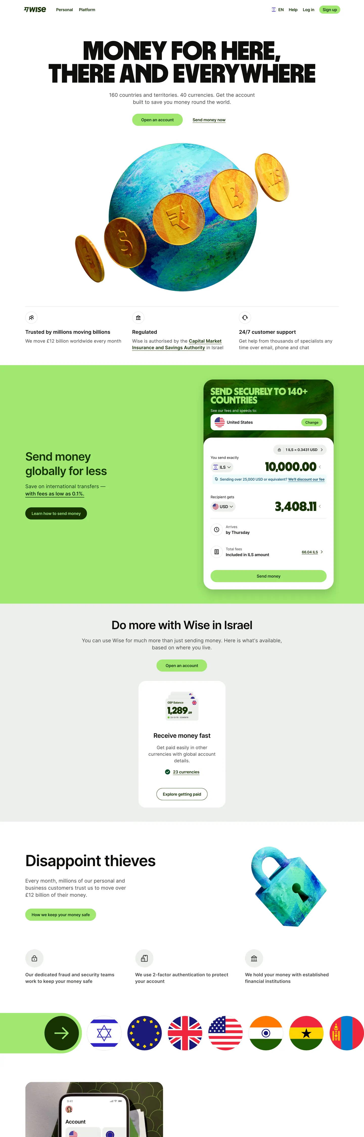
A snapshot of the brand in production. Scroll the frame to see the whole page.
Colors
22 colors
Wise Inspired's system runs on #9fe870 as its primary voltage, used in 4 of 28 components. Type is set in Inter across 14 tokens from 12px to 126px, weights 400–900. Shape language is soft — components average 22px corner radius, with no sharp interactive edges.
Brand & Accent
Sparing, CTA-only voltage · 6
Surface
Page and card backgrounds · 2
Text
Headlines, body, captions · 4
Semantic
Status, errors, success, links · 3
Other
Specialty colors · 7
Typography
14 type tokens
Set in Inter across 14 tokens, from 12px to 126px, weights 400–900. Shown in its own stack: where the font isn't installed, the fallback the file names stands in.
- display-mega126px · weight 900 · lh 107.1pxThe quick brown fox jumps over the lazy dog
- display-xxl96px · weight 900 · lh 81.6pxThe quick brown fox jumps over the lazy dog
- display-xl64px · weight 900 · lh 54.4pxThe quick brown fox jumps over the lazy dog
- display-lg47px · weight 400 · lh 70.5px · tracking -0.108pxThe quick brown fox jumps over the lazy dog
- display-md40px · weight 900 · lh 34pxThe quick brown fox jumps over the lazy dog
- display-sm32px · weight 600 · lh 38.4px · tracking -0.96pxThe quick brown fox jumps over the lazy dog
- display-xs24px · weight 600 · lh 31.2px · tracking -0.48pxThe quick brown fox jumps over the lazy dog
- body-lg20px · weight 400 · lh 30pxThe quick brown fox jumps over the lazy dog
- body-md16px · weight 400 · lh 24pxThe quick brown fox jumps over the lazy dog
- body-md-strong16px · weight 600 · lh 24pxThe quick brown fox jumps over the lazy dog
- body-sm14px · weight 400 · lh 20pxThe quick brown fox jumps over the lazy dog
- body-sm-strong14px · weight 600 · lh 20pxThe quick brown fox jumps over the lazy dog
- caption12px · weight 400 · lh 16pxThe quick brown fox jumps over the lazy dog
- button-md16px · weight 600 · lh 24pxThe quick brown fox jumps over the lazy dog
Layout
Radii and spacing
7 corner radii and 8 spacing values. Shape language: soft.
Radii
- none0px
- sm8px
- md12px
- lg16px
- xl24px
- pill9999px
- full9999px
Spacing
- xxs2px
- xs4px
- sm8px
- md12px
- lg16px
- xl24px
- 2xl32px
- 3xl48px
Components
28 components
Each rendered from its tokens (color, type, radius, padding) on Wise's own canvas.
- Nav Barnav-barNav Bar
- Nav Linknav-linkNav Link
- Button Primarybutton-primaryButton Primary
- Button Secondarybutton-secondaryButton Secondary
- Button Tertiarybutton-tertiaryButton Tertiary
- button-icon-circularButton Icon Circular
- Type here…text-inputText Input
- Card Contentcard-contentCard Content
- Card Feature Sagecard-feature-sageCard Feature Sage
- Card Feature Greencard-feature-greenCard Feature Green
- Card Feature Darkcard-feature-darkCard Feature Dark
- Hero Bandhero-bandHero Band
- Hero Band Darkhero-band-darkHero Band Dark
- Content Bandcontent-bandContent Band
- Currency Converter Cardcurrency-converter-cardCurrency Converter Card
- Badge Positivebadge-positiveBadge Positive
- Badge Negativebadge-negativeBadge Negative
- FooterfooterFooter
- Ex Pricing Tierex-pricing-tierEx Pricing Tier
- Ex Pricing Tier Featuredex-pricing-tier-featuredEx Pricing Tier Featured
- Ex Product Selectorex-product-selectorEx Product Selector
- Ex Cart Drawerex-cart-drawerEx Cart Drawer
- Ex App Shell Rowex-app-shell-rowEx App Shell Row
- Ex Data Table Cellex-data-table-cellEx Data Table Cell
- Ex Auth Form Cardex-auth-form-cardEx Auth Form Card
- Ex Modal Cardex-modal-cardEx Modal Card
- Ex Empty State Cardex-empty-state-cardEx Empty State Card
- Ex Toastex-toastEx Toast
In use
The system, in use
Wise's tokens on the kind of product it builds.
Build something people actually use.
A short paragraph of marketing copy that previews how the brand's display tier and body tier read together. Two sentences is usually enough.
FAQ
Wise Inspired design system FAQ
Common questions about Wise's tokens, components, and how to use this DESIGN.md in your project.
Read next
Related reading
Specs, directories, and component libraries that pair with this design system.
Use it
Use Wise Inspired in your project
One machine-readable file. Drop it into Claude, Cursor, or any AI tool that reads DESIGN.md.
Download the DESIGN.md
One machine-readable file: every color, type, radius, spacing, and component token of Wise Inspired.
Feed it to your AI tool
Drop it into Claude, Cursor, or GitHub Copilot. The agent writes React components and Tailwind classes that match Wise Inspired's visual language.
Reference the tokens directly
Or paste the values into your Tailwind config, CSS variables, or component library: every color, size and radius is a quoted, ready-to-copy value.
Read the full DESIGN.md: overview, rationale, do’s and don’ts
Overview
Wise — the global money-transfer brand — wears its identity in a single signature pairing: a vivid lime-green {colors.primary} (#9fe870) used as the CTA pill and brand accent, set against a pale sage-tinted canvas {colors.canvas-soft} (#e8ebe6) that runs across the hero band, and a near-black ink {colors.ink} (#0e0f0c) with a hint of warmth from the brand's underlying olive cast. The brand reads more like a calm Scandinavian magazine than a bank — generous whitespace, large rounded cards, and an unusually heavy display sans set at weight 900 carrying every hero headline.
Display typography is the second decisive voice. The proprietary Wise Sans family carries hero displays at weight 900 in scales from 64 px up to 126 px on the largest hero. The brand pairs Wise Sans 900 with Inter at weight 600 for sub-displays — the contrast between the chunky proprietary face and Inter's neutrality creates a particular hierarchy: Wise Sans for the brand moment, Inter for everything else.
Cards are universally pill-rounded — {rounded.xl} 24 px is the brand's signature card radius. Buttons take the same 24 px pill-rectangle shape. The brand never uses sharp corners on UI elements; the visual softness is part of the friendly fintech voice.
Key Characteristics:
- A single lime-green CTA accent
{colors.primary}(#9fe870) — the brand's universal primary action color. No second accent. - Two-face display typography — Wise Sans (proprietary, weight 900, hero scale) + Inter (weight 600, sub-display scale). The contrast is the brand's typographic story.
{rounded.xl}24 px is the canonical card and button radius. Generous, friendly.- Sage-tinted canvas
{colors.canvas-soft}(#e8ebe6) is the brand's hero surface; white{colors.canvas}is reserved for cards within the sage band. - A full semantic palette: positive green family, warning yellow family, negative red family — each documented with content / hover / active variants for in-product use.
- Currency-converter card on the hero — the brand's signature interactive component, hosting from/to amount inputs.
Colors
Brand & Accent
- Wise Green (
{colors.primary}—#9fe870): The brand's universal CTA color. Every primary button, every "Send money" pill, the brand's logo accent. - Wise Green Hover (
{colors.primary-active}—#cdffad): The lighter green for active state. - Wise Green Neutral (
{colors.primary-neutral}—#c5edab): A mid-saturation green used as a neutral active fill. - Wise Green Pale (
{colors.primary-pale}—#e2f6d5): The lightest green for soft surface tints / badge backgrounds.
Surface
- Canvas (
{colors.canvas}—#ffffff): Pure white for card interiors. - Canvas Soft (
{colors.canvas-soft}—#e8ebe6): The sage-tinted page background. Defining mood of the brand.
Text
- Ink (
{colors.ink}—#0e0f0c): Near-black with a hint of olive warmth — the brand's default text and headings color. - Ink Deep (
{colors.ink-deep}—#163300): A deep forest-green ink used on positive-state surfaces. - Body (
{colors.body}—#454745): Secondary body text. - Mute (
{colors.mute}—#868685): Lowest-priority text — captions, placeholder, fine print.
Semantic
- Positive (
{colors.positive}—#2ead4b): Success indicator. - Positive Deep (
{colors.positive-deep}—#054d28): Pressed positive state. - Warning (
{colors.warning}—#ffd11a): Caution indicator. - Warning Deep (
{colors.warning-deep}—#b86700): Pressed warning. - Warning Content (
{colors.warning-content}—#4a3b1c): Text on warning surfaces. - Negative (
{colors.negative}—#d03238): Destructive / error red. - Negative Deep (
{colors.negative-deep}—#a72027): Pressed destructive. - Negative Darkest (
{colors.negative-darkest}—#a7000d): Highest-emphasis destructive text. - Negative Bg (
{colors.negative-bg}—#320707): Dark maroon for destructive callout backgrounds.
Brand Accent — Tertiary
- Accent Orange (
{colors.accent-orange}—#ffc091): Bright peach used inside illustrative content / pricing cards. - Accent Cyan (
{colors.accent-cyan}—#38c8ff): Bright sky-blue used as a tertiary illustration accent.
Typography
Font Family
Two faces ladder the system:
- Wise Sans — proprietary geometric sans with an unusually heavy weight 900 used for all hero displays. The face is the brand's typographic signature. Always at weight 900, never lighter on the marketing surface.
- Inter — used for sub-displays (weight 600), all body, and form labels. Loaded with
font-feature-settings: "calt"for contextual alternates.
Hierarchy
| Token | Size | Weight | Line Height | Letter Spacing | Use |
|---|---|---|---|---|---|
{typography.display-mega} | 126px | 900 | 107.1px | 0 | Hero stencil at maximum scale. |
{typography.display-xxl} | 96px | 900 | 81.6px | 0 | Sub-hero scale. |
{typography.display-xl} | 64px | 900 | 54.4px | 0 | Standard hero headline. |
{typography.display-lg} | 47px | 400 | 70.5px | -0.108px | Lighter sub-display. |
{typography.display-md} | 40px | 900 | 34px | 0 | Section / card headlines. |
{typography.display-sm} | 32px | 600 | 38.4px | -0.96px | Inter-rendered section headings. |
{typography.display-xs} | 24px | 600 | 31.2px | -0.48px | Sub-section displays. |
{typography.body-lg} | 20px | 400 | 30px | 0 | Lead paragraphs. |
{typography.body-md} | 16px | 400 | 24px | 0 | Default body. |
{typography.body-md-strong} | 16px | 600 | 24px | 0 | Bold inline body. |
{typography.body-sm} | 14px | 400 | 20px | 0 | Secondary body. |
{typography.body-sm-strong} | 14px | 600 | 20px | 0 | Bold caption / nav-link. |
{typography.caption} | 12px | 400 | 16px | 0 | Fine print. |
{typography.button-md} | 16px | 600 | 24px | 0 | Button label. |
Principles
- Weight 900 for hero, weight 600 for everything else. The brand's display ceiling is full-black weight; everything below is semibold.
- Wise Sans for the brand voice, Inter for utility. Strict role separation.
Note on Font Substitutes
Wise Sans is proprietary. Open-source substitutes:
- Display — Inter at weight 900 or Manrope at weight 800 / 900 captures the geometric heaviness. Geist weight 800 is a passable second choice.
- Sub-display + body — Inter is the brand's actual second face.
Layout
Spacing System
- Base unit: 4 px.
- Tokens:
{spacing.xxs}2 px ·{spacing.xs}4 px ·{spacing.sm}8 px ·{spacing.md}12 px ·{spacing.lg}16 px ·{spacing.xl}24 px ·{spacing.2xl}32 px ·{spacing.3xl}48 px. - Section padding: bands use
{spacing.3xl}48 px top/bottom on desktop. - Card interior: cards at
{spacing.xl}24 px.
Grid & Container
- Marketing container centres at ~1200 px.
- Hero: split layout (headline left, currency-converter card right) at desktop; stacked at mobile.
- Feature grids: 2-up / 3-up at desktop.
Responsive Strategy
Breakpoints
| Name | Width | Key Changes |
|---|---|---|
| Mobile | < 768px | Hero stacks; converter card full-width below headline; grids 1-up. |
| Tablet | 768–1023px | Grids 2-up. |
| Desktop | ≥ 1024px | Hero split; full grids. |
Touch Targets
Buttons render ~48 px tall (12 vertical padding + 24 line). WCAG AAA at all widths.
Image Behavior
Photography is sparse; the brand prefers illustrative SVGs and product mockups inside cards. Country flag thumbnails appear inside currency rows.
Elevation & Depth
| Level | Treatment | Use |
|---|---|---|
| Level 0 — Flat | No shadow, no border. | Default. |
| Level 1 — Hairline on Dark | 1 px solid {colors.ink} border. | Tertiary outline buttons, form inputs. |
| Level 2 — Soft Card | Implicit Level 0 white card sitting on sage canvas — the surface contrast IS the elevation. | Cards on the sage hero band. |
The brand uses surface contrast ({colors.canvas-soft} background vs {colors.canvas} cards) as the primary elevation cue.
Shapes
Border Radius Scale
| Token | Value | Use |
|---|---|---|
{rounded.none} | 0px | Full-bleed bands. |
{rounded.sm} | 8px | Inline pills, small badges. |
{rounded.md} | 12px | Form inputs, smaller chrome. |
{rounded.lg} | 16px | Mid-size cards. |
{rounded.xl} | 24px | The brand's canonical button + card radius. |
{rounded.pill} | 9999px | Status pills and full-radius accents. |
{rounded.full} | 9999px | Circular icon containers. |
Components
Buttons
button-primary — the lime-green CTA pill.
- Background
{colors.primary}, text{colors.on-primary}, label{typography.button-md}, padding{spacing.md} {spacing.xl}, shape{rounded.xl}24 px.
button-secondary — the sage-tinted secondary.
- Background
{colors.canvas-soft}, text{colors.ink}, same typography / padding / shape.
button-tertiary — the white outline tertiary.
- Background
{colors.canvas}, text{colors.ink}, 1 px solid{colors.ink}border, same typography / padding / shape.
button-icon-circular — the circular icon button.
- Background
{colors.canvas}, ink icon, shape{rounded.full}.
Cards & Containers
card-content — the default white card.
- Background
{colors.canvas}, text{colors.ink}, padding{spacing.xl}, shape{rounded.xl}. No border, sits on sage canvas.
card-feature-sage — the sage-tinted feature card.
- Background
{colors.canvas-soft}, text{colors.ink}, padding{spacing.xl}, shape{rounded.xl}.
card-feature-green — the soft-green feature card.
- Background
{colors.primary-pale}, text{colors.ink}, padding{spacing.xl}, shape{rounded.xl}.
card-feature-dark — the polarity-flipped dark card with green text.
- Background
{colors.ink}, text{colors.primary}(Wise green!), padding{spacing.xl}, shape{rounded.xl}. Used for promotional moments.
currency-converter-card — the brand's signature interactive widget.
- Background
{colors.canvas}, text{colors.ink}, 1 px solid{colors.ink}border, padding{spacing.xl}, shape{rounded.xl}. Hosts from/to amount inputs + currency selectors.
Inputs & Forms
text-input — the canonical text input.
- Background
{colors.canvas}, text{colors.ink}, 1 px solid{colors.ink}border, body in{typography.body-md}, padding{spacing.md} {spacing.lg}, shape{rounded.md}.
Navigation
nav-bar — the sticky top nav.
- Background
{colors.canvas}, text{colors.ink}, padding{spacing.md} {spacing.xl}.
nav-link — link items inside nav.
- Text
{colors.ink}, set in{typography.body-sm-strong}.
footer — the dark footer band.
- Background
{colors.ink}, text{colors.canvas-soft}, padding{spacing.3xl} {spacing.xl}. Body in{typography.body-sm}.
Signature Components
hero-band — the sage-canvas hero band.
- Background
{colors.canvas-soft}, text{colors.ink}, padding{spacing.3xl} {spacing.xl}. Headline in{typography.display-mega}(Wise Sans weight 900).
hero-band-dark — the polarity-flipped dark hero.
- Background
{colors.ink}, text{colors.primary}(Wise green headline on near-black!), same padding / scale.
content-band — the white content band that follows hero.
- Background
{colors.canvas}, text{colors.ink}, padding{spacing.3xl} {spacing.xl}. Section headline in{typography.display-md}.
badge-positive — the positive status pill.
- Background
{colors.primary-pale}, text{colors.positive-deep}, body in{typography.body-sm-strong}, padding{spacing.xs} {spacing.md}, shape{rounded.pill}.
badge-negative — the negative status pill.
- Background
{colors.negative-bg}, text white, body in{typography.body-sm-strong}, padding{spacing.xs} {spacing.md}, shape{rounded.pill}.
Examples (illustrative)
Auto-derived kit-mirror demonstration surfaces (
scripts/derive-examples-block.mjs). Eachex-*entry references brand-native primitives so downstream consumers (/preview-design,/generate-kit) re-skin the same 10 surfaces consistently.TO_FILLmarkers indicate missing primitives — resolve in the LLM judgment pass.
ex-pricing-tier — Default Pricing tier card. Re-uses feature-card chrome with brand canvas-soft surface.
- Properties:
backgroundColor,textColor,borderColor,rounded,padding
ex-pricing-tier-featured — Featured/highlighted tier — polarity-flipped surface (dark fill + light text in light mode, light fill + dark text in dark mode).
- Properties:
backgroundColor,textColor,rounded,padding
ex-product-selector — What's Included summary card — re-purposed for SaaS / B2B verticals (NOT a literal product gallery).
- Properties:
backgroundColor,rounded,padding
ex-cart-drawer — Subscription summary — re-purposed for SaaS / B2B (line items per add-on, not literal cart).
- Properties:
backgroundColor,rounded,padding,item-divider
ex-app-shell-row — Sidebar nav row inside the App Shell example. Active state uses brand primary as the indicator.
- Properties:
backgroundColor,activeIndicator,rounded,padding
ex-data-table-cell — Default data-table th + td chrome. Header uses mono-caps eyebrow typography; body uses body-sm.
- Properties:
headerBackground,headerTypography,bodyTypography,cellPadding,rowBorder
ex-auth-form-card — Sign-in / sign-up card. Re-uses feature-card chrome with text-input primitives inside.
- Properties:
backgroundColor,rounded,padding
ex-modal-card — Modal dialog surface — same chrome as feature-card with elevated shadow.
- Properties:
backgroundColor,rounded,padding
ex-empty-state-card — Empty-state illustration frame.
- Properties:
backgroundColor,rounded,padding,captionTypography
ex-toast — Toast notification surface — feature-card shape + medium shadow.
- Properties:
backgroundColor,rounded,padding,typography
Do's and Don'ts
Do
- Reserve
{colors.primary}Wise green for every primary CTA. The lime-green pill IS the brand's conversion signature. - Set hero headlines in
{typography.display-mega}/{typography.display-xl}Wise Sans weight 900. Never lighter. - Use
{rounded.xl}24 px for buttons and cards. The generous radius is the brand's friendliness signature. - Cycle page surfaces in
{colors.canvas-soft}sage canvas →{colors.canvas}white cards. Surface contrast carries elevation. - Use the full semantic palette (positive / warning / negative) for in-product status — never repurpose Wise green as success indicator since it IS the brand CTA.
Don't
- Don't introduce a second brand accent. Wise green is the sole identity colour.
- Don't render the hero in weight 700 or lighter. The brand's display weight is 900.
- Don't render CTAs as sharp rectangles. The 24 px pill geometry is non-negotiable.
- Don't pair the green CTA with a green background. The brand always sits Wise green on neutral surfaces (sage / white / ink).
- Don't replace Wise Sans with a generic geometric sans for hero typography — the proprietary face IS the brand's voice.
Known Gaps
- Hover state colors: beyond the documented
{colors.primary-active}lighter-green active variant, precise pointer-hover micro-states (e.g., subtle elevation lift on cards, button shadow pulse) are not fully captured. - Loading states / skeleton screens: progress indicators, skeleton placeholders, and inline spinners are not represented in the extracted surfaces.
- Dark mode tokens: the spec captures the light marketing surface; a dedicated dark-mode token set (paired with
{colors.ink}as canvas) is not documented here. - Mobile app component library: the iOS / Android app extends the marketing brand with native list rows, segmented controls, and gesture sheets that aren't captured in this web-focused spec.
- Country flag assets: flag thumbnails appear inside currency converter rows, but the asset set, sizing rules, and rounded-corner treatment are not formally documented here.
Fintech & Crypto
More systems like this
More DESIGN.md files in Fintech & Crypto.
Pricing
Build it with Pro
The DESIGN.md files are free. Pro adds 6,000+ blocks, premium templates and the MCP server, so your AI editor builds in your system for you.
4.9/5 out of 5 · 150+ reviewsfrom 150+ founders and developers.
Billing
Billed once a year in USD. Cancel anytime.
- How many people can use the license.
- Client work, SaaS products and anything you charge for.
- Production-ready React sections: hero, pricing, features, dashboards and more.
- Complete multi-page sites you can ship as they are.
- React icons from every major library, installable with one command.
- Presets that restyle every block, in light and dark.
- Lets your AI editor search, preview and install blocks for you.
- Priority requests are answered first.
Individual
For personal projects & open source
$32instead of $49/mo
$389 billed yearly
- Seats: 1 seat
- Commercial use: Personal & open source only
- Pro blocks: 6,000+ blocks
- Templates: All 14 templates
- React icons: 294k+ icons
- Themes: All 59 themes
- MCP server: Basic usage
- Support: Standard
Team
Most popularFor freelancers, agencies & startups
$66instead of $99/mo
$789 billed yearly · ≈ $13/dev/mo
- Seats: Up to 5 seats
- Commercial use: Included
- Pro blocks: 6,000+ blocks
- Templates: All 14 templates
- React icons: 294k+ icons
- Themes: All 59 themes
- MCP server: High usage
- Support: Priority
Organization
For companies with larger teams
$132instead of $199/mo
$1,589 billed yearly
- Seats: Unlimited seats
- Commercial use: Included
- Pro blocks: 6,000+ blocks
- Templates: All 14 templates
- React icons: 294k+ icons
- Themes: All 59 themes
- MCP server: Unlimited usage
- Support: Priority
Billed once a year in USD. Cancel anytime.
Individual
For personal projects & open source
$32instead of $49/mo
$389 billed yearly
- How many people can use the license.Seats: 1 seat
- Client work, SaaS products and anything you charge for.Commercial use: Personal & open source only
- Production-ready React sections: hero, pricing, features, dashboards and more.Pro blocks: 6,000+ blocks
- Complete multi-page sites you can ship as they are.Templates: All 14 templates
- React icons from every major library, installable with one command.React icons: 294k+ icons
- Presets that restyle every block, in light and dark.Themes: All 59 themes
- Lets your AI editor search, preview and install blocks for you.MCP server: Basic usage
- Priority requests are answered first.Support: Standard
Team
Most popularFor freelancers, agencies & startups
$66instead of $99/mo
$789 billed yearly · ≈ $13/dev/mo
Everything in Individual, plus
- How many people can use the license.Seats: Up to 5 seats
- Client work, SaaS products and anything you charge for.Commercial use: Included
- Lets your AI editor search, preview and install blocks for you.MCP server: High usage
- Priority requests are answered first.Support: Priority
Organization
For companies with larger teams
$132instead of $199/mo
$1,589 billed yearly
Everything in Team, plus
- How many people can use the license.Seats: Unlimited seats
- Lets your AI editor search, preview and install blocks for you.MCP server: Unlimited usage
- Secure checkout via Stripe
- Code lives in your repo
- Keep what you've shipped if you cancel
- License terms
Your system, built for you
Every block, template and icon, installed by your AI agent in your design system. The DESIGN.md files stay free.