Betterment Design System
Betterment's fintech marketing system: midnight navy #000b50 hero, Season Mix display type, GT America body, gold #ffc729 sparingly. Tokens for React, Next.js, and AI tools.
Add shadcn.io to your AI agent. · Pro It installs blocks, icons and templates in your design system from a prompt, with Pro.
Set up MCP- Primary
- #000b50
- Typeface
- GT America
- Shape
- Mixed
- Base radius
- 12px
- Colors
- 10
- Type tokens
- 14
- Components
- 18
- Spacing values
- 7
About
About Betterment DESIGN.md
Curated by Dov Azencot · Updated May 19, 2026 · Source betterment.com (opens in a new tab)
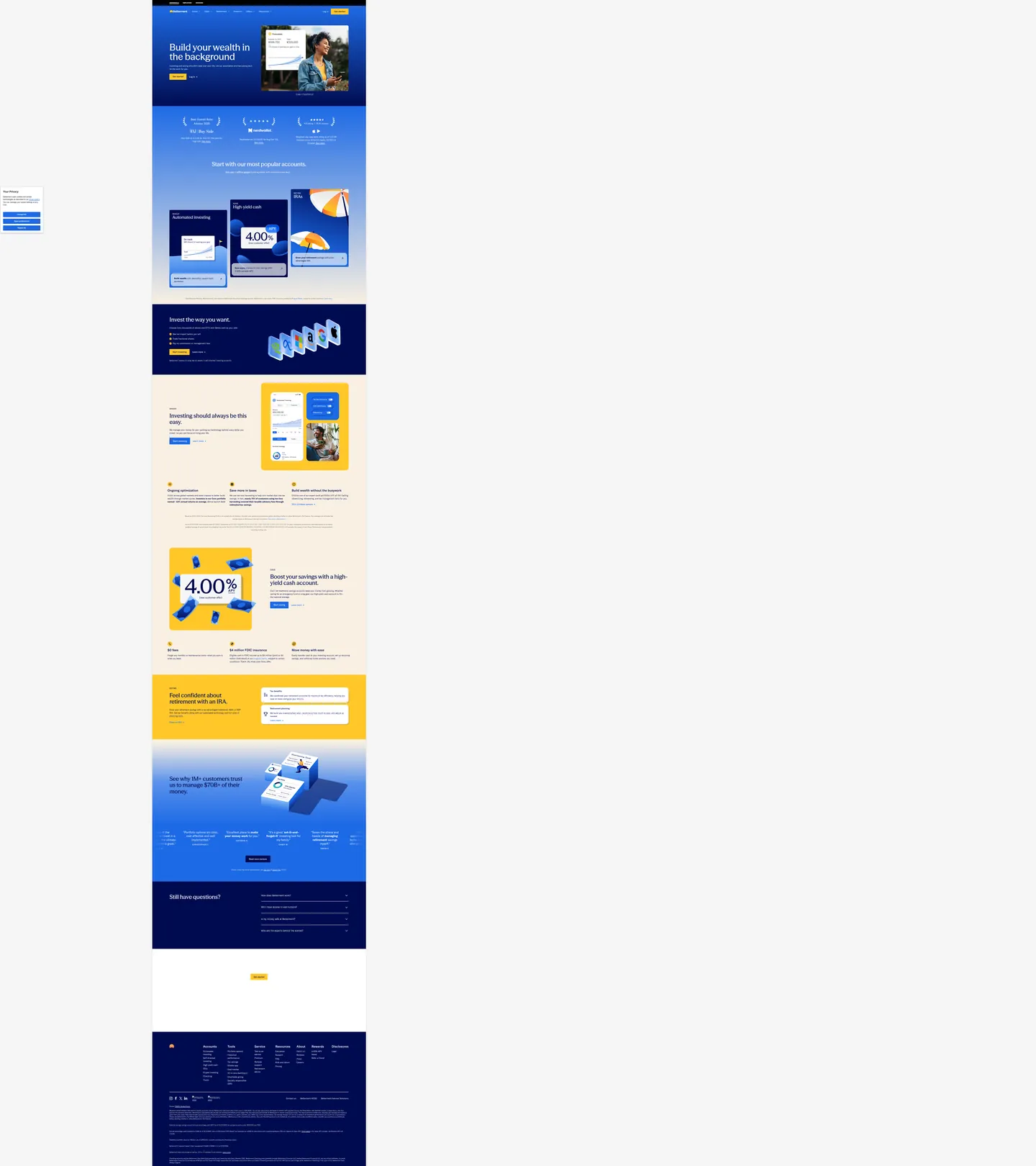
Betterment's marketing site opens on midnight navy — a very dark blue with just enough chroma to read as sky rather than charcoal — and sets its hero headline ("Build your wealth in the background") in Season Mix, a proprietary serif-influenced display face that brings editorial gravity to what is otherwise a technology product. This pairing is unusual in the robo-advisor category. Wealthfront and Fidelity run mid-weight blue canvases and standard sans-serif headlines; Robinhood goes dark-mode with green accents. Betterment makes the opposite bet: deep navy that almost reads as night sky, editorial display type that reads closer to a financial magazine than a fintech dashboard.
The DESIGN.md file packages 10 colors tokens drawn from the extraction, organized into a midnight navy floor, a bright cobalt blue (#1d6ae5) for interactive elements and gradient nodes, a single gold (#ffc729) warm accent used 5 times as illustration and highlight fills, and a cream canvas (#f9f0e2) below the fold. Typography runs 14 tokens across two families: Season Mix at 44–72px for display, and GT America (a proprietary grotesque licensed from GrilliType) for every body, label, nav, and UI surface. Components number 18, covering the navy hero, the physical-shadow product cards, the gold-highlight yield panels, the warm-cream section floor, and the dark-navy footer.
Feed this file to Claude or Cursor and it reproduces the fintech tension: the night-sky canvas signals safety and seriousness, the editorial display type signals authority without aggression, and the single gold accent delivers just enough warmth to feel aspirational. The physical-card shadow is the most distinctive implementation move — a CSS compound shadow with a deep-navy offset (matching `--btm-card-shadow` in the CSS) that no other fintech brand in the directory uses.
What makes it distinct
5
- Midnight navy voltage#000b50 fills the above-fold hero canvas; not corporate blue but a near-black with chroma that distinguishes it from the gray-dark canvases at Linear or Vercel
- Two-typeface hierarchySeason Mix (a proprietary serif-influenced sans) runs h1/h2 display at 44–72px; GT America handles all body, nav, and UI labels
- Gold as the solitary warm accent#ffc729 appears exactly 5 times as background fills; in a cold-navy system, one gold element carries all the warmth in the page
- Physical card illusionproduct cards use a compound shadow (drop + inset) that casts a deep navy offset shadow, making the cards read as tangible objects
- Warm cream floor below the fold#f9f0e2 carries the below-fold sections, inverting the hero's dark gravity and making the system feel like day and night
betterment.com
Live at betterment.com
A snapshot of the brand in production. Scroll the frame to see the whole page.
Colors
10 colors
Betterment's system runs on #000b50 as its primary voltage, used in 8 of 18 components. Type is set in GT America across 14 tokens from 11px to 72px, weights 400–700. Shape language is mixed across 18 components, blending pills, soft rounds, and squarer corners.
Brand & Accent
Sparing, CTA-only voltage · 1
Surface
Page and card backgrounds · 2
Text
Headlines, body, captions · 3
Borders & Hairlines
Dividers, outlines, rules · 1
Other
Specialty colors · 3
Typography
14 type tokens
Set in GT America across 14 tokens, from 11px to 72px, weights 400–700. Shown in its own stack: where the font isn't installed, the fallback the file names stands in.
- display-xl72px · weight 500 · lh 72pxThe quick brown fox jumps over the lazy dog
- display-lg44px · weight 500 · lh 48.4pxThe quick brown fox jumps over the lazy dog
- display-md32px · weight 500 · lh 38.4pxThe quick brown fox jumps over the lazy dog
- heading-lg24px · weight 500 · lh 32.4pxThe quick brown fox jumps over the lazy dog
- heading-md22px · weight 400 · lh 29.7pxThe quick brown fox jumps over the lazy dog
- body-lg18px · weight 400 · lh 24.3pxThe quick brown fox jumps over the lazy dog
- body-md16px · weight 400 · lh 24pxThe quick brown fox jumps over the lazy dog
- body-md-medium16px · weight 500 · lh 24pxThe quick brown fox jumps over the lazy dog
- body-sm14px · weight 400 · lh 21pxThe quick brown fox jumps over the lazy dog
- label-caps11px · weight 700 · lh 16.5pxThe quick brown fox jumps over the lazy dog
- caption12px · weight 400 · lh 16.2pxThe quick brown fox jumps over the lazy dog
- label-track14px · weight 500 · lh 16.1px · tracking 1.12pxThe quick brown fox jumps over the lazy dog
- nav-link11px · weight 700 · lh 16.5pxThe quick brown fox jumps over the lazy dog
- button-md18px · weight 400 · lh 24.3pxThe quick brown fox jumps over the lazy dog
Layout
Radii and spacing
6 corner radii and 7 spacing values. Shape language: mixed.
Radii
- none0px
- xs3px
- sm8px
- md12px
- lg20px
- full9999px
Spacing
- xs5px
- sm8px
- md12px
- base16px
- lg24px
- xl32px
- 2xl48px
Components
18 components
Each rendered from its tokens (color, type, radius, padding) on Betterment's own canvas.
- Button Primarybutton-primaryButton Primary
- Button Secondarybutton-secondaryButton Secondary
- Button Goldbutton-goldButton Gold
- Top Navtop-navTop Nav
- Nav Linknav-linkNav Link
- Hero Headinghero-headingHero Heading
- Section Headingsection-headingSection Heading
- Section Heading Lightsection-heading-lightSection Heading Light
- Body Paragraphbody-paragraphBody Paragraph
- Body Paragraph Darkbody-paragraph-darkBody Paragraph Dark
- Hero Sectionhero-sectionHero Section
- CardcardCard
- Card Cobaltcard-cobaltCard Cobalt
- Card Goldcard-goldCard Gold
- Cream Sectioncream-sectionCream Section
- Label Tracklabel-trackLabel Track
- Type here…text-inputText Input
- FooterfooterFooter
In use
The system, in use
Betterment's tokens on the kind of product it builds.
Build something people actually use.
A short paragraph of marketing copy that previews how the brand's display tier and body tier read together. Two sentences is usually enough.
- · 1 project
- · Community support
- · 10k req/mo
- · 10 projects
- · Priority support
- · 1M req/mo
- · Custom domains
- · Unlimited
- · SLA
- · Audit log
- · SSO
FAQ
Betterment design system FAQ
Common questions about Betterment's tokens, components, and how to use this DESIGN.md in your project.
Read next
Related reading
Specs, directories, and component libraries that pair with this design system.
- Browse all design systemsThe full directory of DESIGN.md files on shadcn.io, with live mockups for each.shadcn.io
- Betterment — official siteBetterment's public marketing site — the source of truth for the live tokens captured in this file.betterment.com (opens in a new tab)
- The DESIGN.md specificationGoogle Labs' open spec for machine-readable design system files — the format this page is built on.github.com (opens in a new tab)
Use it
Use Betterment in your project
One machine-readable file. Drop it into Claude, Cursor, or any AI tool that reads DESIGN.md.
Download the DESIGN.md
One machine-readable file: every color, type, radius, spacing, and component token of Betterment.
Feed it to your AI tool
Drop it into Claude, Cursor, or GitHub Copilot. The agent writes React components and Tailwind classes that match Betterment's visual language.
Reference the tokens directly
Or paste the values into your Tailwind config, CSS variables, or component library: every color, size and radius is a quoted, ready-to-copy value.
Read the full DESIGN.md: overview, rationale, do’s and don’ts
Overview
Betterment's marketing site makes a typographic bet that the rest of the robo-advisor category has not taken. Editorial display in fintech: the hero headline runs in Season Mix — a serif-inflected proprietary face — at 72px on a midnight-navy canvas (#000b50), and the effect reads more like a financial magazine spread than a technology product landing page. Where Wealthfront stays on a white canvas with a medium-weight sans, and Robinhood commits to a dark product-first surface, Betterment gives its display type the canvas to carry the visual weight that most fintech brands offload to photography or gradient fills.
The color system is a study in cold-warm contrast. The midnight navy hero floor (#000b50) cedes to a warm cream canvas (#f9f0e2) in the below-fold product sections — the equivalent of shifting from night to day. The single warm chromatic signal is gold (#ffc729, wired as --bt-gold) appearing 5 times across the page as product-panel accent fills. The interactive primary is cobalt blue (#1d6ae5), used for buttons, gradient nodes, and section highlights. This three-tone story (night navy / warm cream / bright cobalt) maps cleanly to a "your money working while you sleep" narrative that the headline makes explicit.
The most technically distinctive feature is the physical-card shadow: Betterment's product cards use a CSS compound shadow that includes a large navy-colored offset drop shadow plus opposing inset highlights, declared as --btm-card-shadow. No other fintech brand in the directory uses a shadow whose color is a transparent version of the brand navy — the cards cast their own brand color as a shadow.
Key Characteristics:
- Midnight navy hero canvas (
{colors.primary}— #000b50), wired as--bt-navy. Not corporate blue — an extremely dark value with 0.123 OKLCH chroma that reads as night sky. - Season Mix for display (h1 / h2) at 44–72px / weight 500; GT America for all body, nav, and UI text.
- Single gold warm accent (
{colors.gold}— #ffc729,--bt-gold), 5 occurrences, all background fills. Zero text or border uses. - Physical-card shadow technique: large navy offset drop shadow + inset corner highlights = cards that appear to have physical depth.
- Warm cream below-fold canvas (
{colors.surface-cream}— #f9f0e2) inverts the hero's dark gravity. - GT America Black (the "Black" weight variant) at 11px uppercase for all navigation labels — small-caps authority on a dark nav surface.
- 20px card radius (
{rounded.lg}) versus 3px button radius ({rounded.xs}) — the system is binary: product cards are rounded, interactive surfaces are nearly square.
Colors
Brand
- Midnight Navy Primary (
{colors.primary}— #000b50): frequency 328 — text (161), border (158), bg (4), shadow (4), gradient (1). Wired as--bt-navyand--btm-card-text. The page's dark canvas and the text color inside product cards on cream backgrounds. Extremely dark blue — OKLCH lightness 0.21, chroma 0.123, hue 264°. - Gold (
{colors.gold}— #ffc729): frequency 5. Background fills only. Wired as--bt-gold. The system's solitary warm moment — a saturated amber-gold that appears in the yield percentage panel ("4.00%") and one IRA section highlight. Zero text or border uses.
Interactive
- Cobalt (
{colors.cobalt}— #1d6ae5): frequency 32 — bg (8), border (13), text (8), gradient (3). The primary interactive and CTA color. Bright mid-blue, clearly distinct from the dark navy. Wired across 19 CSS variables as the button, toggle, and link fill. - Cobalt Light (
{colors.cobalt-light}— #5790eb): frequency 1. Gradient only. The light gradient stop for cobalt-to-navy gradient backgrounds.
Surface
- Canvas (
{colors.canvas}— #ffffff): frequency 717 — text (359), border (345), bg (8), shadow (5). The product-card surface on cream backgrounds and the base below-fold floor before cream is applied. The dominant count comes from the Ketch cookie-consent overlay CSS variables that share the extraction. - Surface Cream (
{colors.surface-cream}— #f9f0e2): frequency 8. Background fills (6) and gradient (2). The below-fold page section floor — warm off-white that pairs against both the navy hero and the cobalt product cards.
Text
- Ink (
{colors.ink}— #ffffff): used as text and border on dark surfaces (navy hero, cobalt cards, dark footer). Pure white on navy. - Ink Dark (
{colors.ink-dark}— #212121): frequency 472 — text (236), border (236). The dominant text color on light (cream, white) surfaces. Near-black, wired across 60+ Ketch cookie-consent CSS variables. - Ink Muted (
{colors.ink-muted}— #5c5c5c): frequency 16. Secondary text on light surfaces — captions, footnotes, fine print.
Hairline
- Hairline (
{colors.hairline}— #212121): wired as a border token on light surfaces. The dark hairline on white/cream backgrounds inverts the typical light-on-light hairline convention.
Typography
Font Families
The system runs two voices: Season Mix for every editorial display moment (h1 / h2 at 44–72px), and GT America (GrilliType's proprietary grotesque, available via CSS as --bt-font-body) for all body, label, nav, and UI surfaces. A third variant, GT America Black, carries the small-uppercase navigation labels at 11px. The division is unambiguous: Season Mix speaks; GT America annotates.
Hierarchy
| Token | Size | Weight | Line Height | Letter Spacing | Use |
|---|---|---|---|---|---|
{typography.display-xl} | 72px | 500 | 72px | 0 | Hero h1 ("Build your wealth in the background") |
{typography.display-lg} | 44px | 500 | 48.4px | 0 | Section h2 ("Start with our most popular accounts") |
{typography.display-md} | 32px | 500 | 38.4px | 0 | Sub-section display text |
{typography.heading-lg} | 24px | 500 | 32.4px | 0 | Card heading |
{typography.heading-md} | 22px | 400 | 29.7px | 0 | Feature sub-heading |
{typography.body-lg} | 18px | 400 | 24.3px | 0 | Button label, hero sub-copy |
{typography.body-md} | 16px | 400 | 24px | 0 | Default running text |
{typography.body-md-medium} | 16px | 500 | 24px | 0 | Emphasized inline text |
{typography.body-sm} | 14px | 400 | 21px | 0 | Caption text, fine print |
{typography.label-caps} | 11px | 700 | 16.5px | 0 | Nav labels (GT America Black, uppercase) |
{typography.caption} | 12px | 400 | 16.2px | 0 | Metadata, small disclaimers |
{typography.label-track} | 14px | 500 | 16.1px | +1.12px | Section category labels (tracked caps) |
{typography.nav-link} | 11px | 700 | 16.5px | 0 | Top-nav links (uppercase GT America Black) |
{typography.button-md} | 18px | 400 | 24.3px | 0 | Button label |
Principles
Season Mix at weight 500 is the editorial voice — not the 700+ that most fintech brands use to project authority, but a measured medium weight that trusts the 72px size to do the heavy lifting. GT America at 400 carries all body text with minimal variation in weight until GT America Black arrives for navigation labels. The tracking on navigation labels (+1.12px at 14px) and the uppercase treatment via label-track is the one place the system gestures toward traditional financial typographic conventions.
Note on Font Substitutes
Season Mix is proprietary — it is not available as an open-source font. For open substitutes at the 44–72px display tier, Cormorant Garamond has comparable serif-influenced texture; Libre Baskerville or Merriweather are closer in weight distribution. For GT America, Inter at the same weights is the closest freely available grotesque; for GT America Black at 11px nav labels, use Inter with font-weight: 900 and text-transform: uppercase.
Layout
Spacing System
- Base unit: 8px.
- Tokens:
{spacing.xs}5px ·{spacing.sm}8px ·{spacing.md}12px ·{spacing.base}16px ·{spacing.lg}24px ·{spacing.xl}32px ·{spacing.2xl}48px. - Section padding: 80px vertical between major sections; the hero uses ~96px top padding.
- Card internal padding: 16px (
{spacing.base}) on product cards, 24px ({spacing.lg}) on feature panels. - Top-nav height: 56px with 0×16px padding.
Grid & Container
- Max content width: ~707px for display headlines, ~1000px for product card grids.
- Hero: full-bleed midnight-navy canvas, centered headline + sub-copy + pill CTA + product screenshot at right.
- Account cards: 3-up horizontal product card row (Automated Investing / High Yield Cash / IRAs) each with a product-screenshot illustration and the physical compound shadow.
- Feature sections: alternating left-text / right-illustration layout on the cream canvas.
Rhythm
The page opens with the dark navy hero band, then alternates: navy product section → cream feature section → gold-accent panel → cream IRA section → dark navy testimonial band → cream FAQ. The consistent alternation between dark-navy and warm-cream bands creates a visual rhythm that no single background color could sustain alone.
Elevation
The system uses a distinctive branded-shadow technique for its product cards. The --btm-card-shadow CSS variable is a compound shadow: a large 10.244px offset drop in rgba(0,11,80,0.20) (transparent midnight navy), combined with opposing inset shadows — a dark 1.7px inset on the top-left corner and a white 1.7px inset on the bottom-right — to simulate physical beveling. The cards appear to cast a navy shadow whose color exactly matches the hero floor, grounding the white cards in the brand's dark-canvas story. Outside the product cards, the system is flat — no other shadow values appear on the captured marketing surface.
Shapes
The radius scale is binary: soft cards, sharp buttons:
{rounded.none}0px — hero section, full-bleed band edges.{rounded.xs}3px — buttons and form inputs. Nearly square.{rounded.sm}8px — secondary UI surfaces (dropdown items, small badges).{rounded.md}12px — medium card containers.{rounded.lg}20px — (5 occurrences): primary product cards (--btm-card-radius). The card's 20px rounding is large enough to read as "soft" against the nearly-square buttons.{rounded.full}9999px — pill badge treatments.
The gap between 3px buttons and 20px cards is intentional: interactive surfaces are nearly squared (traditional fintech conservatism), and data display surfaces are rounded (contemporary app warmth). Mixing them on the same page signals both reliability and approachability.
Components
button-primary — Cobalt {colors.cobalt} fill, white text, {rounded.xs} 3px radius, 13×24px padding. Used for "Get started" actions on both dark and light backgrounds.
button-gold — Gold {colors.gold} fill, midnight navy text, same radius and padding. Used for the yield product CTA on the high-yield cash section.
button-secondary — Transparent fill, white text, 1px white border. Used for secondary actions on dark navy backgrounds.
top-nav — Midnight navy {colors.primary} surface, 56px height. Houses the Betterment wordmark and the GT America Black 11px uppercase navigation links.
nav-link — Transparent background, white text at {typography.nav-link} (GT America Black / 11px / uppercase). The uppercase small-cap treatment is the nav's one nod to traditional banking typography.
hero-section — Full-bleed midnight navy {colors.primary} canvas, 96×24px padding, white {typography.display-xl} headline + {typography.body-md} sub-copy + primary CTA.
hero-heading — White {colors.ink} text, Season Mix 72px / 500, the signature display moment.
section-heading — Midnight navy {colors.primary} text, Season Mix 44px / 500. Used on cream-background sections where the navy text inverts the hero relationship.
card — White {colors.canvas} surface, midnight navy text, {rounded.lg} 20px radius, 16px padding, compound navy shadow. The product account card — Automated Investing, High Yield Cash, IRAs.
card-cobalt — Cobalt {colors.cobalt} fill, white text, same 20px radius. Used for the "Invest the way you want" dark section card.
card-gold — Gold {colors.gold} fill, midnight navy text. The yield percentage panel ("4.00%") — the single warmest surface on the page.
cream-section — Warm cream {colors.surface-cream} background, dark ink text, 80×24px section padding. The feature section floor for all below-fold product descriptions.
body-paragraph — White text on dark surfaces at {typography.body-md}.
body-paragraph-dark — Dark ink {colors.ink-dark} text on cream surfaces at {typography.body-md}.
text-input — White surface, dark text, {rounded.xs} 3px radius, 9×12px padding, muted ink border.
footer — Midnight navy {colors.primary} canvas, white text, {typography.body-sm}. Dense link grid followed by regulatory disclosures in smaller caption type.
Do's and Don'ts
Do use Season Mix exclusively for h1 and h2 display elements — never for body, labels, or buttons. GT America handles everything functional; Season Mix's editorial texture works only at sizes where the letterform details read.
Do treat {colors.gold} (#ffc729) as the system's single warm punctuation. In a cold-navy system, one gold element per view carries all the aspiration. Multiple gold elements compete with each other and dilute the yield-product connotation.
Do apply the compound navy shadow to product cards on cream backgrounds. Using a generic rgba(0,0,0,0.15) shadow instead loses the brand coherence — the navy shadow color is what ties the card to the hero canvas.
Do maintain the {rounded.xs} 3px radius on all buttons. The near-square button is a deliberate financial-product signal; rounding buttons to 20px to match the cards would make the UI feel more like a consumer app than a wealth-management platform.
Don't use {colors.cobalt} (#1d6ae5) as a background canvas for full-bleed sections. It is an interactive-element and gradient-node color; using it as a section background would create a third canvas tone (navy / cobalt / cream) that the page cannot sustain.
Don't run Season Mix below 32px. Below that size the editorial texture of the face is lost and it reads as a generic medium-weight sans; drop to GT America heading sizes instead.
Don't use {colors.hairline} (#212121) for borders on dark navy surfaces. It is a dark-on-light border token; on the navy canvas, use rgba(255,255,255,0.2) for a white-with-alpha border that survives on the dark floor.
Don't add drop shadows to buttons. The shadow technique is reserved for product cards — applying it to interactive buttons would flatten the visual hierarchy by treating buttons and data surfaces as the same elevation tier.
Known Gaps
- Hover and focus states: the resting state only is captured; button hover, link underline animation, and input focus ring behavior are not exposed on the marketing surface.
- Mobile navigation: the 1440px-wide extraction captures desktop layout; mobile nav drawer, hamburger menu, and touch-target adjustments are not documented.
- Product surfaces: the authenticated dashboard and portfolio management screens (Betterment's core product) carry a substantially different token set; this file covers only the marketing site.
- Illustration system: Betterment uses 3D-rendered product card illustrations (the umbrella, the stacked cards, the abstract shapes) — the illustration style parameters are not captured as design tokens here.
- Regulatory/disclaimer typography: the legal disclosure paragraphs at the page bottom use a distinct small-text treatment that is not represented in the component set.
- Gradient system: the hero-to-section gradient transitions (navy to cobalt, cobalt to cream) use compound gradients with intermediate stops that are not fully captured in the flat color tokens here.
Fintech & Crypto
More systems like this
More DESIGN.md files in Fintech & Crypto.
Pricing
Build it with Pro
The DESIGN.md files are free. Pro adds 6,000+ blocks, premium templates and the MCP server, so your AI editor builds in your system for you.
4.9/5 out of 5 · 150+ reviewsfrom 150+ founders and developers.
Billing
Billed once a year in USD. Cancel anytime.
- How many people can use the license.
- Client work, SaaS products and anything you charge for.
- Production-ready React sections: hero, pricing, features, dashboards and more.
- Complete multi-page sites you can ship as they are.
- React icons from every major library, installable with one command.
- Presets that restyle every block, in light and dark.
- Lets your AI editor search, preview and install blocks for you.
- Priority requests are answered first.
Individual
For personal projects & open source
$32instead of $49/mo
$389 billed yearly
- Seats: 1 seat
- Commercial use: Personal & open source only
- Pro blocks: 6,000+ blocks
- Templates: All 14 templates
- React icons: 294k+ icons
- Themes: All 59 themes
- MCP server: Basic usage
- Support: Standard
Team
Most popularFor freelancers, agencies & startups
$66instead of $99/mo
$789 billed yearly · ≈ $13/dev/mo
- Seats: Up to 5 seats
- Commercial use: Included
- Pro blocks: 6,000+ blocks
- Templates: All 14 templates
- React icons: 294k+ icons
- Themes: All 59 themes
- MCP server: High usage
- Support: Priority
Organization
For companies with larger teams
$132instead of $199/mo
$1,589 billed yearly
- Seats: Unlimited seats
- Commercial use: Included
- Pro blocks: 6,000+ blocks
- Templates: All 14 templates
- React icons: 294k+ icons
- Themes: All 59 themes
- MCP server: Unlimited usage
- Support: Priority
Billed once a year in USD. Cancel anytime.
Individual
For personal projects & open source
$32instead of $49/mo
$389 billed yearly
- How many people can use the license.Seats: 1 seat
- Client work, SaaS products and anything you charge for.Commercial use: Personal & open source only
- Production-ready React sections: hero, pricing, features, dashboards and more.Pro blocks: 6,000+ blocks
- Complete multi-page sites you can ship as they are.Templates: All 14 templates
- React icons from every major library, installable with one command.React icons: 294k+ icons
- Presets that restyle every block, in light and dark.Themes: All 59 themes
- Lets your AI editor search, preview and install blocks for you.MCP server: Basic usage
- Priority requests are answered first.Support: Standard
Team
Most popularFor freelancers, agencies & startups
$66instead of $99/mo
$789 billed yearly · ≈ $13/dev/mo
Everything in Individual, plus
- How many people can use the license.Seats: Up to 5 seats
- Client work, SaaS products and anything you charge for.Commercial use: Included
- Lets your AI editor search, preview and install blocks for you.MCP server: High usage
- Priority requests are answered first.Support: Priority
Organization
For companies with larger teams
$132instead of $199/mo
$1,589 billed yearly
Everything in Team, plus
- How many people can use the license.Seats: Unlimited seats
- Lets your AI editor search, preview and install blocks for you.MCP server: Unlimited usage
- Secure checkout via Stripe
- Code lives in your repo
- Keep what you've shipped if you cancel
- License terms
Your system, built for you
Every block, template and icon, installed by your AI agent in your design system. The DESIGN.md files stay free.