Bank of America Design System
Bank of America's marketing system: CNX humanist sans for display, Roboto for UI, azure #0053c2 for interactive elements, flag-red #e31837 for accents. Dense traditional banking aesthetic. Tokens for React.
Add shadcn.io to your AI agent. · Pro It installs blocks, icons and templates in your design system from a prompt, with Pro.
Set up MCP- Primary
- #0053c2
- Typeface
- cnx-regular
- Shape
- Mixed
- Base radius
- 8px
- Colors
- 14
- Type tokens
- 13
- Components
- 16
- Spacing values
- 9
About
About Bank of America DESIGN.md
Curated by Dov Azencot · Updated May 19, 2026 · Source bankofamerica.com (opens in a new tab)
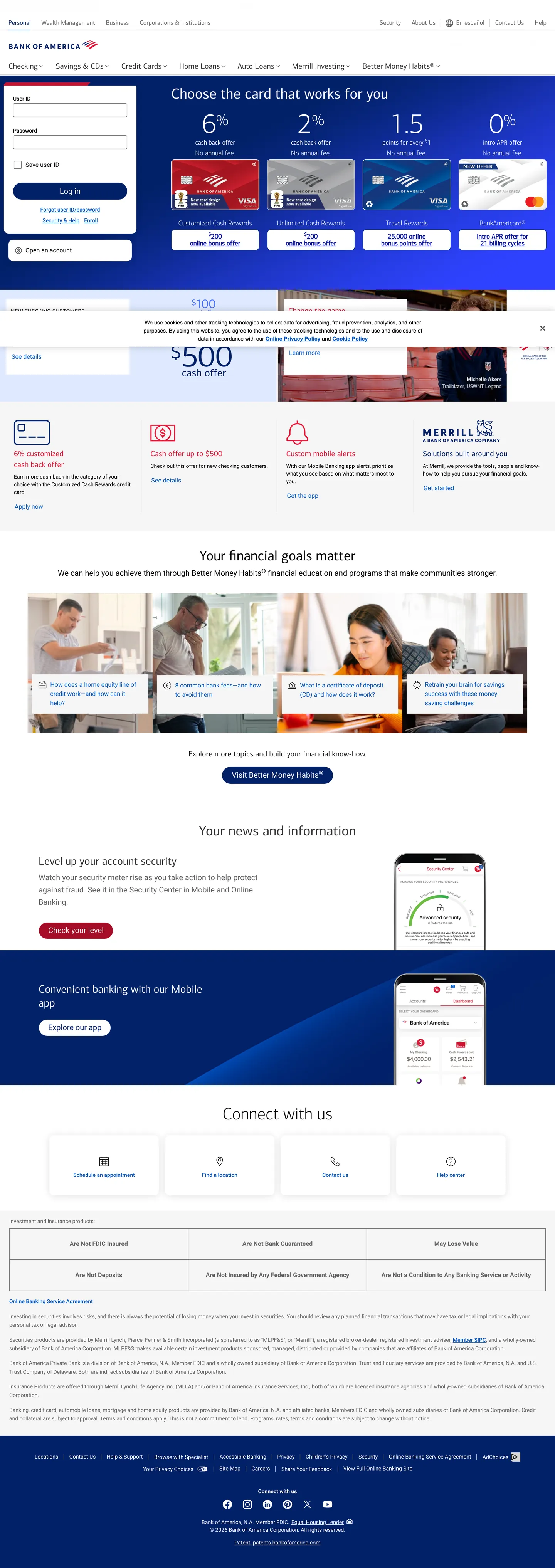
Bank of America's marketing site is a document, not a campaign. The page opens with a dense product-card grid showing credit card offers side by side — APR rates, sign-up bonuses, card names — before a headline appears. This sequence inverts every contemporary landing-page convention: where fintech brands lead with a mission statement and defer product details, BofA leads with the product and assumes the visitor already knows what a bank does. The result is a page that reads like a well-organized financial portal rather than a brand statement, a deliberate choice for an institution where 40+ million households already carry some relationship.
The DESIGN.md file packages 14 colors tokens grounded in the extraction — five neutrals covering the near-black ink ladder (#222222, #333333, #646464), two blues (azure #0053c2 and navy #012169) as the structural interactive and the deep brand tone, flag-red (#e31837) as a confined accent, and three whites (pure #ffffff plus two light grays). Typography runs 13 tokens across two families: CNX (a proprietary BofA humanist sans) for marketing display and headers, and Roboto for all functional UI — form labels, body paragraphs, navigational elements. Components total 17 definitions, including the 22px pill-shaped login button, the credit card feature grid, and the site-wide login panel.
Feed this file to Claude or Cursor and it reproduces the institutional specificity: near-black ink instead of true black, azure reserved exclusively for text and borders (never as a background fill in the marketing surface), flag-red confined to the logo zone, and CNX at 38–44px / weight 300–400 for all display headings. The one design move worth studying is the absence of decorative density reduction — BofA does not add whitespace to appear contemporary, and the grid's information density is a feature, not a limitation.
What makes it distinct
5
- Dual proprietary typefacesCNX (a custom humanist sans for headlines) and Roboto (for UI labels and body copy) create a hard boundary between marketing and functional surfaces
- 2px dominant radiusthe most frequent border-radius in the extraction (18 occurrences) signals a traditional banking aesthetic that has not adopted consumer-app rounding conventions
- Azure as interactive anchor#0053c2 appears 62 times in text (31) and border (31), carrying every link, nav item, and focus indicator without ever appearing as a background fill in the marketing surface
- Flag-red contained to logo and alerts#e31837 appears 10 times but exclusively in the logomark and contextual alert callouts; it never decorates marketing copy
- Information density over whitespacethe page alternates between dense card grids and wide editorial bands, with minimal blank breathing room between sections
bankofamerica.com
Live at bankofamerica.com
A snapshot of the brand in production. Scroll the frame to see the whole page.
Colors
14 colors
Bank of America's system runs on #0053c2 as its primary voltage, used in 2 of 16 components. Type is set in cnx-regular across 13 tokens from 14px to 44px, weights 300–600. Shape language is mixed across 16 components, blending pills, soft rounds, and squarer corners.
Surface
Page and card backgrounds · 2
Text
Headlines, body, captions · 4
Other
Specialty colors · 8
Typography
13 type tokens
Set in cnx-regular across 13 tokens, from 14px to 44px, weights 300–600. Shown in its own stack: where the font isn't installed, the fallback the file names stands in.
- display-xl44px · weight 400 · lh 61.6pxThe quick brown fox jumps over the lazy dog
- display-lg38px · weight 300 · lh 41.8pxThe quick brown fox jumps over the lazy dog
- heading-md22px · weight 400 · lh 26.4pxThe quick brown fox jumps over the lazy dog
- heading-sm17px · weight 600 · lh 18pxThe quick brown fox jumps over the lazy dog
- body-xl20px · weight 400 · lh 32pxThe quick brown fox jumps over the lazy dog
- body-lg20px · weight 400 · lh 28pxThe quick brown fox jumps over the lazy dog
- body-md16px · weight 400 · lh 24pxThe quick brown fox jumps over the lazy dog
- body-sm14px · weight 400 · lh 20pxThe quick brown fox jumps over the lazy dog
- label-bold16px · weight 400 · lh 24pxThe quick brown fox jumps over the lazy dog
- label-sm14px · weight 400 · lh 16pxThe quick brown fox jumps over the lazy dog
- label-medium14px · weight 500 · lh 20pxThe quick brown fox jumps over the lazy dog
- nav-link16px · weight 400 · lh 24pxThe quick brown fox jumps over the lazy dog
- button-md20px · weight 500 · lh 20pxThe quick brown fox jumps over the lazy dog
Layout
Radii and spacing
7 corner radii and 9 spacing values. Shape language: mixed.
Radii
- none0px
- xs2px
- sm4px
- md8px
- lg10px
- xl12px
- pill22px
Spacing
- xs2px
- sm4px
- base8px
- md12px
- lg15px
- xl16px
- 2xl28px
- 3xl32px
- section50px
Components
16 components
Each rendered from its tokens (color, type, radius, padding) on Bank of America's own canvas.
- Button Primarybutton-primaryButton Primary
- Button Secondarybutton-secondaryButton Secondary
- Button Ghostbutton-ghostButton Ghost
- Top Navtop-navTop Nav
- Nav Linknav-linkNav Link
- Nav Link Activenav-link-activeNav Link Active
- Hero Headinghero-headingHero Heading
- Section Headingsection-headingSection Heading
- Section Heading Whitesection-heading-whiteSection Heading White
- Body Paragraphbody-paragraphBody Paragraph
- Body Paragraph Mutedbody-paragraph-mutedBody Paragraph Muted
- CardcardCard
- Card Bluecard-blueCard Blue
- Feature Gridfeature-gridFeature Grid
- Type here…text-inputText Input
- FooterfooterFooter
In use
The system, in use
Bank of America's tokens on the kind of product it builds.
Build something people actually use.
A short paragraph of marketing copy that previews how the brand's display tier and body tier read together. Two sentences is usually enough.
FAQ
Bank of America design system FAQ
Common questions about Bank of America's tokens, components, and how to use this DESIGN.md in your project.
Read next
Related reading
Specs, directories, and component libraries that pair with this design system.
- Browse all design systemsThe full directory of DESIGN.md files on shadcn.io, with live mockups for each.shadcn.io
- Bank of America — official siteBank of America's public marketing site — the source of truth for the live tokens captured in this file.bankofamerica.com (opens in a new tab)
- The DESIGN.md specificationGoogle Labs' open spec for machine-readable design system files — the format this page is built on.github.com (opens in a new tab)
Use it
Use Bank of America in your project
One machine-readable file. Drop it into Claude, Cursor, or any AI tool that reads DESIGN.md.
Download the DESIGN.md
One machine-readable file: every color, type, radius, spacing, and component token of Bank of America.
Feed it to your AI tool
Drop it into Claude, Cursor, or GitHub Copilot. The agent writes React components and Tailwind classes that match Bank of America's visual language.
Reference the tokens directly
Or paste the values into your Tailwind config, CSS variables, or component library: every color, size and radius is a quoted, ready-to-copy value.
Read the full DESIGN.md: overview, rationale, do’s and don’ts
Overview
Bank of America's marketing site refuses to perform modernity. Institutional density: the page opens not with a hero headline but with a grid of credit card product cards, each displaying APR rates, sign-up bonus amounts, and card tier names in small Roboto type. A headline appears only after the card grid. This sequencing — product before brand story — distinguishes BofA from every robo-advisor and neobank in the directory, and it is a deliberate choice for an institution where most visitors arrive with a specific product inquiry rather than a brand discovery intent.
The color system is a study in bounded roles. Azure (#0053c2) appears 62 times in text and border roles, carrying every interactive link and navigation label — but zero times as a background fill in the marketing surface. Flag-red (#e31837) appears 10 times in the logo zone and contextual alert callouts but never in marketing copy or buttons. Deep navy (#012169) carries authentication surfaces and footer backgrounds. Where Betterment uses midnight navy as a hero canvas, BofA uses it only for the login panel and footer — the functional surfaces — while keeping the main marketing floor on pure white. The color separation is institutional: brand colors are identity marks, not decorative fills.
Typography follows the same institutional logic. CNX (a custom humanist sans commissioned for BofA's 2012 rebrand) handles all marketing display text — headlines at 38–44px in weight 300–400. Roboto handles all functional UI text — form labels, button labels, body paragraphs. The boundary is hard: CNX does not appear in navigation or forms, Roboto does not appear in marketing headlines.
Key Characteristics:
- Azure (
{colors.azure}— #0053c2): frequency 62, exclusively as text (31) and border (31). Zero background fills in the marketing surface. The interactive anchor that never becomes a canvas. - Flag-red (
{colors.flag-red}— #e31837): frequency 10, confined to logo zone and alert callouts. Never on marketing copy or button fills. - Near-black ink (
{colors.ink}— #222222): frequency 500 — text (258), border (242). Not pure black — a dark gray that softens the high-contrast banking aesthetic. - CNX display / Roboto function — a hard family boundary between marketing surfaces and interactive surfaces.
- 2px dominant radius (18 occurrences) — the minimum rounding that reads as intentional rather than absent.
- Information-density model: the hero section yields to a product comparison grid above the first fold.
- Deep navy (
{colors.navy}— #012169) reserved for authentication and footer surfaces only.
Colors
Interactive
- Azure (
{colors.azure}— #0053c2): frequency 62 — text (31), border (31). The load-bearing interactive color: every hyperlink, navigation label, focus indicator, and inline call-to-action runs in this value. It never fills a button or section background in the captured marketing surface — it is a text-and-border-only token at this surface level. - Cobalt (
{colors.cobalt}— #0d1ba7): frequency 4, all as text. A slightly more saturated deep blue that appears in product illustration overlays and icon fills.
Brand Identity
- Navy (
{colors.navy}— #012169): frequency 19 — text (6), border (10), bg (3). The institutional brand navy — fills the login button, the authentication form, and the footer. Wired as the primary CTA background. - Flag-red (
{colors.flag-red}— #e31837): frequency 10 — text (5), border (5). Confined to the logomark, promotional badge callouts, and contextual alert indicators. Never decorative. - Flag-red Dark (
{colors.flag-red-dark}— #c41230): frequency 1, bg only. The dark brand-red variant — appears as a hover-state or darker badge background. - Flag-red Deeper (
{colors.flag-red-deeper}— #a50e28): frequency 1, bg only. The deepest red value in the brand spectrum. - Sky (
{colors.sky}— #0073cf): frequency 1, bg only. A lighter blue used for a product-section illustration background accent.
Surface
- Canvas (
{colors.canvas}— #ffffff): frequency 358 — text (166), bg (36), border (156). The page floor. The dominant surface — pure white, no warm or cool offset. - Surface-1 (
{colors.surface-1}— #d5d5d5): frequency 1, bg only. The light gray used for divider rules and secondary surface fills.
Text
- Ink (
{colors.ink}— #222222): frequency 500 — text (258), border (242). The dominant ink. Not pure black — a dark near-black that softens the visual intensity slightly. - Ink Secondary (
{colors.ink-secondary}— #333333): frequency 60 — text (37), border (23). The secondary text tone for supporting body copy. - Ink Muted (
{colors.ink-muted}— #646464): frequency 72 — text (38), border (34). Caption and metadata tone — regulatory disclosure text, card fine print. - Ink Light (
{colors.ink-light}— #555555): frequency 2. A mid-range gray for secondary structural elements.
Shadow
- Shadow Gray (
{colors.shadow-gray}— #919191): frequency 1, shadow only. The single shadow value captured in the extraction — used for subtle card-elevation halos.
Typography
Font Families
The system enforces a strict two-family functional split: CNX (Bank of America's custom humanist sans, commissioned from Dalton Maag in 2012) handles all marketing display and heading text, with three weight variants: cnx-light (used at 44px for the hero heading), cnx-regular (38px for marketing h2s, 16–20px for section leads), and cnx-medium (22px for sub-headings). Roboto handles all functional UI text: form labels, body paragraphs, button labels, navigation items. roboto-regular for standard text, roboto-bold for list items, roboto-medium for links and interactive labels. The family boundary is unambiguous: CNX does not appear in navigation or forms; Roboto does not appear in marketing headlines.
Hierarchy
| Token | Size | Weight | Line Height | Letter Spacing | Use |
|---|---|---|---|---|---|
{typography.display-xl} | 44px | 400 | 61.6px | 0 | Hero h2 ("Connect with us", "Your financial goals matter") — CNX Light |
{typography.display-lg} | 38px | 300 | 41.8px | 0 | Section h2 ("Choose the card that works for you") — CNX Regular at weight 300 |
{typography.heading-md} | 22px | 400 | 26.4px | 0 | Sub-section headings — CNX Medium |
{typography.heading-sm} | 17px | 600 | 18px | 0 | Card headings and feature labels — CNX Regular semibold |
{typography.body-xl} | 20px | 400 | 32px | 0 | Intro paragraph text — CNX Regular |
{typography.body-lg} | 20px | 400 | 28px | 0 | Section lead paragraphs |
{typography.body-md} | 16px | 400 | 24px | 0 | Default Roboto body text |
{typography.body-sm} | 14px | 400 | 20px | 0 | Secondary body text and captions — Roboto |
{typography.label-bold} | 16px | 400 | 24px | 0 | List items — Roboto Bold |
{typography.label-sm} | 14px | 400 | 16px | 0 | Small form labels and spans — Roboto |
{typography.label-medium} | 14px | 500 | 20px | 0 | Link and interactive labels — Roboto Medium |
{typography.nav-link} | 16px | 400 | 24px | 0 | Top-nav links — CNX Regular |
{typography.button-md} | 20px | 500 | 20px | 0 | Primary button label — Roboto |
Principles
CNX runs at weight 300–400 for all display text — the lightest weight tier in the system. This is the same "confidence through restraint" move that Cloudflare makes at weight 500 and Stripe makes at weight 300, but BofA lands in the middle. The 44px hero heading at CNX Light (weight 400 rendering as approximately 300) produces a display that is authoritative through sheer size, not through weight. Roboto's functional role means that every interactive element — buttons, links, inputs — renders in a different family than the marketing copy; the boundary signals that "this is where brand ends and product begins."
Note on Font Substitutes
CNX is proprietary and not publicly available. Nunito Sans or Source Sans 3 (both Google Fonts) carry similar humanist proportions at display sizes; Trebuchet MS (system-available) is a closer historical match. Roboto is a Google Font and freely available everywhere.
Layout
Spacing System
- Base unit: 8px.
- Tokens:
{spacing.xs}2px ·{spacing.sm}4px ·{spacing.base}8px ·{spacing.md}12px ·{spacing.lg}15px ·{spacing.xl}16px ·{spacing.2xl}28px ·{spacing.3xl}32px ·{spacing.section}50px. - Section vertical padding: ~50px between major section bands.
- Card padding: 16×12px on product card grids, 28×16px on feature blue cards.
- Nav padding: 12px top / 8px horizontal — a tight, information-dense nav row.
Grid & Container
- Max content width: 1392px — wider than most fintech brands, reflecting the information-dense product grid.
- Hero / login panel: the top of the page holds the login form inline at desktop width rather than in a modal, with the credit card grid immediately below.
- Credit card grid: 4-up product card row at desktop, showing card name, APR, bonus, and CTA per card.
- Feature grid: 3-up or 4-up icon-plus-label grid for banking services (checking accounts, savings, mortgages, wealth management).
Rhythm
The page stacks functional bands without generous breathing room: login panel → card comparison grid → product categories → editorial "your financial goals" → app feature → connect section → footer. No section uses a significant gap — the 50px section padding is the maximum spacing token, and the page reads as a continuous document rather than an open-canvas marketing sequence.
Elevation
The elevation model is hairline-plus-tonal, with minimal shadow use. The dominant border token is {colors.surface-1} (#d5d5d5) used as a light gray card outline on the white canvas. Shadow gray (#919191) appears exactly once as a shadow value — a subtle halo on the primary authentication form. There are no colored shadows (no navy offsets, no brand-tinted depth), and no tonal lift technique (no surface-2 elevation layer). Depth in the product grid comes entirely from the 1px gray hairline border separating cards on a white background.
Shapes
The radius scale is minimal-utility, anchored at 2px:
{rounded.none}0px — section backgrounds, full-bleed feature bands.{rounded.xs}2px — dominant rounding (18 occurrences): form inputs, product cards, navigation items. The minimum rounding that reads as intentional.{rounded.sm}4px — (3 occurrences): larger interactive chips and some secondary card containers.{rounded.md}8px — (4 occurrences): search inputs and selected product card surfaces.{rounded.lg}10px — (4 occurrences): feature illustration containers.{rounded.xl}12px — (7 occurrences): card containers in the financial-goals section.{rounded.pill}22px — (4 occurrences): the login button and primary CTA pill shapes.
The gap between 2px cards and 22px CTAs is the system's only radius contrast. The login and primary action buttons are the rounded elements; everything informational is square.
Components
button-primary — Deep navy {colors.navy} fill, white text, {rounded.pill} 22px radius, 8×24px padding, 44px height. The login button is the canonical instance — a rounded pill on a field of navy.
button-secondary — White {colors.canvas} fill, azure {colors.azure} text, 1px azure border, {rounded.xs} 2px radius. The default inline CTA for product offers and comparison sections.
button-ghost — Transparent fill, azure text, no border. Used for inline text links that need button affordance without visual weight.
top-nav — Navy {colors.navy} surface at the very top, with the BofA eagle/flag logo, primary account navigation, and a search input. Below that, a white secondary nav with the product category tabs.
nav-link — Transparent background, navy {colors.navy} text at {typography.nav-link}, 12×8×8px padding, 46px height. Tab-style active state uses a bottom navy border-bottom indicator.
hero-heading — Near-black {colors.ink} text, {typography.display-xl} (44px / CNX Light). Appears on the editorial mid-page sections ("Your financial goals matter," "Connect with us") rather than at the very top of the page.
section-heading — Near-black text, {typography.display-lg} (38px / CNX Regular at weight 300). The product section headers ("Choose the card that works for you").
section-heading-white — White {colors.canvas} text, same typography. Used on the navy and cobalt-background feature sections.
body-paragraph — Near-black text, Roboto 16px / 400, standard body copy.
body-paragraph-muted — Muted gray {colors.ink-muted} (#646464), Roboto 14px / 400. Regulatory disclosure text, secondary card details.
card — White surface, light gray {colors.surface-1} border, {rounded.xl} 12px radius, 16×12px padding. The product feature card used in the financial goals section.
card-blue — Navy {colors.navy} fill, white text, {rounded.xl} 12px radius, 28×16px padding. The Merrill investment card — the only dark-surface card in the marketing section.
feature-grid — White surface, light gray border, {rounded.xs} 2px radius, 15px padding. The dense product grid used for credit card comparisons — 4 cards side by side with APR, bonus, and CTA per card.
text-input — White surface, dark ink text, {rounded.sm} 4px radius, muted gray border, 36px height. The inline search input in the top navigation uses an extended right padding (100px) to accommodate the submit button.
footer — Navy {colors.navy} surface, white text, {typography.body-sm} Roboto, 32×16px padding. Multi-column link grid with regulatory disclosures below.
Do's and Don'ts
Do use {colors.azure} (#0053c2) only for text and border roles. It appears 62 times in the extraction with zero background-fill occurrences in the marketing surface — using it as a button background or section fill violates the system's semantic role separation.
Do use {colors.navy} (#012169) for authentication and CTA-button fills only. It is not a marketing canvas color; applying it to editorial section backgrounds creates a tone the system does not support.
Do maintain the CNX / Roboto family boundary. CNX should not appear in form labels or button text; Roboto should not appear in marketing headlines. When the two families appear on the same surface, each signals its domain.
Do use {rounded.xs} (2px) as the default rounding for cards and inputs. Rounding up to 8–12px to feel more contemporary breaks the institutional signal that makes the 22px pill button stand out as the single warm interactive element.
Don't use {colors.flag-red} (#e31837) for marketing copy highlights, heading accents, or button fills. It appears in the logo zone and contextual alerts only; applying it decoratively reads as a warning signal rather than a brand emphasis.
Don't add whitespace between sections to make the page feel more spacious. The 50px section padding ({spacing.section}) is the system's maximum; increasing it undermines the information-density model that the page's returning-user audience relies on.
Don't apply shadows to product cards. The system uses hairline borders ({colors.surface-1}) rather than elevation shadows for card separation; adding box-shadows imports a visual convention from a different design system category.
Don't render display headlines in Roboto. CNX carries the institutional marketing voice — using Roboto at 38–44px reads as a system error rather than a stylistic choice.
Known Gaps
- Hover and focus states: the resting state is captured throughout; the nav tab active-indicator (a bottom-border in navy) is documented, but hover fills, input focus rings, and button active-press states are not captured.
- Mobile layout: the 1440px extraction captures desktop only; the mobile nav (likely a hamburger-to-drawer), responsive card grid collapsing, and mobile login form layout are not documented.
- Authenticated product surfaces: the online banking dashboard, transaction history, and account management screens have a substantially different visual system (higher density, tabular data components, chart elements) not captured here.
- Credit card illustration system: the card-art illustrations (actual credit card designs with their visual motifs) are product-surface items, not design-system tokens, and are not documented.
- Merrill Lynch / Merrill Edge sub-brand: the Merrill investment platform uses its own type and color conventions on sub-pages; this file captures only the BofA primary marketing surface.
- Accessibility compliance patterns: BofA is subject to ADA compliance requirements; the focus ring implementation, ARIA patterns, and keyboard-navigation design are not documented from the marketing surface alone.
Banking & Payments
More systems like this
More DESIGN.md files in Banking & Payments.
Pricing
Build it with Pro
The DESIGN.md files are free. Pro adds 6,000+ blocks, premium templates and the MCP server, so your AI editor builds in your system for you.
4.9/5 out of 5 · 150+ reviewsfrom 150+ founders and developers.
Billing
Billed once a year in USD. Cancel anytime.
- How many people can use the license.
- Client work, SaaS products and anything you charge for.
- Production-ready React sections: hero, pricing, features, dashboards and more.
- Complete multi-page sites you can ship as they are.
- React icons from every major library, installable with one command.
- Presets that restyle every block, in light and dark.
- Lets your AI editor search, preview and install blocks for you.
- Priority requests are answered first.
Individual
For personal projects & open source
$32instead of $49/mo
$389 billed yearly
- Seats: 1 seat
- Commercial use: Personal & open source only
- Pro blocks: 6,000+ blocks
- Templates: All 14 templates
- React icons: 294k+ icons
- Themes: All 59 themes
- MCP server: Basic usage
- Support: Standard
Team
Most popularFor freelancers, agencies & startups
$66instead of $99/mo
$789 billed yearly · ≈ $13/dev/mo
- Seats: Up to 5 seats
- Commercial use: Included
- Pro blocks: 6,000+ blocks
- Templates: All 14 templates
- React icons: 294k+ icons
- Themes: All 59 themes
- MCP server: High usage
- Support: Priority
Organization
For companies with larger teams
$132instead of $199/mo
$1,589 billed yearly
- Seats: Unlimited seats
- Commercial use: Included
- Pro blocks: 6,000+ blocks
- Templates: All 14 templates
- React icons: 294k+ icons
- Themes: All 59 themes
- MCP server: Unlimited usage
- Support: Priority
Billed once a year in USD. Cancel anytime.
Individual
For personal projects & open source
$32instead of $49/mo
$389 billed yearly
- How many people can use the license.Seats: 1 seat
- Client work, SaaS products and anything you charge for.Commercial use: Personal & open source only
- Production-ready React sections: hero, pricing, features, dashboards and more.Pro blocks: 6,000+ blocks
- Complete multi-page sites you can ship as they are.Templates: All 14 templates
- React icons from every major library, installable with one command.React icons: 294k+ icons
- Presets that restyle every block, in light and dark.Themes: All 59 themes
- Lets your AI editor search, preview and install blocks for you.MCP server: Basic usage
- Priority requests are answered first.Support: Standard
Team
Most popularFor freelancers, agencies & startups
$66instead of $99/mo
$789 billed yearly · ≈ $13/dev/mo
Everything in Individual, plus
- How many people can use the license.Seats: Up to 5 seats
- Client work, SaaS products and anything you charge for.Commercial use: Included
- Lets your AI editor search, preview and install blocks for you.MCP server: High usage
- Priority requests are answered first.Support: Priority
Organization
For companies with larger teams
$132instead of $199/mo
$1,589 billed yearly
Everything in Team, plus
- How many people can use the license.Seats: Unlimited seats
- Lets your AI editor search, preview and install blocks for you.MCP server: Unlimited usage
- Secure checkout via Stripe
- Code lives in your repo
- Keep what you've shipped if you cancel
- License terms
Your system, built for you
Every block, template and icon, installed by your AI agent in your design system. The DESIGN.md files stay free.