Brex Design System
Brex's design system as a DESIGN.md file. Warm orange #ff5900, Inter 500, 19 colors, 17 components. For React, Next.js, and AI tools.
Add shadcn.io to your AI agent. · Pro It installs blocks, icons and templates in your design system from a prompt, with Pro.
Set up MCP- Primary
- #ff5900
- Typeface
- inter
- Shape
- Mixed
- Base radius
- 10px
- Colors
- 19
- Type tokens
- 12
- Components
- 17
- Spacing values
- 9
About
About Brex DESIGN.md
Curated by Dov Azencot · Updated May 13, 2026 · Source brex.com (opens in a new tab)
Brex's marketing surface is the warmest of the current fintech category. Where Stripe carries indigo `#533afd`, Ramp carries lime, and Mercury carries near-monochrome — Brex commits to a single warm orange `#ff5900` as the sole filled-CTA voltage. The hex hits the page in just three background spots (the "Get started" button, an inline accent dot, and a hover-reveal underline), but every primary action across every band rides that one color. Beneath it sits a near-black ink `#15191e` for type and an off-white canvas `#fcfcfd` for surface — the chromatic system has only one accent and it earns the contrast.
This page packages the full system into a single DESIGN.md file. Inside: 19 colors, 12 type tokens, 5 corner radii, 9 spacing values, and 17 components — primary and secondary buttons, a 60px sticky top-nav with a `--brex-nav-height` token, feature cards with `rgba(66,87,138,0.15)` cool-blue hairlines, the cream-card surface, a 36px-tall text-input, and the eyebrow-cap label pattern with `0.05em` letter-spacing and uppercase text-transform. Every hex is quoted; every token name traces back to a Brex `--_1k5xs26*` CSS custom property captured live from the homepage.
Feed the file to Claude, Cursor, or GitHub Copilot. The AI writes React components and Tailwind classes that match Brex's warm-orange-anchored hierarchy — single-voltage CTA placement, Inter weight-500 display, 10px-radius pill geometry, cool-blue hairlines, the 8/24/72px spacing rhythm — instead of a generic fintech theme. Where most spend-management tools default to bold-weight display headlines at 600 or 700, Brex commits its entire 14–72px display tier to weight 500 — the result reads architectural rather than aggressive.
What makes it distinct
5
- Warm orange CTA voltage`#ff5900` is the only filled button color, three background appearances against forty text/border uses
- Inter weight-500 display architecturethe entire 14–72px display tier renders at one weight with negative tracking from -0.14px to -1.44px
- Tight 10px-radius pill button36px tall, 12px horizontal padding, no shadow on rest, the brand's whole transactional surface
- Cool-blue hairline border`rgba(66,87,138,0.15)` edges every card and input, a chromatic counterpoint to the warm orange
- Three-family typographic chordInter for product chrome, Flecha for editorial serif moments, Space Mono for numeric callouts
brex.com
Live at brex.com
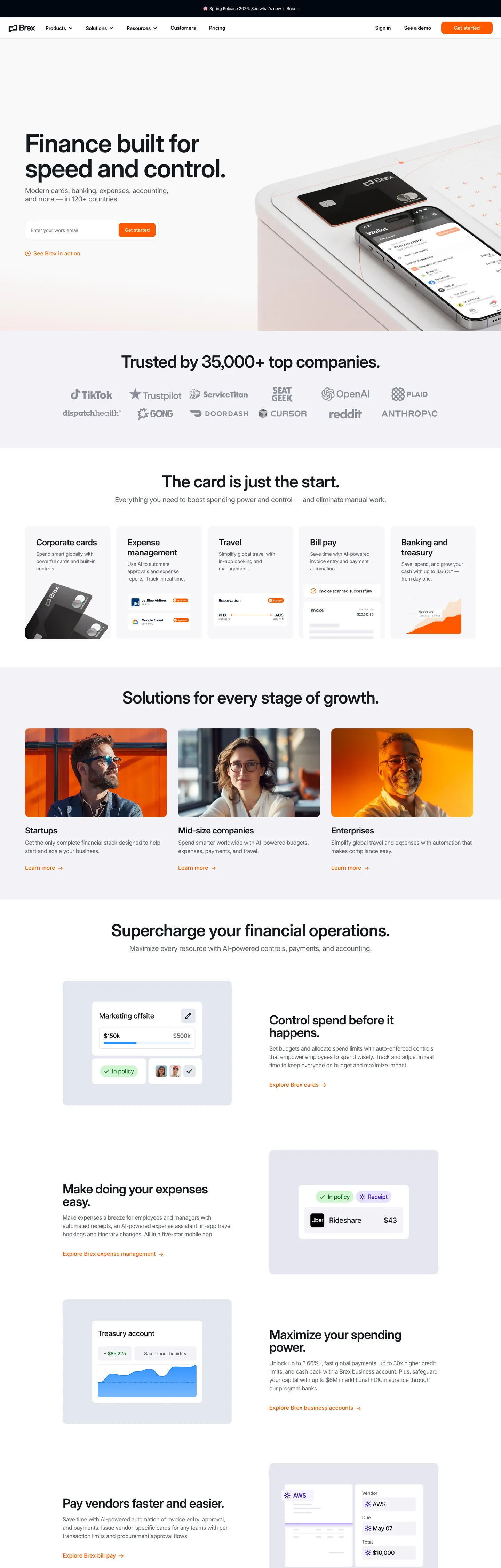
A snapshot of the brand in production. Scroll the frame to see the whole page.
Colors
19 colors
Brex's system runs on #ff5900 as its primary voltage, used in 2 of 17 components. Type is set in inter across 12 tokens from 12px to 72px, weights 400–500. Shape language is mixed across 17 components, blending pills, soft rounds, and squarer corners.
Brand & Accent
Sparing, CTA-only voltage · 1
Surface
Page and card backgrounds · 2
Text
Headlines, body, captions · 6
Borders & Hairlines
Dividers, outlines, rules · 6
Other
Specialty colors · 4
Typography
12 type tokens
Set in inter across 12 tokens, from 12px to 72px, weights 400–500. Shown in its own stack: where the font isn't installed, the fallback the file names stands in.
- display-xxl72px · weight 500 · lh 1 · tracking -1.44pxThe quick brown fox jumps over the lazy dog
- display-xl48px · weight 500 · lh 1 · tracking -0.96pxThe quick brown fox jumps over the lazy dog
- display-lg36px · weight 500 · lh 1 · tracking -0.72pxThe quick brown fox jumps over the lazy dog
- display-md24px · weight 500 · lh 1.21 · tracking -0.48pxThe quick brown fox jumps over the lazy dog
- display-md-serif36px · weight 500 · lh 1.11The quick brown fox jumps over the lazy dog
- heading-md20px · weight 500 · lh 1.2 · tracking -0.4pxThe quick brown fox jumps over the lazy dog
- body-lg16px · weight 400 · lh 1.5 · tracking -0.32pxThe quick brown fox jumps over the lazy dog
- body-md14px · weight 400 · lh 1.5 · tracking -0.28pxThe quick brown fox jumps over the lazy dog
- body-sm12px · weight 400 · lh 1.5 · tracking -0.24pxThe quick brown fox jumps over the lazy dog
- label-cap12px · weight 500 · lh 1.5 · tracking 0.6pxThe quick brown fox jumps over the lazy dog
- button-md14px · weight 400 · lh 1.57The quick brown fox jumps over the lazy dog
- mono-callout14px · weight 400 · lh 1.5The quick brown fox jumps over the lazy dog
Layout
Radii and spacing
5 corner radii and 9 spacing values. Shape language: mixed.
Radii
- none0px
- sm6px
- md10px
- lg12px
- full9999px
Spacing
- xxs2px
- xs4px
- sm8px
- md12px
- base16px
- lg24px
- xl32px
- 2xl48px
- 3xl72px
Components
17 components
Each rendered from its tokens (color, type, radius, padding) on Brex's own canvas.
- Button Primarybutton-primaryButton Primary
- Button Primary Hoverbutton-primary-hoverButton Primary Hover
- Button Secondarybutton-secondaryButton Secondary
- Button On Darkbutton-on-darkButton On Dark
- Type here…text-inputText Input
- Type here…text-input-focusedText Input Focused
- Top Navtop-navTop Nav
- Card Featurecard-featureCard Feature
- Card Feature Shadowcard-feature-shadowCard Feature Shadow
- Card Darkcard-darkCard Dark
- Hero Sectionhero-sectionHero Section
- Eyebrow Labeleyebrow-labelEyebrow Label
- Announcement Pillannouncement-pillAnnouncement Pill
- Link On Lightlink-on-lightLink On Light
- Divider Hairlinedivider-hairlineDivider Hairline
- Footer Darkfooter-darkFooter Dark
- Mono Amountmono-amountMono Amount
In use
The system, in use
Brex's tokens on the kind of product it builds.
Build something people actually use.
A short paragraph of marketing copy that previews how the brand's display tier and body tier read together. Two sentences is usually enough.
FAQ
Brex design system FAQ
Common questions about Brex's tokens, components, and how to use this DESIGN.md in your project.
Read next
Related reading
Specs, directories, and component libraries that pair with this design system.
- Browse all design systemsThe full directory of DESIGN.md files on shadcn.io, with live mockups for each.shadcn.io
- Brex — official siteBrex's finance-software platform for company cards, banking, expenses, and accounting.brex.com (opens in a new tab)
- The DESIGN.md specificationGoogle Labs' open spec for machine-readable design system files — the format this page is built on.github.com (opens in a new tab)
Use it
Use Brex in your project
One machine-readable file. Drop it into Claude, Cursor, or any AI tool that reads DESIGN.md.
Download the DESIGN.md
One machine-readable file: every color, type, radius, spacing, and component token of Brex.
Feed it to your AI tool
Drop it into Claude, Cursor, or GitHub Copilot. The agent writes React components and Tailwind classes that match Brex's visual language.
Reference the tokens directly
Or paste the values into your Tailwind config, CSS variables, or component library: every color, size and radius is a quoted, ready-to-copy value.
Read the full DESIGN.md: overview, rationale, do’s and don’ts
Overview
Brex's marketing surface opens with a contradiction: a financial-software brand that picks a warm orange #ff5900 over the category-default cool indigo or fintech navy. The hex hits the page in just three background spots — the "Get started" hero CTA, an inline accent on the announcement pill, and a hover-reveal underline — but every primary action across every section rides that one warm voltage. Beneath the orange sits a near-black ink #15191e for type and an off-white canvas #fcfcfd for surface. The palette runs disciplined: 18 documented tokens total, one accent, six neutrals, four hairline alphas, three shadow alphas.
Warm voltage is the brand's signature move. Where Stripe carries electric indigo, Ramp carries lime, and Mercury carries near-monochrome restraint, Brex commits to a single saturated red-orange and lets it carry the page alone. The supporting cast is intentionally cool: hairlines render in rgba(66,87,138,0.15) (a desaturated blue at 15% alpha), the dark footer band fills with pure #000000, and shadows wash in rgba(16,24,40,0.05–0.16) (cool slate). The page therefore reads warm-on-cool — the orange CTA sits at the center of every band, framed by blue-edged cards and slate-shadowed lift.
Weight-500 architecture: the entire display tier (14px through 72px) renders in Inter at weight 500 with proportionally tightening negative letter-spacing — -1.44px at 72px down to -0.14px at 14px. The 72px hero "Finance built for speed and control." sits at one weight; the 48px section openers sit at the same weight; the 36px card titles sit at the same weight. Where most spend-management marketing climbs to weight 600 or 700 for display impact, Brex holds the entire ladder at 500 — confidence through consistent mid-weight rather than bold-weight muscle. A serif (Flecha) and a monospaced family (Space Mono) layer in for two specific roles: editorial card titles and numeric callouts.
Key Characteristics:
- Single warm-orange CTA voltage —
#ff5900is the only filled-button color across every marketing band. - Inter weight-500 display tier from 14px to 72px — no weight changes across the ladder, only size and tracking.
- 10px-radius pill button at 36px tall — tight transactional geometry between full-pill (9999px) and technical-square (6px).
- Cool-blue hairline
rgba(66,87,138,0.15)on every card and input — chromatic counterpoint to the warm orange. - Three-family typographic chord — Inter for chrome, Flecha for editorial serif, Space Mono for numeric callouts.
- 60px sticky top nav with
--brex-nav-heighttoken plus acalc(60px + 24px)scroll-padding compensation. - Black
#000000dark band for the announcement bar and footer — pure black, never the near-black#15191eink.
Colors
Source pages: home (
/), announcement band, hero, "Trusted by 35,000+" logo strip, "Card is just the start" feature grid.
Brand & Accent
- Orange (
{colors.primary}—#ff5900) — frequency 85. Used as text (40), border (42), background (3). The brand's single filled-CTA voltage; reserved forbutton-primaryfills, inline link emphasis on hover, and a small accent dot inside the announcement pill.
Text
- Ink (
{colors.ink}—#15191e) — frequency 138. Used as text (71), border (67). The default body-text and heading color across the brand. A near-black with a faint blue undertone (oklch hue 254), warmer than pure black; carries hero, section headlines, and nav-link rest state. - Ink Mute (
{colors.ink-mute}—#60646c) — frequency 44. Used as text (22), border (22). The brand's H2 sub-heading color and helper-text fill (the "Cards, banking, expenses, accounting" sub-headline beneath the hero). - Ink Mute 2 (
{colors.ink-mute-2}—#6f737b) — frequency 15. Used as text (8), border (7). A slightly warmer mid-tone; appears on caption labels and footer-link rest state. - Ink Soft (
{colors.ink-soft}—#8b8d98) — frequency 62. Used as text (31), border (31). Scoped to placeholder text, disabled states, and metadata labels. - Ink Disabled (
{colors.ink-disabled}—#b9bbc6) — frequency 38. Used as text (19), border (19). The disabled-button text color and the lightest still-legible neutral.
Surface
- Canvas (
{colors.canvas}—#fcfcfd) — frequency 78. Used as background (39), text (21), border (18). The default page and card surface — a 0.5%-tinted off-white that reads paper-white but renders softer than pure white (which collapses into the same merged token). - Canvas Deep (
{colors.canvas-deep}—#000710) — frequency 3. Used as background (3). The deep navy-black used as a dashboard-mockup chrome fill and the dark-card surface — distinct from the pure-#000000footer. - Dark Surface (
{colors.dark-surface}—#000000) — frequency 1168. Used as text (585), border (582), shadow (1). Pure black, the dominant chromatic value on the page by raw count — fills the announcement bar, the bottom footer band, andcard-darksurfaces. Despite the high count, never used as primary body text (that role belongs to#15191e).
Hairline & Edge
- Hairline (
{colors.hairline}—#42578a) — frequency 3. Used as border (2), shadow (1). The full-saturation cool blue from which the alpha-15% hairline derives. - Hairline Soft (
{colors.hairline-soft}—rgba(66,87,138,0.15)). Used as the default 1px border on cards, inputs, and modal chrome — the brand's signature cool-blue edge against the warm orange CTA. - Hairline Cool (
{colors.hairline-cool}—rgba(21,25,30,0.1)). Used on darker surfaces where the blue alpha would disappear; a 10%-alpha near-black hairline. - Hairline Cool 3 (
{colors.hairline-cool-3}—rgba(21,25,30,0.3)). A heavier hairline used on focused-input borders and table dividers. - Hairline Cool 4 (
{colors.hairline-cool-4}—rgba(21,25,30,0.4)). The strongest documented hairline alpha, reserved for hover-state borders on dense table chrome.
Shadow
- Shadow SM (
{colors.shadow-sm}—rgba(16,24,40,0.05)). The lightest documented shadow alpha; combined with two other stops to form the restingcard-feature-shadow. - Shadow MD (
{colors.shadow-md}—rgba(16,24,40,0.09)). The middle alpha used as the dominant blur in card lifts. - Shadow LG (
{colors.shadow-lg}—rgba(16,24,40,0.16)). The heaviest documented alpha, used on floating panels and modal chrome. - Shadow Hairline (
{colors.shadow-hairline}—rgba(16,24,40,0.04)). A 1px inset shadow that doubles as a faint hairline on shadowed cards.
Typography
Font Family
The chrome and product tier is Inter at weights 400 and 500 — declared as 'inter', 'inter Fallback', -apple-system, BlinkMacSystemFont, Helvetica, Arial, sans-serif. The hero, every section heading, every body paragraph, every nav link, and every button label renders in Inter.
Two secondary families layer in:
- Flecha (proprietary serif via
--font-flecha) — used for editorial card titles where the brand wants a softer voice. A single instance captured on the homepage: a 36px / 500 / 1.11 leading h4 in the feature grid. - Space Mono (loaded via
--font-space-mono) — used in numeric callouts, account-number chips, and code-style amount displays. The monospaced rhythm reinforces the financial-data signal where columns of numbers need to align.
Hierarchy
| Token | Family | Size | Weight | Line Height | Letter Spacing | Use |
|---|---|---|---|---|---|---|
{typography.display-xxl} | Inter | 72px | 500 | 1.0 | -1.44px | Hero h1 |
{typography.display-xl} | Inter | 48px | 500 | 1.0 | -0.96px | Section h2 opener |
{typography.display-lg} | Inter | 36px | 500 | 1.0 | -0.72px | Card / sub-section h3 |
{typography.display-md} | Inter | 24px | 500 | 1.21 | -0.48px | Compact h3/h4 |
{typography.display-md-serif} | Flecha | 36px | 500 | 1.11 | 0 | Editorial card title |
{typography.heading-md} | Inter | 20px | 500 | 1.2 | -0.4px | H2 sub-heading |
{typography.body-lg} | Inter | 16px | 400 | 1.5 | -0.32px | Default body / nav link |
{typography.body-md} | Inter | 14px | 400 | 1.5 | -0.28px | Card body / form text |
{typography.body-sm} | Inter | 12px | 400 | 1.5 | -0.24px | Caption / announcement |
{typography.label-cap} | Inter | 12px | 500 | 1.5 | 0.6px | Uppercase eyebrow |
{typography.button-md} | Inter | 14px | 400 | 1.57 | 0 | Pill button label |
{typography.mono-callout} | Space Mono | 14px | 400 | 1.5 | 0 | Numeric / code callout |
Principles
- Weight 500 is the display anchor. Every display tier from 24px through 72px renders at weight 500. Dropping to 400 collapses display into body; climbing to 600 breaks the architectural rhythm.
- Negative tracking scales with size.
-1.44pxat 72px,-0.96pxat 48px,-0.72pxat 36px,-0.48pxat 24px,-0.4pxat 20px,-0.32pxat 16px. Body sizes (14px and below) carry tighter ratios that hold up at small render. - Uppercase eyebrows carry positive tracking. The
label-captoken inverts the tracking direction —0.6pxpositive plusuppercasetext-transform — so the all-caps label opens up rather than crunches. - Reserve Flecha for editorial moments. The serif is not a general-purpose heading family; it appears once or twice per page to break the Inter rhythm at a specific feature card.
- Reserve Space Mono for numerics. Account numbers, amounts, transaction codes, and inline code. Not a paragraph face.
Layout
Spacing System
- Base unit: 8px (with 2 / 4 / 12 sub-tokens for fine work).
- Tokens:
{spacing.xxs}2px ·{spacing.xs}4px ·{spacing.sm}8px ·{spacing.md}12px ·{spacing.base}16px ·{spacing.lg}24px ·{spacing.xl}32px ·{spacing.2xl}48px ·{spacing.3xl}72px. - Section padding: 72–80px vertical on marketing surfaces; the captured page hits
80px 0px 48pxas the dominant section rhythm. - Page horizontal padding: 72px outside the 1200px content max — captured as
0px 72px24 times in the extraction. - Card internal padding: 24px on feature cards; 32px on dark and pricing surfaces.
Grid & Container
- Marketing pages center in a ~1200px container (
--_1k5xs26fa: 1200px) with0px 72pxouter gutters. - Hero h1 wraps in a 768px column inside the 1200px container, leaving generous right-rail space for the credit-card mockup.
- Feature grid runs 4-up on desktop, 2-up at tablet, 1-up on mobile.
Whitespace Philosophy
Brex pads generously: 72px between sections, 80px around the hero, 48px between a section heading and its content. The 60px sticky nav plus a calc(60px + 24px) scroll-padding-top compensation (--brex-scroll-padding) means deep-linked anchors always land 84px below the viewport top — the nav never covers a target heading.
Elevation & Depth
| Level | Treatment | Use |
|---|---|---|
| 0 | Flat | Default surface |
| 1 | 0 1px 1px rgba(0,0,0,0.04) | Form-input rest border-equivalent |
| 2 | 0px 1px 1px -2px rgba(16,24,40,0.12), 0px 3px 2px -2px rgba(16,24,40,0.11), 0px 0px 0px 1px rgba(16,24,40,0.04) | Card lift on white |
| 3 | 0px 0px 6px rgba(16,24,40,0.05), 0px 6px 10px -4px rgba(16,24,40,0.1), 0px 0px 2px 1px rgba(16,24,40,0.02) | Feature-card hover lift |
| 4 | 0px 12px 20px -14px rgba(16,24,40,0.09), 0px 4px 12px 2px rgba(16,24,40,0.1), 0px 2px 4px -4px rgba(16,24,40,0.14) | Floating panel, dropdown |
| 5 | 0px 14px 20px -11px rgba(16,24,40,0.16), 0px 6px 20px 4px rgba(16,24,40,0.12), 0px 4px 8px -8px rgba(16,24,40,0.14) | Modal chrome |
Decorative Depth
Brex layers three shadow stops on every elevated card — a tight inner stop (0px 0px 2px 1px) acting as a near-hairline, a soft mid stop (0px 6px 10px -4px) carrying the lift, and an outer stop (0px 0px 6px) softening the edge. The triple-stop approach reads more architectural than the single-blur shadow most card systems use. The cool-blue hairline rgba(66,87,138,0.15) doubles as a flat-state "depth" cue when shadow would feel heavy.
Shapes
Border Radius Scale
| Token | Value | Use |
|---|---|---|
{rounded.none} | 0px | Hero section, eyebrow labels, footer chrome |
{rounded.sm} | 6px | Compact chips, table cells |
{rounded.md} | 10px | Primary button, text input — the signature radius |
{rounded.lg} | 12px | Feature cards, dashboard mockup chrome |
{rounded.full} | 9999px | Announcement pills, avatar chrome |
The brand's signature is the 10px middle radius — between the technical-square 6px and the full-pill 9999px. The primary button, secondary button, and text input all sit at 10px. Feature cards step up one tier to 12px. Pills are reserved for announcement bars and avatars, never buttons.
Components
Buttons
button-primary — the dominant CTA system-wide.
- Background
{colors.primary}(#ff5900), text{colors.canvas}(#fcfcfd), border{colors.primary}. Type{typography.button-md}(Inter 14 / 400 / 22px leading). Rounded{rounded.md}(10px). Padding0px 12px. Height 36px. No rest-state shadow.
button-secondary — outline alternative on light surfaces.
- Background
{colors.canvas}, text{colors.ink}, 1px{colors.hairline-soft}border (no fill). Same geometry as primary.
button-on-dark — primary alternative on the dark announcement bar and footer.
- Background
{colors.dark-surface}(#000000), text{colors.on-dark}(#fcfcfd). Same geometry.
Inputs & Forms
text-input — the work-email and contact-form field.
- Background
{colors.canvas}, text{colors.ink}, 1px{colors.hairline-soft}border. Type{typography.body-md}(Inter 14 / 400 / -0.28px). Rounded{rounded.md}(10px). Padding8px 2px. Height 36px (matches button height for inline pairing). - Focus state
text-input-focusedswaps border to{colors.ink}— no orange focus ring.
Navigation
top-nav — 60px sticky top bar (--brex-nav-height: 60px).
- Background
{colors.canvas}(or transparent over hero), text{colors.ink}, type{typography.body-lg}. Padding0px 24px. Height 60px. Logo wordmark on the left, primary nav center, sign-in link plusbutton-primaryon the right.
Cards & Containers
card-feature — flat hairlined feature card.
- Background
{colors.canvas}, text{colors.ink}, 1px{colors.hairline-soft}border. Padding 24px. Rounded{rounded.lg}(12px). No shadow at rest.
card-feature-shadow — feature card with hover-or-prominent lift.
- Same surface, swaps border for the triple-stop Level 3 shadow.
card-dark — inverted dark feature card.
- Background
{colors.canvas-deep}(#000710), text{colors.on-dark}. Padding 32px. Used for "Solutions for every stage of growth" feature explanations.
Signature Components
hero-section — the 72px Inter h1 plus 20px Inter sub-heading composition.
- Background
{colors.canvas}, padding72px 24px. The 72-pixel display headline sits in a 768px column with the credit-card mockup floating right.
announcement-pill — the top dark band carrying "Spring Release 2026" announcements.
- Background
{colors.dark-surface}(#000000), text{colors.canvas}, type{typography.body-sm}, rounded{rounded.full}(9999px). Padding4px 12px.
eyebrow-label — uppercase section eyebrow with positive tracking.
- Text
{colors.ink-mute}(#60646c), type{typography.label-cap}(12 / 500 / 0.6px / uppercase). The brand's primary section-prefix pattern.
mono-amount — Space Mono numeric chip.
- Background
{colors.canvas}, text{colors.ink}, type{typography.mono-callout}(Space Mono 14 / 400). Rounded{rounded.sm}(6px). Padding4px 8px. Used for account numbers, transaction codes, and inline money amounts.
link-on-light — inline link on light surfaces.
- Text
{colors.primary}(#ff5900) rendered in{typography.body-md}. No underline at rest; underline on hover.
divider-hairline — horizontal 1px section divider.
- Background
{colors.hairline-soft}(rgba(66,87,138,0.15)), height 1px. Used between section bands when the visual rhythm needs a quiet seam.
footer-dark — the pure-black footer band.
- Background
{colors.dark-surface}(#000000), text{colors.canvas}, type{typography.body-sm}. Padding72px 24px. Holds 4-column link groups and the brand wordmark.
Do's and Don'ts
Do
- Reserve
#ff5900for filled CTAs and inline link emphasis — one filledbutton-primaryper band. - Render the entire display tier (24–72px) at Inter weight 500. Drop to 400 for body, never for display.
- Scale negative letter-spacing proportionally with size —
-1.44pxat 72px through-0.24pxat 12px. - Use the cool-blue hairline
rgba(66,87,138,0.15)on every flat card and input — it's the brand's signature edge. - Reserve Flecha for one or two editorial feature-card titles per page; reserve Space Mono for numeric callouts.
- Apply the
--brex-scroll-padding: calc(60px + 24px)offset on the html element so anchor scrolls land below the 60px sticky nav.
Don't
- Don't use
#15191eink as a background fill — it's a 138-occurrence text-and-border token (71 text, 67 border, 0 background). For dark surfaces use#000000(dark-surface) or#000710(canvas-deep) instead. - Don't replace the 10px button radius with the 9999px full pill — pills are reserved for the announcement bar and avatars, not transactional buttons.
- Don't render the 36px button-height taller — the compact 36px is part of the brand's transactional density and matches the 36px text-input height for inline pairing.
- Don't add a second filled-CTA color to the page.
#ff5900is the only filled-button color — secondary actions render as outlinedbutton-secondaryagainstrgba(66,87,138,0.15)borders. - Don't apply tabular-figure features to Inter body text — Brex's numeric signal lives in Space Mono callouts (
mono-amount), not in Inter body viatnum. - Don't drop the eyebrow-label letter-spacing to 0 — the uppercase eyebrow requires
0.6pxpositive tracking to open up. Tracked-tight all-caps reads cramped.
Known Gaps
- Hover and focus states for
button-primary: only the rest state was extracted live. The hover-state hex#e64f00in the component spec is an inferred darker step from the orange; the live hover and focus rings were not captured. - Product-app semantic palette: error, success, and warning states live inside the authenticated dashboard at
dashboard.brex.comand are not part of this marketing-system spec. - Motion specs: the homepage uses scroll-triggered card reveals and a subtle hover-lift transition (
box-shadow 0.2s ease-out, transform 0.3s ease-in-outcaptured as--_1k5xs26e7); the full motion vocabulary is not documented here. - Dark mode: Brex's marketing site does not surface a dark-mode toggle; if a dark mode token set exists internally for the product app, it was not captured.
- Sub-brand accents: Brex Capital, Brex Travel, and Brex AI Agents may carry small accent palettes layered on top of the core orange system — not captured.
- Loading skeletons and chart palettes: the dashboard mockups visible on the homepage include chart colors that live in their own product-app token set, not the core marketing palette.
Fintech & Crypto
More systems like this
More DESIGN.md files in Fintech & Crypto.
Pricing
Build it with Pro
The DESIGN.md files are free. Pro adds 6,000+ blocks, premium templates and the MCP server, so your AI editor builds in your system for you.
4.9/5 out of 5 · 150+ reviewsfrom 150+ founders and developers.
Billing
Billed once a year in USD. Cancel anytime.
- How many people can use the license.
- Client work, SaaS products and anything you charge for.
- Production-ready React sections: hero, pricing, features, dashboards and more.
- Complete multi-page sites you can ship as they are.
- React icons from every major library, installable with one command.
- Presets that restyle every block, in light and dark.
- Lets your AI editor search, preview and install blocks for you.
- Priority requests are answered first.
Individual
For personal projects & open source
$32instead of $49/mo
$389 billed yearly
- Seats: 1 seat
- Commercial use: Personal & open source only
- Pro blocks: 6,000+ blocks
- Templates: All 14 templates
- React icons: 294k+ icons
- Themes: All 59 themes
- MCP server: Basic usage
- Support: Standard
Team
Most popularFor freelancers, agencies & startups
$66instead of $99/mo
$789 billed yearly · ≈ $13/dev/mo
- Seats: Up to 5 seats
- Commercial use: Included
- Pro blocks: 6,000+ blocks
- Templates: All 14 templates
- React icons: 294k+ icons
- Themes: All 59 themes
- MCP server: High usage
- Support: Priority
Organization
For companies with larger teams
$132instead of $199/mo
$1,589 billed yearly
- Seats: Unlimited seats
- Commercial use: Included
- Pro blocks: 6,000+ blocks
- Templates: All 14 templates
- React icons: 294k+ icons
- Themes: All 59 themes
- MCP server: Unlimited usage
- Support: Priority
Billed once a year in USD. Cancel anytime.
Individual
For personal projects & open source
$32instead of $49/mo
$389 billed yearly
- How many people can use the license.Seats: 1 seat
- Client work, SaaS products and anything you charge for.Commercial use: Personal & open source only
- Production-ready React sections: hero, pricing, features, dashboards and more.Pro blocks: 6,000+ blocks
- Complete multi-page sites you can ship as they are.Templates: All 14 templates
- React icons from every major library, installable with one command.React icons: 294k+ icons
- Presets that restyle every block, in light and dark.Themes: All 59 themes
- Lets your AI editor search, preview and install blocks for you.MCP server: Basic usage
- Priority requests are answered first.Support: Standard
Team
Most popularFor freelancers, agencies & startups
$66instead of $99/mo
$789 billed yearly · ≈ $13/dev/mo
Everything in Individual, plus
- How many people can use the license.Seats: Up to 5 seats
- Client work, SaaS products and anything you charge for.Commercial use: Included
- Lets your AI editor search, preview and install blocks for you.MCP server: High usage
- Priority requests are answered first.Support: Priority
Organization
For companies with larger teams
$132instead of $199/mo
$1,589 billed yearly
Everything in Team, plus
- How many people can use the license.Seats: Unlimited seats
- Lets your AI editor search, preview and install blocks for you.MCP server: Unlimited usage
- Secure checkout via Stripe
- Code lives in your repo
- Keep what you've shipped if you cancel
- License terms
Your system, built for you
Every block, template and icon, installed by your AI agent in your design system. The DESIGN.md files stay free.