Ally Design System
Ally Bank's marketing system as a DESIGN.md file. Saturated purple primary voltage with deeper plum text-color secondary, TruthSans across every tier, photography-led editorial bands. Tokens for React, Next.js, and AI coding tools.
Add shadcn.io to your AI agent. · Pro It installs blocks, icons and templates in your design system from a prompt, with Pro.
Set up MCP- Primary
- #852ef2
- Typeface
- TruthSans
- Shape
- Soft
- Base radius
- 16px
- Colors
- 11
- Type tokens
- 12
- Components
- 15
- Spacing values
- 9
About
About Ally DESIGN.md
Curated by Dov Azencot · Updated May 18, 2026 · Source ally.com (opens in a new tab)
Ally's marketing site refuses the trust-blue convention every traditional US bank runs (Chase navy, Bank of America blue, Wells Fargo red-on-cream) and commits instead to a two-tier purple voltage. The primary CTA fill is saturated purple #852ef2 — a high-chroma violet that reads more like a tech-brand accent than a banking color. The text-color voltage is a deeper plum #954293, which carries 87 captured occurrences as text and border across feature panels and the deep-purple co-brand band at the bottom of the page. The two purples sit at different roles: the saturated one fills CTAs and feature accents, the deeper plum carries longer-form structural type and the dark band. Together they replace what most banks would do with one or two shades of blue.
The DESIGN.md file packages the system into a machine-readable spec for React tooling. Inside: 11 colors tokens drawn from the two-tier purple voltage, the structural ink-on-canvas tier, and the dark-plum feature-panel surface; 14 typography tokens running TruthSans at 80, 40, 30, 24, 16, and 14px in weights 400, 600, and 700 (the system has no third typeface beyond an occasional Poppins fallback in legal copy); 5 radius tokens centered on a 24px CTA radius with no fully-rounded pill at the top; an 8px base spacing scale; and 15 components definitions covering the purple CTA pill, the dark-plum feature panel, the photographic hero, the segmented account-type control, the editorial photo-tile grid, and the bottom co-brand CTA panel.
Feed this file to Claude or Cursor and it reproduces Ally's specific moves: two-tier purple voltage instead of banking blue, photography-led hero with 80px TruthSans display in weight 700, deep-plum feature panels that flip contrast to white-on-purple, 24px-rounded CTA geometry without escalating to a pill, and the editorial photo-tile grid below the fold. The one move worth borrowing only if you have an actual co-brand partnership: the dark-plum CTA panel that pairs your wordmark with a partner's wordmark inline. Ally's "Tonal x Ally" treatment is the page's most distinctive structural device.
What makes it distinct
5
- Two-tier purple voltage#852ef2 for primary CTAs, #954293 as a deeper plum that carries 87 occurrences as text and border across feature panels
- Departs from banking blueAlly rejects the trust-blue convention every traditional bank runs and commits to a saturated purple as the brand voltage
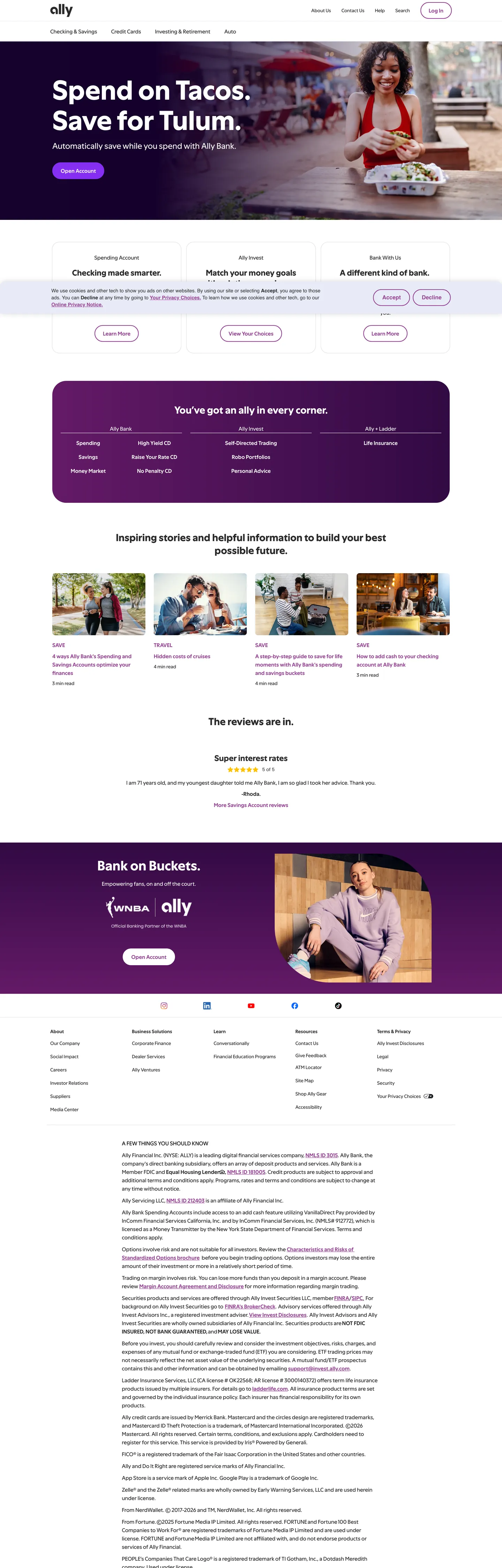
- Photography-led hero with 80px displayTruthSans at weight 700 on a full-bleed lifestyle photograph (a woman eating tacos), white type, purple pill CTA
- Tonal-partnership CTA panela deep-purple band at the bottom pairs the Ally logo with a third-party (Tonal) wordmark inline as a co-brand statement
- 24px rounded geometryevery CTA and segmented control sits at 24px rounding, sub-pill on a scale that runs 8 / 16 / 20 / 24 / 40px with no fully-rounded pill
ally.com
Live at ally.com
A snapshot of the brand in production. Scroll the frame to see the whole page.
Colors
11 colors
Ally's system runs on #852ef2 as its primary voltage, used in 1 of 15 components. Type is set in TruthSans across 12 tokens from 14px to 80px, weights 400–700. Shape language is soft — components average 19px corner radius, with no sharp interactive edges.
Brand & Accent
Sparing, CTA-only voltage · 5
Surface
Page and card backgrounds · 2
Text
Headlines, body, captions · 3
Borders & Hairlines
Dividers, outlines, rules · 1
Typography
12 type tokens
Set in TruthSans across 12 tokens, from 14px to 80px, weights 400–700. Shown in its own stack: where the font isn't installed, the fallback the file names stands in.
- display-xl80px · weight 700 · lh 87pxThe quick brown fox jumps over the lazy dog
- display-lg40px · weight 700 · lh 50pxThe quick brown fox jumps over the lazy dog
- display-md30px · weight 700 · lh 37pxThe quick brown fox jumps over the lazy dog
- heading-md24px · weight 700 · lh 30pxThe quick brown fox jumps over the lazy dog
- heading-sm24px · weight 400 · lh 32pxThe quick brown fox jumps over the lazy dog
- body-md16px · weight 400 · lh 24pxThe quick brown fox jumps over the lazy dog
- body-sm14px · weight 400 · lh 28pxThe quick brown fox jumps over the lazy dog
- body-emphasis16px · weight 600 · lh 24pxThe quick brown fox jumps over the lazy dog
- label-md14px · weight 600 · lh 20pxThe quick brown fox jumps over the lazy dog
- caption14px · weight 400 · lh 21pxThe quick brown fox jumps over the lazy dog
- button-md16px · weight 600 · lh 24pxThe quick brown fox jumps over the lazy dog
- nav-link14px · weight 400 · lh 20pxThe quick brown fox jumps over the lazy dog
Layout
Radii and spacing
6 corner radii and 9 spacing values. Shape language: soft.
Radii
- none0px
- sm8px
- md16px
- lg20px
- cta24px
- xl40px
Spacing
- xs4px
- sm8px
- md10px
- base16px
- lg22px
- xl24px
- 2xl32px
- 3xl40px
- 4xl80px
Components
15 components
Each rendered from its tokens (color, type, radius, padding) on Ally's own canvas.
- Hero Sectionhero-sectionHero Section
- Hero Headinghero-headingHero Heading
- Section Headingsection-headingSection Heading
- Panel Headingpanel-headingPanel Heading
- Body Paragraphbody-paragraphBody Paragraph
- Body Paragraph Largebody-paragraph-largeBody Paragraph Large
- Button Primarybutton-primaryButton Primary
- Button Secondarybutton-secondaryButton Secondary
- Top Navtop-navTop Nav
- Nav Linknav-linkNav Link
- Segmented Tabsegmented-tabSegmented Tab
- Feature Panelfeature-panelFeature Panel
- Cta Panel Darkcta-panel-darkCta Panel Dark
- Card Photocard-photoCard Photo
- Type here…text-inputText Input
In use
The system, in use
Ally's tokens on the kind of product it builds.
Build something people actually use.
A short paragraph of marketing copy that previews how the brand's display tier and body tier read together. Two sentences is usually enough.
FAQ
Ally design system FAQ
Common questions about Ally's tokens, components, and how to use this DESIGN.md in your project.
Read next
Related reading
Specs, directories, and component libraries that pair with this design system.
- Browse all design systemsThe full directory of DESIGN.md files on shadcn.io, with live mockups for each.shadcn.io
- Ally — official siteAlly Bank's public marketing site — the source of truth for the live tokens captured in this file.ally.com (opens in a new tab)
- The DESIGN.md specificationGoogle Labs' open spec for machine-readable design system files — the format this page is built on.github.com (opens in a new tab)
Use it
Use Ally in your project
One machine-readable file. Drop it into Claude, Cursor, or any AI tool that reads DESIGN.md.
Download the DESIGN.md
One machine-readable file: every color, type, radius, spacing, and component token of Ally.
Feed it to your AI tool
Drop it into Claude, Cursor, or GitHub Copilot. The agent writes React components and Tailwind classes that match Ally's visual language.
Reference the tokens directly
Or paste the values into your Tailwind config, CSS variables, or component library: every color, size and radius is a quoted, ready-to-copy value.
Read the full DESIGN.md: overview, rationale, do’s and don’ts
Overview
Ally's marketing site refuses the trust-blue convention every traditional US commercial bank runs. Two-tier purple voltage. Where Chase commits to navy, Bank of America to blue, and Wells Fargo to red-on-cream, Ally picks saturated purple {colors.primary} (#852ef2) as the primary CTA fill and a deeper plum {colors.brand-plum} (#954293) as the structural type-and-panel color. The two purples sit at different functional roles: the saturated one is the action signal (CTA pills, feature accents), the deeper plum is the structural-type signal (the deep-purple feature panel that runs near the bottom, plus 87 captured occurrences as text and border across the page). The system has chromatic depth without leaving the purple family.
The hero is photographic and large. A full-bleed lifestyle photograph of a woman eating tacos at an outdoor restaurant fills the above-fold band; the headline "Spend on Tacos. Save for Tulum." sits at 80px TruthSans weight 700 in white over the photograph, with a 24px-rounded saturated-purple pill CTA tucked beneath. The 80px display is the loudest typographic moment in the directory's banking-section — Monzo tops out at 61px, Nubank at 56px, Starling at 48px. Ally takes the display ladder one tier higher and lets the photograph carry the size. The wordmark "ally" sits in lower-case in the top-nav, rendered at a small 14px size — the brand identity uses voice-down lettering even as the display goes very large.
Below the fold the page returns to a white canvas. A 3-tab segmented control in 24px-rounded outline pills lets the visitor pick "Checking, Money, and Savings" / "Stocks, Bonds, and Funds" / "Different kind of bank" as their navigation. Then a deep-plum feature panel ({component.feature-panel} — {colors.brand-plum} fill, white text, 24px-rounded) lays out a 6-up category grid (Mortgage / Auto / Credit Card / Invest / Robo Portfolios / Money Market) — the panel is the chromatic centerpiece of the page. Below it sits an editorial 3-tile photographic strip ("Inspiring stories and helpful information to build your best possible future") and a bottom CTA panel in even deeper plum {colors.brand-plum-deepest} (#300942) pairing the Ally wordmark inline with the Tonal partnership wordmark — the only co-brand statement on the page.
Key Characteristics:
- Two-tier purple voltage:
{colors.primary}(#852ef2) fills CTAs,{colors.brand-plum}(#954293) carries structural type and the feature-panel fill — 87 captured occurrences. - Departs from the blue-banking convention every legacy US bank runs — purple is the brand-positioning move.
- 80px hero h1 in TruthSans weight 700 — the tallest display in the banking section of the design directory.
- TruthSans across every tier, no second sans family beyond a small Poppins fallback in legal copy.
- 24px-rounded geometry on every CTA, every segmented control, and every photo-tile container — sub-pill but distinctly soft.
- Photography-led hero and editorial 3-tile band — lifestyle photography (eating tacos, family beach, working from home) carries the marketing surface; no decorative illustration.
- Two depths of dark-purple panel:
{colors.brand-plum}(#954293) for the mid-page feature panel,{colors.brand-plum-deepest}(#300942) for the bottom co-brand CTA — the second-darkest is the structural climax. - Lowercase wordmark "ally" rendered small in the top-nav — voice-down lettering balances the very large hero display.
Colors
Brand voltage (two-tier purple)
- Saturated Purple (
{colors.primary}— #852ef2): the primary CTA fill. Captured twice on the page — once as background fill (the Open Account button), once as border. High-chroma violet (oklch lightness 54, chroma 0.26). The action signal — used only on buttons and structural accents, never as a body color. - Brand Plum (
{colors.brand-plum}— #954293): frequency 87 — used as text (42), border (43), background (2). The text-color voltage that carries the deep-purple feature panel surface, plus structural type emphasis across the page. Wired across feature-cell headings and the panel fill. The two-tier purple's structural anchor. - Brand Plum Dark (
{colors.brand-plum-dark}— #7d2279): captured twice inside gradient stops on the deep-purple panel. Sits between the mid plum and the deepest plum as a transition tone. - Brand Plum Deepest (
{colors.brand-plum-deepest}— #300942): captured twice inside gradient stops and as the dark-CTA panel surface. The structural climax of the system — used only on the bottom co-brand CTA panel where the Ally + Tonal partnership lives. - Ultra Dark (
{colors.brand-ultra-dark}— #16052b): captured once as a background fill on a very dark accent surface. The darkest purple in the system, almost-but-not-quite black, used only on a single deep-emphasis surface.
Text
- Ink (
{colors.ink}— #2a2a2a): frequency 166 — the dominant body-text color. Used as text (83), border (83). A warm dark gray, lighter than off-black, used for every body paragraph and section heading on the white canvas. - Ink Link (
{colors.ink-link}— #0000ee): frequency 2 — the system's default browser-blue link color, captured on a small set of inline links. The page deliberately keeps this as the user-agent default rather than restyling it. - Ink Black (
{colors.ink-black}— #000000): frequency 43 — used as text (21) and border (21). The maximum-contrast text tone, used sparingly for the secondary outline-CTA borders and for high-emphasis body text.
Surfaces
- Canvas (
{colors.canvas}— #ffffff): frequency 265 — the body floor below the photographic hero, the top-nav surface, and the inside of every white card. Wired as the structural default. - Surface Lavender (
{colors.surface-lavender}— #e7eaf7): captured once as a background — used on the segmented-tab area as a faint lavender wash that connects visually to the purple voltage without competing with it.
Hairline
- Hairline (
{colors.hairline}— #dddddd): captured 3 times, all as shadow ink. The system's lightest gray — used for subtle borders on card surfaces and for the soft shadow under elevated CTAs.
Typography
Font Family
The system runs TruthSans for every spoken surface — wired in CSS as the single custom property --truth-sans = TruthSans, arial, helvetica, sans-serif. There is no separate display family, no serif tier, no second sans. A small amount of Poppins appears as a fallback in legal-copy spans (likely a CMS-injected legacy style), but it never carries primary content. TruthSans does every job.
Hierarchy
| Token | Size | Weight | Line Height | Use |
|---|---|---|---|---|
{typography.display-xl} | 80px | 700 | 87px | Hero h1 ("Spend on Tacos. Save for Tulum.") |
{typography.display-lg} | 40px | 700 | 50px | Deep-plum feature panel headline ("You've got an Ally in every corner") |
{typography.display-md} | 30px | 700 | 37px | Section h2 ("Inspiring stories and helpful information") |
{typography.heading-md} | 24px | 700 | 30px | Category card titles inside the feature panel |
{typography.heading-sm} | 24px | 400 | 32px | Editorial sub-headlines and lighter h3 treatments |
{typography.body-md} | 16px | 400 | 24px | Default running paragraph text |
{typography.body-sm} | 14px | 400 | 28px | Caption rows and secondary copy with extended leading |
{typography.body-emphasis} | 16px | 600 | 24px | Inline emphasis and primary CTA labels |
{typography.label-md} | 14px | 600 | 20px | Small-caps category labels |
{typography.caption} | 14px | 400 | 21px | Footer regulatory text and metadata |
{typography.button-md} | 16px | 600 | 24px | Primary and secondary button labels |
{typography.nav-link} | 14px | 400 | 20px | Top-nav link labels |
Principles
Display weight tops out at 700 — Ally is the only bank in the directory that lets weight escalate that high. The 80px hero h1 at weight 700 is unambiguously the loudest typographic moment, and the deep-plum panel headline at 40px / 700 is the second. Body sits at weight 400; primary-button labels and inline emphasis use 600. There is no 300 or 500 weight on the captured page — the system is binary in weight terms: light body or heavy display.
The 14px / 28px line-height combination on body-sm (line-height 200%) is unusually generous — it gives the secondary text rows the same air a 16px body line would carry, which keeps the smaller copy readable inside the editorial 3-tile grid.
Note on Font Substitutes
TruthSans is licensed. Inter at weight 400 and 700 is the closest open-source substitute; the proportions transfer cleanly and Inter's slightly looser counters read close to TruthSans at the body sizes. For the 80px hero display, Geist (Vercel's sans) has a similar cap-height density. The Poppins fallback in legal copy can be left as-is if you're matching Ally directly, or normalized to Inter to keep the system unified.
Layout
Spacing System
- Base unit: 8px, with a distinctive 10px sub-unit (39 captured occurrences in the 0px 0px 10px margin pattern that pads the page's stacked text blocks).
- Tokens:
{spacing.xs}4px ·{spacing.sm}8px ·{spacing.md}10px ·{spacing.base}16px ·{spacing.lg}22px ·{spacing.xl}24px ·{spacing.2xl}32px ·{spacing.3xl}40px ·{spacing.4xl}80px. - Section padding (vertical):
{spacing.4xl}(80px) between major bands (4 captured occurrences). - CTA padding: 8×22 (
{spacing.sm} {spacing.lg}) — the dominant button-padding measurement (8 captured occurrences on{component.button-primary}). - Card internal padding:
{spacing.2xl}(32px) on the deep-plum feature panel with 16px column gaps.
Grid & Container
- Max content width: ~1200px on most bands; ~1080px on the editorial photo-tile grid.
- Hero block: full-bleed photographic canvas, content (headline + CTA) centered with 32×80 padding.
- Segmented control: 3-up horizontally-aligned tab row in 24px-rounded outline pills; the active tab shifts to a purple-bordered treatment.
- Deep-plum feature panel: 24px-rounded surface in
{colors.brand-plum}containing a 6-column category grid (Mortgage, Auto, Credit Card, Invest, Robo Portfolios, Money Market) at desktop, collapsing to 3-up on tablet. - Editorial 3-tile grid: 3-column photo-tile band ("Inspiring stories and helpful information") with each tile carrying a lifestyle photograph at the top and a heading+excerpt beneath.
- Bottom co-brand CTA panel: 40px-rounded dark-plum panel pairing the lowercase Ally wordmark with the Tonal partnership wordmark on a single line.
Rhythm
The page alternates between photographic bands and chromatic panels. The hero is photographic; the segmented control sits on white; the deep-plum feature panel is the chromatic climax of the middle of the page; the editorial 3-tile grid returns to photographic-tile-on-white; the bottom CTA panel goes even deeper plum. Two depths of dark-purple panel mark the structural climax of the page — the mid plum is the "what we offer" moment, the deepest plum is the "what we partner with" moment.
Elevation
The system uses flat-with-shadow-accent elevation. The captured page has 3 occurrences of {colors.hairline} (#dddddd) used as shadow ink and 1 occurrence of black-as-shadow — confined to subtle lift treatments on CTAs and on the segmented-control active tab.
- Flat (no shadow): hero, feature panel, editorial grid, footer — 95% of surfaces.
- CTA elevation: the saturated-purple
{component.button-primary}sits with a very subtle hairline-gray drop shadow at ~3% alpha — readable as a tactile signal more than a true lift. - Segmented-tab active state: uses the same hairline shadow to mark the active tab without a fill.
- Card lift: the editorial photo-tile cards have no shadow; depth comes from the 24px corner rounding and the photographic content alone.
Shapes
The radius scale is stepped without a pill:
{rounded.none}0px — section dividers and the hero photograph.{rounded.sm}8px — small chips and the form-input corners (4 captured occurrences).{rounded.md}16px — mid-size cards (1 captured occurrence).{rounded.lg}20px — secondary cards (3 captured occurrences).{rounded.cta}24px — the dominant CTA, segmented-tab, feature-panel, and photo-tile radius (10 captured occurrences). The system's signature corner.{rounded.xl}40px — the bottom co-brand CTA panel (1 captured occurrence) — the largest radius on the page, used once for the structural climax.
There is no 9999px fully-rounded pill anywhere on the marketing surface. The 24px-on-CTA choice is deliberately sub-pill — softer than the 8px traditional-banking radius but stopping short of the neobank pill convention that Monzo, Nubank, and Revolut use.
Components
hero-section — Full-bleed photographic canvas, 80×32 padding. No surface fill of its own — the lifestyle photograph carries the band. Holds the hero h1 in white at {typography.display-xl} and a saturated-purple CTA pill beneath.
hero-heading — White {colors.canvas} text on the photographic hero, TruthSans 80px / 700. The display tier — confidence by sheer size on photography.
section-heading — Dark gray {colors.ink} text at {typography.display-md} (30px / 700) — the section h2s below the fold ("Inspiring stories and helpful information to build your best possible future").
panel-heading — White {colors.canvas} text at {typography.display-lg} (40px / 700) — the deep-plum panel headline ("You've got an Ally in every corner") and the bottom co-brand panel headline ("Bank on Buckets.").
body-paragraph — Default {colors.ink} text at {typography.body-md} (16px / 400) — the workhorse paragraph style.
body-paragraph-large — {colors.ink} text at {typography.heading-sm} (24px / 400) — used for the editorial dek beneath section headings where the page wants the type to lift without going to weight 700.
button-primary — The signature CTA. Saturated-purple {colors.primary} fill, white text, {rounded.cta} 24px radius, 8×22 padding, 48px height, weight 600. "Open Account" is the canonical instance. No pill — the 24px corner is the brand's deliberately-sub-pill action shape.
button-secondary — Transparent fill with dark text and a 1px ink-black {colors.ink-black} border. {rounded.cta} 24px radius, same 48px height. Used inside the segmented control and for "Learn more" tertiary actions.
top-nav — White {colors.canvas} surface, 60px height, 12×24 padding, 1px {colors.hairline} bottom rule. The lowercase "ally" wordmark sits flush left at 14px, product links (Bank / Invest / Auto / Mortgage / Insurance) center, "Open Account" CTA flush right.
nav-link — Browser-blue {colors.ink-link} text in {typography.nav-link} (14px / 400), 8×12 padding. The default #0000ee is kept rather than restyled — the system trusts the user-agent semantic.
segmented-tab — Transparent fill, dark text, 1px ink-black border, {rounded.cta} 24px radius, 12×24 padding, 48px height. The 3-tab segmented control above the deep-plum panel ("Checking, Money, and Savings" / "Stocks, Bonds, and Funds" / "Different kind of bank").
feature-panel — Deep plum {colors.brand-plum} (#954293) surface, white text, {rounded.cta} 24px radius, 32×16 padding. The mid-page chromatic centerpiece — holds the 6-up category grid (Mortgage / Auto / Credit Card / Invest / Robo Portfolios / Money Market) with white card-titles in {typography.heading-md} (24px / 700).
cta-panel-dark — The deepest plum {colors.brand-plum-deepest} (#300942) surface, white text, {rounded.xl} 40px radius, 80px internal padding. The bottom co-brand CTA panel pairing the Ally wordmark with the Tonal partnership wordmark. The structural climax of the page — used once.
card-photo — White {colors.canvas} surface, {rounded.cta} 24px radius, 0 padding (the lifestyle photograph fills the tile edge-to-edge). Used in the 3-up editorial photo-tile grid.
text-input — White {colors.canvas} fill, dark text, 1px {colors.hairline} border, {rounded.sm} 8px radius, 12×16 padding, 48px height.
Do's and Don'ts
Do treat the two-tier purple voltage as functionally distinct. {colors.primary} (#852ef2) is for CTAs and structural accents; {colors.brand-plum} (#954293) is for structural type and the feature-panel surface. Collapsing them into a single purple loses the chromatic depth that the deeper plum carries in 87 captured occurrences.
Do keep the 24px-rounded geometry on every CTA. The {rounded.cta} (24px) corner is the brand's signature action shape — deliberately sub-pill, distinctly softer than traditional-banking 8px corners. Escalating to a 999px pill makes Ally read as a neobank (Monzo, Nubank) instead of an online-but-traditional bank.
Do use the lifestyle photography as the hero canvas. The 80px TruthSans weight 700 display only reads as editorial confidence when it's floating over a photograph. Without the photograph, the same display becomes a SaaS shout and undercuts the brand's editorial voice.
Do reserve the deepest plum ({colors.brand-plum-deepest} — #300942) for the bottom co-brand CTA panel only. The {component.cta-panel-dark} is the structural climax of the page; using the deepest plum on a mid-page panel would dilute the single-climax discipline.
Don't use the traditional-banking blue (the Chase navy or Citi cobalt) anywhere in the system. Ally's purple is a deliberate positional move against the legacy-bank convention; introducing a blue accent would erase the brand-positioning signal that the entire color system is built to carry.
Don't add a 999px fully-rounded pill to the radius scale. The captured page has no pill element — every corner stops at 40px or below. Adding a pill button collapses Ally into the neobank-pill convention and loses the deliberately-sub-pill geometry that separates it from Monzo and Revolut.
Don't render the lowercase "ally" wordmark in uppercase or at display size. The brand identity is voice-down — the wordmark sits at 14px in the top-nav even when the hero display is at 80px. Bumping the wordmark up to display size would invert the brand's typographic voice.
Don't use the default browser-blue {colors.ink-link} (#0000ee) as a body-text color or for non-link emphasis. The system deliberately keeps it as a semantic user-agent link color only; rendering body text in #0000ee creates an accessibility-and-semantic mismatch.
Known Gaps
- Form input states:
{component.text-input}carries the resting state; error / validation styling is not exposed on the captured marketing surface. The product surfaces likely render error tones in a red that's not captured. - Dark mode: the captured marketing surface is light-only. The deep-purple feature and CTA panels function as inversion bands but there is no full dark variant.
- Hover and focus states: the hover treatment on
{component.button-primary}is not exposed in the captured surface; the focus-ring color is not declared. - Motion: the segmented-tab transitions and the photo-tile hovers have subtle motion but the spec captures end-state values only.
- Product surfaces: this DESIGN.md captures the marketing site only. The Ally Banking app, the Ally Invest dashboard, and the Ally Auto financing flow all carry richer token systems that are not represented here.
- Co-brand pattern: the bottom CTA panel pairs Ally with Tonal inline; the spec does not document the typographic and lockup rules for other co-brand pairings (Ally has partnerships across auto, mortgage, and home-improvement).
- Legal-copy typeface: the Poppins fallback in some legal spans is likely a CMS legacy; the spec keeps TruthSans as the canonical family but doesn't formally retire Poppins.
- Iconography: the system uses thin single-stroke line icons inside category cells (a house for Mortgage, a car for Auto, etc.); the icon set is not exposed as named SVGs in the captured marketing surface.
Banking & Payments
More systems like this
More DESIGN.md files in Banking & Payments.
Pricing
Build it with Pro
The DESIGN.md files are free. Pro adds 6,000+ blocks, premium templates and the MCP server, so your AI editor builds in your system for you.
4.9/5 out of 5 · 150+ reviewsfrom 150+ founders and developers.
Billing
Billed once a year in USD. Cancel anytime.
- How many people can use the license.
- Client work, SaaS products and anything you charge for.
- Production-ready React sections: hero, pricing, features, dashboards and more.
- Complete multi-page sites you can ship as they are.
- React icons from every major library, installable with one command.
- Presets that restyle every block, in light and dark.
- Lets your AI editor search, preview and install blocks for you.
- Priority requests are answered first.
Individual
For personal projects & open source
$32instead of $49/mo
$389 billed yearly
- Seats: 1 seat
- Commercial use: Personal & open source only
- Pro blocks: 6,000+ blocks
- Templates: All 14 templates
- React icons: 294k+ icons
- Themes: All 59 themes
- MCP server: Basic usage
- Support: Standard
Team
Most popularFor freelancers, agencies & startups
$66instead of $99/mo
$789 billed yearly · ≈ $13/dev/mo
- Seats: Up to 5 seats
- Commercial use: Included
- Pro blocks: 6,000+ blocks
- Templates: All 14 templates
- React icons: 294k+ icons
- Themes: All 59 themes
- MCP server: High usage
- Support: Priority
Organization
For companies with larger teams
$132instead of $199/mo
$1,589 billed yearly
- Seats: Unlimited seats
- Commercial use: Included
- Pro blocks: 6,000+ blocks
- Templates: All 14 templates
- React icons: 294k+ icons
- Themes: All 59 themes
- MCP server: Unlimited usage
- Support: Priority
Billed once a year in USD. Cancel anytime.
Individual
For personal projects & open source
$32instead of $49/mo
$389 billed yearly
- How many people can use the license.Seats: 1 seat
- Client work, SaaS products and anything you charge for.Commercial use: Personal & open source only
- Production-ready React sections: hero, pricing, features, dashboards and more.Pro blocks: 6,000+ blocks
- Complete multi-page sites you can ship as they are.Templates: All 14 templates
- React icons from every major library, installable with one command.React icons: 294k+ icons
- Presets that restyle every block, in light and dark.Themes: All 59 themes
- Lets your AI editor search, preview and install blocks for you.MCP server: Basic usage
- Priority requests are answered first.Support: Standard
Team
Most popularFor freelancers, agencies & startups
$66instead of $99/mo
$789 billed yearly · ≈ $13/dev/mo
Everything in Individual, plus
- How many people can use the license.Seats: Up to 5 seats
- Client work, SaaS products and anything you charge for.Commercial use: Included
- Lets your AI editor search, preview and install blocks for you.MCP server: High usage
- Priority requests are answered first.Support: Priority
Organization
For companies with larger teams
$132instead of $199/mo
$1,589 billed yearly
Everything in Team, plus
- How many people can use the license.Seats: Unlimited seats
- Lets your AI editor search, preview and install blocks for you.MCP server: Unlimited usage
- Secure checkout via Stripe
- Code lives in your repo
- Keep what you've shipped if you cancel
- License terms
Your system, built for you
Every block, template and icon, installed by your AI agent in your design system. The DESIGN.md files stay free.