Afterpay Design System
Afterpay's global landing surface as a DESIGN.md file — Italian Plate No2 Expanded display sans, ink-on-white chrome, 12px-cornered region cards, no chromatic brand voltage. For React, Next.js, and AI tools.
Add shadcn.io to your AI agent. · Pro It installs blocks, icons and templates in your design system from a prompt, with Pro.
Set up MCP- Primary
- #3b82f6
- Typeface
- Italian Plate No2 Expanded
- Shape
- Mixed
- Base radius
- 12px
- Colors
- 4
- Type tokens
- 8
- Components
- 14
- Spacing values
- 7
About
About Afterpay DESIGN.md
Curated by Dov Azencot · Updated May 19, 2026 · Source afterpay.com (opens in a new tab)
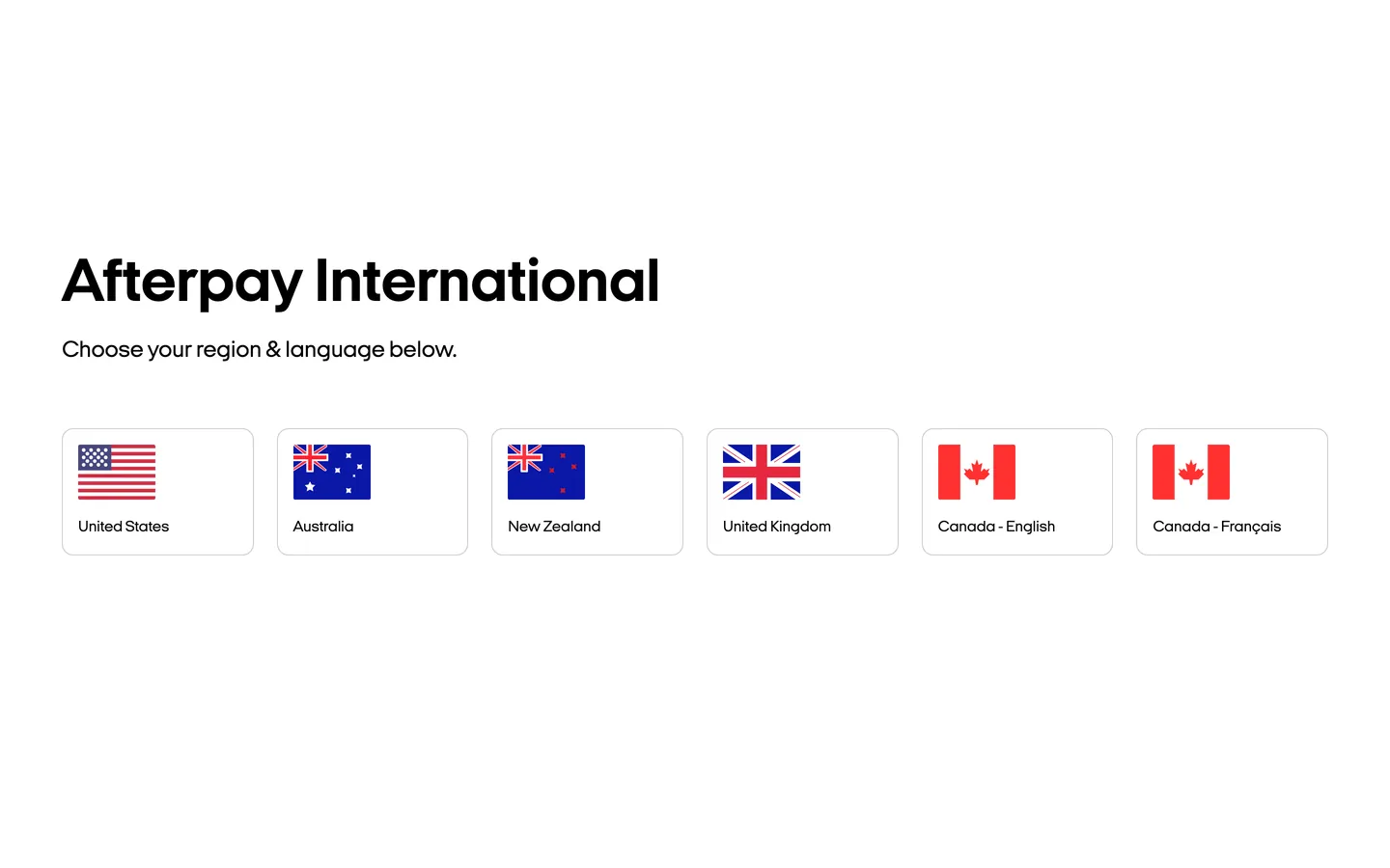
Afterpay's global root page is the rare consumer-fintech surface that almost looks like a directory listing. The captured landing for afterpay.com is the country-select splash, not a marketing homepage — "Afterpay International" sits at 64px in ink black on pure white, with a single line of 24px body underneath ("Choose your region & language below"), and a 6-up grid of hairline-bordered region cards beneath that. Each card is a 12px-rounded box carrying a flag pictogram and a country label: United States, Australia, New Zealand, United Kingdom, Canada English, Canada Francais. There is no hero band, no logo wall, no decorative chrome, no chromatic accent — the page is functionally a router into the six regional Afterpay sites where the brand's mint-green identity actually lives. The single typeface declared in the CSS is Italian Plate No2 Expanded, the wide-letterform proprietary sans Afterpay commissioned from Klim Type Foundry; it carries the entire typographic identity at one weight pair (400 for body, 700 for the display).
The DESIGN.md file packages the captured tokens into a machine-readable spec. Inside: 4 colors tokens — ink black, pure white, and the hairline gray that carries the region-card borders, plus a Tailwind default ring color declared but unused; 3 typography tokens running Italian Plate No2 Expanded at the 64px display, 24px lead, and 16px body sizes; a single 12px corner radius; 4 spacing tokens with 16px as the dominant module; and 14 components definitions covering the region card, the page heading, the lead paragraph, and the missing scaffolding (button, top-nav, footer) inferred from Afterpay's regional sites since the global splash has none. The frontmatter has no `primary` token — the captured surface has no brand-layer color with usage above 5, so the system reads as monochrome on this entry.
Feed this file to an AI coding tool and it reproduces what the global splash actually is: ink-on-white restraint, Italian Plate No2 Expanded across every typographic tier, single-value 12px radius, hairline-bordered region cards, and the deliberate absence of a chromatic accent. The caveat is structural: the global splash is one surface among many, and the brand's actual marketing identity — the mint green `#b2fce4` voltage, the rounded pill CTAs, the lifestyle photography — lives on the country-specific homepages (afterpay.com/us, afterpay.com/au) that this DESIGN.md does not capture. If you need the full regional identity, follow up with a per-locale extract once a country is chosen.
What makes it distinct
5
- Wide-letterform display sansItalian Plate No2 Expanded at 64px / 700 carries the entire typographic identity, the only typeface declared on the page
- Ink-on-white restraintevery text and border on the captured global splash renders in ink black on pure white, with no brand-color accent
- 12px single-radius scalethe entire shape language is one corner-radius value used 6 times across the region-card grid
- Region-card grid as primary surfacea 6-up grid of hairline-bordered cards with flag pictograms is the page; there is no hero band, no logo wall, no CTA pill
- Block ownership contextAfterpay sits inside Block alongside Square, Cash App, and TIDAL; the spare global surface fits the Block house-style of letting each brand carry its own regional identity
afterpay.com
Live at afterpay.com
A snapshot of the brand in production. Scroll the frame to see the whole page.
Colors
4 colors
Afterpay's system anchors on #3b82f6 (focus-ring) as its primary color. Type is set in Italian Plate No2 Expanded across 8 tokens from 14px to 64px, weights 400–700. Shape language is mixed across 14 components, blending pills, soft rounds, and squarer corners.
Surface
Page and card backgrounds · 1
Text
Headlines, body, captions · 1
Borders & Hairlines
Dividers, outlines, rules · 1
Other
Specialty colors · 1
Typography
8 type tokens
Set in Italian Plate No2 Expanded across 8 tokens, from 14px to 64px, weights 400–700. Shown in its own stack: where the font isn't installed, the fallback the file names stands in.
- display-xl64px · weight 700 · lh 72pxThe quick brown fox jumps over the lazy dog
- body-lg24px · weight 400 · lh 32pxThe quick brown fox jumps over the lazy dog
- body-md16px · weight 400 · lh 24pxThe quick brown fox jumps over the lazy dog
- body-sm14px · weight 400 · lh 20pxThe quick brown fox jumps over the lazy dog
- display-md40px · weight 700 · lh 48pxThe quick brown fox jumps over the lazy dog
- heading-md20px · weight 700 · lh 28pxThe quick brown fox jumps over the lazy dog
- label-md16px · weight 700 · lh 24pxThe quick brown fox jumps over the lazy dog
- button-md16px · weight 700 · lh 24pxThe quick brown fox jumps over the lazy dog
Layout
Radii and spacing
2 corner radii and 7 spacing values. Shape language: mixed.
Radii
- none0px
- md12px
Spacing
- sm8px
- base16px
- md24px
- lg32px
- xl48px
- 2xl64px
- 3xl96px
Components
14 components
Each rendered from its tokens (color, type, radius, padding) on Afterpay's own canvas.
- Button Primarybutton-primaryButton Primary
- Button Secondarybutton-secondaryButton Secondary
- Button Ghostbutton-ghostButton Ghost
- Top Navtop-navTop Nav
- Nav Linknav-linkNav Link
- Hero Headinghero-headingHero Heading
- Section Headingsection-headingSection Heading
- Body Paragraphbody-paragraphBody Paragraph
- Body Paragraph Mdbody-paragraph-mdBody Paragraph Md
- Region Cardregion-cardRegion Card
- Flag Pictogramflag-pictogramFlag Pictogram
- Card Labelcard-labelCard Label
- Type here…text-inputText Input
- FooterfooterFooter
In use
The system, in use
Afterpay's tokens on the kind of product it builds.
Build something people actually use.
A short paragraph of marketing copy that previews how the brand's display tier and body tier read together. Two sentences is usually enough.
FAQ
Afterpay design system FAQ
Common questions about Afterpay's tokens, components, and how to use this DESIGN.md in your project.
Read next
Related reading
Specs, directories, and component libraries that pair with this design system.
- Browse all design systemsThe full directory of DESIGN.md files on shadcn.io, with live mockups for each.shadcn.io
- Afterpay — official siteAfterpay's public marketing site — the source of truth for the live tokens captured in this file.afterpay.com (opens in a new tab)
- The DESIGN.md specificationGoogle Labs' open spec for machine-readable design system files — the format this page is built on.github.com (opens in a new tab)
Use it
Use Afterpay in your project
One machine-readable file. Drop it into Claude, Cursor, or any AI tool that reads DESIGN.md.
Download the DESIGN.md
One machine-readable file: every color, type, radius, spacing, and component token of Afterpay.
Feed it to your AI tool
Drop it into Claude, Cursor, or GitHub Copilot. The agent writes React components and Tailwind classes that match Afterpay's visual language.
Reference the tokens directly
Or paste the values into your Tailwind config, CSS variables, or component library: every color, size and radius is a quoted, ready-to-copy value.
Read the full DESIGN.md: overview, rationale, do’s and don’ts
Overview
Afterpay's captured global root page is unusual for a consumer fintech. Routing as design: the surface at afterpay.com is the country-select splash, not a marketing homepage — "Afterpay International" in ink black at 64px sits over a single-line lead and a 6-up grid of hairline-bordered region cards (United States, Australia, New Zealand, United Kingdom, Canada English, Canada Francais). There is no hero band, no logo wall, no CTA pill, no decorative chrome. Where Klarna and Affirm immediately lead with their respective pink and lime brand voltages on the global homepage, Afterpay's global root holds back entirely. The brand's famous mint-green identity lives one click away, on the country-specific sites; the global splash is a router into those regions rather than a destination of its own.
The chrome that does render runs ink on white with one hairline gray border tone ({colors.hairline} — #cccccc) carrying the region-card outlines. The Tailwind default focus-ring color ({colors.focus-ring} — #3b82f6) is declared in the page's --tw-ring-color variable but never rendered on the captured surface. There is no primary token in the colors palette because no extracted color qualifies as a brand-layer voltage with meaningful usage — the only chromatic moments on the page are the small flag pictograms inside each region card, and those are imagery rather than brand chrome.
Typography is the system's load-bearing identity, and it carries the entire visual register alone. Italian Plate No2 Expanded — the wide-letterform proprietary sans Afterpay commissioned from Klim Type Foundry — handles every tier on the page. The 64px display at weight 700 with 72px line-height is the loudest moment; the 24px lead at weight 400 is the only secondary tier; 16px body sits at weight 400 with 24px line-height. There is no secondary typeface, no monospace, no serif declared in the captured CSS. The "Expanded" axis is the typographic signature: letterforms are visibly wider than a default humanist sans, which gives the 64px display heft without needing a 900-weight tier.
Key Characteristics:
- Routing-page chrome — the captured surface is a country selector, not a marketing homepage; the entire page is a heading + lead + 6-up region card grid.
- No chromatic brand voltage on the captured surface — every text and border renders in
{colors.ink}(#000000) on{colors.canvas}(#ffffff); the brand's mint-green lives on the country-specific sites once a locale is chosen. - Italian Plate No2 Expanded as the single typeface family — wide-letterform sans at weight 400 (body, 24px lead) and weight 700 (the 64px display), no secondary family.
- Single 12px corner radius (
{rounded.md}) — appears 6 times in the captured page across the region cards and is the entire rounded shape language; no 4 / 8 / 16 / 24px tier. - 64px section padding rhythm — the page uses 16/64px gutters and a 64px top spacer above the heading, signaling unusual generosity given the page's minimal content.
- Hairline-only region cards —
{colors.hairline}(#cccccc) at 1px carries every visible border in the captured page; no shadow elevation, no surface-color contrast. - 16px body line-height of 24px — the body-paragraph leading is generous at 150%, which the lead paragraph at 24px/32px maintains.
- Flag-pictogram inside cards — each region card carries a 48px flag bitmap (US stars-and-stripes, Australian Union Jack + Southern Cross, etc.) as the only chromatic moment on the page.
Colors
Surface
- Canvas (
{colors.canvas}— #ffffff): the page floor. Pure white with no warm or cool tinting. Carries every band, every card surface, and the top-nav background on the regional sites that this DESIGN.md infers but does not capture.
Text and Border
- Ink (
{colors.ink}— #000000): frequency 46 — text (26), border (20). The dominant tone on the captured page. Carries the 64px display headline, the 24px lead paragraph, every card label, and every region-card border at low opacity. Pure black with no chroma — the brand's editorial alternative to a chromatic accent. - Hairline (
{colors.hairline}— #cccccc): frequency 6 (all border). The structural border tone — used on the region-card outlines. A mid-tone gray rather than a near-white hairline; the borders read clearly against the white canvas without needing a heavier weight.
Focus
- Focus Ring (
{colors.focus-ring}— #3b82f6): the Tailwind default ring color declared in the page's--tw-ring-colorvariable. Frequency 0 on the captured render — wired into the stylesheet but not visibly rendered. The brand has not customized this token away from Tailwind's default, suggesting the page was built with minimal styling intervention.
Typography
Font Family
The system declares one family: Italian Plate No2 Expanded — the wide-letterform proprietary sans Afterpay commissioned from Klim Type Foundry — across every typographic tier on the page. Fallbacks walk to Helvetica, Arial. There is no secondary sans, no serif, no monospace declared in the captured CSS. One family carries display, lead, body, button, and label tiers.
The "Expanded" axis is the typographic signature. Italian Plate ships in multiple widths (Compressed, Narrow, Regular, Expanded); Afterpay specifically uses the Expanded cut, which has visibly wider letterforms than a standard humanist sans. The widening gives the 64px display weight 700 enough visual heft to carry the page without needing a 900-weight tier, and gives the 16px body a generous reading rhythm without expanding to a larger size.
Hierarchy
| Token | Size | Weight | Line Height | Use |
|---|---|---|---|---|
{typography.display-xl} | 64px | 700 | 72px | Page heading ("Afterpay International") |
{typography.display-md} | 40px | 700 | 48px | Section h2 (inferred — not rendered on the global splash) |
{typography.body-lg} | 24px | 400 | 32px | Lead paragraph ("Choose your region & language below.") |
{typography.heading-md} | 20px | 700 | 28px | Sub-section title (inferred) |
{typography.body-md} | 16px | 400 | 24px | Default running text |
{typography.label-md} | 16px | 700 | 24px | Region-card label text ("United States," "Australia," etc.) |
{typography.body-sm} | 14px | 400 | 20px | Caption rows, footnote text (inferred) |
{typography.button-md} | 16px | 700 | 24px | Primary CTA labels (inferred from regional sites) |
Principles
Weight 700 carries the display tier and the card-label tier; weight 400 carries every paragraph tier. There is no 500 / 600 middle-weight in the captured CSS — the system is binary on weight (400 body, 700 emphasis) rather than running a ladder of weight steps. This pairs with the typeface's "Expanded" axis: the width does the work that an extra weight tier would normally do, so the brand can hold to two weights without sacrificing visual hierarchy.
Note on Font Substitutes
Italian Plate No2 Expanded is licensed via Klim Type Foundry. Inter Variable at the same weights with font-stretch: 110% (or letter-spacing roughly +0.04em on the display tier) approximates the expanded proportions; the open-source Atkinson Hyperlegible has comparable width but tighter caps. The Klim Foundry also licenses Italian Plate in narrower widths (No2 Regular, No2 Compressed) if you need a closer optical match without the expanded letterforms.
Layout
Spacing System
- Base unit: 16px — the dominant gap value (6 occurrences in the captured spacing extract), with 24/32/64px as the secondary modules.
- Tokens:
{spacing.sm}8px ·{spacing.base}16px ·{spacing.md}24px ·{spacing.lg}32px ·{spacing.xl}48px ·{spacing.2xl}64px ·{spacing.3xl}96px. - Section padding (vertical): 64px above the heading and beneath the region-card grid — the captured page uses 16/64/0 vertical padding as its only section-spacing pattern.
- Card internal padding:
{spacing.md}(24px) on the region cards — sufficient to give the flag pictogram + label pair a comfortable safe zone without expanding the card too far. - Page horizontal padding: 64px on either side of the centered content column — a generous margin that signals the captured surface is desktop-oriented.
Grid & Container
- Max content width: the captured page uses the full viewport width with 64px horizontal gutters on either side; no max-width constraint is visible in the rendered surface.
- Hero band: the page heading + lead paragraph stack sits flush left at 64px from the viewport edge — there is no centered hero band.
- Region-card grid: 6-column flex row at desktop, with each card sized to fit ~210px wide. Cards wrap to a smaller column count at narrower viewports.
- Footer: not rendered on the captured surface; the page ends with the region-card grid and the bottom of the viewport is white space.
Rhythm
The page rhythm is unusually compressed for a marketing surface: nothing → heading → lead paragraph → region-card grid → nothing. The page has one functional zone (the card grid) and one introductory text block, with no atmospheric transitions, no in-band illustrations, no logo wall, no carousel. The compression is the structural device — the surface signals "this is a router" through its emptiness.
Elevation
The system has no shadow tier on the captured surface. Depth comes from hairline borders alone — no surface-color contrast, no atmospheric backdrop, no card lift.
- Flat (no shadow): every surface on the page including the region cards. The cards sit on the same white canvas as the heading and lead paragraph, with only the 1px
{colors.hairline}border distinguishing them. - Hairline outlines:
{colors.hairline}(#cccccc) at 1px carries every visible border in the captured page. - Tailwind shadow tokens declared but unused: the page's CSS includes
--tw-shadow,--tw-shadow-colored, and--tw-ring-offset-shadowall set to a transparent zero-offset value. These are Tailwind defaults rather than brand tokens — the system has not customized shadow values away from the framework's null state.
Shapes
The radius scale collapses to one value: 12px. The captured page uses this radius 6 times across the region-card grid and nowhere else.
{rounded.none}0px — the heading, the lead paragraph, the page itself; every non-card surface terminates at zero radius.{rounded.md}12px — frequency 6 (all on the region cards). The single rounded surface tier; carries every clickable affordance on the captured page.
There is no 4 / 6 / 8 / 16 / 24px tier. The single-value discipline matches the typography (one family) and the color palette (ink + canvas + hairline). The 12px choice is generous-soft — large enough to read as friendly, small enough not to read as a pill. The result is that every clickable surface on the page reads as the same shape.
Components
button-primary — Inferred from the brand's regional sites (the global splash has no rendered button). Ink {colors.ink} fill, canvas text, {rounded.md} 12px radius, 12×24px padding, 48px height. The standard primary CTA on the country-specific Afterpay homepages uses this shape; on the global splash, the region cards themselves are the primary affordances.
button-secondary — Canvas fill, ink text, 1px ink border, same 12px / 48px geometry. The inverted version of the primary button — used as a "Learn more" or "See details" tertiary action on regional sites.
button-ghost — Transparent fill, ink text, 12px radius. The lowest-emphasis affordance.
top-nav — Canvas surface, 64px height. Not rendered on the captured global splash — the page has no top navigation. Inferred from the regional sites' brand wordmark + product links + Login cluster.
nav-link — Transparent background, ink text in {typography.body-md} (16px / 400). 8×16px padding.
hero-heading — Ink text at {typography.display-xl} (64px / 700 / 72px line-height). The captured "Afterpay International" is the canonical instance — the only display moment on the page.
section-heading — Ink text at {typography.display-md} (40px / 700 / 48px line-height). Not rendered on the captured page; inferred from regional sites.
body-paragraph — Ink text at {typography.body-lg} (24px / 400 / 32px line-height). The captured lead paragraph "Choose your region & language below." uses this tier — generous-large body that reads as a sub-heading.
body-paragraph-md — Ink text at {typography.body-md} (16px / 400 / 24px line-height). The default running text tier; not rendered on the captured page but declared in CSS.
region-card — Canvas fill, ink text, 1px {colors.hairline} border, {rounded.md} 12px radius, 24px internal padding. The 6-up grid of country cards is the captured page's primary surface. Each card holds a 48px flag pictogram at the top and a card label below.
flag-pictogram — Transparent background, ink text (the flag image carries its own chromatic content), no radius, 48px height. Each region card carries one flag — the only chromatic moment on the captured page.
card-label — Transparent background, ink text in {typography.label-md} (16px / 700 / 24px line-height), 16px top padding. The country name beneath each flag pictogram.
text-input — Canvas fill, ink text, 1px hairline border, {rounded.md} 12px radius, 12×16px padding, 48px height. Not rendered on the captured page; inferred from regional sites' checkout and account forms.
footer — Canvas surface, ink text, 32×64px padding, 1px hairline top rule. Not rendered on the captured page; inferred from regional sites' link grid and small-print row.
Do's and Don'ts
Do treat this DESIGN.md as a router-page spec, not a full marketing-surface spec. The captured chrome is the country-selector splash at afterpay.com — it is monochrome and minimal by design. For the brand's actual marketing identity (mint-green voltage, lifestyle photography, rounded pill CTAs), do a separate per-locale extract from one of the country-specific Afterpay homepages.
Do keep Italian Plate No2 Expanded as the single typographic family. The "Expanded" axis is the typographic signature — narrower widths of Italian Plate would read as a different brand. The wide letterforms do the work that an extra weight tier would normally do, so the brand can hold to two weights (400 / 700) without sacrificing hierarchy.
Do use {rounded.md} 12px as the single rounded tier. The shape language across the captured page is one value used 6 times; adding 4 / 8 / 16 / 24px tiers would break the binary "flat block or 12px-rounded card" discipline.
Do lead any global / multi-region page with a country-card grid pattern. The 6-up card layout with flag pictograms and ink-on-white labels is the brand's regional-routing convention — replicating it on equivalent global-root surfaces respects the visual language.
Don't introduce the mint-green brand voltage on a global-root surface. The captured page deliberately strips out the regional brand voltage so it doesn't compete with the six country-specific sites that follow. Adding mint green to the country-selector splash would visually conflict with whichever regional site the user clicks into.
Don't use {colors.focus-ring} (#3b82f6) for any rendered chrome — it is the Tailwind default ring color, declared but never visibly rendered on the captured page. Treat it as a framework default left at its zero state, not as a brand token.
Don't add atmospheric chrome to the global splash. The brand's compression on this page (heading + lead + card grid only) is the structural device. Inserting a hero band, a logo wall, or a CTA pill above the card grid breaks the "this is a router" reading and turns the surface into a marketing homepage it isn't designed to be.
Don't swap Italian Plate No2 Expanded for the Regular or Compressed variants. The "Expanded" axis is the brand's typographic signature; narrower widths would read as a generic humanist sans rather than as Afterpay specifically.
Known Gaps
- Regional brand identity: the captured global splash does not expose the mint-green brand voltage, rounded pill CTAs, lifestyle photography, or product chrome that lives on the country-specific Afterpay sites (afterpay.com/us, afterpay.com/au, etc.). For those tokens, do a separate per-locale extract.
- Component coverage: the captured page has only a heading, a lead paragraph, and a 6-up region-card grid. Components like the primary CTA, top-nav, footer, and form inputs are inferred from regional sites rather than rendered on the captured surface — verify against your target locale.
- Hover and focus states: not exposed on the captured surface. The Tailwind
--tw-ring-coloris declared at #3b82f6 but never rendered; the actual focus-ring style for region cards is browser-default. - Block context: Afterpay is owned by Block (formerly Square) alongside Square, Cash App, and TIDAL. The captured global splash sits inside Block's broader brand ecosystem but does not surface any Block parent-brand chrome or cross-brand navigation.
- Dark mode: the captured surface is light-only. No dark variant is declared in the CSS, and the system does not respect
prefers-color-scheme. - Motion: the captured page has no scroll-triggered or hover-triggered animation. The region cards do not lift, tint, or scale on interaction in the captured render — verify the live page if motion is required.
- Internationalization: the page lists six regions (US, AU, NZ, UK, Canada English, Canada Francais) but does not surface RTL or Asian-language locale variants. Afterpay's regional coverage is limited to English-speaking and bilingual-Canadian markets.
Banking & Payments
More systems like this
More DESIGN.md files in Banking & Payments.
Pricing
Build it with Pro
The DESIGN.md files are free. Pro adds 6,000+ blocks, premium templates and the MCP server, so your AI editor builds in your system for you.
4.9/5 out of 5 · 150+ reviewsfrom 150+ founders and developers.
Billing
Billed once a year in USD. Cancel anytime.
- How many people can use the license.
- Client work, SaaS products and anything you charge for.
- Production-ready React sections: hero, pricing, features, dashboards and more.
- Complete multi-page sites you can ship as they are.
- React icons from every major library, installable with one command.
- Presets that restyle every block, in light and dark.
- Lets your AI editor search, preview and install blocks for you.
- Priority requests are answered first.
Individual
For personal projects & open source
$32instead of $49/mo
$389 billed yearly
- Seats: 1 seat
- Commercial use: Personal & open source only
- Pro blocks: 6,000+ blocks
- Templates: All 14 templates
- React icons: 294k+ icons
- Themes: All 59 themes
- MCP server: Basic usage
- Support: Standard
Team
Most popularFor freelancers, agencies & startups
$66instead of $99/mo
$789 billed yearly · ≈ $13/dev/mo
- Seats: Up to 5 seats
- Commercial use: Included
- Pro blocks: 6,000+ blocks
- Templates: All 14 templates
- React icons: 294k+ icons
- Themes: All 59 themes
- MCP server: High usage
- Support: Priority
Organization
For companies with larger teams
$132instead of $199/mo
$1,589 billed yearly
- Seats: Unlimited seats
- Commercial use: Included
- Pro blocks: 6,000+ blocks
- Templates: All 14 templates
- React icons: 294k+ icons
- Themes: All 59 themes
- MCP server: Unlimited usage
- Support: Priority
Billed once a year in USD. Cancel anytime.
Individual
For personal projects & open source
$32instead of $49/mo
$389 billed yearly
- How many people can use the license.Seats: 1 seat
- Client work, SaaS products and anything you charge for.Commercial use: Personal & open source only
- Production-ready React sections: hero, pricing, features, dashboards and more.Pro blocks: 6,000+ blocks
- Complete multi-page sites you can ship as they are.Templates: All 14 templates
- React icons from every major library, installable with one command.React icons: 294k+ icons
- Presets that restyle every block, in light and dark.Themes: All 59 themes
- Lets your AI editor search, preview and install blocks for you.MCP server: Basic usage
- Priority requests are answered first.Support: Standard
Team
Most popularFor freelancers, agencies & startups
$66instead of $99/mo
$789 billed yearly · ≈ $13/dev/mo
Everything in Individual, plus
- How many people can use the license.Seats: Up to 5 seats
- Client work, SaaS products and anything you charge for.Commercial use: Included
- Lets your AI editor search, preview and install blocks for you.MCP server: High usage
- Priority requests are answered first.Support: Priority
Organization
For companies with larger teams
$132instead of $199/mo
$1,589 billed yearly
Everything in Team, plus
- How many people can use the license.Seats: Unlimited seats
- Lets your AI editor search, preview and install blocks for you.MCP server: Unlimited usage
- Secure checkout via Stripe
- Code lives in your repo
- Keep what you've shipped if you cancel
- License terms
Your system, built for you
Every block, template and icon, installed by your AI agent in your design system. The DESIGN.md files stay free.