Binance Design System
Binance's design system as a DESIGN.md file. Yellow #FCD535, BinanceNova + BinancePlex, 24 colors, 35 components. For React, Next.js, and AI tools.
Add shadcn.io to your AI agent. · Pro It installs blocks, icons and templates in your design system from a prompt, with Pro.
Set up MCP- Primary
- #fcd535
- Typeface
- BinanceNova
- Shape
- Mixed
- Base radius
- 6px
- Colors
- 24
- Type tokens
- 15
- Components
- 35
- Spacing values
- 8
About
About Binance DESIGN.md
Curated by Dov Azencot · Updated May 12, 2026 · Source binance.com (opens in a new tab)
Binance's design system is built around scarcity and contrast. One brand color (Binance Yellow, #FCD535) does every primary CTA, every value-claim headline, every wordmark. The canvas is a near-black #0b0e11 on marketing pages and pure white on transactional pages — yellow CTAs and gray-blue hairlines thread through both modes unchanged.
This page packages all of that into a single DESIGN.md file. Inside: 24 colors, 16 type styles, 8 spacing values, 7 corner radii, and 35 components — every piece you need to build something that looks like a trading platform rather than a generic SaaS theme.
Download the file and feed it to Claude, Cursor, or GitHub Copilot. The AI writes React components and Tailwind classes that respect the system's distinctive rules — BinancePlex on every number, trading green and red as text only, yellow reserved for the focal action. Or just use it as a reference for your own work.
What makes it distinct
5
- Single yellow voltage#FCD535 with #181a20 black text is the only primary CTA combination, never inverted
- Two-typeface splitBinanceNova for editorial, BinancePlex for every price, volume, and stat counter
- Dual-theme surfacesdark #0b0e11 for marketing, white #ffffff for buy/deposit transactional flows
- Trading semantics built in#0ecb81 up and #f6465d down as text-only color, never card surfaces
- Light footer on dark body#fafafa footer closes every page, a deliberate marketing-reset inversion
binance.com
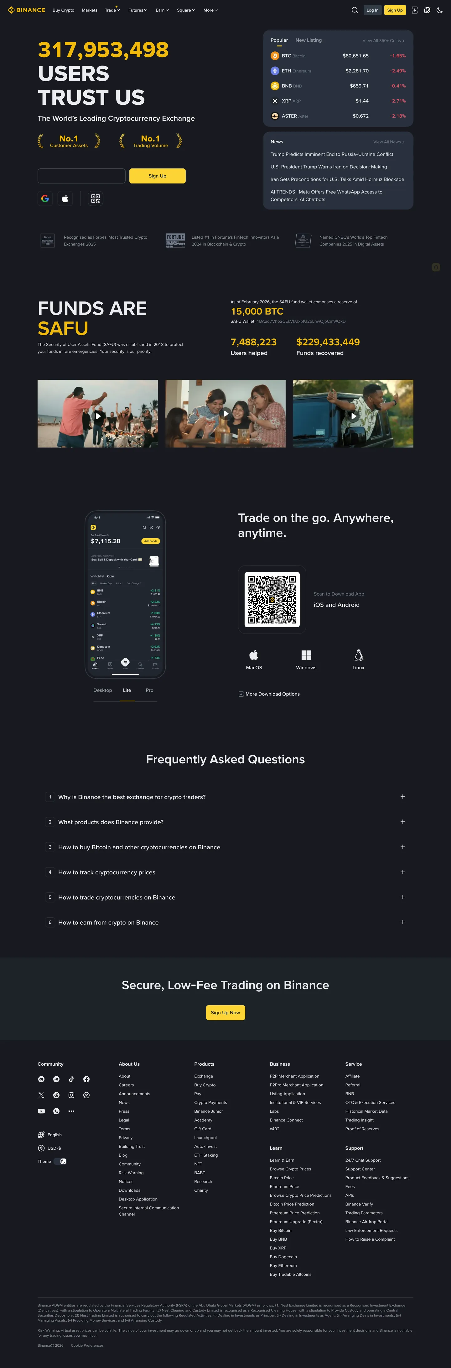
Live at binance.com
A snapshot of the brand in production. Scroll the frame to see the whole page.
Colors
24 colors
Binance's system runs on #fcd535 as its primary voltage, used in 7 of 35 components. Type is set in BinanceNova across 15 tokens from 12px to 64px, weights 400–700. Shape language is mixed across 35 components, blending pills, soft rounds, and squarer corners.
Brand & Accent
Sparing, CTA-only voltage · 4
Surface
Page and card backgrounds · 6
Text
Headlines, body, captions · 9
Borders & Hairlines
Dividers, outlines, rules · 1
Semantic
Status, errors, success, links · 2
Other
Specialty colors · 2
Typography
15 type tokens
Set in BinanceNova across 15 tokens, from 12px to 64px, weights 400–700. Shown in its own stack: where the font isn't installed, the fallback the file names stands in.
- hero-display64px · weight 700 · lh 1.1 · tracking -1pxThe quick brown fox jumps over the lazy dog
- display-lg48px · weight 700 · lh 1.1 · tracking -0.5pxThe quick brown fox jumps over the lazy dog
- display-md40px · weight 600 · lh 1.15 · tracking -0.3pxThe quick brown fox jumps over the lazy dog
- display-sm32px · weight 600 · lh 1.2The quick brown fox jumps over the lazy dog
- title-lg24px · weight 600 · lh 1.3The quick brown fox jumps over the lazy dog
- title-md20px · weight 600 · lh 1.35The quick brown fox jumps over the lazy dog
- title-sm16px · weight 600 · lh 1.4The quick brown fox jumps over the lazy dog
- number-display40px · weight 700 · lh 1.1 · tracking -0.3pxThe quick brown fox jumps over the lazy dog
- number-md16px · weight 500 · lh 1.4The quick brown fox jumps over the lazy dog
- number-sm14px · weight 500 · lh 1.4The quick brown fox jumps over the lazy dog
- body-md14px · weight 400 · lh 1.5The quick brown fox jumps over the lazy dog
- body-sm13px · weight 400 · lh 1.5The quick brown fox jumps over the lazy dog
- caption12px · weight 500 · lh 1.4The quick brown fox jumps over the lazy dog
- button14px · weight 600 · lh 1The quick brown fox jumps over the lazy dog
- nav-link14px · weight 500 · lh 1.4The quick brown fox jumps over the lazy dog
Layout
Radii and spacing
7 corner radii and 8 spacing values. Shape language: mixed.
Radii
- xs2px
- sm4px
- md6px
- lg8px
- xl12px
- pill9999px
- full9999px
Spacing
- xxs4px
- xs8px
- sm12px
- md16px
- lg24px
- xl32px
- xxl48px
- section80px
Components
35 components
Each rendered from its tokens (color, type, radius, padding) on Binance's own canvas.
- Button Primarybutton-primaryButton Primary
- Button Primary Activebutton-primary-activeButton Primary Active
- Button Primary Disabledbutton-primary-disabledButton Primary Disabled
- Button Primary Pillbutton-primary-pillButton Primary Pill
- Button Secondary On Darkbutton-secondary-on-darkButton Secondary On Dark
- Button Secondary On Lightbutton-secondary-on-lightButton Secondary On Light
- Button Tertiary Textbutton-tertiary-textButton Tertiary Text
- Button Trading Upbutton-trading-upButton Trading Up
- Button Trading Downbutton-trading-downButton Trading Down
- Button Subscribebutton-subscribeButton Subscribe
- Text Linktext-linkText Link
- Top Nav Darktop-nav-darkTop Nav Dark
- Top Nav Lighttop-nav-lightTop Nav Light
- Hero Band Darkhero-band-darkHero Band Dark
- Stat Callout Cardstat-callout-cardStat Callout Card
- Trust Badgetrust-badgeTrust Badge
- Markets Table Cardmarkets-table-cardMarkets Table Card
- Markets Rowmarkets-rowMarkets Row
- Price Up Cellprice-up-cellPrice Up Cell
- Price Down Cellprice-down-cellPrice Down Cell
- Search Input On Darksearch-input-on-darkSearch Input On Dark
- Type here…text-input-on-lightText Input On Light
- Funds Safu Bandfunds-safu-bandFunds Safu Band
- Feature Photo Cardfeature-photo-cardFeature Photo Card
- Qr Promo Cardqr-promo-cardQr Promo Card
- Faq Rowfaq-rowFaq Row
- Cta Band Darkcta-band-darkCta Band Dark
- Arena Hero Gradientarena-hero-gradientArena Hero Gradient
- Cookie Consent Cardcookie-consent-cardCookie Consent Card
- Buy Crypto Amount Cardbuy-crypto-amount-cardBuy Crypto Amount Card
- Steps Cardsteps-cardSteps Card
- Price Chart Cardprice-chart-cardPrice Chart Card
- Conversion Cellconversion-cellConversion Cell
- Trader Rowtrader-rowTrader Row
- Footer Lightfooter-lightFooter Light
In use
The system, in use
Binance's tokens on the kind of product it builds.
Build something people actually use.
A short paragraph of marketing copy that previews how the brand's display tier and body tier read together. Two sentences is usually enough.
FAQ
Binance design system FAQ
Common questions about Binance's tokens, components, and how to use this DESIGN.md in your project.
Read next
Related reading
Specs, directories, and component libraries that pair with this design system.
Use it
Use Binance in your project
One machine-readable file. Drop it into Claude, Cursor, or any AI tool that reads DESIGN.md.
Download the DESIGN.md
One machine-readable file: every color, type, radius, spacing, and component token of Binance.
Feed it to your AI tool
Drop it into Claude, Cursor, or GitHub Copilot. The agent writes React components and Tailwind classes that match Binance's visual language.
Reference the tokens directly
Or paste the values into your Tailwind config, CSS variables, or component library: every color, size and radius is a quoted, ready-to-copy value.
Read the full DESIGN.md: overview, rationale, do’s and don’ts
Overview
Binance reads like a financial trading platform that wants to feel both authoritative and energetic. The base atmosphere is deep near-black canvas ({colors.canvas-dark} — #0b0e11) holding white type and a single, ubiquitous accent: Binance Yellow ({colors.primary} — #FCD535). That yellow does almost all of the brand's heavy lifting — it carries every primary CTA, every value-claim headline ("FUNDS ARE SAFU"), every "Sign Up" pill, every featured tier indicator, and the wordmark itself. There is no secondary brand color. The system trusts the yellow voltage to do the brand work, and it carries it.
Type runs Binance's custom BinanceNova (display + body) and BinancePlex (numerical / financial display) stack. BinanceNova carries display headlines, section titles, and body copy. BinancePlex appears on price tickers, large stat numbers (transaction volumes, user counts, prize pools) — anywhere a number wants to feel "tabular and reliable." Both run at modest weights — display sizes use weight 600-700 (bolder than typical marketing because trading platforms need numbers to read at a glance), body stays at 400.
The product is multi-theme: marketing surfaces (homepage, smart-money, futures arena) default to dark, while transactional surfaces (buy crypto, deposit, withdraw) flip to a light theme. The same yellow CTAs and gray-blue hairlines ({colors.hairline-on-light} — #eaecef) thread through both — only canvas, surface, and text tones flip. Trading green ({colors.trading-up} — #0ecb81) and red ({colors.trading-down} — #f6465d) signal price direction in tables, charts, and price tickers across both modes.
Key Characteristics:
- Single accent color:
{colors.primary}(#FCD535) does all brand voltage — primary CTAs, hero headlines, brand mark, badges. Used scarcely on dark for emphasis, ubiquitously on transactional dialogs. - Custom type stack:
BinanceNova(display + body) andBinancePlex(numbers, prices, financial data). Big stat numbers always render in BinancePlex for tabular consistency. - Multi-theme: marketing pages default dark (
{colors.canvas-dark}); transactional pages flip light ({colors.canvas-light}). Yellow CTAs and trading green/red are shared across both. - Light footer on dark body: the homepage uses
{colors.surface-soft-light}(#fafafa) for the footer even when the body above it is dark — a deliberate inversion that visually closes the page. - Trading semantics: green up / red down (
{colors.trading-up}/{colors.trading-down}) for price changes, applied as text color rather than badge background. - Card surfaces:
{colors.surface-card-dark}(#1e2329) for elevated cards on dark;{colors.canvas-light}for cards on light. No gradient surfaces, no atmospheric backdrops — flat color blocks throughout. - Border radius is small to medium:
{rounded.md}(6px) for primary buttons,{rounded.lg}(8px) for inputs and content cards,{rounded.xl}(12px) for elevated card containers,{rounded.pill}for prominent feature CTAs. - Spacing follows a 4-multiple scale; major editorial bands sit at
{spacing.section}(80px) — slightly tighter than typical marketing-only sites because product pages need denser layouts.
Colors
Brand & Accent
- Binance Yellow (
{colors.primary}— #FCD535): The single brand color. Used for primary CTA backgrounds, the wordmark, brand-claim headlines ("FUNDS ARE SAFU"), trust badges ("No.1 Trading Volume"), large stat numbers in{component.stat-callout-card}, and inline links. - Binance Yellow Active (
{colors.primary-active}— #f0b90b): The press / hover-darker variant. Slightly more saturated yellow. - Binance Yellow Disabled (
{colors.primary-disabled}— #3a3a1f): A desaturated dark-yellow used on disabled CTAs over dark canvas. - Accent Turquoise (
{colors.accent-turquoise}— #2dbdb6): A small secondary accent used very sparingly on Smart Money's "Check Now" CTA over dark surfaces. Treat as a single-product accent, not a system color.
Surface
The system has two canvas modes that map to product context:
Dark mode (marketing default):
- Canvas Dark (
{colors.canvas-dark}— #0b0e11): The primary page floor. Near-black with a slight warm tint — never pure black. - Surface Card Dark (
{colors.surface-card-dark}— #1e2329): Cards, navigation dropdowns, secondary buttons over dark canvas, markets table. - Surface Elevated Dark (
{colors.surface-elevated-dark}— #2b3139): One step lighter, used for nested cards, hovered nav items, and chart background panels.
Light mode (transactional):
- Canvas Light (
{colors.canvas-light}— #ffffff): The page floor on transactional pages (buy crypto, deposit forms, account dialogs). - Surface Soft Light (
{colors.surface-soft-light}— #fafafa): Footer surface and disabled states. - Surface Strong Light (
{colors.surface-strong-light}— #f5f5f5): Form input backgrounds in muted contexts.
Hairlines & Borders
- Hairline on Light (
{colors.hairline-on-light}— #eaecef): The 1px border tone on light surfaces. Dembrandt's frequency analysis confirms this as the highest-count token (1022 occurrences) — Binance uses hairlines liberally. - Hairline on Dark (
{colors.hairline-on-dark}— #2b3139): The 1px border tone on dark surfaces. Same hex as{colors.surface-elevated-dark}— borders feel like surface steps, not ink lines. - Border Strong (
{colors.border-strong}— #cdd1d6): A heavier border tone used on disabled secondary buttons.
Text
- Ink (
{colors.ink}— #181a20): The strongest text on light surfaces. Display headlines on transactional pages. - Body on Dark (
{colors.body}— #eaecef): Default running-text on dark canvas — deliberately not pure white, slightly cooler. - Body on Light (
{colors.body-on-light}— #181a20): Same as ink — light-mode body text reuses the ink token. - Muted (
{colors.muted}— #707a8a): Footer links, breadcrumbs, captions, table column headers. Works on both light and dark canvas. - Muted Strong (
{colors.muted-strong}— #929aa5): A second-tier muted for emphasized labels. - On Primary (
{colors.on-primary}— #181a20): Black text on yellow primary CTAs. - On Dark (
{colors.on-dark}— #ffffff): Pure white for high-contrast headlines on dark canvas.
Trading Semantics
- Trading Up (
{colors.trading-up}— #0ecb81): Price-up green, used as text color in tables, charts, and inline ticker arrows. Never as a button background. - Trading Down (
{colors.trading-down}— #f6465d): Price-down red. Same usage rules as trading-up.
Info / Focus
- Info (
{colors.info}— #3b82f6): Inline info badges and the focus-ring base. The Tailwind--tw-ring-colortoken surfaced by dembrandt — used on input focus.
Typography
Font Family
The system runs BinanceNova for display and body, and BinancePlex for numerical / financial data. Both are licensed Binance custom typefaces. The fallback stack walks -apple-system, BlinkMacSystemFont, "Segoe UI", Roboto, sans-serif.
The split is functional, not decorative:
- BinanceNova → editorial type (headlines, paragraphs, button labels, nav)
- BinancePlex → tabular numerical type (prices, volumes, percentages, stat counters, prize pools)
Mixing them is not optional — BinanceNova on a price ticker would lose the trading-platform character; BinancePlex on a paragraph would feel monospace-cold.
Hierarchy
| Token | Size | Weight | Line Height | Letter Spacing | Use |
|---|---|---|---|---|---|
{typography.hero-display} | 64px | 700 | 1.1 | -1px | Homepage h1 ("316,258,026 USERS TRUST US") |
{typography.display-lg} | 48px | 700 | 1.1 | -0.5px | Brand-claim headlines ("FUNDS ARE SAFU"), prize-pool hero ("Futures Masters Arena") |
{typography.display-md} | 40px | 600 | 1.15 | -0.3px | Section heads on long-scroll pages |
{typography.display-sm} | 32px | 600 | 1.2 | 0 | CTA band headlines ("Secure, Low-Fee Trading on Binance") |
{typography.title-lg} | 24px | 600 | 1.3 | 0 | Sub-section titles |
{typography.title-md} | 20px | 600 | 1.35 | 0 | QR-promo cards, feature card titles |
{typography.title-sm} | 16px | 600 | 1.4 | 0 | Trust badges, FAQ rows, step labels |
{typography.number-display} | 40px | 700 | 1.1 | -0.3px | Big stat numbers (15,000 BTC, $429,423,449) — BinancePlex |
{typography.number-md} | 16px | 500 | 1.4 | 0 | Markets table prices, table cells — BinancePlex |
{typography.number-sm} | 14px | 500 | 1.4 | 0 | Inline prices, % changes — BinancePlex |
{typography.body-md} | 14px | 400 | 1.5 | 0 | Default running-text — BinanceNova |
{typography.body-sm} | 13px | 400 | 1.5 | 0 | Cookie consent text, footer body |
{typography.caption} | 12px | 500 | 1.4 | 0 | Small meta labels |
{typography.button} | 14px | 600 | 1 | 0 | Standard CTA button labels |
{typography.nav-link} | 14px | 500 | 1.4 | 0 | Top nav menu items |
Principles
Display sizes use weight 700 — heavier than most marketing systems. This makes sense for a trading platform: numbers need to read at a glance, headlines need to compete with chart visualizations and dense data tables. The system will not soften display weight to 400 the way Airtable or Stripe does.
{typography.number-display} and the smaller number variants always use BinancePlex, even when surrounding body type uses BinanceNova. Prices, volumes, and stat counters render in BinancePlex regardless of context — it is the system's "trustworthy number" voice.
Note on Font Substitutes
If BinanceNova and BinancePlex are unavailable, Inter is the closest open-source substitute for BinanceNova and JetBrains Mono or IBM Plex Sans is the closest substitute for BinancePlex (depending on whether tabular monospace fidelity matters more than humanist proportions). Adjust display headlines down by ~3% in line-height to match BinanceNova's tighter cap height.
Layout
Spacing System
- Base unit: 4px.
- Tokens:
{spacing.xxs}4px ·{spacing.xs}8px ·{spacing.sm}12px ·{spacing.md}16px ·{spacing.lg}24px ·{spacing.xl}32px ·{spacing.xxl}48px ·{spacing.section}80px. - Section padding (vertical):
{spacing.section}(80px) — slightly tighter than airy marketing sites (96px) because Binance pages mix marketing bands with dense product surfaces (markets tables, FAQ accordions). - Card internal padding:
{spacing.lg}(24px) for content cards and markets tables;{spacing.xl}(32px) for QR-promo cards and CTA bands;{spacing.md}(16px) for trust badges and table rows. - Gutters:
{spacing.lg}(24px) between cards in 3-up grids;{spacing.md}(16px) inside footer column gutters and dense FAQ lists.
Grid & Container
- Max content width: ~1280px centered on marketing pages; ~1440px on product surfaces (markets, smart-money tables) where horizontal density matters.
- Editorial body: Single 12-column grid; product pages often use 8/4 split (main panel + side rail).
- Markets table: 5-column header (Pair / Last Price / 24h Change / 24h Volume / Action), with the first column carrying coin icon + symbol pair.
- Footer: 6-column link list at desktop, wrapping to 2-up at tablet and 1-up on mobile.
Whitespace Philosophy
Binance is denser than typical marketing sites — long-scroll pages mix hero bands with markets tables, FAQ accordions, and feature grids without much breathing room between them. The system trusts contrast (yellow vs. dark canvas, green vs. red price cells) to do the visual separation work, not whitespace. Where whitespace appears, it's always uniform — {spacing.section} between every major band.
Elevation & Depth
| Level | Treatment | Use |
|---|---|---|
| Flat | No shadow, no border | Body sections, top nav, hero bands, footer |
| Soft hairline | 1px {colors.hairline-on-dark} or {colors.hairline-on-light} | Inputs, table dividers, FAQ row separators, secondary buttons |
| Card surface | {colors.surface-card-dark} background on dark canvas, {colors.canvas-light} on light context — no shadow | All elevated cards (markets-table-card, QR-promo-card, feature-photo-card, trust-badges) |
| Subtle drop shadow | Faint shadow visible only when a card sits over imagery | Used sparingly on the buy-crypto-amount-card on transactional pages |
| Focus ring | 0 0 0 2px {colors.info-ring} at 50% alpha | Input + button keyboard focus state |
The elevation philosophy is flat surfaces with color-block separation. Binance does not use heavy drop shadows or glassmorphism — depth comes from the contrast between {colors.canvas-dark} and {colors.surface-card-dark} (a 12-step lightness jump that reads as a clear elevation boundary).
Decorative Depth
- Yellow → dark vertical gradient backdrop on the Futures Arena hero:
{colors.primary}fading down to{colors.canvas-dark}. This is a single-page treatment used for product-launch / event hero surfaces, not a system-wide signature. - Coin-stack illustrations flanking large stat blocks (3D rendered crypto coins, trophy icons). These are illustrations, not tokens — treat as content rather than design system surface.
Shapes
Border Radius Scale
| Token | Value | Use |
|---|---|---|
{rounded.xs} | 2px | Almost no use — reserved for very small badges |
{rounded.sm} | 4px | Small inline buttons (subscribe, trading-up / trading-down inline) |
{rounded.md} | 6px | Standard CTA buttons, primary buttons, primary input fields |
{rounded.lg} | 8px | Search input, content cards, trust badges, sub-cards |
{rounded.xl} | 12px | Elevated card containers (markets-table-card, QR-promo-card, CTA bands) |
{rounded.pill} | 9999px | Prominent feature CTAs ("Sign Up" pill on dark, futures-arena "Join Now") |
{rounded.full} | 9999px / 50% | Coin icons, avatars |
Binance's radius hierarchy is tighter than typical marketing systems — most surfaces sit at 6-12px. The pill radius is a deliberate exception used to signal "this is a top-of-page action."
Photography & Iconography
- Coin icons render as 24×24 or 32×32 rounded glyphs (often 50% radius on circular outline + the coin's brand color inside).
- 3D rendered coin stacks and trophy illustrations are full-color illustrations with a slight floor shadow — not flat icons.
- Photographic content (people-using-the-app section) crops to
{rounded.xl}(12px) corners, full-bleed on mobile.
Components
Top Navigation
top-nav-dark — The marketing top nav on dark canvas. 64px tall, {colors.canvas-dark} background. Carries the yellow Binance wordmark at left, primary horizontal menu (Buy Crypto, Markets, Trade, Futures, Earn, Square, Smart Money, Campaigns), right-side cluster with language selector, light/dark toggle, "Log In" text link, "Sign Up" {component.button-primary}. The wordmark uses {colors.primary} for "BINANCE" type.
top-nav-light — The transactional top nav on light canvas (buy crypto, deposit pages). Same layout but {colors.canvas-light} background and {colors.ink} menu items.
Buttons
button-primary — The signature primary CTA. Background {colors.primary}, text {colors.on-primary} (black on yellow — the system's iconic combination), type {typography.button}, padding 12px × 24px, height 40px, rounded {rounded.md} (6px). Press state: button-primary-active darkens to {colors.primary-active} (#f0b90b). Disabled state: button-primary-disabled desaturates to {colors.primary-disabled}.
button-primary-pill — A larger pill variant of the primary CTA used for top-of-page sign-up moments and product-launch heroes (Futures Arena "Join Now"). Same yellow + black combination, padding 14px × 32px, rounded {rounded.pill} (9999px). Use sparingly — the pill is a "this is THE action" signal.
button-secondary-on-dark — Used over {colors.canvas-dark} for less-emphasized actions. Background {colors.surface-card-dark}, text {colors.on-dark}, rounded {rounded.md}.
button-secondary-on-light — Light-canvas equivalent. Background {colors.canvas-light} with {colors.hairline-on-light} 1px border, text {colors.ink}.
button-tertiary-text — Inline text button with no background. Used for "Log In" in the top nav and inline "Read More" links.
button-trading-up — A solid green button used on price-up signals (Buy / Long actions). Background {colors.trading-up}, text {colors.on-dark}, rounded {rounded.sm} (4px), padding 8px × 20px. Smaller and tighter than {component.button-primary} because it appears in dense trading interfaces.
button-trading-down — Symmetric red variant for Sell / Short actions. Same shape, background {colors.trading-down}.
button-subscribe — Compact yellow CTA used in the Smart Money traders table to subscribe to a top trader. Smaller height (28px) and tighter padding than the primary CTA — fits inside dense table rows. Same yellow + black combination.
text-link — Inline body links in {colors.primary} (yellow on dark, also yellow on light). No underline by default. Type inherits {typography.body-md}.
Cards & Containers
hero-band-dark — Full-width dark band carrying the homepage h1 + sub-headline + dual CTA pair. Background {colors.canvas-dark}, padding {spacing.section} (80px). The h1 ("316,258,026 USERS TRUST US") uses {typography.hero-display} at 64px / 700 — the system's largest type role.
stat-callout-card — Inline yellow stat numbers (15,000 BTC, 7,488,223, $429,423,449). Transparent background, text {colors.primary}, type {typography.number-display} in BinancePlex. Used as a flat layout block, not a card with surface — the yellow text alone carries the visual weight.
trust-badge — Small dark cards holding "No.1 Customer Service" / "No.1 Trading Volume" claims. Background {colors.surface-card-dark}, rounded {rounded.lg} (8px), padding 16px × 20px. Yellow numeric or word badge ("No.1") sits next to a short label.
markets-table-card — The right-side markets table on the homepage. Background {colors.surface-card-dark}, rounded {rounded.xl} (12px), padding {spacing.lg} (24px). Carries a tab row (Popular / New listing / Top gainers), then a 5-column row of coin pairs with last price, 24h change %, action button. Each row uses {component.markets-row}.
markets-row — A single row inside the markets table. Transparent background, 12px vertical padding, hairline divider between rows. Coin icon (32×32) + symbol on left; last price in {typography.number-md} (BinancePlex); 24h change cell colored by direction ({component.price-up-cell} or {component.price-down-cell}); right-aligned chevron icon for "view detail."
price-up-cell / price-down-cell — Colored text cells for price changes. Transparent background, text {colors.trading-up} or {colors.trading-down}, type {typography.number-md} in BinancePlex. Always paired with a small triangle arrow indicating direction.
feature-photo-card — The "Trade on the go" section's photo strip — 3 lifestyle photos showing people using the Binance app. Background {colors.surface-card-dark}, rounded {rounded.xl}. Photos crop edge-to-edge, no internal padding around the image.
qr-promo-card — The "Trade on the go. Anywhere, anytime." card with QR code. Background {colors.surface-card-dark}, rounded {rounded.xl}, padding {spacing.xl} (32px). Contains an h2 in {typography.title-md}, a body paragraph, app store badges (iOS / Android), and a centered QR code.
funds-safu-band — The yellow-headlined "FUNDS ARE SAFU" band. Background stays {colors.canvas-dark}, but the headline uses {colors.primary} at {typography.display-lg}. Below the headline, three large {component.stat-callout-card} numbers anchor the band: total BTC reserves, users helped, funds recovered.
faq-row — A single FAQ accordion row. Transparent background, padding 20px vertical, hairline divider between rows. Closed state: question in {typography.title-sm} + chevron icon at right. Open state: question + answer body in {typography.body-md}.
cta-band-dark — The "Secure, Low-Fee Trading on Binance" pre-footer CTA band. Background {colors.surface-card-dark} (one step elevated from canvas), rounded {rounded.xl}, padding {spacing.xxl} (48px). Carries an h2 in {typography.display-sm} and a {component.button-primary} aligned right.
Light-Mode Transactional Components
buy-crypto-amount-card — The right-rail card on the Buy BTC page. Background {colors.canvas-light}, rounded {rounded.lg} (8px), padding {spacing.lg} (24px). Carries an editable amount input in {typography.number-display} (BinancePlex), a currency selector, and a yellow {component.button-primary} for "Continue" / "Confirm Order."
steps-card — The "How to Buy Crypto" 3-up cards (Enter Amount → Confirm Order → Receive Crypto). Background {colors.canvas-light}, rounded {rounded.lg}, padding {spacing.lg}. Each card has a small numbered icon, a {typography.title-sm} step name, and a body description.
price-chart-card — The "Bitcoin Markets" card carrying the BTC price chart. Background {colors.canvas-light}, rounded {rounded.lg}. Top row carries pair selector ($79,065.04, +0.45%); main area is a candlestick / line chart in {colors.trading-up} and {colors.trading-down}; bottom row carries timeframe selector (24H / 1W / 1M / 3M / 1Y / ALL).
conversion-cell — A single row in the BTC ↔ USD conversion table. Transparent background, text {colors.body-on-light}, type {typography.body-md}. Pair label on left (BTC, USDT, etc.); USD equivalent on right.
Inputs & Forms
search-input-on-dark — The "Search currencies" input on the homepage hero. Background {colors.surface-card-dark}, text {colors.on-dark}, rounded {rounded.lg} (8px), padding 10px × 16px, height 40px. Carries a yellow {component.button-primary-pill} on the right side ("Sign Up").
text-input-on-light — Standard input on transactional pages. Background {colors.canvas-light}, 1px {colors.hairline-on-light} border, rounded {rounded.md} (6px), padding 10px × 16px, height 40px. Focus state inherits the focus-ring shadow.
cookie-consent-card — The cookie banner card visible on the homepage. Background {colors.canvas-light}, rounded {rounded.lg}, padding {spacing.md} (16px). Body text in {typography.body-sm} (13px / 400) with three stacked button options (Accept Cookies & Continue / Reject Additional Cookies / Manage Cookies).
Smart Money Sub-System
trader-row — A single row in the top-traders table on /smart-money. Transparent background, padding 12px vertical, hairline divider between rows. Avatar + trader name + private/public badge on left; ROI %, AUM, mint date columns; yellow {component.button-subscribe} on right.
Signature Components
arena-hero-gradient — The Futures Arena product-launch hero. A vertical gradient from {colors.primary} at top to {colors.canvas-dark} at bottom, with the prize-pool headline (4,000,000 USDT) in {typography.display-lg} centered. A {component.button-primary-pill} ("Join Now") sits below the headline. Used only on product-launch event surfaces — do not generalize to other heroes.
Footer
footer-light — The light-gray footer that closes every page (including dark-canvas pages). Background {colors.surface-soft-light} (#fafafa), text {colors.body-on-light}. 6-column link list at desktop covering Community / About Us / Products / Business / Service / Learn columns. Vertical padding 64px. The deliberate light footer on a dark page is one of Binance's most distinctive layout choices — it visually closes the page with a "marketing reset" surface.
Do's and Don'ts
Do
- Reserve
{colors.primary}(Binance Yellow) for primary actions, brand-claim headlines, and the wordmark. Never use it for secondary or decorative purposes — yellow's scarcity is what makes it powerful. - Keep
{component.button-primary}(yellow with black text) as the universal primary CTA across both dark and light modes. The same button appears identically on{colors.canvas-dark}and{colors.canvas-light}. - Use
{component.button-trading-up}(green) and{component.button-trading-down}(red) only for explicit Buy/Sell or Long/Short actions. Never use them for general "confirm" or "cancel" because they carry semantic price-direction meaning. - Use BinancePlex for every number. Prices, volumes, percentages, stat counters — all BinancePlex. Mixing BinanceNova into a number ticker breaks the trading-platform character.
- Choose canvas mode by surface intent: dark for marketing / product showcase / trading dashboards; light for transactional dialogs (buy / deposit / withdraw / form submission).
- Anchor every editorial band with
{spacing.section}(80px). Binance is denser than airy marketing sites — 80px is the right rhythm.
Don't
- Don't introduce a second brand color. The system has exactly one accent (
{colors.primary}) and any expansion dilutes the brand identity. The turquoise on Smart Money is a single-product experiment, not a system token. - Don't use yellow for body text or large surface fills. It is for focal-point CTAs and headlines only.
- Don't use
{colors.trading-up}/{colors.trading-down}as background fills on cards. They are price-direction signals, expressed as text color or small badge fill — never as a card surface. - Don't soften display weight.
{typography.hero-display}and{typography.display-lg}are intentionally weight 700 — going to 400 reads as design-portfolio, not trading platform. - Don't add atmospheric gradients to the canvas (mesh, aurora, glow effects). Binance trusts color-block contrast — adding atmospheric depth muddies the trading-platform feel.
- Don't invert
{component.button-primary}'s text color. Black on yellow is the system's signature — white text on yellow loses contrast and brand recognition.
Responsive Behavior
Breakpoints
| Name | Width | Key Changes |
|---|---|---|
| Mobile | < 768px | Top nav collapses to hamburger; hero h1 drops from 64px to ~36px; markets table converts to a horizontally-scrollable card list; demo grids drop to 1-up; footer 6 columns wrap to 2 |
| Tablet | 768–1024px | Top nav stays horizontal but tightens, secondary menu items hide behind a "More" dropdown; markets table 2-up; pricing/feature grids 2-up |
| Desktop | 1024–1440px | Full top-nav with all primary menu items; 5-column markets table; trading dashboards in 8/4 split (chart + side rail) |
| Wide | > 1440px | Same as desktop with more outer breathing room; max content width caps at 1280-1440px depending on surface |
Touch Targets
- Primary CTAs render at minimum 40 × 40px (
{component.button-primary}height + padding) — meets WCAG AAA's 44 × 44 with surrounding spacing. - Subscribe / inline action buttons are 28 × 28 — denser than ideal but matches industry trading platform norms.
- Coin icons in markets tables are 32 × 32px, with the entire row tappable for 44px+ effective target.
Collapsing Strategy
- Top nav collapses to hamburger at < 768px; the menu opens as a full-screen sheet with the same yellow accent CTAs anchored to the bottom of the sheet.
- Markets table reflows to a horizontally-scrollable single card per coin pair on mobile.
- The hero stat numbers ("316M USERS") shrink proportionally rather than wrapping — Binance's biggest claim must always read as a single block.
- Trading dashboards switch from chart + side-rail to chart-only with a separate "Trade" tab on mobile.
- The light footer stays full-bleed at every breakpoint — it does not collapse to a separate dark variant.
Image Behavior
- Coin icons stay at fixed 24/32px sizes regardless of breakpoint.
- Lifestyle photos in the "Trade on the go" section crop responsively — wider at desktop, taller (vertical) at mobile.
- 3D coin-stack illustrations are fixed-aspect-ratio assets that scale uniformly without cropping.
Iteration Guide
- Focus on ONE component at a time. Reference its YAML key directly (
{component.button-primary},{component.markets-row}). - When adding a new component, decide first whether it lives in dark mode (marketing / product) or light mode (transactional). The same component appears in both with surface tone flipped.
- Variants of an existing component (
-active,-disabled) live as separate entries incomponents:— never as nested state objects. - Use
{token.refs}everywhere prose mentions a color, a radius, a typography role, or a spacing value. - Never document hover. The system documents Default and Active/Pressed states only.
- Numbers always use BinancePlex; copy always uses BinanceNova. Mixing them is a system violation.
- Trading green / red are semantic price tokens — never repurpose them for "success" or "error" generic states.
Known Gaps
- The dembrandt frequency analyzer captured
#eaecef(light hairline, count 1022) as the highest-frequency token. The brand-defining{colors.primary}(#FCD535) appears far less frequently because it's used scarcely as accent — its system role had to be confirmed from screenshots. - BinanceNova and BinancePlex weight-axis values are not formalized as variable-font tokens — only the static weights observed in screenshots are documented.
- Animation and transition timings (chart redraws, price-change flashes) are not in scope.
- Form validation states beyond
{component.text-input-on-light}defaults are not extracted — error / success input variants would need a sign-up or order-confirmation flow to confirm. - The trading dashboard surfaces (Spot / Futures / Margin) were not in the analyzed URL set; their order book, candlestick chart configuration, and position-management cards are not documented here.
- The light/dark theme toggle behavior (whether transactional pages can be forced dark by user preference) is product behavior, not extracted from the marketing surfaces.
Fintech & Crypto
More systems like this
More DESIGN.md files in Fintech & Crypto.
Pricing
Build it with Pro
The DESIGN.md files are free. Pro adds 6,000+ blocks, premium templates and the MCP server, so your AI editor builds in your system for you.
4.9/5 out of 5 · 150+ reviewsfrom 150+ founders and developers.
Billing
Billed once a year in USD. Cancel anytime.
- How many people can use the license.
- Client work, SaaS products and anything you charge for.
- Production-ready React sections: hero, pricing, features, dashboards and more.
- Complete multi-page sites you can ship as they are.
- React icons from every major library, installable with one command.
- Presets that restyle every block, in light and dark.
- Lets your AI editor search, preview and install blocks for you.
- Priority requests are answered first.
Individual
For personal projects & open source
$32instead of $49/mo
$389 billed yearly
- Seats: 1 seat
- Commercial use: Personal & open source only
- Pro blocks: 6,000+ blocks
- Templates: All 14 templates
- React icons: 294k+ icons
- Themes: All 59 themes
- MCP server: Basic usage
- Support: Standard
Team
Most popularFor freelancers, agencies & startups
$66instead of $99/mo
$789 billed yearly · ≈ $13/dev/mo
- Seats: Up to 5 seats
- Commercial use: Included
- Pro blocks: 6,000+ blocks
- Templates: All 14 templates
- React icons: 294k+ icons
- Themes: All 59 themes
- MCP server: High usage
- Support: Priority
Organization
For companies with larger teams
$132instead of $199/mo
$1,589 billed yearly
- Seats: Unlimited seats
- Commercial use: Included
- Pro blocks: 6,000+ blocks
- Templates: All 14 templates
- React icons: 294k+ icons
- Themes: All 59 themes
- MCP server: Unlimited usage
- Support: Priority
Billed once a year in USD. Cancel anytime.
Individual
For personal projects & open source
$32instead of $49/mo
$389 billed yearly
- How many people can use the license.Seats: 1 seat
- Client work, SaaS products and anything you charge for.Commercial use: Personal & open source only
- Production-ready React sections: hero, pricing, features, dashboards and more.Pro blocks: 6,000+ blocks
- Complete multi-page sites you can ship as they are.Templates: All 14 templates
- React icons from every major library, installable with one command.React icons: 294k+ icons
- Presets that restyle every block, in light and dark.Themes: All 59 themes
- Lets your AI editor search, preview and install blocks for you.MCP server: Basic usage
- Priority requests are answered first.Support: Standard
Team
Most popularFor freelancers, agencies & startups
$66instead of $99/mo
$789 billed yearly · ≈ $13/dev/mo
Everything in Individual, plus
- How many people can use the license.Seats: Up to 5 seats
- Client work, SaaS products and anything you charge for.Commercial use: Included
- Lets your AI editor search, preview and install blocks for you.MCP server: High usage
- Priority requests are answered first.Support: Priority
Organization
For companies with larger teams
$132instead of $199/mo
$1,589 billed yearly
Everything in Team, plus
- How many people can use the license.Seats: Unlimited seats
- Lets your AI editor search, preview and install blocks for you.MCP server: Unlimited usage
- Secure checkout via Stripe
- Code lives in your repo
- Keep what you've shipped if you cancel
- License terms
Your system, built for you
Every block, template and icon, installed by your AI agent in your design system. The DESIGN.md files stay free.