Skip to content

Barclays Design System

Barclays' corporate site design system as DESIGN.md. Royal Blue #006de3 primary, Barclays Effra at 80px/700, binary radius (8px cards / 99px pills), 20 colors, 15 components. For React, Next.js, and AI tools.

Add shadcn.io to your AI agent. · Pro It installs blocks, icons and templates in your design system from a prompt, with Pro.

Set up MCP
Primary
#006de3
Typeface
Barclays Effra
Shape
Soft
Base radius
8px
Colors
20
Type tokens
10
Components
15
Spacing values
9

About

About Barclays DESIGN.md

Curated by Dov Azencot · Updated May 19, 2026 · Source home.barclays (opens in a new tab)

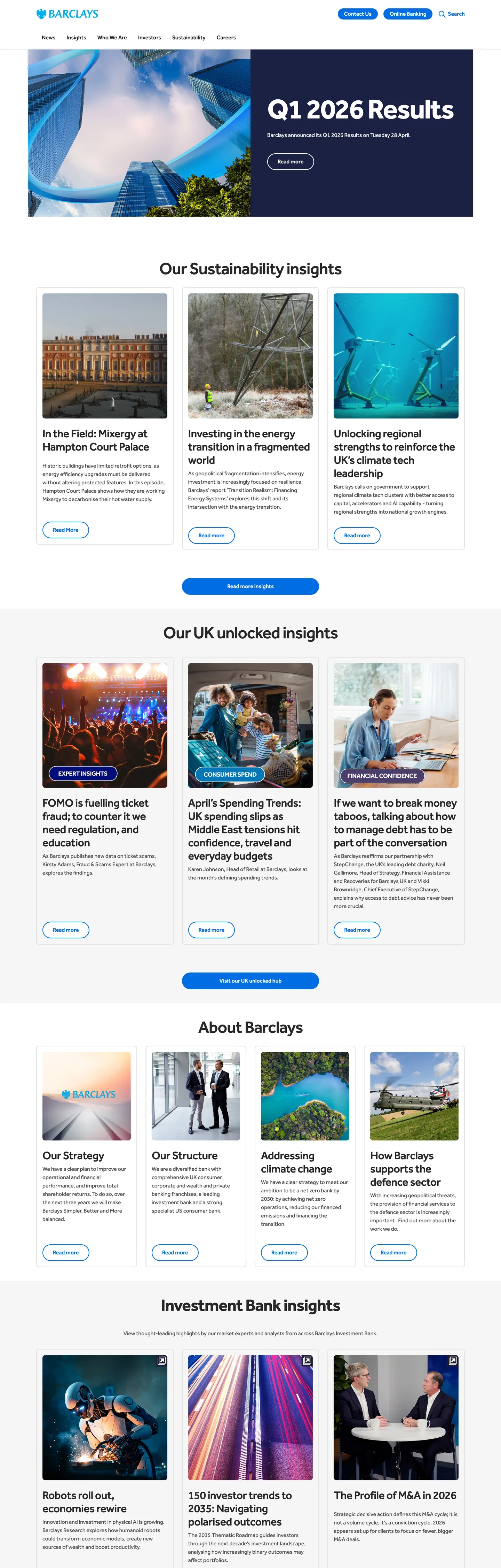
Barclays' corporate site lands its authority in the first viewport: an 80px Barclays Effra headline at weight 700 with -2.56px tracking rendered in pure white on a full-bleed dark photography hero — "Q1 2026 Results" set in four words at the heaviest display weight deployed by any bank in this directory. Where Morgan Stanley keeps its heading at weight 500 in a semi-serif editorial family, and where HSBC stays on a conventional 48px display, Barclays goes heavier. The move reads not as a retail bank headline but as a newspaper front page: compressed, declarative, unqualified. Below the photography, the page inverts to a white canvas carrying a substantial 12-card news grid in 32px / weight 500 section headings and 16px / weight 400 body copy — Barclays Effra across every tier without a second typeface.

The DESIGN.md file packages this system for React and AI tools. Inside: 20 colors tokens organized around a single Royal Blue (#006de3) interactive layer wired into 37 CSS custom properties — CTA button fill, border, focus ring, toggle track, tab indicator, and progress bar all share the same hex. Structural tokens cover a charcoal near-black (#272727) heading color, a medium gray (#515151) body color, and a light hairline (#e2e2e2) that accounts for 1485 of 1486 captured border occurrences. Twelve typography tokens span Barclays Effra across display (80px / 700), section heading (48px / 500 and 32px / 500), body (16px / 400), and button label (16px / 500) tiers. The radius scale is exactly two values: 8px for cards and form fields, 99px for every button.

Feed this file to Claude or Cursor to reproduce Barclays' specific moves: heavy display weight at near-newspaper scale, Royal Blue concentrated into a single interactive layer rather than distributed as a palette accent, binary radius that makes buttons feel warmer than the card chrome, and hairline-only card surfaces that carry an editorial grid with no decorative depth signals. The one disciplined move worth studying: mapping a single hex to 37 semantic token names — Barclays' CSS variable architecture ensures that the brand blue reaches every interactive surface without ever being hardcoded directly.

What makes it distinct

5

  1. Single-typeface systemBarclays Effra runs at 80px/700 display down to 16px/400 body with no secondary family
  2. Royal Blue as universal interactive layer#006de3 wired into 37 CSS custom properties covering button fills, focus rings, toggle tracks, and progress bars simultaneously
  3. Binary radius scale8px on all card and form surfaces, 99px full-pill on every button; no middle tier
  4. Dark photography hero with 80px displaythe above-fold h1 sits at -2.56px tracking, the heaviest display weight in the banking category
  5. Hairline-only card grid#e2e2e2 borders carry 1485 of 1486 border occurrences; no shadow, no tonal lift

home.barclays

Live at home.barclays

A snapshot of the brand in production. Scroll the frame to see the whole page.

Barclays's website at home.barclays

Colors

20 colors

Barclays's system runs on #006de3 as its primary voltage, used in 4 of 15 components. Type is set in Barclays Effra across 10 tokens from 12px to 80px, weights 400–700. Shape language is soft — components average 51px corner radius, with no sharp interactive edges.

Brand & Accent

Sparing, CTA-only voltage · 3

Surface

Page and card backgrounds · 2

Text

Headlines, body, captions · 4

Borders & Hairlines

Dividers, outlines, rules · 1

Semantic

Status, errors, success, links · 7

Other

Specialty colors · 3

Typography

10 type tokens

Set in Barclays Effra across 10 tokens, from 12px to 80px, weights 400–700. Shown in its own stack: where the font isn't installed, the fallback the file names stands in.

  • display-xl80px · weight 700 · lh 76px · tracking -2.56pxThe quick brown fox jumps over the lazy dog
  • display-lg48px · weight 700 · lh 58px · tracking -1.152pxThe quick brown fox jumps over the lazy dog
  • display-md48px · weight 500 · lh 58px · tracking -1.152pxThe quick brown fox jumps over the lazy dog
  • heading-md32px · weight 500 · lh 38px · tracking -0.512pxThe quick brown fox jumps over the lazy dog
  • heading-sm16px · weight 700 · lh 24pxThe quick brown fox jumps over the lazy dog
  • body-md16px · weight 400 · lh 24pxThe quick brown fox jumps over the lazy dog
  • body-sm14px · weight 400 · lh 21pxThe quick brown fox jumps over the lazy dog
  • label-md16px · weight 500 · lh 24pxThe quick brown fox jumps over the lazy dog
  • button-md16px · weight 500 · lh 24pxThe quick brown fox jumps over the lazy dog
  • caption12px · weight 400 · lh 18pxThe quick brown fox jumps over the lazy dog

Layout

Radii and spacing

5 corner radii and 9 spacing values. Shape language: soft.

Radii

  • none0px
  • sm4px
  • md8px
  • lg16px
  • full99px

Spacing

  • xxs4px
  • xs8px
  • sm12px
  • base16px
  • lg24px
  • xl32px
  • 2xl40px
  • 3xl56px
  • 4xl80px

Components

15 components

Each rendered from its tokens (color, type, radius, padding) on Barclays's own canvas.

  • Button Primary
    button-primaryButton Primary
  • Button Primary Hover
    button-primary-hoverButton Primary Hover
  • Button Secondary
    button-secondaryButton Secondary
  • Button Small
    button-smallButton Small
  • Top Nav
    top-navTop Nav
  • Nav Link
    nav-linkNav Link
  • Hero Section
    hero-sectionHero Section
  • Hero Heading
    hero-headingHero Heading
  • Section Heading
    section-headingSection Heading
  • Article Heading
    article-headingArticle Heading
  • Body Paragraph
    body-paragraphBody Paragraph
  • Card
    cardCard
  • Link Text
    link-textLink Text
  • Tag Chip
    tag-chipTag Chip
  • Footer
    footerFooter

In use

The system, in use

Barclays's tokens on the kind of product it builds.

Build something people actually use.

A short paragraph of marketing copy that previews how the brand's display tier and body tier read together. Two sentences is usually enough.

Get startedLearn more
Marketing heroHeadline, sub-copy, primary CTA — the universal homepage opener.
Reporting · 14 min read

The quiet collapse of an old idea

For decades the consensus held that the system would correct itself. Then it didn't. This is the inside story of what changed, told by the people who watched it unravel.

"Nobody noticed because the failure was indistinguishable from progress."

By Sam Reporter · Updated 2 hours ago

Editorial articleMagazine-style longform with display headline.

FAQ

Barclays design system FAQ

Common questions about Barclays's tokens, components, and how to use this DESIGN.md in your project.

Read next

Specs, directories, and component libraries that pair with this design system.

Use it

Use Barclays in your project

One machine-readable file. Drop it into Claude, Cursor, or any AI tool that reads DESIGN.md.

Download DESIGN.md
  1. Download the DESIGN.md

    One machine-readable file: every color, type, radius, spacing, and component token of Barclays.

  2. Feed it to your AI tool

    Drop it into Claude, Cursor, or GitHub Copilot. The agent writes React components and Tailwind classes that match Barclays's visual language.

  3. Reference the tokens directly

    Or paste the values into your Tailwind config, CSS variables, or component library: every color, size and radius is a quoted, ready-to-copy value.

Read the full DESIGN.md: overview, rationale, do’s and don’ts

Overview

Barclays' corporate site does not ease into its subject matter. Editorial weight: the page opens on an 80px Barclays Effra headline at weight 700 with -2.56px tracking — "Q1 2026 Results" — rendered in pure white on a full-bleed aerial photography hero. No bank in this directory deploys a heavier or larger display heading on its primary marketing surface; the weight is a declarative institutional statement, not a consumer-brand invitation. Where Morgan Stanley keeps its display at weight 500 in a semi-serif editorial family to suggest financial-publication gravitas, Barclays presses to 700 to assert corporate magnitude directly.

Below the photography band, the page inverts to a white canvas running a substantial editorial grid — twelve news and insights cards organized under "Our Sustainability Insights," "Our UK Unlocked Insights," and "Investment Bank Insights" headers in 48px / weight 500 section headings. The chromatic vocabulary across the entire page resolves to one decision: Royal Blue (#006de3) as the universal interactive layer. It is wired into 37 CSS custom properties simultaneously — button fill, border, focus ring, toggle track, tab indicator, and progress bar all share the same hex. Unlike Cloudflare's single orange or Stripe's single indigo, Barclays' blue does not appear as a page-level brand accent in hero sections or surface fills; it appears precisely where interaction occurs.

The shape language is exactly binary. Binary radius: card and form surfaces use 8px rounding, every button uses 99px (full pill). The CSS exposes additional radius tokens (4px, 12px, 16px) but the captured marketing surface shows only these two values in use. The pill button makes the interactive layer feel warmer than the card chrome — it is the only curved surface in an otherwise angular editorial grid.

Key Characteristics:

  • Heavy display weight — 80px / weight 700 / -2.56px tracking for the hero h1, 48px / weight 500 for section h2s; no bank peer uses this scale.
  • Single typeface, Barclays Effra, across every tier including button labels, captions, and article cards.
  • Royal Blue (#006de3) concentrated into a single interactive layer wired to 37 CSS custom properties — not distributed as a palette accent.
  • Binary radius: 8px on cards and form surfaces, 99px on all buttons; no middle value.
  • Hairline-only card surfaces — {colors.hairline} (#e2e2e2) accounts for 1485 of 1486 captured border occurrences; zero shadow.
  • Charcoal near-black (#272727) as the heading text color — not pure black; a slightly warmer ink that carries the heading hierarchy.
  • Secondary brand color sky blue (#00aeef) restricted to the Barclays logo mark; absent from interactive or decorative surfaces.
  • Dark navy (#1a2142) backing the hero photography panel as the fallback surface color.

Colors

Brand Interactive

  • Primary ({colors.primary} — #006de3): frequency 80. Used as text (35), background (5), border (40). The universal interactive layer — wired into --tkn-button-primary-background-color-default, --tkn-border-color-interactive-default, --tkn-text-interactive-primary-color-default, --tkn-focus-ring-extended-inner-color-default, --tkn-toggle-track-color-checked-default, --tkn-tab-selected-indicator-color-default, and 31 more. The page's single chromatic decision point.
  • Primary Hover ({colors.primary-hover} — #005bbe): frequency 0 in rendered capture. Wired as --t-color-interactive-alt — the press/hover variant of the Royal Blue, one stop darker. Used in the focus-hover box-shadow token.
  • Primary Light ({colors.primary-light} — #00aeef): frequency 1, border only. Wired as --tkn-brand-primary, --t-color-primary, --t-brand-logo-color. The Barclays eagle logo renders in this sky blue. Not used on interactive surfaces.

Surface & Background

  • Canvas ({colors.canvas} — #ffffff): frequency 63. Used as background (38), text (15), border (10). The below-fold page floor, button text on blue fills, and inverse text elements.
  • Surface-1 ({colors.surface-1} — #f6f6f6): wired as --tkn-background-color-default and --tkn-toggle-track-color-unchecked-default. The subtle tinted surface for disabled states and section backgrounds.
  • Midnight ({colors.midnight} — #1a2142): frequency 2, background only. The hero photography fallback surface — the dark navy behind the above-fold band.
  • Midnight Deep ({colors.midnight-deep} — #161b2f): wired as --scl-theme-color-10, --t-color-sacred-dark. The darkest available surface, used for dark-panel editorial sections.
  • Info Tint ({colors.info-tint} — #e7f0fb): wired as --tkn-background-color-info-default and --tkn-status-info-secondary-color-default. The pale blue tint used for informational alert backgrounds and subtle hover fills.

Text

  • Ink ({colors.ink} — #272727): frequency 287. Used as text (153), border (134). The dominant heading color — wired as --t-type-heading-color, --tkn-text-color-heading, --scl-theme-heading-color. Not pure black; the charcoal warmth softens the contrast with the white canvas.
  • Ink Mid ({colors.ink-mid} — #515151): frequency 152. Used as text (76), border (76). The body-paragraph color — wired as --tkn-text-color-default, --t-type-color, --scl-theme-text-muted. The workhorse running-text tone.
  • Ink Muted ({colors.ink-muted} — #8e8e8e): wired as --tkn-button-disabled-secondary-foreground-color, --tkn-icon-color-disabled, --tkn-text-color-disabled. Used for disabled states and the input border in resting state.

Hairline

  • Hairline ({colors.hairline} — #e2e2e2): frequency 13 as border. Wired as --tkn-border-color-default, --tkn-seperator-primary-color-default, --tkn-button-disabled-primary-background-color. The dominant border tone — 1485 of 1486 captured border occurrences use this value.

Semantic Status

  • Error ({colors.error} — #e3000f): wired into 24 error-state custom properties. Error button backgrounds, error borders, error text.
  • Success ({colors.success} — #09821f): wired into 8 success-state properties. Success borders, success text, progress indicators.
  • Warning ({colors.warning} — #ffba00): wired into 6 warning-state properties. Warning borders, warning icons.
  • Error Tint ({colors.error-tint} — #fde7e9): error alert background.
  • Warning Tint ({colors.warning-tint} — #fff8e7): warning alert background.
  • Success Tint ({colors.success-tint} — #f4f9f5): success alert background.

Dark Mode

  • Dark Mode Text ({colors.dark-mode-text} — #cbccd1): wired as --scl-theme-text-color-dark-mode. The body-text color for dark-mode surfaces.
  • Interactive Dark ({colors.interactive-dark} — #3696fc): wired as --scl-theme-color-interactive. The interactive accent for dark-theme surfaces — a brighter variant of the Royal Blue.

Typography

Font Family

The system runs Barclays Effra across every tier — display, heading, body, button, caption. There is no secondary family, no mono tier, no serif accent. The CSS declares "Barclays Effra", Arial, sans-serif with Arial as the system fallback and "Barclays Effra", Arial, Verdana, sans-serif on the scale-level font-family token. Barclays Effra is proprietary and not publicly licensed.

Hierarchy

TokenSizeWeightLine HeightLetter SpacingUse
{typography.display-xl}80px70076px-2.56pxHero h1 ("Q1 2026 Results")
{typography.display-lg}48px70058px-1.152pxBold section h2 variants
{typography.display-md}48px50058px-1.152pxSection h2 ("Our Sustainability Insights")
{typography.heading-md}32px50038px-0.512pxSub-section h3, article card heads
{typography.heading-sm}16px70024px0Inline h2 section labels, bold inline markers
{typography.body-md}16px40024px0Default running text
{typography.body-sm}14px40021px0Caption, tag labels, footer links
{typography.label-md}16px50024px0Nav links, interactive labels
{typography.button-md}16px50024px0Button labels
{typography.caption}12px40018px0Metadata, small labels

Principles

The display tier breaks with every convention in the banking category. 80px / 700 / -2.56px tracking is compression-plus-weight — the headline reads like a newspaper billboard, not a financial services hero. At 48px, section headings use weight 500 (not 700), which creates a clear authority tier between the h1 and the h2. Body copy stays strictly at 16px / 400 — no intermediate sizes interrupt the weight ladder.

Note on Font Substitutes

Barclays Effra is not publicly available. Helvetica Neue at the same weights is the closest geometric sans-serif substitute; apply -0.032em letter-spacing on the 48px display tier and -0.064em on the 80px hero to approximate the tight tracking. Inter works at body sizes but lacks the Effra's slightly condensed feel at large display scales.

Layout

Spacing System

  • Base unit: 16px — the dominant spacing value (70 occurrences in the extraction), appearing on card padding, nav insets, and form field padding.
  • Tokens: {spacing.xxs} 4px · {spacing.xs} 8px · {spacing.sm} 12px · {spacing.base} 16px · {spacing.lg} 24px · {spacing.xl} 32px · {spacing.2xl} 40px · {spacing.3xl} 56px · {spacing.4xl} 80px.
  • Section vertical padding: approximately 80px between major sections; the hero band uses 80px top/bottom.
  • Card internal padding: 24px for the news and insights cards.
  • Button padding: 10×28px for the full-width primary CTA; 2×16px for the compact nav-area "Online Banking" pill.
  • Nav padding: 24px inline and 24px top-padding on the navigation container.

Grid & Container

  • Max content width: 1280px declared in CSS as --t-max-width; 1440px for the hero aperture.
  • Hero: full-bleed dark photography; content centered at approximately 1200px. The h1 "Q1 2026 Results" sits left-aligned on the dark panel.
  • News grid: 3-column layout at desktop for the "Sustainability Insights" and "UK Unlocked Insights" sections, with equal-width article cards carrying a photograph, article heading in 32px / 500, and body paragraph below.
  • "About Barclays" section: 4-column grid of text-only cards (Our Strategy / Our Structure / Addressing Climate Change / How Barclays Supports the Defence Sector).
  • Investment Bank Insights: a secondary 3-column grid of article cards with photography overlaid by a gradient banner bottom.

Rhythm

The page alternates between editorial density (the 12-card news grid, the 4-column about section) and generous display (the hero, the "About Barclays" section header). Both modes share the same 24px card padding and 16px base spacing unit — the density difference comes from card count, not from padding change.

Elevation

The system has no shadow tier on the marketing surface. The capture found zero shadow-color occurrences. Depth is communicated entirely through hairline borders — {colors.hairline} (#e2e2e2) on card edges and section separators. The CSS exposes a box-shadow token (--t-raised-box-shadow: 0 0 20px rgba(39,39,39,0.2)) and a banner shadow (--scl-theme-banner-box-shadow-1) but neither appears in the captured marketing surface elements.

The hero panel achieves depth contrast by color alone — dark midnight navy against the white canvas below, with no gradient or shadow at the seam.

Shapes

The radius scale is binary: cards and form surfaces at 8px, all buttons at 99px full pill.

  • {rounded.none} 0px — the hero section edge, the above-fold photography band.
  • {rounded.sm} 4px — form field border-radius per CSS variable --t-border-radius-sm; chip elements per --t-ghost-border-radius.
  • {rounded.md} 8px — card containers, panel surfaces per CSS variable --t-border-radius. The default surface rounding on the marketing page.
  • {rounded.lg} 16px — declared in CSS as --t-border-radius-xl but not visible in captured marketing components.
  • {rounded.full} 99px — every button on the page. "Online Banking," the primary CTA, form submit buttons — all full pill. Wired as --t-button-border-radius and --scl-theme-button-border-radius.

Components

button-primary — Royal Blue {colors.primary} fill, white text, Barclays Effra 16px / weight 500, full-pill {rounded.full} radius, 10×28px padding, 44px height. The primary CTA across the page.

button-primary-hover — Shifts to {colors.primary-hover} (#005bbe) on hover. Same dimensions and typography.

button-secondary — White canvas fill, Royal Blue text and border at 2px. Same full-pill radius. The outlined CTA variant.

button-small — Royal Blue fill, white text, 2×16px padding, 32px height. The compact "Online Banking" pill in the top-nav area.

top-nav — White canvas surface, 72px height, 24px top padding. Barclays eagle logo in sky blue left-aligned, primary links (Strategy / Sustainability / Media / Investors / Careers), and right-aligned "Online Banking" compact pill CTA.

nav-link — Transparent, charcoal ink text at {typography.label-md} (16px / 500), 12px horizontal padding. Active state adds a 4px Royal Blue bottom border per --t-header-link-border-width.

hero-section — Midnight navy {colors.midnight} fill with full-bleed photography, 80px vertical padding. The h1 headline sits left-aligned in white.

hero-heading — White text on the dark hero, Barclays Effra 80px / 700 / -2.56px tracking. The heaviest typographic moment in the system.

section-heading — Charcoal ink text on white canvas, Barclays Effra 48px / 500 / -1.152px tracking. "Our Sustainability Insights," "Our UK Unlocked Insights," "Investment Bank Insights."

article-heading — 32px / 500 / -0.512px tracking in charcoal ink. The card-level h3 for each news and insights article.

body-paragraph — Ink-mid (#515151) text, Barclays Effra 16px / 400, 24px line height. The default article body copy and section lead paragraphs.

card — White canvas fill, 1px hairline border {colors.hairline}, 8px radius {rounded.md}, 24px padding. The dominant card surface across the news grids.

link-text — Royal Blue {colors.primary} text, Barclays Effra 16px / 500. Used for "Learn more →" article links and inline cross-references.

tag-chip — Ink-muted text, hairline border, 4px radius, 2×16px padding. Article category tags ("Sustainability," "Investment Bank").

footer — White canvas, ink-mid body text, Barclays Effra 14px / 400, 40×24px padding. No surface contrast from the page floor.

Do's and Don'ts

Do run the hero heading at 80px / weight 700 with -2.56px tracking. The compression is deliberate — reduce tracking to 0 and the display reads as a generic heavy sans, not the newspaper-billboard register Barclays intends.

Do use Royal Blue ({colors.primary} — #006de3) only on interactive surfaces: button fills, border highlights, focus rings, toggle tracks. Its value comes from being the only chromatic signal on an otherwise monochrome page — place it on decorative elements or section headers and the interactive affordance signal breaks down.

Do keep card surfaces at exactly 8px radius {rounded.md} and buttons at full pill {rounded.full}. The binary contrast between card-surface sharpness and button softness is the shape language's only decision — introducing a middle value (12px, 16px) dissolves the contrast.

Do separate heading color (#272727 charcoal) from body color (#515151 mid-gray). The two-tone ink hierarchy — darker headings, lighter body — creates the reading rhythm for the dense 12-card news grid. Collapsing them to the same value flattens the editorial hierarchy.

Don't apply the hero heading weight (700) to section h2 headings. Section h2s use weight 500 at 48px — putting 700 on them creates two competing display moments and removes the authority tier between the hero h1 and the section anchors.

Don't use {colors.primary-light} (#00aeef) for interactive elements or as an accent. It is the logo mark's color only; wiring it into buttons or links would make the interactive layer look like a logo element rather than a designed affordance.

Don't add shadows to card surfaces. The system declares --t-raised-box-shadow in CSS but never renders it on marketing cards. A card shadow would import elevation vocabulary from product-dashboard UX into a flat editorial context where it reads as decorative noise.

Don't render display headings below weight 500 on any tier. The system's typographic anchor is Barclays Effra's weight ladder: 700 for the hero h1 and major h2, 500 for section headings and button labels, 400 for body. Below 500 at heading sizes, Barclays Effra reads as a regular web font rather than an institutional voice.

Known Gaps

  • Light mode vs. dark mode: the captured surface is the default light mode. The CSS exposes a dark-mode color set (--cbccd1 for body text, --161b2f for deep surface, --3696fc for interactive), but no dark-mode rendering was captured.
  • State matrix: only the resting state and one hover state (button fill shift from #006de3 to #005bbe) are documented. Focus rings (double-ring: 2px white + 4px Royal Blue), active press, and disabled states are declared in CSS but not captured on interactive elements.
  • Mega-menu navigation: the top-nav items likely expand into dropdown panels; their internal layout, card structure, and background treatment are not captured.
  • Sub-brand and product surfaces: the corporate site (home.barclays) is distinct from barclays.co.uk (personal banking), Barclaycard, and Barclays Wealth. Each sub-brand may run a different color set on top of the same Effra foundation.
  • Motion: the hero photography uses a parallax or scroll animation; timing values are not captured.
  • The --00aeef logo color: the sky blue (#00aeef) appears as --tkn-brand-primary in CSS but renders only in the Barclays eagle logo on the captured surface. Whether the brand uses it for any other surface in product UIs is not determinable from the marketing page alone.

Banking & Payments

More systems like this

More DESIGN.md files in Banking & Payments.

Pricing

Build it with Pro

The DESIGN.md files are free. Pro adds 6,000+ blocks, premium templates and the MCP server, so your AI editor builds in your system for you.

4.9/5 out of 5 · 150+ reviewsfrom 150+ founders and developers.

Billed once a year in USD. Cancel anytime.

Individual

For personal projects & open source

$32instead of $49/mo

$389 billed yearly

  • How many people can use the license.Seats: 1 seat
  • Client work, SaaS products and anything you charge for.Commercial use: Personal & open source only
  • Production-ready React sections: hero, pricing, features, dashboards and more.Pro blocks: 6,000+ blocks
  • Complete multi-page sites you can ship as they are.Templates: All 14 templates
  • React icons from every major library, installable with one command.React icons: 294k+ icons
  • Presets that restyle every block, in light and dark.Themes: All 59 themes
  • Lets your AI editor search, preview and install blocks for you.MCP server: Basic usage
  • Priority requests are answered first.Support: Standard

Team

Most popular

For freelancers, agencies & startups

$66instead of $99/mo

$789 billed yearly · ≈ $13/dev/mo

Everything in Individual, plus

  • How many people can use the license.Seats: Up to 5 seats
  • Client work, SaaS products and anything you charge for.Commercial use: Included
  • Lets your AI editor search, preview and install blocks for you.MCP server: High usage
  • Priority requests are answered first.Support: Priority

Organization

For companies with larger teams

$132instead of $199/mo

$1,589 billed yearly

Everything in Team, plus

  • How many people can use the license.Seats: Unlimited seats
  • Lets your AI editor search, preview and install blocks for you.MCP server: Unlimited usage
  • Secure checkout via Stripe
  • Code lives in your repo
  • Keep what you've shipped if you cancel
  • License terms

Your system, built for you

Every block, template and icon, installed by your AI agent in your design system. The DESIGN.md files stay free.

Get Pro