Affirm Design System
Affirm's buy-now-pay-later design system as a DESIGN.md file. Indigo #4a4af4, Axiforma 300, 22 colors, 17 components. For React, Next.js, and AI tools.
Add shadcn.io to your AI agent. · Pro It installs blocks, icons and templates in your design system from a prompt, with Pro.
Set up MCP- Primary
- #4a4af4
- Typeface
- Axiforma for Affirm
- Shape
- Soft
- Base radius
- 16px
- Colors
- 22
- Type tokens
- 12
- Components
- 17
- Spacing values
- 9
About
About Affirm DESIGN.md
Curated by Dov Azencot · Updated May 13, 2026 · Source affirm.com (opens in a new tab)
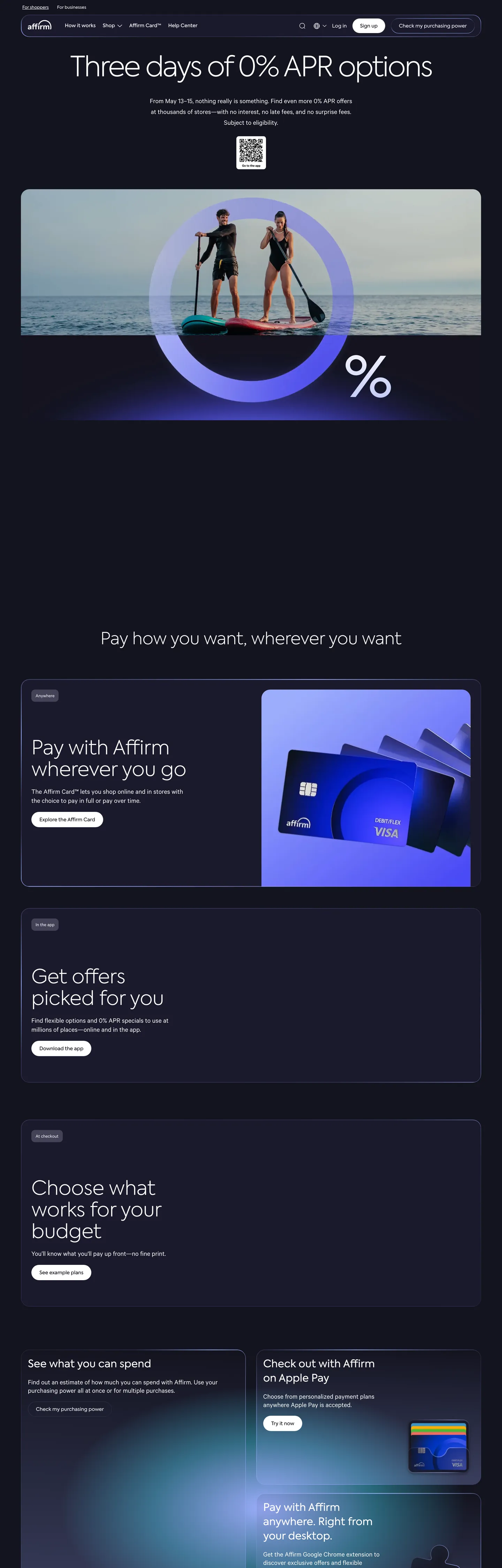
Affirm's marketing surface opens on indigo-black "#101820" — a near-black warmed with a faint blue undertone that anchors the entire site, never pure "#000000". The hero photography of paddleboarders sits under a circular periwinkle "#9cadfc" halo that announces the brand's signature gesture: a soft indigo glow used as atmosphere rather than fill. The single brand voltage, indigo "#4a4af4", lives inside the CSS variable layer as `--color-primary-base` and surfaces only on focus rings and a small handful of CTA states — the page itself prefers the white-on-near-black hierarchy and lets the glow do the chromatic work. Inverted text "#ffffff" carries every reading surface, with "#9f9f9f" and "#6d6e71" handling the secondary register. Where most buy-now-pay-later brands push retail-cheerful palettes, Affirm pushes the inverse and trusts the periwinkle glow to telegraph approachability.
This page packages the full system into a single DESIGN.md file. Inside: 22 colors tokens, 12 typography levels across the proprietary Axiforma for Affirm and Calibre families, 6 corner radii, 9 spacing values, and 17 components — the hero pill nav, the cream-bordered scene cards, the 36px capsule search bar, the carousel pagination dots, and the indigo-glow gradient stops. Every hex is quoted; every Axiforma weight (300, 400, 500) is reproducible. The format is the Google Labs DESIGN.md spec — plain text, machine-readable, grep-friendly.
Feed the file to Claude, Cursor, or GitHub Copilot. The AI writes React components and Tailwind classes that match Affirm's particular dialect — indigo-black-canvas-first surfaces, the 300-weight display register with negative tracking, 96px pill CTAs, and the periwinkle-glow gradient as the brand's depth medium — instead of a generic fintech dark theme. Inter Variable at weight 300 with -3.2px tracking on the 80px display tier is the closest open-source path; the Axiforma family is proprietary and not licensed for redistribution.
What makes it distinct
5
- Indigo-black canvas as defaultevery marketing surface sits on #101820, the most-used token at 328 occurrences, with #ffffff doing every text job
- Periwinkle glow as depth signature#9cadfc carries 46 gradient uses and 15 shadow uses, never appears as a button fill
- Axiforma weight 300 display with negative tracking-3.2px at 80px scaling down to -0.6px at 30px, the inverse of every default rendering of a sans-serif hero
- 96px pill geometry on a 24px workhorse basethe card radius appears 43 times, the full pill 11 times, with the 36px search-bar capsule as the only intermediate step
- Three weight registers300 owns display, 400 owns body Calibre, 500 carries Axiforma at 14–15px caption work; bold weights are absent above the input chrome
affirm.com
Live at affirm.com
A snapshot of the brand in production. Scroll the frame to see the whole page.
Colors
22 colors
Affirm's system runs on #4a4af4 as its primary voltage, used in 2 of 17 components. Type is set in Axiforma for Affirm across 12 tokens from 12px to 80px, weights 300–500. Shape language is soft — components average 42px corner radius, with no sharp interactive edges.
Brand & Accent
Sparing, CTA-only voltage · 6
Surface
Page and card backgrounds · 6
Text
Headlines, body, captions · 5
Borders & Hairlines
Dividers, outlines, rules · 1
Semantic
Status, errors, success, links · 3
Other
Specialty colors · 1
Typography
12 type tokens
Set in Axiforma for Affirm across 12 tokens, from 12px to 80px, weights 300–500. Shown in its own stack: where the font isn't installed, the fallback the file names stands in.
- display-xxl80px · weight 300 · lh 1.1 · tracking -3.2pxThe quick brown fox jumps over the lazy dog
- display-xl76px · weight 300 · lh 0.8 · tracking 0The quick brown fox jumps over the lazy dog
- display-lg56px · weight 300 · lh 1.1 · tracking 0The quick brown fox jumps over the lazy dog
- display-md50px · weight 300 · lh 1.17 · tracking 0The quick brown fox jumps over the lazy dog
- display-sm48px · weight 300 · lh 1.1 · tracking 0The quick brown fox jumps over the lazy dog
- heading-md30px · weight 400 · lh 1.1 · tracking -0.6pxThe quick brown fox jumps over the lazy dog
- body-lg20px · weight 400 · lh 1.55 · tracking 0The quick brown fox jumps over the lazy dog
- body-md18px · weight 400 · lh 1.17 · tracking 0The quick brown fox jumps over the lazy dog
- body-sm14px · weight 400 · lh 1.43 · tracking 0The quick brown fox jumps over the lazy dog
- label-md15px · weight 500 · lh 1.73 · tracking 0The quick brown fox jumps over the lazy dog
- caption14px · weight 500 · lh 1 · tracking 0The quick brown fox jumps over the lazy dog
- micro12px · weight 400 · lh 1.2 · tracking 0.25pxThe quick brown fox jumps over the lazy dog
Layout
Radii and spacing
6 corner radii and 9 spacing values. Shape language: soft.
Radii
- xs4px
- sm10px
- md16px
- lg24px
- capsule36px
- pill96px
Spacing
- xxs2px
- xs4px
- sm8px
- md12px
- base16px
- lg20px
- xl24px
- xxl30px
- huge60px
Components
17 components
Each rendered from its tokens (color, type, radius, padding) on Affirm's own canvas.
- Button Primary Pillbutton-primary-pillButton Primary Pill
- Button Primary Pill Hoverbutton-primary-pill-hoverButton Primary Pill Hover
- Button On Darkbutton-on-darkButton On Dark
- Button Secondary Ghostbutton-secondary-ghostButton Secondary Ghost
- Search Capsulesearch-capsuleSearch Capsule
- Type here…text-inputText Input
- Top Navtop-navTop Nav
- Card Scene Darkcard-scene-darkCard Scene Dark
- Card Scene Elevatedcard-scene-elevatedCard Scene Elevated
- Card Content Tilecard-content-tileCard Content Tile
- Tag Pill Softtag-pill-softTag Pill Soft
- Carousel Pagination Dotcarousel-pagination-dotCarousel Pagination Dot
- Carousel Pagination Dot Inactivecarousel-pagination-dot-inactiveCarousel Pagination Dot Inactive
- Hero Halohero-haloHero Halo
- Link On Darklink-on-darkLink On Dark
- Divider Strokedivider-strokeDivider Stroke
- Footer Darkfooter-darkFooter Dark
In use
The system, in use
Affirm's tokens on the kind of product it builds.
Build something people actually use.
A short paragraph of marketing copy that previews how the brand's display tier and body tier read together. Two sentences is usually enough.
FAQ
Affirm design system FAQ
Common questions about Affirm's tokens, components, and how to use this DESIGN.md in your project.
Read next
Related reading
Specs, directories, and component libraries that pair with this design system.
- Browse all design systemsThe full directory of DESIGN.md files on shadcn.io, with live mockups for each.shadcn.io
- Affirm — official siteThe buy-now-pay-later platform whose marketing surface this DESIGN.md captures.affirm.com (opens in a new tab)
- The DESIGN.md specificationGoogle Labs' open spec for machine-readable design system files.github.com (opens in a new tab)
Use it
Use Affirm in your project
One machine-readable file. Drop it into Claude, Cursor, or any AI tool that reads DESIGN.md.
Download the DESIGN.md
One machine-readable file: every color, type, radius, spacing, and component token of Affirm.
Feed it to your AI tool
Drop it into Claude, Cursor, or GitHub Copilot. The agent writes React components and Tailwind classes that match Affirm's visual language.
Reference the tokens directly
Or paste the values into your Tailwind config, CSS variables, or component library: every color, size and radius is a quoted, ready-to-copy value.
Read the full DESIGN.md: overview, rationale, do’s and don’ts
Overview
Affirm's marketing surface opens on indigo-black "#101820" with a circular periwinkle "#9cadfc" halo behind the hero paddleboard photography — the brand's signature gesture. The page is a dark canvas where every reading surface is "#ffffff" on near-black, and the chromatic action happens not in button fills but in gradient and shadow uses of the periwinkle glow. The lighter wash "#e2e2ff" carries the indigo tag-pill background; the darkest indigo "#212189" appears as a gradient mid-stop pulling toward black.
The color system has two primary roles. Indigo-black ({colors.canvas} — "#101820") is the universal canvas, the most-used token at 328 occurrences across text, border, and one bg fill. Periwinkle glow ({colors.primary-glow} — "#9cadfc") is the brand's atmospheric depth medium, surfacing in 46 gradient stops and 15 shadow declarations, never as a button fill. The load-bearing CTA voltage indigo "#4a4af4" sits inside --color-primary-base and only appears as the focus-ring outline and on the secondary on-dark CTA — Affirm prefers white-on-black for primary action and lets the glow carry the brand voltage.
Typography is built around Axiforma for Affirm at weight 300 with negative letter-spacing on the largest display tier — the brand's editorial-density display signature. The 80px hero headline runs -3.2px tracking; the 30px heading runs -0.6px; mid-display sizes (48–56px) sit at zero tracking. Body copy hands off to Calibre at 14–20px / weight 400 with normal tracking. Axiforma at weight 500 carries 14–15px caption and label work — bold weights above 500 are absent.
Glow-as-depth: Affirm replaces the conventional drop-shadow stack with a periwinkle glow token "{colors.primary-glow}" applied at low alpha. The radial halo behind the hero, the linear-stroke gradient along card edges, and the carousel ambient lift all come from the same rgba(168, 169, 252, .25) voltage. Where most fintech sites use neutral gray shadows to build a surface ladder, Affirm uses chromatic glow — depth is brand atmosphere, not lift.
Key Characteristics:
- Indigo-black canvas as default — every marketing surface sits on "{colors.canvas}" ("#101820"), the workhorse token at 328 occurrences across the page.
- Periwinkle glow as depth medium — "{colors.primary-glow}" ("#9cadfc") shows up in 46 gradient stops and 15 shadow declarations, kept off button fills.
- Single-voltage CTA hierarchy: white-on-black pill is the primary action; the indigo "#4a4af4" fill is reserved for one secondary on-dark CTA per band.
- Axiforma thin (weight 300) display tier with -3.2px letter-spacing at 80px — the inverse of the heavier defaults most consumer-fintech brands ship.
- 96px full-pill geometry on a 24px workhorse card radius — radii cluster on two values, with 36px reserved for the search capsule.
- Calibre body type at 18px / weight 400 with normal tracking — a wider, humanist register than the Axiforma display work, deliberately less compressed.
- Cream-bordered scene cards "{colors.canvas-elevated}" ("#0c0c14") introduce a slightly darker product-mockup surface above the canvas — the brand's surface ladder runs darker, not lighter.
Colors
Source pages: home (
/),/pay-with-affirm,/apple-pay,/buy-now-pay-later.
Brand & Accent
- Indigo Primary ("{colors.primary}" — "#4a4af4"): frequency 0 on the page, but declared in
--color-primary-baseand--outline: 2px solid #4a4af4. Reserved for focus rings and the on-dark secondary CTA fill — never a body-text color. - Indigo Dark ("{colors.primary-dark}" — "#2f2fc1"): frequency 0 on the surface, declared in
--color-primary-dark. Used as a gradient mid-stop in the hero radial wash. - Indigo Darkest ("{colors.primary-darkest}" — "#212189"): frequency 0 surface, declared in
--color-primary-darkest. Anchors the deepest indigo end of--color-gradient-right-indigowhich pairs "#212189" against pure black at the right edge. - Periwinkle Glow ("{colors.primary-glow}" — "#9cadfc"): frequency 69. Used as gradient (46), shadow (15), border (4), text (4). The brand's atmospheric depth medium — appears in the radial hero halo, the linear-stroke card edge, and as the carousel-pagination active dot.
- Indigo Wash ("{colors.primary-wash}" — "#e2e2ff"): frequency 3, used as bg (3). The pale fill for
--background-accent-subtleindigo tag pills. - Indigo Subtle ("{colors.primary-subtle}" — "#e6e6fc"): frequency 0 surface, declared as
--color-primary-lightest. Reserved for the lightest indigo tag-pill background variant.
Canvas & Surface
- Indigo-Black Canvas ("{colors.canvas}" — "#101820"): frequency 328. Used as text (160), border (160), bg (1), gradient (7). The dominant surface — Affirm's universal canvas, declared as
--color-greyscale-black-100and--content-neutral. - Canvas Elevated ("{colors.canvas-elevated}" — "#0c0c14"): frequency 26. Used as border (13), text (12), shadow (1). The darker product-mockup surface — Affirm's surface ladder runs darker, not lighter.
- Glass Background ("{colors.canvas-glass}" — "#1b1b30"): frequency 1 (gradient). Declared as
--glass-background-colorat 80 percent alpha — the low-alpha glass-blur fill on overlay scene cards. - Canvas Light ("{colors.canvas-light}" — "#ffffff"): frequency 285. Used as text (139), border (139), bg (7). The inverted track — text on dark canvas plus the rare light-surface input fill.
- Surface Neutral 1 ("{colors.surface-neutral-1}" — "#f0f5f7"): declared as
--color-ui-colors-background-neutral-2. Cool-tinted off-white for the light dashboard product UI. - Surface Neutral 3 ("{colors.surface-neutral-3}" — "#ede9e6"): declared as
--color-ui-colors-background-neutral-3. Warm-tinted off-white used on light product cards.
Ink
- Ink Inverse ("{colors.ink-inverse}" — "#ffffff"): the universal text color on the dark canvas.
- Ink Caption ("{colors.ink-caption}" — "#6d6e71"): frequency 6. Used as text (3), border (3). Caption and helper text on light surfaces.
- Ink Disabled ("{colors.ink-disabled}" — "#9f9f9f"): frequency 26. Used as text (13), border (13). Disabled state and carousel-pagination inactive dot.
- Ink Grade 80 ("{colors.ink-grade-80}" — "#3a3c3d"): declared as
--color-ui-colors-text-80. Mid-emphasis text on light surfaces. - Ink Grade 30 ("{colors.ink-grade-30}" — "#bbbdbe"): declared as
--color-greyscale-black-30. Low-emphasis text in the dashboard surface.
Hairline & Semantic
- Hairline Cool ("{colors.hairline-cool}" — "#d3e3ea"): declared as
--color-ui-colors-border-neutral-2. 1px hairline borders on form chrome. - Success ("{colors.success}" — "#2abc7a"): declared as
--color-success-base. Approval state in the dashboard product. - Success Dark ("{colors.success-dark}" — "#0a894c"): the darker success ink.
- Warning ("{colors.warning}" — "#ffca61"): declared as
--color-warning-base. Awaiting-approval state. - Destructive ("{colors.destructive}" — "#ff6d50"): declared as
--color-destructive-base. Rejection and error states.
Typography
Font Family
The display and UI tier is Axiforma for Affirm (proprietary, declared in --font-family-display: "Axiforma for Affirm", "Axiforma", "Calibre", sans-serif). Body copy hands off to Calibre (declared in --font-family-body: "Calibre", sans-serif). The monospace voice is Alma Mono (--font-family-monospace: "Alma Mono", Courier, monospace) and surfaces only inside the developer-API documentation, not on the marketing top of funnel.
When Axiforma is unavailable, fall back to Inter Variable at weight 300 with -3.2px tracking on the 80px display tier; Inter's open-source weight 300 carries the closest letter shape to Axiforma's thin register. Avoid Helvetica or Roboto — both are too geometric for Axiforma's slightly humanist silhouette.
Hierarchy
| Token | Size | Weight | Line Height | Letter Spacing | Use |
|---|---|---|---|---|---|
{typography.display-xxl} | 80px | 300 | 1.1 | -3.2px | Hero headline |
{typography.display-xl} | 76px | 300 | 0.8 | 0 | Section opener |
{typography.display-lg} | 56px | 300 | 1.1 | 0 | Sub-section title |
{typography.display-md} | 50px | 300 | 1.17 | 0 | Section heading |
{typography.display-sm} | 48px | 300 | 1.1 | 0 | Compact display |
{typography.heading-md} | 30px | 400 | 1.1 | -0.6px | Card title / h3 |
{typography.body-lg} | 20px | 400 | 1.55 | 0 | Marketing body lead |
{typography.body-md} | 18px | 400 | 1.17 | 0 | Default UI body |
{typography.body-sm} | 14px | 400 | 1.43 | 0 | Helper, footer body |
{typography.label-md} | 15px | 500 | 1.73 | 0 | Pill button label |
{typography.caption} | 14px | 500 | 1.0 | 0 | Tag pill, eyebrow |
{typography.micro} | 12px | 400 | 1.2 | 0.25px | Nav link, fine print |
Principles
- Thin weight is the brand. Display tiers always render at weight 300. Bumping to 400+ on display sizes collapses the brand's editorial register.
- Negative tracking only at 80px. -3.2px at 80px and -0.6px at 30px are the only negative-tracked tiers; mid-display sizes (48–56px) stay at zero tracking.
- Two-family contrast. Axiforma carries display and caption; Calibre carries body and paragraph copy. The contrast between Axiforma's slightly humanist display and Calibre's more neutral body register is deliberate.
- No bold above 500. Weights 600/700/800/900 are declared in the variable layer but never render on the marketing surface — the brand stays under 500.
Note on Font Substitutes
Axiforma is proprietary. Use Inter Variable at weight 300 with letter-spacing: -3.2px on the 80px display tier — Inter is the closest open-source analogue. For body sizes, Inter at weight 400 with zero tracking substitutes for Calibre. Avoid Helvetica, Arial, or system-ui defaults — their stems read too geometric and even-width against Axiforma's slightly humanist silhouette.
Layout
Spacing System
- Base unit: 4px (with 1.5 / 2 sub-tokens for fine carousel-dot work).
- Tokens: "{spacing.xxs}" 2px · "{spacing.xs}" 4px · "{spacing.sm}" 8px · "{spacing.md}" 12px · "{spacing.base}" 16px · "{spacing.lg}" 20px · "{spacing.xl}" 24px · "{spacing.xxl}" 30px · "{spacing.huge}" 60px.
- Section padding: 40–240px (declared in
--section-spacing-xsthrough--section-spacing-xxl); the 80px and 120px stops carry most marketing rhythm. - Card internal padding: 30px on scene cards (declared in spacing stack as
30px 30px 0px); 24px on content tiles; 14px x 23px on pill buttons.
Grid & Container
- Marketing pages center in a 1320px max-content-width container (declared as
--max-content-width: 1320pxand--grid-base-width: 1440px). - Hero photography extends edge-to-edge above the dark canvas.
- Carousel sections use a 378px card width on a 442px slide offset.
Whitespace Philosophy
The dark canvas absorbs whitespace differently — Affirm uses generous 80–160px section gaps so the periwinkle glow has room to radiate. Content tightens to 30–40px on the dashboard product surface where users compare and act.
Elevation & Depth
| Level | Treatment | Use |
|---|---|---|
| 0 | Flat | Default surface |
| 1 | box-shadow: rgba(168, 169, 252, 0.25) 0 0 12px | Card lift on indigo-black canvas |
| 2 | box-shadow: rgba(168, 169, 252, 0.25) 0 0 75.59px | Hero halo, carousel ambient lift |
| 3 | Periwinkle radial gradient | The brand's primary depth medium — atmospheric color rather than literal shadow |
Decorative Depth
The periwinkle glow IS the depth system. The radial halo behind hero photography (--color-2025-radial-gradient: radial-gradient(44.05% 43.36% at 52.67% 56.72%, #9cadfc 0%, #296a7d 54.81%, #13131f 100%)) is the brand's signature lift; the linear-stroke gradient along card hairlines (--LINEAR-STROKE-GRADIENT: linear-gradient(90deg, rgba(74,74,244,.1), #4a4af4 50%, rgba(74,74,244,.1))) carries the same voltage at smaller scale. Literal gray drop-shadows are absent.
Shapes
Border Radius Scale
| Token | Value | Use |
|---|---|---|
{rounded.xs} | "4px" | Form chrome, hairline tags |
{rounded.sm} | "10px" | Carousel pagination dots |
{rounded.md} | "16px" | Mid-size product cards |
{rounded.lg} | "24px" | Scene cards, content tiles, dashboard chrome |
{rounded.capsule} | "36px" | Search-bar capsule only |
{rounded.pill} | "96px" | All CTAs, tag pills |
Photography Geometry
The brand uses outdoor photography more than product screenshots — paddleboarders against dawn water, retail scenes, customer portraits. Photography is treated as full-bleed background inside {rounded.lg} 24px containers with a periwinkle glow halo composited on top. Product UI mockups (the credit card preview, Apple Pay scene) appear as composited cards with a subtle indigo-glow shadow.
Components
Buttons
button-primary-pill — the dominant CTA across the dark canvas.
- Background "{colors.canvas-light}" ("#ffffff"), text "{colors.canvas}" ("#101820"), type "{typography.label-md}", padding 14px 23px, rounded "{rounded.pill}" 96px.
- Hover state
button-primary-pill-hovershifts background to "{colors.primary-glow}" ("#9cadfc") — the rare moment indigo glow becomes a fill.
button-on-dark — the indigo secondary on dark surfaces.
- Background "{colors.primary}" ("#4a4af4"), text "{colors.canvas-light}", same pill geometry. The only place the load-bearing indigo "#4a4af4" surfaces as a fill.
button-secondary-ghost — outline-style alternative.
- Background "{colors.canvas}", text "{colors.ink-inverse}", 1px #ffffff stroke border, same pill geometry.
Inputs & Forms
search-capsule — the homepage search bar.
- Background "{colors.canvas-light}", text "{colors.canvas-elevated}", type "{typography.body-md}", padding 20px 104px 20px 54px, rounded "{rounded.capsule}" 36px, height 54px. The lone surface using the intermediate 36px radius.
text-input — standard form field.
- Background "{colors.canvas-light}", text "{colors.canvas-elevated}", type "{typography.body-md}", padding 12px 16px, rounded "{rounded.xs}" 4px, height 48px (declared as
--input-height: 48px).
Cards & Containers
card-scene-dark — the dominant product-mockup container.
- Background "{colors.canvas-elevated}" ("#0c0c14"), text "{colors.ink-inverse}", padding 30px 30px 0px, rounded "{rounded.lg}" 24px, optional periwinkle-glow Level 2 shadow.
card-scene-elevated — the glass-blur variant.
- Background "{colors.canvas-glass}" ("#1b1b30") at .8 alpha, text "{colors.ink-inverse}", padding 30px, rounded "{rounded.lg}",
--glass-backdrop-blur: blur(clamp(8px, 2vw, 18px)).
card-content-tile — feature explanation card.
- Background "{colors.canvas-elevated}", text "{colors.ink-inverse}", padding 24px, rounded "{rounded.md}" 16px.
Pills, Tags, and Chips
tag-pill-soft — subdued indigo tag.
- Background "{colors.primary-wash}" ("#e2e2ff"), text "{colors.primary-darkest}" ("#212189"), type "{typography.micro}", padding 4px 8px, rounded "{rounded.pill}".
Navigation
top-nav — top nav floating over the dark canvas.
- Background "{colors.canvas}", text "{colors.ink-inverse}", padding 14px 4px, height 64px (declared as
--header-height: 64px). Wordmark left, nav center, sign-in right.
Signature Components
Hero Halo — circular periwinkle "{colors.primary-glow}" radial gradient composited behind hero photography. Implemented as the --color-2025-radial-gradient SVG/CSS layer at 44.05% × 43.36% with a #9cadfc → #296a7d → #13131f stop sequence. The brand's most-photographed feature.
Divider Stroke — the brand's linear-stroke gradient hairline --LINEAR-STROKE-GRADIENT: linear-gradient(90deg, rgba(74,74,244,.1), #4a4af4 50%, rgba(74,74,244,.1)). Runs along the bottom edge of feature sections at 1px height; the indigo midpoint is the only on-surface appearance of the load-bearing "#4a4af4".
Carousel Pagination Dot — 10px circular dot at "{colors.primary-glow}" for active state, "{colors.ink-disabled}" at 0.2 opacity for inactive. The active dot is the smallest on-surface appearance of the periwinkle glow.
link-on-dark — inline links on the dark canvas.
- Text "{colors.ink-inverse}" ("#ffffff") rendered in "{typography.body-md}", underlined on hover.
footer-dark — site-wide footer.
- Background "{colors.canvas}", text "{colors.ink-caption}" ("#6d6e71"), type "{typography.body-sm}", padding 60px 24px. Holds 4–6 columns of link groups, social icons, and a small legal row.
Do's and Don'ts
Do
- Reserve "{colors.primary}" ("#4a4af4") for focus rings and the on-dark secondary CTA — it should appear sparingly, not as a primary fill.
- Apply the periwinkle radial halo behind every hero photograph; a flat dark canvas without the halo reads as wrong-brand.
- Render display tiers at weight 300 with -3.2px tracking at 80px — the thin negative-tracked register is the typographic signature.
- Use "{colors.canvas-light}" ("#ffffff") as the primary CTA fill on the dark canvas — white-on-black is the default, indigo is the exception.
- Pair every feature explanation with outdoor photography or a composited product scene; the brand argues through atmosphere, not feature lists.
- Apply the periwinkle glow shadow (
rgba(168, 169, 252, 0.25)) instead of gray drop-shadows on every elevated card.
Don't
- Don't bump display weight above 300 — at 400 the brand's editorial air collapses. Use Calibre at weight 400 for body, not Axiforma at 400 for display.
- Don't fill primary CTAs with "{colors.primary}" ("#4a4af4") on the dark canvas — it's a focus-ring and secondary-CTA color, not the dominant button voltage. The dominant pill is "{colors.canvas-light}" white.
- Don't use 16px or 20px corners on a card — neither value appears in the extracted radii. Stick to 24px on cards and 96px on pills, with 36px reserved for the search capsule.
- Don't apply a gray drop-shadow to any elevated surface — Affirm's depth medium is the periwinkle glow, not neutral shadow.
- Don't render body copy in Axiforma — body is Calibre territory. Axiforma above 18px is display only.
- Don't square off pills at 16px or 24px — the brand pill is 96px and reads as approachable consumer-fintech action.
Responsive Behavior
Breakpoints
| Name | Width | Key Changes |
|---|---|---|
| Wide | ≥ 1440px | Full 1320px max-content-width; hero halo at full scale |
| Desktop | 1024–1440px | Default content max-width; carousel 3-up |
| Tablet | 768–1023px | Carousel 2-up; section spacing tightens to 60px |
| Mobile | < 768px | Carousel 1-up; hamburger nav; display drops 80 → 42px |
Touch Targets
- Pill buttons hit ≥ 48×48px on mobile via
--input-height-mobile: 48px. The 96px pill radius preserves the approachable consumer-fintech read at any size. - Form fields stay at 48px minimum height on mobile.
Collapsing Strategy
- Display tiers stair-step 80 → 56 → 48 → 30 → 22px through the breakpoints.
- The hero halo re-centers on mobile but does not disappear — the glow is non-negotiable.
- Scene cards stair-step 3-up → 2-up → 1-up.
- Photography crops shift from full-bleed landscape on desktop to centered portrait on mobile.
Image Behavior
Outdoor photography uses srcset with art-direction crops at major breakpoints. Mobile crops focus tight on the subject; desktop crops show the full atmospheric scene with the periwinkle halo intact.
Known Gaps
- Hero radial gradient precision: treated here as a single composite token (
--color-2025-radial-gradient); the multi-layer SVG halo with its blur and noise textures is not fully captured. - Dashboard product semantic palette: approval / pending / rejected transaction states live inside the authenticated affirm.com checkout widget, not the marketing surface.
- Motion specs: the carousel pagination drift, the search-bar focus transition, and the scene-card hover lift are not captured.
- Sub-brand palettes: Affirm Card, Pay in 4, Adaptive Checkout, and the Apple Pay integration each carry small accent shifts not present on the core marketing surface.
- Loading skeleton tokens: the dashboard skeleton screens are absent from the public marketing capture.
- Code-block / mono usage: Alma Mono is declared in the variable layer but appears only inside the developer-API documentation pages, which are not part of this top-of-funnel spec.
Banking & Payments
More systems like this
More DESIGN.md files in Banking & Payments.
Pricing
Build it with Pro
The DESIGN.md files are free. Pro adds 6,000+ blocks, premium templates and the MCP server, so your AI editor builds in your system for you.
4.9/5 out of 5 · 150+ reviewsfrom 150+ founders and developers.
Billing
Billed once a year in USD. Cancel anytime.
- How many people can use the license.
- Client work, SaaS products and anything you charge for.
- Production-ready React sections: hero, pricing, features, dashboards and more.
- Complete multi-page sites you can ship as they are.
- React icons from every major library, installable with one command.
- Presets that restyle every block, in light and dark.
- Lets your AI editor search, preview and install blocks for you.
- Priority requests are answered first.
Individual
For personal projects & open source
$32instead of $49/mo
$389 billed yearly
- Seats: 1 seat
- Commercial use: Personal & open source only
- Pro blocks: 6,000+ blocks
- Templates: All 14 templates
- React icons: 294k+ icons
- Themes: All 59 themes
- MCP server: Basic usage
- Support: Standard
Team
Most popularFor freelancers, agencies & startups
$66instead of $99/mo
$789 billed yearly · ≈ $13/dev/mo
- Seats: Up to 5 seats
- Commercial use: Included
- Pro blocks: 6,000+ blocks
- Templates: All 14 templates
- React icons: 294k+ icons
- Themes: All 59 themes
- MCP server: High usage
- Support: Priority
Organization
For companies with larger teams
$132instead of $199/mo
$1,589 billed yearly
- Seats: Unlimited seats
- Commercial use: Included
- Pro blocks: 6,000+ blocks
- Templates: All 14 templates
- React icons: 294k+ icons
- Themes: All 59 themes
- MCP server: Unlimited usage
- Support: Priority
Billed once a year in USD. Cancel anytime.
Individual
For personal projects & open source
$32instead of $49/mo
$389 billed yearly
- How many people can use the license.Seats: 1 seat
- Client work, SaaS products and anything you charge for.Commercial use: Personal & open source only
- Production-ready React sections: hero, pricing, features, dashboards and more.Pro blocks: 6,000+ blocks
- Complete multi-page sites you can ship as they are.Templates: All 14 templates
- React icons from every major library, installable with one command.React icons: 294k+ icons
- Presets that restyle every block, in light and dark.Themes: All 59 themes
- Lets your AI editor search, preview and install blocks for you.MCP server: Basic usage
- Priority requests are answered first.Support: Standard
Team
Most popularFor freelancers, agencies & startups
$66instead of $99/mo
$789 billed yearly · ≈ $13/dev/mo
Everything in Individual, plus
- How many people can use the license.Seats: Up to 5 seats
- Client work, SaaS products and anything you charge for.Commercial use: Included
- Lets your AI editor search, preview and install blocks for you.MCP server: High usage
- Priority requests are answered first.Support: Priority
Organization
For companies with larger teams
$132instead of $199/mo
$1,589 billed yearly
Everything in Team, plus
- How many people can use the license.Seats: Unlimited seats
- Lets your AI editor search, preview and install blocks for you.MCP server: Unlimited usage
- Secure checkout via Stripe
- Code lives in your repo
- Keep what you've shipped if you cancel
- License terms
Your system, built for you
Every block, template and icon, installed by your AI agent in your design system. The DESIGN.md files stay free.