Wells Fargo Design System
Wells Fargo's marketing-site design system as a DESIGN.md file. Stagecoach red #d71e28, warm cream #f9f7f6 canvas, Wells Fargo Sans type family, 10 colors tokens, 14 components. For React, Next.js, and AI tools.
Add shadcn.io to your AI agent. · Pro It installs blocks, icons and templates in your design system from a prompt, with Pro.
Set up MCP- Primary
- #d71e28
- Typeface
- Wells Fargo Sans Regular
- Shape
- Mixed
- Base radius
- 24px
- Colors
- 10
- Type tokens
- 12
- Components
- 14
- Spacing values
- 7
About
About Wells Fargo DESIGN.md
Curated by Dov Azencot · Updated May 19, 2026 · Source wellsfargo.com (opens in a new tab)
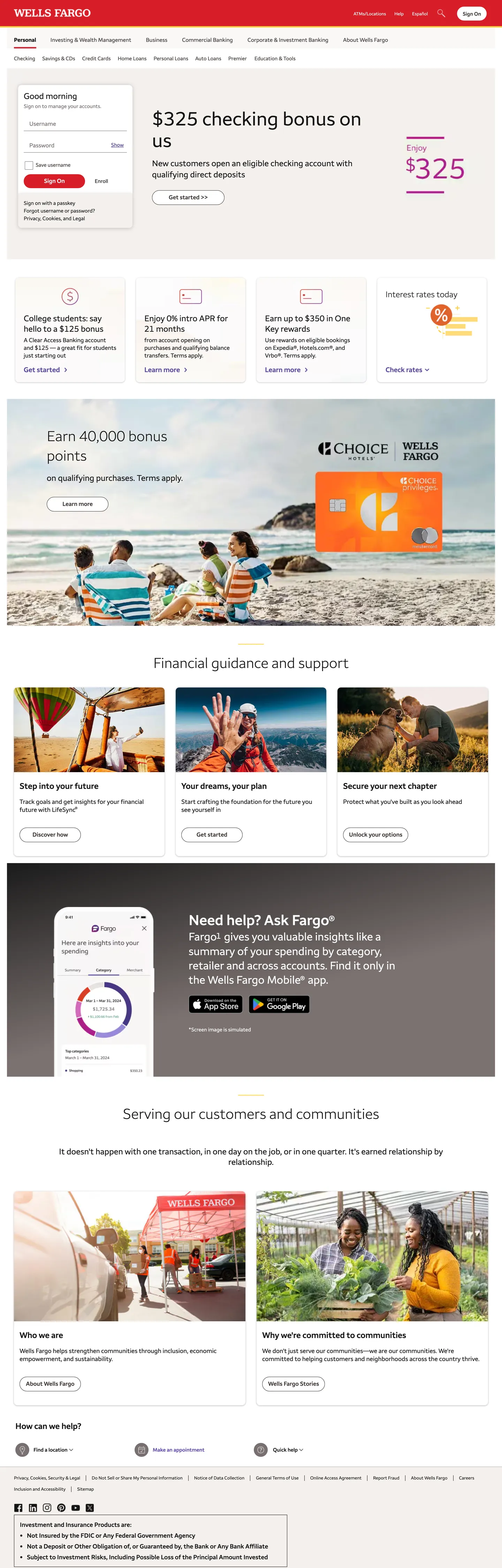
Wells Fargo's homepage opens with a full-width stagecoach-red navigation bar — the brand's scarlet #d71e28 fills the header band completely, carrying the stagecoach logo and utility links in white. Below that, the entire page runs on a warm antique-cream canvas (#f9f7f6 is the declared themeColor, not pure white), with near-black body text and a surprising purple link accent (#5a469b) rather than a red or gold derivative. Where Citi separates brand blue from interactive cerulean, Wells Fargo separates the brand red (header-only) from a completely different interactive hue (purple), treating the two colors as distinct semantic registers rather than tonal variations of the same palette.
The typographic choice reinforces the warmth. Wells Fargo Sans — a custom family — ships in four weights that graduate from the display headline (42px / Light 300) down through Regular body text (13–17px / 400) to SemiBold interactive labels (15–24px / 600) and Bold emphasis (16–18px / 700). The weight graduation is smoother than Citi's binary 300/700 gap — a SemiBold sits between Regular and Bold, giving the page a warmer, more magazine-like tone. The 56px display headline captured in the hero ("$325 checking bonus on us") uses Regular 400 at a large scale — not Bold — which keeps the large type feeling approachable rather than forceful.
The DESIGN.md file packages this into machine-readable tokens. The distinctive move for builders: the warm cream canvas (#f9f7f6) is not pure white — it carries a visible warmth that affects every card, section background, and input surface. Substituting pure white breaks the system's temperature. The red is structurally confined to the nav; the purple carries all interactivity; and the near-black ink (#141414) is noticeably warmer than pure black, consistent with the canvas's temperature throughout.
What makes it distinct
5
- Stagecoach red as nav canvas#d71e28 fills the entire top navigation bar and appears only there, while the body runs entirely on warm cream #f9f7f6
- Warm cream themeColorthe page declares #F9F7F6 as its theme-color meta; the canvas is not pure white but a slightly warm off-white that runs the full system
- Wells Fargo Sans across four weightsLight 300 for display, Regular 400 for body, SemiBold 600 for headings and interactive labels, Bold 700 for emphasis; no secondary family
- Purple link accent#5a469b carries 40 interactive occurrences as the link and secondary accent color, a surprising pairing against the red nav
- Two-tier radius10px on standard elements, 24px on featured promotional panels; no pill or sharp-corner extremes
wellsfargo.com
Live at wellsfargo.com
A snapshot of the brand in production. Scroll the frame to see the whole page.
Colors
10 colors
Wells Fargo's system runs on #d71e28 as its primary voltage, used in 1 of 14 components. Type is set in Wells Fargo Sans Regular across 12 tokens from 13px to 56px, weights 300–600. Shape language is mixed across 14 components, blending pills, soft rounds, and squarer corners.
Surface
Page and card backgrounds · 2
Text
Headlines, body, captions · 6
Borders & Hairlines
Dividers, outlines, rules · 1
Other
Specialty colors · 1
Typography
12 type tokens
Set in Wells Fargo Sans Regular across 12 tokens, from 13px to 56px, weights 300–600. Shown in its own stack: where the font isn't installed, the fallback the file names stands in.
- display-xl56px · weight 400 · lh 62pxThe quick brown fox jumps over the lazy dog
- display-md42px · weight 300 · lh 54pxThe quick brown fox jumps over the lazy dog
- heading-lg24px · weight 600 · lh 34pxThe quick brown fox jumps over the lazy dog
- heading-md20px · weight 600 · lh 25pxThe quick brown fox jumps over the lazy dog
- heading-sm17px · weight 600 · lh 22pxThe quick brown fox jumps over the lazy dog
- body-lg18px · weight 400 · lh 23pxThe quick brown fox jumps over the lazy dog
- body-md16px · weight 400 · lh 22pxThe quick brown fox jumps over the lazy dog
- body-sm15px · weight 400 · lh 19pxThe quick brown fox jumps over the lazy dog
- body-xs13px · weight 400 · lh 18pxThe quick brown fox jumps over the lazy dog
- label-md15px · weight 600 · lh 19pxThe quick brown fox jumps over the lazy dog
- button-md17px · weight 600 · lh 22pxThe quick brown fox jumps over the lazy dog
- nav-link13px · weight 400 · lh 16pxThe quick brown fox jumps over the lazy dog
Layout
Radii and spacing
4 corner radii and 7 spacing values. Shape language: mixed.
Radii
- none0px
- sm10px
- md24px
- lg40px
Spacing
- xs2px
- sm8px
- md12px
- base16px
- lg20px
- xl24px
- 2xl40px
Components
14 components
Each rendered from its tokens (color, type, radius, padding) on Wells Fargo's own canvas.
- Button Primarybutton-primaryButton Primary
- Button Secondarybutton-secondaryButton Secondary
- Top Navtop-navTop Nav
- Nav Linknav-linkNav Link
- Hero Headinghero-headingHero Heading
- Section Headingsection-headingSection Heading
- Body Paragraphbody-paragraphBody Paragraph
- Body Paragraph Mutedbody-paragraph-mutedBody Paragraph Muted
- CardcardCard
- Card Featuredcard-featuredCard Featured
- LabellabelLabel
- Type here…text-inputText Input
- Section Bandsection-bandSection Band
- FooterfooterFooter
In use
The system, in use
Wells Fargo's tokens on the kind of product it builds.
Build something people actually use.
A short paragraph of marketing copy that previews how the brand's display tier and body tier read together. Two sentences is usually enough.
FAQ
Wells Fargo design system FAQ
Common questions about Wells Fargo's tokens, components, and how to use this DESIGN.md in your project.
Read next
Related reading
Specs, directories, and component libraries that pair with this design system.
- Browse all design systemsThe full directory of DESIGN.md files on shadcn.io, with live mockups for each.shadcn.io
- Wells Fargo — official siteWells Fargo's public marketing site — the source of truth for the live tokens captured in this file.wellsfargo.com (opens in a new tab)
- The DESIGN.md specificationGoogle Labs' open spec for machine-readable design system files — the format this page is built on.github.com (opens in a new tab)
Use it
Use Wells Fargo in your project
One machine-readable file. Drop it into Claude, Cursor, or any AI tool that reads DESIGN.md.
Download the DESIGN.md
One machine-readable file: every color, type, radius, spacing, and component token of Wells Fargo.
Feed it to your AI tool
Drop it into Claude, Cursor, or GitHub Copilot. The agent writes React components and Tailwind classes that match Wells Fargo's visual language.
Reference the tokens directly
Or paste the values into your Tailwind config, CSS variables, or component library: every color, size and radius is a quoted, ready-to-copy value.
Read the full DESIGN.md: overview, rationale, do’s and don’ts
Overview
Wells Fargo's homepage makes a bold typographic statement before a user reads a word. Stagecoach red as brand boundary. The entire top navigation bar is scarlet #d71e28 — the stagecoach brand color — and below it, the red disappears entirely. The body runs on warm antique-cream canvas with near-black ink and a purple link accent (#5a469b) that has no chromatic relationship to the red above it. Where Citi's dual-blue system tones up and down within a single hue family, Wells Fargo separates its brand identity color (red, header only) from its interactive system color (purple, everywhere else) as if they belong to different design systems that share a border.
The display headline ("$325 checking bonus on us") runs at 56px in Wells Fargo Sans Regular at weight 400 — large but not Bold, which keeps the tone conversational. Below it the type graduates through a SemiBold (600) section heading tier, a Regular (400) body tier, and a caption tier, all in the same proprietary family. The warmth of the cream canvas and the humanist geometry of Wells Fargo Sans work together to project community bank rather than Wall Street institution.
The radius language is similarly warm and approachable: 10px on everyday cards and inputs, 24px on featured promotional panels, 40px on the mobile-app download pill chip. There is no sharp-corner tier.
Key Characteristics:
- Stagecoach red (
{colors.red}— #d71e28) appears only as the navigation bar fill — 2 background occurrences. Never used as text, border, or body accent. - Purple link accent (
{colors.link}— #5a469b) carries 40 interactive occurrences (20 text, 20 border) — all link text, CTA underlines, and button fills in the body. - Warm cream canvas (
{colors.canvas}— #f9f7f6 theme color) throughout — not pure white; the warmth is consistent from nav edge to footer edge. - Wells Fargo Sans in four weights — Light (300), Regular (400), SemiBold (600), Bold (700) — with a smooth weight ladder rather than a binary gap.
- Display headline at 56px / weight 400 (Regular) — the large size does the emphasis work; Bold weight is held for inline labels and emphasis spans.
- Two-tier radius: 10px on standard elements, 24px on featured cards; 40px on pill chips.
- Near-black ink (
{colors.ink}— #141414) and warm grey muted ({colors.ink-muted}— #787070) — both carry visible warmth rather than neutral cool grey.
Colors
Brand
- Red (
{colors.red}— #d71e28): frequency 2, both as background fills. The stagecoach brand voltage — fills the top navigation bar exclusively. Layer: brand in extraction. Never used as text or border on the marketing body.
Interactive
- Link (
{colors.link}— #5a469b): frequency 40 — 20 as text, 20 as border. The interactive system color for all link text, CTA button fills, and interactive surface accents. A medium-value purple distinct from the brand red. - Link Hover (
{colors.link-hover}— #6048ad): frequency 4. A slightly lighter, more saturated purple for hover and active states on interactive elements. - Link Dark (
{colors.link-dark}— #46348d): frequency 2. The darkened purple for pressed / visited states.
Text
- Ink (
{colors.ink}— #141414): frequency 248 — the dominant text color. Near-black with slight warmth, used for all body copy, hero headline, and section headings. - Ink Muted (
{colors.ink-muted}— #787070): frequency 317 — appearing as text (157), border (157), and gradient (1). The mid-grey used for secondary body text, hairline borders, and meta labels. The high frequency is explained by its dual role as both a text and border color. - Ink Warm (
{colors.ink-warm}— #3b3331): frequency 44. A dark warm brown used for select headline and label tones — slightly warmer than the near-black ink.
Surface
- Canvas (
{colors.canvas}— #f9f7f6): frequency 50 as merged cluster (with pure white and near-white variants). The body floor — warm cream throughout. The declared themeColor for the page. - Surface-1 (
{colors.surface-1}— #f4f0ed): frequency 2. A slightly deeper cream for alternate section fills and the sign-on sidebar background.
Hairline
- Hairline (
{colors.hairline}— #787070): shared with the ink-muted tone. The 157 border occurrences use this warm grey rather than a pure neutral hairline — a deliberate warmth move that avoids the cold grey borders typical of banking interfaces.
Typography
Font Family
The system runs Wells Fargo Sans exclusively — a custom proprietary humanist sans in four named weight variants: Wells Fargo Sans Light (300), Wells Fargo Sans Regular (400), Wells Fargo Sans SemiBold (600), and Wells Fargo Sans Bold (700). Fallback stack is Arial, Helvetica, sans-serif. There is no secondary family. The four weights create a smooth gradient from the 300-weight display headline (approachable, not authoritative) through the 400/600 body-and-heading split to the 700 Bold for inline emphasis.
Hierarchy
| Token | Size | Weight | Line Height | Use |
|---|---|---|---|---|
{typography.display-xl} | 56px | 400 | 62px | Hero display headline — large size, Regular weight |
{typography.display-md} | 42px | 300 | 54px | Light-weight section display, promotional panels |
{typography.heading-lg} | 24px | 600 | 34px | Section sub-headings (SemiBold) |
{typography.heading-md} | 20px | 600 | 25px | Card headings and feature titles |
{typography.heading-sm} | 17px | 600 | 22px | Nav section labels and inline headings |
{typography.body-lg} | 18px | 400 | 23px | Hero sub-paragraph and section lead |
{typography.body-md} | 16px | 400 | 22px | Standard body and input label |
{typography.body-sm} | 15px | 400 | 19px | Card body text and secondary links |
{typography.body-xs} | 13px | 400 | 18px | Caption, fine print, footnote disclaimers |
{typography.label-md} | 15px | 600 | 19px | Interactive labels, link-style headings |
{typography.button-md} | 17px | 600 | 22px | Button labels |
{typography.nav-link} | 13px | 400 | 16px | Top-nav links |
Principles
The display headline at 56px / Regular 400 is the single largest typographic moment, and it earns its scale through size rather than weight — the system trusts large Regular-weight type to command attention without shouting. SemiBold (600) does the heading work across 17–24px, which gives section headings warmth; Bold (700) appears only in inline emphasis spans and is not used for any standalone heading tier. The result is a warmer, softer weight scale than Citi's binary 300/700 snap.
Note on Font Substitutes
Wells Fargo Sans is proprietary. Source Sans Pro at weights 300/400/600/700 is the closest open-source substitute — the humanist geometry transfers well across the full size range. Lato works for the 300/400 tiers but is slightly narrower at SemiBold. For a banking UI where warmth is the goal, avoid Inter (too neutral-cool) and prefer Source Sans, Nunito, or Karla.
Layout
Spacing System
- Base unit: 8px (dominant gap), with 20px as the most frequent compound padding.
- Tokens:
{spacing.xs}2px ·{spacing.sm}8px ·{spacing.md}12px ·{spacing.base}16px ·{spacing.lg}20px ·{spacing.xl}24px ·{spacing.2xl}40px. - Card padding:
{spacing.lg}(20px) standard;{spacing.xl}(24px) on featured promotional cards. - Section padding:
{spacing.2xl}(40px) vertical on major section bands. - Button padding: 9px top/bottom, 16px horizontal.
Grid & Container
- Max content width: approximately 1280px; the sign-on sidebar module sits at approximately 296px width flush right within the hero.
- Hero layout: two-column split — left column holds the headline and marketing copy; right column holds the sign-on form panel, a common banking-page convention.
- Below-fold grid: a mix of 3-up feature cards and 2-up editorial image rows; the home equity and community sections use full-bleed photography with overlaid text.
Rhythm
The page alternates between cream sections and warmer surface-1 fills at the community and community-bank sections. Photography of community members and families appears in alternating editorial rows — the page's visual identity comes primarily from warm-toned photography rather than from graphic brand moments.
Elevation
The system uses warm-grey hairline borders as the primary card-separation mechanism, matching the warm-grey tone of the ink-muted color rather than using a neutral grey hairline. Shadows appear on the sign-on panel (11 {colors.hairline} occurrences wired as black shadow ink at low opacity) and on card hover states. There is no expressive shadow tier.
- Flat: all section bands, body text, footer — the majority of surfaces.
- Card hairline: 1px
{colors.hairline}(#787070 warm grey) borders on standard product cards. - Sign-on panel elevation: black-at-opacity soft shadow on the sign-on sidebar distinguishes it from the hero background.
Shapes
The radius scale is warm and two-tiered:
{rounded.none}0px — input fields in the sign-on form (sharp-cornered, high-information-density context).{rounded.sm}10px — standard cards, buttons, and everyday UI surfaces.{rounded.md}24px — featured promotional cards, the "$325 checking bonus" hero tile, and larger editorial panels.{rounded.lg}40px — the mobile app download pill chip.
The 10px default is a degree warmer than the 8px used by Citi and the 4–6px used by Cloudflare — enough to read as "community bank" rather than "fintech" or "institutional." The 24px featured-card radius is the most distinctive shape in the system; it gives the promotional card the feel of a physical marketing card.
Components
button-primary — Purple {colors.link} fill, cream text, Wells Fargo Sans SemiBold at {typography.button-md}, {rounded.sm} 10px, 9×16px padding, 40px height. The canonical CTA for product applications and sign-on actions.
button-secondary — Cream fill, purple text and 1px purple border, same typography and radius. Used in dual-button clusters alongside the primary fill.
top-nav — Stagecoach red {colors.red} fill, cream white text in {typography.nav-link} (13px / 400), no border-radius, 44px height. Holds the stagecoach logo and the secondary utility nav (ATMs/Locations, Contact, Sign On).
nav-link — Transparent background, cream white text on the red nav surface. The primary product nav links (Checking, Savings, Credit Cards, Home Loans, Personal Loans, Investing, Small Business).
hero-heading — Near-black {colors.ink} at {typography.display-xl} (56px / 400). "$325 checking bonus on us" is the canonical instance — large Regular weight is the display convention.
section-heading — Near-black {colors.ink} at {typography.heading-lg} (24px / 600). Section titles like "Financial guidance and support" and "Serving our customers and communities."
body-paragraph — Near-black {colors.ink} at {typography.body-md} (16px / 400). Standard marketing body copy.
body-paragraph-muted — Warm grey {colors.ink-muted} at {typography.body-sm} for secondary body, card descriptions, and meta text.
card — Cream {colors.canvas} fill, 1px warm-grey {colors.hairline} border, {rounded.sm} 10px, 20px padding. The standard product card — used for the checking account promotion tiles and feature-benefit cards.
card-featured — Cream fill, {rounded.md} 24px, 24px padding, no border. The featured promotional panel — the "$325 checking bonus" hero tile uses this rounded treatment.
label — Purple {colors.link} text at {typography.label-md} (15px / 600). Interactive section headings that double as navigation labels (e.g., the financial-guidance category links).
text-input — Cream {colors.canvas} fill, near-black text, {rounded.none} sharp corners, 1×16px padding, 30px height. The sign-on username and password fields — the only 0px radius surface in the system.
section-band — {colors.surface-1} deeper cream fill, 40px vertical padding. Used for the app-download and community sections where a tonal shift signals a change in content register.
footer — Cream {colors.canvas} surface, warm grey {colors.ink-muted} text at {typography.body-xs} (13px / 400), 20×16px padding. The footer holds four-to-five link groups (Who We Are, Products, Sites, and legal) in the same cream as the body.
Do's and Don'ts
Do confine the stagecoach red {colors.red} to the navigation bar. The system's disciplined separation of brand identity (red header) from interactive affordance (purple body) is the organizing principle; placing red on body CTAs or section fills would collapse that separation and make the page feel like a different brand.
Do use the warm cream {colors.canvas} (#f9f7f6) as the body floor, not pure white. The warmth is the system's temperature signal — the cream pairs with the near-black ink (#141414) and warm-grey hairlines (#787070) to create a consistent warm register that pure white would break.
Do use Wells Fargo Sans SemiBold (600) — not Bold (700) — for section headings and button labels. The SemiBold tier is the workhouse of the heading system; Bold appears only for inline emphasis and is too heavy for standalone headings at 17–24px.
Do use 24px radius on any featured promotional card. The system's two-tier radius (10px standard / 24px featured) creates a clear visual hierarchy between everyday content cards and highlighted product promotions.
Don't use the purple {colors.link} (#5a469b) for non-interactive text. The purple carries the same semantic contract as the cerulean in Citi's system — it means "this can be tapped." Using it for decorative headings or labels that aren't interactive trains users to expect interactivity that isn't there.
Don't use sharp corners ({rounded.none}) except on sign-on input fields. The 0px radius on inputs is a convention for high-density form contexts; applying it to buttons or cards would break the warm-radius tone of the rest of the page.
Don't render the display headline in Bold weight. The 56px / Regular 400 display convention is intentional — large type at regular weight reads as trustworthy and approachable rather than aggressive. Adding Bold weight at that scale tips the page toward demanding rather than inviting.
Don't introduce a neutral cool grey for hairlines or secondary text. The ink-muted tone ({colors.ink-muted}) carries a warm brownish undertone; substituting a neutral or cool mid-grey would break the system's consistent warm temperature and read as a different brand temperature entirely.
Known Gaps
- Hover states: no hover states for buttons or cards are captured from the marketing surface; only
{colors.link-hover}and{colors.link-dark}are inferred from the declared color palette. - Mobile navigation: the stagecoach-red nav collapses to a mobile hamburger; the expanded drawer surface and flyout treatment are not represented.
- Sign-on error states: the sign-on input fields capture the resting state only; validation error and field-focus states are not exposed in the captured marketing surface.
- Stagecoach logo and arc mark: the stagecoach illustration and wordmark are SVG assets not representable in DESIGN.md tokens; the brand logo treatment is absent from the component system.
- ATM/branch locator module: a map and branch-search widget appears on the homepage but its specialized tokens (map fill, pin color, search input treatment) are not captured.
- Community photography treatment: the editorial sections use full-bleed photography with warm-toned community imagery as the primary visual identity signal; photo art direction is not capturable as design tokens.
Banking & Payments
More systems like this
More DESIGN.md files in Banking & Payments.
Pricing
Build it with Pro
The DESIGN.md files are free. Pro adds 6,000+ blocks, premium templates and the MCP server, so your AI editor builds in your system for you.
4.9/5 out of 5 · 150+ reviewsfrom 150+ founders and developers.
Billing
Billed once a year in USD. Cancel anytime.
- How many people can use the license.
- Client work, SaaS products and anything you charge for.
- Production-ready React sections: hero, pricing, features, dashboards and more.
- Complete multi-page sites you can ship as they are.
- React icons from every major library, installable with one command.
- Presets that restyle every block, in light and dark.
- Lets your AI editor search, preview and install blocks for you.
- Priority requests are answered first.
Individual
For personal projects & open source
$32instead of $49/mo
$389 billed yearly
- Seats: 1 seat
- Commercial use: Personal & open source only
- Pro blocks: 6,000+ blocks
- Templates: All 14 templates
- React icons: 294k+ icons
- Themes: All 59 themes
- MCP server: Basic usage
- Support: Standard
Team
Most popularFor freelancers, agencies & startups
$66instead of $99/mo
$789 billed yearly · ≈ $13/dev/mo
- Seats: Up to 5 seats
- Commercial use: Included
- Pro blocks: 6,000+ blocks
- Templates: All 14 templates
- React icons: 294k+ icons
- Themes: All 59 themes
- MCP server: High usage
- Support: Priority
Organization
For companies with larger teams
$132instead of $199/mo
$1,589 billed yearly
- Seats: Unlimited seats
- Commercial use: Included
- Pro blocks: 6,000+ blocks
- Templates: All 14 templates
- React icons: 294k+ icons
- Themes: All 59 themes
- MCP server: Unlimited usage
- Support: Priority
Billed once a year in USD. Cancel anytime.
Individual
For personal projects & open source
$32instead of $49/mo
$389 billed yearly
- How many people can use the license.Seats: 1 seat
- Client work, SaaS products and anything you charge for.Commercial use: Personal & open source only
- Production-ready React sections: hero, pricing, features, dashboards and more.Pro blocks: 6,000+ blocks
- Complete multi-page sites you can ship as they are.Templates: All 14 templates
- React icons from every major library, installable with one command.React icons: 294k+ icons
- Presets that restyle every block, in light and dark.Themes: All 59 themes
- Lets your AI editor search, preview and install blocks for you.MCP server: Basic usage
- Priority requests are answered first.Support: Standard
Team
Most popularFor freelancers, agencies & startups
$66instead of $99/mo
$789 billed yearly · ≈ $13/dev/mo
Everything in Individual, plus
- How many people can use the license.Seats: Up to 5 seats
- Client work, SaaS products and anything you charge for.Commercial use: Included
- Lets your AI editor search, preview and install blocks for you.MCP server: High usage
- Priority requests are answered first.Support: Priority
Organization
For companies with larger teams
$132instead of $199/mo
$1,589 billed yearly
Everything in Team, plus
- How many people can use the license.Seats: Unlimited seats
- Lets your AI editor search, preview and install blocks for you.MCP server: Unlimited usage
- Secure checkout via Stripe
- Code lives in your repo
- Keep what you've shipped if you cancel
- License terms
Your system, built for you
Every block, template and icon, installed by your AI agent in your design system. The DESIGN.md files stay free.