Wealthfront Design System
Wealthfront's marketing system runs on deep night-violet rather than fintech green — a 62px Calibre hero in near-white sits on a violet gradient with a 12-degree phone mockup. Tokens for React, Next.js, and AI coding tools.
Add shadcn.io to your AI agent. · Pro It installs blocks, icons and templates in your design system from a prompt, with Pro.
Set up MCP- Primary
- #4840bb
- Typeface
- Calibre
- Shape
- Mixed
- Base radius
- 8px
- Colors
- 13
- Type tokens
- 14
- Components
- 18
- Spacing values
- 10
About
About Wealthfront DESIGN.md
Curated by Dov Azencot · Updated May 19, 2026 · Source wealthfront.com (opens in a new tab)
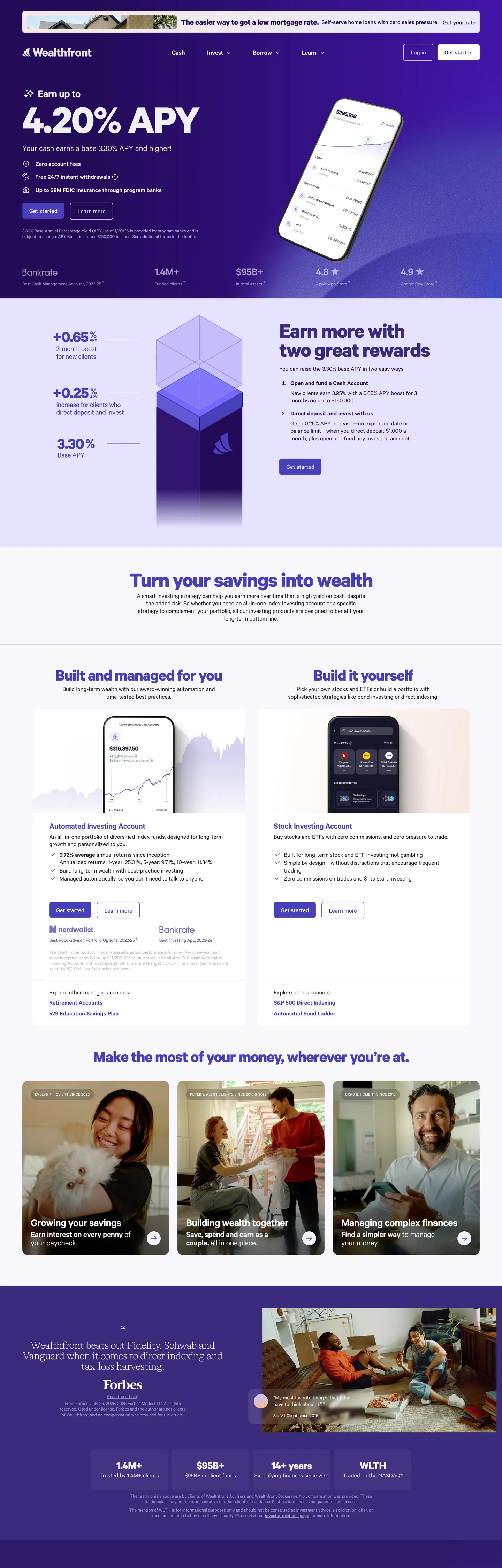
Wealthfront's marketing site does something most US robo-advisors avoid: it commits to a deep night-violet voltage instead of the fintech-green or cool-blue that Betterment, Robinhood, SoFi, and Chime all reach for. The above-fold is a 32px-rounded card carrying a violet-to-night gradient — deep night #230b59 at the lower-left through saturated indigo #4840bb in the upper-right — with a 62px Calibre weight-700 headline "Earn up to 4.20% APY" in near-white, three bullet rows beneath, a single indigo CTA pill labeled "Get started", and a phone mockup tilted at 12 degrees on the right showing the Wealthfront iOS dashboard. The card floats inside the page rather than running full-bleed; cream is visible at the edges, and the violet gradient reads as a panel rather than as the page canvas itself.
The DESIGN.md file packages the system into a machine-readable spec for React tooling. Inside: 13 colors tokens drawn from a 200+ CSS custom-property system wired with `--tk-*` design-token prefixes, organized around the violet voltage `#4840bb` (`--tk-content-interactive-default`), the night-base `#230b59` (`--tk-night-start`), the near-black ink `#18172b` (`--tk-content-primary`), the soft hairline `#e5e7eb` (`--tk-content-divider`), and a small set of chart-categorical accents reserved for the financial diagrams. 14 typography tokens cover Calibre at 11px through 62px in weights 400–700; an uppercase eyebrow tier at 11px / 500 / 0.55px tracking sits above every section heading. A radius scale of 6 / 8 / 16 / 9999px. 18 components covering the gradient hero card, the saturated indigo CTA pill, the cream feature panels, the phone-mockup frame, the underlined nav-link cluster, and the data-table row.
Feed this file to Claude or Cursor and it reproduces Wealthfront's specific moves: a 32px-rounded gradient hero card instead of a flat full-bleed surface, deep night-violet instead of fintech-green or cool-blue, Calibre across every tier from 11px eyebrow up to 62px hero, hairline-everything chrome with a single `#e5e7eb` border tone, and tilted-charcoal phone mockups for every product surface. The token references resolve cleanly: every hex, font name, radius, and spacing value is a quoted scalar you can paste into Tailwind config or CSS variables. The one move worth borrowing only if your fintech wants to break category convention: the willingness to skip green entirely and commit to a violet voltage that signals trust through tonal depth rather than through the predictable financial-product chromatic vocabulary.
What makes it distinct
5
- Night-violet over fintech-greenWealthfront commits to a deep violet voltage (#4840bb) where Betterment, Robinhood, and SoFi reach for green or cool blue
- Single-card herothe above-fold is a 32px-rounded violet gradient card rather than a full-bleed surface, floating inside the page with cream visible at the edges
- Calibre across every tierdisplay at 62px / 700 / -1.86px tracking, body at 18px / 400, eyebrow labels at 11px / 500 / 0.55px tracking, all from the same family
- Hairline-everything chrome580 of the 1486 captured borders use a single #e5e7eb hairline; no border-color ladder, no contrast outlines
- Phone mockups tilted 12 degreesevery product surface is shown inside a rounded charcoal handset frame, never as a flat browser screenshot
wealthfront.com
Live at wealthfront.com
A snapshot of the brand in production. Scroll the frame to see the whole page.
Colors
13 colors
Wealthfront's system runs on #4840bb as its primary voltage, used in 2 of 18 components. Type is set in Calibre across 14 tokens from 11px to 62px, weights 400–700. Shape language is mixed across 18 components, blending pills, soft rounds, and squarer corners.
Brand & Accent
Sparing, CTA-only voltage · 5
Surface
Page and card backgrounds · 3
Text
Headlines, body, captions · 4
Borders & Hairlines
Dividers, outlines, rules · 1
Typography
14 type tokens
Set in Calibre across 14 tokens, from 11px to 62px, weights 400–700. Shown in its own stack: where the font isn't installed, the fallback the file names stands in.
- display-xl62px · weight 700 · lh 55.8px · tracking -1.86pxThe quick brown fox jumps over the lazy dog
- display-lg48px · weight 700 · lh 43.2px · tracking -1.44pxThe quick brown fox jumps over the lazy dog
- display-md32px · weight 700 · lh 28.8px · tracking -0.96pxThe quick brown fox jumps over the lazy dog
- heading-lg32px · weight 400 · lh 35.2pxThe quick brown fox jumps over the lazy dog
- heading-md24px · weight 600 · lh 24px · tracking -0.48pxThe quick brown fox jumps over the lazy dog
- heading-sm22px · weight 700 · lh 33pxThe quick brown fox jumps over the lazy dog
- heading-xs20px · weight 600 · lh 18px · tracking -0.6pxThe quick brown fox jumps over the lazy dog
- body-lg18px · weight 400 · lh 27pxThe quick brown fox jumps over the lazy dog
- body-md18px · weight 500 · lh 21.6pxThe quick brown fox jumps over the lazy dog
- body-sm14px · weight 400 · lh 20pxThe quick brown fox jumps over the lazy dog
- button-md18px · weight 500 · lh 21.6pxThe quick brown fox jumps over the lazy dog
- nav-link18px · weight 400 · lh 27pxThe quick brown fox jumps over the lazy dog
- caption12px · weight 400 · lh 16pxThe quick brown fox jumps over the lazy dog
- eyebrow11px · weight 500 · lh 16.5px · tracking 0.55pxThe quick brown fox jumps over the lazy dog
Layout
Radii and spacing
5 corner radii and 10 spacing values. Shape language: mixed.
Radii
- none0px
- sm6px
- md8px
- lg16px
- full9999px
Spacing
- xxs2px
- xs4px
- sm8px
- md12px
- base15px
- lg16px
- xl24px
- 2xl32px
- 3xl48px
- 4xl64px
Components
18 components
Each rendered from its tokens (color, type, radius, padding) on Wealthfront's own canvas.
- Hero Cardhero-cardHero Card
- Hero Headinghero-headingHero Heading
- Section Headingsection-headingSection Heading
- Sub Section Headingsub-section-headingSub Section Heading
- Body Paragraphbody-paragraphBody Paragraph
- Body Paragraph On Violetbody-paragraph-on-violetBody Paragraph On Violet
- Legal Disclosurelegal-disclosureLegal Disclosure
- Eyebrow Labeleyebrow-labelEyebrow Label
- Button Primarybutton-primaryButton Primary
- Button Secondarybutton-secondaryButton Secondary
- Top Navtop-navTop Nav
- Nav Linknav-linkNav Link
- Card Creamcard-creamCard Cream
- Card Whitecard-whiteCard White
- Data Rowdata-rowData Row
- Phone Framephone-framePhone Frame
- Avatar Pillavatar-pillAvatar Pill
- Type here…text-inputText Input
In use
The system, in use
Wealthfront's tokens on the kind of product it builds.
Build something people actually use.
A short paragraph of marketing copy that previews how the brand's display tier and body tier read together. Two sentences is usually enough.
FAQ
Wealthfront design system FAQ
Common questions about Wealthfront's tokens, components, and how to use this DESIGN.md in your project.
Read next
Related reading
Specs, directories, and component libraries that pair with this design system.
- Browse all design systemsThe full directory of DESIGN.md files on shadcn.io, with live mockups for each.shadcn.io
- Wealthfront — official siteWealthfront's public marketing site — the source of truth for the live tokens captured in this file.wealthfront.com (opens in a new tab)
- The DESIGN.md specificationGoogle Labs' open spec for machine-readable design system files — the format this page is built on.github.com (opens in a new tab)
Use it
Use Wealthfront in your project
One machine-readable file. Drop it into Claude, Cursor, or any AI tool that reads DESIGN.md.
Download the DESIGN.md
One machine-readable file: every color, type, radius, spacing, and component token of Wealthfront.
Feed it to your AI tool
Drop it into Claude, Cursor, or GitHub Copilot. The agent writes React components and Tailwind classes that match Wealthfront's visual language.
Reference the tokens directly
Or paste the values into your Tailwind config, CSS variables, or component library: every color, size and radius is a quoted, ready-to-copy value.
Read the full DESIGN.md: overview, rationale, do’s and don’ts
Overview
Wealthfront's marketing site does something most US robo-advisors avoid. Violet over green. Where Betterment, Robinhood, SoFi, and Cash App all reach for green or cool-blue as the load-bearing brand voltage, Wealthfront commits to a deep night-violet instead — {colors.primary} (#4840bb) wired as --tk-content-interactive-default carries every CTA and link accent, with {colors.primary-deep} (#230b59) wired as --tk-night-start sitting beneath as the gradient lower-stop and the secondary heading color. Green appears in the system only as a single chart-positive accent and as a chart-categorical swatch reserved for the financial diagrams — never in the marketing chrome. The chromatic decision signals trust through tonal depth rather than through the predictable financial-product palette.
Single-card hero — the above-fold is not a full-bleed gradient like Cloudflare's orange or Spline's near-black. The hero is a 32px-rounded card carrying a violet-to-night gradient that floats inside the page with cream visible at the edges; the gradient reads as a panel rather than as the page canvas itself. Inside the card sit a 62px Calibre weight-700 headline ("Earn up to 4.20% APY") in near-white, three small bullet rows beneath, a saturated indigo {colors.primary} CTA pill labeled "Get started", and a phone mockup tilted at 12 degrees on the right showing the Wealthfront iOS dashboard. Below the fold, the page flips to a near-white canvas with cream feature panels ({colors.surface-cool} — #f4f3f7) holding 32px Calibre bold sub-headlines in violet {colors.primary-violet} (#3b2b7d) and tilted charcoal phone mockups beside them.
Typography is Calibre across every tier — a single humanist sans that does the work of display, heading, body, button, nav, and eyebrow. Display sits at 62px / 700 with -1.86px tracking; sub-section heads at 32px / 700 / -0.96px; body running text at 18px / 400 / 1.5 line-height; legal disclosure at 12px / 400; and an uppercase eyebrow tier at 11px / 500 / 0.55px tracking sits above every section heading as the small-caps signpost. There is no serif moment anywhere on the page; the entire typographic system is one variable-weight Calibre.
Key Characteristics:
- Deep night-violet voltage (
{colors.primary}— #4840bb) wired into 27--tk-*CSS token names; no green or cool-blue anywhere in the marketing chrome. - Single-card hero — a 32px-rounded violet gradient card floats inside the page rather than running full-bleed; cream is visible at every edge.
- Calibre across every tier, from 11px uppercase eyebrow labels through to the 62px hero display — one family, no serif counterpart.
- Hairline-everything chrome —
{colors.hairline}(#e5e7eb) carries 580 of the 1486 captured border occurrences; there is no second hairline tone in the system. - Phone mockups tilted at 12 degrees — every product surface is shown inside a rounded charcoal handset frame, never as a flat browser screenshot.
- Eyebrow tier at 11px / 500 / 0.55px tracking, uppercase — the small-caps signpost that sits above every section heading.
- 16px radius dominates major surfaces (the gradient hero card, the cream feature panels, the phone-frame outer corners, the testimonial card) — 20 of 42 captured radii sit at 16px.
- 6px radius on the CTA pill — kept visually distinct as a chip rather than fully-rounded so it reads as a financial-product button rather than a casual consumer CTA.
Colors
Brand
- Violet (
{colors.primary}— #4840bb): frequency 27 (20 text, 5 bg, 2 border). The load-bearing voltage — wired in CSS as--tk-content-interactive-default,--tk-surface-interactive-primary,--tk-chart-quantitative-primary,--tk-chart-categorical1,--tk-night-end,--tk-vibrant-twilight-start, and 21 other token names. Carries the CTA pill fill, every link accent, the active-tab underline, and the upper-stop on the hero gradient. - Deep Night (
{colors.primary-deep}— #230b59): frequency 43 (34 text, 1 bg, 6 border, 2 gradient). Wired as--tk-night-startand--tk-chart-categorical0. The hero gradient's lower-stop, the top-nav background fill, and the secondary heading color when the violet would feel too saturated for body-adjacent text. - Night (
{colors.primary-night}— #161338): frequency 3 (3 text). The darkest violet in the captured page — a near-black with a faint blue undertone used inside the hero card for one specific micro-label. - Violet Heading (
{colors.primary-violet}— #3b2b7d): frequency 2 (1 text, 1 bg). A mid-violet reserved for the below-the-fold section h2 headings, slightly desaturated from the primary so the display reads as a heading rather than as a link. - Saturated Violet (
{colors.primary-saturated}— #4b18bf): frequency 2, both inside gradients. The brightest violet on the page — used as the upper end-stop of the night gradient.
Surface
- Canvas (
{colors.canvas}— #ffffff): frequency 168 (151 text, 14 bg, 1 border). Wired as--tk-surfaceand--tk-surface-elevated. The dominant surface — the below-fold body floor, every card inner fill, and the white text rendered on top of the violet hero card. - Surface Cool (
{colors.surface-cool}— #f4f3f7): frequency 5 (3 bg, 2 border). Wired as--tk-surface-notice-info. The off-white tone used for the cream feature panels below the fold — slightly cooler and more violet-undertoned than pure white. - Surface Violet (
{colors.surface-violet}— #dadef1): frequency 6. Wired as--tk-chart-categorical3. The palest violet in the system, used as the avatar-pill background in the testimonial section.
Text
- Ink (
{colors.ink}— #18172b): frequency 18 (17 text, 1 bg). Wired as--tk-content-primary,--tk-surface-inverted,--tk-chart-neutral-primary,--tk-content-divider. The dominant body text color and the inverted-surface fill. Never pure black. - Ink Soft (
{colors.ink-soft}— #424158): frequency 19 (18 text, 1 border). A secondary running-text tone used inside long-form copy where ink would feel too heavy. - Muted (
{colors.muted}— #b7b7c0): frequency 51 (51 text). The dominant secondary-text color — the legal disclosure rows, the data-table sub-labels, and the caption tiers. Slightly purple-tinted so it carries the violet undertone of the system. - Ink Black (
{colors.ink-black}— #000000): frequency 9 (3 text, 3 bg, 3 gradient). Used only inside the charcoal phone-mockup frame and as the gradient overlay ink on the hero card.
Hairline
- Hairline (
{colors.hairline}— #e5e7eb): frequency 881 (293 text, 4 bg, 580 border, 4 gradient). The single dominant border tone — 39% of all captured borders use this value. Wired as--tk-soft-start,--tk-surface-notice-destructive,--tk-soft-end. There is no second hairline tone; the system is mono-hairline.
Typography
Font Families
The system runs Calibre for every tier — a humanist sans by Klim Type Foundry that does the work of display, heading, body, button, nav, and eyebrow. Fallbacks walk ui-sans-serif, system-ui, -apple-system, "Segoe UI", Roboto, "Helvetica Neue", Arial, "Noto Sans", sans-serif. There is no serif counterpart, no monospace counterpart, no second display family.
The single-family decision is the typographic signature. Where Stripe pairs Sohne with Sohne Mono and Cloudflare pairs FT Kunst Grotesk with Apercu Mono Pro, Wealthfront commits to Calibre alone and divides labor by weight (400 / 500 / 600 / 700) and by tracking (-1.86px to +0.55px). The eyebrow tier at 11px / 500 / 0.55px tracking uppercase is the small-caps device that fills the role a monospace label would play in a dev-tools system.
Hierarchy
| Token | Size | Weight | Line Height | Letter Spacing | Use |
|---|---|---|---|---|---|
{typography.display-xl} | 62px | 700 | 55.8px | -1.86px | Hero h1 ("Earn up to 4.20% APY") and section h2 below the fold |
{typography.display-lg} | 48px | 700 | 43.2px | -1.44px | Larger sub-section headings |
{typography.display-md} | 32px | 700 | 28.8px | -0.96px | Bold sub-section heads ("Built and managed for you") |
{typography.heading-lg} | 32px | 400 | 35.2px | 0 | Lighter h3 headings (data-section titles) |
{typography.heading-md} | 24px | 600 | 24px | -0.48px | Card-title h3 / h4 |
{typography.heading-sm} | 22px | 700 | 33px | 0 | h3 inside the feature panels |
{typography.heading-xs} | 20px | 600 | 18px | -0.6px | Stat-display headlines inside data cards |
{typography.body-lg} | 18px | 400 | 27px | 0 | Default running text — paragraph body |
{typography.body-md} | 18px | 500 | 21.6px | 0 | Mid-emphasis body and the CTA pill label |
{typography.body-sm} | 14px | 400 | 20px | 0 | Caption rows and small labels |
{typography.button-md} | 18px | 500 | 21.6px | 0 | Primary button label |
{typography.nav-link} | 18px | 400 | 27px | 0 | Top-nav link labels |
{typography.caption} | 12px | 400 | 16px | 0 | Legal disclosure text and the smallest captions |
{typography.eyebrow} | 11px | 500 | 16.5px | 0.55px (uppercase) | Uppercase section-header eyebrow |
Principles
Display weight sits at 700 with tight negative tracking (-1.86px on the 62px hero, -0.96px on the 32px sub-heads). The confidence comes from weight and tracking together. The same 62px / 700 / -1.86px treatment carries both the hero h1 and the section h2 below the fold, anchoring the page on a single display step rather than a tiered ladder of decreasing sizes.
The eyebrow tier — 11px / 500 / 0.55px tracking uppercase — is the small-caps device that fills the role a monospace label would play in a dev-tools system. There is no all-caps tier in display; small-caps duty falls entirely to the eyebrow at the small end.
Note on Font Substitutes
Calibre is a licensed family from Klim Type Foundry. The closest open-source substitute is Inter at the same weights with letter-spacing reduced by 0.03em on display sizes — Inter's slightly looser counters read close to Calibre's geometric humanist character at 18px body. General Sans is closer in feel but not free. For the eyebrow tier, any humanist sans (Inter, Geist) at weight 500 with positive tracking transfers cleanly.
Layout
Spacing System
- Base unit: 8px (with 4px and 2px as the sub-base tier).
- Tokens:
{spacing.xxs}2px ·{spacing.xs}4px ·{spacing.sm}8px ·{spacing.md}12px ·{spacing.base}15px ·{spacing.lg}16px ·{spacing.xl}24px ·{spacing.2xl}32px ·{spacing.3xl}48px ·{spacing.4xl}64px. - Section padding (vertical):
{spacing.2xl}(32px) on the hero card;{spacing.3xl}(48px) on the larger feature panels below the fold. - Card internal padding:
{spacing.2xl}(32px) on{component.card-cream}and{component.card-white}. - Top-nav padding:
{spacing.md}(12px) vertical,{spacing.3xl}(48px) horizontal.
Grid & Container
- Max content width: ~1344px on the body floor below the fold (matches the captured
widthPxon the body-paragraph extraction). - Hero card: 32px-rounded inset card running ~1280px wide with cream visible at the edges, containing the headline + CTA + tilted phone mockup in a 55% / 45% horizontal split.
- Below-fold sections: centered 2-up grid pairing a cream feature panel with a phone mockup, repeated for each product domain ("Built and managed for you", "Build it yourself", "Make the most of your money").
- Data table rows: full-width with
{colors.hairline}rules separating each row, 12px vertical padding.
Rhythm
The page alternates between gradient panel and cream editorial. The hero is a single dense gradient panel with everything (headline, bullets, CTA, phone) packed inside. Below the fold the rhythm opens up — each section becomes a 2-up grid pairing a cream feature panel with a tilted phone mockup, with 64px vertical spacing between sections. The testimonial band returns to a dense single-panel composition; the disclosure footer flattens back to single-column. The rhythm is dense-then-open-then-dense rather than a steady tempo.
Elevation
The system has essentially no shadow tier beyond a soft tonal lift on the hero card. The page renders depth through three devices:
- Tonal lift: the cream feature panels (
{colors.surface-cool}) sit on the pure-white body floor with a one-step tonal contrast — no shadow drawn. - Hairline borders:
{colors.hairline}(#e5e7eb) carries 580 of the 1486 captured borders. Hairlines do the elevation work for cards, dropdowns, input fields, and data-table rows. - Phone-mockup frame: the only element on the page with a visible shadow is the charcoal phone-mockup frame, which carries a soft
rgba(24, 23, 43, .17)16-pixel halo wired as--tk-content-shadow.
The shadow ink is wired as rgba(24, 23, 43, *) — the same hex as {colors.ink} at low opacity. Wealthfront ties shadow tone to ink color rather than to pure black, which keeps elevation feeling consistent with the violet-undertoned text.
Shapes
The radius scale is generous on cards, tight on chips:
{rounded.none}0px — data-table rows and full-bleed sections.{rounded.sm}6px — the primary CTA pill, the secondary button, and the text input (12 occurrences). Kept visually distinct as a chip rather than fully-rounded so the button reads as a financial-product affordance rather than a casual consumer CTA.{rounded.md}8px — dropdown items and smaller chips (4 occurrences).{rounded.lg}16px — the dominant major-surface rounding (20 occurrences). The gradient hero card, the cream feature panels, the phone-mockup outer corners, the testimonial card.{rounded.full}9999px — the pill-shaped avatar surrounds in the testimonial section (6 occurrences).
There is no 4px tier, no 12px tier, no 24px tier. The 16px default carries every major surface; the 6px tier carries every CTA. The binary split keeps the chrome readable as financial-product UI rather than as a casual lifestyle brand.
Components
hero-card — The 32px-rounded gradient card that carries the above-fold composition. {colors.primary-deep} gradient lower-stop, {colors.primary} upper-stop, 48px internal padding, ~1280px wide. Floats inside the page with cream visible at the edges.
hero-heading — Near-white text on the violet gradient, 62px Calibre weight 700 with -1.86px tracking. The largest typographic moment in the system.
section-heading — Same {typography.display-xl} token rendered in violet {colors.primary-violet} on the white canvas below the fold ("Turn your savings into wealth", "Make the most of your money, wherever you're at").
sub-section-heading — Violet {colors.primary-violet} text at {typography.display-md} (32px / 700) — the sub-headings inside feature panels ("Built and managed for you", "Build it yourself").
body-paragraph — Default ink running text at {typography.body-lg} (18px / 400) on the white canvas.
body-paragraph-on-violet — White text at {typography.body-md} on the violet hero card — the sub-headline and bullet rows beneath the 62px h1.
legal-disclosure — Muted {colors.muted} text at {typography.caption} (12px / 400) — the dense disclosure rows below the data sections and the full-width legal band above the footer.
eyebrow-label — Ink text at {typography.eyebrow} (11px / 500 / 0.55px tracking) uppercase. The small-caps section signpost that sits above every section heading.
button-primary — The signature CTA. Saturated violet {colors.primary} fill, white text, {rounded.sm} 6px radius, 12x20 padding, 46px height. "Get started" is the canonical instance.
button-secondary — White fill, violet text, 1px hairline border, same dimensions as primary. Used for "Learn more" / "Open an account" below the fold.
top-nav — Deep night-violet {colors.primary-deep} surface, 64px height, 12x48 padding. The Wealthfront wordmark sits flush left in white; product links (Cash / Investing / Borrowing / Pricing) center; "Log in" + "Get started" cluster flush right. The only navigation in the directory that runs on the brand voltage rather than a neutral surface.
nav-link — White text in {typography.nav-link} (18px / 400) on the violet top-nav, no hover background visible in the captured surface.
card-cream — {colors.surface-cool} fill, ink text, {rounded.lg} 16px radius, 32px internal padding. The default feature panel below the fold — holds a sub-section heading, an eyebrow label, a body paragraph, and an embedded phone-mockup pictogram.
card-white — White fill, ink text, 1px hairline border, {rounded.lg} 16px radius, 32px internal padding. Used for data-table containers and the testimonial card.
data-row — White surface with a 1px {colors.hairline} bottom border, 12px vertical padding. Used inside the data-section tables ("Cash" / "Bonds" / "Stocks" allocation rows).
phone-frame — Pure black {colors.ink-black} outer shell with a violet-product interior, {rounded.lg} 16px outer radius, 0 padding. Houses the tilted iOS dashboard mockups. Tilted at 12 degrees in the hero and at 0 degrees below the fold.
avatar-pill — Pale violet {colors.surface-violet} fill, deep night text in {typography.heading-md}, fully-rounded {rounded.full} pill, 48px height. Used as the testimonial-author avatar surrounds.
text-input — White fill, ink text, 1px hairline border, {rounded.sm} 6px radius, 12x16 padding, 44px height. Form field outline thickens to 2px on focus.
Do's and Don'ts
Do treat the violet {colors.primary} as the load-bearing voltage and skip green entirely. The system has 27 captured violet occurrences and zero green occurrences in the marketing chrome; introducing a green accent for "positive" affordances (gains, success states) would dissolve the deliberate inversion of the fintech-category palette.
Do keep the hero as a 32px-rounded inset card rather than a full-bleed gradient surface. The card-with-edges treatment is what differentiates Wealthfront's hero from Cloudflare's full-bleed orange and Spline's near-black canvas; expanding the gradient to the page edges loses the panel-floating signature.
Do use Calibre across every tier from 11px eyebrow up to 62px hero. The single-family system is the typographic discipline; introducing a serif counterpart for "editorial" sections or a monospace for "data" sections would break the brand's tonal consistency.
Do render every product surface inside a tilted charcoal phone frame. The 12-degree tilt and the rounded {rounded.lg} corners are the brand's product-presentation device; showing a flat browser screenshot or an untilted phone would feel borrowed from a different system.
Don't swap {colors.primary} (the violet voltage) for {colors.primary-deep} on the CTA fill. The deep night {colors.primary-deep} is reserved for the top-nav surface and the gradient lower-stop; using it on the button would crush the chromatic step between background and affordance.
Don't use {colors.hairline} (#e5e7eb) as a background fill or a text color — it is a border-only token (580 of its 881 occurrences are borders). For a light surface, use {colors.canvas} or {colors.surface-cool} instead.
Don't introduce a 4px corner radius tier or a 12px radius tier. The system is binary on cards (16px) and chips (6px); adding a middle value softens the contrast between major surfaces and tappable affordances and makes the data tables feel less like financial UI.
Don't render the eyebrow tier in mixed case or in a larger size. The 11px / 500 / 0.55px tracking uppercase treatment is the system's only small-caps signpost; bumping to 14px or dropping the uppercase reads as a generic SaaS label rather than as Wealthfront's editorial section device.
Known Gaps
- Dark mode: the captured marketing surface is light-only. A dark variant exists in the iOS app (rendered inside the phone mockups) but is not represented in the marketing tokens.
- Hover and focus states: the primary button, secondary button, and text input all have hover variants wired in the
--tk-surface-interactive-*token family, but only the resting states are visible on the captured surface. - Form input error states: the
--tk-invalid-box-shadow-border-defaulttoken suggests a 1px destructive-red focus ring, but the rendering is not exposed on the marketing page; the destructive ink is wired as--tk-content-interactive-destructive. - Motion: the phone mockups subtly tilt-animate on scroll-into-view and the hero gradient holds a slow rotation, but the spec captures end-state values only.
- iOS product surfaces: the dashboard screens shown inside the phone mockups carry their own surface tokens (chart-categorical accents, affordability tiers, day / night gradient pairs) that are referenced in CSS but not rendered on the marketing chrome.
- Chart-categorical palette: a 10-step chart-categorical ladder spanning deep night through violet, pale violet, mint, sage, leaf-green, ochre, sand, and butter is wired in CSS but not all swatches are rendered on the marketing surface; the palette is reserved for the product investment-allocation charts.
- Footnote and legal-disclosure typography: the regulatory disclosure tier uses a complex multi-column layout with
{typography.caption}that is partially captured but not fully tokenized as a component.
Fintech & Crypto
More systems like this
More DESIGN.md files in Fintech & Crypto.
Pricing
Build it with Pro
The DESIGN.md files are free. Pro adds 6,000+ blocks, premium templates and the MCP server, so your AI editor builds in your system for you.
4.9/5 out of 5 · 150+ reviewsfrom 150+ founders and developers.
Billing
Billed once a year in USD. Cancel anytime.
- How many people can use the license.
- Client work, SaaS products and anything you charge for.
- Production-ready React sections: hero, pricing, features, dashboards and more.
- Complete multi-page sites you can ship as they are.
- React icons from every major library, installable with one command.
- Presets that restyle every block, in light and dark.
- Lets your AI editor search, preview and install blocks for you.
- Priority requests are answered first.
Individual
For personal projects & open source
$32instead of $49/mo
$389 billed yearly
- Seats: 1 seat
- Commercial use: Personal & open source only
- Pro blocks: 6,000+ blocks
- Templates: All 14 templates
- React icons: 294k+ icons
- Themes: All 59 themes
- MCP server: Basic usage
- Support: Standard
Team
Most popularFor freelancers, agencies & startups
$66instead of $99/mo
$789 billed yearly · ≈ $13/dev/mo
- Seats: Up to 5 seats
- Commercial use: Included
- Pro blocks: 6,000+ blocks
- Templates: All 14 templates
- React icons: 294k+ icons
- Themes: All 59 themes
- MCP server: High usage
- Support: Priority
Organization
For companies with larger teams
$132instead of $199/mo
$1,589 billed yearly
- Seats: Unlimited seats
- Commercial use: Included
- Pro blocks: 6,000+ blocks
- Templates: All 14 templates
- React icons: 294k+ icons
- Themes: All 59 themes
- MCP server: Unlimited usage
- Support: Priority
Billed once a year in USD. Cancel anytime.
Individual
For personal projects & open source
$32instead of $49/mo
$389 billed yearly
- How many people can use the license.Seats: 1 seat
- Client work, SaaS products and anything you charge for.Commercial use: Personal & open source only
- Production-ready React sections: hero, pricing, features, dashboards and more.Pro blocks: 6,000+ blocks
- Complete multi-page sites you can ship as they are.Templates: All 14 templates
- React icons from every major library, installable with one command.React icons: 294k+ icons
- Presets that restyle every block, in light and dark.Themes: All 59 themes
- Lets your AI editor search, preview and install blocks for you.MCP server: Basic usage
- Priority requests are answered first.Support: Standard
Team
Most popularFor freelancers, agencies & startups
$66instead of $99/mo
$789 billed yearly · ≈ $13/dev/mo
Everything in Individual, plus
- How many people can use the license.Seats: Up to 5 seats
- Client work, SaaS products and anything you charge for.Commercial use: Included
- Lets your AI editor search, preview and install blocks for you.MCP server: High usage
- Priority requests are answered first.Support: Priority
Organization
For companies with larger teams
$132instead of $199/mo
$1,589 billed yearly
Everything in Team, plus
- How many people can use the license.Seats: Unlimited seats
- Lets your AI editor search, preview and install blocks for you.MCP server: Unlimited usage
- Secure checkout via Stripe
- Code lives in your repo
- Keep what you've shipped if you cancel
- License terms
Your system, built for you
Every block, template and icon, installed by your AI agent in your design system. The DESIGN.md files stay free.