Visa Design System
Visa's marketing-site design system as a DESIGN.md file. Brand blue #1434cb reserved for primary CTAs and links, deep midnight navy for the travel-benefits panel, Visa Dialect at modest weights, hairline-only cards. Tokens for React, Next.js, and AI coding tools.
Add shadcn.io to your AI agent. · Pro It installs blocks, icons and templates in your design system from a prompt, with Pro.
Set up MCP- Primary
- #1434cb
- Typeface
- visa-font--dialect-latin-regular
- Shape
- Mixed
- Base radius
- 8px
- Colors
- 19
- Type tokens
- 12
- Components
- 17
- Spacing values
- 8
About
About Visa DESIGN.md
Curated by Dov Azencot · Updated May 19, 2026 · Source visa.com (opens in a new tab)
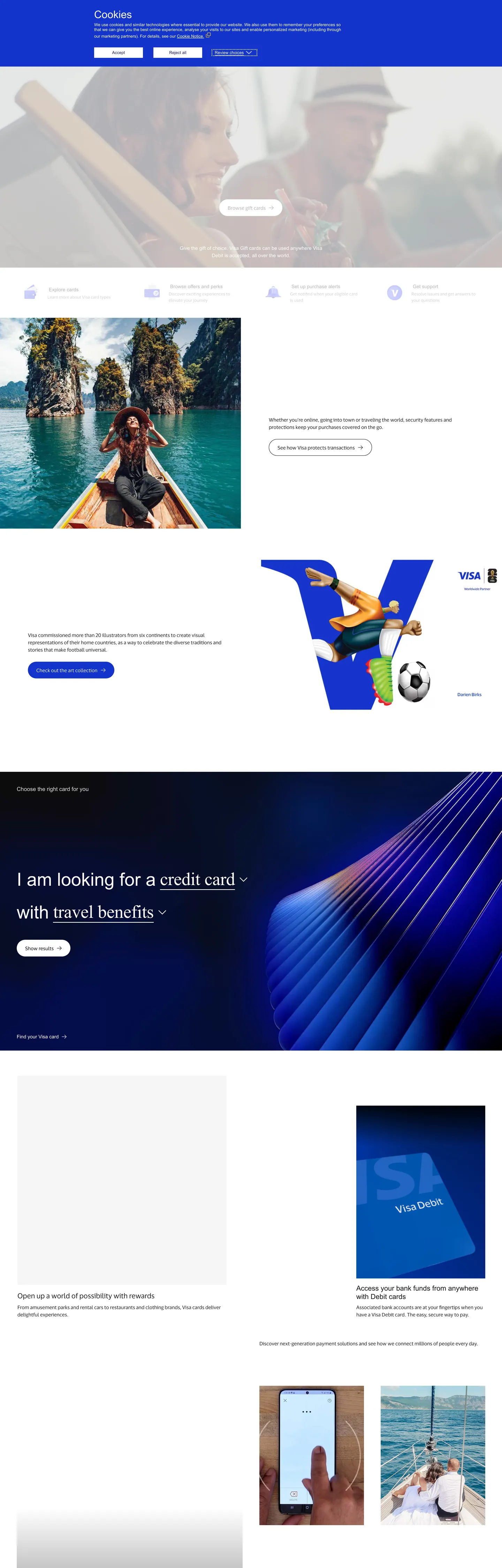
Visa's marketing site reads like a financial-services magazine wearing a payment-network logo. The top of the page is warm white with a slim cookie band in Visa Brand Blue above it, the headline "Where AI Meets Commerce" sits at 32px in Visa Dialect over a travel photograph, and the structural work below is carried by a 1px hairline in pale neutral that draws 371 of the 372 border occurrences captured on the page. Where most card networks lean on saturated gradient blocks to broadcast trust, Visa holds back: the brand blue waits for the primary CTA pill and the inline links, and the only field of saturated color above the second fold is the wide midnight-navy panel reading "I am looking for a credit card with travel benefits" alongside a parallel-line illustration that echoes the dolphin-fin shape from the wordmark.
The DESIGN.md file packages the system into a machine-readable spec for React tooling. Inside: 19 colors tokens drawn from a 240-variable `:root` namespace, organized into a brand tier (Visa Brand Blue #1434cb plus a darker midnight navy #1a1f72 for hover and a deeper #020f27 for the panel canvas), a structural tier of ink at #1a1a1a / secondary at #353535 / tertiary at #757575, a single hairline at #e5e7eb, plus a complete semantic set for success / warning / error / focus that ships unused on the homepage; 18 typography tokens running Visa Dialect at modest weights — 52px display at weight 400 is the heaviest typographic moment — with Open Sans appearing only inside the cookie-banner copy; a binary radius scale of 4 / 8 / 1000px; and 17 components definitions covering the Visa Blue primary button, the secondary outline button, the hairline-bordered card finder, the midnight-navy promoted panel, and the bento-grid tile.
Feed this file to Claude or Cursor and it reproduces Visa's specific moves: warm-white body canvas instead of grayscale neutral, brand-blue restraint at the CTA and link tier only, midnight-navy reserved for the one wide horizontal promoted panel per page, Visa Dialect across every typographic step, and hairline-bordered cards that never lift with a shadow. The one decision worth borrowing only if you control a category-defining trust brand is the willingness to spend the brand color on a single CTA pill — most fintech brands cannot resist coating the hero in voltage. Visa can; the wordmark already does that job everywhere else in the world.
What makes it distinct
5
- Two-blue brand voltageVisa Brand Blue carries the primary CTA pill and inline links while a deep midnight navy carries the wide horizontal hero panel mid-page, splitting the work between accent and surface
- Visa Dialect across every tiera commissioned humanist sans wired into eight `--font-dialect-*` variables, running 52px display at weight 400 with -0.52px tracking, never above weight 500
- Hairline-only card chromea pale neutral #e5e7eb carries 371 of the page's border occurrences; depth comes from outline geometry rather than from elevation shadows
- Binary radius scale4 / 8px on inputs and cards plus a 1000px pill on CTAs; no 12 / 16 / 20px middle tier
- 240 :root custom propertiessemantic tokens like `--color-btn-primary`, `--card-link`, and `--promoted-dark-blue` map every component surface to a named slot in the system
visa.com
Live at visa.com
A snapshot of the brand in production. Scroll the frame to see the whole page.
Colors
19 colors
Visa's system runs on #1434cb as its primary voltage, used in 2 of 17 components. Type is set in visa-font--dialect-latin-regular across 12 tokens from 12px to 52px, weights 400–500. Shape language is mixed across 17 components, blending pills, soft rounds, and squarer corners.
Brand & Accent
Sparing, CTA-only voltage · 4
Surface
Page and card backgrounds · 2
Text
Headlines, body, captions · 5
Borders & Hairlines
Dividers, outlines, rules · 2
Semantic
Status, errors, success, links · 3
Other
Specialty colors · 3
Typography
12 type tokens
Set in visa-font--dialect-latin-regular across 12 tokens, from 12px to 52px, weights 400–500. Shown in its own stack: where the font isn't installed, the fallback the file names stands in.
- display-xl52px · weight 400 · lh 57.2px · tracking -0.52pxThe quick brown fox jumps over the lazy dog
- display-lg32px · weight 500 · lh 48pxThe quick brown fox jumps over the lazy dog
- heading-md20px · weight 400 · lh 24pxThe quick brown fox jumps over the lazy dog
- heading-sm16px · weight 500 · lh 19.2pxThe quick brown fox jumps over the lazy dog
- body-lg20px · weight 400 · lh 30pxThe quick brown fox jumps over the lazy dog
- body-md16px · weight 400 · lh 24pxThe quick brown fox jumps over the lazy dog
- body-sm14px · weight 400 · lh 21pxThe quick brown fox jumps over the lazy dog
- label-md14px · weight 500 · lh 21pxThe quick brown fox jumps over the lazy dog
- caption12px · weight 400 · lh 18pxThe quick brown fox jumps over the lazy dog
- button-md14px · weight 400 · lh 14pxThe quick brown fox jumps over the lazy dog
- nav-link14px · weight 500 · lh 21pxThe quick brown fox jumps over the lazy dog
- cookie-text12px · weight 400 · lh 14.4pxThe quick brown fox jumps over the lazy dog
Layout
Radii and spacing
5 corner radii and 8 spacing values. Shape language: mixed.
Radii
- none0px
- sm4px
- md8px
- lg16px
- pill1000px
Spacing
- xs4px
- sm8px
- md12px
- base16px
- lg24px
- xl32px
- 2xl48px
- 3xl80px
Components
17 components
Each rendered from its tokens (color, type, radius, padding) on Visa's own canvas.
- Button Primarybutton-primaryButton Primary
- Button Primary Hoverbutton-primary-hoverButton Primary Hover
- Button Primary Disabledbutton-primary-disabledButton Primary Disabled
- Button Secondarybutton-secondaryButton Secondary
- Top Navtop-navTop Nav
- Nav Linknav-linkNav Link
- Hero Headinghero-headingHero Heading
- Section Headingsection-headingSection Heading
- Body Paragraphbody-paragraphBody Paragraph
- Body Paragraph Mutedbody-paragraph-mutedBody Paragraph Muted
- Promoted Panelpromoted-panelPromoted Panel
- Card Hairlinecard-hairlineCard Hairline
- Bento Tilebento-tileBento Tile
- Quick Linkquick-linkQuick Link
- Type here…text-inputText Input
- Inline Linkinline-linkInline Link
- FooterfooterFooter
In use
The system, in use
Visa's tokens on the kind of product it builds.
Build something people actually use.
A short paragraph of marketing copy that previews how the brand's display tier and body tier read together. Two sentences is usually enough.
FAQ
Visa design system FAQ
Common questions about Visa's tokens, components, and how to use this DESIGN.md in your project.
Read next
Related reading
Specs, directories, and component libraries that pair with this design system.
- Browse all design systemsThe full directory of DESIGN.md files on shadcn.io, with live mockups for each.shadcn.io
- Visa — official siteVisa's public marketing site — the source of truth for the live tokens captured in this file.visa.com (opens in a new tab)
- The DESIGN.md specificationGoogle Labs' open spec for machine-readable design system files — the format this page is built on.github.com (opens in a new tab)
Use it
Use Visa in your project
One machine-readable file. Drop it into Claude, Cursor, or any AI tool that reads DESIGN.md.
Download the DESIGN.md
One machine-readable file: every color, type, radius, spacing, and component token of Visa.
Feed it to your AI tool
Drop it into Claude, Cursor, or GitHub Copilot. The agent writes React components and Tailwind classes that match Visa's visual language.
Reference the tokens directly
Or paste the values into your Tailwind config, CSS variables, or component library: every color, size and radius is a quoted, ready-to-copy value.
Read the full DESIGN.md: overview, rationale, do’s and don’ts
Overview
Visa's marketing site reads like a financial-services magazine wearing a payment-network logo. Brand-blue restraint. Where Mastercard layers a red-and-yellow Venn over the hero and American Express coats the page in cobalt gradient, Visa holds Visa Brand Blue ({colors.primary} — #1434cb) back to the primary CTA pill, the inline link tone, and the focus ring — three roles, two background-fill occurrences in the entire captured page. The body canvas stays on warm white ({colors.canvas} — #ffffff) and the brand mark in the top nav does the saturated-blue work that the rest of the page declines to do.
The chromatic discipline is split across two blues. Visa Brand Blue carries the CTA tier; a deeper midnight navy ({colors.midnight-navy} — #020f27, wired as --promoted-dark-blue) carries the wide horizontal promoted panel mid-page that reads "I am looking for a credit card with travel benefits." Two blues, two jobs — the bright one for clicks, the dark one for canvas. The hover and active states on the primary button step to {colors.primary-hover} (#1a1f72) and {colors.primary-active} (#20317e), a darker cousin of the brand voltage that keeps the press state on-brand without flashing a new hue. Compare to Stripe's indigo-and-mesh hero or Affirm's mint-green CTA — Visa is one of the few major payment brands that keeps the body white and lets a single saturated panel do the figure-ground work.
Typography is Visa Dialect across every tier — a commissioned humanist sans wired into eight --font-dialect-* CSS variables covering light, regular, medium, semibold, and bold weights for Latin and Cyrillic both. Display sits at 52px in weight 400 with -0.52px tracking; the secondary display at 32px in weight 500 (slightly heavier when the size drops); body at 14–16px in weight 400; nav and labels at 14px in weight 500. There is no 700+ weight visible. Open Sans 12px appears only inside the cookie-banner copy — a legal-text fallback, not part of the brand voice.
Key Characteristics:
- Single brand voltage in two roles —
{colors.primary}for CTA / link / focus,{colors.midnight-navy}for the one wide promoted panel per page. No gradient hero. - Warm-white body canvas (
{colors.canvas}— #ffffff) carries every editorial band; the brand mark in the top nav does all the saturated-blue work the page itself declines. - Visa Dialect across every typographic step, weight 400–500 only — no 700+ moment anywhere on the captured page.
- Hairline-only cards —
{colors.hairline}(#e5e7eb) carries 371 of 372 captured border occurrences; cards never lift with a drop shadow. - Binary radius scale — 4px on inputs, 8px on cards, 1000px on CTA pills and image tabs; no 12 / 16 / 20px middle tier.
- 240
:rootCSS custom properties under--color-*,--font-dialect-*,--motion-*,--spacing-*,--border-radius-*— every component surface maps to a named slot. - Semantic color tier ships ready but mostly unused on the homepage —
{colors.status-success}(#008a32),{colors.status-warning}(#d27b00),{colors.status-error}(#d22730) declared as CSS vars but absent from the captured render. - 8px base spacing unit. Tokens cluster at 8 / 12 / 16 / 24 / 48px with an 80px outer-section step.
Colors
Brand
- Visa Brand Blue (
{colors.primary}— #1434cb): frequency 2 as background. The brand voltage — fills the primary CTA pill, inline link color, the focus ring outline, and the--card-linkaccent. Wired in CSS as--color-primary,--color-btn-primary,--color-text-link,--card-link,--color-border-focus,--tab-focus, and--color-btn-secondary-focus-border. Two background-fill occurrences only — the discipline is real. - Primary Hover (
{colors.primary-hover}— #1a1f72): frequency 2 as text. The hover / active variant — a darker cousin of the brand voltage. Wired as--color-primary-hover,--color-btn-primary-hover,--color-btn-primary-active. - Primary Active (
{colors.primary-active}— #20317e): the deepest press state on the primary button. Wired as--color-primary-active. - Primary Disabled (
{colors.primary-disabled}— #d9dffb): frequency 6 as text. The pale-blue ghost of the brand voltage used for disabled CTAs. Wired as--color-btn-primary-disabled. - Midnight Navy (
{colors.midnight-navy}— #020f27): frequency 1 as background. Reserved for the wide horizontal promoted panel mid-page ("I am looking for a credit card with travel benefits"). Wired as--promoted-dark-blue. The single saturated background-fill moment on the page and the only place the brand voice goes dark. - Focus Ring (
{colors.focus-ring}— #3163e9): a brighter cobalt used as the outer focus-ring color at 0.3 opacity. Wired as--color-focus-ring.
Text
- Ink (
{colors.ink}— #1a1a1a): frequency 89. The dominant text color — display headlines below the hero, body paragraphs, primary nav labels, card headings. Wired as--color-text-primary,--card-heading,--bento-grid-text-heading,--promote-header. Never pure black. - Ink Secondary (
{colors.ink-secondary}— #353535): the second-tier text tone for--color-text-secondaryand--color-secondary. Declared but rarely rendered on the captured surface. - Ink Tertiary (
{colors.ink-tertiary}— #757575): declared as--color-text-tertiarybut absent from the captured render. - Ink Muted (
{colors.ink-muted}— #656565): frequency 12. The workhorse muted tone for card descriptions, bento sub-titles, disclaimer text. Wired as--card-description,--bento-grid-text-subtitle,--quick-link-description,--promote-description,--disclaimer-title-description. - Ink Disabled (
{colors.ink-disabled}— #b2b2b2): declared as--color-text-disabledand--color-secondary-disabled— reserved for disabled-state labels.
Surface
- Canvas (
{colors.canvas}— #ffffff): frequency 131 (106 as text, 16 as bg, 9 as border). The page floor and the dominant text-on-image color. Wired in CSS to nearly 25 different--color-*variables (--color-bg-primary,--card-comparison-panel-bg,--modal-container-bg-color,--quick-link-bg, etc.). - Surface Tertiary (
{colors.surface-tertiary}— #f1f2f6): the pale-neutral fill used for card-finder backgrounds and error-status-bg. Wired as--color-border-tertiaryand--color-status-error-bg.
Hairline
- Hairline (
{colors.hairline}— #e5e7eb): frequency 372 — 371 of them as border. The dominant border tone, used as essentially the only border tone in the system. Wired as--color-border-secondary,--card-bottom-panel-border,--share-article-border,--color-btn-secondary-disabled,--color-bg-secondary. - Border Strong (
{colors.border-strong}— #1a1a1a): frequency 4 as border. The dark hairline used on the outline-style secondary button and the tab-bar bottom rule. Wired as--color-border-primary,--color-btn-secondary-border.
Semantic
- Status Success (
{colors.status-success}— #008a32): declared as--color-status-successand--color-border-success. Absent from the captured marketing surface; reserved for product success-state UI. - Status Warning (
{colors.status-warning}— #d27b00): declared as--color-status-warningand--color-border-warning. Absent from the captured marketing surface. - Status Error (
{colors.status-error}— #d22730): declared as--color-status-errorand--color-border-error. Absent from the captured marketing surface. - Shadow (
{colors.shadow}— #000000): frequency 186 — 180 as text, 3 as bg, 2 as border. Most occurrences are at low opacity for modal scrims and hover overlays (--color-bg-overlay,--color-hover-overlay,--color-active-overlay,--modal-background-color) rather than as a direct fill.
Typography
Font Family
The system runs Visa Dialect for everything spoken — a commissioned humanist sans wired into eight --font-dialect-* CSS variables. The family ships Latin and Cyrillic subsets at five weights (light / regular / medium / semibold / bold), with a separate UI optical size (--font-dialect-ui-regular) for sub-16px sizes on buttons. Fallbacks walk to Arial, sans-serif. Open Sans 12px appears only inside the cookie-banner copy at the very top of the page — a legal-text fallback, not part of the brand voice.
Hierarchy
| Token | Size | Weight | Line Height | Letter Spacing | Use |
|---|---|---|---|---|---|
{typography.display-xl} | 52px | 400 | 57.2px | -0.52px | Promoted-panel headlines ("I am looking for a credit card with travel benefits") |
{typography.display-lg} | 32px | 500 | 48px | 0 | Hero headline over photography ("Where AI Meets Commerce") |
{typography.heading-md} | 20px | 400 | 24px | 0 | Sub-section titles |
{typography.heading-sm} | 16px | 500 | 19.2px | 0 | Card-finder h2 / smaller block titles |
{typography.body-lg} | 20px | 400 | 30px | 0 | Lead-paragraph blocks under display |
{typography.body-md} | 16px | 400 | 24px | 0 | Default running text inside cards |
{typography.body-sm} | 14px | 400 | 21px | 0 | Caption rows, card descriptions, disclaimer copy |
{typography.label-md} | 14px | 500 | 21px | 0 | Nav links, button text, in-card labels |
{typography.caption} | 12px | 400 | 18px | 0 | Metadata, fine print, footnote strips |
{typography.button-md} | 14px | 400 | 14px | 0 | Primary CTA pill label (Visa Dialect UI optical size) |
{typography.nav-link} | 14px | 500 | 21px | 0 | Top-nav link labels |
{typography.cookie-text} | 12px | 400 | 14.4px | 0 | Cookie-banner legal copy only (Open Sans) |
Principles
Display weight tops out at 500, never 700+. The 52px promoted-panel headline at weight 400 with -0.52px tracking is the editorial-magazine treatment — confidence by tracking and color contrast rather than by typographic mass. Where most fintech brands command attention with weight 600+ display, Visa holds at weight 400 and lets the headline read as long-form first-person copy ("I am looking for…") rather than as a SaaS shout. The 32px hero headline at weight 500 carries the rare "slightly heavier when smaller" inversion that Apple's marketing system also uses.
Note on Font Substitutes
Visa Dialect is a commissioned proprietary family. Inter at the same weights is the closest open-source substitute; Source Sans 3 is a closer match in feel for the slightly-rounder counters Dialect carries on the bowls of a and g. For the UI optical size at 14px button labels, Inter Display at the same size also transfers cleanly. The weight discipline — display at 400, never above 500 — is the move to preserve.
Layout
Spacing System
- Base unit: 8px — the dominant gap value, appearing 56 times in the captured page.
- Tokens:
{spacing.xs}4px ·{spacing.sm}8px ·{spacing.md}12px ·{spacing.base}16px ·{spacing.lg}24px ·{spacing.xl}32px ·{spacing.2xl}48px ·{spacing.3xl}80px. - Section padding (vertical): 80px on outer sections, 48px on inner blocks. The CSS exposes
--section-spacing-desktopat 10rem (160px) and--section-spacing-tabletat 5rem (80px). - Card internal padding:
{spacing.lg}(24px) for{component.card-hairline}and{component.bento-tile};{spacing.base}(16px) for{component.quick-link}. - Top-nav padding:
{spacing.base}(16px) vertical,{spacing.2xl}(48px) horizontal.
Grid & Container
- Max content width: ~1080px on the hero band and editorial blocks, ~1280px on the bento grid and card-finder rows.
- Hero block: photograph-anchored with a 32px headline reading "Where AI Meets Commerce" overlaid on a travel image; the brand mark and primary nav sit above it on a white surface.
- Promoted panel: full-bleed midnight-navy band with a 52px headline reading "I am looking for a credit card with travel benefits" and a parallel-line illustration (echoing the Visa dolphin-fin wordmark shape) on the right at 50/50.
- Bento grid: mixed-row card layout with hairline-bordered tiles in
{rounded.lg}(16px), each holding a heading, body paragraph, and link affordance. - Quick-link rows: 4-up grid of hairline-bordered tiles with category icons.
Rhythm
The page alternates between photograph-led and typography-led bands. The hero is photograph-led (travel image with overlaid headline). The promoted panel is typography-led (midnight navy, illustrated parallel lines, 52px headline). The bento grid below returns to photograph-led tiles. The card-finder strip is typography-led again. No section sits on a saturated gradient or a colored canvas other than the single promoted-panel block — Visa keeps the chromatic vocabulary down to "warm white" and "midnight navy" for backgrounds, full stop.
Elevation
The system has essentially no shadow tier on body cards. Of the 186 captured occurrences of {colors.shadow}, almost all are confined to low-opacity overlay tokens — --color-bg-overlay at 50% black, --color-hover-overlay at 3% black, --modal-background-color at 75% black — used for modal scrims and hover states. The declared --shadow-md, --shadow-lg, --shadow-xl, and --bento-grid-shadow tokens exist but are absent from the captured render; depth comes from the geometry of {colors.hairline} outlines (371 of 372 captured borders) rather than from layered elevation.
- Flat (no shadow): hero, body bands, bento tiles, card-finder rows, footer — 99% of surfaces.
- Card outline:
{colors.hairline}(#e5e7eb) at 1px is the structural lift on every body card. - Modal / toast:
--toast-shadowdeclares a 5-stop ambient shadow stack reserved for modal and toast surfaces — not for body cards. - Bento ambient lift:
--bento-grid-shadowdeclares a 1x1x4x2 ambient lift at 10% black as an optional surface treatment but it doesn't render in the captured page.
Shapes
The radius scale is binary: small-step rounding on inputs and cards, full pill on CTAs and image-tab affordances. No middle tier.
- Small-step:
{rounded.sm}4px (6 occurrences — inputs, small chips, declared as--border-radius-sm),{rounded.md}8px (4 — cards, dropdowns, declared as--border-radius-md),{rounded.lg}16px (declared as--border-radius-xl, used on bento tiles). - Pill:
{rounded.pill}1000px (5 occurrences — primary and secondary CTAs, image-tab affordances, declared as--border-radius-pilland--text-image-border-radius-pill). - No middle tier: the scale skips 12 / 20 / 24px. Either a surface uses one of the small-step radii or it goes to a full pill — there is no rounded-but-not-pill option.
The pill treatment is the warmest surface in the system. The Visa Brand Blue pill at 1000px radius is the single most-tappable element on every page and the only place the brand voltage shows up as a background fill.
Components
button-primary — The signature CTA. Visa Brand Blue {colors.primary} fill, white text, fully-rounded {rounded.pill} (1000px), 16x24 padding, 48px height. Wired in CSS as --color-btn-primary. The single saturated-blue background-fill moment that runs across every page.
button-primary-hover — Background flips to {colors.primary-hover} (#1a1f72) — a darker cousin of the brand voltage that keeps the press state on-brand without flashing a new hue. --color-btn-primary-hover and --color-btn-primary-active.
button-primary-disabled — Pale-blue ghost {colors.primary-disabled} (#d9dffb) — the disabled-state tint declared as --color-btn-primary-disabled.
button-secondary — White {colors.canvas} fill, ink text, 1px ink border {colors.border-strong}, fully-rounded {rounded.pill}. The outline-style alternative used for "Learn more" / "View benefits" secondary actions.
top-nav — White {colors.canvas} surface, 64px height, 1px bottom hairline {colors.hairline}. Visa wordmark flush left in saturated brand blue, primary nav links center (About / Products / Solutions / Innovation), right-aligned login / region selector. The wordmark is the only place the brand blue appears in the nav band.
nav-link — Transparent background, ink or white text depending on context (white when the nav floats over a photograph), {typography.nav-link} 14px / 500.
hero-heading — White text on the photograph overlay, {typography.display-lg} (32px / 500). The hero headline ("Where AI Meets Commerce") sits at this smaller display tier when overlaid on imagery; the 52px tier is reserved for the in-page promoted panel.
section-heading — Ink text on white, {typography.display-xl} (52px / 400, -0.52px tracking). The editorial-magazine display tier.
body-paragraph — Default ink running-text at {typography.body-md} (16px / 400).
body-paragraph-muted — {colors.ink-muted} (#656565) text at {typography.body-md} — used for card descriptions and bento sub-titles.
promoted-panel — Full-bleed midnight-navy {colors.midnight-navy} (#020f27) background, white text, no radius (edge-to-edge), 80x48 padding. Holds the 52px first-person headline and a parallel-line illustration that echoes the Visa wordmark dolphin-fin shape. The single saturated background-fill section per page.
card-hairline — White {colors.canvas} surface, 1px {colors.hairline} border, {rounded.md} 8px radius, 24px internal padding. The default content card — holds the card-finder forms, comparison panels, and quick-link blocks. Zero shadow.
bento-tile — White surface, 1px hairline border, {rounded.lg} 16px radius, 24px padding. The slightly-larger card variant used in the bento grid — holds a heading at {typography.heading-sm}, a body paragraph in muted ink, and an inline link.
quick-link — White surface, 1px hairline border, {rounded.md} 8px radius, 16px padding. The category-icon tile used in the 4-up quick-link grid (cards, accounts, security, support).
text-input — White surface, ink text, 1px hairline border, {rounded.sm} 4px radius, 12x16 padding, 44px height. Focus state inherits the {colors.primary} border via --color-border-focus.
inline-link — Inline text in {colors.primary} (Visa Brand Blue) at {typography.body-md}. The link tier in body copy — the brand voltage doing color work without taking a background.
footer — White canvas, muted ink text, 48x24 padding. A multi-column site-map block with category headings in ink and links in muted ink — the brand voltage stays out of the footer entirely.
Do's and Don'ts
Do reserve {colors.primary} (Visa Brand Blue #1434cb) for the CTA pill, inline link tone, and focus ring — and {colors.midnight-navy} (#020f27) for the single wide promoted panel per page. Two blues, two jobs. Flooding the hero in brand blue collapses the figure-ground move that the warm-white canvas does.
Do use {colors.hairline} (#e5e7eb) as the only border tone on body cards. The system carries 371 of 372 captured borders in this single neutral; introducing a second hairline tone would dilute the "outline-only depth" discipline.
Do keep display weight at 400–500. The 52px promoted-panel headline at weight 400 is the editorial-magazine treatment; bumping to 600+ turns the dek into a generic fintech shout and breaks the first-person voice.
Do let {colors.midnight-navy} (#020f27) carry the wide horizontal panel mid-page, not a saturated brand-blue. The page wants exactly one saturated background-fill moment — and it is darker than the brand mark, not the same hue.
Don't use {colors.hairline} (#e5e7eb) for background fills or text — it is a border-only token (371 of 372 captured occurrences are borders). For a light surface, use {colors.canvas} (#ffffff) instead; the system has no neutral surface-fill tier above pure white.
Don't introduce a 12 / 16 / 20px middle radius tier. The system is binary — 4 / 8px small-step plus a 1000px pill. Adding a middle radius softens the contrast between body cards and the CTA pill, which is the only fully-rounded surface on the page.
Don't render the primary CTA in {colors.midnight-navy} (#020f27) or any darker navy. The CTA is the one place the brand voltage carries a background, and stepping it down to the panel-canvas navy would lose the saturation that makes the button read as actionable.
Don't mix {colors.status-error} (#d22730) or {colors.status-warning} (#d27b00) into editorial chrome — they are reserved semantic tones for form validation and toast notifications, declared in CSS but absent from the marketing render. Using them as decorative reds or oranges breaks the trust-color convention payment brands depend on.
Known Gaps
- Hover and focus states: documented for
{component.button-primary-hover}and{component.button-primary-disabled}only; the full state matrix (active press on secondary, disabled tints on text-input, focus-ring color on cards) is partially exposed via--color-focus-ring(#3163e9 at 0.3 opacity) but not consistently rendered on the captured surface. - Form input error states:
{component.text-input}carries the resting state; error / validation styling lives behind the--color-border-errorand--color-status-error-bgtokens but is not rendered on the marketing site. - Dark mode: the captured marketing surfaces are light-only. The CSS exposes
--color-bg-inverse,--color-text-inverse, and--tab-text-inversetokens that suggest a dark variant in product surfaces, but the public marketing site does not currently expose it. - Motion: the system declares a complete motion tier —
--motion-duration-instant(25ms),--motion-duration-short1(.1s) through--motion-duration-long2(1.5s), and easings--motion-easing-standard,--motion-easing-fanfare,--motion-easing-quick-entrance— but the spec captures end-state values only. - Product surfaces: this DESIGN.md captures the marketing site only. The cardholder portal (
usa.visa.com/cardholders), Visa Direct developer console, and merchant-acceptance product surfaces carry their own token systems that are not represented here. - Promoted color tier: the CSS exposes a
--promoted-*namespace (--promoted-dark-blue,--promoted-yellow-sorbet,--promoted-brown) that appears intended for editorial promotional callouts; only the dark-blue variant is rendered on the captured page, and the yellow-sorbet and brown variants are declared but absent. - Semantic color tier: the system declares a complete status palette (success / warning / error in three values each — background, border, bold) that ships with the CSS bundle but is absent from the captured marketing surface; reserved for form validation and toast notifications inside product UI.
Banking & Payments
More systems like this
More DESIGN.md files in Banking & Payments.
Pricing
Build it with Pro
The DESIGN.md files are free. Pro adds 6,000+ blocks, premium templates and the MCP server, so your AI editor builds in your system for you.
4.9/5 out of 5 · 150+ reviewsfrom 150+ founders and developers.
Billing
Billed once a year in USD. Cancel anytime.
- How many people can use the license.
- Client work, SaaS products and anything you charge for.
- Production-ready React sections: hero, pricing, features, dashboards and more.
- Complete multi-page sites you can ship as they are.
- React icons from every major library, installable with one command.
- Presets that restyle every block, in light and dark.
- Lets your AI editor search, preview and install blocks for you.
- Priority requests are answered first.
Individual
For personal projects & open source
$32instead of $49/mo
$389 billed yearly
- Seats: 1 seat
- Commercial use: Personal & open source only
- Pro blocks: 6,000+ blocks
- Templates: All 14 templates
- React icons: 294k+ icons
- Themes: All 59 themes
- MCP server: Basic usage
- Support: Standard
Team
Most popularFor freelancers, agencies & startups
$66instead of $99/mo
$789 billed yearly · ≈ $13/dev/mo
- Seats: Up to 5 seats
- Commercial use: Included
- Pro blocks: 6,000+ blocks
- Templates: All 14 templates
- React icons: 294k+ icons
- Themes: All 59 themes
- MCP server: High usage
- Support: Priority
Organization
For companies with larger teams
$132instead of $199/mo
$1,589 billed yearly
- Seats: Unlimited seats
- Commercial use: Included
- Pro blocks: 6,000+ blocks
- Templates: All 14 templates
- React icons: 294k+ icons
- Themes: All 59 themes
- MCP server: Unlimited usage
- Support: Priority
Billed once a year in USD. Cancel anytime.
Individual
For personal projects & open source
$32instead of $49/mo
$389 billed yearly
- How many people can use the license.Seats: 1 seat
- Client work, SaaS products and anything you charge for.Commercial use: Personal & open source only
- Production-ready React sections: hero, pricing, features, dashboards and more.Pro blocks: 6,000+ blocks
- Complete multi-page sites you can ship as they are.Templates: All 14 templates
- React icons from every major library, installable with one command.React icons: 294k+ icons
- Presets that restyle every block, in light and dark.Themes: All 59 themes
- Lets your AI editor search, preview and install blocks for you.MCP server: Basic usage
- Priority requests are answered first.Support: Standard
Team
Most popularFor freelancers, agencies & startups
$66instead of $99/mo
$789 billed yearly · ≈ $13/dev/mo
Everything in Individual, plus
- How many people can use the license.Seats: Up to 5 seats
- Client work, SaaS products and anything you charge for.Commercial use: Included
- Lets your AI editor search, preview and install blocks for you.MCP server: High usage
- Priority requests are answered first.Support: Priority
Organization
For companies with larger teams
$132instead of $199/mo
$1,589 billed yearly
Everything in Team, plus
- How many people can use the license.Seats: Unlimited seats
- Lets your AI editor search, preview and install blocks for you.MCP server: Unlimited usage
- Secure checkout via Stripe
- Code lives in your repo
- Keep what you've shipped if you cancel
- License terms
Your system, built for you
Every block, template and icon, installed by your AI agent in your design system. The DESIGN.md files stay free.