Vercel Inspired Design System
Vercel's design language as a DESIGN.md file. Ink #171717, Geist + Geist Mono, mesh gradient, 40+ components. For React, Next.js, and AI tools.
Add shadcn.io to your AI agent. · Pro It installs blocks, icons and templates in your design system from a prompt, with Pro.
Set up MCP- Primary
- #171717
- Typeface
- Geist
- Shape
- Soft
- Base radius
- 8px
- Colors
- 36
- Type tokens
- 14
- Components
- 40
- Spacing values
- 12
About
About Vercel Inspired DESIGN.md
Curated by Dov Azencot · Updated May 12, 2026 · Source vercel.com (opens in a new tab)
Vercel's design language is the dashboard marketing surface for a developer platform, written for engineers who already know the syntax. The page operates with one of the strictest stark systems on the web: a near-white #fafafa body, ink-near-black #171717 for type, and a 200-step gray scale where every divider, border, and disabled state lives on its own deliberate step. There is no brand-blue or marketing accent — the ink IS the brand. Conversion targets, dark bands, code mockups, and primary CTAs all share the same #171717 tone, polarity-flipped onto white when a section needs depth.
This DESIGN.md packages the system into a single machine-readable file. Inside: 36 colors tokens (including the three-pair Develop / Preview / Ship gradient stack), 15 typography styles across Geist and Geist Mono, 9 corner radii (from 0px to 9999px, with the 100px pill as the marketing-CTA signature), 12 spacing values stepping from 4px to a 192px section gap, and 40+ components from `nav-bar` to `pricing-card-featured` to the polarity-flipped `showcase-band-dark`. The format follows the Google Labs DESIGN.md spec — colors, typography, rounded, spacing, components, all token-referenced.
Feed the file to Claude, Cursor, or Copilot when you need a React component that reads as Vercel rather than as a generic shadcn theme. The agent picks up the discipline — 100px pill CTAs, sentence-case headlines with -2.4px tracking, mono eyebrows above geometric-sans body, stacked shadows instead of heavy drops. Reference the tokens directly in Tailwind config, or use the spec as an audit checklist. The system is worth studying because of what it refuses: no second accent color, no display weight above 600, no gradient miniaturization. Restraint is the product.
What makes it distinct
5
- Single ink primary#171717 carries every CTA, never softened to a brand-blue or secondary accent
- One mesh gradientcyan #50e3c2, blue #007cf0, pink #ff0080, amber #f9cb28 fused, used only at hero scale
- Two pill scales coexist100px marketing CTAs and 6px nav buttons, never mixed inside one screen
- Geist display caps at weight 600aggressive -2.4px tracking carries voice instead of heavier weights
- Stacked shadows over single drops4-12% black opacity layered with an inset hairline ring on every card
vercel.com
Live at vercel.com
A snapshot of the brand in production. Scroll the frame to see the whole page.
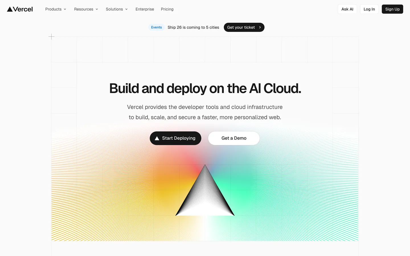
Colors
36 colors
Vercel Inspired's system runs on #171717 as its primary voltage, used in 7 of 40 components. Type is set in Geist across 14 tokens from 12px to 48px, weights 400–600. Shape language is soft — components average 24px corner radius, with no sharp interactive edges.
Brand & Accent
Sparing, CTA-only voltage · 1
Surface
Page and card backgrounds · 3
Text
Headlines, body, captions · 9
Borders & Hairlines
Dividers, outlines, rules · 2
Semantic
Status, errors, success, links · 10
Other
Specialty colors · 11
Typography
14 type tokens
Set in Geist across 14 tokens, from 12px to 48px, weights 400–600. Shown in its own stack: where the font isn't installed, the fallback the file names stands in.
- display-xl48px · weight 600 · lh 48px · tracking -2.4pxThe quick brown fox jumps over the lazy dog
- display-lg32px · weight 600 · lh 40px · tracking -1.28pxThe quick brown fox jumps over the lazy dog
- display-md24px · weight 600 · lh 32px · tracking -0.96pxThe quick brown fox jumps over the lazy dog
- display-sm20px · weight 600 · lh 28px · tracking -0.6pxThe quick brown fox jumps over the lazy dog
- body-lg18px · weight 400 · lh 28px · tracking 0pxThe quick brown fox jumps over the lazy dog
- body-md16px · weight 400 · lh 24pxThe quick brown fox jumps over the lazy dog
- body-md-strong16px · weight 500 · lh 24pxThe quick brown fox jumps over the lazy dog
- body-sm14px · weight 400 · lh 20px · tracking -0.28pxThe quick brown fox jumps over the lazy dog
- body-sm-strong14px · weight 500 · lh 20px · tracking -0.28pxThe quick brown fox jumps over the lazy dog
- caption12px · weight 400 · lh 16pxThe quick brown fox jumps over the lazy dog
- caption-mono12px · weight 400 · lh 16pxThe quick brown fox jumps over the lazy dog
- code13px · weight 400 · lh 20pxThe quick brown fox jumps over the lazy dog
- button-md14px · weight 500 · lh 20pxThe quick brown fox jumps over the lazy dog
- button-lg16px · weight 500 · lh 24pxThe quick brown fox jumps over the lazy dog
Layout
Radii and spacing
9 corner radii and 12 spacing values. Shape language: soft.
Radii
- none0px
- xs4px
- sm6px
- md8px
- lg12px
- xl16px
- pill-sm64px
- pill100px
- full9999px
Spacing
- xxs4px
- xs8px
- sm12px
- md16px
- lg24px
- xl32px
- 2xl40px
- 3xl48px
- 4xl64px
- 5xl96px
- 6xl128px
- section192px
Components
40 components
Each rendered from its tokens (color, type, radius, padding) on Vercel's own canvas.
- Nav Barnav-barNav Bar
- Nav Linknav-linkNav Link
- Nav Cta Signupnav-cta-signupNav Cta Signup
- Nav Cta Loginnav-cta-loginNav Cta Login
- Nav Cta Ask Ainav-cta-ask-aiNav Cta Ask Ai
- Button Primarybutton-primaryButton Primary
- Button Secondarybutton-secondaryButton Secondary
- Button Primary Smbutton-primary-smButton Primary Sm
- Button Secondary Smbutton-secondary-smButton Secondary Sm
- Tab Ghosttab-ghostTab Ghost
- icon-button-circularIcon Button Circular
- Card Marketingcard-marketingCard Marketing
- Card Marketing Largecard-marketing-largeCard Marketing Large
- Card Softcard-softCard Soft
- Template Cardtemplate-cardTemplate Card
- Code Editor Mockupcode-editor-mockupCode Editor Mockup
- Form Inputform-inputForm Input
- Form Input Smform-input-smForm Input Sm
- Form Input Lgform-input-lgForm Input Lg
- Badge Secondarybadge-secondaryBadge Secondary
- Pricing Cardpricing-cardPricing Card
- Pricing Card Featuredpricing-card-featuredPricing Card Featured
- Logo Striplogo-stripLogo Strip
- Hero Bandhero-bandHero Band
- Feature Mesh Bandfeature-mesh-bandFeature Mesh Band
- Showcase Band Lightshowcase-band-lightShowcase Band Light
- Showcase Band Darkshowcase-band-darkShowcase Band Dark
- FooterfooterFooter
- Link Inlinelink-inlineLink Inline
- Banner Marketingbanner-marketingBanner Marketing
- Ex Pricing Tierex-pricing-tierEx Pricing Tier
- Ex Pricing Tier Featuredex-pricing-tier-featuredEx Pricing Tier Featured
- Ex Product Selectorex-product-selectorEx Product Selector
- Ex Cart Drawerex-cart-drawerEx Cart Drawer
- Ex App Shell Rowex-app-shell-rowEx App Shell Row
- Ex Data Table Cellex-data-table-cellEx Data Table Cell
- Ex Auth Form Cardex-auth-form-cardEx Auth Form Card
- Ex Modal Cardex-modal-cardEx Modal Card
- Ex Empty State Cardex-empty-state-cardEx Empty State Card
- Ex Toastex-toastEx Toast
In use
The system, in use
Vercel's tokens on the kind of product it builds.
Build something people actually use.
A short paragraph of marketing copy that previews how the brand's display tier and body tier read together. Two sentences is usually enough.
FAQ
Vercel Inspired design system FAQ
Common questions about Vercel's tokens, components, and how to use this DESIGN.md in your project.
Read next
Related reading
Specs, directories, and component libraries that pair with this design system.
Use it
Use Vercel Inspired in your project
One machine-readable file. Drop it into Claude, Cursor, or any AI tool that reads DESIGN.md.
Download the DESIGN.md
One machine-readable file: every color, type, radius, spacing, and component token of Vercel Inspired.
Feed it to your AI tool
Drop it into Claude, Cursor, or GitHub Copilot. The agent writes React components and Tailwind classes that match Vercel Inspired's visual language.
Reference the tokens directly
Or paste the values into your Tailwind config, CSS variables, or component library: every color, size and radius is a quoted, ready-to-copy value.
Read the full DESIGN.md: overview, rationale, do’s and don’ts
Overview
Vercel is a developer-platform brand — the page is a deployment dashboard's marketing surface, written for engineers who already know the syntax. It earns that posture with one of the cleanest stark systems on the web: near-white {colors.canvas-soft} (#fafafa) body background, ink-near-black {colors.ink} (#171717) text, a 200-step gray scale that gives every divider, border, and disabled state its own deliberate step. The only place the brand introduces color at marketing scale is the multi-stop mesh gradient ({colors.gradient-develop-start} #007cf0 → {colors.gradient-preview-end} #ff0080 → {colors.gradient-ship-start} #ff4d4d → {colors.cyan} #50e3c2 / magenta / amber) that floats in atmospheric backdrops, never miniaturized to a swatch. That gradient is the entire decoration system.
Type is the second decisive voice. The brand's own custom geometric sans (Geist) carries display, body, button — everything narrative — at weight 600 for display, 500 for buttons, 400 for body. A matching monospaced face (Geist Mono) carries technical labels: terminal mockups, code blocks, sometimes filename captions. Headlines are sentence-case with aggressive negative letter-spacing (-2.4px at 48 px hero) — the brand never letter-spaces positively, never goes uppercase outside of mono labels.
Surfaces use a four-step ladder: {colors.canvas} (#ffffff pure white for cards), {colors.canvas-soft} (#fafafa 98% — the page body), {colors.canvas-soft-2} (#f5f5f5 95% occasional inset region), {colors.primary} (#171717 deep ink-near-black used as the polarity-flipped band when a section needs the dark mode treatment). Shadows are exceptionally subtle — every elevated card carries a stacked shadow built from 0px 1px 1px #00000005 + 0px 2px 2px #0000000a + an inset border. Cards never float on heavy drop-shadow; they sit on the page held by hairline + soft glow.
Key Characteristics:
- A single black-ink primary CTA
{colors.primary}(#171717) carries every conversion target, paired with white-on-whitebutton-secondaryfor the secondary action. The brand uses 100 px pill shape for marketing CTAs and a tight 6 px square shape for in-app nav buttons. - A multi-stop mesh gradient (cyan-blue-magenta-amber) is the only decorative chrome — used at hero scale and inside feature-band atmospheric backdrops. It is the brand.
- Every section eyebrow and small label uses the monospace face
{typography.caption-mono}or{typography.code}; everything else is in the geometric sans. - Subtle stacked-shadow elevation — three offsets layered with 4-12 % black opacity — never a single heavy drop-shadow.
- A complete 100–1000 gray + blue + red + amber + green + teal + purple + pink color scale exists as a system token set, but the marketing surface uses only the
100,1000, and700-level tones; the rest stay in the design-system tokens for in-product surfaces. - An "Active CPU" pricing rhythm:
pricing-cardlays out 3-up on the pricing page withpricing-card-featured(Pro tier) polarity-flipped to{colors.primary}(#171717) against white-card siblings.
Colors
Brand & Accent
- Ink (
{colors.primary}—#171717): The single primary CTA color. Black-near-pure ink that carries every Sign Up pill, every footer CTA, the dark-band polarity-flip. Used as text color throughout the page on light surfaces. (Resolved from--ds-gray-1000.) - Cyan (
{colors.cyan}—#50e3c2): A signature mint-cyan used in the brand gradient and inside Geist-system spotlight tokens. Visible inside the hero gradient stops. - Highlight Pink (
{colors.highlight-pink}—#ff0080): The brand's highlight magenta, used as the high-saturation stop in the preview-gradient pair. - Violet (
{colors.violet}—#7928ca): The deep purple used as the start of the preview-gradient and inside developer-console highlights. - Link Blue (
{colors.link}—#0070f3): The brand's primary link color and the legacy--geist-successsemantic.
Surface
- Canvas (
{colors.canvas}—#ffffff): The pure-white card / dialog / modal surface. - Canvas Soft (
{colors.canvas-soft}—#fafafa): The default page background — 98 % white. Almost every section sits on this tone. - Canvas Soft 2 (
{colors.canvas-soft-2}—#f5f5f5): A slightly deeper inset surface for "code editor inner background", template-card hover states, and dropdown menus. - Hairline (
{colors.hairline}—#ebebeb): 1 px dividers — table rows, card borders, input borders. - Hairline Strong (
{colors.hairline-strong}—#a1a1a1): The 500-level gray, used as the slightly-stronger divider on light bands and as the deemphasized text color.
Text
- Ink (
{colors.ink}—#171717): Every heading and body paragraph on light surfaces. - Body (
{colors.body}—#4d4d4d): Secondary text — sub-headings, body captions, nav-link inactive text, footer column body. - Mute (
{colors.mute}—#888888): Lowest-priority text — placeholder text, fine print, low-key labels. - On Primary (
{colors.on-primary}—#ffffff): All text on{colors.primary}(#171717) surfaces.
Semantic
- Success / Link (
{colors.success}—#0070f3): The brand's legacy success indicator doubles as the primary link color. Visible underline-on-hover for inline body links. - Link Deep (
{colors.link-deep}—#0761d1): The pressed / visited tone for inline links. - Link Bg Soft (
{colors.link-bg-soft}—#d3e5ff): Soft pastel blue fill for "what's new" pill banners and informational badges. - Error (
{colors.error}—#ee0000): Validation red for destructive actions and form errors. - Error Soft (
{colors.error-soft}—#f7d4d6): Soft pastel red for destructive-state backgrounds. - Error Deep (
{colors.error-deep}—#c50000): Pressed / deep destructive state. - Warning (
{colors.warning}—#f5a623): Caution / pending status indicator. - Warning Soft (
{colors.warning-soft}—#ffefcf) / Warning Deep ({colors.warning-deep}—#ab570a): Background + pressed variants.
Brand Gradient
The brand's signature decoration is a three-pair gradient stack:
- Develop (
{colors.gradient-develop-start}#007cf0→{colors.gradient-develop-end}#00dfd8) — the blue-to-teal pair used to mark the "deploy" / "develop" rhythm. - Preview (
{colors.gradient-preview-start}#7928ca→{colors.gradient-preview-end}#ff0080) — the violet-to-pink pair used for "preview" surfaces. - Ship (
{colors.gradient-ship-start}#ff4d4d→{colors.gradient-ship-end}#f9cb28) — the coral-to-amber pair used for "ship" surfaces.
The three pairs collapse into a single multi-color mesh gradient when used as the hero atmospheric backdrop. Treat the gradient as one unified object — do not crop down to a single color, do not reorder the stops, and do not miniaturize. Used at hero scale only.
Typography
Font Family
Two custom faces carry the entire system:
- A custom geometric sans (extracted as
Geist) for every display, body, button, link, and label. Weights 400 / 500 / 600 are the working set; the face never appears in 700 or heavier. Display sizes are tracked aggressively negative (-2.4 pxat 48 px hero,-1.28 pxat 32 px section); body stays at neutral or slightly-negative tracking. - A custom monospaced face (extracted as
Geist Mono) for terminal mockups, code blocks, and small mono-caption labels — anything that wants to signal "technical." Weight 400 only at 12 – 13 px. Tracking neutral.
A condensed display sans (Space Grotesk) is loaded as a third face for occasional editorial moments but does not render as the primary face anywhere in the captured surfaces.
Hierarchy
| Token | Size | Weight | Line Height | Letter Spacing | Use |
|---|---|---|---|---|---|
{typography.display-xl} | 48px | 600 | 48px | -2.4px | Hero headline ("Build and deploy on the AI Cloud."). |
{typography.display-lg} | 32px | 600 | 40px | -1.28px | Section headlines ("Your frontend, delivered.", "A compute model for all workloads."). |
{typography.display-md} | 24px | 600 | 32px | -0.96px | Card-cluster headlines, pricing-tier names. |
{typography.display-sm} | 20px | 600 | 28px | -0.6px | Inline display micro-headings. |
{typography.body-lg} | 18px | 400 | 28px | 0 | Lead paragraphs under section headlines. |
{typography.body-md} | 16px | 400 | 24px | 0 | Default body paragraph. |
{typography.body-md-strong} | 16px | 500 | 24px | 0 | Bolded inline body. |
{typography.body-sm} | 14px | 400 | 20px | -0.28px | Secondary body, nav-link text, button-md labels. |
{typography.body-sm-strong} | 14px | 500 | 20px | -0.28px | Nav CTA labels, table-row emphasis. |
{typography.caption} | 12px | 400 | 16px | 0 | Footer secondary lines, badge labels. |
{typography.caption-mono} | 12px | 400 | 16px | 0 | Section eyebrows and label captions that want a technical voice. |
{typography.code} | 13px | 400 | 20px | 0 | Inline code, terminal mockups, command snippets. |
{typography.button-md} | 14px | 500 | 20px | 0 | Small / nav-scale button labels. |
{typography.button-lg} | 16px | 500 | 24px | 0 | Marketing-scale pill button labels. |
Principles
- Negative tracking is part of the voice. Display sizes use aggressive
-2.4to-0.6px tracking. Reverting to default tracking breaks the brand. - Sentence-case headlines, period-terminated. Headlines like "Build and deploy on the AI Cloud." end with a deliberate period — that punctuation is part of the brand's voice.
- Mono for the technical layer only. Section eyebrows, code blocks, terminal mockups. Body paragraphs never set in mono.
- Weight 600 is the display ceiling. The geometric sans never appears at 700 / 800. The brand reads as a calmer system because of this.
Note on Font Substitutes
The two primary faces are proprietary (custom-cut for the brand). Open-source substitutes:
- Geometric sans — Inter (400 / 500 / 600) is the closest stylistic match;
font-feature-settings: "ss01", "ss02"enables the geometric alternates. Satoshi is a passable second choice. - Monospace — JetBrains Mono (400) at 12 – 13 px matches the technical voice. IBM Plex Mono is the second-best option.
Layout
Spacing System
- Base unit: 4 px. The brand's
--geist-spacetoken is exactly 4 px and every captured value is a multiple of 4. - Tokens:
{spacing.xxs}4 px ·{spacing.xs}8 px ·{spacing.sm}12 px ·{spacing.md}16 px ·{spacing.lg}24 px ·{spacing.xl}32 px ·{spacing.2xl}40 px ·{spacing.3xl}48 px ·{spacing.4xl}64 px ·{spacing.5xl}96 px ·{spacing.6xl}128 px ·{spacing.section}192 px. - Section padding: marketing bands use
{spacing.4xl}to{spacing.5xl}top/bottom. Hero bands stretch to{spacing.section}to give the mesh gradient room to breathe. - Card interior padding: marketing cards sit at
{spacing.lg}to{spacing.xl}; template-grid cards stay tighter at{spacing.md}because they sit in a denser grid. - Inline gap: button rows, nav rows, and chip rows use
{spacing.sm}to{spacing.md}between siblings. The brand's--geist-gapis exactly 24 px.
Grid & Container
- Max width: ~1400 px (
--ds-page-width); the legacy--geist-page-widthis 1200 px and still appears on some marketing surfaces. Content centers with horizontal gutters of{spacing.lg}24 px on desktop,{spacing.md}16 px on mobile. - Column patterns:
- Three-feature row: 3-up at desktop, 1-up at mobile (rows like "Web Apps / Composable Commerce / Multi-tenant Platforms").
- Tab pill row: 5-up centered row of
tab-ghostpills. - Template-grid cluster: 5-up at desktop, scaling to 1-up at mobile.
- Pricing tier grid: 3-up at desktop with the middle tier polarity-flipped.
- Logo strip: ~5 logos wide, single row.
Whitespace Philosophy
The mesh gradient does most of the heavy decorative lifting; whitespace separates the bands. Section spacing is generous — {spacing.4xl} to {spacing.5xl} between bands lets the gradient breathe. Inside a card, the headline/paragraph stack is tight ({spacing.xs} 8 px gap), then a wider gap before the CTA cluster. The page reads as engineered — large gaps + tight interior, never the other way around.
Responsive Strategy
Breakpoints
| Name | Width | Key Changes |
|---|---|---|
| Mobile | < 600px | Hero stacks; nav collapses to hamburger; 3-up feature grids drop to 1-up; tab pill row enables horizontal scroll. |
| Tablet | 600–959px | 3-up grids drop to 2-up; nav still horizontal. |
| Desktop | 960–1199px | Full 3-up grids; pricing 3-up. |
| Wide | 1200–1399px | Container caps at 1400 px content width. |
| Ultra-wide | ≥ 1400px | Content stays centered at 1400 px; bands stretch edge-to-edge in color but content holds the max-width. |
Touch Targets
The button-primary pill renders at ~32 px tall in nav and ~48 px tall in marketing contexts. Marketing CTAs comfortably meet WCAG AAA at all breakpoints; nav buttons inflate touch area through {spacing.xs} padding on mobile to meet the 44 × 44 px floor.
Collapsing Strategy
- Nav: full link row + Ask AI / Log In / Sign Up pills at desktop. Collapses to logo + hamburger at mobile with the menu opening as a full-overlay.
- Hero: mesh gradient stays centered; headline + body stack vertically at all breakpoints (the brand doesn't use a split-hero pattern).
- Three-feature row: 3-up → 2-up → 1-up at the breakpoints above; cards keep their
{rounded.md}8 px shape across all viewports. - Pricing card grid: 3-up at desktop, vertical stack at mobile with
pricing-card-featuredalways sitting in the middle. - Template grid: 5-up → 3-up → 2-up → 1-up. Each
template-cardkeeps its 16:9 aspect on the image.
Image Behavior
- Mesh gradient: rendered as inline SVG or canvas-painted gradient; scales fluidly with the hero container; never crops, never tiles.
- Customer logos: rendered as monochrome SVGs in the logo strip; consistent 24 px height.
- Code editor mockup: dark
{colors.primary}(#171717) rectangle with mono text rendered inside; treated as an image at the layout level. - Template thumbnails: 16:9 landscape inside
{rounded.md}card chrome; lazy-loaded; consistent grayscale palette in the placeholder state.
Elevation & Depth
| Level | Treatment | Use |
|---|---|---|
| Level 0 — Flat | No shadow, no border. | Full-bleed hero bands and the polarity-flipped dark sections. |
| Level 1 — Inset Hairline | 0 0 0 1px #00000014 inset 1 px border. | Default card chrome — the brand's universal "you can see this card" cue. |
| Level 2 — Subtle Drop | 0px 1px 1px #00000005, 0px 2px 2px #0000000a plus inset hairline. | Slightly elevated cards (template-grid, marketing-card). |
| Level 3 — Soft Stack | 0px 2px 2px #0000000a, 0px 8px 8px -8px #0000000a plus inset hairline. | The "medium" elevation — feature-grid cards. |
| Level 4 — Float Stack | 0px 2px 2px #0000000a, 0px 8px 16px -4px #0000000a plus inset hairline. | "Large" elevation — pricing cards, callout panels. |
| Level 5 — Modal | 0px 1px 1px #00000005, 0px 8px 16px -4px #0000000a, 0px 24px 32px -8px #0000000f plus inset hairline. | Modal / dialog surfaces and dropdown menus. |
The brand uses STACKED shadows — multiple small offsets layered to fake natural light — never a single 8-px-blur generic drop. Inset hairline rings are always added so the card edge stays crisp.
Decorative Depth
- Mesh gradient as atmospheric depth: the hero's multi-stop gradient is the brand's only "atmospheric" effect — applied as a flat 2-D backdrop rather than a 3-D illustration.
- Polarity-flipped dark band as section-depth: switching the surface from
{colors.canvas-soft}(#fafafa) to{colors.primary}(#171717the deep ink) is the brand's chief depth cue between bands. - Inset-shadow + drop-shadow combo: the cards' combination of an inset 1 px ring and a multi-stop drop produces a "card sits on the page" effect without ever feeling material-heavy.
Shapes
Border Radius Scale
| Token | Value | Use |
|---|---|---|
{rounded.none} | 0px | Full-bleed hero / footer bands. |
{rounded.xs} | 4px | Tightest inline pill — the nav-cta-signup 6-px-radius button (mapped to xs/sm). |
{rounded.sm} | 6px | The brand's --geist-radius token — base UI radius for in-app buttons, form inputs, dropdown menus. |
{rounded.md} | 8px | The brand's --geist-marketing-radius token — feature cards, template cards. |
{rounded.lg} | 12px | Slightly larger card chrome (pricing-card variants). |
{rounded.xl} | 16px | Largest card chrome — when a card hosts a hero image cap. |
{rounded.pill-sm} | 64px | Tab-ghost pills inside the "AI Apps / Web Apps / Ecommerce / Marketing / Platforms" row. |
{rounded.pill} | 100px | The marketing CTA pill — button-primary, button-secondary, "Start Deploying" pill. |
{rounded.full} | 9999px | Icon-button circular containers, nav-link ghost pills. |
Photography Geometry
- Mesh gradient: full-bleed 2-D atmospheric backdrop, never cropped to a frame; treated as the page's wallpaper.
- Customer logos: monochrome SVG, consistent 24 px height in a flex row.
- Code editor mockup: 16:10 dark rectangle,
{rounded.md}corners. - Template thumbnails: 16:9 landscape inside
{rounded.md}chrome. - Showcase imagery: 2:1 or 16:9 inside
{rounded.lg}to{rounded.xl}chrome with a stacked shadow.
Components
Buttons
button-primary — the canonical 100-px-radius black pill, marketing scale.
- Background
{colors.primary}(#171717), text{colors.on-primary}(#ffffff), label set in{typography.button-lg}, padding0px {spacing.sm}12 px, shape{rounded.pill}100 px. Renders ~48 px tall when paired with the marketing flex layout.
button-secondary — the white pill paired with the black primary inside marketing bands.
- Background
{colors.canvas}(#ffffff), text{colors.ink}(#171717), same typography + padding asbutton-primary, shape{rounded.pill}.
button-primary-sm — the smaller-scale primary pill used inside nav and pricing-card CTAs.
- Background
{colors.primary}(#171717), text{colors.on-primary}(#ffffff), label set in{typography.button-md}(14 px / 500), shape{rounded.pill}.
button-secondary-sm — the smaller-scale white pill paired with button-primary-sm.
- Background
{colors.canvas}(#ffffff), text{colors.ink}(#171717), same typography + shape asbutton-primary-sm.
tab-ghost — the centered-row tab pill ("AI Apps / Web Apps / Ecommerce / Marketing / Platforms").
- Background
{colors.canvas}(#ffffff), text{colors.ink}(#171717), label set in{typography.body-sm}, padding0px {spacing.md}, shape{rounded.pill-sm}64 px.
icon-button-circular — the circular icon container (often a "?" or arrow inside).
- Background
{colors.canvas}(#ffffff), dark icon, 1 px solid hairline border, shape{rounded.full}.
Nav CTAs:
nav-cta-signup — the small black "Sign Up" button in the nav row.
- Background
{colors.primary}(#171717), text{colors.on-primary}(#ffffff), label{typography.body-sm-strong}, padding0px {spacing.xs}, height 28 px, shape{rounded.sm}6 px (the brand's--geist-radius).
nav-cta-login — the white "Log In" button in the nav.
- Background
{colors.canvas}(#ffffff), text{colors.ink}(#171717), same typography / height / shape asnav-cta-signup.
nav-cta-ask-ai — the small "Ask AI" button with a faint border.
- Background
{colors.canvas}(#ffffff), text{colors.ink}(#171717), 1 px solid{colors.hairline}(#ebebeb) border (extracted as0px solid rgb(235, 235, 235)), same typography / height / shape.
Cards & Containers
card-marketing — the canonical marketing feature card (3-up section cards).
- Background
{colors.canvas}(#ffffff), text{colors.ink}(#171717), padding{spacing.lg}24 px, shape{rounded.md}8 px (the--geist-marketing-radius). Carries Level 3 soft-stack shadow.
card-marketing-large — the larger marketing card used for "compute model" / "AI Gateway" callouts.
- Background
{colors.canvas}(#ffffff), text{colors.ink}(#171717), padding{spacing.xl}, shape{rounded.lg}12 px. Carries Level 4 float-stack shadow.
card-soft — the soft-tinted card used inside cluster groups (lighter than canvas-soft).
- Background
{colors.canvas-soft}(#fafafa), text{colors.ink}(#171717), padding{spacing.lg}, shape{rounded.md}.
template-card — the deploy-template card in the "Deploy your first app" grid.
- Background
{colors.canvas}(#ffffff), text{colors.ink}(#171717), padding{spacing.md}16 px, shape{rounded.md}8 px. Hosts a 16:9 thumbnail at the top.
code-editor-mockup — the dark code-preview surface inside marketing bands.
- Background
{colors.primary}(#171717), text{colors.on-primary}(#ffffff), body in{typography.code}(13 px / Geist Mono), padding{spacing.lg}24 px, shape{rounded.md}8 px.
pricing-card — the default pricing-tier card.
- Background
{colors.canvas}(#ffffff), text{colors.ink}(#171717), padding{spacing.xl}32 px, shape{rounded.lg}12 px. Inside: tier name in{typography.display-md}, price in{typography.display-xl}, feature list in{typography.body-md}rows, CTA at the bottom.
pricing-card-featured — the polarity-flipped "Pro" tier card.
- Background
{colors.primary}(#171717), text{colors.on-primary}(#ffffff), same shape + padding aspricing-card. CTA inverts tobutton-secondary-sm(white pill on black card).
Inputs & Forms
form-input — the canonical text input.
- Background
{colors.canvas}(#ffffff), text{colors.ink}(#171717), 1 px solid{colors.hairline}(#ebebeb) border, body in{typography.body-sm}(14 px), padding0px {spacing.sm}, height 40 px (the brand's--geist-form-height), shape{rounded.sm}6 px.
form-input-sm — small-height variant (32 px tall) for tight forms.
- Same as
form-inputbut height 32 px (the--geist-form-small-height).
form-input-lg — large-height variant (48 px tall) for hero CTAs.
- Same as
form-inputbut height 48 px (the--geist-form-large-height); body in{typography.body-md}16 px.
Navigation
nav-bar — the sticky top nav.
- Background
{colors.canvas}(#ffffff), text{colors.ink}(#171717), height 64 px (the brand's--header-height), padding{spacing.sm} {spacing.lg}. Layout: logo left, link row center, "Ask AI / Log In / Sign Up" cluster right.
nav-link — the centered link row inside nav-bar.
- Text
{colors.body}(#4d4d4d), set in{typography.body-sm}, padding{spacing.xs} {spacing.sm}, shape{rounded.full}(ghost pill — visible only on hover or active, but the radius is documented).
footer — the bottom 4-column nav.
- Background
{colors.canvas}(#ffffff), text{colors.body}(#4d4d4d), padding{spacing.4xl} {spacing.lg}. Eyebrow column labels in{typography.caption-mono}(uppercase mono effect); link rows in{typography.body-sm}.
Signature Components
hero-band — the white hero with the mesh gradient backdrop.
- Background
{colors.canvas}(#ffffff) (or{colors.canvas-soft}#fafafaon some surfaces), text{colors.ink}(#171717), padding{spacing.4xl} {spacing.lg}. Inside: a small mono badge above the headline, the headline in{typography.display-xl}(sentence-case, period-terminated), a body lead in{typography.body-lg}, then a CTA row withbutton-primary+button-secondary. The mesh gradient sits behind, scaled to occupy roughly the top half of the band.
feature-mesh-band — the secondary section that hosts a mesh-gradient atmospheric backdrop with feature copy on top.
- Background
{colors.canvas}(#ffffff), text{colors.ink}(#171717), padding{spacing.5xl} {spacing.lg}. Section headline in{typography.display-lg}; supporting body in{typography.body-md}.
showcase-band-light — a soft-canvas section ("Deploy your first app in seconds").
- Background
{colors.canvas-soft}(#fafafa), text{colors.ink}(#171717), padding{spacing.5xl} {spacing.lg}.
showcase-band-dark — the polarity-flipped dark band ("A compute model for all workloads").
- Background
{colors.primary}(#171717), text{colors.on-primary}(#ffffff), padding{spacing.5xl} {spacing.lg}. Section headline in{typography.display-lg}(white on black). Often contains acode-editor-mockupflush with the band.
logo-strip — the customer-logo wrapping row near the top of the page.
- Background
{colors.canvas}(#ffffff), text{colors.body}(#4d4d4d), padding{spacing.lg} {spacing.xl}. Logos rendered as monochrome SVGs at consistent height.
badge-secondary — the small inline metadata pill ("New", "Beta", "Live").
- Background
{colors.canvas-soft}(#fafafa), text{colors.body}(#4d4d4d), body in{typography.caption}, padding0px {spacing.xs}, shape{rounded.full}.
banner-marketing — the "Introducing X" announcement pill at the top of pages.
- Background
{colors.canvas-soft}(#fafafa), text{colors.body}(#4d4d4d), body in{typography.body-sm}, padding{spacing.xs} {spacing.sm}, shape{rounded.full}.
link-inline — body-copy inline links.
- Text
{colors.link}(#0070f3), body in{typography.body-md}, underlined.
Examples (illustrative)
Auto-derived kit-mirror demonstration surfaces (
scripts/derive-examples-block.mjs). Eachex-*entry references brand-native primitives so downstream consumers (/preview-design,/generate-kit) re-skin the same 10 surfaces consistently.TO_FILLmarkers indicate missing primitives — resolve in the LLM judgment pass.
ex-pricing-tier — Default Pricing tier card. Re-uses feature-card chrome with brand canvas-soft surface.
- Properties:
backgroundColor,textColor,borderColor,rounded,padding
ex-pricing-tier-featured — Featured/highlighted tier — polarity-flipped surface (dark fill + light text in light mode, light fill + dark text in dark mode).
- Properties:
backgroundColor,textColor,rounded,padding
ex-product-selector — What's Included summary card — re-purposed for SaaS / B2B verticals (NOT a literal product gallery).
- Properties:
backgroundColor,rounded,padding
ex-cart-drawer — Subscription summary — re-purposed for SaaS / B2B (line items per add-on, not literal cart).
- Properties:
backgroundColor,rounded,padding,item-divider
ex-app-shell-row — Sidebar nav row inside the App Shell example. Active state uses brand primary as the indicator.
- Properties:
backgroundColor,activeIndicator,rounded,padding
ex-data-table-cell — Default data-table th + td chrome. Header uses mono-caps eyebrow typography; body uses body-sm.
- Properties:
headerBackground,headerTypography,bodyTypography,cellPadding,rowBorder
ex-auth-form-card — Sign-in / sign-up card. Re-uses feature-card chrome with text-input primitives inside.
- Properties:
backgroundColor,rounded,padding
ex-modal-card — Modal dialog surface — same chrome as feature-card with elevated shadow.
- Properties:
backgroundColor,rounded,padding
ex-empty-state-card — Empty-state illustration frame.
- Properties:
backgroundColor,rounded,padding,captionTypography
ex-toast — Toast notification surface — feature-card shape + medium shadow.
- Properties:
backgroundColor,rounded,padding,typography
Known Gaps
- Hover-state colors: The brand uses subtle hover transitions on nav links and cards (typically a faint background fill shift toward
{colors.canvas-soft-2}#f5f5f5), but precise per-component hover tokens are not captured here. - Focus rings: Form inputs darken their border on focus, but the exact focus-ring color and width (whether
{colors.link}#0070f3or an ink-tinted ring) is not documented. - Loading skeletons: Vercel's skeleton placeholders (used in dashboard tables and template grids) shimmer in
{colors.canvas-soft-2}#f5f5f5to{colors.hairline}#ebebeb, but the animation timing and stop tokens are not captured. - Dashboard / in-product surfaces: This DESIGN.md covers the public marketing page. The Vercel dashboard's denser inner surfaces — deployment tables, log viewers, project sidebars — use the same
{colors.primary}#171717+ Geist Mono vocabulary but with tighter spacing and additional gray-scale steps not captured here. - Full gray scale: The 100–1000 gray scale (and the parallel blue / red / amber / green / teal / purple / pink scales) exists as a system token set, but only the marketing-surface tones (
100,1000,700-level) are documented; the in-product step values are not.
Web Infrastructure & Hosting
More systems like this
More DESIGN.md files in Web Infrastructure & Hosting.
Pricing
Build it with Pro
The DESIGN.md files are free. Pro adds 6,000+ blocks, premium templates and the MCP server, so your AI editor builds in your system for you.
4.9/5 out of 5 · 150+ reviewsfrom 150+ founders and developers.
Billing
Billed once a year in USD. Cancel anytime.
- How many people can use the license.
- Client work, SaaS products and anything you charge for.
- Production-ready React sections: hero, pricing, features, dashboards and more.
- Complete multi-page sites you can ship as they are.
- React icons from every major library, installable with one command.
- Presets that restyle every block, in light and dark.
- Lets your AI editor search, preview and install blocks for you.
- Priority requests are answered first.
Individual
For personal projects & open source
$32instead of $49/mo
$389 billed yearly
- Seats: 1 seat
- Commercial use: Personal & open source only
- Pro blocks: 6,000+ blocks
- Templates: All 14 templates
- React icons: 294k+ icons
- Themes: All 59 themes
- MCP server: Basic usage
- Support: Standard
Team
Most popularFor freelancers, agencies & startups
$66instead of $99/mo
$789 billed yearly · ≈ $13/dev/mo
- Seats: Up to 5 seats
- Commercial use: Included
- Pro blocks: 6,000+ blocks
- Templates: All 14 templates
- React icons: 294k+ icons
- Themes: All 59 themes
- MCP server: High usage
- Support: Priority
Organization
For companies with larger teams
$132instead of $199/mo
$1,589 billed yearly
- Seats: Unlimited seats
- Commercial use: Included
- Pro blocks: 6,000+ blocks
- Templates: All 14 templates
- React icons: 294k+ icons
- Themes: All 59 themes
- MCP server: Unlimited usage
- Support: Priority
Billed once a year in USD. Cancel anytime.
Individual
For personal projects & open source
$32instead of $49/mo
$389 billed yearly
- How many people can use the license.Seats: 1 seat
- Client work, SaaS products and anything you charge for.Commercial use: Personal & open source only
- Production-ready React sections: hero, pricing, features, dashboards and more.Pro blocks: 6,000+ blocks
- Complete multi-page sites you can ship as they are.Templates: All 14 templates
- React icons from every major library, installable with one command.React icons: 294k+ icons
- Presets that restyle every block, in light and dark.Themes: All 59 themes
- Lets your AI editor search, preview and install blocks for you.MCP server: Basic usage
- Priority requests are answered first.Support: Standard
Team
Most popularFor freelancers, agencies & startups
$66instead of $99/mo
$789 billed yearly · ≈ $13/dev/mo
Everything in Individual, plus
- How many people can use the license.Seats: Up to 5 seats
- Client work, SaaS products and anything you charge for.Commercial use: Included
- Lets your AI editor search, preview and install blocks for you.MCP server: High usage
- Priority requests are answered first.Support: Priority
Organization
For companies with larger teams
$132instead of $199/mo
$1,589 billed yearly
Everything in Team, plus
- How many people can use the license.Seats: Unlimited seats
- Lets your AI editor search, preview and install blocks for you.MCP server: Unlimited usage
- Secure checkout via Stripe
- Code lives in your repo
- Keep what you've shipped if you cancel
- License terms
Your system, built for you
Every block, template and icon, installed by your AI agent in your design system. The DESIGN.md files stay free.