Vanguard Design System
Vanguard's marketing system as a DESIGN.md file — saturated crimson hero with Jack Bogle's portrait, FF Mark weight 800 display, 80px pill CTAs, and a near-black editorial floor. Tokens for React, Next.js, and AI coding tools.
Add shadcn.io to your AI agent. · Pro It installs blocks, icons and templates in your design system from a prompt, with Pro.
Set up MCP- Primary
- #c20029
- Typeface
- FF Mark
- Shape
- Soft
- Base radius
- 0px
- Colors
- 9
- Type tokens
- 10
- Components
- 14
- Spacing values
- 8
About
About Vanguard DESIGN.md
Curated by Dov Azencot · Updated May 19, 2026 · Source investor.vanguard.com (opens in a new tab)
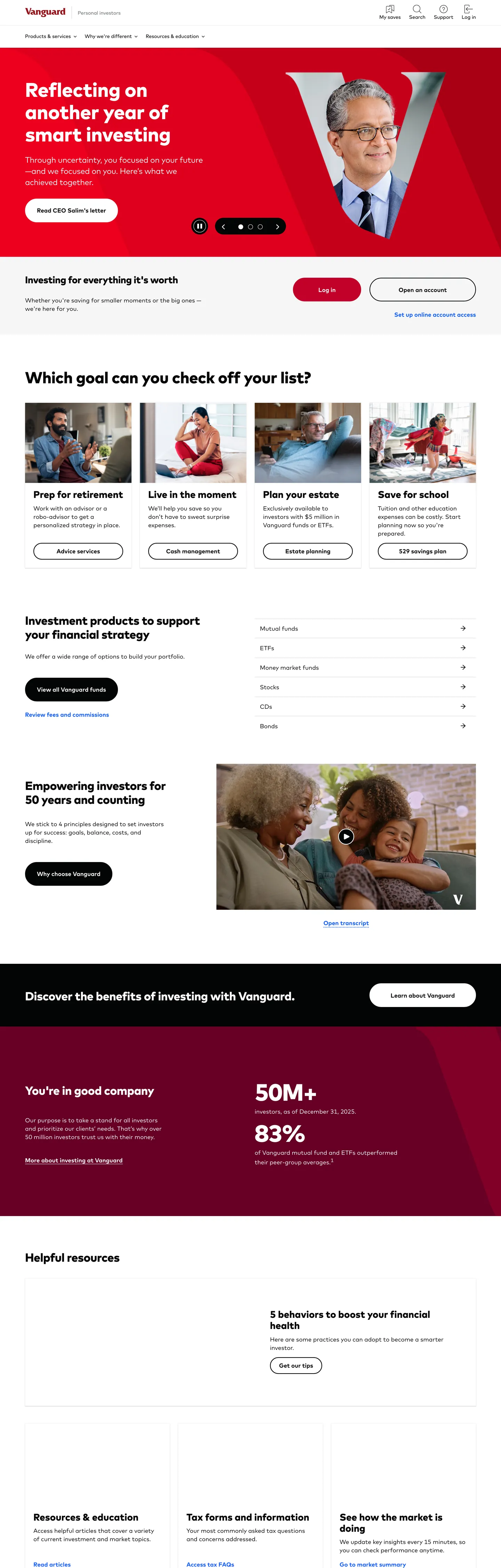
Vanguard's marketing site does something almost no other broker attempts: the hero is a portrait of the founder. Jack Bogle in a navy suit, three-quarter profile, sits inside a saturated crimson rectangle that occupies the entire above-fold canvas, with an oversized sans-serif "V" filling the negative space behind his shoulders. The headline — "Reflecting on another year of smart investing" — sits in white on the same red block beside him, and the primary CTA pill drops a single red-on-red fill into the bottom-left corner. Where Schwab paints its hero in corporate navy and Fidelity leans on a green-and-white photographic editorial, Vanguard reads as a manifesto poster: founder, monogram, declarative sentence. The "V" mark is doing the same job a logo would in a luxury brand wordmark.
The DESIGN.md file packages the system into a machine-readable spec for React tooling. Inside: 9 colors tokens dominated by near-black ink at frequency 388 and crimson voltage at frequency 4 (declared as the primary CTA fill); 11 typography tokens running FF Mark at four weights — 400 body, 700 emphasis, 800 display, 900 sub-section — with sizes spanning 17px body up to a 92px hero h1; 4 radius tokens centered on 32px panels and 80px pill CTAs; 8 spacing values on a 4px base with 24px and 32px doing the heaviest lifting; and 14 components definitions covering the crimson primary pill, the near-black secondary surface, hero h1, body paragraph, and the inverted statistic-card variant used inside the testimonial bands.
Feed this file to an AI coding tool and it reproduces Vanguard's specific moves: founder-portrait hero block (or branded photograph at minimum), crimson voltage carrying the CTA, FF Mark weight 800 at display sizes, 80px pill CTAs, and the near-black-over-white inversion below the fold. The one move that only works if your brand has a 50-year recognizable founder: don't replicate the portrait without earning the equity. Most teams should treat it as a structural lesson — give the brand a face, even if the face is a product object rather than a person.
What makes it distinct
5
- Founder-as-hero portraitJack Bogle photographed three-quarter against an oversized red V monogram sits above the headline, where every other broker shows a chart or a phone mockup
- Crimson hero canvasa saturated red block carries the above-fold composition rather than the usual finance-industry navy or black
- FF Mark across every tiera single sans-serif runs the 92px weight-800 display down to the 17px body, no serif voice anywhere
- 80px pill CTAs and 32px rounded panelsthe radius scale skips the 4-12px small-step tier most fintech systems use, jumping straight to generous-soft
- Binary chromatic systemcrimson + near-black do every job, with a single cobalt blue held for inline links and footer accents
investor.vanguard.com
Live at investor.vanguard.com
A snapshot of the brand in production. Scroll the frame to see the whole page.
Colors
9 colors
Vanguard's system runs on #c20029 as its primary voltage, used in 3 of 14 components. Type is set in FF Mark across 10 tokens from 17px to 92px, weights 400–900. Shape language is soft — components average 46px corner radius, with no sharp interactive edges.
Brand & Accent
Sparing, CTA-only voltage · 1
Surface
Page and card backgrounds · 3
Text
Headlines, body, captions · 4
Other
Specialty colors · 1
Typography
10 type tokens
Set in FF Mark across 10 tokens, from 17px to 92px, weights 400–900. Shown in its own stack: where the font isn't installed, the fallback the file names stands in.
- display-xl92px · weight 800 · lh 96px · tracking -2pxThe quick brown fox jumps over the lazy dog
- display-lg68px · weight 800 · lh 72px · tracking -1.5pxThe quick brown fox jumps over the lazy dog
- display-md57px · weight 800 · lh 64px · tracking -0.5pxThe quick brown fox jumps over the lazy dog
- display-sm46px · weight 800 · lh 48px · tracking -0.5pxThe quick brown fox jumps over the lazy dog
- heading-lg34px · weight 800 · lh 40px · tracking -0.5pxThe quick brown fox jumps over the lazy dog
- heading-md28px · weight 900 · lh 32pxThe quick brown fox jumps over the lazy dog
- lead23px · weight 400 · lh 32px · tracking -0.5pxThe quick brown fox jumps over the lazy dog
- body-md17px · weight 400 · lh 24pxThe quick brown fox jumps over the lazy dog
- body-emphasis17px · weight 700 · lh 24pxThe quick brown fox jumps over the lazy dog
- button-md17px · weight 400 · lh 25.5pxThe quick brown fox jumps over the lazy dog
Layout
Radii and spacing
4 corner radii and 8 spacing values. Shape language: soft.
Radii
- none0px
- lg32px
- pill80px
- full9999px
Spacing
- xs4px
- sm12px
- base16px
- lg24px
- xl32px
- 2xl56px
- 3xl72px
- 4xl112px
Components
14 components
Each rendered from its tokens (color, type, radius, padding) on Vanguard's own canvas.
- Button Primarybutton-primaryButton Primary
- Button Secondarybutton-secondaryButton Secondary
- Button On Darkbutton-on-darkButton On Dark
- Top Navtop-navTop Nav
- Nav Linknav-linkNav Link
- Hero Sectionhero-sectionHero Section
- Hero Headinghero-headingHero Heading
- Section Headingsection-headingSection Heading
- Body Paragraphbody-paragraphBody Paragraph
- Card Lightcard-lightCard Light
- Card Darkcard-darkCard Dark
- Card Crimsoncard-crimsonCard Crimson
- LinklinkLink
- Avatar Circleavatar-circleAvatar Circle
In use
The system, in use
Vanguard's tokens on the kind of product it builds.
Build something people actually use.
A short paragraph of marketing copy that previews how the brand's display tier and body tier read together. Two sentences is usually enough.
- · 1 project
- · Community support
- · 10k req/mo
- · 10 projects
- · Priority support
- · 1M req/mo
- · Custom domains
- · Unlimited
- · SLA
- · Audit log
- · SSO
FAQ
Vanguard design system FAQ
Common questions about Vanguard's tokens, components, and how to use this DESIGN.md in your project.
Read next
Related reading
Specs, directories, and component libraries that pair with this design system.
- Browse all design systemsThe full directory of DESIGN.md files on shadcn.io, with live mockups for each.shadcn.io
- Vanguard — official siteVanguard's public marketing site — the source of truth for the live tokens captured in this file.investor.vanguard.com (opens in a new tab)
- The DESIGN.md specificationGoogle Labs' open spec for machine-readable design system files — the format this page is built on.github.com (opens in a new tab)
Use it
Use Vanguard in your project
One machine-readable file. Drop it into Claude, Cursor, or any AI tool that reads DESIGN.md.
Download the DESIGN.md
One machine-readable file: every color, type, radius, spacing, and component token of Vanguard.
Feed it to your AI tool
Drop it into Claude, Cursor, or GitHub Copilot. The agent writes React components and Tailwind classes that match Vanguard's visual language.
Reference the tokens directly
Or paste the values into your Tailwind config, CSS variables, or component library: every color, size and radius is a quoted, ready-to-copy value.
Read the full DESIGN.md: overview, rationale, do’s and don’ts
Overview
Vanguard's marketing site does something almost no other broker dares. Founder-as-hero. The above-fold canvas is a saturated crimson rectangle ({colors.primary} — #c20029) carrying a three-quarter portrait of Jack Bogle in a navy suit, with an oversized sans-serif "V" monogram filling the negative space behind his shoulders. The 92px FF Mark display headline in white sits beside the portrait, and the primary CTA pill — fully rounded at 80px radius — drops into the bottom-left of the block. Where Schwab paints its hero in corporate navy, Fidelity leans on a green-and-white photographic editorial, and Robinhood goes matte black with a gradient orb, Vanguard reads as a manifesto poster: founder, monogram, declarative sentence. The "V" mark is doing the same load-bearing job a logo would in a luxury wordmark — except the system trusts you to recognize Bogle by face rather than by name.
The chromatic system is binary. Crimson ({colors.primary}) carries the hero band, the primary CTA fill, and a single statistic-emphasis card below the fold; near-black ink ({colors.ink} — #040505) carries every text surface and the inverted dark band beneath the editorial spread. The single chromatic exception is a saturated cobalt link blue ({colors.link} — #145bff) reserved for inline anchor text and footer accents, appearing 56 times in the captured page but only inside link contexts. There is no secondary red, no orange or yellow product-domain accents, no gradient atmosphere — the discipline is severe even compared to a single-voltage system like Cloudflare or Airbnb. The brand voltage owns the hero, then disappears entirely from the body chrome.
Typography is FF Mark across every tier, with no serif or monospace voice. Display tops out at 92px in weight 800 with -2px letter-spacing on the hero h1, drops to 57px / 800 for section headlines, 28px / 900 for h3s. Body sits at 17px / 400 with 24px line-height. The weight-900 h3 tier is unusual — most systems run sub-section titles at the same weight as the display tier; Vanguard's h3 is the heaviest weight on the page, used as a typographic exclamation in the editorial cells.
Key Characteristics:
- Saturated crimson hero canvas (
{colors.primary}— #c20029) carrying the founder portrait and the oversized "V" monogram — the brand voltage owns the above-fold composition then recedes from body chrome below the fold. - FF Mark across every tier, with display at 92px / weight 800 / -2px tracking on the hero h1 and weight 900 reserved for sub-section h3s — the heaviest weight on the page sits at 28px, not 92px.
- Binary radius scale: 32px on every content panel and card, 80px pill on every primary CTA. No 4-12px small-step tier exists.
- Near-black editorial floor below the fold —
{colors.ink}(#040505) carries 388 occurrences total, 185 as text and 179 as border, dominating the page outside the crimson band. - Single cobalt link blue (
{colors.link}— #145bff) reserved for inline anchors and footer accents — 56 occurrences, 22 inside gradients on hover states. - Generous spacing rhythm — 24px and 32px are the dominant module values, with 72px and 112px section padding on the hero and the dark inverted band.
- No serif tier, no monospace tier, no product-domain accent colors — the system is intentionally narrower than the Cloudflare or Stripe model.
- Statistic cards inside the dark band invert to white text on crimson (
{component.card-crimson}), the only chromatic moment outside the hero block.
Colors
Brand
- Vanguard Crimson (
{colors.primary}— #c20029): frequency 4. Used as background (2), border (2). The single chromatic brand element on the page — fills the hero block, the primary CTA pill, the inverted statistic-emphasis cards. Restraint is the move: the crimson never appears as text, never bleeds into nav chrome, never picks up a soft or dark variant. One value, one role, deployed where the brand statement matters.
Text
- Ink (
{colors.ink}— #040505): frequency 388 — 185 as text, 179 as border. The dominant text and divider tone across the system. Near-black rather than pure #000000; the slight green-blue lift gives editorial body type a softer presence than absolute black. - Ink Soft (
{colors.ink-soft}— #1a1a1a): frequency 315 — 159 as text, 156 as border. The secondary running-text and hairline tone. Used inside cards and beneath display headlines. - Ink Muted (
{colors.ink-muted}— #717777): frequency 30 — used for footnote-style copy under stat blocks ("Vanguard ETF Shares are not redeemable…"). The 50% lightness is calibrated so disclaimer text reads as legally present but never competes with editorial content.
Surface
- Canvas (
{colors.canvas}— #ffffff): frequency 91 — 17 as background, 35 as text on the crimson and dark bands. The page floor below the fold; also the text color on every dark-canvas component. - Surface-1 (
{colors.surface-1}— #3f4444): frequency 1 as background — a single dark-charcoal panel used in a single editorial band. Rare enough to read as a deliberate accent rather than a system tone. - Surface Tint (
{colors.surface-tint}— #ffeded): frequency 1 inside a gradient — the soft pink end-stop on hover-state crimson gradients. Documented for completeness; barely renders on the static surface.
Semantic
- Link (
{colors.link}— #145bff): frequency 56 — 17 as text, 17 as border, 22 inside gradients. The inline anchor tone — saturated cobalt, distinct from both the crimson voltage and the near-black body. Appears under "Learn more" / "View details" affordances throughout the editorial bands. - Shadow (
{colors.shadow}— #000000): frequency 10 — used as 16 shadow occurrences across drop shadows on cards and the floating navigation bar.
Typography
Font Family
The system runs FF Mark across every tier — a contemporary geometric sans by FontFont, originally drawn by Hannes von Döhren and Christoph Koeberlin. Fallbacks walk Arial, sans-serif (the Arial fallback is unusual for a 2026 brand; Vanguard ships it for legacy IE compatibility on tax-document surfaces). There is no serif voice, no monospace tier, no display-only family — one geometric sans does display, heading, body, button, and label labor.
Hierarchy
| Token | Size | Weight | Line Height | Letter Spacing | Use |
|---|---|---|---|---|---|
{typography.display-xl} | 92px | 800 | 96px | -2px | Hero h1 ("Investing for everything it's worth") |
{typography.display-lg} | 68px | 800 | 72px | -1.5px | Below-fold display moments |
{typography.display-md} | 57px | 800 | 64px | -0.5px | Section h2 ("Reflecting on another year of smart investing") |
{typography.display-sm} | 46px | 800 | 48px | -0.5px | Sub-section display |
{typography.heading-lg} | 34px | 800 | 40px | -0.5px | Statistic numerals inside dark-band cards |
{typography.heading-md} | 28px | 900 | 32px | 0 | h3 — the heaviest weight on the page |
{typography.lead} | 23px | 400 | 32px | -0.5px | Lead paragraph beneath section headlines |
{typography.body-md} | 17px | 400 | 24px | 0 | Default running text |
{typography.body-emphasis} | 17px | 700 | 24px | 0 | Inline emphasis, inline links, nav labels |
{typography.button-md} | 17px | 400 | 25.5px | 0 | Primary CTA label |
Principles
Display weight sits at 800 for every size from 92px down to 34px. The 92px hero h1 with -2px tracking is the loudest typographic moment in the system, and the tracking calibration is what gives the display tier its editorial confidence rather than the weight alone. The h3 tier at 28px / 900 is unusual — most systems reserve weight 900 for either a brand wordmark or an extreme display moment, not for sub-section titles. Here weight 900 reads as typographic emphasis at small sizes, where the 800 display tier would otherwise feel under-leaded.
Body running text holds at 17px (not 16px) — a small but deliberate choice that gives the editorial bands a slightly more generous reading rhythm than the typical fintech 14-16px body.
Note on Font Substitutes
FF Mark is a licensed FontFont family. The closest open-source substitutes are Inter at the same weights, or Geist for the display tier (slightly tighter cap heights). Both transfer cleanly though FF Mark's slightly softer counters open the optical color at 17px body in a way Inter does not quite match. For the 92px hero tier, General Sans is closer in proportion but not free.
Layout
Spacing System
- Base unit: 4px (with 8px and 16px as dominant modules).
- Tokens:
{spacing.xs}4px ·{spacing.sm}12px ·{spacing.base}16px ·{spacing.lg}24px ·{spacing.xl}32px ·{spacing.2xl}56px ·{spacing.3xl}72px ·{spacing.4xl}112px. - Section padding (vertical): ~112px on the hero crimson band; ~72px between major editorial bands; ~56px on the inverted dark band.
- Card internal padding:
{spacing.xl}(32px) on the standard{component.card-light}and{component.card-crimson}cards; 56x32 on the dark-band{component.card-dark}statistic blocks. - Top-nav padding: 16x32 — the sticky nav band sits at 73px tall with 16px vertical and 32px horizontal padding.
Grid & Container
- Max content width: ~1296px on body bands and the dark-band statistic strip; ~1080px on display-heavy editorial sections.
- Hero block: the crimson canvas extends to the page-edge with the portrait and headline inside a ~1080px centered safe zone.
- Below-fold editorial bands: centered 2-up "Which goal can you check off your list?" cards and 4-up product strips, each with 24px internal gutter.
- Dark statistic band: full-width near-black panel with two 50M+ / 83% statistic blocks and the crimson
{component.card-crimson}emphasis tile.
Rhythm
The page alternates between chromatic statement bands (the crimson hero, the dark statistic strip, the editorial spread with the family-on-couch photograph) and white editorial bands (the goal-card grid, the helpful-resources footer block). The rhythm is binary: every section either commits to a saturated surface or returns to pure white; there are no soft-tinted transitions. This is what makes the crimson hero feel like a poster — the page does not lead into it through a gradient, and it does not lead out of it through a fade. The surface either is crimson, or is not.
Elevation
The system has essentially no shadow tier on body chrome — depth comes from surface-color contrast and the 32px panel rounding rather than from layered elevation.
- Flat (no shadow): hero, editorial bands, footer, every white surface — 99% of the page.
- Tonal lift: the dark statistic band (
{colors.ink}— #040505) sits on white canvas without a transition shadow; the 32px rounding alone gives it the visual weight of an elevated tile. - Single soft shadow: the sticky nav has a faint 1px shadow at the bottom edge — used for scroll-state separation, not for elevation drama.
- Crimson cards (
{component.card-crimson}) inside the dark band float on the surrounding{colors.ink}with no shadow — chromatic contrast is the elevation device.
Shapes
The radius scale is generous-soft + pill, with a binary character. There is no 4-12px small-step tier:
{rounded.none}0px — the top-nav band and full-bleed editorial sections.{rounded.lg}32px — frequency 10. Every content panel, statistic card, editorial tile, and the hero block itself.{rounded.pill}80px — frequency 7. Every primary and secondary CTA renders at this radius, which on the 56-68px button heights resolves as fully-rounded pill.{rounded.full}9999px — frequency 6 (declared as 50% in extraction). Used on circular avatar treatments and the play-button overlay on the founder portrait.
The discipline is unusual for finance. Schwab, Fidelity, and Morgan Stanley all run 4-8px small-step rounding on cards and 24px or less on CTAs. Vanguard's jump straight from 0px to 32px makes the editorial bands feel like magazine spreads rather than dashboard chrome.
Components
button-primary — The signature CTA. Crimson {colors.primary} fill, white text, fully-rounded {rounded.pill} 80px radius, 0x32px padding, 68px height. "Get started" / "Open an account" are the canonical instances, both rendered at the bottom-left of the hero block.
button-secondary — Transparent fill with near-black text and a 1px {colors.ink} border. {rounded.pill} radius, 56px height. Used for "Learn more" tertiary actions inside editorial cells.
button-on-dark — White {colors.canvas} fill with near-black text. {rounded.pill} radius, 56px height. The inverse CTA used inside the dark statistic band and on the dark-canvas footer band.
top-nav — White {colors.canvas} surface, 73px height, 16x32 padding. Holds the Vanguard wordmark flush left, primary product nav center, and "Log in" CTA flush right rendered as {component.button-primary}. Sticky-scroll behavior with a 64px collapsed height after first scroll.
nav-link — Transparent background, near-black text in {typography.body-emphasis} (17px / 700), 16x15 padding. The weight-700 nav labels are heavier than most marketing nav systems use — closer to a banking-dashboard nav voice than a SaaS marketing-page voice.
hero-section — Crimson {colors.primary} fill, white text, {rounded.lg} 32px radius, 112x56 padding. The full-bleed-but-inset hero block — note the 32px rounding makes the crimson canvas float inside the page rather than running edge-to-edge.
hero-heading — White text on the crimson hero, FF Mark 92px / 800 with -2px tracking. The display tier.
section-heading — White text on the dark band, {typography.display-md} (57px / 800). Used for "Reflecting on another year of smart investing" inside the inverted statistic spread.
body-paragraph — {colors.ink-muted} (#717777) running text at {typography.body-md}. The default footnote and disclaimer style.
card-light — White {colors.canvas} fill, near-black text, {rounded.lg} 32px radius, 32px internal padding. The default content card on the white editorial bands.
card-dark — Near-black {colors.ink} fill, white text, {rounded.lg} 32px radius, 56x32 padding. The inverted statistic-block card used on the dark band ("50M+" and "83%" with their explanatory dek).
card-crimson — Crimson {colors.primary} fill, white text, {rounded.lg} 32px radius. The single chromatic accent tile inside the dark statistic band — the brand voltage's only reappearance below the fold.
link — Cobalt {colors.link} (#145bff) text, transparent background, {typography.body-emphasis} weight 700. The inline anchor treatment across editorial bands and footer columns.
avatar-circle — Pink-tint {colors.surface-tint} fill, {rounded.full} circle, 48px diameter. Used for the customer-testimonial avatar slot beneath the family photograph.
Do's and Don'ts
Do treat the crimson voltage as a hero-band canvas color, not a CTA accent. The single move that defines this system is the full-bleed {colors.primary} (#c20029) hero block carrying the founder portrait. Holding the crimson in reserve for a CTA fill misses the point — the hero canvas is the brand statement.
Do use FF Mark weight 800 (not 700) for every display size from 34px up. Display weight is the system's confidence signal; dropping to 700 at the 57px section headline tier turns the editorial spread into a generic broker-marketing voice.
Do keep the radius scale binary — {rounded.lg} 32px on panels, {rounded.pill} 80px on CTAs. Adding a 12px or 16px middle tier softens the contrast between body chrome and the magazine-rounded statement cards.
Do render the link tone as cobalt {colors.link} (#145bff), not as crimson. The crimson is reserved for the brand voltage; using it on inline anchors would dilute the single chromatic brand signal and the link tier would compete with the hero band.
Don't swap the hero canvas from saturated crimson {colors.primary} to a softer or darker red. The single saturated value is the brand statement; introducing a {colors.primary} light or dark variant breaks the binary chromatic discipline.
Don't introduce a serif display tier "for editorial gravity." FF Mark weight 800 with -2px tracking is the system's editorial voice. Adding a serif headline reads as a category-default move (Schwab, Fidelity, Morgan Stanley all use serifs) and undercuts the brand's typographic signature.
Don't render the founder portrait or any photographic hero with a soft glow or shadow ring. The portrait sits flat against the crimson canvas with no atmospheric treatment; adding shadow flattens the poster effect.
Don't use {colors.ink} (#040505) for body text that needs to read at small sizes — the near-black is calibrated for display and editorial tiers. For 12-14px legal footnotes, use {colors.ink-muted} (#717777) instead.
Known Gaps
- Hover and focus states: the captured marketing surface exposes resting states only; full button hover, active, focus, and disabled variants live inside the authenticated dashboard surface.
- Form input styles: the marketing site does not render a primary text input above the fold; field styling lives in the account-opening flow which is not captured here.
- Dark mode: the marketing site is light-only. A dark variant exists in the authenticated dashboard for after-hours trading views but is not represented here.
- Motion: the hero portrait carries a subtle scale-on-scroll parallax and the statistic bands count up on intersection — the spec captures end-state values only. Easing curves and timings live in the runtime.
- Authenticated surfaces: this DESIGN.md captures the public marketing site only. The Vanguard dashboard (
personal.vanguard.com) and the advisor-services surface carry richer token systems with table chrome, chart palettes, and inline alerts that are not represented here. - Product-domain accents: the marketing site uses no product-domain color split — every product card sits on the same white canvas with near-black text. Funds, ETFs, retirement, and advice services share a single visual treatment, which is unusual for the broker category.
- Sub-brand surfaces: Vanguard Personal Advisor, Institutional, and Charitable Endowment Program each carry sub-brand chrome variations not exposed on the consumer marketing surface.
Fintech & Crypto
More systems like this
More DESIGN.md files in Fintech & Crypto.
Pricing
Build it with Pro
The DESIGN.md files are free. Pro adds 6,000+ blocks, premium templates and the MCP server, so your AI editor builds in your system for you.
4.9/5 out of 5 · 150+ reviewsfrom 150+ founders and developers.
Billing
Billed once a year in USD. Cancel anytime.
- How many people can use the license.
- Client work, SaaS products and anything you charge for.
- Production-ready React sections: hero, pricing, features, dashboards and more.
- Complete multi-page sites you can ship as they are.
- React icons from every major library, installable with one command.
- Presets that restyle every block, in light and dark.
- Lets your AI editor search, preview and install blocks for you.
- Priority requests are answered first.
Individual
For personal projects & open source
$32instead of $49/mo
$389 billed yearly
- Seats: 1 seat
- Commercial use: Personal & open source only
- Pro blocks: 6,000+ blocks
- Templates: All 14 templates
- React icons: 294k+ icons
- Themes: All 59 themes
- MCP server: Basic usage
- Support: Standard
Team
Most popularFor freelancers, agencies & startups
$66instead of $99/mo
$789 billed yearly · ≈ $13/dev/mo
- Seats: Up to 5 seats
- Commercial use: Included
- Pro blocks: 6,000+ blocks
- Templates: All 14 templates
- React icons: 294k+ icons
- Themes: All 59 themes
- MCP server: High usage
- Support: Priority
Organization
For companies with larger teams
$132instead of $199/mo
$1,589 billed yearly
- Seats: Unlimited seats
- Commercial use: Included
- Pro blocks: 6,000+ blocks
- Templates: All 14 templates
- React icons: 294k+ icons
- Themes: All 59 themes
- MCP server: Unlimited usage
- Support: Priority
Billed once a year in USD. Cancel anytime.
Individual
For personal projects & open source
$32instead of $49/mo
$389 billed yearly
- How many people can use the license.Seats: 1 seat
- Client work, SaaS products and anything you charge for.Commercial use: Personal & open source only
- Production-ready React sections: hero, pricing, features, dashboards and more.Pro blocks: 6,000+ blocks
- Complete multi-page sites you can ship as they are.Templates: All 14 templates
- React icons from every major library, installable with one command.React icons: 294k+ icons
- Presets that restyle every block, in light and dark.Themes: All 59 themes
- Lets your AI editor search, preview and install blocks for you.MCP server: Basic usage
- Priority requests are answered first.Support: Standard
Team
Most popularFor freelancers, agencies & startups
$66instead of $99/mo
$789 billed yearly · ≈ $13/dev/mo
Everything in Individual, plus
- How many people can use the license.Seats: Up to 5 seats
- Client work, SaaS products and anything you charge for.Commercial use: Included
- Lets your AI editor search, preview and install blocks for you.MCP server: High usage
- Priority requests are answered first.Support: Priority
Organization
For companies with larger teams
$132instead of $199/mo
$1,589 billed yearly
Everything in Team, plus
- How many people can use the license.Seats: Unlimited seats
- Lets your AI editor search, preview and install blocks for you.MCP server: Unlimited usage
- Secure checkout via Stripe
- Code lives in your repo
- Keep what you've shipped if you cancel
- License terms
Your system, built for you
Every block, template and icon, installed by your AI agent in your design system. The DESIGN.md files stay free.