Ubuntu Design System
Ubuntu's marketing-site design system as a DESIGN.md file. Charcoal hero canvas, Suru geometric backgrounds, Ubuntu variable font from weight 180 to 550, orange logo only, single green CTA. For React, Next.js, and AI tools.
Add shadcn.io to your AI agent. · Pro It installs blocks, icons and templates in your design system from a prompt, with Pro.
Set up MCP- Primary
- #008013
- Typeface
- Ubuntu variable
- Shape
- Sharp
- Base radius
- 0px
- Colors
- 9
- Type tokens
- 8
- Components
- 14
- Spacing values
- 7
About
About Ubuntu DESIGN.md
Curated by Dov Azencot · Updated May 18, 2026 · Source ubuntu.com (opens in a new tab)
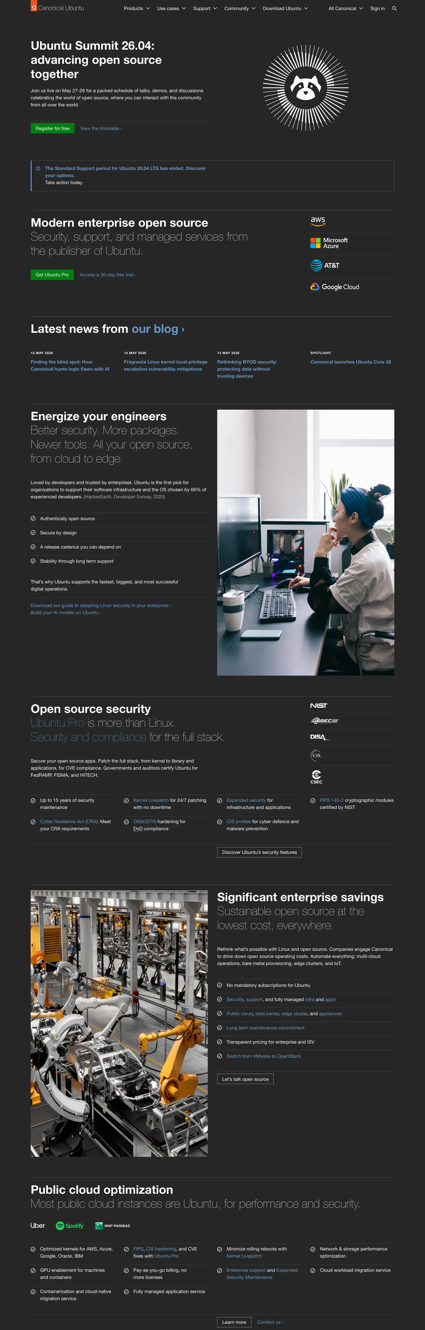
Ubuntu's marketing site opens with a full-bleed charcoal hero (#262626) bearing an announcement headline in Ubuntu variable at weight 550, 40px — "Ubuntu Summit 26.04: advancing open source together" — with a circular logo treatment and a single green CTA button. Below that band, the page switches to white and runs in dense editorial columns with the same Ubuntu variable font, now at weight 180 for display headings and 400 for body copy. The weight 180 is the system's most unusual typographic move: a display heading lighter than caption text in most font stacks, producing an editorial airiness that contrasts with the heavy charcoal hero above it.
The decorative layer is Canonical's Suru system — a set of diagonal geometric tile images referenced by CSS variables like --vf-suru-pyramid-top-left and --vf-suru-fan-bottom-right. These JPG assets contain sage-gray triangular forms positioned at corners and section edges, giving the page a geometry-led identity that lives in background images rather than SVG or border patterns. The result is that ubuntu.com's visual distinctiveness is entirely in these image assets, not in its color palette (white and charcoal), its shapes (all square), or its type (sparse weight use). Stripping the Suru assets leaves a monochrome editorial page with no remaining identity marker.
The action color split is worth noting explicitly: Ubuntu orange (#e95420) appears in the top-left logo mark and nowhere else on the page. The primary CTA button is a separate green (#008013), a Canonical-specific color wired as --vf-color-button-positive-default. This means the brand-recognition color and the action-trigger color are different hues, an architectural decision that leaves the orange as a pure identity signal and assigns all functional urgency to green. For a developer audience, green-as-action maps to "go" / "success" rather than to brand recall — a pragmatic choice over a purely aesthetic one.
What makes it distinct
5
- Ultra-light display typeUbuntu variable at weight 180 (not 400) for the 40px hero heading is the lightest display weight in the directory by a wide margin
- Suru pattern systemCanonical's diagonal geometric tile images (pyramid corner, fan corner, divider triangle, 50/50 split) carry all decorative work as CSS-variable-referenced JPG assets
- Orange logo, green buttonthe Ubuntu orange (#e95420) appears only on the logo; the primary CTA is a separate green (#008013), an unusual brand/action color split
- Zero corner radiusno element on the marketing site rounds its corners; all surfaces, buttons, inputs, and cards are fully square-cornered
- Charcoal hero, white bodythe above-fold hero and announcement banner are near-black (#262626); the rest of the page is white, with no alternating dark-band pattern
ubuntu.com
Live at ubuntu.com
A snapshot of the brand in production. Scroll the frame to see the whole page.
Colors
9 colors
Ubuntu's system runs on #008013 as its primary voltage, used in 1 of 14 components. Type is set in Ubuntu variable across 8 tokens from 16px to 40px, weights 180–550. Shape language is sharp — components average 0px corner radius, favoring crisp rectangles.
Brand & Accent
Sparing, CTA-only voltage · 2
Surface
Page and card backgrounds · 3
Text
Headlines, body, captions · 3
Borders & Hairlines
Dividers, outlines, rules · 1
Typography
8 type tokens
Set in Ubuntu variable across 8 tokens, from 16px to 40px, weights 180–550. Shown in its own stack: where the font isn't installed, the fallback the file names stands in.
- display-xl40px · weight 550 · lh 48pxThe quick brown fox jumps over the lazy dog
- display-light40px · weight 180 · lh 48pxThe quick brown fox jumps over the lazy dog
- heading-md16px · weight 550 · lh 24pxThe quick brown fox jumps over the lazy dog
- heading-tracked16px · weight 550 · lh 24px · tracking 0.8pxThe quick brown fox jumps over the lazy dog
- body-md16px · weight 400 · lh 24pxThe quick brown fox jumps over the lazy dog
- body-light20.8px · weight 300 · lh 16pxThe quick brown fox jumps over the lazy dog
- button-md16px · weight 400 · lh 24pxThe quick brown fox jumps over the lazy dog
- nav-link16px · weight 400 · lh 24pxThe quick brown fox jumps over the lazy dog
Layout
Radii and spacing
1 corner radii and 7 spacing values. Shape language: sharp.
Radii
- none0px
Spacing
- xs6px
- sm16px
- md18px
- lg24px
- xl32px
- 2xl64px
- hero-pad8px
Components
14 components
Each rendered from its tokens (color, type, radius, padding) on Ubuntu's own canvas.
- Button Primarybutton-primaryButton Primary
- Button Secondarybutton-secondaryButton Secondary
- Top Navtop-navTop Nav
- Nav Linknav-linkNav Link
- Hero Headinghero-headingHero Heading
- Section Headingsection-headingSection Heading
- Section Heading Lightsection-heading-lightSection Heading Light
- Body Paragraphbody-paragraphBody Paragraph
- Body Paragraph Lightbody-paragraph-lightBody Paragraph Light
- CardcardCard
- Type here…text-inputText Input
- Hero Dark Bandhero-dark-bandHero Dark Band
- LinklinkLink
- Label Trackedlabel-trackedLabel Tracked
In use
The system, in use
Ubuntu's tokens on the kind of product it builds.
Build something people actually use.
A short paragraph of marketing copy that previews how the brand's display tier and body tier read together. Two sentences is usually enough.
- · 1 project
- · Community support
- · 10k req/mo
- · 10 projects
- · Priority support
- · 1M req/mo
- · Custom domains
- · Unlimited
- · SLA
- · Audit log
- · SSO
FAQ
Ubuntu design system FAQ
Common questions about Ubuntu's tokens, components, and how to use this DESIGN.md in your project.
Read next
Related reading
Specs, directories, and component libraries that pair with this design system.
- Browse all design systemsThe full directory of DESIGN.md files on shadcn.io, with live mockups for each.shadcn.io
- Ubuntu — official siteUbuntu's public marketing site — the source of truth for the live tokens captured in this file.ubuntu.com (opens in a new tab)
- The DESIGN.md specificationGoogle Labs' open spec for machine-readable design system files — the format this page is built on.github.com (opens in a new tab)
Use it
Use Ubuntu in your project
One machine-readable file. Drop it into Claude, Cursor, or any AI tool that reads DESIGN.md.
Download the DESIGN.md
One machine-readable file: every color, type, radius, spacing, and component token of Ubuntu.
Feed it to your AI tool
Drop it into Claude, Cursor, or GitHub Copilot. The agent writes React components and Tailwind classes that match Ubuntu's visual language.
Reference the tokens directly
Or paste the values into your Tailwind config, CSS variables, or component library: every color, size and radius is a quoted, ready-to-copy value.
Read the full DESIGN.md: overview, rationale, do’s and don’ts
Overview
Ubuntu's marketing site is built on three structural decisions that separate it from every other Linux or infrastructure brand in the directory. Suru as visual identity: the page's geometric distinctiveness lives entirely in Canonical's Suru background image system — diagonal sage-gray triangular tile assets applied at corners and section dividers — rather than in color, shape, or type choices. Strip the Suru assets and the page becomes an undifferentiated charcoal-and-white editorial layout. Where Cloudflare builds identity through a saturated hero canvas and Red Hat through PatternFly token depth, Ubuntu builds identity through image-layer geometry.
The typographic system runs a single variable-weight family — Ubuntu variable — across every tier, but exercises the weight axis in an unusual direction. The 40px section headings in the white body of the page use weight 180, a setting so light it approaches the hairline end of the axis. Most display systems run 500–700 at large sizes; Ubuntu's editorial body runs 180 at 40px, which reads closer to a luxury fashion or editorial publication than to an open-source Linux distribution. The hero headings contrast at 550 (a non-standard mid-weight between semibold and regular), making the weight range across the page span 180–550 — the full middle band of the variable axis, deliberately skipping both the heavy (700+) and the extreme-light (100) ends.
Key Characteristics:
- Charcoal hero (#262626) with white text and a green CTA — only the announcement/hero band is dark.
- Ubuntu variable font spanning weight 180 (editorial body display) to 550 (hero heading), the widest weight range in the directory.
- Ubuntu orange (#e95420) appears only on the logo mark — the CTA color is a separate institutional green (#008013).
- Zero border radius on every element — buttons, cards, inputs, and containers are fully square-cornered.
- Suru geometric patterns (diagonal triangular tile images) carry all decorative work as CSS-referenced background assets.
- White-canvas editorial body below the hero — no alternating dark bands.
- No shadow elevation — hairline borders (#939393) on cards, no drop shadows.
Colors
Action
- Primary (
{colors.primary}— #008013): frequency 6. Used as background (3), border (3). The CTA button fill and border. Wired as--vf-color-button-positive-defaultand--vf-color-border-positive. The primary action color — distinct from the brand orange.
Surface
- Canvas (
{colors.canvas}— #ffffff): frequency 1500 (text 709, border 696, shadow 95). The dominant surface and reversed text color throughout the page. Wired as--vf-color-background-default,--vf-color-button-positive-text. - Canvas Dark (
{colors.canvas-dark}— #262626): frequency 14 (bg only). The hero and top-nav background. The page's only dark surface; not extended to other bands. - Surface Alt (
{colors.surface-alt}— #f2f2f2): declared as--vf-color-background-neutral-defaultand--vf-suru-background. The subtle off-white for form field backgrounds and neutral UI surfaces.
Brand (logo-only)
- Brand Orange (
{colors.brand-orange}— #e95420): frequency 1 (bg only). The canonical Ubuntu orange, used exclusively on the top-nav logo mark. Does not appear on any CTA, card, or editorial surface.
Text & Hairlines
- Ink (
{colors.ink}— #000000): frequency 5. Text, background, and link-default signals. Wired as--vf-color-text-default. - Ink Muted (
{colors.ink-muted}— #707070): declared as--vf-color-border-high-contrast,--vf-color-border-neutral. Available for secondary borders and de-emphasized text. - Hairline (
{colors.hairline}— #939393): frequency 10 (border only). Card dividers and table rules. The single mid-gray border tone in the captured render. - Link (
{colors.link}— #0066cc): frequency 2 (text 1, border 1). Standard hyperlink color, wired as--vf-color-link-default.
Typography
Font Family
The system runs a single family — Ubuntu variable — across every tier. The CSS declaration is "Ubuntu variable", Ubuntu, -apple-system, "Segoe UI", Roboto, Oxygen, Cantarell, "Fira Sans", "Droid Sans", "Helvetica Neue", sans-serif. The variable nature of the font is the key capability: weight is set on a continuous axis, allowing the 180 and 550 values that no static font stack supports.
There is no separate display family, no mono voice for code (not visible in the marketing surface), and no serif tier. Every typographic moment — hero, editorial, caption, button, nav — resolves to the Ubuntu variable font.
Hierarchy
| Token | Size | Weight | Line Height | Use |
|---|---|---|---|---|
{typography.display-xl} | 40px | 550 | 48px | Hero h1 ("Ubuntu Summit 26.04…"), section h2 in hero band |
{typography.display-light} | 40px | 180 | 48px | Editorial section headings on the white body ("Enterprise open source") |
{typography.heading-md} | 16px | 550 | 24px | Sub-section h2 titles, card headings |
{typography.heading-tracked} | 16px | 550 | 24px | Date stamps / time labels (0.8px letter-spacing) |
{typography.body-md} | 16px | 400 | 24px | Default running text, nav links, button labels |
{typography.body-light} | 20.8px | 300 | 16px | Large-print labels and pull-text in sub-nav |
{typography.button-md} | 16px | 400 | 24px | CTA button labels |
{typography.nav-link} | 16px | 400 | 24px | Top-nav item labels |
Principles
The 40px / weight 180 editorial heading is the system's decisive typographic move. Most open-source infrastructure brands anchor their marketing type at 500+ to project technical confidence; Ubuntu's white-canvas editorial body uses the lightest displayable weight of the variable axis, which reads as an invitation to read rather than a command to act. The hero h1 at weight 550 provides the only typographic authority moment; everything below it in the scroll is deliberately quieter.
Note on Font Substitutes
The Ubuntu variable font is open-source and freely available from Google Fonts as "Ubuntu" (which includes variable-weight support). If variable fonts are unavailable, Ubuntu Light (weight 300) approximates the 180 display tier and Ubuntu Medium (weight 500) approximates the 550 heading tier. Nunito and Poppins are geometrically similar but lack the Ubuntu variable font's specific weight 180 setting; both run warmer at equivalent light weights.
Layout
Spacing System
- Base unit: 18px (the most-frequent spacing value in the extract, appearing 117 times — the page uses an 18px column baseline rather than the standard 8px or 16px).
- Tokens:
{spacing.xs}6px ·{spacing.sm}16px ·{spacing.md}18px ·{spacing.lg}24px ·{spacing.xl}32px ·{spacing.2xl}64px. - Hero padding: 8px top on heading, 6px top on body paragraph — minimal top padding, letting the hero headline meet the hero canvas with minimal gap.
- Container side padding: 24px left, 32px right on nav; 32px / 0px in body columns.
Grid & Container
- Max content width: not explicitly declared; layout uses standard Canonical site width (~1200px).
- Hero: full-width charcoal (#262626) band with a centered headline + body + green CTA left-column, circular event imagery right-column.
- News section: 3-column card grid with headline + date + body snippet per card.
- Product sections: 2-column split (text left, partner logo grid right) for cloud provider sections.
- Feature rows: single-column editorial with large side imagery (robotics, datacenter photography).
Rhythm
Unlike Red Hat's alternating-band pattern, Ubuntu's page structure is a single dark hero followed by a long white editorial scroll. The decorative rhythm comes from Suru geometric corner patterns placed at section boundaries, not from background-color alternation. This creates a continuous reading experience with visual markers at section edges rather than full-surface contrast changes.
Elevation
The system has no shadow elevation:
- Flat (no shadow): hero, editorial bands, footer — all surfaces.
- Hairline borders:
{colors.hairline}(#939393) 1px borders on cards and table dividers. The only elevation signal. - No box-shadow declarations visible in the captured CSS; the Vanilla design system may declare them for product UI surfaces not present in the marketing page.
Shapes
The radius philosophy is universally flat:
{rounded.none}0px — every element. Buttons, cards, inputs, announcement banners, hero containers, nav items — nothing rounds. The extraction shows an empty radii array (no corner radius values captured from any element on the page).
This is the sharpest radius system in the directory. The angular sharpness works with the Suru diagonal geometry: rounded corners would undercut the pointed-triangle visual language of the background patterns.
Components
button-primary — Green {colors.primary} (#008013) fill and border, white text, 0px radius, 4.5×16px padding, 35px height. "Register for free" is the canonical hero instance.
button-secondary — Transparent fill, near-black {colors.ink} text and 1px border, same 0px radius and sizing. Used for tertiary navigation links styled as outlines.
top-nav — Charcoal {colors.canvas-dark} (#262626) surface, 56px height, white text links. Ubuntu wordmark (orange on black logo) flush left, product nav links (Enterprise / Desktop / IoT / Cloud) in the middle, utility links right.
nav-link — Transparent background, white text in {typography.nav-link} (16px / 400), 16px left / 32px right padding, 56px height. Square hover state (no pill, no underline in the captured render).
hero-heading — White {colors.canvas} text on charcoal hero, {typography.display-xl} (40px / 550). The only high-weight typographic moment in the system.
section-heading — White text in dark bands at the same {typography.display-xl} token. Used for "Enterprise open source" and similar mid-page section headings.
section-heading-light — Near-black {colors.ink} text on white canvas, {typography.display-light} (40px / 180). The editorial section headings on the white body — the ultra-light display weight.
body-paragraph — White {colors.canvas} text in dark hero band, {typography.body-md} (16px / 400), 6px top padding.
body-paragraph-light — Near-black {colors.ink} text on the white editorial body, same {typography.body-md} token.
card — White canvas, 1px {colors.hairline} border, 0px radius, 24px padding. Used for news articles and feature summary cards.
text-input — Light-gray {colors.surface-alt} fill, near-black text, 0px radius, 4.5×16px padding, 35px height, 1px {colors.hairline} border. Form fields for newsletter and contact surfaces.
hero-dark-band — Charcoal {colors.canvas-dark} fill, white text, 32px padding. The announcement hero band.
link — Cobalt {colors.link} (#0066cc) inline text links. Standard hyperlink treatment in body editorial copy.
label-tracked — Near-black text at 16px / 550 with 0.8px letter-spacing. Used for date stamps ("2 Feb 2026") and section micro-labels.
Do's and Don'ts
Do keep Ubuntu orange ({colors.brand-orange} — #e95420) on the logo mark only. The CTA system runs on green, not orange. Using the orange on a button or section band would conflict with the Canonical brand architecture.
Do use the Ubuntu variable font's weight 180 for large editorial headings on the white canvas. The ultra-light display weight at 40px is the system's editorial personality — it requires the variable font to render correctly and should not be approximated with a static 200 or 300 weight, which will read heavier.
Do apply Suru geometric patterns (the --vf-suru-* CSS variable assets from assets.ubuntu.com) at section boundaries and hero corners. Without the Suru geometry, the page loses its only visual identity marker.
Do keep all buttons, cards, and inputs at 0px border radius. The angular Suru geometry requires a matching squared UI language; any rounding would create a visual mismatch.
Don't use the cobalt link color ({colors.link} — #0066cc) for button backgrounds or fills. In this system it appears twice (text and border) as a hyperlink color only — it is not a brand voltage and not an action color.
Don't add alternating dark editorial bands below the hero. The page is structured as one dark hero followed by one long white editorial scroll; adding dark mid-page bands would import Red Hat's layout pattern into a system that explicitly avoids it.
Don't render heading labels at weight 700 or heavier. The system tops out at 550 for the heaviest heading. Weight 700 or 800 from the Ubuntu variable axis exists but conflicts with the editorial restraint that defines the marketing surface.
Don't apply drop shadows. The system has no shadow elevation; depth is achieved entirely through 1px hairline borders and the image-based Suru geometry.
Known Gaps
- Suru geometric patterns: the --vf-suru-* CSS variables reference hosted assets at assets.ubuntu.com (JPG files). These are the system's primary visual-identity layer but are not tokenizable as hex or radius values — they must be referenced as image assets or recreated as SVG.
- Color-scheme / dark mode: the Vanilla design system supports a light/dark split but the captured marketing surface applies dark (#262626) only to the hero band. A toggleable dark mode for the full page is not represented here.
- Focus ring and interactive states: the --vf-color-focus (cornflower-blue) token is declared as a CSS variable but no focus states are observable in the static capture.
- Mobile layout: the Suru pattern assets change at mobile breakpoints (25/75 split vs. 50/50 split variants), but the breakpoint behavior is not captured in this static render.
- Orange application on sub-brands: Ubuntu Pro, Ubuntu Advantage, and Landscape marketing sub-pages likely use the orange more extensively; the captured redhat.com-style orange discipline applies to the main ubuntu.com marketing page only.
- Accessibility-state colors: --vf-color-background-caution-default (amber), --vf-color-background-negative-default (red), and --vf-color-background-positive-default (green at alpha) are declared for notification and alert contexts not present in the captured marketing surface.
Backend, Database & DevOps
More systems like this
More DESIGN.md files in Backend, Database & DevOps.
Pricing
Build it with Pro
The DESIGN.md files are free. Pro adds 6,000+ blocks, premium templates and the MCP server, so your AI editor builds in your system for you.
4.9/5 out of 5 · 150+ reviewsfrom 150+ founders and developers.
Billing
Billed once a year in USD. Cancel anytime.
- How many people can use the license.
- Client work, SaaS products and anything you charge for.
- Production-ready React sections: hero, pricing, features, dashboards and more.
- Complete multi-page sites you can ship as they are.
- React icons from every major library, installable with one command.
- Presets that restyle every block, in light and dark.
- Lets your AI editor search, preview and install blocks for you.
- Priority requests are answered first.
Individual
For personal projects & open source
$32instead of $49/mo
$389 billed yearly
- Seats: 1 seat
- Commercial use: Personal & open source only
- Pro blocks: 6,000+ blocks
- Templates: All 14 templates
- React icons: 294k+ icons
- Themes: All 59 themes
- MCP server: Basic usage
- Support: Standard
Team
Most popularFor freelancers, agencies & startups
$66instead of $99/mo
$789 billed yearly · ≈ $13/dev/mo
- Seats: Up to 5 seats
- Commercial use: Included
- Pro blocks: 6,000+ blocks
- Templates: All 14 templates
- React icons: 294k+ icons
- Themes: All 59 themes
- MCP server: High usage
- Support: Priority
Organization
For companies with larger teams
$132instead of $199/mo
$1,589 billed yearly
- Seats: Unlimited seats
- Commercial use: Included
- Pro blocks: 6,000+ blocks
- Templates: All 14 templates
- React icons: 294k+ icons
- Themes: All 59 themes
- MCP server: Unlimited usage
- Support: Priority
Billed once a year in USD. Cancel anytime.
Individual
For personal projects & open source
$32instead of $49/mo
$389 billed yearly
- How many people can use the license.Seats: 1 seat
- Client work, SaaS products and anything you charge for.Commercial use: Personal & open source only
- Production-ready React sections: hero, pricing, features, dashboards and more.Pro blocks: 6,000+ blocks
- Complete multi-page sites you can ship as they are.Templates: All 14 templates
- React icons from every major library, installable with one command.React icons: 294k+ icons
- Presets that restyle every block, in light and dark.Themes: All 59 themes
- Lets your AI editor search, preview and install blocks for you.MCP server: Basic usage
- Priority requests are answered first.Support: Standard
Team
Most popularFor freelancers, agencies & startups
$66instead of $99/mo
$789 billed yearly · ≈ $13/dev/mo
Everything in Individual, plus
- How many people can use the license.Seats: Up to 5 seats
- Client work, SaaS products and anything you charge for.Commercial use: Included
- Lets your AI editor search, preview and install blocks for you.MCP server: High usage
- Priority requests are answered first.Support: Priority
Organization
For companies with larger teams
$132instead of $199/mo
$1,589 billed yearly
Everything in Team, plus
- How many people can use the license.Seats: Unlimited seats
- Lets your AI editor search, preview and install blocks for you.MCP server: Unlimited usage
- Secure checkout via Stripe
- Code lives in your repo
- Keep what you've shipped if you cancel
- License terms
Your system, built for you
Every block, template and icon, installed by your AI agent in your design system. The DESIGN.md files stay free.