Uber Eats Design System
Uber Eats' marketing design system: ink-black pill CTAs on a photography-led amber canvas, UberMove 52px display, address-search as the primary hero action. Tokens for React, Next.js, and AI coding tools.
Add shadcn.io to your AI agent. · Pro It installs blocks, icons and templates in your design system from a prompt, with Pro.
Set up MCP- Primary
- #000000
- Typeface
- UberMoveText
- Shape
- Soft
- Base radius
- 8px
- Colors
- 5
- Type tokens
- 11
- Components
- 15
- Spacing values
- 7
About
About Uber Eats DESIGN.md
Curated by Dov Azencot · Updated May 19, 2026 · Source ubereats.com (opens in a new tab)
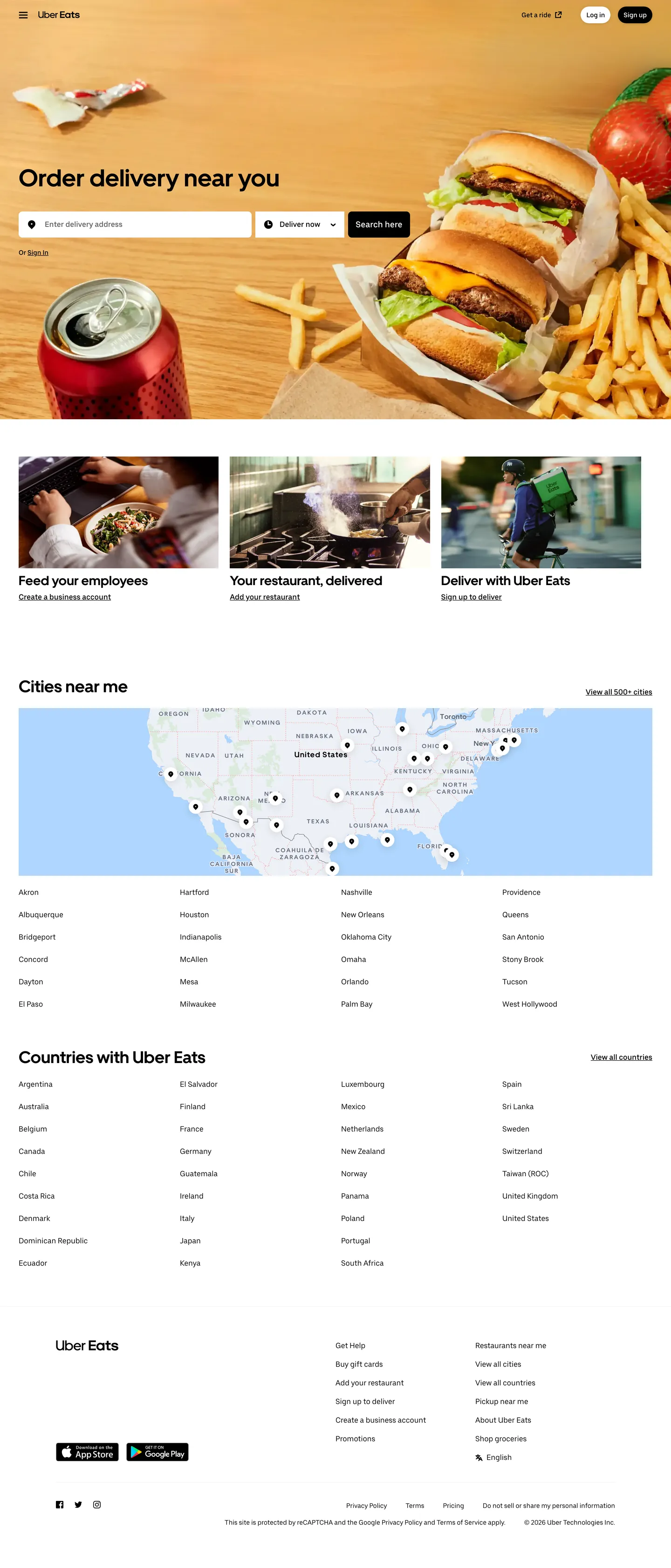
Uber Eats' marketing page makes a counterintuitive move for a brand famous for its green accent: the landing page at ubereats.com is structurally black and white. The above-fold hero is warm only because a large food photograph — a burger, fries, a tomato — bleeds warmth into the composition. The actual design system tokens underneath are ink black, pure white, and two neutral grays. The green that appears in the mobile app and brand advertising is absent from the captured marketing surface. What reads as amber is photography, not a brand color declaration.
The DESIGN.md file packages the system into a machine-readable spec: 5 colors tokens drawn from a strictly ink-black-and-white palette with two light gray surfaces, 11 typography tokens spanning UberMove bold at 28–52px for all heading tiers and UberMoveText at 14–18px for body and interface copy, 5 radius tokens anchored on a 500px pill as the dominant shape (the navigation sign-up button, all CTA chips, every badge), and 15 components covering the hero search form, the address typeahead input, the pill button, the split-section card, and the full-width map tile.
Feed this file to Claude or Cursor and it reproduces Uber Eats' specific moves: pure-black pill CTAs rather than a green or colored fill, hero photography carrying the chromatic weight the brand doesn't declare in CSS, address-search as the hero's primary interaction rather than a browse button, and UberMove's single bold-only heading tier that creates typographic authority without a weight ladder. The one thing worth borrowing carefully is the photography-as-canvas approach — it only works when the imagery is consistently warm and high-production; inconsistent photography collapses the system back to plain black-and-white.
What makes it distinct
5
- Photography-as-brand-canvasthe hero amber warmth comes entirely from food photography, not a declared brand color; the design system is structurally black-and-white below the fold
- 500px border-radius pillthe primary CTA and every badge/tag uses a near-infinite radius, making pill geometry the single most distinctive shape signal in the system
- Address-search as hero CTAunlike most food apps that lead with a Browse button, Uber Eats puts the location typeahead front-and-center as the primary above-fold action
- Two-weight type splitUberMove (700 weight only) carries every heading; UberMoveText (400–500) carries everything else, creating a sharp editorial/utility divide with no middle tier
- Black-on-white below the foldonce the hero photography ends, the system drops to pure ink on white with near-zero chromatic elements, trusting city-name grids and map thumbnails as the visual interest
ubereats.com
Live at ubereats.com
A snapshot of the brand in production. Scroll the frame to see the whole page.
Colors
5 colors
Uber Eats's system runs on #000000 as its primary voltage, used in 15 of 15 components. Type is set in UberMoveText across 11 tokens from 14px to 52px, weights 400–700. Shape language is soft — components average 114px corner radius, with no sharp interactive edges.
Surface
Page and card backgrounds · 3
Text
Headlines, body, captions · 2
Typography
11 type tokens
Set in UberMoveText across 11 tokens, from 14px to 52px, weights 400–700. Shown in its own stack: where the font isn't installed, the fallback the file names stands in.
- display-xl52px · weight 700 · lh 64pxThe quick brown fox jumps over the lazy dog
- display-md36px · weight 700 · lh 44pxThe quick brown fox jumps over the lazy dog
- display-sm28px · weight 700 · lh 36pxThe quick brown fox jumps over the lazy dog
- body-lg18px · weight 500 · lh 24pxThe quick brown fox jumps over the lazy dog
- body-md16px · weight 400 · lh 24pxThe quick brown fox jumps over the lazy dog
- body-md-medium16px · weight 500 · lh 20pxThe quick brown fox jumps over the lazy dog
- body-sm14px · weight 400 · lh 20pxThe quick brown fox jumps over the lazy dog
- label-md14px · weight 500 · lh 16pxThe quick brown fox jumps over the lazy dog
- nav-link18px · weight 500 · lh 24pxThe quick brown fox jumps over the lazy dog
- button-md14px · weight 500 · lh 16pxThe quick brown fox jumps over the lazy dog
- caption14px · weight 400 · lh 20pxThe quick brown fox jumps over the lazy dog
Layout
Radii and spacing
4 corner radii and 7 spacing values. Shape language: soft.
Radii
- none0px
- sm8px
- pill500px
- full9999px
Spacing
- xs8px
- sm12px
- base16px
- lg24px
- xl40px
- 2xl64px
- section72px
Components
15 components
Each rendered from its tokens (color, type, radius, padding) on Uber Eats's own canvas.
- Button Primarybutton-primaryButton Primary
- Button Secondarybutton-secondaryButton Secondary
- Top Navtop-navTop Nav
- Nav Linknav-linkNav Link
- Hero Headinghero-headingHero Heading
- Section Headingsection-headingSection Heading
- Body Paragraphbody-paragraphBody Paragraph
- Type here…text-inputText Input
- Search Wrappersearch-wrapperSearch Wrapper
- CardcardCard
- Feature Cardfeature-cardFeature Card
- City Linkcity-linkCity Link
- Section Bandsection-bandSection Band
- FooterfooterFooter
- Map Tilemap-tileMap Tile
In use
The system, in use
Uber Eats's tokens on the kind of product it builds.
Build something people actually use.
A short paragraph of marketing copy that previews how the brand's display tier and body tier read together. Two sentences is usually enough.
FAQ
Uber Eats design system FAQ
Common questions about Uber Eats's tokens, components, and how to use this DESIGN.md in your project.
Read next
Related reading
Specs, directories, and component libraries that pair with this design system.
- Browse all design systemsThe full directory of DESIGN.md files on shadcn.io, with live mockups for each.shadcn.io
- Uber Eats — official siteUber Eats' public marketing site — the source of truth for the live tokens captured in this file.ubereats.com (opens in a new tab)
- The DESIGN.md specificationGoogle Labs' open spec for machine-readable design system files — the format this page is built on.github.com (opens in a new tab)
Use it
Use Uber Eats in your project
One machine-readable file. Drop it into Claude, Cursor, or any AI tool that reads DESIGN.md.
Download the DESIGN.md
One machine-readable file: every color, type, radius, spacing, and component token of Uber Eats.
Feed it to your AI tool
Drop it into Claude, Cursor, or GitHub Copilot. The agent writes React components and Tailwind classes that match Uber Eats's visual language.
Reference the tokens directly
Or paste the values into your Tailwind config, CSS variables, or component library: every color, size and radius is a quoted, ready-to-copy value.
Read the full DESIGN.md: overview, rationale, do’s and don’ts
Overview
Uber Eats' marketing system is built on a paradox. Photography-as-canvas: a brand associated with a specific green delivers its entire above-fold chromatic energy through food photography rather than declared brand colors. The ink black and pure white that the CSS actually specifies are the entire structural palette — 997 and 36 occurrences respectively. The amber and warmth that register visually come from burgers, fries, and fresh produce photographed at high production quality. Where DoorDash runs a red-filled hero band and Grubhub uses dark near-black surfaces, Uber Eats delegates the hero's mood entirely to the imagery.
The typography system makes a matching editorial choice: two proprietary families with a strict role split and no overlap. UberMove runs exclusively at weight 700 across all heading sizes (28–52px), creating authority through scale alone. UberMoveText handles every other surface — buttons, body copy, navigation, captions — at weights 400 and 500. There is no medium-weight heading, no light-weight display. The gap between the bold heading tier and the interface tier is wide enough that no element risks occupying an ambiguous middle.
Key Characteristics:
- No declared brand color with more than 1 usage occurrence — ink black (
{colors.ink}) at frequency 997 is the page's dominant color, used as text, border, and shadow. - 500px border-radius pill geometry on every interactive element — the primary CTA, the nav sign-up button, all category chips — while cards and the search wrapper use 8px rounding. The system is binary: pill or soft-card, nothing in between.
- UberMove bold (700) for all headings, UberMoveText medium/regular (400–500) for all interface copy — a two-family split with no weight crossover.
- Address-search typeahead as the primary above-fold action, not a Browse button — the hero gates restaurant browsing behind location entry.
- Below-fold sections drop to pure white canvas with dense city-name and country-name link grids — no photography, no color, no gradient bands.
- Photography carries the entire emotional weight of the brand; the CSS token system is structurally monochrome.
Colors
Structural
- Ink (
{colors.ink}— #000000): frequency 997. Used as text (483), border (483), shadow (28), background (3). The near-total dominant color — pure black runs the entire navigation, heading, body-copy, and link system. Not near-black; true zero-lightness black is the deliberate choice for every typographic surface. - Canvas (
{colors.canvas}— #ffffff): frequency 36. Used as background (31), text (3), border (2). The page floor beneath the photography hero and in all below-fold content bands. Pure white, not an off-white — there is no cream or warm-white softening in the system. - Surface-1 (
{colors.surface-1}— #f3f3f3): frequency 5. Used as background (3), shadow (2). The light neutral behind section divider bands and subtle card lift contexts. - Surface-2 (
{colors.surface-2}— #e8e8e8): frequency 3. Used as background (3). The secondary neutral for map tile backgrounds and feature-section fills.
Typography
Font Families
The system runs two proprietary custom families. UberMove carries every heading tier — it appears exclusively at weight 700, at sizes 28px, 36px, and 52px. The fallback stack is sans-serif, which makes the system entirely dependent on the custom font loading correctly; there is no system-ui intermediate fallback. UberMoveText runs on every non-heading surface — body paragraphs, navigation links, buttons, form labels, captions — at weights 400 and 500. The fallback stack is system-ui, "Helvetica Neue", Helvetica, Arial, sans-serif, which provides reliable degradation through a standard system-ui chain.
Hierarchy
| Token | Size | Weight | Line Height | Use |
|---|---|---|---|---|
{typography.display-xl} | 52px | 700 | 64px | Hero h1 ("Order delivery near you") |
{typography.display-md} | 36px | 700 | 44px | Section h2 ("Cities near me") |
{typography.display-sm} | 28px | 700 | 36px | Sub-section headings |
{typography.body-lg} | 18px | 500 | 24px | Nav links and nav CTAs |
{typography.body-md} | 16px | 400 | 24px | Default body paragraphs |
{typography.body-md-medium} | 16px | 500 | 20px | Emphasized body and product callouts |
{typography.label-md} | 14px | 500 | 16px | Button labels and small CTAs |
{typography.body-sm} | 14px | 400 | 20px | Caption text and secondary links |
{typography.nav-link} | 18px | 500 | 24px | Top-nav interactive links |
{typography.button-md} | 14px | 500 | 16px | All button label text |
{typography.caption} | 14px | 400 | 20px | Footer and metadata text |
Note on Font Substitutes
Both UberMove and UberMoveText are proprietary. For UberMove at weight 700, Geist Bold or Inter Black (weight 900) approximates the display confidence; both share the humanist grotesque structure. For UberMoveText, Inter at weights 400 and 500 is the closest open-source substitute — the proportions transfer cleanly at the 14–18px interface sizes.
Layout
Spacing System
- Base unit: 8px, with 16px as the primary module.
- Tokens:
{spacing.xs}8px ·{spacing.sm}12px ·{spacing.base}16px ·{spacing.lg}24px ·{spacing.xl}40px ·{spacing.2xl}64px ·{spacing.section}72px. - Hero section padding (vertical): 72px top, 88px bottom — the most generous spacing interval in the system.
- Nav horizontal padding: 40px on each side, creating a wide gutter that keeps the wordmark and navigation from crowding the viewport edges.
- Card internal padding: 16px — consistent across all card surfaces.
Grid & Container
- Hero: full-width with a 240px-wide left column holding the headline, search input, and subtext, while the right side extends into the full-bleed food photography.
- Feature row: 3-column equal-width grid for the B2B feature cards (employee ordering, restaurant delivery, courier sign-up).
- City grid: multi-column alphabetical link list filling the full container width — the system's densest typographic surface.
- Max content width: implied at ~1280px based on the nav padding and hero composition.
Rhythm
The page is organized as a two-act structure: a single above-fold photographic hero (the brand moment), followed by a sequence of white-canvas informational sections with progressively denser content — feature cards, a full-bleed map, a city grid, a country grid, and the footer. The rhythm compresses as you scroll down; the brand expression concentrates entirely at the top.
Elevation
The system has no meaningful shadow tier. The 28 shadow occurrences captured all use {colors.ink} (black) at low opacity — subtle elevation cues on the search wrapper and the nav bar. Depth on the page comes from three sources: the photography hero blending into the white canvas below, the {colors.surface-1} gray bands separating content sections, and the 8px border-radius card containers sitting on the white floor. No decorative drop-shadow treatment appears anywhere below the fold.
Shapes
The radius vocabulary is binary: pill or soft-card.
{rounded.none}0px — applied to the address typeahead input field, which sits flush inside its search wrapper container.{rounded.sm}8px — the search wrapper, cards, and map tile containers. The default "content surface" radius.{rounded.pill}500px — the primary CTA button, the nav "Sign up" link, every category chip, and every badge element on the page. This value renders as a fully-rounded pill on any button-height element.{rounded.full}9999px — equivalent to the pill treatment for icon-only circular elements.
The 500px pill is the brand's most distinctive geometric signal. On a page this typographically restrained, the fully-rounded interactive elements stand out as the system's single personality statement.
Components
button-primary — Ink-black fill, white text, {rounded.pill} 500px radius, 12px padding, 36px height. The page's primary CTA — "Sign up" in the nav and the search submission target.
button-secondary — White fill, ink text, 1px ink border, pill radius. Used for secondary actions at the same size as the primary.
top-nav — White canvas, 72px height, 40px horizontal padding. Houses the Uber Eats wordmark and a right-aligned "Sign in" / "Sign up" cluster. No bottom border, no shadow.
nav-link — The nav "Sign up" target: ink-black background, white text, 8px radius, 12x16px padding — deliberately a filled dark pill in contrast to a transparent nav link, signaling the single recommended action.
hero-heading — Ink text on transparent surface, {typography.display-xl} (52px / 700). The hero h1 sits over the white left-column background before the photography takes over.
section-heading — Ink text, {typography.display-md} (36px / 700). Section-level headings in below-fold content.
body-paragraph — Ink text at {typography.body-md-medium} (16px / 500). Slightly heavier than the default 400 weight — product descriptions and feature callouts use medium weight body copy.
text-input — White canvas, ink text, no border-radius, no visible border in the captured extraction. Sits inside the {component.search-wrapper} as a contained input.
search-wrapper — White canvas, ink text, {rounded.sm} 8px radius, 12x16px padding, 56px height. The outer container holding the address typeahead and delivery-type selectors — the hero's primary interaction element.
card — White canvas, ink text, {rounded.sm} 8px, 16px padding. The base card for feature sections.
city-link — Transparent background, ink text at {typography.body-md}. Renders in dense multi-column grids — typographically the smallest unit in the system.
section-band — Light gray {colors.surface-1} background, full-width, generous vertical padding. Separates the content sections below the fold.
footer — White canvas, ink text at {typography.caption}, 40px padding. No surface contrast against the page floor.
Do's and Don'ts
Do use photography to carry the system's chromatic weight above the fold. The ink-black token structure works because a high-production food photograph does the color work. A composition that relies on the CSS tokens alone will read as a black-and-white directory — the photography is load-bearing, not decorative.
Do apply the 500px pill radius to every interactive affordance — buttons, chips, badges, and status tags. The binary radius language (8px for surfaces, pill for interactives) is the system's shape signature; mixing in a 12px or 24px rounded button would read as an error.
Do keep UberMove exclusively at weight 700. Using UberMove at any weight other than 700 is not supported by the extraction — the font appears only in bold, and a lighter-weight display heading in the same family would undercut the heading-versus-interface division.
Do treat the address typeahead as the hero's primary action, not a "Get started" or "Order now" button. The location-gate pattern is the page's information architecture, not decorative — it sets the user's path through the product.
Don't use {colors.surface-2} (#e8e8e8) as a text background inside cards — it appears only 3 times, all as background fills on the map tile. Pairing body text on this gray would introduce a mid-tone surface the system doesn't use for content.
Don't add a heading weight below 700 in UberMove. The two-family split has no intermediate heading weight — using UberMove at 400 or 500 would conflict with the system's division where UberMoveText owns all non-700 weights.
Don't substitute a colored CTA button for the ink-black primary. The primary button is #000000 fill — introducing a green, amber, or any chromatic button fill invents a token that doesn't exist in the captured marketing surface.
Don't use {colors.canvas} (#ffffff) as an ink or border color over dark backgrounds. The system has no dark-surface sections — all content areas below the fold are white-canvas. There is no established light-on-dark pattern for content components.
Known Gaps
- Brand green: Uber Eats' well-known green accent (visible in the mobile app and brand advertising) does not appear in the captured marketing page extraction. Any green implementation would require referencing the app's color system, not these marketing tokens.
- Mobile breakpoints: the captured surface is at 1440px desktop width. The below-fold city grids and feature cards likely reflow significantly on mobile — the multi-column dense grids would not survive at 375px without substantial restructuring.
- Hover and focus states: no hover captures exist in the extraction. The full state matrix (input focus ring, button hover, nav hover) is not represented here.
- Dark mode: the marketing site is light-only. The Uber Eats app carries a dark theme that is not represented in this spec.
- Restaurant card / browse surface: the main product interaction — restaurant cards, menu items, ratings, price indicators — belongs to the app and authenticated delivery UX, which is not captured by the marketing landing page extractor.
- Animation: the hero photography loads with a fade-in sequence; the search typeahead has dropdown autocomplete styling. End-state values only are captured here.
Food & Delivery
More systems like this
More DESIGN.md files in Food & Delivery.
Pricing
Build it with Pro
The DESIGN.md files are free. Pro adds 6,000+ blocks, premium templates and the MCP server, so your AI editor builds in your system for you.
4.9/5 out of 5 · 150+ reviewsfrom 150+ founders and developers.
Billing
Billed once a year in USD. Cancel anytime.
- How many people can use the license.
- Client work, SaaS products and anything you charge for.
- Production-ready React sections: hero, pricing, features, dashboards and more.
- Complete multi-page sites you can ship as they are.
- React icons from every major library, installable with one command.
- Presets that restyle every block, in light and dark.
- Lets your AI editor search, preview and install blocks for you.
- Priority requests are answered first.
Individual
For personal projects & open source
$32instead of $49/mo
$389 billed yearly
- Seats: 1 seat
- Commercial use: Personal & open source only
- Pro blocks: 6,000+ blocks
- Templates: All 14 templates
- React icons: 294k+ icons
- Themes: All 59 themes
- MCP server: Basic usage
- Support: Standard
Team
Most popularFor freelancers, agencies & startups
$66instead of $99/mo
$789 billed yearly · ≈ $13/dev/mo
- Seats: Up to 5 seats
- Commercial use: Included
- Pro blocks: 6,000+ blocks
- Templates: All 14 templates
- React icons: 294k+ icons
- Themes: All 59 themes
- MCP server: High usage
- Support: Priority
Organization
For companies with larger teams
$132instead of $199/mo
$1,589 billed yearly
- Seats: Unlimited seats
- Commercial use: Included
- Pro blocks: 6,000+ blocks
- Templates: All 14 templates
- React icons: 294k+ icons
- Themes: All 59 themes
- MCP server: Unlimited usage
- Support: Priority
Billed once a year in USD. Cancel anytime.
Individual
For personal projects & open source
$32instead of $49/mo
$389 billed yearly
- How many people can use the license.Seats: 1 seat
- Client work, SaaS products and anything you charge for.Commercial use: Personal & open source only
- Production-ready React sections: hero, pricing, features, dashboards and more.Pro blocks: 6,000+ blocks
- Complete multi-page sites you can ship as they are.Templates: All 14 templates
- React icons from every major library, installable with one command.React icons: 294k+ icons
- Presets that restyle every block, in light and dark.Themes: All 59 themes
- Lets your AI editor search, preview and install blocks for you.MCP server: Basic usage
- Priority requests are answered first.Support: Standard
Team
Most popularFor freelancers, agencies & startups
$66instead of $99/mo
$789 billed yearly · ≈ $13/dev/mo
Everything in Individual, plus
- How many people can use the license.Seats: Up to 5 seats
- Client work, SaaS products and anything you charge for.Commercial use: Included
- Lets your AI editor search, preview and install blocks for you.MCP server: High usage
- Priority requests are answered first.Support: Priority
Organization
For companies with larger teams
$132instead of $199/mo
$1,589 billed yearly
Everything in Team, plus
- How many people can use the license.Seats: Unlimited seats
- Lets your AI editor search, preview and install blocks for you.MCP server: Unlimited usage
- Secure checkout via Stripe
- Code lives in your repo
- Keep what you've shipped if you cancel
- License terms
Your system, built for you
Every block, template and icon, installed by your AI agent in your design system. The DESIGN.md files stay free.