Chipotle Design System
Chipotle's design system as a DESIGN.md file. Burnt umber #451400, Trade Gothic LT Bold 48px uppercase, 13 colors, 17 components. For React, Next.js, AI tools.
Add shadcn.io to your AI agent. · Pro It installs blocks, icons and templates in your design system from a prompt, with Pro.
Set up MCP- Primary
- #786259
- Typeface
- Trade Gothic LT Bold
- Shape
- Sharp
- Base radius
- 12px
- Colors
- 13
- Type tokens
- 12
- Components
- 17
- Spacing values
- 8
About
About Chipotle DESIGN.md
Curated by Dov Azencot · Updated May 13, 2026 · Source chipotle.com (opens in a new tab)
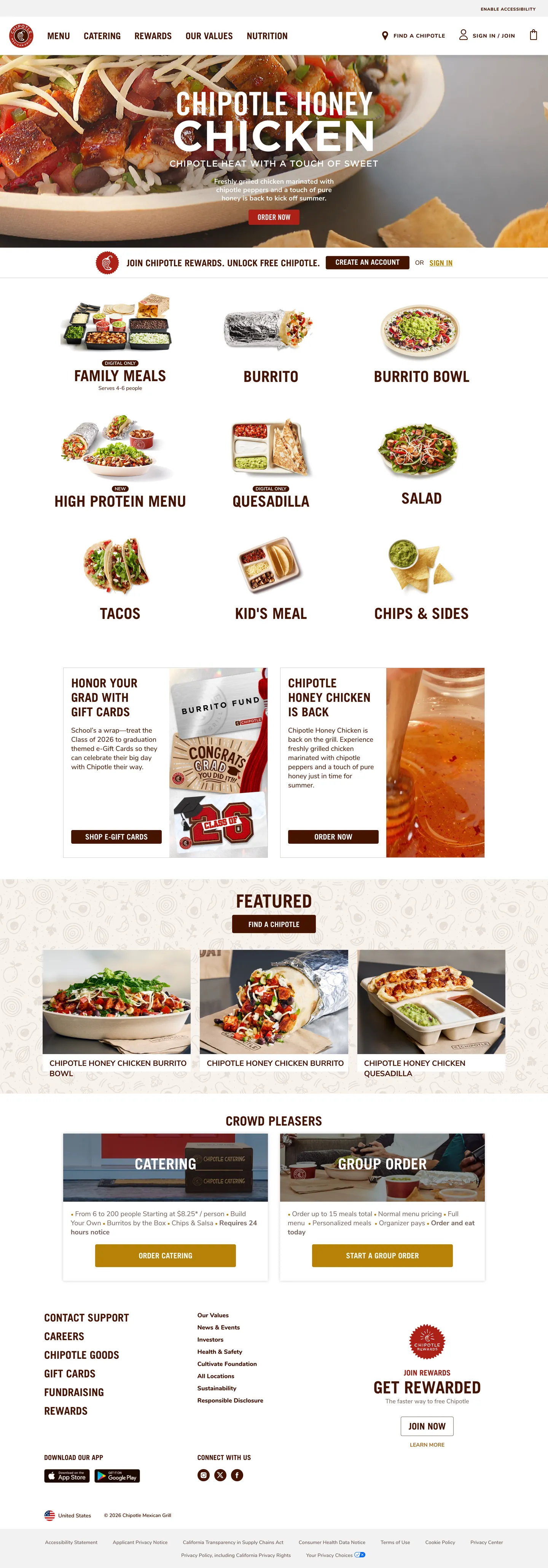
Chipotle's ordering surface reads like a deli counter laid out on butcher paper. The dominant chrome color is not black and not gray — it is a deep burnt-umber ink (`#451400`) that carries roughly 677 occurrences across the captured page, split almost evenly between text (335) and hairline border (331). That single token does the work that most retail systems split between a heading color, a body color, and a divider gray. Mustard gold (`#b68207`) shows up only 8 times — the Honey Chicken hero CTA strip and a Rewards bag-grab promo are essentially the entire chromatic budget of the page. Where most fast-casual brands ship a flat tomato red or a leaf green as their voltage, Chipotle reserves color for the moments the photograph cannot carry on its own.
This page packages Chipotle's marketing-and-order surface into one DESIGN.md file built on the Google Labs spec. Inside: 13 colors tokens grouped into burnt-umber chrome (ink, hairline, shadow), photographic-safe neutrals (cream, white, ash), the single mustard-gold brand voltage, a crimson Rewards red, and four warm chili-tone gradients. 11 typography tokens run on a Trade Gothic LT Bold uppercase / Nunito body split — display sits at 48px in weight 500 uppercase rather than the 700+ weight that fintech brands lean on. The spec also captures 4px and 12px corner radii, an 8-step spacing scale from 5px to 40px anchored at 16px and 20px, and 17 components — the menu category tile, the burnt-umber filled CTA, the Rewards bag-grab card, the Catering hero panel, the bottom-of-page footer column.
Feed the file to Claude, Cursor, or GitHub Copilot and the agent will reproduce Chipotle's restraint — die-cut food photography on cream-white tiles, 4px-cornered burnt-umber buttons with 16/700 Nunito Extra Bold uppercase labels, mustard-gold reserved for the hero strip — rather than a generic fast-casual theme. Or read the file as a discipline study: the system's strength is that almost every container reuses the same burnt-umber outline plus white fill plus photographic tile vocabulary, which is why Chipotle never needs a secondary accent to ship a new featured menu category.
What makes it distinct
5
- Burnt-umber monochrome chrome#451400 carries 677 occurrences as both text (335) and hairline border (331), the structural workhorse of the whole site
- Mustard-gold scarcity voltage#b68207 appears 8 times total, reserved for the Honey Chicken hero CTA and a single rewards strip
- Photographic menu tiles, not typographic categoriesevery menu entry is a die-cut food photograph above 24px uppercase Trade Gothic LT Bold
- Hard-corner geometryevery CTA carries a 4px radius and 9 of 3 radii on the page are 4px, with 12px reserved only for the catering hero panels
- Two-typeface split disciplineTrade Gothic LT Bold uppercase for category and headline moments, Nunito 18/400 for descriptions and body, never blended
chipotle.com
Live at chipotle.com
A snapshot of the brand in production. Scroll the frame to see the whole page.
Colors
13 colors
Chipotle's system anchors on #786259 (ash) as its primary color. Type is set in Trade Gothic LT Bold across 12 tokens from 12px to 48px, weights 400–700. Shape language is sharp — components average 3px corner radius, favoring crisp rectangles.
Brand & Accent
Sparing, CTA-only voltage · 3
Text
Headlines, body, captions · 2
Borders & Hairlines
Dividers, outlines, rules · 1
Other
Specialty colors · 7
Typography
12 type tokens
Set in Trade Gothic LT Bold across 12 tokens, from 12px to 48px, weights 400–700. Shown in its own stack: where the font isn't installed, the fallback the file names stands in.
- display-hero48px · weight 500 · lh 38pxThe quick brown fox jumps over the lazy dog
- display-lg40px · weight 700 · lh 1.2The quick brown fox jumps over the lazy dog
- display-md32px · weight 400 · lh 1.2The quick brown fox jumps over the lazy dog
- heading-md28px · weight 400 · lh 1.2The quick brown fox jumps over the lazy dog
- heading-sm24px · weight 500 · lh 1.2The quick brown fox jumps over the lazy dog
- h3-uppercase18px · weight 500 · lh 1.2The quick brown fox jumps over the lazy dog
- body-lg18px · weight 400 · lh 1.5The quick brown fox jumps over the lazy dog
- body-strong18px · weight 700 · lh 1.5The quick brown fox jumps over the lazy dog
- body-md20px · weight 700 · lh 1.4The quick brown fox jumps over the lazy dog
- button-label16px · weight 700 · lh 32pxThe quick brown fox jumps over the lazy dog
- link-sm13px · weight 600 · lh 1.4The quick brown fox jumps over the lazy dog
- caption-xs12px · weight 700 · lh 13pxThe quick brown fox jumps over the lazy dog
Layout
Radii and spacing
3 corner radii and 8 spacing values. Shape language: sharp.
Radii
- none0px
- sm4px
- md12px
Spacing
- xxs5px
- xs10px
- sm13px
- md16px
- base18px
- lg20px
- xl32px
- xxl40px
Components
17 components
Each rendered from its tokens (color, type, radius, padding) on Chipotle's own canvas.
- Button Primarybutton-primaryButton Primary
- Button Primary Widebutton-primary-wideButton Primary Wide
- Button Secondary Outlinebutton-secondary-outlineButton Secondary Outline
- Button Rewardsbutton-rewardsButton Rewards
- Hero Strip Honeyhero-strip-honeyHero Strip Honey
- Menu Category Tilemenu-category-tileMenu Category Tile
- Rewards Bag Grab Cardrewards-bag-grab-cardRewards Bag Grab Card
- Catering Hero Panelcatering-hero-panelCatering Hero Panel
- Card Defaultcard-defaultCard Default
- Card Featuredcard-featuredCard Featured
- Top Navtop-navTop Nav
- Nav Linknav-linkNav Link
- Footer Column Linkfooter-column-linkFooter Column Link
- Footer Headingfooter-headingFooter Heading
- Rewards Cta Circlerewards-cta-circleRewards Cta Circle
- Type here…text-inputText Input
- Hairline Dividerhairline-dividerHairline Divider
In use
The system, in use
Chipotle's tokens on the kind of product it builds.
Build something people actually use.
A short paragraph of marketing copy that previews how the brand's display tier and body tier read together. Two sentences is usually enough.
FAQ
Chipotle design system FAQ
Common questions about Chipotle's tokens, components, and how to use this DESIGN.md in your project.
Read next
Related reading
Specs, directories, and component libraries that pair with this design system.
- Browse all design systemsThe full directory of DESIGN.md files on shadcn.io, with live mockups for each.shadcn.io
- Chipotle — official siteChipotle Mexican Grill's ordering and rewards surface — the source this design.md describes.chipotle.com (opens in a new tab)
- The DESIGN.md specificationGoogle Labs' open spec for machine-readable design system files.github.com (opens in a new tab)
Use it
Use Chipotle in your project
One machine-readable file. Drop it into Claude, Cursor, or any AI tool that reads DESIGN.md.
Download the DESIGN.md
One machine-readable file: every color, type, radius, spacing, and component token of Chipotle.
Feed it to your AI tool
Drop it into Claude, Cursor, or GitHub Copilot. The agent writes React components and Tailwind classes that match Chipotle's visual language.
Reference the tokens directly
Or paste the values into your Tailwind config, CSS variables, or component library: every color, size and radius is a quoted, ready-to-copy value.
Read the full DESIGN.md: overview, rationale, do’s and don’ts
Overview
Chipotle's ordering surface is a foil-wrapped fast-casual catalog rendered in burnt umber on cream — a system where one ink color ({colors.ink} — #451400) carries both the text moment and the hairline moment across nearly every container, and color appears only where the brand decides to scream. The dominant token does the work most retail systems would split between three: 335 occurrences as text, 331 as border, 7 as background fill, totaling 677 hits in the captured page. There is no separate heading color, no separate divider gray, no secondary text tone — burnt umber is the entire chrome.
Burnt-umber as load-bearing chrome: where most fast-casual brands ship a tomato-red and a leaf-green as their two voltages, Chipotle ships one near-black-brown that doubles as both content and container. The mustard gold ({colors.brand-gold} — #b68207) shows up only 8 times across the captured page — and even those 8 occurrences are scoped to a single hero strip announcing the seasonal Honey Chicken LTO. Rewards red ({colors.rewards-red} — #ad2118) is rarer still: 2 occurrences, both inside the bag-grab promo card. Unlike the convention of a fast-casual landing page leading with a fully saturated brand-color hero band, Chipotle's hero is photographic — a die-cut chicken bowl shot on cream — and the chromatic moment is a thin gold strip beneath it.
The typographic discipline carries the rest of the voice. Trade Gothic LT Bold covers every uppercase headline and category label across the page (48/500 hero, 40/700 category tiles, 24/500 menu names), while Nunito carries every mixed-case description, button label, and footer link. The two typefaces never blend inside the same surface — uppercase tiles get Trade Gothic LT Bold, body paragraphs get Nunito 18/400. Buttons are universally 4px-cornered (14 of the captured 17 radii are 4px), never pilled. The page rhythm is a 20px constant — gap between menu tiles, padding inside the rewards card, vertical breath between footer rows — appearing 20 times in the captured spacing data, more than any other value.
Key Characteristics:
- Single burnt-umber chrome token (
{colors.ink}— #451400) carries both text (335) and hairline border (331) on the page — a one-color structural system instead of a two-color heading-plus-divider pair. - Mustard-gold scarcity voltage (
{colors.brand-gold}— #b68207) reserved for the seasonal Honey Chicken hero strip; 8 occurrences total. - Crimson Rewards red (
{colors.rewards-red}— #ad2118) scoped to the bag-grab promo card; 2 occurrences total. - Two-typeface split: Trade Gothic LT Bold uppercase for headlines and category tiles, Nunito for descriptions and body — never blended inside a single surface.
- Hard-corner geometry: every CTA carries a 4px radius (
{rounded.sm}); 12px ({rounded.md}) reserved for catering hero panels only. - 20px universal rhythm constant — the most frequent spacing value on the page, used as gap, padding, and section breath.
- Photographic die-cut menu tiles instead of typographic category cards — every menu entry is food on cream.
- Cream surface (
{colors.cream}— #f2f2f2) reserved for promotional cards (Bag Grab, Rewards), separating them from the white default tile background. - 35px-tall primary CTA (
{component.button-primary}) — a deliberately compact button instead of a touch-friendly 44px+ pill. - Footer column-link tokens run a Nunito SemiBold 13/600 family — the system's smallest text tier, used for legal and link-list scaffolding.
Colors
Burnt-Umber Chrome (Structural)
- Burnt Umber Ink (
{colors.ink}— #451400) — frequency 677. Used as text (335), border (331), background (7), gradient (4). The system's load-bearing token: every heading, every paragraph, every hairline divider, and every primary CTA fill collapses into this one near-black-brown. - Ink Soft (
{colors.ink-soft}— #6b321b) — frequency 4. Used as gradient (4) only. A warmer mid-tone reserved for the burnt-umber gradient that backs the Honey Chicken strip and the catering hero stops. - Ash (
{colors.ash}— #786259) — frequency 77. Used as text (38), border (39). A muted mid-brown used as the secondary metadata text color and the input-border outline on form fields. - Hairline Soft (
{colors.hairline-soft}— #d4cbc7) — frequency 2. Used as border (2). A warm-gray 1px divider for inside-card row separators, where a full burnt-umber outline would feel too heavy.
Surface
- White (
{colors.white}— #ffffff) — frequency 73. Used as text (33), border (31), background (6), gradient (3). The primary tile-fill and the inverse-text token on burnt-umber buttons. - Cream (
{colors.cream}— #f2f2f2) — frequency 4. Used as background (4). A soft warm-gray reserved for promotional cards (Bag Grab, Rewards strip) — separates them visually from the white menu tile grid. - Black (
{colors.black}— #000000) — frequency 4. Used as border (1), shadow (3). Not a content color — only the 1px primary-button border and the underlying shadow stack.
Brand Voltage (Scarcity)
- Brand Gold (
{colors.brand-gold}— #b68207) — frequency 8. Used as text (2), background (2), border (2), gradient (2). Reserved for the Honey Chicken hero CTA strip at the top of the page — appears 8 times total across the whole captured page. - Brand Gold Deep (
{colors.brand-gold-deep}— #976500) — frequency 2. Used as gradient (2). The deeper stop in the gold gradient pair on the foil-wrap hero band. - Brand Gold Tint (
{colors.brand-gold-tint}— #a76721) — frequency 4. Used as text (2), border (2). A muted gold-brown that softens the gold strip's outer edge.
Rewards Ceremony
- Rewards Red (
{colors.rewards-red}— #ad2118) — frequency 2. Used as background (1), gradient (1). The crimson signature of the Rewards bag-grab promo card; appears twice on the captured page. - Rewards Red Deep (
{colors.rewards-red-deep}— #9c1f16) — frequency 4. Used as text (2), border (2). The slightly darker tonal stop in the same crimson family — used on the Rewards card outline and label text. - Rewards Red Soft (
{colors.rewards-red-soft}— #b3473f) — frequency 1. Used as gradient (1). The pale-rust gradient stop on the Rewards card top border.
Typography
Font Family
The system runs a two-typeface split. Trade Gothic LT Bold (with "Helvetica Neue", Arial, sans-serif fallback) covers every uppercase headline and category label. Nunito (and its Nunito SemiBold / Nunito Extra Bold variants, with "Helvetica Neue", Arial, sans-serif fallback) covers everything mixed-case — body, button labels, footer links. There is no third typeface and no serif anywhere on the captured page.
Trade Gothic LT Bold is proprietary (Linotype). Reasonable open-source substitutes are League Gothic, Bebas Neue, or Oswald at weight 500 and uppercase. Nunito is available on Google Fonts and substitutes one-for-one.
Hierarchy
| Token | Size | Weight | Line Height | Use |
|---|---|---|---|---|
{typography.display-hero} | 48px | 500 | 38px | Hero FEATURED heading band, uppercase Trade Gothic LT Bold |
{typography.display-lg} | 40px | 700 | 1.2 | Category tile labels (BURRITO, QUESADILLA), uppercase |
{typography.display-md} | 32px | 400 | 1.2 | Featured-section subhead, uppercase |
{typography.heading-md} | 28px | 400 | 1.2 | Promo card heading (HONOR YOUR GRAB), uppercase |
{typography.heading-sm} | 24px | 500 | 1.2 | Menu category names and second-tier headings, uppercase |
{typography.h3-uppercase} | 18px | 500 | 1.2 | Footer column headings, uppercase Trade Gothic LT Bold |
{typography.body-lg} | 18px | 400 | 1.5 | Default body paragraph copy, Nunito |
{typography.body-strong} | 18px | 700 | 1.5 | Inline emphasis inside body paragraphs, Nunito bold |
{typography.body-md} | 20px | 700 | 1.4 | Sub-heading row labels, Nunito |
{typography.button-label} | 16px | 700 | 32px | All CTA labels — Nunito Extra Bold, uppercase by transform |
{typography.link-sm} | 13px | 600 | 1.4 | Footer column links and metadata, Nunito SemiBold |
{typography.caption-xs} | 12px | 700 | 13px | Legal copy and disclosure micro-text, Nunito uppercase |
Principles
- Weight does not escalate beyond 700. Trade Gothic LT Bold display sits at 500 on the hero
FEATUREDband — not 700 or 800 — and the size-only jump from 24px to 48px carries the hierarchy. - Uppercase carries identity, not weight. Every Trade Gothic LT Bold size is uppercase by
text-transform; no lowercase Trade Gothic appears on the captured page. The block-lettering pattern matches the foil-wrap and deli-counter aesthetic of the brand. - Mixed case is Nunito-only. Body, descriptions, button labels, and footer links all run Nunito (or its weight variants). Trade Gothic never appears in mixed case.
- Line-height runs 1.2 on display and 1.5 on body. Nunito body paragraphs sit at
lineHeight: 1.5for legibility, while Trade Gothic uppercase headings tighten to 1.2 or fixed-px values (38px on the 48px hero).
Layout
Spacing System
Pixel-based scale with a single rhythm constant at 20px:
- Tokens:
{spacing.xxs}5px ·{spacing.xs}10px ·{spacing.sm}13px ·{spacing.md}16px ·{spacing.base}18px ·{spacing.lg}20px ·{spacing.xl}32px ·{spacing.xxl}40px. - Universal rhythm constant: 20px (
{spacing.lg}) — the most frequent spacing value on the page (20 occurrences), used as menu-tile gap, promo-card padding, and footer column gutter. - Secondary anchor: 16px (
{spacing.md}) — appears 15 times, used as outer gutter and button horizontal padding on the wide CTA variant.
Grid & Container
- Menu category grid: 4-up on desktop dropping to 2-up on mobile, with 20px gap between tiles.
- Hero strip: full-width, 40px vertical padding, 20px horizontal inside the gold strip.
- Featured row: 3-up image-card grid centered under the
FEATUREDheading. - Footer: 4-column column-link grid with 16px column gap.
Border Radius Scale
{rounded.none}(0px): Hero gold strip, top nav, footer container, hairline dividers.{rounded.sm}(4px): Every CTA, every menu category tile, every default card and form input — the universal radius on the page (14 occurrences).{rounded.md}(12px): Catering hero panels only (3 occurrences) — the single context where Chipotle softens the corner above 4px.
Whitespace Philosophy
Whitespace is tight — 5px, 10px, 13px, and 20px carry roughly half the captured spacing values. The system trusts the photographic die-cut food tiles to carry the visual breath rather than generous padding. Containers run flush against each other separated by 1px burnt-umber hairlines rather than gaps.
Elevation
| Level | Treatment | Use |
|---|---|---|
| Default tile | 0px 0px 40px rgba(0,0,0,0.06) | Soft halo around menu category tiles |
| Promo card | Subtle 1px burnt-umber outline only | Bag Grab and Rewards promotional cards rely on the outline, not a shadow |
| Hero strip | No shadow — flat full-bleed gold band | The Honey Chicken hero is flat color, not raised |
| Catering panel | Inner padding on a 12px-rounded dark panel | Depth comes from the radius shift, not the shadow stack |
Shadow philosophy: Whisper-soft to absent. The only captured shadow is a 0px 0px 40px halo with a low alpha — three occurrences in the page. Everywhere else, the system relies on the 1px burnt-umber outline to define the container edge. There are no drop shadows on buttons, no inner shadows on inputs, no layered ambient stacks. Shadow-as-absence: the brand reads the burnt-umber hairline as the depth signal, and the photograph as the visual lift.
Shapes
The radius scale is two-tiered. {rounded.sm} (4px) carries every button, tile, and card; {rounded.md} (12px) is scoped to Catering hero panels. There are no pills, no full-circle buttons (except the optional Rewards CTA circle), and no rounded-rectangle surfaces above 12px. The hard-corner geometry matches the foil-wrap rectangular die of a Chipotle burrito itself — the brand's product silhouette is the design silhouette.
Components
Buttons
button-primary — Burnt-umber {colors.ink} fill, white text, 4px radius, 0px 12px padding, 35px tall, 16/700 Nunito Extra Bold uppercase label. The most common CTA on the page (CREATE AN ACCOUNT, ORDER NOW). Carries a 1px black border for a foil-stamped edge feel.
button-primary-wide — Same burnt-umber fill and uppercase label, slightly larger at 0px 16px padding and 40px height. Used on featured rows where the CTA needs to sit beside a larger product photograph.
button-secondary-outline — White fill with burnt-umber text and 1px burnt-umber outline at 4px radius. Used for LEARN MORE-style secondary actions paired with a filled primary CTA.
button-rewards — Rewards-red {colors.rewards-red} fill, white text, 4px radius, 40px height. Used inside the bag-grab promo card and as the optional rewards CTA circle.
Hero & Promotional Surfaces
hero-strip-honey — Full-bleed mustard-gold {colors.brand-gold} strip with the seasonal Honey Chicken announcement. White Trade Gothic LT Bold 48/500 uppercase headline burned into the gold band, 20px vertical padding. No shadow, no radius — flat color edge to edge.
menu-category-tile — White fill, 4px radius, 20px padding, 1px burnt-umber outline. Each tile carries a die-cut food photograph centered above a 24/500 uppercase Trade Gothic LT Bold label (BURRITO, QUESADILLA, SALAD). No price, no description — the photograph and label do the work.
rewards-bag-grab-card — Cream {colors.cream} fill with 1px rewards-red outline, 4px radius, 20px padding. Carries the HONOR YOUR GRAB ON GIFT CARDS promo with the dual Trade Gothic LT Bold heading + Nunito body. The crimson outline differentiates it from the burnt-umber menu tiles.
catering-hero-panel — Burnt-umber {colors.ink} filled dark panel with white Trade Gothic LT Bold 40/700 headline, 12px radius, 32px padding. The single surface on the page where the corner radius exceeds 4px.
Cards & Containers
card-default — White fill with a 1px hairline-soft outline at 4px radius. Used for featured-row product cards beneath the FEATURED heading.
card-featured — Cream fill with a 1px ash outline. The slightly warmer companion to card-default, used on the second tier of promo cards.
Navigation
top-nav — White fill, 60px tall, 1px burnt-umber bottom hairline. Left: Chipotle wordmark. Center: primary links (MENU, LOCATIONS, REWARDS, OUR VALUES, NUTRITION). Right: account, language, and order CTA. Every link is link-sm Nunito SemiBold 13/600.
nav-link — Transparent fill with burnt-umber text, 10px vertical padding × 16px horizontal. No underline by default; active state adds a 2px burnt-umber underline.
Footer
footer-column-link — Transparent fill with burnt-umber link-sm 13/600 text, 5px vertical padding. Stacked inside a 4-column layout.
footer-heading — Trade Gothic LT Bold 18/500 uppercase column heading (CONTACT SUPPORT, CAREERS, CHIPOTLE GOODS, GIFT CARDS).
Forms
text-input — White fill, 1px ash outline at 4px radius, 40px tall, 10px × 16px padding. Nunito 18/400 body inside. Used in the footer email sign-up and rewards forms.
Utility
hairline-divider — 1px tall hairline-soft background, full-width inside cards and between footer column rows.
rewards-cta-circle — Optional 120px circular Rewards-red disc with white 16/700 Nunito Extra Bold uppercase label inside. Used on the rewards strip as a secondary CTA shape.
Do's and Don'ts
Do anchor every heading, every body paragraph, and every hairline on burnt-umber #451400. The system trusts one color to do three jobs — splitting the heading into a darker tone and the divider into a separate gray will read as inconsistent, not as polish.
Do use 4px corners on every CTA and every tile. 12px is reserved for catering panels only — using it elsewhere shifts the geometry away from the foil-wrap silhouette.
Don't use mustard gold #b68207 as a general-purpose CTA fill. It appears 8 times on the page, all inside the Honey Chicken hero strip. Stretching it into a primary button color flattens the seasonal-LTO signal and makes every CTA fight for the same attention slot the hero already owns.
Don't pair Trade Gothic LT Bold with mixed-case text. Trade Gothic LT Bold on the captured page is always uppercase via text-transform; mixing it with Nunito's lowercase body inside the same paragraph breaks the two-typeface split. Body paragraphs run Nunito 18/400 only.
Don't soften the 1px burnt-umber outline into a gray or a translucent black. The captured page uses #451400 for 331 of its border occurrences directly — translucent gray makes the menu tiles look generic-card instead of foil-stamped.
Don't add drop shadows to buttons or tiles. The system carries depth through the 1px outline and the photograph, not the shadow stack. The only captured shadow is a soft halo on tiles (0px 0px 40px low-alpha).
Don't use rewards red #ad2118 outside the bag-grab promo card. It appears twice on the page total. Using it on error states, links, or other CTAs collapses its ceremonial role.
Don't scale primary button height above 40px or down below 35px. The captured primary CTA is 35px tall with 0px 12px padding — the compact button is part of the brand's voice, not a touch-target accident. Push it to 48px and the page reads like a generic shadcn default.
Known Gaps
- Trade Gothic LT Bold is proprietary — not on Google Fonts. Substitute with League Gothic, Bebas Neue, or Oswald at weight 500 uppercase and document the swap.
- No CSS custom properties on
:root— the captured page has zero--tokendeclarations, so the spec relies entirely on inline-resolved values and selector-level styles. - Hover and active states — not documented on the captured snapshot; the spec covers default states only.
- Mobile breakpoints — the desktop 1440×4122 capture documents the full ordering surface, but mobile-specific component variants (drawer nav, single-column menu grid) were not captured.
- Dark mode — Chipotle's marketing surface is light-canvas only; no dark mode is captured or implied by the token system.
- Cart, checkout, and bag flow — the captured page is the marketing home; full ordering UI (item builder, ingredient selector, bag review) is not part of this spec.
Food & Delivery
More systems like this
More DESIGN.md files in Food & Delivery.
Pricing
Build it with Pro
The DESIGN.md files are free. Pro adds 6,000+ blocks, premium templates and the MCP server, so your AI editor builds in your system for you.
4.9/5 out of 5 · 150+ reviewsfrom 150+ founders and developers.
Billing
Billed once a year in USD. Cancel anytime.
- How many people can use the license.
- Client work, SaaS products and anything you charge for.
- Production-ready React sections: hero, pricing, features, dashboards and more.
- Complete multi-page sites you can ship as they are.
- React icons from every major library, installable with one command.
- Presets that restyle every block, in light and dark.
- Lets your AI editor search, preview and install blocks for you.
- Priority requests are answered first.
Individual
For personal projects & open source
$32instead of $49/mo
$389 billed yearly
- Seats: 1 seat
- Commercial use: Personal & open source only
- Pro blocks: 6,000+ blocks
- Templates: All 14 templates
- React icons: 294k+ icons
- Themes: All 59 themes
- MCP server: Basic usage
- Support: Standard
Team
Most popularFor freelancers, agencies & startups
$66instead of $99/mo
$789 billed yearly · ≈ $13/dev/mo
- Seats: Up to 5 seats
- Commercial use: Included
- Pro blocks: 6,000+ blocks
- Templates: All 14 templates
- React icons: 294k+ icons
- Themes: All 59 themes
- MCP server: High usage
- Support: Priority
Organization
For companies with larger teams
$132instead of $199/mo
$1,589 billed yearly
- Seats: Unlimited seats
- Commercial use: Included
- Pro blocks: 6,000+ blocks
- Templates: All 14 templates
- React icons: 294k+ icons
- Themes: All 59 themes
- MCP server: Unlimited usage
- Support: Priority
Billed once a year in USD. Cancel anytime.
Individual
For personal projects & open source
$32instead of $49/mo
$389 billed yearly
- How many people can use the license.Seats: 1 seat
- Client work, SaaS products and anything you charge for.Commercial use: Personal & open source only
- Production-ready React sections: hero, pricing, features, dashboards and more.Pro blocks: 6,000+ blocks
- Complete multi-page sites you can ship as they are.Templates: All 14 templates
- React icons from every major library, installable with one command.React icons: 294k+ icons
- Presets that restyle every block, in light and dark.Themes: All 59 themes
- Lets your AI editor search, preview and install blocks for you.MCP server: Basic usage
- Priority requests are answered first.Support: Standard
Team
Most popularFor freelancers, agencies & startups
$66instead of $99/mo
$789 billed yearly · ≈ $13/dev/mo
Everything in Individual, plus
- How many people can use the license.Seats: Up to 5 seats
- Client work, SaaS products and anything you charge for.Commercial use: Included
- Lets your AI editor search, preview and install blocks for you.MCP server: High usage
- Priority requests are answered first.Support: Priority
Organization
For companies with larger teams
$132instead of $199/mo
$1,589 billed yearly
Everything in Team, plus
- How many people can use the license.Seats: Unlimited seats
- Lets your AI editor search, preview and install blocks for you.MCP server: Unlimited usage
- Secure checkout via Stripe
- Code lives in your repo
- Keep what you've shipped if you cancel
- License terms
Your system, built for you
Every block, template and icon, installed by your AI agent in your design system. The DESIGN.md files stay free.