Instacart Design System
Instacart's design system as a DESIGN.md file. Green #108910, Instacart Sans, 18 colors, 32 components for React, Next.js, and AI coding tools.
Add shadcn.io to your AI agent. · Pro It installs blocks, icons and templates in your design system from a prompt, with Pro.
Set up MCP- Primary
- #108910
- Typeface
- Instacart Sans
- Shape
- Soft
- Base radius
- 8px
- Colors
- 18
- Type tokens
- 11
- Components
- 32
- Spacing values
- 9
About
About Instacart DESIGN.md
Curated by Dov Azencot · Updated May 13, 2026 · Source instacart.com (opens in a new tab)
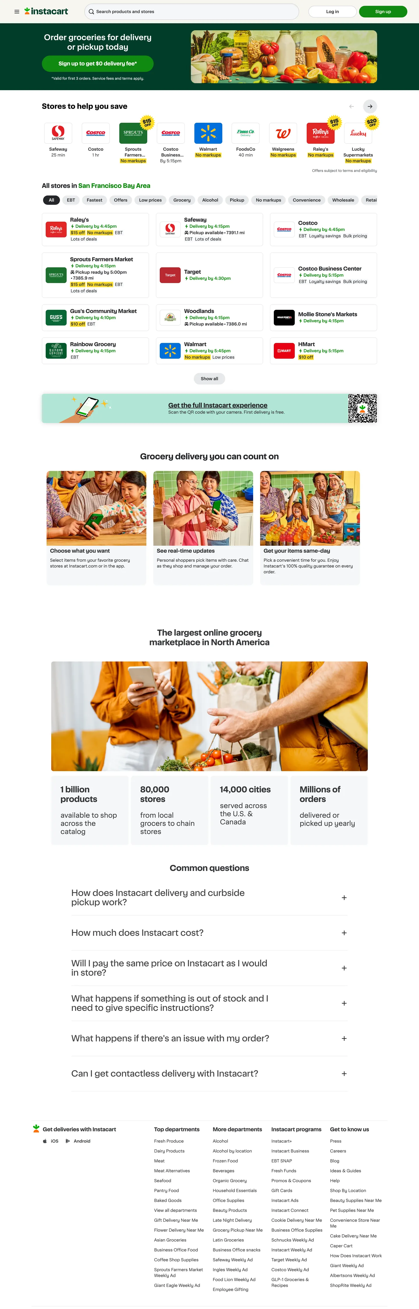
Instacart's home page is the rare consumer marketplace where the brand voltage barely fills any pixels. The green that the logo screams — Instacart Green ("#108910") — appears 30 times across the captured surface, but 28 of those are borders or text strokes; only 2 are background fills. That inversion is the whole design move. Where DoorDash floods red across CTAs and Uber Eats stamps a black pill on every conversion target, Instacart treats green as a structural outline color — it draws the search-bar focus ring, the in-stock pill outline, the chevron link, the chevron icon — and leaves the page's actual surface work to a six-rung grayscale ladder and the warm beige tertiary "#f7f5f0".
This DESIGN.md packages the system into one machine-readable file following the Google Labs spec. Inside: 18 colors tokens grouped into brand, surface, ink, and membership roles; 11 typography tokens running on Instacart Sans at weights 400 / 600 / 700 with sizes spanning 10px micro-labels up to a 28px hero label; a radii scale of four values where the 28px capsule is reserved for the search bar and primary CTA; a 4 / 8 / 12 / 16 / 24 / 32 / 40 / 48px spacing scale; and 32 components covering the retailer grid card, the in-stock chip, the Instacart+ membership band, the search capsule, the FAQ accordion row, and the dense footer column.
Feed the file to Claude, Cursor, or GitHub Copilot and the agent will reproduce Instacart's restraint — green as a hairline color rather than a fill, retailer cards as 8px rectangles, Instacart Sans at weight 600 rather than 700 across nav and titles, and Yellow locked to Instacart+ surfaces. Or reference the tokens directly: every hex, font, radius, and spacing value is a quoted string that drops into Tailwind config or CSS variables. The system is worth studying because it proves a delivery marketplace can scale to 1,500 retailers and 85,000 stores without ever raising its voice — the green is everywhere, almost none of it shouts.
What makes it distinct
5
- Green-as-stroke not green-as-fillprimary #108910 logs 14 border / 14 text / 2 background appearances out of 30, the inverse of how most marketplace brands deploy their voltage
- Two-radius geometry28px capsule on the search field and primary CTA, 8px on every retailer card; nothing in between
- Six-tier grayscale ladder#242529 / #343538 / #56595e / #72767e / #8f939b / #c7c8cd / #e8e9eb carries text, hairlines, and chips while green stays scarce
- Yellow #ffdc23 is locked to Instacart+ membership ceremonyappears 12 times, never as a generic accent
- Instacart Sans at weight 600 carries every nav label, retailer card title, and section heading at 14 / 17 / 20 / 26pxweight 700 is reserved for the single h2 at 24px
instacart.com
Live at instacart.com
A snapshot of the brand in production. Scroll the frame to see the whole page.
Colors
18 colors
Instacart's system runs on #108910 as its primary voltage, used in 6 of 32 components. Type is set in Instacart Sans across 11 tokens from 10px to 28px, weights 400–700. Shape language is soft — components average 140px corner radius, with no sharp interactive edges.
Brand & Accent
Sparing, CTA-only voltage · 3
Surface
Page and card backgrounds · 1
Text
Headlines, body, captions · 5
Borders & Hairlines
Dividers, outlines, rules · 2
Other
Specialty colors · 7
Typography
11 type tokens
Set in Instacart Sans across 11 tokens, from 10px to 28px, weights 400–700. Shown in its own stack: where the font isn't installed, the fallback the file names stands in.
- display-md26px · weight 600 · lh 33pxThe quick brown fox jumps over the lazy dog
- display-sm24px · weight 700 · lh 28pxThe quick brown fox jumps over the lazy dog
- hero-label28px · weight 400 · lh 32pxThe quick brown fox jumps over the lazy dog
- heading-lg20px · weight 600 · lh 25pxThe quick brown fox jumps over the lazy dog
- heading-md17px · weight 600 · lh 20pxThe quick brown fox jumps over the lazy dog
- body-lg23px · weight 400 · lh 28pxThe quick brown fox jumps over the lazy dog
- body-md16px · weight 400 · lh 18pxThe quick brown fox jumps over the lazy dog
- body-default14px · weight 400 · lh 20pxThe quick brown fox jumps over the lazy dog
- body-strong14px · weight 600 · lh 20pxThe quick brown fox jumps over the lazy dog
- caption12px · weight 400 · lh 16pxThe quick brown fox jumps over the lazy dog
- micro10px · weight 400 · lh 10pxThe quick brown fox jumps over the lazy dog
Layout
Radii and spacing
6 corner radii and 9 spacing values. Shape language: soft.
Radii
- none0px
- sm4px
- md8px
- lg12px
- capsule28px
- full999px
Spacing
- xxs2px
- xs4px
- sm8px
- md12px
- base16px
- lg24px
- xl32px
- 2xl40px
- 3xl48px
Components
32 components
Each rendered from its tokens (color, type, radius, padding) on Instacart's own canvas.
- Top Navtop-navTop Nav
- Nav Linknav-linkNav Link
- Search Barsearch-barSearch Bar
- Button Primarybutton-primaryButton Primary
- Button Primary Hoverbutton-primary-hoverButton Primary Hover
- Button Primary Pressbutton-primary-pressButton Primary Press
- Button Secondarybutton-secondaryButton Secondary
- Retailer Cardretailer-cardRetailer Card
- Retailer Card Titleretailer-card-titleRetailer Card Title
- Retailer Card Metaretailer-card-metaRetailer Card Meta
- In Stock Pillin-stock-pillIn Stock Pill
- Delivery Eta Chipdelivery-eta-chipDelivery Eta Chip
- Category Chipcategory-chipCategory Chip
- Membership Bandmembership-bandMembership Band
- Membership Ctamembership-ctaMembership Cta
- Promo Band Darkpromo-band-darkPromo Band Dark
- Section Headingsection-headingSection Heading
- Stat Largestat-largeStat Large
- Stat Captionstat-captionStat Caption
- Feature Cardfeature-cardFeature Card
- Feature Card Titlefeature-card-titleFeature Card Title
- Faq Rowfaq-rowFaq Row
- Type here…text-inputText Input
- Type here…text-input-focusText Input Focus
- Link Defaultlink-defaultLink Default
- Link Legallink-legalLink Legal
- FooterfooterFooter
- Footer Column Titlefooter-column-titleFooter Column Title
- Footer Linkfooter-linkFooter Link
- App Download Pillapp-download-pillApp Download Pill
- Icon Chevronicon-chevronIcon Chevron
- DividerdividerDivider
In use
The system, in use
Instacart's tokens on the kind of product it builds.
Build something people actually use.
A short paragraph of marketing copy that previews how the brand's display tier and body tier read together. Two sentences is usually enough.
FAQ
Instacart design system FAQ
Common questions about Instacart's tokens, components, and how to use this DESIGN.md in your project.
Read next
Related reading
Specs, directories, and component libraries that pair with this design system.
- Browse all design systemsThe full directory of DESIGN.md files on shadcn.io, with live mockups for each.shadcn.io
- Instacart — official siteThe live grocery-delivery marketplace whose tokens this DESIGN.md captures.instacart.com (opens in a new tab)
- The DESIGN.md specificationGoogle Labs' open spec for machine-readable design system files.github.com (opens in a new tab)
Use it
Use Instacart in your project
One machine-readable file. Drop it into Claude, Cursor, or any AI tool that reads DESIGN.md.
Download the DESIGN.md
One machine-readable file: every color, type, radius, spacing, and component token of Instacart.
Feed it to your AI tool
Drop it into Claude, Cursor, or GitHub Copilot. The agent writes React components and Tailwind classes that match Instacart's visual language.
Reference the tokens directly
Or paste the values into your Tailwind config, CSS variables, or component library: every color, size and radius is a quoted, ready-to-copy value.
Read the full DESIGN.md: overview, rationale, do’s and don’ts
Overview
Instacart's home page is the marketplace surface that proves a brand can ship green on every screen without ever flooding a button with it. The page is structurally a grayscale grid — retailer logos pinned inside {rounded.md} 8px white cards, body text in {colors.body} (#343538), hairlines in {colors.hairline-soft} (#e8e9eb) — punctuated by the capsule search bar and a single capsule CTA. The brand voltage, Instacart Green ({colors.primary} — #108910), runs as a stroke color: 14 border occurrences, 14 text occurrences, 2 background fills across 30 total captures. Green-as-stroke is the named principle — every chevron icon, in-stock pill outline, search-focus ring, and link text uses the green, but the green never fills a button background in the marketing surface.
Where most delivery marketplaces (DoorDash flooding red, Uber Eats stamping black) push a single conversion color across every CTA fill, Instacart inverts the move. The primary CTA on the hero is filled {colors.primary}, yes, but it's the only one — every other green appearance is a hairline. This is not a brand that lacks confidence in its voltage; it is a brand that has chosen scarcity over saturation.
Type carries the second story. Instacart Sans runs across every surface in three weights — 400 for body, 600 for nav and card titles, 700 for the single h2 at 24px. Sizes step deliberately: 10px micro labels, 12px caption, 14px body (the workhorse, 101 occurrences in the capture), 16-17px nav, 20-23-26-28px display. No italic, no extra weights, no tracking variation — the face is allowed to do the work.
Key Characteristics:
- Green-as-stroke discipline —
{colors.primary}(#108910) appears 30 times: 14 borders, 14 text strokes, 2 background fills. The voltage is everywhere, almost none of it fills surfaces. - Two-radius geometry —
{rounded.capsule}28px is reserved for the search bar and the primary CTA;{rounded.md}8px is the retailer-card default (52 occurrences, the dominant radius by an order of magnitude); nothing rounds to 4px or 16px in between. - A six-tier grayscale ladder (
#242529/#343538/#56595e/#72767e/#8f939b/#c7c8cd/#e8e9eb) carries surface work — text colors, hairlines, chip fills — while green stays scarce. - Yellow (
{colors.membership-yellow}—#ffdc23) is locked to Instacart+ membership ceremony. Twelve appearances in the capture, every one a background fill on a membership surface; never a generic accent. - Instacart Sans at weight 600 carries the system. Card titles, nav links, section headings sit at 14 / 17 / 20 / 26px in weight 600; weight 700 appears exactly once (the 24px h2 statement section).
- The retailer-grid is the page's structural unit — small 8px-radius white cards with logo, name, delivery ETA, and an outlined green in-stock pill, packed dense across the viewport.
Colors
Brand & Accent
- Instacart Green (
{colors.primary}—#108910): frequency 30. Used as text (14), border (14), background (2). Mapped to--ids-color-brand-primary-regular. The system's voltage — every chevron, every in-stock outline, every link, the primary CTA fill. Stays scarce on backgrounds; the green-as-stroke discipline is the brand's whole color story. - Primary Hover (
{colors.primary-hover}—#0d720d): hover state for the primary CTA, mapped to--ids-color-brand-primary-darkand--ids-color-system-feedback-success-dark. - Primary Press (
{colors.primary-press}—#0a610a): pressed state, mapped to--ids-color-brand-primary-extra-dark. Both shades share success-semantic duty — Instacart's success palette is the brand green deepened. - Secondary Deep Green (
{colors.secondary-deep}—#003d29): frequency 1. Used as background fill on the secondary promo band ("The biggest online grocery marketplace in North America"). Mapped to--ids-color-brand-secondary-regular. Reserved for editorial dark-band moments. - Membership Yellow (
{colors.membership-yellow}—#ffdc23): frequency 12. Used as background (12), never as text or border. Mapped to--ids-color-brand-max-light. Locked to Instacart+ ceremony — the trial-promo band, membership badge, Instacart+ CTA fill. - Tertiary Warm (
{colors.tertiary-warm}—#f7f5f0): a warm-neutral beige tint mapped to--ids-color-brand-tertiary-lightand other tertiary roles. Used as a soft fill on delivery-ETA chips and editorial card backgrounds — references paper-bag and shelf materials.
Surface
- Canvas (
{colors.canvas}—#ffffff): the default page background. Mapped to--ids-color-system-grayscale-00. Carries retailer cards, feature cards, the search bar, and the top nav. - Hairline Soft (
{colors.hairline-soft}—#e8e9eb): frequency 27. Used as background (13), border (14). Mapped to--ids-color-system-grayscale-20. The page's workhorse hairline — divides nav, footer, retailer-card edges; tints chip fills.
Ink
- Ink (
{colors.ink}—#000000): frequency 395. Used as text (185), border (206), shadow (3). The h2 statement color and the heaviest border tone. Stays restricted to display headings and structural hairlines. - Ink Soft (
{colors.ink-soft}—#242529): frequency 370. Used as text (195), border (174). Mapped to--ids-color-system-grayscale-80and--ids-color-brand-max-dark. Card titles, footer column titles, app-download pill fill — the "near-black that's still warm enough to sit on canvas without fighting it." - Body (
{colors.body}—#343538): frequency 595. The workhorse text color — text (300) and border (295). Mapped to--ids-color-system-grayscale-70. Carries every body paragraph, every retailer card name, every nav label that isn't a title. - Body Muted (
{colors.body-muted}—#56595e): mapped to--ids-color-system-grayscale-60. Secondary text — captions, delivery-ETA, retailer-card meta lines. - Mute (
{colors.mute}—#72767e): mapped to--ids-color-system-grayscale-50. Tertiary text — fine print, footer secondary lines. - Mute Soft (
{colors.mute-soft}—#8f939b): mapped to--ids-color-system-grayscale-40. Lowest-priority text — disabled states, placeholder copy. - Hairline (
{colors.hairline}—#c7c8cd): mapped to--ids-color-system-grayscale-30. The search-bar border and the text-input border on default state.
Semantic
- Link (
{colors.link}—#0000ee): frequency 222. Used as text (117), border (105). The browser-default link blue inside legal fine print and "skip to content" anchors. Stays out of the brand's primary link role — Instacart Green carries body-link styling instead. - Danger (
{colors.danger}—#e12726): frequency 3. Mapped to--ids-color-system-feedback-detrimental-regular. Reserved for inline validation errors and removal confirmations. - Danger Deep (
{colors.danger-deep}—#b92831): mapped to--ids-color-system-feedback-detrimental-dark. Hover / pressed state for danger surfaces.
Typography
Font Family
One typeface carries the entire surface: Instacart Sans (with an Instacart Sans Fallback and Arial as the final fallback). It's a proprietary humanist sans with a tall x-height and a slightly curved geometry — friendly enough for grocery copy, structured enough for retailer logos. Three weights only: 400 for body, 600 for emphasis and headings, 700 for a single 24px h2. No italic, no extra weights, no tracking flourish.
Open-source substitutes: Inter or DM Sans at weights 400 / 600 / 700 match Instacart Sans' geometric width and x-height closely. Plus Jakarta Sans is a softer alternative; Manrope at 500 / 700 is the closest fallback if the design needs a marginally more rounded feel.
Hierarchy
| Token | Size | Weight | Line Height | Use |
|---|---|---|---|---|
{typography.hero-label} | 28px | 400 | 32px | Button-context hero label ("Sign up to get $0 delivery fee*"). Single-occurrence display weight 400. |
{typography.display-md} | 26px | 600 | 33px | h1 hero headlines and large promo-band titles. |
{typography.display-sm} | 24px | 700 | 28px | The single weight-700 h2 statement ("Stores to help you save"). |
{typography.body-lg} | 23px | 400 | 28px | Editorial card paragraphs ("available to shop across the catalog"). |
{typography.heading-lg} | 20px | 600 | 25px | h2 secondary headings, stat-section labels. |
{typography.heading-md} | 17px | 600 | 20px | h3 card titles, FAQ row questions. |
{typography.body-md} | 16px | 400 | 18px | Input labels and CTA labels (search bar, primary button text). |
{typography.body-default} | 14px | 400 | 20px | The workhorse body — 101 occurrences in the capture. Retailer card names, nav links, body paragraphs. |
{typography.body-strong} | 14px | 600 | 20px | Bold body — 62 occurrences. Nav titles, card-title strong variant. |
{typography.caption} | 12px | 400 | 16px | Delivery-ETA chips, footer links, fine print. |
{typography.micro} | 10px | 400 | 10px | Legal disclaimer micro-labels, footer copyright fragments. |
Principles
- Sentence-case across the board. No all-caps headlines, no display-tracking flourish.
- Weight 600 is the default emphasis. Weight 700 is reserved for the single h2 "Stores to help you save" statement section. Promoting nav labels to 700 breaks the system.
- One face does the work. Instacart Sans across every weight, every size — no second-typeface contrast pairing, no display-vs-text family split.
- Numerals use the same face. Stat values like "1 billion products" and "85,000 stores" sit in Instacart Sans weight 600, not a separate display numeral set.
Layout
Spacing System
- Base unit: 4px. The CSS variables
--ids-system-space-*declare 4 / 8 / 12 / 16 / 24 / 32 / 40 / 48 explicitly. - Tokens:
{spacing.xxs}2px ·{spacing.xs}4px ·{spacing.sm}8px ·{spacing.md}12px ·{spacing.base}16px ·{spacing.lg}24px ·{spacing.xl}32px ·{spacing.2xl}40px ·{spacing.3xl}48px. - Section padding: marketing bands sit at
{spacing.xl}32px top/bottom; promo bands inset at{spacing.lg}24px horizontally. - Card interior padding: retailer cards run
{spacing.md}12px; feature cards step up to{spacing.lg}24px. - Inline gap: retailer-grid columns use
{spacing.sm}8px between cards; nav rows use{spacing.base}16px between siblings.
Grid & Container
- Max width: a ~1200px container centered with horizontal gutters of
{spacing.lg}24px on desktop,{spacing.base}16px on mobile. - Column patterns: the retailer grid runs 5-up at desktop, 3-up at tablet, 2-up at mobile-large, 1-up at mobile. Feature cards run 3-up at desktop, stacking 1-up on mobile. The membership band always full-width.
Whitespace Philosophy
Card-to-card spacing is tight — Instacart's page treats the retailer grid like a real shelf, packing 12-15 retailer cards above the fold. Inside each card the headline / meta / chip stack sits at {spacing.xs} 4px between siblings. Bands separate at {spacing.xl} 32px to {spacing.2xl} 40px; nothing in between. The brand resists the urge to over-pad — grocery is a high-density catalog, and the layout matches.
Responsive Strategy
Breakpoints
| Name | Width | Key Changes |
|---|---|---|
| Mobile | < 600px | Nav collapses to logo + hamburger; retailer grid 1-up; search bar full-width. |
| Mobile-Large | 600–767px | Retailer grid 2-up; promo bands full-bleed. |
| Tablet | 768–1023px | Retailer grid 3-up; nav stays horizontal; feature cards 2-up. |
| Desktop | 1024–1199px | Retailer grid 5-up; full nav row visible. |
| Desktop-Large | ≥ 1200px | Container caps at ~1200px; bands stay edge-to-edge while content centers. |
Touch Targets
The primary CTA renders at 56px height; the search bar at 56px; the secondary CTA at 44px. All meet WCAG AAA minimums. Retailer cards inflate tap area through the full card body — the entire 8px-radius rectangle is hit-target, not just the title or logo.
Image Behavior
- Retailer logos: square or rectangle SVG, pinned inside the 8px card; consistent ~64px logo height.
- Editorial illustrations: the lifestyle photography (hands at grocery counter, kitchen surfaces) sits inside
{rounded.md}8px containers, never circular. - Stat-band background: full-bleed editorial photography behind the "1 billion products" stat row; image runs edge-to-edge, no card frame.
Elevation & Depth
| Level | Treatment | Use |
|---|---|---|
| Level 0 — Flat | No shadow, no border. | Default — most retailer cards lean on {colors.hairline-soft} border instead of shadow. |
| Level 1 — Hairline | 1px {colors.hairline-soft} border. | Retailer cards, feature cards, FAQ rows, top nav bottom edge. |
| Level 2 — Subtle Drop | rgba(0, 0, 0, 0.08) 0px 2px 8px 0px | Hovered retailer cards and the membership-band CTA. Mapped to --ids-opacity-light 0.08. |
| Level 3 — Card Drop | rgba(0, 0, 0, 0.16) 0px 4px 16px 0px | Modal surfaces and the search-suggestion dropdown. Mapped to --ids-opacity-regular 0.16. |
Decorative Depth
- Hairline over shadow: the brand prefers a single-pixel hairline border over a soft drop shadow at the card level. The result is a dense, shelf-like read where every card edge is sharp.
- Yellow band as polarity-flip depth: the Instacart+ membership band uses
{colors.membership-yellow}as a full-bleed fill against the white retailer grid — the polarity shift carries depth without shadow.
Shapes
Border Radius Scale
| Token | Value | Use |
|---|---|---|
{rounded.none} | 0px | Promo bands, footer fill, full-bleed photography. |
{rounded.sm} | 4px | Delivery-ETA chips, system-radius-4 token. |
{rounded.md} | 8px | The canonical card radius — every retailer card (52 occurrences in the capture), feature card, text input. The dominant shape. |
{rounded.lg} | 12px | The membership-band container — slightly softer than the retailer grid to distinguish editorial moments. |
{rounded.capsule} | 28px | Reserved for the search bar (738px wide) and the primary CTA (56px tall). The signature soft-tactile surface. |
{rounded.full} | 999px | In-stock pills, category chips, circular icon containers. |
Photography Geometry
- Retailer logos: square or rectangle SVG vectors, sized consistently within
{rounded.md}8px containers. - Editorial photography: rounded rectangle
{rounded.md}8px frames; never cropped to a circle. - Stat-band background imagery: full-bleed, no card chrome, no radius.
Components
Buttons
button-primary — the green capsule CTA.
- Background
{colors.primary}(#108910), text{colors.canvas}(#ffffff), label set in{typography.body-md}, padding0 16px, height 56px, shape{rounded.capsule}28px. The only green fill on the marketing surface — every other green appearance is a stroke.
button-primary-hover — hover-state fill.
- Background
{colors.primary-hover}(#0d720d), text{colors.canvas}, shape{rounded.capsule}. A slight darkening only — no shadow lift.
button-primary-press — pressed-state fill.
- Background
{colors.primary-press}(#0a610a), text{colors.canvas}, shape{rounded.capsule}.
button-secondary — the green-outlined capsule.
- Background
{colors.canvas}, text{colors.primary}, border{colors.primary}1px, label in{typography.body-strong}, padding0 16px, height 44px, shape{rounded.capsule}. Green-as-stroke in its purest expression — the outline IS the brand.
Cards & Containers
retailer-card — the grocery-grid unit.
- Background
{colors.canvas}, body text{colors.body}, border{colors.hairline-soft}, padding{spacing.md}12px, shape{rounded.md}8px. The dominant component — 12-15 visible above the fold at desktop.
feature-card — the editorial 3-up feature row card.
- Background
{colors.canvas}, border{colors.hairline-soft}, padding{spacing.lg}24px, shape{rounded.md}8px. Hosts illustration + title + body.
promo-band-dark — the secondary green editorial band.
- Background
{colors.secondary-deep}(#003d29), text{colors.canvas}, typography{typography.display-md}, padding{spacing.xl} {spacing.lg}32 24, shape{rounded.none}. Used for the "biggest online grocery marketplace" statement section.
Inputs & Forms
search-bar — the hero capsule search field.
- Background
{colors.canvas}, text{colors.body}, border{colors.hairline}, typography{typography.body-md}, padding0 48px 0 16px, height 56px, shape{rounded.capsule}28px. The signature input — wide (738px) and tactile against the orthogonal retailer grid.
text-input — the canonical rectangular input.
- Background
{colors.canvas}, text{colors.body}, border{colors.hairline}#c7c8cd, typography{typography.body-md}, padding{spacing.md} {spacing.base}, height 48px, shape{rounded.md}8px.
text-input-focus — focus state.
- Border switches to
{colors.primary}#108910— the green-as-stroke focus ring.
Navigation
top-nav — the sticky top navigation bar.
- Background
{colors.canvas}, text{colors.body}, typography{typography.body-strong}, padding{spacing.md} {spacing.lg}, bottom border{colors.hairline-soft}. Logo at the left edge, links centered, sign-in pill at the right.
nav-link — the link row inside top-nav.
- Text
{colors.body}, set in{typography.body-strong}14 / 600.
footer — the dense column footer.
- Background
{colors.canvas}, text{colors.body}, typography{typography.caption}, padding{spacing.xl} {spacing.lg}, top border{colors.hairline-soft}. Five-column link grid at desktop.
footer-column-title — column heading.
- Text
{colors.ink-soft}, set in{typography.body-strong}14 / 600.
footer-link — link inside footer column.
- Text
{colors.body-muted}#56595e, set in{typography.caption}12 / 400.
Signature Components
in-stock-pill — the green-outlined availability pill on retailer cards.
- Background
{colors.canvas}, text{colors.primary}, border{colors.primary}, typography{typography.caption}, padding{spacing.xxs} {spacing.sm}, shape{rounded.full}. Green-as-stroke at its smallest scale — the pill carries brand voltage without a single filled pixel.
delivery-eta-chip — the warm-neutral delivery-time chip.
- Background
{colors.tertiary-warm}(#f7f5f0), text{colors.body}, typography{typography.caption}, padding{spacing.xxs} {spacing.sm}, shape{rounded.sm}. The chip carries the time estimate ("60 min", "Pickup ready in 2hr") on the retailer-card meta line.
category-chip — the horizontal-scroll category filter.
- Background
{colors.hairline-soft}, text{colors.body}, typography{typography.body-strong}, padding{spacing.sm} {spacing.md}, shape{rounded.full}.
membership-band — the Instacart+ trial band.
- Background
{colors.membership-yellow}(#ffdc23), text{colors.ink}, typography{typography.heading-lg}, padding{spacing.lg} {spacing.xl}, shape{rounded.lg}. The one place yellow lives.
membership-cta — the dark capsule paired with the yellow band.
- Background
{colors.ink-soft}(#242529), text{colors.canvas}, typography{typography.body-strong}, padding{spacing.sm} {spacing.base}, height 44px, shape{rounded.capsule}. Membership conversion CTA — the only near-black capsule on the page.
section-heading — the page's display headline.
- Text
{colors.ink}, set in{typography.display-sm}24 / 700. The only weight-700 instance on the surface.
stat-large — the stat-row big number.
- Text
{colors.ink}, set in{typography.display-md}26 / 600. Used on the "1 billion products / 85,000 stores / 14,000 cities" stat band.
stat-caption — the stat-row caption.
- Text
{colors.body-muted}#56595e, set in{typography.body-default}.
faq-row — the FAQ accordion item.
- Background
{colors.canvas}, text{colors.body}, question in{typography.heading-md}, padding{spacing.base} 0, bottom border{colors.hairline-soft}. No card chrome — hairlines separate the rows.
app-download-pill — the iOS / Android download pill in the footer.
- Background
{colors.ink-soft}, text{colors.canvas}, typography{typography.body-strong}, padding{spacing.sm} {spacing.base}, shape{rounded.capsule}.
Links
link-default — the brand-green inline link.
- Text
{colors.primary}#108910, body in{typography.body-default}. Used for "Learn more" and category-jump anchors. Green-as-stroke — the link is the green text itself.
link-legal — the browser-default link inside legal fine print.
- Text
{colors.link}#0000ee, body in{typography.caption}. The system's only chromatic non-green link.
icon-chevron — the green chevron on link rows.
- Text
{colors.primary}, scaled to{typography.body-default}14px. Indicates "view more" on retailer-card titles and category headings.
divider — the horizontal hairline.
- Background
{colors.hairline-soft}, height 1px. Used between FAQ rows, footer column groups, and the top-nav bottom edge.
Do's and Don'ts
Do
- Reserve
{colors.primary}(#108910) for stroke contexts — chevrons, in-stock pill outlines, search-bar focus rings, link text. Use it as a background fill only on the single primary CTA. - Use
{rounded.capsule}28px exclusively on the search bar and primary CTA; default every other surface (retailer cards, feature cards, text inputs) to{rounded.md}8px. - Anchor body text on
{colors.body}(#343538) rather than pure black. The page's 595 occurrences of#343538carry the workhorse text role — pure#000000is reserved for the single weight-700 h2. - Use
{colors.tertiary-warm}(#f7f5f0) as the soft chip fill for delivery-ETA labels. The warm beige reads as "paper bag" against the cooler grayscale grid. - Lock
{colors.membership-yellow}(#ffdc23) to Instacart+ surfaces only. The yellow signals membership, not generic emphasis. - Set Instacart Sans at weight 600 for every card title and nav label. Weight 700 stays scoped to the single 24px h2 statement.
Don't
- Don't render the primary CTA at
{rounded.md}8px or{rounded.full}999px. The 28px capsule is a two-surface signature (search + primary CTA); break it and the page loses its tactile-vs-grid contrast. - Don't fill retailer cards or feature cards with
{colors.primary}as a background. Green-as-fill is a one-CTA privilege; every other green appearance must be a border or a text stroke. - Don't use
{colors.link}(#0000ee) as a primary text-link color. The browser-default blue is reserved for legal fine print; brand links use{colors.primary}green. - Don't promote
{typography.body-strong}14 / 600 to 14 / 700 across nav and card titles. Weight 700 is reserved for one element — the 24px h2. - Don't apply a drop shadow to the default retailer card. The 1px
{colors.hairline-soft}border IS the card's edge; adding shadow flattens the dense shelf-like read. - Don't introduce a second accent voltage (orange, blue, magenta) outside the existing Instacart+ yellow and detrimental red. The green / grayscale / beige / yellow palette is the system's whole chromatic surface.
- Don't use the deep secondary green
{colors.secondary-deep}(#003d29) as a text color or a button fill. The token is scoped to full-bleed editorial promo bands only — using it elsewhere reads as a second brand voltage and breaks the green-as-stroke discipline.
Known Gaps
- Authenticated shopping flow: cart, checkout, order-tracking, and per-retailer storefronts live behind a sign-in wall and are not captured in this spec.
- Dark mode: the brand's CSS variables include grayscale-90 / 99 tokens (mapped to
--ids-color-system-grayscale-90/--ids-color-system-grayscale-99) suggesting a dark mode exists for the iOS / Android apps, but the public marketing surface is light-only. - Hover & focus states: hover treatments for retailer cards (subtle shadow lift) are partially captured via Level 2 elevation; full focus-ring color combinations and keyboard-focus outlines are not.
- Live map view: the in-delivery map tile style — used during active orders — lives on the authenticated app surface and isn't represented.
- Per-retailer custom theming: logged-in users browsing a specific store catalog (Costco, Wegmans, Aldi) see retailer-themed accents; that overlay system is out of scope.
- Loading skeletons: skeleton screen color and animation values for the retailer-grid load state were not visible in the captured marketing surfaces.
Food & Delivery
More systems like this
More DESIGN.md files in Food & Delivery.
Pricing
Build it with Pro
The DESIGN.md files are free. Pro adds 6,000+ blocks, premium templates and the MCP server, so your AI editor builds in your system for you.
4.9/5 out of 5 · 150+ reviewsfrom 150+ founders and developers.
Billing
Billed once a year in USD. Cancel anytime.
- How many people can use the license.
- Client work, SaaS products and anything you charge for.
- Production-ready React sections: hero, pricing, features, dashboards and more.
- Complete multi-page sites you can ship as they are.
- React icons from every major library, installable with one command.
- Presets that restyle every block, in light and dark.
- Lets your AI editor search, preview and install blocks for you.
- Priority requests are answered first.
Individual
For personal projects & open source
$32instead of $49/mo
$389 billed yearly
- Seats: 1 seat
- Commercial use: Personal & open source only
- Pro blocks: 6,000+ blocks
- Templates: All 14 templates
- React icons: 294k+ icons
- Themes: All 59 themes
- MCP server: Basic usage
- Support: Standard
Team
Most popularFor freelancers, agencies & startups
$66instead of $99/mo
$789 billed yearly · ≈ $13/dev/mo
- Seats: Up to 5 seats
- Commercial use: Included
- Pro blocks: 6,000+ blocks
- Templates: All 14 templates
- React icons: 294k+ icons
- Themes: All 59 themes
- MCP server: High usage
- Support: Priority
Organization
For companies with larger teams
$132instead of $199/mo
$1,589 billed yearly
- Seats: Unlimited seats
- Commercial use: Included
- Pro blocks: 6,000+ blocks
- Templates: All 14 templates
- React icons: 294k+ icons
- Themes: All 59 themes
- MCP server: Unlimited usage
- Support: Priority
Billed once a year in USD. Cancel anytime.
Individual
For personal projects & open source
$32instead of $49/mo
$389 billed yearly
- How many people can use the license.Seats: 1 seat
- Client work, SaaS products and anything you charge for.Commercial use: Personal & open source only
- Production-ready React sections: hero, pricing, features, dashboards and more.Pro blocks: 6,000+ blocks
- Complete multi-page sites you can ship as they are.Templates: All 14 templates
- React icons from every major library, installable with one command.React icons: 294k+ icons
- Presets that restyle every block, in light and dark.Themes: All 59 themes
- Lets your AI editor search, preview and install blocks for you.MCP server: Basic usage
- Priority requests are answered first.Support: Standard
Team
Most popularFor freelancers, agencies & startups
$66instead of $99/mo
$789 billed yearly · ≈ $13/dev/mo
Everything in Individual, plus
- How many people can use the license.Seats: Up to 5 seats
- Client work, SaaS products and anything you charge for.Commercial use: Included
- Lets your AI editor search, preview and install blocks for you.MCP server: High usage
- Priority requests are answered first.Support: Priority
Organization
For companies with larger teams
$132instead of $199/mo
$1,589 billed yearly
Everything in Team, plus
- How many people can use the license.Seats: Unlimited seats
- Lets your AI editor search, preview and install blocks for you.MCP server: Unlimited usage
- Secure checkout via Stripe
- Code lives in your repo
- Keep what you've shipped if you cancel
- License terms
Your system, built for you
Every block, template and icon, installed by your AI agent in your design system. The DESIGN.md files stay free.