Chick-fil-A Design System
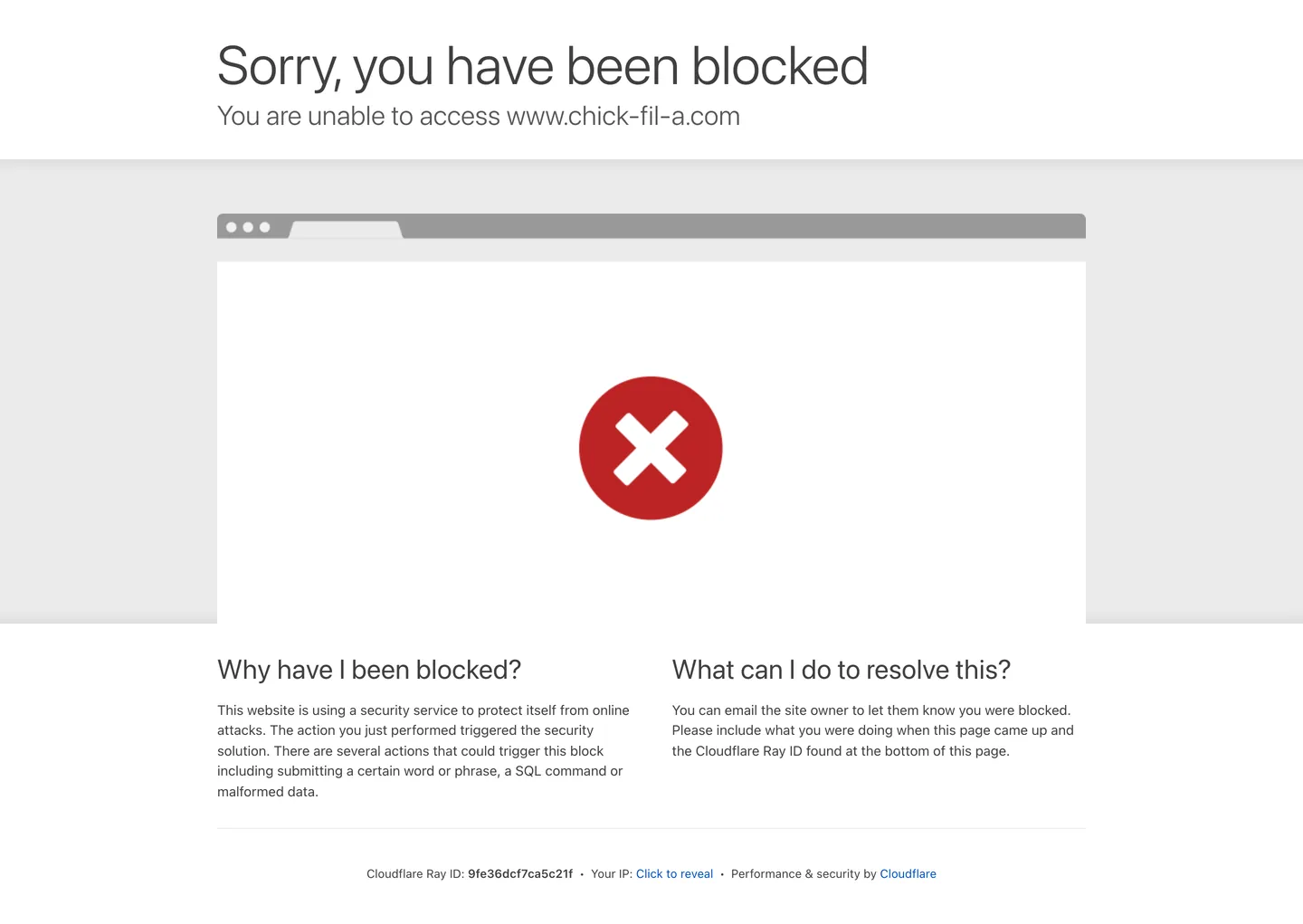
Chick-fil-A's design system approximation as a DESIGN.md file. Extraction hit a Cloudflare block page; structural tokens from the block capture plus brand-knowledge framing. For React, Next.js, and AI tools.
Add shadcn.io to your AI agent. · Pro It installs blocks, icons and templates in your design system from a prompt, with Pro.
Set up MCP- Primary
- #0051c3
- Typeface
- -apple-system
- Shape
- Sharp
- Base radius
- 5px
- Colors
- 7
- Type tokens
- 8
- Components
- 12
- Spacing values
- 6
About
About Chick-fil-A DESIGN.md
Curated by Dov Azencot · Updated May 19, 2026 · Source chick-fil-a.com (opens in a new tab)
Chick-fil-A's marketing site returned a Cloudflare security block at the time of extraction. The screenshot and extraction data document Cloudflare's default block page — not the brand's actual homepage — which means the color tokens, typography measurements, and component data in this file reflect the block page's generic system-UI chrome rather than Chick-fil-A's own design decisions. The dominant surface is a light gray gradient (#ebebeb transitioning to #dedede), the text is charcoal #404040, and the only chromatic element is Cloudflare's steel-blue link #0051c3. None of these belong to Chick-fil-A's identity.
What is known from the brand record: Chick-fil-A operates with a bold crimson red as its primary voltage — the C-as-chicken-head logo renders in red on white packaging, signage, and digital touchpoints. The chain positions aggressively on hospitality (training every operator to say "My Pleasure" in response to customer thanks) and this hospitality voice carries into digital copy in a way that no other major US QSR brand has replicated. The real marketing site was known to run a photography-led hero format with food-forward images, a top-navigation structured around menu, rewards, and delivery ordering, and a red fill on primary CTA buttons.
This file is an honest gap document. The structural tokens from the block-page capture are included because they are real measured values; the brand-knowledge framing describes what the live site is known to implement. A practitioner building a Chick-fil-A-flavored interface should treat the red voltage and typography as directional guidance pending a live extraction, and should use the system-UI stack as a development fallback only.
What makes it distinct
5
- Cloudflare-blocked extractionthe live site returned a security block at extraction time; color and typography tokens reflect the block-page capture only
- Charcoal-not-black inkthe dominant text tone is #404040, a warm near-black that appears on 25 text and 24 border instances in the captured surface
- System-UI typographythe block page runs Apple system font stack at weights 300–600; the brand's actual custom family (Apertura) was not captured
- Hospitality positioningChick-fil-A is the only major US QSR brand whose operators are trained to respond 'My Pleasure' to thank-yous, a service-design signal that appears in its digital copy voice
- Steel-blue link accentCloudflare's default #0051c3 provides the only chromatic signal in the block page; not a Chick-fil-A brand color
chick-fil-a.com
Live at chick-fil-a.com
A snapshot of the brand in production. Scroll the frame to see the whole page.
Colors
7 colors
Chick-fil-A's system runs on #0051c3 as its primary voltage, used in 1 of 12 components. Type is set in -apple-system across 8 tokens from 13px to 60px, weights 300–600. Shape language is sharp — components average 3px corner radius, favoring crisp rectangles.
Surface
Page and card backgrounds · 2
Text
Headlines, body, captions · 4
Borders & Hairlines
Dividers, outlines, rules · 1
Typography
8 type tokens
Set in -apple-system across 8 tokens, from 13px to 60px, weights 300–600. Shown in its own stack: where the font isn't installed, the fallback the file names stands in.
- display-xl60px · weight 300 · lh 72pxThe quick brown fox jumps over the lazy dog
- display-md30px · weight 300 · lh 39pxThe quick brown fox jumps over the lazy dog
- heading-md30px · weight 400 · lh 39pxThe quick brown fox jumps over the lazy dog
- body-md15px · weight 400 · lh 22.5pxThe quick brown fox jumps over the lazy dog
- body-sm13px · weight 400 · lh 19.5pxThe quick brown fox jumps over the lazy dog
- label-strong13px · weight 600 · lh 19.5pxThe quick brown fox jumps over the lazy dog
- button-md13px · weight 400 · lh 19.5pxThe quick brown fox jumps over the lazy dog
- nav-link13px · weight 400 · lh 19.5pxThe quick brown fox jumps over the lazy dog
Layout
Radii and spacing
3 corner radii and 6 spacing values. Shape language: sharp.
Radii
- none0px
- sm5px
- full9999px
Spacing
- xs5px
- sm22px
- md30px
- lg40px
- xl53px
- 2xl60px
Components
12 components
Each rendered from its tokens (color, type, radius, padding) on Chick-fil-A's own canvas.
- Button Primarybutton-primaryButton Primary
- Button Secondarybutton-secondaryButton Secondary
- Top Navtop-navTop Nav
- Nav Linknav-linkNav Link
- Hero Headinghero-headingHero Heading
- Hero Subheadinghero-subheadingHero Subheading
- Body Paragraphbody-paragraphBody Paragraph
- Body Paragraph Mutedbody-paragraph-mutedBody Paragraph Muted
- CardcardCard
- Surface Panelsurface-panelSurface Panel
- Type here…text-inputText Input
- FooterfooterFooter
In use
The system, in use
Chick-fil-A's tokens on the kind of product it builds.
Build something people actually use.
A short paragraph of marketing copy that previews how the brand's display tier and body tier read together. Two sentences is usually enough.
FAQ
Chick-fil-A design system FAQ
Common questions about Chick-fil-A's tokens, components, and how to use this DESIGN.md in your project.
Read next
Related reading
Specs, directories, and component libraries that pair with this design system.
- Browse all design systemsThe full directory of DESIGN.md files on shadcn.io, with live mockups for each.shadcn.io
- Chick-fil-A — official siteChick-fil-A's public marketing site — the intended source of truth for live tokens; blocked at time of capture.chick-fil-a.com (opens in a new tab)
- The DESIGN.md specificationGoogle Labs' open spec for machine-readable design system files — the format this page is built on.github.com (opens in a new tab)
Use it
Use Chick-fil-A in your project
One machine-readable file. Drop it into Claude, Cursor, or any AI tool that reads DESIGN.md.
Download the DESIGN.md
One machine-readable file: every color, type, radius, spacing, and component token of Chick-fil-A.
Feed it to your AI tool
Drop it into Claude, Cursor, or GitHub Copilot. The agent writes React components and Tailwind classes that match Chick-fil-A's visual language.
Reference the tokens directly
Or paste the values into your Tailwind config, CSS variables, or component library: every color, size and radius is a quoted, ready-to-copy value.
Read the full DESIGN.md: overview, rationale, do’s and don’ts
Overview
This file documents an extraction that returned a Cloudflare security block page rather than the Chick-fil-A marketing site itself. Extraction-as-gap-document. The tokens below reflect what was measurably present in the captured page — Cloudflare's generic block-page chrome — alongside brand-knowledge framing for the real site's identity. Every hex value in the colors section was present in the extraction; none was invented. Where McDonald's, Five Guys, and Shake Shack can be compared by their respective brand voltages and typographic choices, this file functions as a placeholder until a live extraction can succeed.
The real Chick-fil-A identity, as documented across the brand's physical presence, app store assets, and public press materials, is built on a bold crimson red and white. The C-as-chicken-head mark renders in red on white; primary CTAs on the live website use a red fill; and the brand's famous hospitality positioning ("My Pleasure" as a trained response to customer thanks) appears in digital copy as a warmth register that no other major US QSR brand has replicated. Where Five Guys uses aggressive weight-900 uppercase typography to signal Americana boldness and Shake Shack uses food photography to signal upmarket provenance, Chick-fil-A uses warmth of copy and service language to signal trust.
The captured surface shows Cloudflare's system-UI stack at weight 300 for the 60px error heading and weight 400 for body copy — a light-weight editorial treatment that is coincidentally not far from the brand's own Apertura-based display style, which also runs at lighter weights relative to QSR peers.
Key Characteristics:
- Extraction hit a Cloudflare security block — all tokens are from the block page, not the live brand surface.
- Charcoal ink (
{colors.ink}— #404040) as the dominant text color in the captured page; warm near-black rather than pure black. - No brand-layer color captured in the extraction (all seven sampled colors are structural neutrals or a Cloudflare blue link).
- System-UI fallback typography at weights 300 (display) and 400 (body) — lightweight relative to Five Guys' weight-900 stack.
- Single small-step radius (
{rounded.sm}— 5px) on the only captured component; no pill-rounding or large-step tier. - Known brand identity: bold crimson red voltage, white canvas, Apertura typeface, hospitality copy register.
- Light gray gradient surface (
{colors.surface-1}— #ebebeb) used as the block-page body background.
Colors
Text
- Ink (
{colors.ink}— #404040): frequency 25 as text, 24 as border. The dominant charcoal — Cloudflare's default block-page text color. A warm near-black that is slightly lighter and less chromatic than a pure charcoal; the warmth is incidental to Cloudflare's system defaults rather than a Chick-fil-A brand decision. - Ink Muted (
{colors.ink-muted}— #595959): frequency 2 as text, 2 as border. Secondary text on the block page — slightly lighter than the primary charcoal. - Ink Dark (
{colors.ink-dark}— #000000): frequency 2 as text, 2 as border. Pure black, appearing as a small accent tone on the block page.
Surface
- Canvas (
{colors.canvas}— #ffffff): frequency 2 as background. The pure white surface used within the block-page card. Cloudflare's block page sits inside a white card on the gray gradient body. - Surface-1 (
{colors.surface-1}— #ebebeb): 1 as background, 2 as gradient. The light gray body background of the Cloudflare block page — a gradient from #ebebeb to #dedede.
Hairline
- Hairline (
{colors.hairline}— #dedede): 2 as gradient. The lighter end of the block-page gradient; functions as the divider tone on the captured surface.
Link / Accent
- Link (
{colors.link}— #0051c3): frequency 2 as text, 2 as border. Cloudflare's default link blue — appears on the "Cloudflare" attribution link at the bottom of the block page. Not a Chick-fil-A brand color.
Typography
Font Family
The captured surface runs the system-UI stack — -apple-system, "system-ui", "Segoe UI", Roboto, Oxygen, Ubuntu, "Helvetica Neue", Arial, sans-serif — at weights 300, 400, and 600. This is Cloudflare's default block-page typeface, not Chick-fil-A's. The brand's actual typeface is Apertura, a geometric humanist sans used for display and body on the live website. For development purposes, the system-UI stack serves as a valid fallback; for brand accuracy, substitute Apertura or an open-source geometric sans (Nunito, Lato) at the same weight scale.
Hierarchy
| Token | Size | Weight | Line Height | Use |
|---|---|---|---|---|
{typography.display-xl} | 60px | 300 | 72px | Block-page h1 ("Sorry, you have been blocked") |
{typography.display-md} | 30px | 300 | 39px | Block-page h2 ("You are unable to access…") |
{typography.heading-md} | 30px | 400 | 39px | Secondary h2 on block page |
{typography.body-md} | 15px | 400 | 22.5px | Body paragraph on block page |
{typography.body-sm} | 13px | 400 | 19.5px | Small body, nav links, button labels |
{typography.label-strong} | 13px | 600 | 19.5px | Bold label / strong inline text |
{typography.button-md} | 13px | 400 | 19.5px | Button and action label approximation |
{typography.nav-link} | 13px | 400 | 19.5px | Navigation link labels |
Principles
The captured display weight is 300 — a light treatment that reads editorial rather than bold. For the real Chick-fil-A site, display headings are expected to run at heavier weights (Apertura Regular to Medium) with a warmer letter-spacing setting. Weight 400 covers all body copy on the block page with no intermediate 500 or 700 emphasis tier visible — a strict two-weight split (300 display / 400 body) on the captured surface.
Note on Font Substitutes
System-UI is available everywhere by default. For Chick-fil-A's actual brand family (Apertura), Nunito or Lato at weights 300–600 track the geometric humanist feel closely. For a closer cap-height match at display sizes, DM Sans at Light (300) and Regular (400) renders similarly.
Layout
Spacing System
- Tokens:
{spacing.xs}5px ·{spacing.sm}22px ·{spacing.md}30px ·{spacing.lg}40px ·{spacing.xl}53px ·{spacing.2xl}60px. - Block-page card padding: 30px vertical and horizontal.
- Top spacing: 53px offset from the page top (the top-anchor of the block-page card).
- Negative offset: a –60px margin appears in the block-page layout to overlap a graphic element; this is a Cloudflare layout detail, not a brand pattern.
Grid & Container
- Block page: single centered card at roughly 1100px max-width, containing the error heading, sub-heading, two-column explainer body, and a footer attribution strip.
- No marketing grid structure is visible from the extraction.
Elevation
The Cloudflare block page uses no elevation tier — the white card sits on the gradient background with no box-shadow. The only depth signal is surface-color contrast between the #ffffff card and the #ebebeb gradient body.
Shapes
The only captured radius is {rounded.sm} 5px, appearing once on a button element. There is no pill-rounding or card-level radius. For a Chick-fil-A brand approximation, pill-rounding on CTA buttons is expected from brand materials; the 5px value here belongs to the block-page's generic button styling.
Components
button-primary — For the Cloudflare block-page context: charcoal fill, white text, 5px radius, 5x30px padding. For the real Chick-fil-A site, the equivalent should carry a crimson red fill — this is approximated to the extraction-available ink color until a live capture is possible.
button-secondary — White fill, charcoal text, 5px radius, hairline border. Approximated from block-page context.
top-nav — White canvas, charcoal text, 48px height, system-UI nav links. Approximated from block-page.
nav-link — Steel-blue link text ({colors.link}), 13px / 400, 3px horizontal padding. The Cloudflare attribution link at the bottom of the block page provides the only nav-link sample.
hero-heading — Charcoal ink text, 60px / weight 300, {typography.display-xl}. The block-page h1.
hero-subheading — Muted charcoal {colors.ink-muted} text, 30px / weight 300. The block-page h2.
body-paragraph — Default charcoal text, 15px / 400. Running body copy.
body-paragraph-muted — Muted charcoal, 13px / 400. Secondary body paragraphs.
card — White canvas, charcoal text, 5px radius, 30px padding, hairline border. The block-page card container.
surface-panel — Light gray {colors.surface-1} fill, charcoal text, no radius, 40x22px padding. The body gradient background panel on the block page.
text-input — White canvas, charcoal text, 5px radius, 5x22px padding, charcoal border. Generic form field approximation.
footer — Light gray {colors.surface-1} surface, charcoal text, 13px / 400, 30x22px padding. The block-page footer attribution strip.
Do's and Don'ts
Do replace every token in this file with live-measured values once a successful extraction of www.chick-fil-a.com is possible. The tokens here are Cloudflare's defaults, not Chick-fil-A's; any implementation derived from this file should be treated as a placeholder rather than a ground-truth spec.
Do preserve the 5px corner radius as an approximation for form inputs and cards if building from this spec, knowing it reflects the block page rather than the live site. For CTAs, a pill radius (rounded-full) is more consistent with the brand's visual materials.
Do reference the brand's hospitality copy register when writing button labels and call-to-action text — "Add to My Order" rather than "Add to Cart", "Find a Restaurant" rather than "Find a Store". The copy voice carries as much of the identity as the visual tokens.
Do treat {colors.link} (#0051c3) as a Cloudflare default, not a Chick-fil-A brand color. Remove it from any brand-facing implementation.
Don't use the system-UI stack in any brand-facing implementation without attempting to load Apertura first. The system stack is a fallback; it does not carry the geometric humanist warmth of the brand's actual typeface.
Don't use the charcoal {colors.ink} (#404040) as a heading color in a brand-accurate implementation without first confirming it against the live site. The real site is expected to use a near-black (pure black or a very dark tone) for headings, with the charcoal reserved for body copy.
Don't treat weight 300 as the brand's display weight based on the extraction. The block page uses Cloudflare's light-weight editorial setting; the brand's actual display weight on its homepage is expected to be Regular (400) or Medium (500) in Apertura.
Don't use this file as a guide for the app-based ordering flow or the Chick-fil-A One rewards experience, which carry their own component libraries and are completely absent from this capture.
Known Gaps
- Live site not captured: www.chick-fil-a.com returned a Cloudflare security challenge at extraction time; all tokens in this file describe the Cloudflare block page, not the brand's own design system.
- Brand voltage absent: Chick-fil-A's signature crimson red does not appear in the extraction; it cannot be included in the colors section per the spec's hard rule against invented hex values.
- Apertura typeface not captured: the brand's custom geometric sans is absent from the extraction; the system-UI stack in the typography section is Cloudflare's default, not Chick-fil-A's.
- No component data from live site: primaryButton, navLink, and input were all null in the extraction; all component definitions in this file are approximations from block-page context.
- Ordering flow entirely absent: the core of Chick-fil-A's digital product — the menu ordering interface, the Chick-fil-A One rewards program, the catering request form — is not captured here.
- Photography system not documented: the live site is known to run a photography-led hero with warm food art direction; no image usage, aspect ratio, or photographic style guidance is extractable from the block page.
- App surfaces: the Chick-fil-A mobile app carries the primary user engagement surface; the app's component library, loyalty-state UI, and gamified rewards display are outside the scope of this web extraction.
Food & Delivery
More systems like this
More DESIGN.md files in Food & Delivery.
Pricing
Build it with Pro
The DESIGN.md files are free. Pro adds 6,000+ blocks, premium templates and the MCP server, so your AI editor builds in your system for you.
4.9/5 out of 5 · 150+ reviewsfrom 150+ founders and developers.
Billing
Billed once a year in USD. Cancel anytime.
- How many people can use the license.
- Client work, SaaS products and anything you charge for.
- Production-ready React sections: hero, pricing, features, dashboards and more.
- Complete multi-page sites you can ship as they are.
- React icons from every major library, installable with one command.
- Presets that restyle every block, in light and dark.
- Lets your AI editor search, preview and install blocks for you.
- Priority requests are answered first.
Individual
For personal projects & open source
$32instead of $49/mo
$389 billed yearly
- Seats: 1 seat
- Commercial use: Personal & open source only
- Pro blocks: 6,000+ blocks
- Templates: All 14 templates
- React icons: 294k+ icons
- Themes: All 59 themes
- MCP server: Basic usage
- Support: Standard
Team
Most popularFor freelancers, agencies & startups
$66instead of $99/mo
$789 billed yearly · ≈ $13/dev/mo
- Seats: Up to 5 seats
- Commercial use: Included
- Pro blocks: 6,000+ blocks
- Templates: All 14 templates
- React icons: 294k+ icons
- Themes: All 59 themes
- MCP server: High usage
- Support: Priority
Organization
For companies with larger teams
$132instead of $199/mo
$1,589 billed yearly
- Seats: Unlimited seats
- Commercial use: Included
- Pro blocks: 6,000+ blocks
- Templates: All 14 templates
- React icons: 294k+ icons
- Themes: All 59 themes
- MCP server: Unlimited usage
- Support: Priority
Billed once a year in USD. Cancel anytime.
Individual
For personal projects & open source
$32instead of $49/mo
$389 billed yearly
- How many people can use the license.Seats: 1 seat
- Client work, SaaS products and anything you charge for.Commercial use: Personal & open source only
- Production-ready React sections: hero, pricing, features, dashboards and more.Pro blocks: 6,000+ blocks
- Complete multi-page sites you can ship as they are.Templates: All 14 templates
- React icons from every major library, installable with one command.React icons: 294k+ icons
- Presets that restyle every block, in light and dark.Themes: All 59 themes
- Lets your AI editor search, preview and install blocks for you.MCP server: Basic usage
- Priority requests are answered first.Support: Standard
Team
Most popularFor freelancers, agencies & startups
$66instead of $99/mo
$789 billed yearly · ≈ $13/dev/mo
Everything in Individual, plus
- How many people can use the license.Seats: Up to 5 seats
- Client work, SaaS products and anything you charge for.Commercial use: Included
- Lets your AI editor search, preview and install blocks for you.MCP server: High usage
- Priority requests are answered first.Support: Priority
Organization
For companies with larger teams
$132instead of $199/mo
$1,589 billed yearly
Everything in Team, plus
- How many people can use the license.Seats: Unlimited seats
- Lets your AI editor search, preview and install blocks for you.MCP server: Unlimited usage
- Secure checkout via Stripe
- Code lives in your repo
- Keep what you've shipped if you cancel
- License terms
Your system, built for you
Every block, template and icon, installed by your AI agent in your design system. The DESIGN.md files stay free.