Kroger Design System
Kroger's grocery e-commerce design system as a DESIGN.md file. Corporate blue #1860ae for links and interactive elements, Nunito display headings, 16px card radius, 17 colors tokens, 18 components. For React, Next.js, and AI tools.
Add shadcn.io to your AI agent. · Pro It installs blocks, icons and templates in your design system from a prompt, with Pro.
Set up MCP- Primary
- #1860ae
- Typeface
- -apple-system
- Shape
- Mixed
- Base radius
- 12px
- Colors
- 17
- Type tokens
- 12
- Components
- 18
- Spacing values
- 7
About
About Kroger DESIGN.md
Curated by Dov Azencot · Updated May 19, 2026 · Source kroger.com (opens in a new tab)
Kroger's digital storefront runs what is effectively a dual-register type system — Nunito for every surface that signals editorial authority (headings, category titles, button labels) and the OS system-ui stack for everything that moves the user through the catalog (nav links, body copy, price metadata). The split is not a contrast of mood but of function: Nunito's rounded geometric forms identify "we are speaking" moments, while system-ui's neutral clarity identifies "you are navigating" moments. Where Target uses a single custom sans-serif throughout and Walmart uses Walmart Sans end-to-end, Kroger outsources the informational layer to whatever the user's OS provides and keeps only the brand-voice layer proprietary.
The DESIGN.md file packages the system into a machine-readable spec for React and AI tools. Inside: 17 colors tokens drawn from the 75-entry clustered extraction — the Kroger corporate blue at three depth levels, a semantic set covering danger/positive/warning/special/boost, structural neutrals from near-black through light hairline, and a sub-brand identifier for Kroger's pharmacy arm; 14 typography tokens across Nunito and system-ui from 32px hero headings through 10.5px superscripts; 7 radius tokens anchored at 4px for action surfaces and 16px for product cards; 7 spacing values on a 4px base; and 18 components definitions covering the blue-fill category tab, the product card, the add-to-cart button, and the carousel paddle system.
Feed this file to Claude or Cursor and it will reproduce Kroger's specific moves: corporate-blue link color reserved for interactive affordances but never used as a background canvas fill, Nunito at 700 for headings with system-ui for body, 4px buttons alongside 16px product cards, and the light-gray (#707172) as the subdued mid-tone that carries inactive state chips and secondary catalog labels. The most instructive structural choice is the clean separation of the brand blue into text-and-border territory — it signals interactivity without competing with the product photography that fills the card grid.
What makes it distinct
5
- Two-family typeface splitNunito for every heading and button, system-ui for all nav and body copy; the contrast between the two families separates catalog structure from editorial hierarchy
- Corporate blue as link voltage#1860ae appears 234 times as text and border but never as a background fill in the captured surface; interactive affordance without canvas invasion
- 16px card radius at grocery scalethe 16px product card rounding (79 occurrences) is notably warmer than Target's 4px or Walmart's 8px, tuning the catalog toward approachability
- 75 clustered CSS color tokensthe most token-dense grocery brand in the directory, with dedicated semantic families for danger, positive, warning, special, boost, and 20+ regional sub-brand identifiers
- 4px base radius for action surfacesbuttons, checkboxes, and form inputs sit at 4px, while cards jump to 16px; the gap between action-surface sharpness and card warmth is a deliberate two-tier choice
kroger.com
Live at kroger.com
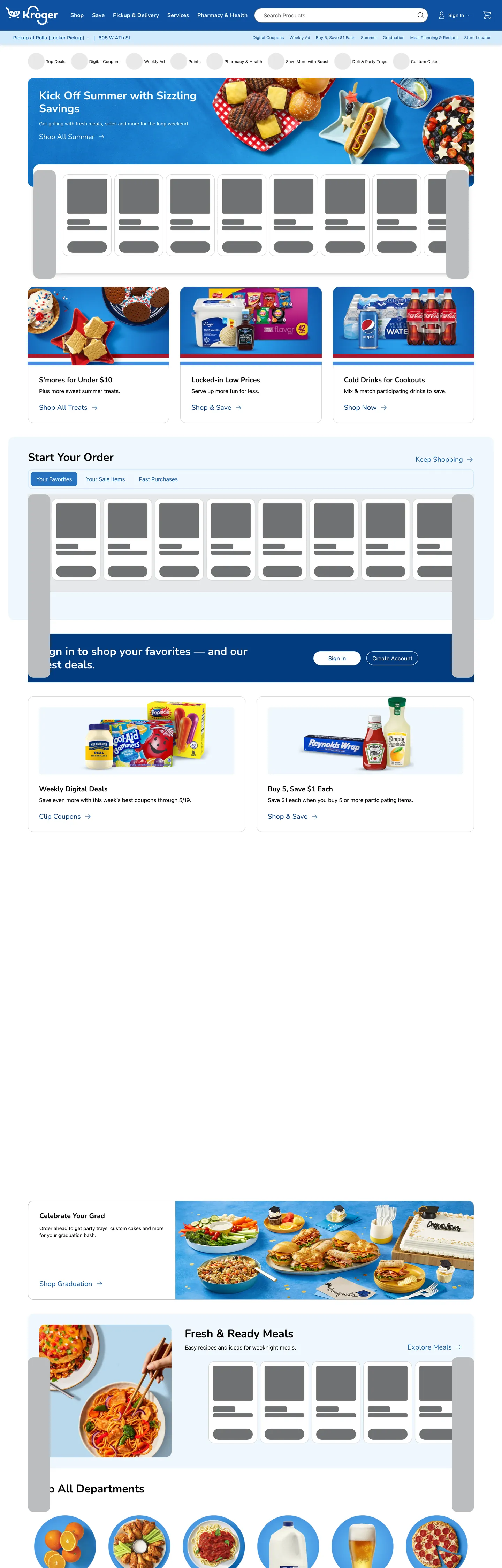
A snapshot of the brand in production. Scroll the frame to see the whole page.
Colors
17 colors
Kroger's system runs on #1860ae as its primary voltage, used in 2 of 18 components. Type is set in -apple-system across 12 tokens from 12px to 32px, weights 400–700. Shape language is mixed across 18 components, blending pills, soft rounds, and squarer corners.
Brand & Accent
Sparing, CTA-only voltage · 4
Surface
Page and card backgrounds · 3
Text
Headlines, body, captions · 3
Borders & Hairlines
Dividers, outlines, rules · 2
Semantic
Status, errors, success, links · 2
Other
Specialty colors · 3
Typography
12 type tokens
Set in -apple-system across 12 tokens, from 12px to 32px, weights 400–700. Shown in its own stack: where the font isn't installed, the fallback the file names stands in.
- display-xl32px · weight 700 · lh 37pxThe quick brown fox jumps over the lazy dog
- heading-md20px · weight 700 · lh 22pxThe quick brown fox jumps over the lazy dog
- heading-sm20px · weight 500 · lh 24pxThe quick brown fox jumps over the lazy dog
- heading-xs20px · weight 400 · lh 24pxThe quick brown fox jumps over the lazy dog
- button-md16px · weight 700 · lh 18pxThe quick brown fox jumps over the lazy dog
- body-lg16px · weight 400 · lh 23pxThe quick brown fox jumps over the lazy dog
- body-md14px · weight 400 · lh 20pxThe quick brown fox jumps over the lazy dog
- body-sm12px · weight 400 · lh 16pxThe quick brown fox jumps over the lazy dog
- label-md14px · weight 500 · lh 20pxThe quick brown fox jumps over the lazy dog
- caption12px · weight 400 · lh 13pxThe quick brown fox jumps over the lazy dog
- nav-link12px · weight 400 · lh 17pxThe quick brown fox jumps over the lazy dog
- price-lg16px · weight 500 · lh 24pxThe quick brown fox jumps over the lazy dog
Layout
Radii and spacing
7 corner radii and 7 spacing values. Shape language: mixed.
Radii
- none0px
- xs4px
- sm8px
- md12px
- lg16px
- xl32px
- full9999px
Spacing
- xxs2px
- xs4px
- sm8px
- md14px
- base16px
- lg32px
- xl48px
Components
18 components
Each rendered from its tokens (color, type, radius, padding) on Kroger's own canvas.
- Button Primarybutton-primaryButton Primary
- Button Primary Hoverbutton-primary-hoverButton Primary Hover
- Button Secondarybutton-secondaryButton Secondary
- Top Navtop-navTop Nav
- Nav Linknav-linkNav Link
- Hero Headinghero-headingHero Heading
- Section Headingsection-headingSection Heading
- Body Paragraphbody-paragraphBody Paragraph
- CardcardCard
- Category Tabcategory-tabCategory Tab
- Category Tab Activecategory-tab-activeCategory Tab Active
- Promo Bannerpromo-bannerPromo Banner
- Carousel Paddlecarousel-paddleCarousel Paddle
- Carousel Paddle Hovercarousel-paddle-hoverCarousel Paddle Hover
- Type here…text-inputText Input
- Price Tagprice-tagPrice Tag
- FooterfooterFooter
- Product Labelproduct-labelProduct Label
In use
The system, in use
Kroger's tokens on the kind of product it builds.
Build something people actually use.
A short paragraph of marketing copy that previews how the brand's display tier and body tier read together. Two sentences is usually enough.
FAQ
Kroger design system FAQ
Common questions about Kroger's tokens, components, and how to use this DESIGN.md in your project.
Read next
Related reading
Specs, directories, and component libraries that pair with this design system.
- Browse all design systemsThe full directory of DESIGN.md files on shadcn.io, with live mockups for each.shadcn.io
- Kroger — official siteKroger's public grocery storefront — the source of truth for the live tokens captured in this file.kroger.com (opens in a new tab)
- The DESIGN.md specificationGoogle Labs' open spec for machine-readable design system files — the format this page is built on.github.com (opens in a new tab)
Use it
Use Kroger in your project
One machine-readable file. Drop it into Claude, Cursor, or any AI tool that reads DESIGN.md.
Download the DESIGN.md
One machine-readable file: every color, type, radius, spacing, and component token of Kroger.
Feed it to your AI tool
Drop it into Claude, Cursor, or GitHub Copilot. The agent writes React components and Tailwind classes that match Kroger's visual language.
Reference the tokens directly
Or paste the values into your Tailwind config, CSS variables, or component library: every color, size and radius is a quoted, ready-to-copy value.
Read the full DESIGN.md: overview, rationale, do’s and don’ts
Overview
Kroger's digital storefront uses what is, among US grocery e-commerce brands, a genuinely unusual typographic strategy. Dual-voice navigation. Nunito — a rounded geometric humanist sans with softly inflated counters — handles every surface that speaks: headings, section titles, button labels, and carousel calls-to-action. The system-ui fallback stack handles every surface that navigates: product names, price metadata, nav-link labels, and filter chips. The contrast between Nunito's bouncy geometry and the neutral system stack creates a clear functional partition without a single extra CSS rule. Where Target uses a single custom sans-serif and Walmart uses Walmart Sans end-to-end, Kroger outsources the informational layer to whatever the user's operating system provides and retains the brand voice only for editorial hierarchy.
The corporate blue (#1860ae) is the system's lone chromatic voltage — but it appears only as text and border, never as a background fill in the marketing surface. Interactive affordances (link text, border rings on active elements, carousel paddles in the light-blue surface tint) use the blue to signal "tappable" without painting any canvas with it. The hero band behind "Kick Off Summer with Sizzling Savings" is a product image fill, not a blue CSS surface. This text-and-border-only discipline is the opposite of Cloudflare (which fills the entire hero canvas with brand orange) and closer to how Amazon or Target handle their brand color — as a link signal, not a structural element.
The shape language is two-tiered warmth: 4px on action surfaces (buttons, form inputs, checkboxes), 16px on content surfaces (product cards, section panels). The 12-point gap makes the two registers visually unambiguous — browsable content feels warm and approachable while tappable affordances stay sharp.
Key Characteristics:
- Corporate blue (#1860ae) appears 234 times — 117 as text, 117 as border — but never as a background fill in the marketing surface.
- Nunito weight 700 at 20–32px for all headings; system-ui weight 400 at 12–16px for body, nav, and metadata — a two-family divide that correlates exactly with editorial vs. informational function.
- 4px radius for action surfaces (buttons, inputs), 16px for product cards — the widest action-to-content radius gap among the major US grocery brands.
- Near-black (#000000) carries 1,398 total occurrences — the dominant text color for headings and body across the page.
- Mid-gray (#707172) handles all neutral-tertiary chip fills, inactive tab backgrounds, and secondary catalog labels.
- 75 clustered CSS color tokens, including 20+ regional sub-brand identifiers (--harrisTeeterBrand, --fredMeyerBrand, --dillonsBrand, etc.) — the most token-dense grocery system in the directory.
- 4px base spacing (63 occurrences), 8px second step (31 occurrences) — the tightest spacing base among the US grocery platforms, tuned for dense product grids.
Colors
Brand
- Primary (
{colors.primary}— #1860ae): frequency 234. Used as text (117), border (117). The Kroger corporate blue — wired as --color-text-action-brand-default, --color-border-action-accent-default, and --blue-text-default. Never renders as a background fill in the captured surface; every occurrence is a link, an interactive border ring, or a focus indicator. - Primary Dark (
{colors.primary-dark}— #0e51a1): frequency 48. Used as text (21), background (8), border (19). The slightly deeper blue that carries hover and pressed states for interactive elements, and fills the primary-button and active-category-tab background. Wired as --krogerBrand and --blue-background-press. - Primary Deeper (
{colors.primary-deeper}— #023b7f): frequency 4. The deepest blue tier — wired as --color-text-brand-primary and --blue-text-primary. Used for primary icon fills and high-emphasis heading accents. - Primary Light (
{colors.primary-light}— #2478ce): frequency 2 (background only). The hover state for carousel paddles and secondary surfaces. Wired as --color-background-brand-secondary and --blue-background-default.
Surface
- Canvas (
{colors.canvas}— #ffffff): frequency 77. Used as background (36), text (20), border (21). The page floor — all product-grid sections, the top-nav, and card interiors. Also the text color for all reversed white-on-blue headline moments. - Surface-1 (
{colors.surface-1}— #e7e8e9): frequency 3. Used as background. A light cool gray that appears as the inverse-background-tertiary — the background behind inverse (dark-canvas) UI zones. - Surface Blue (
{colors.surface-blue}— #eff7fd): frequency 3. A very light sky-blue used as the resting fill for carousel paddles. Wired as --color-background-brand-tertiary, --blue-background-tertiary. The single chromatic surface fill in the catalog.
Text
- Ink (
{colors.ink}— #000000): frequency 1398. Used as text (714), border (683), shadow (1). The dominant text color — primary headings, body copy, product labels, price display. Also drives 683 of all border occurrences as the hairline/rule color in the near-black ink tone. Wired as --color-text-primary and --color-border-primary. - Ink Secondary (
{colors.ink-secondary}— #3c3d3e): frequency 0 rendered, but wired as --gray-text-primary and --color-text-neutral-primary — the default neutral-text tone for secondary labels in the system at rest. - Ink Muted (
{colors.ink-muted}— #707172): frequency 108. Used as background (108) — in the neutral secondary and tertiary chip fill contexts (--gray-background-default, --color-background-neutral-secondary). Not a text color in the captured marketing surface but carries inactive state tabs.
Hairlines
- Hairline (
{colors.hairline}— #bcbdbe): frequency 6. Used as background. The tertiary border tone — wired as --color-border-tertiary, --gray-border-tertiary. Lighter than ink for card outlines and section dividers. - Hairline Light (
{colors.hairline-light}— #d3d4d5): frequency 27. Used as border (27). The inverse border — used for borders on dark/inverse surfaces (--color-border-inverse-tertiary). Also wires into carousel paddle and component tab outer-border.
Semantic
- Surface Blue (
{colors.surface-blue}— #eff7fd): see above. - Success (
{colors.success}— #306c36): declared as --color-icon-action-positive-default. Positive/success action color for confirmations and availability indicators. - Danger (
{colors.danger}— #a9011f): declared as --color-background-danger-primary. Error and out-of-stock indicator. - Warning (
{colors.warning}— #aa3c00): declared as --yellow-icon-default. Warning state for expiring offers and near-sold-out signals. - Special (
{colors.special}— #79508b): declared as --purple-border-default. Kroger's "special" product-category accent for Boost savings and subscription-tier badging.
Shadow
- Shadow (
{colors.shadow}— #1d1e1f): frequency 3 as shadow. The multi-level shadow ink — wired as --shadow-level-1-color and --shadow-level-2-color. Used in the elevation shadow declarations (--shadow-6, --shadow-16, --shadow-24).
Typography
Font Families
The system runs two families: Nunito for editorial authority surfaces and the system-ui fallback stack (resolving to Roboto on Chrome/Android) for informational surfaces. Nunito is declared as --type-headline-font-family; the system stack is declared as --type-baseline-text-font-family. The divide correlates exactly with function: Nunito identifies brand-voice moments (headings, CTAs, section titles), system-ui identifies navigation moments (product names, price rows, filter chips, body copy).
Hierarchy
| Token | Family | Size | Weight | Line Height | Use |
|---|---|---|---|---|---|
{typography.display-xl} | Nunito | 32px | 700 | 37px | Hero h2 ("Kick Off Summer…"), section h2 |
{typography.heading-md} | Nunito | 20px | 700 | 22px | Section sub-headers, category titles |
{typography.heading-sm} | Nunito | 20px | 500 | 24px | Nav link labels in Nunito style |
{typography.heading-xs} | Nunito | 20px | 400 | 24px | h3-level product-category section |
{typography.button-md} | Nunito | 16px | 700 | 18px | Primary button, category-tab labels |
{typography.body-lg} | system-ui | 16px | 400 | 23px | Body running text, nav link labels |
{typography.body-md} | system-ui | 14px | 400 | 20px | Body paragraphs, promo descriptions |
{typography.body-sm} | system-ui | 12px | 400 | 16px | Product card captions, label rows |
{typography.label-md} | system-ui | 14px | 500 | 20px | Price unit labels, badge text |
{typography.caption} | system-ui | 12px | 400 | 13px | Legal text, asterisk footnotes |
{typography.nav-link} | system-ui | 12px | 400 | 17px | Top-nav link labels, breadcrumb |
{typography.price-lg} | system-ui | 16px | 500 | 24px | Price display, savings callouts |
Principles
Nunito's display range tops at 32px / 700 — the hero h2 tier. Below that, Nunito covers headings at 20px in three weight steps (700, 500, 400) that map to decreasing emphasis. There is no 24px or 28px Nunito tier — the scale jumps from 20px straight to 32px. Body copy strictly uses the system-ui stack; no Nunito body text appears in the captured surface. This functional split eliminates the need for font-weight gymnastics within a single family.
Note on Font Substitutes
Nunito is open-source (Google Fonts) — no licensing steps required. The closest alternatives with similar rounded geometry are DM Sans and Poppins. For the system-ui layer, Roboto is already embedded in the fallback stack on most Android and Chrome environments. On Apple platforms the stack resolves to San Francisco, which is visually distinct — if typographic consistency across platforms matters, replace the system-ui layer with Inter.
Layout
Spacing System
- Base unit: 4px — the single most-captured value with 63 occurrences. Dominant in inter-element gaps and grid gutters.
- Tokens:
{spacing.xxs}2px ·{spacing.xs}4px ·{spacing.sm}8px ·{spacing.md}14px ·{spacing.base}16px ·{spacing.lg}32px ·{spacing.xl}48px. - Button padding: 8px all-around at the default small-button tier (category tab, nav link chip).
- Product card internal padding: 16px — the base spacing value, aligned with the
{spacing.base}token. - Section vertical rhythm: ~32px between major catalog sections; ~14px between product rows within a grid.
Grid & Container
- Max content width: ~1440px at desktop. Product grids run at 5–6 columns for the weekly specials carousel and 3–4 columns for product category grids.
- Hero banner: full-bleed promotional image with the heading overlay at left-center. The current hero carries a summer grilling campaign — product photography fills the entire hero canvas.
- Category nav: a scrollable horizontal tab row below the hero, holding "Pharmacy & Health," "Deli," "Produce," and other department tabs.
- Product card grid: uniform cards at 16px radius, shadow-elevated on hover (--shadow-6 through --shadow-24), with image panel + product name + price + add-to-cart button.
Rhythm
The page structure is banner → category tabs → product carousel → promo block → product grid → editorial section. Each band is separated by 32px vertical whitespace. Within bands, the 4px and 8px base units dominate — the catalog is dense by design, fitting as many product cards per viewport as the 16px card radius permits.
Elevation
Kroger's marketing surface uses a three-level shadow system declared in CSS custom properties:
- --shadow-6: a three-layer shadow using
{colors.shadow}at 4%, 12%, and 8% opacity — the resting card elevation. Product cards use this on hover-in. - --shadow-16: the same three-layer structure at larger blur radii — modal and drawer elevation.
- --shadow-24: the widest spread variant — highest elevation for full-page overlays and dialogs.
The shadow ink is {colors.shadow} (#1d1e1f) — a near-neutral very dark blue-gray rather than pure black. This keeps shadows slightly warm rather than hard-printed.
Shapes
The radius scale is two-tiered:
{rounded.none}0px — full-bleed banner panels and section separators.{rounded.xs}4px — the action-surface default: primary buttons, form inputs, checkboxes (--component-checkbox-radius), and category-tab rectangles. 114 occurrences — the dominant radius.{rounded.sm}8px — secondary surfaces and intermediate tiles. 11 occurrences.{rounded.md}12px — the yellow-tag radius (--component-yellow-tag-radius is declared at 0.25rem = 4px, but 12px appears in the component scale for medium tiles).{rounded.lg}16px — product cards and large surface tiles. 79 occurrences — the second dominant radius.{rounded.xl}32px — the carousel paddle at desktop dimensions.{rounded.full}9999px — full pills for toggle buttons and circular avatar chips. Wired as --component-button-radius (62.5rem) and --radius-round.
The 4px-to-16px two-tier structure is the system's defining shape gesture. Browsable content is warm (16px); interactive surfaces are precise (4px). The gap is always visible to the eye.
Components
button-primary — Mid-blue {colors.primary-dark} (#0e51a1) fill, white text at {typography.button-md} (Nunito / 16px / 700), {rounded.xs} 4px radius, 8px padding, 34px height. The canonical instance is the category-navigation tab in its active state ("Pharmacy & Health").
button-primary-hover — Deepens to {colors.primary-deeper} (#023b7f) on press — darker within the blue family, no hue shift.
button-secondary — White fill, corporate-blue text and border, full-pill {rounded.full} rounding, 8×16px padding, 40px height. Used for "Shop All" and secondary browse CTAs.
top-nav — White canvas surface, 64px height, 1px hairline bottom border. Houses the Kroger logo, the search bar, the department-tab navigation strip, and the account / cart icons.
nav-link — Transparent, mid-blue {colors.primary-dark} text in system-ui at {typography.nav-link} (12px / 400). Appears in the sub-nav strip below the primary nav for breadcrumbs and quick-links.
hero-heading — White text on transparent product-image hero background, Nunito {typography.display-xl} (32px / 700). "Kick Off Summer with Sizzling Savings" is the canonical captured instance.
section-heading — Ink text at {typography.display-xl} on the white canvas — used for "Customize Your Meal," "Fresh & Ready Meals," and "All Departments" section intros.
body-paragraph — Ink text at {typography.body-md} (14px / 400 / system-ui). Used for promotional lead copy and product description paragraphs.
card — White canvas fill, 1px hairline border, {rounded.lg} 16px radius, 16px padding, shadow on hover. The standard product card — contains an image panel, product label, price row, and add-to-cart button.
category-tab — White fill, ink text, 1px hairline border, {rounded.xs} 4px radius, 8px padding, 34px height. The inactive department-navigation tab.
category-tab-active — Mid-blue {colors.primary-dark} fill, white text. The active tab — same dimensions as inactive.
promo-banner — Mid-blue {colors.primary-dark} fill, white text at {typography.body-md}, 16×32px padding. The promotional callout strips that appear between catalog sections.
carousel-paddle — Light-blue {colors.surface-blue} fill, corporate-blue icon, {rounded.lg} 16px radius, 40px height. The resting state of the carousel left/right navigation paddle. Wired as --component-carousel-paddle-color-default.
carousel-paddle-hover — Shifts to {colors.primary-light} (#2478ce) fill with white icon. Wired as --component-carousel-paddle-color-hover.
text-input — White fill, ink text, 1px hairline border, {rounded.xs} 4px radius, 8px padding, 40px height.
price-tag — Transparent, ink text at {typography.price-lg} (system-ui / 16px / 500). Price display rendered inline within product cards.
footer — White canvas, muted gray text at {typography.body-sm}, 1px top hairline, 32×16px padding. Holds the department links, legal disclaimers, and pharmacy disclaimers.
product-label — Transparent, ink text at {typography.body-sm} (12px / 400 / system-ui). Product name displayed beneath the card image.
Do's and Don'ts
Do use {colors.primary} (#1860ae) as text and border only — never as a background fill in marketing surfaces. The system's interactive-affordance discipline keeps the blue as a tappability signal rather than a structural canvas element. Introducing a blue hero background would collapse the functional distinction between "brand voice" (ink/canvas) and "interactive affordance" (corporate blue).
Do use Nunito for every heading, section title, and button label — then switch to system-ui for every body, caption, price, and nav-link. The two-family split is the system's primary structural tool; mixing Nunito into body copy or system-ui into headings breaks the functional partition without adding any typographic benefit.
Do observe the 4px-to-16px radius split: use {rounded.xs} 4px on buttons, checkboxes, and form inputs; use {rounded.lg} 16px on product cards and panel surfaces. Rounding buttons to 8px or 12px moves them out of the action-surface tier and makes them read as content containers.
Do use the three-level shadow system (--shadow-6 → --shadow-16 → --shadow-24) for card hover, modal, and dialog elevation respectively. Each level uses {colors.shadow} (#1d1e1f) as the ink — not pure black. Substituting black ink shadows makes the page feel printed rather than digital.
Don't use {colors.ink-muted} (#707172) as a text color — it is a background fill token in the captured surface (108 of 108 occurrences are background fills for inactive chip states). For secondary text, use {colors.ink-secondary} (#3c3d3e). Using the mid-gray as text color will make secondary copy too low-contrast for WCAG AA compliance.
Don't render headings in the system-ui font stack — Nunito is not a stylistic option in this system but a functional designation for heading surfaces. A developer reaching for font-family: system-ui on an h2 would inadvertently break the dual-voice partition that distinguishes Kroger's catalog from a generic e-commerce template.
Don't introduce a 12px or 14px radius on buttons. The two-tier system is 4px or 16px — there is no middle radius for action surfaces. A 12px button reads as a content tile; the 4px sharpness is the affordance signal.
Don't add regional sub-brand colors (--harrisTeeterBrand, --fredMeyerBrand, etc.) to the marketing layer. These are chain-identification tokens for the banner-selector and account flows; using them as page-decoration accents in the main storefront would read as a chain co-branding error.
Known Gaps
- Checkout flow: the add-to-cart and payment forms live behind authentication walls not captured in the marketing extraction. Button active-state, input focus-ring color, and form validation colors are not represented.
- Dark mode: no dark-mode surface is exposed in the marketing layer. The token system includes inverse color families (--color-text-inverse-primary, --inverse-border-primary) but no dark-canvas page surfaces appear in the capture.
- Mobile layout: the 1440px desktop capture does not represent the 768px breakpoint where the 5-column carousel collapses to 2-column and the top-nav hamburgers. Spacing values and radius behavior at mobile scale are not documented.
- Sub-brand token isolation: the 20+ regional chain brand tokens (--harrisTeeterBrand, --dillonsBrand, --kingSoopersBrand, etc.) are declared in the CSS but none render in the marketing surface. Their visual application on chain-specific pages is not captured.
- Pharmacy and health sub-theme: the --pharmacyBrand and --krogerHealthBrand tokens suggest a dedicated pharmacy sub-surface with a deeper navy palette — not rendered in the main storefront capture and not represented in this file's color tokens.
- Motion: the carousel auto-play timing (--sidebar-timing: 500ms, --dropdownSlideDownTiming: 141ms, --inputSlideOutTiming: 253ms) is declared but visual animation behavior is not documented.
- Boost savings program: the "Boost" loyalty token family (--boost-border-default, --boost-savings-color, etc.) spans a magenta-to-pink gradient range used in the subscription savings UI — fully declared but not rendered in the captured marketing page.
E-commerce & Retail
More systems like this
More DESIGN.md files in E-commerce & Retail.
Pricing
Build it with Pro
The DESIGN.md files are free. Pro adds 6,000+ blocks, premium templates and the MCP server, so your AI editor builds in your system for you.
4.9/5 out of 5 · 150+ reviewsfrom 150+ founders and developers.
Billing
Billed once a year in USD. Cancel anytime.
- How many people can use the license.
- Client work, SaaS products and anything you charge for.
- Production-ready React sections: hero, pricing, features, dashboards and more.
- Complete multi-page sites you can ship as they are.
- React icons from every major library, installable with one command.
- Presets that restyle every block, in light and dark.
- Lets your AI editor search, preview and install blocks for you.
- Priority requests are answered first.
Individual
For personal projects & open source
$32instead of $49/mo
$389 billed yearly
- Seats: 1 seat
- Commercial use: Personal & open source only
- Pro blocks: 6,000+ blocks
- Templates: All 14 templates
- React icons: 294k+ icons
- Themes: All 59 themes
- MCP server: Basic usage
- Support: Standard
Team
Most popularFor freelancers, agencies & startups
$66instead of $99/mo
$789 billed yearly · ≈ $13/dev/mo
- Seats: Up to 5 seats
- Commercial use: Included
- Pro blocks: 6,000+ blocks
- Templates: All 14 templates
- React icons: 294k+ icons
- Themes: All 59 themes
- MCP server: High usage
- Support: Priority
Organization
For companies with larger teams
$132instead of $199/mo
$1,589 billed yearly
- Seats: Unlimited seats
- Commercial use: Included
- Pro blocks: 6,000+ blocks
- Templates: All 14 templates
- React icons: 294k+ icons
- Themes: All 59 themes
- MCP server: Unlimited usage
- Support: Priority
Billed once a year in USD. Cancel anytime.
Individual
For personal projects & open source
$32instead of $49/mo
$389 billed yearly
- How many people can use the license.Seats: 1 seat
- Client work, SaaS products and anything you charge for.Commercial use: Personal & open source only
- Production-ready React sections: hero, pricing, features, dashboards and more.Pro blocks: 6,000+ blocks
- Complete multi-page sites you can ship as they are.Templates: All 14 templates
- React icons from every major library, installable with one command.React icons: 294k+ icons
- Presets that restyle every block, in light and dark.Themes: All 59 themes
- Lets your AI editor search, preview and install blocks for you.MCP server: Basic usage
- Priority requests are answered first.Support: Standard
Team
Most popularFor freelancers, agencies & startups
$66instead of $99/mo
$789 billed yearly · ≈ $13/dev/mo
Everything in Individual, plus
- How many people can use the license.Seats: Up to 5 seats
- Client work, SaaS products and anything you charge for.Commercial use: Included
- Lets your AI editor search, preview and install blocks for you.MCP server: High usage
- Priority requests are answered first.Support: Priority
Organization
For companies with larger teams
$132instead of $199/mo
$1,589 billed yearly
Everything in Team, plus
- How many people can use the license.Seats: Unlimited seats
- Lets your AI editor search, preview and install blocks for you.MCP server: Unlimited usage
- Secure checkout via Stripe
- Code lives in your repo
- Keep what you've shipped if you cancel
- License terms
Your system, built for you
Every block, template and icon, installed by your AI agent in your design system. The DESIGN.md files stay free.