DoorDash Design System
DoorDash's corporate marketing system as a DESIGN.md file. DoorDash Red #eb1700 on pill CTAs, TT-Norms across every role, 20px soft-rounded tiles, 16 colors and 15 components for React, Next.js, and AI tools.
Add shadcn.io to your AI agent. · Pro It installs blocks, icons and templates in your design system from a prompt, with Pro.
Set up MCP- Primary
- #eb1700
- Typeface
- TT-Norms
- Shape
- Mixed
- Base radius
- 16px
- Colors
- 16
- Type tokens
- 11
- Components
- 15
- Spacing values
- 7
About
About DoorDash DESIGN.md
Curated by Dov Azencot · Updated May 19, 2026 · Source about.doordash.com (opens in a new tab)
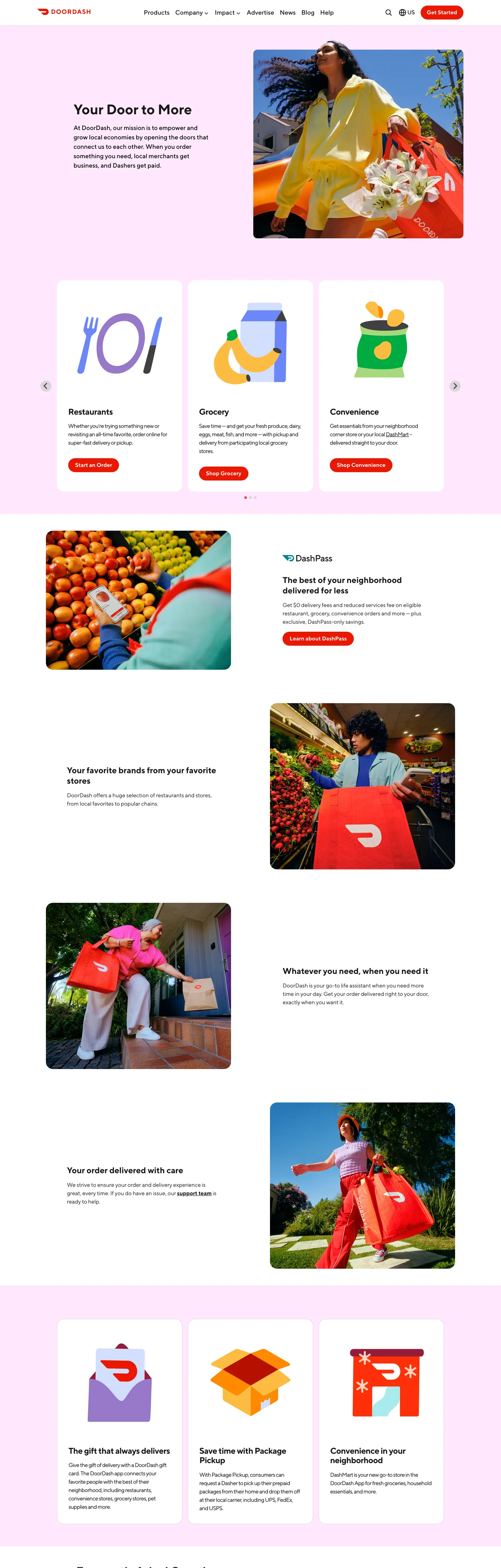
DoorDash's corporate marketing site (about.doordash.com) does something most consumer marketplace brands do not: it commits fully to the brand voltage on every primary action and surrounds it with a soft pastel-pink canvas that softens what would otherwise be a saturated chromatic shout. The hero "Your Door to More" sits in matte ink on a near-white surface; underneath it, a 4-card product grid uses cards with `#ffe8fe`-pink fills and DoorDash Red `#eb1700` pill CTAs as the conversion targets. The pink reads as an unexpected move — Uber Eats, Grubhub, and Instacart all run their marketing on white plus a single saturated voltage, while DoorDash adds a quiet chromatic intermediary. The pink does not compete with the red; it softens it, the way a paper takeout bag softens a logo print.
The DESIGN.md file packages the system into a machine-readable spec for React tooling. Inside: 16 colors tokens drawn from 1378 occurrences of matte ink (text 697, border 681), 305 occurrences of pure white, 87 of pure black, 36 of a near-black surface variant, and the 23-occurrence DoorDash Red brand voltage that appears exclusively as background fill on pill CTAs. Eleven typography tokens all run on TT-Norms — no second family on the corporate surface. The radius scale is brutally binary: 20px (72 occurrences) on every product tile and card, 9999px (23 occurrences) on every pill CTA, with 16px / 50% / 8px as rare one-off treatments. 15 components cover the pill primary CTA, the soft-pink card surface, the tight-tracked display headline, the navigation row with 18px / 500 labels, and the body paragraph in TT-Norms with -0.64px tracking.
Feed this file to Claude or Cursor and it reproduces DoorDash's specific moves: red-on-pill conversion voltage, soft-pink card surfaces softening the red, TT-Norms across every typographic role, the tight negative-tracking display, and the 20px-or-pill radius binary. The token references resolve cleanly. The one move worth borrowing only if your product is itself a consumer marketplace: the willingness to use a softening pastel intermediary between a saturated CTA voltage and a white canvas. SaaS brands generally cannot — the pink reads as commerce-warm rather than as productivity-cool. But on a marketplace where the conversion CTA is "Order now" rather than "Start trial," the soft canvas + saturated CTA pairing performs the warmth a delivery brand needs.
What makes it distinct
5
- Red-on-pill voltageDoorDash Red #eb1700 appears 23 times exclusively as background fill on 9999px pill CTAs, never as text or border
- TT-Norms everywhereevery one of 18 captured typographic signatures runs on TT-Norms; no second family on the corporate surface
- Soft-pink card canvas`{colors.surface-pink}` #ffe8fe is the dominant card-tile background, paired with the brand red CTA inside each card
- Two-radius binary20px on every product tile (72 occurrences, dominant), 9999px on every pill CTA (23 occurrences); nothing at 8 / 12 / 16px
- Tight tracking displayh1 sits at 40px / weight 700 / -0.64px letter-spacing; the negative tracking pulls the headline to read as dense and confident rather than airy
about.doordash.com
Live at about.doordash.com
A snapshot of the brand in production. Scroll the frame to see the whole page.
Colors
16 colors
DoorDash's system runs on #eb1700 as its primary voltage, used in 1 of 15 components. Type is set in TT-Norms across 11 tokens from 12px to 40px, weights 400–700. Shape language is mixed across 15 components, blending pills, soft rounds, and squarer corners.
Brand & Accent
Sparing, CTA-only voltage · 2
Surface
Page and card backgrounds · 3
Text
Headlines, body, captions · 3
Borders & Hairlines
Dividers, outlines, rules · 2
Other
Specialty colors · 6
Typography
11 type tokens
Set in TT-Norms across 11 tokens, from 12px to 40px, weights 400–700. Shown in its own stack: where the font isn't installed, the fallback the file names stands in.
- display-xl40px · weight 700 · lh 46pxThe quick brown fox jumps over the lazy dog
- display-lg32px · weight 700 · lh 36.8pxThe quick brown fox jumps over the lazy dog
- display-md24px · weight 700 · lh 27.6px · tracking -0.64pxThe quick brown fox jumps over the lazy dog
- heading-md20px · weight 450 · lh 30px · tracking -0.56pxThe quick brown fox jumps over the lazy dog
- heading-sm18px · weight 500 · lh 20.7pxThe quick brown fox jumps over the lazy dog
- body-md16px · weight 400 · lh 24px · tracking -0.64pxThe quick brown fox jumps over the lazy dog
- body-emphasis16px · weight 700 · lh 22px · tracking -0.01pxThe quick brown fox jumps over the lazy dog
- body-sm14px · weight 500 · lh 19.6px · tracking -0.14pxThe quick brown fox jumps over the lazy dog
- nav-link18px · weight 500 · lh 20.7pxThe quick brown fox jumps over the lazy dog
- button-md16px · weight 400 · lh 18.4pxThe quick brown fox jumps over the lazy dog
- caption12px · weight 450 · lh 18px · tracking -0.36pxThe quick brown fox jumps over the lazy dog
Layout
Radii and spacing
5 corner radii and 7 spacing values. Shape language: mixed.
Radii
- none0px
- sm8px
- md16px
- lg20px
- full9999px
Spacing
- xs8px
- sm12px
- base16px
- md24px
- lg32px
- xl40px
- 2xl48px
Components
15 components
Each rendered from its tokens (color, type, radius, padding) on DoorDash's own canvas.
- Hero Sectionhero-sectionHero Section
- Hero Headinghero-headingHero Heading
- Section Headingsection-headingSection Heading
- Body Paragraphbody-paragraphBody Paragraph
- Body Paragraph Mutedbody-paragraph-mutedBody Paragraph Muted
- Button Primarybutton-primaryButton Primary
- Button Secondarybutton-secondaryButton Secondary
- Top Navtop-navTop Nav
- Nav Linknav-linkNav Link
- Category Cardcategory-cardCategory Card
- Product Tileproduct-tileProduct Tile
- Promo Bandpromo-bandPromo Band
- Navy Bandnavy-bandNavy Band
- Type here…text-inputText Input
- FooterfooterFooter
In use
The system, in use
DoorDash's tokens on the kind of product it builds.
Build something people actually use.
A short paragraph of marketing copy that previews how the brand's display tier and body tier read together. Two sentences is usually enough.
FAQ
DoorDash design system FAQ
Common questions about DoorDash's tokens, components, and how to use this DESIGN.md in your project.
Read next
Related reading
Specs, directories, and component libraries that pair with this design system.
- Browse all design systemsThe full directory of DESIGN.md files on shadcn.io, with live mockups for each.shadcn.io
- DoorDash — corporate siteDoorDash's corporate marketing site — the source of truth for the live tokens captured in this file.about.doordash.com (opens in a new tab)
- The DESIGN.md specificationGoogle Labs' open spec for machine-readable design system files — the format this page is built on.github.com (opens in a new tab)
Use it
Use DoorDash in your project
One machine-readable file. Drop it into Claude, Cursor, or any AI tool that reads DESIGN.md.
Download the DESIGN.md
One machine-readable file: every color, type, radius, spacing, and component token of DoorDash.
Feed it to your AI tool
Drop it into Claude, Cursor, or GitHub Copilot. The agent writes React components and Tailwind classes that match DoorDash's visual language.
Reference the tokens directly
Or paste the values into your Tailwind config, CSS variables, or component library: every color, size and radius is a quoted, ready-to-copy value.
Read the full DESIGN.md: overview, rationale, do’s and don’ts
Overview
DoorDash's corporate marketing site (about.doordash.com) inverts the food-delivery convention. Softened voltage. Where Uber Eats runs a saturated red CTA directly on a white canvas, Grubhub commits to an orange-on-white shout, and Instacart turns its green into a structural hairline rather than a fill, DoorDash takes a different route: it commits fully to the brand red on every primary CTA — DoorDash Red ({colors.primary} — #eb1700) appears 23 times, exclusively as background fill on pill buttons — but surrounds each CTA with a soft pink {colors.surface-pink} (#ffe8fe) card surface that softens what would otherwise read as a generic e-commerce shout. The pink does not compete with the red; it contains it.
The typographic system is TT-Norms everywhere. All 18 captured typographic signatures run on the same family — no second face for headings, no monospace for captions, no editorial serif anywhere. Display sits at 40px / weight 700 with normal tracking; the descended h2 lands at 24px / 700 / -0.64px letter-spacing (the tight negative tracking is the signature move — pulls the headline to read as dense and confident rather than airy). Body is 16px / 400 with the same -0.64px tracking. Nav labels move to weight 500 at 18px. There is no weight ladder of 400 / 500 / 600 / 700 — the system jumps from 400 (body) to 450 (sub-heading) to 500 (nav) to 700 (display) with no 600 step. Where Instacart relies on its proprietary Instacart Sans at three weights, DoorDash runs TT-Norms at four including the unusual 450.
The radius scale is two-radius binary. {rounded.lg} 20px (72 occurrences, the dominant value by a wide margin) on every product tile, category card, and content surface; {rounded.full} 9999px (23 occurrences) on every primary CTA pill. The 20px is generous — softer than Instacart's 8px card or Uber's 12px tile — and reads as marketplace-warm rather than as productivity-engineered. A handful of {rounded.md} 16px (4 occurrences) and 50%-circle (5 occurrences) treatments exist on icon-only chrome but are off-system.
Key Characteristics:
- DoorDash Red (
{colors.primary}— #eb1700) appears 23 times, exclusively as background fill on pill CTAs; never as text or border. - Soft pink
{colors.surface-pink}(#ffe8fe) carries the category-card and promo-band surfaces — the chromatic intermediary between the red voltage and the white canvas. - A legacy DoorDash red (
{colors.primary-legacy}— #ff3008) is declared as--color-doordash-redin the CSS but never rendered on the captured surface — preserved as brand-history artifact. - TT-Norms across every typographic role; no second family on the corporate surface.
- Tight negative tracking on every body and display token (-0.36px to -0.64px); even nav labels at 18px / 500 sit with tracking pulled inward.
- Two-radius binary:
{rounded.lg}20px on every tile (72 occurrences),{rounded.full}9999px on every pill CTA (23 occurrences). No 8 / 12 / 16px middle tier. - Navy
{colors.navy}(#233069) and burgundy{colors.burgundy}(#810b00) wired as CSS variables but absent from the captured render — reserved for consumer-side surfaces or promotional bands not exposed on the corporate page. - Ink
{colors.ink}(#191919) carries 1378 occurrences — 697 text, 681 border — making it the load-bearing tone. Pure black{colors.shadow}appears 87 times as a tighter body-text variant.
Colors
Brand
- DoorDash Red (
{colors.primary}— #eb1700): frequency 23 — all 23 are background fill, never text or border. Wired as the rendered fill on every pill CTA (Get Started, Order Now, See How). The brand voltage held to a single surface role. - DoorDash Legacy Red (
{colors.primary-legacy}— #ff3008): frequency 0 in the rendered surface; declared as--color-doordash-red. The brand's prior voltage hex — slightly more orange / saturated — preserved as a CSS variable but migrated away from on the corporate marketing chrome.
Ink
- Ink (
{colors.ink}— #191919): frequency 1378 — 697 text, 681 border. Wired as--color-text-primaryand--reject-all-button-text-color. The load-bearing tone — display headlines, body text, nav labels, and 681 border-occurrence surfaces. Not pure black; a near-black with a slight warmth that matches the cream-warm canvas treatment elsewhere on the page. - Ink Secondary (
{colors.ink-secondary}— #1f2229): frequency 36 — 18 text, 18 border. A blueish-near-black variant used on secondary nav surfaces and footnote text. - Ink Tertiary (
{colors.ink-tertiary}— #434343): frequency 0 rendered; wired as--color-text-medium,--color-grey-dark, and--prebanner-text-color. Reserved for tertiary text — likely metadata and timestamp strips. - Shadow (
{colors.shadow}— #000000): frequency 87 — 43 text, 43 border, 1 shadow. Used as the tighter body-text color on product-card prose; pure black where ink would feel too warm.
Surface
- Canvas (
{colors.canvas}— #ffffff): frequency 305 — 131 border, 131 text-on-dark, 42 background, 1 shadow. The page floor; pure white with no off-white tinting. Wired as--color-white,--prebanner-background-color, and--color-grey-light(which paradoxically resolves to white on this page). - Surface Pink (
{colors.surface-pink}— #ffe8fe): frequency 4 — all 4 as background fill. The signature card-tile surface: holds the Restaurants / Grocery / Convenience category cards and the promotional pullquote band. The chromatic intermediary that softens the red CTA inside each card. - Surface Stone (
{colors.surface-stone}— #e7e4d9): frequency 0 rendered; wired as--color-stone. A warm taupe declared but not exposed on the corporate page — likely reserved for the consumer marketplace's storefront surfaces. - Hairline (
{colors.hairline}— #d9d9d9): frequency 15 — all 15 as border. The card-outline tone on product tiles and input fields. - Hairline Soft (
{colors.hairline-soft}— #cccccc): frequency 4 — all 4 as background. The disabled-state or hover-tint surface.
Reserved (declared but not rendered)
- Navy (
{colors.navy}— #233069): wired as--color-navy. A deep desaturated navy reserved for promotional bands and consumer-merchant landing pages. - Blue Light (
{colors.blue-light}— #e4ebf7): wired as--color-blue-light. The pale-blue surface paired with the navy. - Burgundy (
{colors.burgundy}— #810b00): wired as--color-burgundy. A deep brick-burgundy reserved for promotional band backgrounds — distinct from the brand red. - Teal Dark (
{colors.teal-dark}— #024c52): wired as--color-teal-dark. Part of the broader product-vertical palette. - Teal Mid (
{colors.teal-mid}— #4ba0a7): wired as--color-teal-mid. The lighter teal companion.
Typography
Font Family
The system runs TT-Norms across every typographic role on the corporate page — display, heading, body, button, nav, and footer. Both the regular cut (TT-Norms) and a DoorDash-licensed variant (DD-TTNorms) are declared, with fallback walking -apple-system, "system-ui", "Segoe UI", Roboto, Helvetica, Arial, sans-serif. A condensed cut (DD-TTNorms Condensed) is declared in --font-condensed but not rendered on the captured surface — reserved for product-specific marketing pages or merchant-side dashboards.
There is no second family — no editorial serif, no monospace, no secondary humanist sans. TT-Norms handles every job from 12px caption to 40px hero display.
Hierarchy
| Token | Size | Weight | Line Height | Letter Spacing | Use |
|---|---|---|---|---|---|
{typography.display-xl} | 40px | 700 | 46px | 0 | Hero h1 ("Your Door to More") |
{typography.display-lg} | 32px | 700 | 36.8px | 0 | Section displays below the hero |
{typography.display-md} | 24px | 700 | 27.6px | -0.64px | Category h2 ("Grocery", "Restaurants", "Convenience") |
{typography.heading-md} | 20px | 450 | 30px | -0.56px | Sub-headings and lead-paragraph blocks |
{typography.heading-sm} | 18px | 500 | 20.7px | 0 | Nav-link tier and inline strong labels |
{typography.body-md} | 16px | 400 | 24px | -0.64px | Default running text under headlines |
{typography.body-emphasis} | 16px | 700 | 22px | -0.01px | Inline strong / emphasized phrases |
{typography.body-sm} | 14px | 500 | 19.6px | -0.14px | Caption rows and meta strips |
{typography.nav-link} | 18px | 500 | 20.7px | 0 | Top-nav category labels |
{typography.button-md} | 16px | 400 | 18.4px | 0 | Primary and secondary pill CTA labels |
{typography.caption} | 12px | 450 | 18px | -0.36px | Legal and footnote captions |
Principles
The defining typographic move is tight negative tracking on body and display. Every running-text token sits at -0.14px to -0.64px letter-spacing — the pull-inward tracking makes the type read as dense and confident rather than airy. Where Instacart commits to default 0 tracking and Uber Eats sits at slight positive tracking, DoorDash pulls every letter pair tighter. The cumulative effect on the 40px hero is a headline that reads as packed and decisive.
The weight ladder is 400 / 450 / 500 / 700 — the unusual 450 step (used on the sub-heading tier at 20px) sits between regular body 400 and the medium 500 used on nav labels. Most type systems use 400 / 500 / 600 / 700; DoorDash skips 600 entirely and inserts a 450 between body and medium. This is a TT-Norms-specific weight that does not exist in most open-source substitutes.
Note on Font Substitutes
TT-Norms is licensed from Typetype. The closest open-source substitute is Inter at the same weights with the tracking applied manually (-0.04em on body and 0 on display). For the unusual weight-450 step, Inter at weight 500 with font-weight: 425 interpolation via variable-font CSS gets close. Geist Sans has comparable tighter cap height and is closer in feel than Inter, though it lacks the same humanist warmth. There is no direct free substitute for the DD-TTNorms Condensed cut.
Layout
Spacing System
- Base unit: 8px, with
0px 8px(54 occurrences) and 32px (38 occurrences) as the dominant values. - Tokens:
{spacing.xs}8px ·{spacing.sm}12px ·{spacing.base}16px ·{spacing.md}24px ·{spacing.lg}32px ·{spacing.xl}40px ·{spacing.2xl}48px. - Section padding (vertical): the dominant band padding is 48x48x16px on the hero and 48px on promotional bands.
- Card internal padding:
{spacing.lg}(32px) on category cards;{spacing.md}(24px) on product tiles. - Top-nav padding:
{spacing.base}(16px) vertical,{spacing.lg}(32px) horizontal.
Grid & Container
- Max content width: 1224px (declared as
--max-width). Hero band runs at full width with the centered text column at ~620px. - Hero block: white canvas with a 2-column layout — text-left, lifestyle photo of a woman with takeout right.
- Category strip: 3-up grid of soft-pink category cards (Restaurants / Grocery / Convenience), each with an illustrated glyph and a red pill CTA.
- Promo band: full-width navy band ("The best of your neighborhood, delivered for less") and a full-width pink band below it.
- Product tile grid: 4-up cards with 2-column copy alternating with lifestyle photography.
Rhythm
The page rhythm alternates between dense product grid and single-photo promo band. Hero is a single lifestyle photograph plus headline. The 3-up pink category strip below is dense and chromatically warm. The pink promo band that follows is full-bleed. Then a 4-up product-tile grid with photography. Then a navy promotional band. The system uses background-color shifts (white → pink → navy → pink → white) to create rhythm rather than using vertical spacing alone.
Elevation
The system has essentially no shadow tier. The captured page has 1 occurrence of a soft shadow under the hero photograph and 1 inside the focus state of the email-capture row. Cards lift off the canvas by surface-color contrast (pink card on white floor) rather than by layered shadows.
- Flat (no shadow): hero text band, all category cards, the navy promo band, the pink pullquote band, the product-tile grid, the footer — 99% of surfaces.
- Photographic lift: the hero lifestyle photo carries a soft shadow underneath, the only consistently-elevated element on the captured page.
- Hairline borders:
{colors.hairline}(#d9d9d9) carries the card-outline work — 15 border occurrences across product tiles and inputs.
Shapes
The radius scale is two-radius binary:
{rounded.lg}20px — 72 occurrences. The dominant radius by a wide margin. Every product tile, every category card, every content surface. Generous-soft rather than tight; 20px is unusually high among marketplace systems (Instacart 8px, Uber 12px, Grubhub 16px). Reads as marketplace-warm.{rounded.full}9999px — 23 occurrences. Every primary CTA pill. Renders as a fully-rounded capsule on the brand-red conversion buttons.{rounded.md}16px — 4 off-system occurrences on icon backgrounds.{rounded.sm}8px — 1 occurrence on the email-capture input outline.- 50% — 5 occurrences on circular icon glyphs inside category cards.
There is no 4 / 6 / 12px tier. Surfaces are either 20px-rounded tiles or full-pill CTAs, with everything else as a one-off exception.
Components
hero-section — White canvas, ink text, 48x48x16px padding. Holds the hero h1 "Your Door to More" at {typography.display-xl}, a sub-paragraph below, and a single red pill CTA on the left, with a lifestyle photo on the right.
hero-heading — Matte ink text on white, TT-Norms 40px / 700, normal tracking. The largest typographic moment on the page.
section-heading — TT-Norms 24px / 700 / -0.64px tracking. The category h2s ("Grocery", "Restaurants", "Convenience") sitting inside the pink category cards.
body-paragraph — Pure black {colors.shadow} running text at {typography.body-md} (16px / 400 / -0.64px tracking). The default body style on white surfaces.
body-paragraph-muted — Ink-tertiary {colors.ink-tertiary} variant for secondary copy.
button-primary — DoorDash Red {colors.primary} fill, white text, TT-Norms 16px / 400, {rounded.full} 9999px pill, 0x6px padding, 40px height. No border. "Get Started" / "Order Now" / "See How" — the signature conversion button on the page. Rendered 23 times across the captured surface.
button-secondary — White {colors.canvas} fill, ink text, 1px ink border, same dimensions. Used for secondary actions on light surfaces.
top-nav — White {colors.canvas} band, 64px height. DoorDash logo flush left, product-nav links center (Products / Resources / Pricing / Company), red "Get Started" pill CTA flush right. No bottom hairline rule — the nav floats over the hero canvas below.
nav-link — Transparent background, ink text in {typography.nav-link} (TT-Norms 18px / 500), 8x0px padding. No hover background captured.
category-card — Soft pink {colors.surface-pink} fill, ink text, {rounded.lg} 20px radius, 32px padding. Holds an illustrated glyph at the top (utensils / banana / shopping bag), a {typography.heading-sm} title, a 1-line description, and a red pill CTA at the bottom. The signature card of the system.
product-tile — White {colors.canvas} fill, 1px {colors.hairline} border, {rounded.lg} 20px radius, 24px padding. Holds product-feature copy and a lifestyle photo. Sits alongside category cards in the 4-up grid below the hero.
promo-band — Full-bleed {colors.surface-pink} background, {typography.display-lg} centered headline, 48x0px padding. The pink pullquote band ("Your favorite brands from your favorite tastes").
navy-band — Full-bleed {colors.navy} (#233069) background, white text, 48x48x16px padding. The "Pickup and delivery, less than five minutes away" promotional band.
text-input — White fill, ink text, 1px {colors.hairline} border, {rounded.sm} 8px radius, 8x12px padding, 40px height. Notably the only component on the page that uses the 8px radius — the input is the off-system surface.
footer — Ink {colors.ink} canvas, white text, 48px padding. Multi-column link list at {typography.body-sm}. Inverts the system: ink as floor, white as ink.
Do's and Don'ts
Do keep DoorDash Red {colors.primary} (#eb1700) as background fill on pill CTAs only. The captured page renders the brand voltage 23 times and every single one is a pill-button fill — using it as text color or border breaks the discipline that defines the conversion language.
Do use {colors.surface-pink} (#ffe8fe) as the card-surface intermediary. The pink is the system's softening move — placing a red CTA directly on the white canvas without the pink intermediary loses the marketplace-warm voice that distinguishes DoorDash from Uber Eats and Grubhub.
Do apply -0.14px to -0.64px letter-spacing on every body and display token. The tight negative tracking is the typographic signature; default 0 tracking makes the system read as generic SaaS rather than as the dense, decisive voice DoorDash carries.
Do use {rounded.lg} 20px on every product tile and card. The 20px is generous-soft — softer than Instacart's 8px card and Uber's 12px tile. It is the radius that distinguishes the marketplace within the food-delivery category; bumping down to 12px reads as borrowed from a peer brand.
Don't use the legacy {colors.primary-legacy} (#ff3008) as a new brand-color token. It is declared as --color-doordash-red for backward compatibility only and never renders on the active marketing surface. Use {colors.primary} (#eb1700) for any intentional red.
Don't introduce a weight-600 step in the typography ladder. The system runs 400 / 450 / 500 / 700 — the unusual 450 sub-heading weight sits between body and medium, and a 600 step would compete with both. Stay on the four-weight ladder TT-Norms ships with.
Don't add a third radius value between 8px and 20px. The system is binary: {rounded.lg} 20px tile or {rounded.full} pill CTA. A 12px or 16px corner reads as a generic SaaS card library rather than as DoorDash's specific marketplace-soft chrome.
Don't render {colors.surface-pink} on text or buttons. It is a card-and-band background fill only — 4 occurrences, all as backgrounds. Using it on a button or as a text color breaks the soft-canvas role and reads as a foreign brand spilling into the system.
Known Gaps
- Consumer-side surfaces: this DESIGN.md captures
about.doordash.com(the corporate marketing site) only. The consumer-facingwww.doordash.comordering surface is Cloudflare-protected and renders a bot-verification page on automated extraction; the consumer storefront, restaurant detail pages, cart, and checkout flow carry their own token system that is not represented here. - Reserved palette: the navy
{colors.navy}(#233069), burgundy{colors.burgundy}(#810b00), and teal{colors.teal-dark}/{colors.teal-mid}are declared as CSS variables but render only minimally or not at all on the captured corporate surface. They likely carry weight on merchant-side dashboards, DashPass subscription pages, and seasonal promotional bands. - Hover and focus states: the captured surface exposes resting states only. Pill-CTA hover, focus ring, and disabled states are not visible.
- Form input variants:
{component.text-input}carries only the email-capture style; search, address-entry, and tip-selection inputs live on the consumer ordering surface. - Motion: lifestyle photographs may carousel-rotate on the corporate page, but the spec captures end-state values only.
- DD-TTNorms Condensed: declared as
--font-condensedbut not rendered. Reserved for product-specific marketing pages. - Dark mode: the captured surface is light-only. A dark variant exists in the merchant-dashboard product but is not represented.
- Legacy red migration:
{colors.primary-legacy}(#ff3008) is preserved in CSS as--color-doordash-redbut no longer rendered. The brand has migrated to the cooler #eb1700 on active marketing chrome.
Food & Delivery
More systems like this
More DESIGN.md files in Food & Delivery.
Pricing
Build it with Pro
The DESIGN.md files are free. Pro adds 6,000+ blocks, premium templates and the MCP server, so your AI editor builds in your system for you.
4.9/5 out of 5 · 150+ reviewsfrom 150+ founders and developers.
Billing
Billed once a year in USD. Cancel anytime.
- How many people can use the license.
- Client work, SaaS products and anything you charge for.
- Production-ready React sections: hero, pricing, features, dashboards and more.
- Complete multi-page sites you can ship as they are.
- React icons from every major library, installable with one command.
- Presets that restyle every block, in light and dark.
- Lets your AI editor search, preview and install blocks for you.
- Priority requests are answered first.
Individual
For personal projects & open source
$32instead of $49/mo
$389 billed yearly
- Seats: 1 seat
- Commercial use: Personal & open source only
- Pro blocks: 6,000+ blocks
- Templates: All 14 templates
- React icons: 294k+ icons
- Themes: All 59 themes
- MCP server: Basic usage
- Support: Standard
Team
Most popularFor freelancers, agencies & startups
$66instead of $99/mo
$789 billed yearly · ≈ $13/dev/mo
- Seats: Up to 5 seats
- Commercial use: Included
- Pro blocks: 6,000+ blocks
- Templates: All 14 templates
- React icons: 294k+ icons
- Themes: All 59 themes
- MCP server: High usage
- Support: Priority
Organization
For companies with larger teams
$132instead of $199/mo
$1,589 billed yearly
- Seats: Unlimited seats
- Commercial use: Included
- Pro blocks: 6,000+ blocks
- Templates: All 14 templates
- React icons: 294k+ icons
- Themes: All 59 themes
- MCP server: Unlimited usage
- Support: Priority
Billed once a year in USD. Cancel anytime.
Individual
For personal projects & open source
$32instead of $49/mo
$389 billed yearly
- How many people can use the license.Seats: 1 seat
- Client work, SaaS products and anything you charge for.Commercial use: Personal & open source only
- Production-ready React sections: hero, pricing, features, dashboards and more.Pro blocks: 6,000+ blocks
- Complete multi-page sites you can ship as they are.Templates: All 14 templates
- React icons from every major library, installable with one command.React icons: 294k+ icons
- Presets that restyle every block, in light and dark.Themes: All 59 themes
- Lets your AI editor search, preview and install blocks for you.MCP server: Basic usage
- Priority requests are answered first.Support: Standard
Team
Most popularFor freelancers, agencies & startups
$66instead of $99/mo
$789 billed yearly · ≈ $13/dev/mo
Everything in Individual, plus
- How many people can use the license.Seats: Up to 5 seats
- Client work, SaaS products and anything you charge for.Commercial use: Included
- Lets your AI editor search, preview and install blocks for you.MCP server: High usage
- Priority requests are answered first.Support: Priority
Organization
For companies with larger teams
$132instead of $199/mo
$1,589 billed yearly
Everything in Team, plus
- How many people can use the license.Seats: Unlimited seats
- Lets your AI editor search, preview and install blocks for you.MCP server: Unlimited usage
- Secure checkout via Stripe
- Code lives in your repo
- Keep what you've shipped if you cancel
- License terms
Your system, built for you
Every block, template and icon, installed by your AI agent in your design system. The DESIGN.md files stay free.