Five Guys Design System
Five Guys' marketing design system as a DESIGN.md file. Crimson #d21033 on black hero canvas, Public Sans Black 108px uppercase, 7 colors, 14 components. For React, Next.js, and AI tools.
Add shadcn.io to your AI agent. · Pro It installs blocks, icons and templates in your design system from a prompt, with Pro.
Set up MCP- Primary
- #d21033
- Typeface
- Public Sans
- Shape
- Soft
- Base radius
- 10px
- Colors
- 7
- Type tokens
- 12
- Components
- 14
- Spacing values
- 8
About
About Five Guys DESIGN.md
Curated by Dov Azencot · Updated May 19, 2026 · Source fiveguys.com (opens in a new tab)
Five Guys' marketing site makes no typographic apology. The hero headline — the brand's punchy three-word identity claim — renders at 108px in Public Sans weight 900, uppercase, with -4.32px letter-spacing that smashes the characters together until the negative space nearly closes. At that size on a pure-black canvas, with a burger photograph bleeding in from the right, the words look less like a web page and more like the side of a building. Where McDonald's has retreated to 36px charcoal-on-white editorial restraint and Shake Shack holds its Jost at a measured 60px, Five Guys goes in the opposite direction and turns its typography into signage.
The crimson red (#d21033) is the system's only non-neutral color, and it is everywhere: CTA button fills, section heading text, card borders, the checkered tile dividers in the menu grid, and the nav background on hover. Unlike Shake Shack's green (held in reserve for two positions) or Cloudflare's orange (concentrated on the hero canvas), Five Guys' red is dispersed — used as text, fill, and border simultaneously. The effect is a chromatic environment rather than a single accent point. The page feels red without necessarily being red-background, because the hue shows up in so many roles at once.
Feed this file to an AI coding tool and it will reproduce the specific Five Guys moves: 108px / 900 uppercase with tight negative tracking for display, crimson as a structural color rather than a scarce accent, pure-black hero then white body mid-section, and the 10px / 100px binary radius system. The system has no moving parts — it is Public Sans, crimson, and a photograph of a cheeseburger, and it is more aggressive than any other brand in this category.
What makes it distinct
5
- 108px weight-900 uppercase herothe h1 renders the brand's three-word identity claim at 108px with -4.32px tracking; the most typographically aggressive hero in the QSR category
- Crimson as structural color#d21033 appears as CTA background, section heading text, card border, and nav link background simultaneously across 97 occurrences
- Pure-black cinematic openingthe hero section sits on a #000000 canvas with white photography, before the page pivots to a white body for the menu grid
- Public Sans onlyweight 900 uppercase at every heading tier, weight 400 for body copy; the system runs one typeface without a display companion or mono accent
- 10px corner radiusthe dominant rounding is 9.99–10px (a card and button standard), with pill CTAs at 100px for the 'Order Now' primary action
fiveguys.com
Live at fiveguys.com
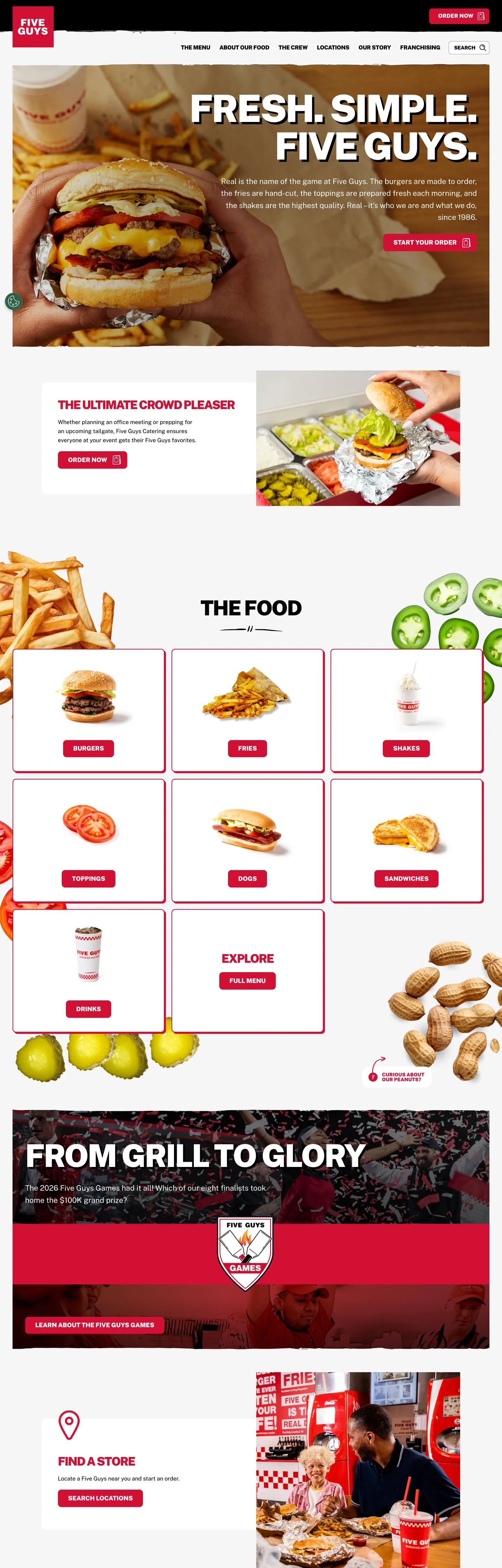
A snapshot of the brand in production. Scroll the frame to see the whole page.
Colors
7 colors
Five Guys's system runs on #d21033 as its primary voltage, used in 7 of 14 components. Type is set in Public Sans across 12 tokens from 13px to 108px, weights 400–900. Shape language is soft — components average 41px corner radius, with no sharp interactive edges.
Brand & Accent
Sparing, CTA-only voltage · 2
Surface
Page and card backgrounds · 2
Text
Headlines, body, captions · 2
Borders & Hairlines
Dividers, outlines, rules · 1
Typography
12 type tokens
Set in Public Sans across 12 tokens, from 13px to 108px, weights 400–900. Shown in its own stack: where the font isn't installed, the fallback the file names stands in.
- display-xl108px · weight 900 · lh 108px · tracking -4.32pxThe quick brown fox jumps over the lazy dog
- display-lg104px · weight 900 · lh 104px · tracking -3.132pxThe quick brown fox jumps over the lazy dog
- display-md90px · weight 900 · lh 90px · tracking -3.6pxThe quick brown fox jumps over the lazy dog
- heading-lg59px · weight 900 · lh 65px · tracking -2.376pxThe quick brown fox jumps over the lazy dog
- heading-md34px · weight 900 · lh 38px · tracking -2.052pxThe quick brown fox jumps over the lazy dog
- heading-sm22px · weight 900 · lh 26pxThe quick brown fox jumps over the lazy dog
- body-lg22px · weight 400 · lh 35pxThe quick brown fox jumps over the lazy dog
- body-md16px · weight 400 · lh 26pxThe quick brown fox jumps over the lazy dog
- body-sm13px · weight 700 · lh 21pxThe quick brown fox jumps over the lazy dog
- label-uppercase18px · weight 900 · lh 18px · tracking -0.198pxThe quick brown fox jumps over the lazy dog
- nav-link16px · weight 900 · lh 22px · tracking -0.02pxThe quick brown fox jumps over the lazy dog
- button-md14px · weight 700 · lh 20px · tracking -0.154pxThe quick brown fox jumps over the lazy dog
Layout
Radii and spacing
5 corner radii and 8 spacing values. Shape language: soft.
Radii
- none0px
- sm10px
- lg20px
- pill100px
- full50%
Spacing
- xs8px
- sm16px
- md20px
- lg27px
- xl36px
- 2xl46px
- 3xl60px
- 4xl80px
Components
14 components
Each rendered from its tokens (color, type, radius, padding) on Five Guys's own canvas.
- Button Primarybutton-primaryButton Primary
- Button Secondarybutton-secondaryButton Secondary
- Top Navtop-navTop Nav
- Nav Linknav-linkNav Link
- Hero Sectionhero-sectionHero Section
- Hero Headinghero-headingHero Heading
- Section Headingsection-headingSection Heading
- Body Paragraphbody-paragraphBody Paragraph
- Body Paragraph Lightbody-paragraph-lightBody Paragraph Light
- CardcardCard
- Crest Cardcrest-cardCrest Card
- Explore Pillexplore-pillExplore Pill
- Type here…text-inputText Input
- FooterfooterFooter
In use
The system, in use
Five Guys's tokens on the kind of product it builds.
Build something people actually use.
A short paragraph of marketing copy that previews how the brand's display tier and body tier read together. Two sentences is usually enough.
FAQ
Five Guys design system FAQ
Common questions about Five Guys's tokens, components, and how to use this DESIGN.md in your project.
Read next
Related reading
Specs, directories, and component libraries that pair with this design system.
- Browse all design systemsThe full directory of DESIGN.md files on shadcn.io, with live mockups for each.shadcn.io
- Five Guys — official siteFive Guys' public marketing site — the source of truth for the live tokens captured in this file.fiveguys.com (opens in a new tab)
- The DESIGN.md specificationGoogle Labs' open spec for machine-readable design system files — the format this page is built on.github.com (opens in a new tab)
Use it
Use Five Guys in your project
One machine-readable file. Drop it into Claude, Cursor, or any AI tool that reads DESIGN.md.
Download the DESIGN.md
One machine-readable file: every color, type, radius, spacing, and component token of Five Guys.
Feed it to your AI tool
Drop it into Claude, Cursor, or GitHub Copilot. The agent writes React components and Tailwind classes that match Five Guys's visual language.
Reference the tokens directly
Or paste the values into your Tailwind config, CSS variables, or component library: every color, size and radius is a quoted, ready-to-copy value.
Read the full DESIGN.md: overview, rationale, do’s and don’ts
Overview
Five Guys' marketing site stakes out the most aggressive typographic position in the US quick-service burger category. Black-canvas weight-900 Americana. The hero headline — the brand's punchy three-word identity claim — runs at 108px in Public Sans Black with -4.32px letter-spacing, the sort of display scale more common on a stadium banner than a fast-food website. Where McDonald's editorial system tops out at 36px/700 and Shake Shack holds its hero at 60px/700, Five Guys renders its opening sentence at three times that scale and smashes the letters together with negative tracking until the counterforms nearly close. No other brand in this review stack — not Shake Shack, not Chipotle, not McDonald's — matches this level of typographic intensity.
The crimson red ({colors.primary} — #d21033) is used in every possible role at once: CTA fill, section heading text, card border, nav link background highlight. With 97 total occurrences (24 text, 24 background, 49 border), the red is not an accent — it is a structural color. The 49 border occurrences alone exceed the total chromatic presence of McDonald's golden yellow on the entire McDonald's site. The red creates an environmental saturation that reads as a chromatic field rather than a highlight, which is the brand's physical identity (the red-and-white checkered bag, tray liner, and box) translated into pixels.
The black hero canvas ({colors.ink} — #000000) flips to white below the fold, creating a hard surface jump that mimics the brand's diner aesthetic: a dramatic opening (chalkboard-dark) followed by a display-case interior (white menu grid with red tile outlines). The surface shift is abrupt by design.
Key Characteristics:
- Hero h1 at 108px / weight 900 / uppercase / -4.32px tracking — the largest and most typographically dense display in the QSR comparison set.
- Crimson
{colors.primary}(#d21033) in three simultaneous roles: fill (24), text (24), border (49) — structural rather than held-in-reserve. - Pure black
{colors.ink}(#000000) hero canvas flipping to pure white{colors.canvas}(#ffffff) below the fold — no mid-tone transition surface. - Public Sans exclusively — weight 900 for all uppercase headings, weight 400 for all body paragraphs, weight 700 for buttons and small labels; no second typeface.
- Binary radius: 10px standard cards, 100px pill CTA — nothing in between.
- WordPress CMS under the hood — the CSS variable names follow the
--wp--preset--naming convention, visible in the extraction. - 97 red color occurrences versus 5 colors total in the extraction's active-use palette — the most chromatic concentration of any QSR brand captured.
Colors
Brand
- Primary Red (
{colors.primary}— #d21033): frequency 97 total — 24 as text, 24 as background, 49 as border. Wired as--wp--preset--color--vivid-red. The structural brand voltage — appears as section heading text ("THE ULTIMATE CROWD PLEASER"), CTA fill ("Order Now" pill), menu card outlines, and checkered grid dividers simultaneously. The 49 border occurrences are the system's most distinctive detail: the red draws the structural grid of the menu, not just the conversion moments.
Text
- Ink (
{colors.ink}— #000000): frequency 281 as text, 10 as background (hero section, footer), 271 as border. Wired as--wp--preset--color--black. The dominant structural color — the hero canvas, footer, and the majority of border outlines (on non-red card sides) all use pure black.
Surface
- Canvas (
{colors.canvas}— #ffffff): frequency 91 as text (white text on dark surfaces), 24 as background (mid-page and card fills), 73 as border. Wired as--wp--preset--color--white. The body canvas below the hero fold; also the fill for menu category cards and the nav surface.
Accent
- Accent Blue (
{colors.accent-blue}— #6aaae4): frequency 1 as background. A single mid-blue tile visible in the "From Grill to Glory" promotional section. Classified aslayer:"brand"in the extraction — this appears to be a social sharing or app download badge element. It is the only non-red chromatic accent on the page and appears once.
Muted Tones
- Ink Muted (
{colors.ink-muted}— #929292): frequency 1 as border. A single medium gray divider — appears in a thin rule between page sections. - Surface-1 (
{colors.surface-1}— #696969): frequency 1 as background. A single mid-gray promotional tile background.
Hairline
- Hairline (
{colors.hairline}— #e6e4e4): frequency 1 as border. A very light warm gray — single hairline divider; carries a faint warm undertone (chroma 0.002) that reads as off-white rather than neutral gray.
Typography
Font Family
The system runs Public Sans exclusively — a free Google Font originally commissioned for the US government's plainlanguage.gov initiative, derived from Libre Franklin. The full stack is "Public Sans", sans-serif. There is no second typeface, no monospace accent, no condensed variant loaded separately — the condensed effect at display sizes is achieved through negative letter-spacing on the same face. Weight 900 (Black) is the dominant weight for all uppercase headings; weight 400 (Regular) covers body copy; weight 700 (Bold) handles button labels and small navigational emphasis.
Hierarchy
| Token | Size | Weight | Line Height | Letter Spacing | Use |
|---|---|---|---|---|---|
{typography.display-xl} | 108px | 900 | 108px | -4.32px | Hero h1 (the brand's punchy three-word identity claim) |
{typography.display-lg} | 104px | 900 | 104px | -3.132px | Secondary hero spans and italic display |
{typography.display-md} | 90px | 900 | 90px | -3.6px | Large section h2 display tier |
{typography.heading-lg} | 59px | 900 | 65px | -2.376px | Section sub-display ("THE FOOD") |
{typography.heading-md} | 34px | 900 | 38px | -2.052px | Standard section h2 ("THE ULTIMATE CROWD PLEASER") |
{typography.heading-sm} | 22px | 900 | 26px | 0 | Card headings (uppercase) |
{typography.body-lg} | 22px | 400 | 35px | 0 | Hero body paragraph (white on black) |
{typography.body-md} | 16px | 400 | 26px | 0 | Default body paragraphs (black on white) |
{typography.body-sm} | 13px | 700 | 21px | 0 | Small-caps disclaimer and label text |
{typography.label-uppercase} | 18px | 900 | 18px | -0.198px | Uppercase nav items, section labels |
{typography.nav-link} | 16px | 900 | 22px | -0.02px | Nav link uppercase labels |
{typography.button-md} | 14px | 700 | 20px | -0.154px | CTA button labels, explore links |
Principles
Every heading tier uses weight 900 with uppercase transformation and negative letter-spacing that scales with font size. The tightest tracked size (108px / -4.32px) achieves the visual effect of a condensed display face without loading one. Body copy at weight 400 / no tracking provides the extreme contrast — the visual jump from a 108px/900 headline to a 22px/400 paragraph is larger than any other QSR system in this comparison set. There is no intermediate 500 or 600 weight anywhere on the captured page.
Note on Font Substitutes
Public Sans is available on Google Fonts with no license. For environments where weight 900 might not render (older Android WebView, some email clients), weight 800 at 90% of the display size is the closest fallback. For a condensed-display alternative that achieves a similar impact without font-size scaling, Barlow Condensed Black or Bebas Neue (both free) can substitute at heading tiers, though they would require removing the letter-spacing values.
Layout
Spacing System
- Base unit: 20px — appears 23 times in the extracted spacing data, more than any other single value.
- Tokens:
{spacing.xs}8px ·{spacing.sm}16px ·{spacing.md}20px ·{spacing.lg}27px ·{spacing.xl}36px ·{spacing.2xl}46px ·{spacing.3xl}60px ·{spacing.4xl}80px. - Hero section padding: 80px top, 125px bottom — generous vertical breathing room around the typographic mass.
- Button padding: 13.986px vertical, 27px horizontal — a carefully-measured 14px vertical for 45px button height with 17px Jost equivalent.
- Nav padding: 0px vertical, 36px horizontal inside nav links.
- Card internal padding: 20px top and sides, 40px bottom (the extra bottom padding creates room for the explore CTA below the card title).
Grid & Container
- Hero: full-bleed black canvas, content centered, burger photograph right-aligned at full bleed.
- Section 1 (below fold): white canvas with a centered crimson h2 and a split layout (text left, styled food photography right, at roughly 40/60 ratio).
- Menu grid: a 3×2 card grid with crimson-bordered tiles, each card containing a food photograph, uppercase heading, and small explore pill. The grid has the visual logic of the brand's physical checkered bag pattern.
- "From Grill to Glory" section: full-bleed dark photographic band with white overlay text and the Five Guys crest badge centered.
- Footer: full-bleed black canvas, centered single-column content.
Rhythm
The page alternates between dark cinematic (hero, "From Grill to Glory") and light commercial (white body, menu grid) bands without a transitional gray surface. The rhythm is binary — black or white, never gray — which matches the brand's physical black-and-white checkered aesthetic (the red fills the grid-line role, not a surface role).
Elevation
The system has a minimal shadow tier. WordPress custom properties declare shadow presets (--wp--preset--shadow--natural, --wp--preset--shadow--crisp, etc.) but the captured page uses primarily border-based elevation — the crimson 1px card borders and the pure-black borders on white cards do the work that shadows would do in other systems.
- Flat (no shadow): hero section, footer, nav — all major layout bands.
- Border-elevated: menu cards use the crimson border as their single depth signal; no box-shadow on the card surface.
- Declared but minimal: the WordPress shadow presets exist as CSS variables but appear to be unused on the captured marketing surface.
Shapes
The radius scale is binary:
{rounded.none}0px — hero section, footer, nav bar. The large structural surfaces are flat-cornered.{rounded.sm}10px — the standard card and form input radius, appearing 23 times at ~9.99px and 11 times at exactly 10px. Used on menu cards, the hero food photograph corners, and the crest card.{rounded.lg}20px — a single occurrence on one secondary card variant.{rounded.pill}100px — the primary CTA button ("Order Now") and the smaller "Explore" pill CTAs within menu cards. A generous pill that renders as fully circular at standard button heights.{rounded.full}50% — single occurrence for an avatar or badge circle.
There is no middle tier (12px, 16px, 24px). The system is binary: either the tight 10px on cards or the generous 100px on CTAs. The jump from card (10px) to button (100px) produces the visual contrast between the menu's structure (boxy, contained) and its calls to action (round, tactile).
Components
button-primary — Crimson {colors.primary} fill, white text, {rounded.pill} 100px radius, 13.986x27px padding, 45px height. "Order Now" is the canonical label. The asymmetric padding in the extraction (13.986px 27px 13.986px 24px on the hero button with an arrow icon) suggests a right-offset for the arrow; the symmetric 27px version appears on standard CTAs.
button-secondary — Transparent fill, crimson text, crimson border, {rounded.pill} 100px radius. The outlined pill variant used for "Order Now" in secondary contexts below the fold.
top-nav — White {colors.canvas} surface, 60px height, 0x36px padding. Carries the Five Guys logo top-left, uppercase Public Sans 900 nav links centered, and a crimson pill CTA ("Order Now") at right. The nav background itself is white; the nav link backgrounds are crimson on hover.
nav-link — Crimson fill background on hover, crimson text in {typography.nav-link} (16px / 900 / uppercase), 0px padding base. The dual crimson (text color matches fill background) means the active/hover state is a crimson block — the text bleeds into the fill at lower saturation.
hero-section — Full-bleed black {colors.ink} canvas, 80px top / 125px bottom padding. Contains the white display headline, white body paragraph, and crimson "Order Now" pill CTA.
hero-heading — White text at {typography.display-xl} (108px / 900 / uppercase / -4.32px tracking). The single most typographically aggressive component in the QSR design set captured here.
section-heading — Crimson {colors.primary} text at {typography.heading-md} (34px / 900 / uppercase / -2.052px tracking). Used for "THE ULTIMATE CROWD PLEASER," "THE FOOD," and other section titles on the white canvas below the hero.
body-paragraph — White text on dark sections, {typography.body-lg} (22px / 400) — the hero paragraph that describes the brand's "real ingredients" proposition.
body-paragraph-light — Ink text on white sections, {typography.body-md} (16px / 400). Standard body paragraphs below the fold.
card — White {colors.canvas} fill, black text, {rounded.sm} 10px radius, 20x20x40px padding (top, side, bottom), 1px crimson {colors.primary} border. The menu grid tile — contains a food photograph, uppercase heading, and explore pill. The red border carries the brand's checkered-pattern visual language into the digital grid.
crest-card — Crimson {colors.primary} fill, white text, {rounded.sm} 10px radius, 46px padding. The Five Guys crest badge card used in the "From Grill to Glory" section — the single large-format crimson fill surface below the hero.
explore-pill — Transparent fill, crimson text, crimson border, {rounded.pill} 100px radius. The small "Explore" CTA within each menu card — a smaller version of the primary button style used as a secondary action.
text-input — White canvas fill, black text, {rounded.sm} 10px radius, 16px padding, black border. Generic form field; appears in the location finder and any search flow.
footer — Black {colors.ink} canvas, white text, 16px body size, 60x36px padding. Single-column centered content with the Five Guys wordmark and navigation links.
Do's and Don'ts
Do use {colors.primary} (#d21033) as a structural color — fill it into card borders, not just CTA buttons. The system's signature is the red grid divider, which references the checkered bag aesthetic. Reducing the red to accent-only CTA use would remove the most distinctive design signal in the system.
Do apply negative letter-spacing proportionally to the font size at display tiers. The tracking formula is roughly -0.04em: -4.32px at 108px, -3.6px at 90px, -2.376px at 59px, -2.052px at 34px. Keeping this proportional relationship is what gives all heading tiers a consistent compressed feel without loading a separate condensed family.
Do maintain the black/white surface binary. The hero is on black, the body is on white, and the footer is back on black. There is no medium-gray surface band between them. The hard jump is the layout's structural statement.
Do use Public Sans 900 uppercase for every heading tier. The system's identity depends on the consistent weight across heading levels — if h1 is at 900 and h2 drops to 700, the compressed-signage aesthetic collapses into a conventional typographic hierarchy.
Don't use the crimson as a text color at small sizes (below 16px). At body paragraph scale, crimson on white falls below AA contrast for running text. The system uses crimson text only for headings (34px+ uppercase) where the large letterforms compensate for the contrast reduction.
Don't introduce a middle radius value (12px, 16px, 24px). The system is binary — {rounded.sm} 10px for cards and {rounded.pill} 100px for CTAs. Adding an intermediate radius breaks the visual distinction between structural chrome (boxy) and conversion surfaces (pill), which is the layout's primary depth signal.
Don't reduce the hero display below 90px. At smaller sizes, the weight-900 uppercase with tight negative tracking reads as merely bold rather than as signage-scaled. The typographic identity requires scale — the letters need to be large enough that the compressed tracking reads as a deliberate choice rather than an oversight.
Don't mix the red across both fill and text roles in the same component. The system uses red-fill-white-text for CTAs and red-text-white-fill for section headings — crossing these (e.g., a red-fill button with red text) would disappear into a monochrome block.
Known Gaps
- Hover and focus states: the extraction captures only resting states; the crimson nav link's active/hover behavior (crimson fill block) is inferred from the navLink component data but not directly confirmed from a hover capture.
- Menu category detail pages: the menu grid links to individual item pages (Burgers, Fries, Hot Dogs, Shakes, etc.) whose component layouts — item photography, customization options, allergen tables — are not represented in this top-level extraction.
- Ordering flow: the online ordering interface, cart, checkout, and delivery-partner handoff carry their own component set that is outside the marketing page scope.
- Mobile layout: the desktop-first marketing page captures assume a viewport around 960–1280px; the mobile collapse of the 108px hero headline (which must scale dramatically), the menu card grid (likely 1-up on mobile), and the nav (likely hamburger-collapsed) are not documented.
- WordPress block theme details: the site runs on WordPress with a block theme; the CSS variable stack includes dozens of
--wp--preset--values for color and typography that are declared but unused on the captured marketing surface. - "From Grill to Glory" section: this promotional content band with the Five Guys crest and store-finder CTA appears in the screenshot but its detailed layout, the crest logo markup, and the location-search component are not fully captured in the extraction.
- App store assets: the Five Guys mobile app carries its own design language, and the extraction captures only the web marketing surface.
Food & Delivery
More systems like this
More DESIGN.md files in Food & Delivery.
Pricing
Build it with Pro
The DESIGN.md files are free. Pro adds 6,000+ blocks, premium templates and the MCP server, so your AI editor builds in your system for you.
4.9/5 out of 5 · 150+ reviewsfrom 150+ founders and developers.
Billing
Billed once a year in USD. Cancel anytime.
- How many people can use the license.
- Client work, SaaS products and anything you charge for.
- Production-ready React sections: hero, pricing, features, dashboards and more.
- Complete multi-page sites you can ship as they are.
- React icons from every major library, installable with one command.
- Presets that restyle every block, in light and dark.
- Lets your AI editor search, preview and install blocks for you.
- Priority requests are answered first.
Individual
For personal projects & open source
$32instead of $49/mo
$389 billed yearly
- Seats: 1 seat
- Commercial use: Personal & open source only
- Pro blocks: 6,000+ blocks
- Templates: All 14 templates
- React icons: 294k+ icons
- Themes: All 59 themes
- MCP server: Basic usage
- Support: Standard
Team
Most popularFor freelancers, agencies & startups
$66instead of $99/mo
$789 billed yearly · ≈ $13/dev/mo
- Seats: Up to 5 seats
- Commercial use: Included
- Pro blocks: 6,000+ blocks
- Templates: All 14 templates
- React icons: 294k+ icons
- Themes: All 59 themes
- MCP server: High usage
- Support: Priority
Organization
For companies with larger teams
$132instead of $199/mo
$1,589 billed yearly
- Seats: Unlimited seats
- Commercial use: Included
- Pro blocks: 6,000+ blocks
- Templates: All 14 templates
- React icons: 294k+ icons
- Themes: All 59 themes
- MCP server: Unlimited usage
- Support: Priority
Billed once a year in USD. Cancel anytime.
Individual
For personal projects & open source
$32instead of $49/mo
$389 billed yearly
- How many people can use the license.Seats: 1 seat
- Client work, SaaS products and anything you charge for.Commercial use: Personal & open source only
- Production-ready React sections: hero, pricing, features, dashboards and more.Pro blocks: 6,000+ blocks
- Complete multi-page sites you can ship as they are.Templates: All 14 templates
- React icons from every major library, installable with one command.React icons: 294k+ icons
- Presets that restyle every block, in light and dark.Themes: All 59 themes
- Lets your AI editor search, preview and install blocks for you.MCP server: Basic usage
- Priority requests are answered first.Support: Standard
Team
Most popularFor freelancers, agencies & startups
$66instead of $99/mo
$789 billed yearly · ≈ $13/dev/mo
Everything in Individual, plus
- How many people can use the license.Seats: Up to 5 seats
- Client work, SaaS products and anything you charge for.Commercial use: Included
- Lets your AI editor search, preview and install blocks for you.MCP server: High usage
- Priority requests are answered first.Support: Priority
Organization
For companies with larger teams
$132instead of $199/mo
$1,589 billed yearly
Everything in Team, plus
- How many people can use the license.Seats: Unlimited seats
- Lets your AI editor search, preview and install blocks for you.MCP server: Unlimited usage
- Secure checkout via Stripe
- Code lives in your repo
- Keep what you've shipped if you cancel
- License terms
Your system, built for you
Every block, template and icon, installed by your AI agent in your design system. The DESIGN.md files stay free.