In-N-Out Burger Design System
In-N-Out Burger's marketing design system as a DESIGN.md file. Brand red #b60000 on white, Montserrat bold all-caps navigation, pill CTAs at 29px radius, retro-Californian visual language. Tokens for React, Next.js, and AI tools.
Add shadcn.io to your AI agent. · Pro It installs blocks, icons and templates in your design system from a prompt, with Pro.
Set up MCP- Primary
- #b60000
- Typeface
- Montserrat
- Shape
- Mixed
- Base radius
- 10px
- Colors
- 6
- Type tokens
- 10
- Components
- 14
- Spacing values
- 7
About
About In-N-Out Burger DESIGN.md
Curated by Dov Azencot · Updated May 19, 2026 · Source in-n-out.com (opens in a new tab)
In-N-Out Burger's marketing site is a case study in brand confidence through chromatic repetition. The brand deep-red appears 50 times in the captured page — as nav link text, CTA button fills, section headings, image borders, and overlay backgrounds — making it one of the highest-frequency single-color deployments in the food-and-delivery category. Where McDonald's holds its red to logo and accent, and where Shake Shack leans on a hunter-green brand identity, In-N-Out saturates the entire interface in red-on-white, then reinforces it with illustrated assets that have been in continuous use since the 1960s: the yellow arrow sign, the Camaro from the television ads, the mascot silhouette.
The DESIGN.md file packages the system into a machine-readable spec for React and AI tools. Inside: 6 colors tokens built on a red-black-white triad with a single mid-grey for borders; 10 typography tokens all running Montserrat — bold at 500 weight for all-caps navigation at 11px, bold at 700 for uppercase section headings at 15px, and regular 400 for body at 15px; a radius scale that runs from 0px to a 29px stadium-pill on the primary CTA, with 50% circles for icon treatments and 10px cards; and 14 components definitions covering the red-pill CTA button, the photo-over-illustration hero grid, the retro card tiles, and the full-bleed illustrated billboard section.
Feed this file to Claude or Cursor and it will reproduce In-N-Out's specific moves: brand-red voltage at near-saturation across every interactive element, Montserrat bold all-caps at small sizes, the 29px pill radius on primary CTAs, and black-on-white body text with no grey tier. The move worth borrowing — the commitment to running one chromatic voltage across text, borders, and backgrounds simultaneously — only holds when the voltage is this saturated and the brand has this much recognition. Attempted with a softer color, it would read as accidental rather than intentional.
What makes it distinct
5
- Dual red-on-white voltagebrand deep-red appears 50 times across text, borders, and backgrounds; the entire interactive chrome runs on one chromatic signal
- Montserrat bold all-caps for navigation11px uppercase weight-500 labels read as a compact retro-diner signage convention, not digital convention
- Pill radius on primary CTAthe 29px border-radius on the main button creates a stadium-pill form that echoes In-N-Out's iconic oval signs
- Illustration over photographythe site deploys retro-illustrated assets (the arrow sign, the '69 Camaro, the mascot) alongside photography, both at full-bleed
- No muted text tierthe system runs two text colors (black and white) with no grey; secondary copy shifts to white-on-red or black-on-white
in-n-out.com
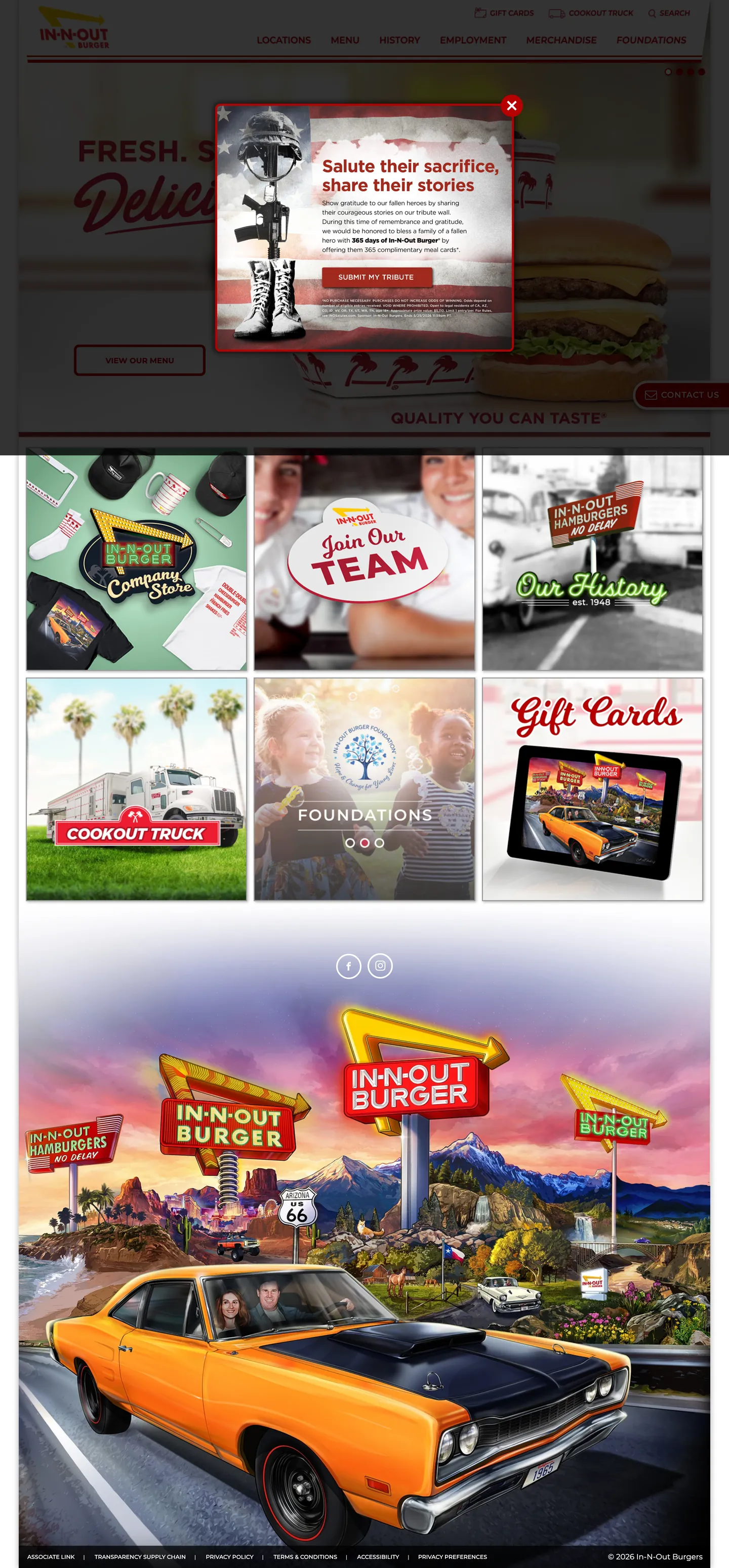
Live at in-n-out.com
A snapshot of the brand in production. Scroll the frame to see the whole page.
Colors
6 colors
In-N-Out Burger's system runs on #b60000 as its primary voltage, used in 8 of 14 components. Type is set in Montserrat across 10 tokens from 11px to 24px, weights 400–700. Shape language is mixed across 14 components, blending pills, soft rounds, and squarer corners.
Brand & Accent
Sparing, CTA-only voltage · 1
Surface
Page and card backgrounds · 1
Text
Headlines, body, captions · 2
Borders & Hairlines
Dividers, outlines, rules · 1
Other
Specialty colors · 1
Typography
10 type tokens
Set in Montserrat across 10 tokens, from 11px to 24px, weights 400–700. Shown in its own stack: where the font isn't installed, the fallback the file names stands in.
- display-xl24px · weight 700 · lh 30pxThe quick brown fox jumps over the lazy dog
- heading-md15px · weight 700 · lh 22.5pxThe quick brown fox jumps over the lazy dog
- body-md15px · weight 400 · lh 22.5pxThe quick brown fox jumps over the lazy dog
- body-sm12px · weight 700 · lh 18pxThe quick brown fox jumps over the lazy dog
- label-md11px · weight 500 · lh 16pxThe quick brown fox jumps over the lazy dog
- button-md15px · weight 700 · lh 22.5pxThe quick brown fox jumps over the lazy dog
- nav-link11px · weight 500 · lh 16pxThe quick brown fox jumps over the lazy dog
- caption12px · weight 700 · lh 18pxThe quick brown fox jumps over the lazy dog
- cta-label15px · weight 700 · lh 22.5pxThe quick brown fox jumps over the lazy dog
- footer-text15px · weight 400 · lh 22.5pxThe quick brown fox jumps over the lazy dog
Layout
Radii and spacing
4 corner radii and 7 spacing values. Shape language: mixed.
Radii
- sm6px
- md10px
- pill29px
- full50%
Spacing
- xs5px
- sm7px
- md8px
- base10px
- lg15px
- xl34px
- 2xl96px
Components
14 components
Each rendered from its tokens (color, type, radius, padding) on In-N-Out Burger's own canvas.
- Button Primarybutton-primaryButton Primary
- Button Secondarybutton-secondaryButton Secondary
- Top Navtop-navTop Nav
- Nav Linknav-linkNav Link
- Hero Headinghero-headingHero Heading
- Section Headingsection-headingSection Heading
- Body Paragraphbody-paragraphBody Paragraph
- CardcardCard
- Editorial Tileeditorial-tileEditorial Tile
- icon-buttonIcon Button
- Type here…text-inputText Input
- FooterfooterFooter
- Modal Overlaymodal-overlayModal Overlay
- BadgebadgeBadge
In use
The system, in use
In-N-Out Burger's tokens on the kind of product it builds.
Build something people actually use.
A short paragraph of marketing copy that previews how the brand's display tier and body tier read together. Two sentences is usually enough.
FAQ
In-N-Out Burger design system FAQ
Common questions about In-N-Out Burger's tokens, components, and how to use this DESIGN.md in your project.
Read next
Related reading
Specs, directories, and component libraries that pair with this design system.
- Browse all design systemsThe full directory of DESIGN.md files on shadcn.io, with live mockups for each.shadcn.io
- In-N-Out Burger — official siteIn-N-Out Burger's public marketing site — the source of truth for the live tokens captured in this file.in-n-out.com (opens in a new tab)
- The DESIGN.md specificationGoogle Labs' open spec for machine-readable design system files — the format this page is built on.github.com (opens in a new tab)
Use it
Use In-N-Out Burger in your project
One machine-readable file. Drop it into Claude, Cursor, or any AI tool that reads DESIGN.md.
Download the DESIGN.md
One machine-readable file: every color, type, radius, spacing, and component token of In-N-Out Burger.
Feed it to your AI tool
Drop it into Claude, Cursor, or GitHub Copilot. The agent writes React components and Tailwind classes that match In-N-Out Burger's visual language.
Reference the tokens directly
Or paste the values into your Tailwind config, CSS variables, or component library: every color, size and radius is a quoted, ready-to-copy value.
Read the full DESIGN.md: overview, rationale, do’s and don’ts
Overview
In-N-Out Burger's marketing site runs one chromatic voltage at near-maximum deployment. Red saturation as identity. The brand deep-red appears 50 times in the captured page — as text on navigation links, as background fills on CTA buttons and badge treatments, as borders on section headings and card accents, and as overlay tints on editorial tiles. Unlike fast-food peers McDonald's (red-to-yellow gradient branding, red held for logo/accent), Shake Shack (hunter-green brand voltage deployed sparingly), and Five Guys (red-and-white at half the frequency), In-N-Out runs red across text, borders, and fills simultaneously — a saturation that reads as brand certainty rather than as decoration.
The illustration-photography hybrid makes the visual system distinctive within the food-delivery category. The 2x3 editorial grid on the homepage deploys flat-illustrative graphic tiles alongside photographic assets, then transitions into a full-bleed illustrated billboard featuring a retro 1969 Camaro and the neon In-N-Out sign. This mix of illustration (Company Store, Join Our Team, Gift Cards) and photography (hero burger, billboard car) is not the convention for fast-casual digital — it is In-N-Out's specific continuity with its mid-century California roadside origin.
Key Characteristics:
- Brand deep-red (
{colors.primary}) at frequency 50: 23 text, 22 border, 5 background — the dominant chromatic signal across every interactive tier. - Ink black (
{colors.ink}) at frequency 91: body text, overlay, shadow, nav structure. - White canvas (
{colors.canvas}) at frequency 31: the page ground and inverse text on red surfaces. - Montserrat across all tiers: 11px / 500 / uppercase for navigation, 15px / 700 / uppercase for headings, 15px / 400 for body.
- 29px pill radius on the primary CTA — a stadium-oval form that references the brand's oval sign geometry.
- 50% circular radius for icon treatments and badge elements.
- Full-bleed photography and illustration deployed at equal visual weight — the site treats illustrated and photographic assets as interchangeable formats.
Colors
Brand
- Primary (
{colors.primary}— #b60000): frequency 50. Used as text (23), border (22), background (5). In-N-Out's single brand voltage — runs across navigation links, CTA buttons, section headings, image border accents, and tile overlays. Not wired into CSS custom properties; hardcoded throughout the stylesheet.
Structure
- Ink (
{colors.ink}— #000000): frequency 91. Used as text (41), background (3), border (36), shadow (11). The structural color — body paragraphs, footer background, shadow layers on cards. Shadow occurrences (11) are notable — the system uses genuine drop shadows on the modal dialog. - Canvas (
{colors.canvas}— #ffffff): frequency 31. Used as text (14) on red fills, background (4), border (13). The page floor and the inverse text color for red-background elements. - Hairline (
{colors.hairline}— #999999): frequency 6, all as borders. The neutral mid-grey used on form inputs and secondary card borders. Not a text color — limited to border context only.
Typography
Font Family
The system runs a single voice: Montserrat (Google Fonts), falling back to sans-serif. Three weight variants appear in the captured surfaces: 500 for navigation labels at 11px uppercase, 700 for headings and CTA labels at 15px uppercase, and 400 for body copy at 15px. Montserrat's humanist-geometric construction at bold weights reads as rounded and approachable — a contrast to the sharpness of the red voltage.
Hierarchy
| Token | Size | Weight | Case | Line Height | Use |
|---|---|---|---|---|---|
{typography.display-xl} | 24px | 700 | default | 30px | Hero headline overlay |
{typography.heading-md} | 15px | 700 | uppercase | 22.5px | Section headings, editorial tile labels |
{typography.body-md} | 15px | 400 | default | 22.5px | Body copy, descriptions |
{typography.nav-link} | 11px | 500 | uppercase | 16px | Navigation link labels |
{typography.label-md} | 11px | 500 | uppercase | 16px | Category labels, chip text |
{typography.caption} | 12px | 700 | default | 18px | Sub-navigation, metadata |
{typography.button-md} | 15px | 700 | default | 22.5px | CTA button labels |
{typography.footer-text} | 15px | 400 | default | 22.5px | Footer navigation and legal text |
Principles
The all-caps treatment at 11px / weight 500 for navigation is the smallest legible uppercase setting in the captured directory — approaching the floor of comfortable reading at screen resolution. It works in this context because the navigation category labels are short (one to two words: "Menu," "Locations," "History") and the contrast on white is maximum. The 15px / 700 uppercase heading size is where the system becomes visually assertive — at full saturation in brand red, it reads as signage rather than as web type.
Note on Font Substitutes
Montserrat is free on Google Fonts — no substitution needed for production use. For a brand with a similar register, Raleway Bold has a comparable all-caps personality; Nunito Bold is softer at the same weight.
Layout
Spacing System
- Base unit: no strict module is evident; values cluster around 7–8px for micro-gaps and 15px for horizontal margins.
- Tokens:
{spacing.xs}5px ·{spacing.sm}7px ·{spacing.md}8px ·{spacing.base}10px ·{spacing.lg}15px ·{spacing.xl}34px ·{spacing.2xl}96px. - Dominant values: 7px (icon labels, micro-margins), 15px (horizontal nav padding), 34px (CTA horizontal padding).
Grid & Container
- Hero: full-bleed photography with red-text headline overlay. No padding at the viewport edge — the image fills the container.
- Editorial tile grid: 2×3 mosaic of illustrated and photographic editorial tiles at equal scale. Each tile is a full-bleed image with text overlay.
- Billboard section: full-bleed illustrated scene (Camaro + In-N-Out neon sign) spanning the full viewport width.
Rhythm
The page alternates between editorial photography/illustration (full-bleed, zero margin) and nav/text zones (fixed height, constrained horizontal padding). The rhythm is dense — editorial panel follows editorial panel with minimal vertical breathing room between. The mid-century American roadside aesthetic is reinforced by the density: roadside signage is not spaced; it is stacked.
Elevation
The system uses actual drop shadows — not hairlines, not tonal lift. The captured page registers 11 shadow occurrences, all using pure ink black as the shadow color. The modal dialog is the primary elevated surface: it sits above an overlay backdrop with a genuine box-shadow. Card tiles appear to use a subtle shadow on hover to signal interactivity. This makes In-N-Out one of the few food-delivery brand sites in the directory that deploys real drop-shadow elevation rather than hairline-only separation.
Shapes
The radius scale is mixed, with strong pill commitment:
{rounded.full}50% — 7 occurrences. Circular icon buttons, badge elements, and the brand's favicon treatment.{rounded.pill}29px — 1 occurrence. The primary CTA button — a stadium-pill that echoes the brand's oval sign and button geometry from printed materials.{rounded.md}10px — 2 occurrences. Content cards and secondary surface tiles.{rounded.sm}6px — 1 occurrence. Smaller UI chips and form elements.
There is no 0px square-corner surface in the captured system. Even secondary buttons and form inputs carry at least 6px rounding — a consistent warm-geometry policy across the board.
Components
button-primary — Brand-red fill ({colors.primary}), white text, {rounded.pill} 29px radius, 7×34px padding, 40px height. "View Menu" and equivalent primary CTAs — the stadium-pill form is the signature CTA shape across all In-N-Out communications.
button-secondary — Transparent fill, brand-red text and border, {rounded.md} 10px radius, same Montserrat bold. Used for secondary actions and "Learn more" style links within editorial tiles.
top-nav — White canvas, 48px height, 15px horizontal padding. Brand logo centered or left-aligned, all-caps nav links ({typography.nav-link}) in brand red flush right. The nav color-codes its links in red rather than the conventional black-on-white.
nav-link — Transparent background, brand-red text at {typography.nav-link} (11px / 500 / uppercase), 15px right padding. The red text on white is the system's interactive affordance signal at the nav tier.
hero-heading — Brand-red text at {typography.display-xl} on the photography hero. No background fill; the headline floats over the food photography.
section-heading — Brand-red text at {typography.heading-md} (15px / 700 / uppercase). Used for section titles like "Quality You Can Taste" — always uppercase, always red.
body-paragraph — Ink-black text at {typography.body-md} (15px / 400). Descriptions, quality copy, and marketing body text.
card — White canvas, brand-red 1px border, {rounded.md} 10px radius, 0 padding on the image frame. Editorial content cards — the red border is the primary brand signal.
editorial-tile — Full-bleed illustrated or photographic tile with a white text overlay. No padding; the image fills edge to edge. Used in the 2x3 grid for Company Store, Join Our Team, Our History, Gift Cards, Cookout Truck, Foundations.
icon-button — Brand-red fill, white icon, 50% radius (circular), 40px height. Badge-style icon buttons and circular interactive elements.
text-input — White fill, ink text at {typography.body-md}, 5×10px padding, 36px height, 1px {colors.hairline} border. Standard form fields — grey rather than red border signals neutral state.
footer — Ink-black fill, white text at {typography.footer-text} (15px / 400), flush horizontal padding. The single dark-canvas surface in the system.
modal-overlay — Black-canvas overlay with the modal card ({rounded.md} 10px radius) centered. The veterans-tribute modal captures the only genuine elevation event on the page.
badge — Brand-red fill, white text at {typography.label-md} (11px / 500 / uppercase), full circular radius, tight padding. Used for notification dots and category badges.
Do's and Don'ts
Do run brand red on navigation links, not just CTA buttons. The system deploys {colors.primary} as the text color for all nav links simultaneously — this is the move that makes the system feel branded throughout the chrome, not just at the primary action point.
Do use the 29px pill radius ({rounded.pill}) on primary CTA buttons. The stadium-pill is the brand's CTA signature — reducing it to 10px or 6px would borrow the secondary-card radius and lose the distinctive oval geometry.
Do mix illustration and photography at equal weight. The editorial tile grid treats illustrated assets and photographic assets as interchangeable — both fill the same tile template at the same scale. Treating illustration as subordinate to photography would break the retro-Californian visual register.
Do use {colors.hairline} only for form input borders. It is a neutral structural token — 6 occurrences, all borders. Do not use it as a text color or surface fill.
Don't apply the brand-red fill to large background sections other than CTAs and icon treatments. The system uses red as text (23x) and border (22x) far more than as fill (5x). Large red fills read as urgency rather than identity in this system; the white canvas is the ground.
Don't render body copy in brand red. The red text convention in this system is reserved for navigation links, section headings, and CTA labels — all short, high-impact text. Running paragraph body copy in red would make 15px / 400 prose illegible and would break the contrast economy.
Don't introduce a grey text tier for secondary copy. The system has no muted grey text — secondary information shifts to a smaller size or moves to the footer, not to a lighter text color. Adding a mid-grey secondary tone would introduce a third ink value the system does not have.
Don't swap the Montserrat all-caps nav labels to title case. The uppercase treatment at 11px is the fast-food signage convention — lowercasing the labels would read as a different brand category (lifestyle, startup) rather than casual-dining retail.
Known Gaps
- Menu and ordering surfaces: the restaurant menu detail page, item customization, and any online-ordering flow carry additional component tokens (item cards, modifier checkboxes, cart surfaces) not visible on the marketing homepage.
- Hover and focus states: the interactive states for nav links, editorial tiles, and card surfaces were not captured. The system likely uses a red-darken hover treatment on the red elements but this is inferred, not measured.
- Mobile layout: the extraction ran at desktop width. The mobile layout (hamburger navigation, stacked editorial tiles) is not represented in this spec.
- Dark mode: the system does not appear to have a dark-mode variant. The footer's black-canvas strip is the only dark surface captured.
- Photographic and illustrative assets: the visual personality of the system is heavily dependent on proprietary photography (food shots, campaign Camaro image) and the proprietary illustration style (Company Store, Foundations tiles). The token spec provides the chrome skeleton but not the assets.
- Animation and transition: the site likely uses fade and slide transitions on editorial tiles and the full-bleed billboard. Easing values and timing are not captured from the static extraction.
Food & Delivery
More systems like this
More DESIGN.md files in Food & Delivery.
Pricing
Build it with Pro
The DESIGN.md files are free. Pro adds 6,000+ blocks, premium templates and the MCP server, so your AI editor builds in your system for you.
4.9/5 out of 5 · 150+ reviewsfrom 150+ founders and developers.
Billing
Billed once a year in USD. Cancel anytime.
- How many people can use the license.
- Client work, SaaS products and anything you charge for.
- Production-ready React sections: hero, pricing, features, dashboards and more.
- Complete multi-page sites you can ship as they are.
- React icons from every major library, installable with one command.
- Presets that restyle every block, in light and dark.
- Lets your AI editor search, preview and install blocks for you.
- Priority requests are answered first.
Individual
For personal projects & open source
$32instead of $49/mo
$389 billed yearly
- Seats: 1 seat
- Commercial use: Personal & open source only
- Pro blocks: 6,000+ blocks
- Templates: All 14 templates
- React icons: 294k+ icons
- Themes: All 59 themes
- MCP server: Basic usage
- Support: Standard
Team
Most popularFor freelancers, agencies & startups
$66instead of $99/mo
$789 billed yearly · ≈ $13/dev/mo
- Seats: Up to 5 seats
- Commercial use: Included
- Pro blocks: 6,000+ blocks
- Templates: All 14 templates
- React icons: 294k+ icons
- Themes: All 59 themes
- MCP server: High usage
- Support: Priority
Organization
For companies with larger teams
$132instead of $199/mo
$1,589 billed yearly
- Seats: Unlimited seats
- Commercial use: Included
- Pro blocks: 6,000+ blocks
- Templates: All 14 templates
- React icons: 294k+ icons
- Themes: All 59 themes
- MCP server: Unlimited usage
- Support: Priority
Billed once a year in USD. Cancel anytime.
Individual
For personal projects & open source
$32instead of $49/mo
$389 billed yearly
- How many people can use the license.Seats: 1 seat
- Client work, SaaS products and anything you charge for.Commercial use: Personal & open source only
- Production-ready React sections: hero, pricing, features, dashboards and more.Pro blocks: 6,000+ blocks
- Complete multi-page sites you can ship as they are.Templates: All 14 templates
- React icons from every major library, installable with one command.React icons: 294k+ icons
- Presets that restyle every block, in light and dark.Themes: All 59 themes
- Lets your AI editor search, preview and install blocks for you.MCP server: Basic usage
- Priority requests are answered first.Support: Standard
Team
Most popularFor freelancers, agencies & startups
$66instead of $99/mo
$789 billed yearly · ≈ $13/dev/mo
Everything in Individual, plus
- How many people can use the license.Seats: Up to 5 seats
- Client work, SaaS products and anything you charge for.Commercial use: Included
- Lets your AI editor search, preview and install blocks for you.MCP server: High usage
- Priority requests are answered first.Support: Priority
Organization
For companies with larger teams
$132instead of $199/mo
$1,589 billed yearly
Everything in Team, plus
- How many people can use the license.Seats: Unlimited seats
- Lets your AI editor search, preview and install blocks for you.MCP server: Unlimited usage
- Secure checkout via Stripe
- Code lives in your repo
- Keep what you've shipped if you cancel
- License terms
Your system, built for you
Every block, template and icon, installed by your AI agent in your design system. The DESIGN.md files stay free.