Grubhub Design System
Grubhub's marketing design system: near-black pill CTAs on white-and-cream canvas, Bagoss bold 42px display, aggressively rounded 24–48px card surfaces. Tokens for React, Next.js, and AI coding tools.
Add shadcn.io to your AI agent. · Pro It installs blocks, icons and templates in your design system from a prompt, with Pro.
Set up MCP- Primary
- #000000
- Typeface
- Bagoss Standard
- Shape
- Soft
- Base radius
- 16px
- Colors
- 8
- Type tokens
- 13
- Components
- 16
- Spacing values
- 8
About
About Grubhub DESIGN.md
Curated by Dov Azencot · Updated May 19, 2026 · Source grubhub.com (opens in a new tab)
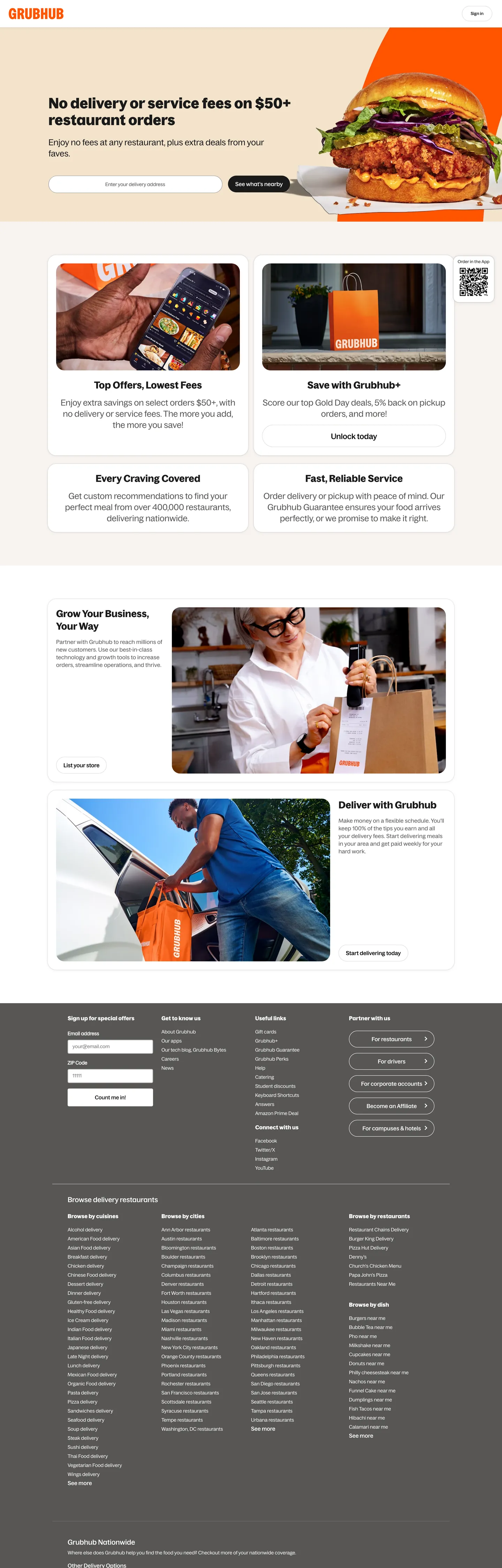
Grubhub's marketing page presents a deliberate tension: a brand that built its identity on red-orange energy delivers its homepage on a near-black-and-white structural palette, with food photography doing the chromatic work. The primary CTA ("See what's nearby") uses #1a1a19 — a near-black with the faintest warm undertone — as its fill color. The nav carries no structural accent. Grubhub's familiar red-orange appears in the logo mark at the top left but nowhere else in the captured CSS token system. Where DoorDash runs a saturated red hero and Uber Eats relies on green-tinged brand touches in its app, Grubhub's marketing surface reads as a neutral, photography-led canvas with a near-black ink system.
The DESIGN.md file packages the system into 8 colors tokens drawn from a near-black, white, warm-gray, and warm-cream palette; 13 typography tokens spanning Bagoss across four named weight variants at 12–42px; 6 radius tokens anchored on a 24px default with a 48px half-pill for interactive chips; and 16 components covering the hero search layout, the feature card grid, the restaurant promotion strip, the footer dark band, and the text input with its border-heavy form field treatment.
Feed this file to Claude or Cursor and it reproduces Grubhub's specific moves: near-black pill CTAs rather than a colored fill, generous 24–48px rounding on all card and chip surfaces, a warm-cream section separator (#f8f4f1) that functions like a subtle brand signal without being a declared accent color, and Bagoss medium as the primary interface weight with Bagoss bold reserved for headings only. The one move worth noting before borrowing: the Bagoss family is proprietary to Grubhub; Fira Sans (the fallback in the font stack) or Inter Medium provides the closest open-source substitute at the 14–16px interface sizes.
What makes it distinct
5
- Near-black ink over brand colorthe captured CTA and heading system uses #1a1a19, not Grubhub's familiar red-orange; the brand color is present in the logo but absent from the page's structural token system
- Bagoss across four named weightsstandard, regular, medium, and bold are distinct font-file variants, not just numeric weight values; the system has more typographic granularity than most food-delivery peers
- 24–48px aggressively rounded cardscard surfaces and interactive chips use 24px and 48px rounding, giving the page a soft, approachable character that contrasts with the stark dark CTAs
- Warm cream surfacethe below-fold content area uses #f8f4f1, a warm off-white that signals warmth without photography
- Address-search as hero primarylike Uber Eats, Grubhub gates restaurant browsing behind a location typeahead, making the search input the above-fold primary interaction
grubhub.com
Live at grubhub.com
A snapshot of the brand in production. Scroll the frame to see the whole page.
Colors
8 colors
Grubhub's system runs on #000000 as its primary voltage, used in 2 of 16 components. Type is set in Bagoss Standard across 13 tokens from 12px to 42px, weights 400–700. Shape language is soft — components average 17px corner radius, with no sharp interactive edges.
Surface
Page and card backgrounds · 2
Text
Headlines, body, captions · 4
Borders & Hairlines
Dividers, outlines, rules · 1
Other
Specialty colors · 1
Typography
13 type tokens
Set in Bagoss Standard across 13 tokens, from 12px to 42px, weights 400–700. Shown in its own stack: where the font isn't installed, the fallback the file names stands in.
- display-xl42px · weight 700 · lh 48pxThe quick brown fox jumps over the lazy dog
- display-sm28px · weight 700 · lh 36pxThe quick brown fox jumps over the lazy dog
- heading-lg24px · weight 400 · lh 32pxThe quick brown fox jumps over the lazy dog
- heading-md22px · weight 500 · lh 28pxThe quick brown fox jumps over the lazy dog
- heading-sm20px · weight 500 · lh 24pxThe quick brown fox jumps over the lazy dog
- subheading16px · weight 500 · lh 19pxThe quick brown fox jumps over the lazy dog
- body-md14px · weight 400 · lh 20pxThe quick brown fox jumps over the lazy dog
- body-md-medium14px · weight 500 · lh 20pxThe quick brown fox jumps over the lazy dog
- button-md16px · weight 500 · lh 22pxThe quick brown fox jumps over the lazy dog
- label-md16px · weight 500 · lh 22pxThe quick brown fox jumps over the lazy dog
- caption12px · weight 500 · lh 16pxThe quick brown fox jumps over the lazy dog
- caption-sm12px · weight 400 · lh 16px · tracking 0.18pxThe quick brown fox jumps over the lazy dog
- nav-link14px · weight 400 · lh 20pxThe quick brown fox jumps over the lazy dog
Layout
Radii and spacing
7 corner radii and 8 spacing values. Shape language: soft.
Radii
- none0px
- xs4px
- md16px
- lg24px
- xl28px
- pill42px
- full100px
Spacing
- xs5px
- sm8px
- md12px
- base16px
- lg24px
- xl32px
- 2xl64px
- section96px
Components
16 components
Each rendered from its tokens (color, type, radius, padding) on Grubhub's own canvas.
- Button Primarybutton-primaryButton Primary
- Button Secondarybutton-secondaryButton Secondary
- Top Navtop-navTop Nav
- Nav Linknav-linkNav Link
- Hero Headinghero-headingHero Heading
- Section Headingsection-headingSection Heading
- Body Paragraphbody-paragraphBody Paragraph
- Type here…text-inputText Input
- Search Wrappersearch-wrapperSearch Wrapper
- CardcardCard
- Feature Cardfeature-cardFeature Card
- Editorial Cardeditorial-cardEditorial Card
- Footer Darkfooter-darkFooter Dark
- Footer Linkfooter-linkFooter Link
- Section Warmsection-warmSection Warm
- Form Labelform-labelForm Label
In use
The system, in use
Grubhub's tokens on the kind of product it builds.
Build something people actually use.
A short paragraph of marketing copy that previews how the brand's display tier and body tier read together. Two sentences is usually enough.
FAQ
Grubhub design system FAQ
Common questions about Grubhub's tokens, components, and how to use this DESIGN.md in your project.
Read next
Related reading
Specs, directories, and component libraries that pair with this design system.
- Browse all design systemsThe full directory of DESIGN.md files on shadcn.io, with live mockups for each.shadcn.io
- Grubhub — official siteGrubhub's public marketing site — the source of truth for the live tokens captured in this file.grubhub.com (opens in a new tab)
- The DESIGN.md specificationGoogle Labs' open spec for machine-readable design system files — the format this page is built on.github.com (opens in a new tab)
Use it
Use Grubhub in your project
One machine-readable file. Drop it into Claude, Cursor, or any AI tool that reads DESIGN.md.
Download the DESIGN.md
One machine-readable file: every color, type, radius, spacing, and component token of Grubhub.
Feed it to your AI tool
Drop it into Claude, Cursor, or GitHub Copilot. The agent writes React components and Tailwind classes that match Grubhub's visual language.
Reference the tokens directly
Or paste the values into your Tailwind config, CSS variables, or component library: every color, size and radius is a quoted, ready-to-copy value.
Read the full DESIGN.md: overview, rationale, do’s and don’ts
Overview
Grubhub's marketing site operates under a brand inversion. Ink-over-identity: the red-orange color that defines Grubhub's logos, app icons, and brand advertising is structurally absent from the page's token system — the primary CTA, heading color, input borders, and nav text all use a near-black (#1a1a19, a barely-warm black with a +67° hue nudge). Where most food-delivery brands commit their brand voltage to at least one above-fold CTA fill, Grubhub's marketing surface treats ink black as the primary action color and lets food photography carry the chromatic energy above the fold. The result reads quieter and more content-forward than the brand's advertising identity suggests.
The shape language compensates with maximally soft geometry. Cards use 24px rounding — a value more common in consumer mobile apps than in marketing web pages. The primary CTA pill uses 28px rounding on a 48px-tall button, producing a surface that reads as bubbly rather than sharp. The text input is the system's only sharp element at 4px, creating a deliberate contrast: interactive affordances are soft-rounded while data-entry surfaces are tight. Unlike the binary pill-or-none approach Uber Eats uses, Grubhub holds a graduated scale with distinct stops at 4px, 16px, 24px, 28px, and 42px.
Key Characteristics:
- Near-black
{colors.ink}(#1a1a19) at frequency 177 — not pure black — carries every heading, CTA fill, input border, and nav link. The faint warm undertone at L=0.22 distinguishes it from a true zero-lightness black. - 24px as the default card radius and 28px on the primary CTA — the system's most distinctive geometric signal against delivery-category peers that use 8–12px rounding.
- Bagoss in four named weight variants (standard, regular, medium, bold) — a richer typographic tool than most delivery platforms, which typically run a single weight of a neutral sans.
- Warm cream
{colors.surface-warm}(#f8f4f1) as a section separator — not a declared brand accent but a structural warmth signal used once on an editorial sub-section. - Dark footer band: the system's only dark-on-dark surface, using
{colors.ink}as the background with white link text in a dense city/cuisine directory grid. - Food photography carries the hero's warmth — the page's amber and orange tones come from fried chicken imagery, not CSS color declarations.
Colors
Structural
- Ink (
{colors.ink}— #1a1a19): frequency 177. Used as text (89), border (87), background (1). The dominant color across the entire system — CTA fills, heading text, form input borders, and most link text. A near-black with the faintest warm-green undertone rather than a pure zero-lightness black. - Ink Deep (
{colors.ink-deep}— #000000): frequency 21. Used as text (11), border (10). A true black that appears in nav links and select border contexts, distinct from the dominant near-black ink. - Canvas (
{colors.canvas}— #ffffff): frequency 694. Used as text (339), border (337), background (18). The page floor and dominant border tone — the massive border count reflects the form field and card outline system. - Shadow (
{colors.shadow}— #262626): frequency 16, all as shadow ink. A dark charcoal used exclusively for card box-shadow values — the system's elevation signal. - Ink Mid (
{colors.ink-mid}— #575655): frequency 15. Used as text (6), background (3), border (6). Secondary text color for labels, captions, and form helper text. A warm mid-gray rather than a neutral. - Hairline (
{colors.hairline}— #dbd9d7): frequency 5, all as border. Card borders and divider lines — a warm light gray rather than a cool neutral, consistent with the system's warm-canvas approach. - Ink Muted (
{colors.ink-muted}— #93918f): frequency 1, as border. The lightest ink tone — a warm light gray appearing on tertiary borders. - Surface Warm (
{colors.surface-warm}— #f8f4f1): frequency 1, as background. A warm off-white used on a single editorial section, the closest thing to a declared brand warmth token in the structural palette.
Typography
Font Families
The system runs Bagoss as its proprietary typeface across all surfaces, with four named font-file variants that go beyond numeric weight declarations: "Bagoss Standard" (the base family at weights 400 and 700), bagoss-medium (the 500-weight interface voice), bagoss-bold (the 700-weight display voice, declared as a separate font file), and bagoss-regular (the 400-weight label context, also a separate file). This four-variant structure provides more granular typographic control than systems that rely on a single variable-weight font. The fallback stack is "Fira Sans", Helvetica, Arial, sans-serif — Fira Sans is the closest openly-licensed substitute.
Hierarchy
| Token | Size | Weight | Line Height | Use |
|---|---|---|---|---|
{typography.display-xl} | 42px | 700 | 48px | Hero h1 display headline |
{typography.display-sm} | 28px | 700 | 36px | Section h1 subheadings |
{typography.heading-lg} | 24px | 400 | 32px | Feature section spans |
{typography.heading-md} | 22px | 500 | 28px | Editorial section titles |
{typography.heading-sm} | 20px | 500 | 24px | h5-level card titles |
{typography.subheading} | 16px | 500 | 19px | h6 feature card titles |
{typography.button-md} | 16px | 500 | 22px | Primary button and interactive labels |
{typography.body-md} | 14px | 400 | 20px | Default body copy and links |
{typography.body-md-medium} | 14px | 500 | 20px | Emphasized body copy |
{typography.label-md} | 16px | 500 | 22px | Form labels |
{typography.caption} | 12px | 500 | 16px | Small label chips |
{typography.caption-sm} | 12px | 400 | 16px | Footer metadata and letter-spaced annotations |
{typography.nav-link} | 14px | 400 | 20px | Top-nav link text |
Note on Font Substitutes
Bagoss is proprietary to Grubhub. Fira Sans (the declared fallback) at weights 400 and 500 is the most direct substitute and transfers well at the 14–16px interface sizes; it shares Bagoss's humanist grotesk structure. Inter at the same weights is a wider-available alternative. For the 42px display tier, Fira Sans Bold approximates the weight confidence of Bagoss Bold.
Layout
Spacing System
- Base unit: 8px, with 16px as the primary module.
- Tokens:
{spacing.xs}5px ·{spacing.sm}8px ·{spacing.md}12px ·{spacing.base}16px ·{spacing.lg}24px ·{spacing.xl}32px ·{spacing.2xl}64px ·{spacing.section}96px. - Footer padding: 96px top, 64px horizontal — the most generous internal padding interval in the system.
- Feature card internal padding: 24px — consistent across the 2x2 card grid.
- CTA padding: 12px vertical, 20px horizontal — producing a 48px-tall button that reads substantial without oversizing.
Grid & Container
- Hero: split layout with the headline, subtext, and search input on the left and food photography on the right, approximately 50/50 at desktop widths.
- Feature grid: 2x2 card grid for the four value-proposition panels (Lowest Fees, Dine, Ordering Control, Fast Service), transitioning to full-width editorial cards below.
- Footer: multi-column dense link grid covering restaurant categories, cuisine types, and cities — the page's highest-information-density surface.
Rhythm
The page moves from an editorial-photo hero into an information grid (2x2 features), then into larger editorial cards (restaurant/courier sign-up), and finally into a full-dark footer. The rhythm is denser and more utilitarian than the hero suggests — the below-fold sections read as category pages within a marketplace rather than brand marketing panels.
Elevation
The system uses box-shadow for card elevation, wired through {colors.shadow} (#262626) at low opacity — 16 shadow occurrences captured, all on card surfaces. Unlike Uber Eats, which uses no meaningful shadow tier, Grubhub explicitly lifts the feature cards above the white canvas with soft black-with-opacity shadows. The dark footer achieves depth through surface-color contrast — the shift from white to near-black ink creates the page's most dramatic tonal transition, with no shadow layer needed.
- Flat (no shadow): hero, nav, editorial image panels, section bands.
- Tonal shadow:
{colors.shadow}(#262626 at opacity) on feature cards — the 24px-rounded card surfaces sit visibly above the canvas. - Surface contrast: the
{colors.surface-warm}(#f8f4f1) section and the dark footer band create depth through color shift rather than shadow.
Shapes
The radius scale is graduated-soft, anchored on 24px with distinct stops at every tier:
{rounded.none}0px — not observed in the extraction; structural resets only.{rounded.xs}4px — applied to the text input field only; the single tight-rounding element in the system.{rounded.md}16px — secondary card surfaces and inner containers.{rounded.lg}24px — the dominant card radius (10 occurrences); every feature card, search wrapper, and category chip uses this value.{rounded.xl}28px — the primary CTA button. At 48px height, this produces a visually pill-like button without reaching the full-circle pill geometry.{rounded.pill}42px — the largest chip-style elements and modal containers.{rounded.full}100px — fully circular elements.
The 4px-to-24px gap is the system's sharpest contrast: form inputs are tight while all card and interactive surfaces are generously soft. This creates an implicit hierarchy — data-entry surfaces (inputs) feel precise; browse surfaces (cards, chips) feel inviting.
Components
button-primary — Near-black {colors.ink} fill, white text, {rounded.xl} 28px radius, 12x20px padding, 48px height. "See what's nearby" is the canonical hero instance — the system's primary conversion action.
button-secondary — White {colors.canvas} fill, ink text, 1px ink border, same {rounded.xl} 28px radius. Used for secondary CTAs at equal weight to the primary.
top-nav — White canvas, 56px height, 24px horizontal padding. Houses the Grubhub wordmark and a right-aligned navigation cluster. No visible background tint or border in the capture.
nav-link — Transparent background, ink-deep text at {typography.nav-link} (14px / 400), no padding — the nav links appear tight and minimal without hover backgrounds.
hero-heading — Near-black {colors.ink} text, Bagoss Bold 42px / 700, transparent background. The above-fold h1 ("No delivery or service fees on $50+ restaurant orders").
body-paragraph — Ink text at {typography.body-md} (14px / 400). The workhorse paragraph style.
text-input — White fill, 1px ink-deep border, {rounded.xs} 4px radius, 8x12px padding, 40px height. The system's single tight-cornered interactive element.
search-wrapper — White canvas, {rounded.lg} 24px radius, 12px horizontal padding, 56px height. The outer container for the address typeahead — sits inside the hero as the primary action surface.
card — White canvas, 1px {colors.hairline} border, {rounded.lg} 24px radius, 16px internal padding. The base card surface.
feature-card — White canvas, 1px hairline border, {rounded.lg} 24px radius, 24px padding. The 2x2 value-proposition cards below the hero.
editorial-card — White canvas, 24px rounding, 24px padding. Full-width editorial cards for the restaurant-partner and courier sign-up sections.
footer-dark — Near-black {colors.ink} background, white text, 96x64px padding. Holds the dense multi-column directory grid of categories, cuisines, and city links.
footer-link — Transparent, white text at {typography.body-md}, 3px vertical padding. The individual link in the footer directory grid — top and bottom spacing comes from the 3px 0px padding pattern that appears 115 times in the extraction.
section-warm — Warm cream {colors.surface-warm} background, 32px padding. The single mid-page editorial divider that introduces warmth without photography.
form-label — Transparent background, ink text at {typography.label-md} (Bagoss Bold 16px / 500). Form field labels.
Do's and Don'ts
Do keep the primary CTA background at {colors.ink} (#1a1a19), not the red-orange brand color. The marketing surface has established a near-black CTA system — introducing a colored button fill invents a token that doesn't exist in the extracted page and conflicts with the current visual identity.
Do use 24px as the default radius for any card or chip surface. The system's radius signature is dramatically softer than delivery-category defaults; dropping to 8px or 12px card rounding would make the components read as belonging to a different brand.
Do respect the Bagoss weight hierarchy: Bagoss Bold exclusively for h1/h2 headings and form labels; bagoss-medium for buttons, subheadings, and h5/h6; Bagoss Standard for body copy and nav links. Crossing weight tiers (e.g., using Bagoss Bold for body paragraphs) would break the system's four-variant discipline.
Do use {colors.shadow} (#262626 at low opacity) for card elevation rather than a tinted or colored shadow. The system's 16 shadow occurrences are all neutral dark — no warm or chromatic tinting appears.
Don't use {colors.hairline} (#dbd9d7) as a background fill — it appears only 5 times, all as border-color on cards and dividers. For a warm-tinted background surface, use {colors.surface-warm} (#f8f4f1) instead.
Don't apply the 28px CTA radius to card containers. The {rounded.xl} 28px value is reserved for the primary interactive CTA; card surfaces use {rounded.lg} 24px. Mixing the two radii removes the implicit distinction between "container" and "action."
Don't use {colors.ink-mid} (#575655) for heading or display text — it appears in secondary body contexts and label annotations only. Heading text requires {colors.ink} (#1a1a19) or {colors.ink-deep} (#000000) for sufficient contrast.
Don't introduce a chromatic section band using the brand red-orange as a background fill. The captured system uses only {colors.surface-warm} (one occurrence) for a warm section separator — a saturated color band would contradict the page's deliberate restraint and conflict with the ink-primary CTA system.
Known Gaps
- Brand red-orange: Grubhub's historical red-orange brand accent is visible in the logo but absent from the marketing page's structural token system. Any red-orange implementation should reference the company's brand guidelines rather than these extracted tokens.
- Mobile breakpoints: the 2x2 feature grid, hero split, and footer directory are captured at 1440px desktop width. The layout behavior at 375px and 768px would require separate inspection.
- Hover and focus states: the extraction captures resting states only. Button hover, input focus rings, and link hover treatments are not represented.
- Restaurant browse surface: the card system for restaurant listings, menu items, ratings, and price indicators belongs to the authenticated delivery UX and is not captured on the marketing landing page.
- Dark mode: the marketing site is light-only. No dark-mode token variants are exposed on the captured surfaces.
- Animation and transition: the hero subtext and feature card appear to load with subtle entrance animations. Easing curves and duration values are not captured.
- Accessibility states: focus rings, aria-selected chip states, and disabled form field styling are not represented in the marketing page capture.
Food & Delivery
More systems like this
More DESIGN.md files in Food & Delivery.
Pricing
Build it with Pro
The DESIGN.md files are free. Pro adds 6,000+ blocks, premium templates and the MCP server, so your AI editor builds in your system for you.
4.9/5 out of 5 · 150+ reviewsfrom 150+ founders and developers.
Billing
Billed once a year in USD. Cancel anytime.
- How many people can use the license.
- Client work, SaaS products and anything you charge for.
- Production-ready React sections: hero, pricing, features, dashboards and more.
- Complete multi-page sites you can ship as they are.
- React icons from every major library, installable with one command.
- Presets that restyle every block, in light and dark.
- Lets your AI editor search, preview and install blocks for you.
- Priority requests are answered first.
Individual
For personal projects & open source
$32instead of $49/mo
$389 billed yearly
- Seats: 1 seat
- Commercial use: Personal & open source only
- Pro blocks: 6,000+ blocks
- Templates: All 14 templates
- React icons: 294k+ icons
- Themes: All 59 themes
- MCP server: Basic usage
- Support: Standard
Team
Most popularFor freelancers, agencies & startups
$66instead of $99/mo
$789 billed yearly · ≈ $13/dev/mo
- Seats: Up to 5 seats
- Commercial use: Included
- Pro blocks: 6,000+ blocks
- Templates: All 14 templates
- React icons: 294k+ icons
- Themes: All 59 themes
- MCP server: High usage
- Support: Priority
Organization
For companies with larger teams
$132instead of $199/mo
$1,589 billed yearly
- Seats: Unlimited seats
- Commercial use: Included
- Pro blocks: 6,000+ blocks
- Templates: All 14 templates
- React icons: 294k+ icons
- Themes: All 59 themes
- MCP server: Unlimited usage
- Support: Priority
Billed once a year in USD. Cancel anytime.
Individual
For personal projects & open source
$32instead of $49/mo
$389 billed yearly
- How many people can use the license.Seats: 1 seat
- Client work, SaaS products and anything you charge for.Commercial use: Personal & open source only
- Production-ready React sections: hero, pricing, features, dashboards and more.Pro blocks: 6,000+ blocks
- Complete multi-page sites you can ship as they are.Templates: All 14 templates
- React icons from every major library, installable with one command.React icons: 294k+ icons
- Presets that restyle every block, in light and dark.Themes: All 59 themes
- Lets your AI editor search, preview and install blocks for you.MCP server: Basic usage
- Priority requests are answered first.Support: Standard
Team
Most popularFor freelancers, agencies & startups
$66instead of $99/mo
$789 billed yearly · ≈ $13/dev/mo
Everything in Individual, plus
- How many people can use the license.Seats: Up to 5 seats
- Client work, SaaS products and anything you charge for.Commercial use: Included
- Lets your AI editor search, preview and install blocks for you.MCP server: High usage
- Priority requests are answered first.Support: Priority
Organization
For companies with larger teams
$132instead of $199/mo
$1,589 billed yearly
Everything in Team, plus
- How many people can use the license.Seats: Unlimited seats
- Lets your AI editor search, preview and install blocks for you.MCP server: Unlimited usage
- Secure checkout via Stripe
- Code lives in your repo
- Keep what you've shipped if you cancel
- License terms
Your system, built for you
Every block, template and icon, installed by your AI agent in your design system. The DESIGN.md files stay free.